# The Tabs Widget
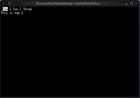
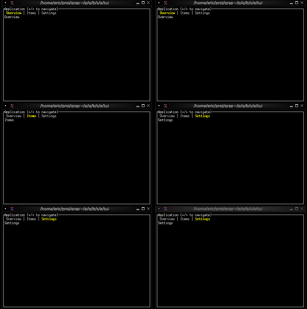
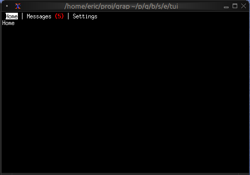
The `tabs` widget creates a tabbed interface for organizing content into multiple switchable panels. Each tab has a title displayed in the tab bar and associated content that's shown when the tab is selected.
## Interface
```graphix
val tabs: fn(
?#divider: &[Span, null],
?#highlight_style: &[Style, null],
?#padding_left: &[Line, null],
?#padding_right: &[Line, null],
?#selected: &[i64, null],
?#size: &[Size, null],
?#style: &[Style, null],
&Array<(Line, Tui)>
) -> Tui;
```
## Parameters
- **selected** - Index of the currently selected tab (0-indexed)
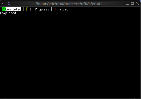
- **highlight_style** - Style for the selected tab title
- **style** - Base style for unselected tab titles
- **divider** - String or span separating tab titles
## Examples
### Basic Usage
```graphix
{{#include ../../examples/tui/tabs_basic.gx}}
```
### Navigation Between Tabs
```graphix
{{#include ../../examples/tui/tabs_navigation.gx}}
```
### Styled Tab Titles
```graphix
{{#include ../../examples/tui/tabs_styled.gx}}
```
### Tab with Badge
```graphix
{{#include ../../examples/tui/tabs_badge.gx}}
```
## Keyboard Navigation
Common patterns:
- `Left`/`Right` - Switch to previous/next tab
- `Tab` - Cycle forward through tabs
- Number keys - Jump directly to tab
## See Also
- [block](block.md) - For containing tabs with borders
- [list](list.md) - Common content for tabs
- [table](table.md) - For tabular content in tabs