# The Line Gauge Widget
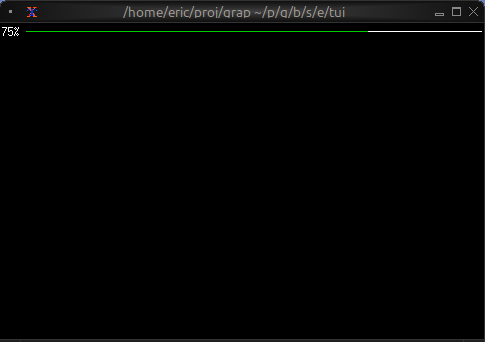
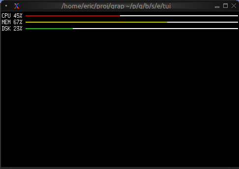
The `line_gauge` widget displays a horizontal progress indicator using line-drawing characters. It's more compact than `gauge` and ideal for dashboards where vertical space is limited.
## Interface
```graphix
type LineSet = [
`Normal,
`Rounded,
`Double,
`Thick
];
val line_gauge: fn(
?#filled_style: &[Style, null],
?#label: &[Line, null],
?#line_set: &[LineSet, null],
?#style: &[Style, null],
?#unfilled_style: &[Style, null],
&f64
) -> Tui;
```
## Parameters
- **filled_style** - Style for the filled portion
- **unfilled_style** - Style for the unfilled portion
- **line_set** - Character set: `Thin`, `Thick` (default), or `Double`
- **label** - Line or span displayed within the gauge
- **style** - Base style for the widget
## Examples
### Basic Usage
```graphix
{{#include ../../examples/tui/linegauge_basic.gx}}
```
### Color-coded Status
```graphix
{{#include ../../examples/tui/linegauge_colored.gx}}
```

### Compact Multi-metric Display
```graphix
{{#include ../../examples/tui/linegauge_multi.gx}}
```
## Use Cases
- System resource monitors (CPU, RAM, disk, network)
- Download/upload progress indicators
- Compact status dashboards
- Progress tracking in limited space
## Comparison with gauge
Use `line_gauge` when:
- You need compact, single-line displays
- Vertical space is limited
- You want a more technical/modern look
Use `gauge` when:
- You have more vertical space available
- You want larger, more prominent indicators
## See Also
- [gauge](gauge.md) - For block-style progress indicators
- [sparkline](sparkline.md) - For historical trend display
- [barchart](barchart.md) - For categorical value comparison