# The Bar Chart Widget
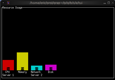
The `barchart` widget displays categorical data as vertical bars, supporting grouped bars, custom styling, and dynamic updates. It's ideal for comparing values across categories, showing rankings, or displaying resource usage.
## Interface
```graphix
type Bar = {
label: &[Line, null],
style: &[Style, null],
text_value: &[string, null],
value: &i64,
value_style: &[Style, null]
};
val bar: fn(
?#label: &[Line, null],
?#style: &[Style, null],
?#text_value: &[string, null],
?#value_style: &[Style, null],
&i64
) -> Bar;
type BarGroup = {
bars: Array<Bar>,
label: [Line, null]
};
val bar_group: fn(
?#label: [Line, null],
Array<Bar>
) -> BarGroup;
val bar_chart: fn(
?#bar_gap: &[i64, null],
?#bar_style: &[Style, null],
?#bar_width: &[i64, null],
?#direction: &[Direction, null],
?#group_gap: &[i64, null],
?#label_style: &[Style, null],
?#max: &[i64, null],
?#style: &[Style, null],
?#value_style: &[Style, null],
&Array<BarGroup>
) -> Tui;
```
## Parameters
### bar_chart
- **max** - Maximum value for chart scale (auto-scales if not specified)
- **bar_width** - Width of each bar in characters
- **bar_gap** - Space between bars within a group
- **group_gap** - Space between bar groups
- **style** - Base style for the chart
### bar_group
- **label** - Line labeling the group (displayed below bars)
### bar
- **style** - Style for the bar
- **label** - Line labeling the bar
- **text_value** - Line displayed above bar (defaults to numeric value)
## Examples
### Basic Usage
```graphix
{{#include ../../examples/tui/barchart_basic.gx}}
```
### Grouped Bars with Dynamic Data
```graphix
{{#include ../../examples/tui/barchart_grouped.gx}}
```
### Color-coded Values
```graphix
{{#include ../../examples/tui/barchart_colored.gx}}
```

## See Also
- [chart](chart.md) - For continuous data visualization
- [sparkline](sparkline.md) - For compact trend display
- [gauge](gauge.md) - For single value display