# The List Widget
The `list` widget displays a scrollable, selectable list of items with keyboard navigation support. It's perfect for menus, file browsers, option selectors, and any interface that requires choosing from a list of items.
## Interface
```graphix
val list: fn(
?#highlight_spacing: &[HighlightSpacing, null],
?#highlight_style: &[Style, null],
?#highlight_symbol: &[string, null],
?#repeat_highlight_symbol: &[bool, null],
?#scroll: &[i64, null],
?#selected: &[i64, null],
?#style: &[Style, null],
&Array<Line>
) -> Tui;
```
## Parameters
- **selected** - Index of the currently selected item (0-indexed)
- **scroll** - Scroll position (offset from the top)
- **highlight_style** - Style for the selected item
- **highlight_symbol** - String displayed before selected item (e.g., "▶ ")
- **repeat_highlight_symbol** - Whether to repeat symbol on wrapped lines
- **style** - Base style for all list items
## Examples
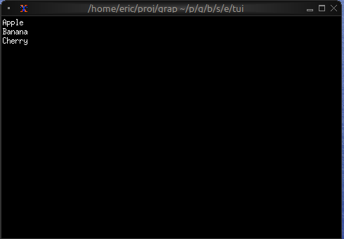
### Basic Usage
```graphix
{{#include ../../examples/tui/list_basic.gx}}
```
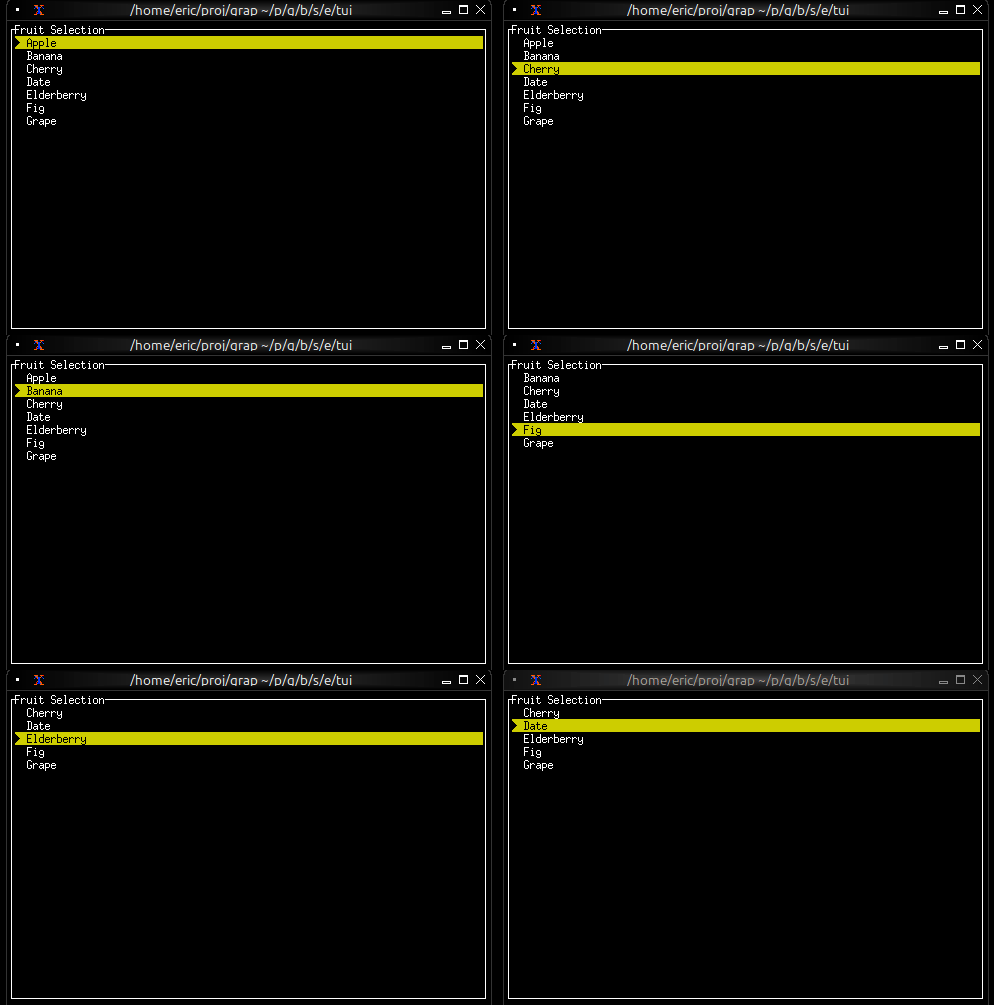
### Interactive List with Navigation
```graphix
{{#include ../../examples/tui/list_interactive.gx}}
```
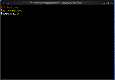
### Styled Items
```graphix
{{#include ../../examples/tui/list_styled.gx}}
```
## See Also
- [table](table.md) - For multi-column structured data
- [scrollbar](scroll.md) - For adding scrollbars
- [block](block.md) - For containing lists with borders
- [tabs](tabs.md) - For switching between different lists