# The Gauge Widget
The `gauge` widget displays a single value as a filled progress indicator, perfect for showing percentages, completion status, or resource usage. It provides a clear visual representation of how full or complete something is.
## Interface
```graphix
val gauge: fn(
?#gauge_style: &[Style, null],
?#label: &[Span, null],
?#style: &[Style, null],
?#use_unicode: &[bool, null],
&f64
) -> Tui;
```
## Parameters
- **gauge_style** - Style for the filled portion
- **label** - Line or span displayed in the center
- **use_unicode** - Use Unicode block characters for smoother rendering
- **style** - Style for the unfilled portion
## Examples
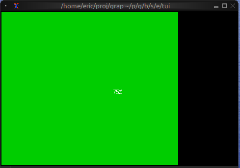
### Basic Usage
```graphix
{{#include ../../examples/tui/gauge_basic.gx}}
```
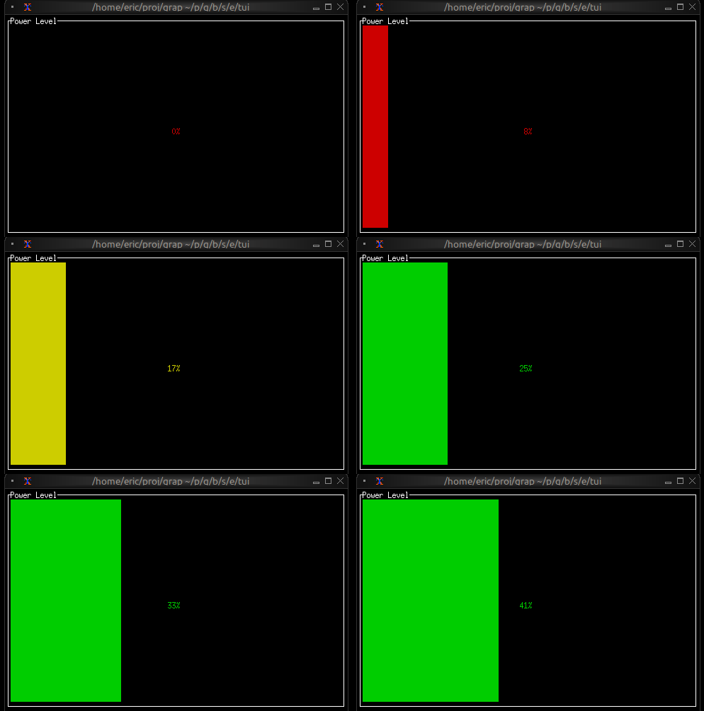
### Progress with Color Thresholds
```graphix
{{#include ../../examples/tui/gauge_threshold.gx}}
```
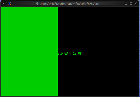
### Resource Usage
```graphix
{{#include ../../examples/tui/gauge_resource.gx}}
```
## See Also
- [linegauge](linegauge.md) - For horizontal line-based gauges
- [sparkline](sparkline.md) - For historical trend display
- [barchart](barchart.md) - For comparing multiple values