#[repr(C)]pub struct QPushButton { /* private fields */ }Expand description
The QPushButton widget provides a command button.
C++ class: QPushButton.
The QPushButton widget provides a command button.
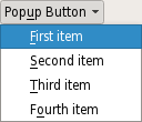
[Missing image windows-pushbutton.jpg]
The push button, or command button, is perhaps the most commonly used widget in any graphical user interface. Push (click) a button to command the computer to perform some action, or to answer a question. Typical buttons are OK, Apply, Cancel, Close, Yes, No and Help.
A command button is rectangular and typically displays a text label describing its action. A shortcut key can be specified by preceding the preferred character with an ampersand in the text. For example:
QPushButton *button = new QPushButton(“&Download”, this);
In this example the shortcut is Alt+D. See the QShortcut documentation for details (to display an actual ampersand, use '&&').
Push buttons display a textual label, and optionally a small icon. These can be set using the constructors and changed later using setText() and setIcon(). If the button is disabled, the appearance of the text and icon will be manipulated with respect to the GUI style to make the button look "disabled".
A push button emits the signal clicked() when it is activated by the mouse, the Spacebar or by a keyboard shortcut. Connect to this signal to perform the button's action. Push buttons also provide less commonly used signals, for example pressed() and released().
Command buttons in dialogs are by default auto-default buttons, i.e., they become the default push button automatically when they receive the keyboard input focus. A default button is a push button that is activated when the user presses the Enter or Return key in a dialog. You can change this with setAutoDefault(). Note that auto-default buttons reserve a little extra space which is necessary to draw a default-button indicator. If you do not want this space around your buttons, call setAutoDefault(false).
Being so central, the button widget has grown to accommodate a great many variations in the past decade. The Microsoft style guide now shows about ten different states of Windows push buttons and the text implies that there are dozens more when all the combinations of features are taken into consideration.
The most important modes or states are:
- Available or not (grayed out, disabled).
- Standard push button, toggling push button or menu button.
- On or off (only for toggling push buttons).
- Default or normal. The default button in a dialog can generally be "clicked" using the Enter or Return key.
- Auto-repeat or not.
- Pressed down or not.
As a general rule, use a push button when the application or dialog window performs an action when the user clicks on it (such as Apply, Cancel, Close and Help) and when the widget is supposed to have a wide, rectangular shape with a text label. Small, typically square buttons that change the state of the window rather than performing an action (such as the buttons in the top-right corner of the QFileDialog) are not command buttons, but tool buttons. Qt provides a special class (QToolButton) for these buttons.
If you need toggle behavior (see setCheckable()) or a button that auto-repeats the activation signal when being pushed down like the arrows in a scroll bar (see setAutoRepeat()), a command button is probably not what you want. When in doubt, use a tool button.
Note: On macOS when a push button's width becomes smaller than 50 or its height becomes smaller than 30, the button's corners are changed from round to square. Use the setMinimumSize() function to prevent this behavior.
A variation of a command button is a menu button. These provide not just one command, but several, since when they are clicked they pop up a menu of options. Use the method setMenu() to associate a popup menu with a push button.
Other classes of buttons are option buttons (see QRadioButton) and check boxes (see QCheckBox).
In Qt, the QAbstractButton base class provides most of the modes and other API, and QPushButton provides GUI logic. See QAbstractButton for more information about the API.
Implementations§
Source§impl QPushButton
impl QPushButton
Shows (pops up) the associated popup menu. If there is no such menu, this function does nothing. This function does not return until the popup menu has been closed by the user.
Returns a built-in Qt slot QPushButton::showMenu that can be passed to qt_core::Signal::connect.
Shows (pops up) the associated popup menu. If there is no such menu, this function does nothing. This function does not return until the popup menu has been closed by the user.
Sourcepub unsafe fn auto_default(&self) -> bool
pub unsafe fn auto_default(&self) -> bool
This property holds whether the push button is an auto default button
Calls C++ function: bool QPushButton::autoDefault() const.
This property holds whether the push button is an auto default button
If this property is set to true then the push button is an auto default button.
In some GUI styles a default button is drawn with an extra frame around it, up to 3 pixels or more. Qt automatically keeps this space free around auto-default buttons, i.e., auto-default buttons may have a slightly larger size hint.
This property's default is true for buttons that have a QDialog parent; otherwise it defaults to false.
See the default property for details of how default and auto-default interact.
Access functions:
| bool | autoDefault() const |
| void | setAutoDefault(bool) |
Sourcepub unsafe fn is_default(&self) -> bool
pub unsafe fn is_default(&self) -> bool
This property holds whether the push button is the default button
Calls C++ function: bool QPushButton::isDefault() const.
This property holds whether the push button is the default button
Default and autodefault buttons decide what happens when the user presses enter in a dialog.
A button with this property set to true (i.e., the dialog's default button,) will automatically be pressed when the user presses enter, with one exception: if an autoDefault button currently has focus, the autoDefault button is pressed. When the dialog has autoDefault buttons but no default button, pressing enter will press either the autoDefault button that currently has focus, or if no button has focus, the next autoDefault button in the focus chain.
In a dialog, only one push button at a time can be the default button. This button is then displayed with an additional frame (depending on the GUI style).
The default button behavior is provided only in dialogs. Buttons can always be clicked from the keyboard by pressing Spacebar when the button has focus.
If the default property is set to false on the current default button while the dialog is visible, a new default will automatically be assigned the next time a push button in the dialog receives focus.
This property's default is false.
Access functions:
| bool | isDefault() const |
| void | setDefault(bool) |
Sourcepub unsafe fn is_flat(&self) -> bool
pub unsafe fn is_flat(&self) -> bool
This property holds whether the button border is raised
Calls C++ function: bool QPushButton::isFlat() const.
This property holds whether the button border is raised
This property's default is false. If this property is set, most styles will not paint the button background unless the button is being pressed. setAutoFillBackground() can be used to ensure that the background is filled using the QPalette::Button brush.
Access functions:
| bool | isFlat() const |
| void | setFlat(bool) |
Returns the button's associated popup menu or 0 if no popup menu has been set.
Calls C++ function: QMenu* QPushButton::menu() const.
Returns the button’s associated popup menu or 0 if no popup menu has been set.
See also setMenu().
Sourcepub unsafe fn meta_object(&self) -> Ptr<QMetaObject>
pub unsafe fn meta_object(&self) -> Ptr<QMetaObject>
Calls C++ function: virtual const QMetaObject* QPushButton::metaObject() const.
Sourcepub unsafe fn minimum_size_hint(&self) -> CppBox<QSize>
pub unsafe fn minimum_size_hint(&self) -> CppBox<QSize>
Reimplemented from QWidget::minimumSizeHint().
Calls C++ function: virtual QSize QPushButton::minimumSizeHint() const.
Reimplemented from QWidget::minimumSizeHint().
Sourcepub unsafe fn from_q_widget(
parent: impl CastInto<Ptr<QWidget>>,
) -> QBox<QPushButton>
pub unsafe fn from_q_widget( parent: impl CastInto<Ptr<QWidget>>, ) -> QBox<QPushButton>
Constructs a push button with no text and a parent.
Calls C++ function: [constructor] void QPushButton::QPushButton(QWidget* parent = …).
Constructs a push button with no text and a parent.
Sourcepub unsafe fn from_q_string_q_widget(
text: impl CastInto<Ref<QString>>,
parent: impl CastInto<Ptr<QWidget>>,
) -> QBox<QPushButton>
pub unsafe fn from_q_string_q_widget( text: impl CastInto<Ref<QString>>, parent: impl CastInto<Ptr<QWidget>>, ) -> QBox<QPushButton>
Constructs a push button with the parent parent and the text text.
Calls C++ function: [constructor] void QPushButton::QPushButton(const QString& text, QWidget* parent = …).
Constructs a push button with the parent parent and the text text.
Sourcepub unsafe fn from_q_icon_q_string_q_widget(
icon: impl CastInto<Ref<QIcon>>,
text: impl CastInto<Ref<QString>>,
parent: impl CastInto<Ptr<QWidget>>,
) -> QBox<QPushButton>
pub unsafe fn from_q_icon_q_string_q_widget( icon: impl CastInto<Ref<QIcon>>, text: impl CastInto<Ref<QString>>, parent: impl CastInto<Ptr<QWidget>>, ) -> QBox<QPushButton>
Constructs a push button with an icon and a text, and a parent.
Calls C++ function: [constructor] void QPushButton::QPushButton(const QIcon& icon, const QString& text, QWidget* parent = …).
Constructs a push button with an icon and a text, and a parent.
Note that you can also pass a QPixmap object as an icon (thanks to the implicit type conversion provided by C++).
Sourcepub unsafe fn new() -> QBox<QPushButton>
pub unsafe fn new() -> QBox<QPushButton>
The QPushButton widget provides a command button.
Calls C++ function: [constructor] void QPushButton::QPushButton().
The QPushButton widget provides a command button.
[Missing image windows-pushbutton.jpg]
The push button, or command button, is perhaps the most commonly used widget in any graphical user interface. Push (click) a button to command the computer to perform some action, or to answer a question. Typical buttons are OK, Apply, Cancel, Close, Yes, No and Help.
A command button is rectangular and typically displays a text label describing its action. A shortcut key can be specified by preceding the preferred character with an ampersand in the text. For example:
QPushButton *button = new QPushButton(“&Download”, this);
In this example the shortcut is Alt+D. See the QShortcut documentation for details (to display an actual ampersand, use '&&').
Push buttons display a textual label, and optionally a small icon. These can be set using the constructors and changed later using setText() and setIcon(). If the button is disabled, the appearance of the text and icon will be manipulated with respect to the GUI style to make the button look "disabled".
A push button emits the signal clicked() when it is activated by the mouse, the Spacebar or by a keyboard shortcut. Connect to this signal to perform the button's action. Push buttons also provide less commonly used signals, for example pressed() and released().
Command buttons in dialogs are by default auto-default buttons, i.e., they become the default push button automatically when they receive the keyboard input focus. A default button is a push button that is activated when the user presses the Enter or Return key in a dialog. You can change this with setAutoDefault(). Note that auto-default buttons reserve a little extra space which is necessary to draw a default-button indicator. If you do not want this space around your buttons, call setAutoDefault(false).
Being so central, the button widget has grown to accommodate a great many variations in the past decade. The Microsoft style guide now shows about ten different states of Windows push buttons and the text implies that there are dozens more when all the combinations of features are taken into consideration.
The most important modes or states are:
- Available or not (grayed out, disabled).
- Standard push button, toggling push button or menu button.
- On or off (only for toggling push buttons).
- Default or normal. The default button in a dialog can generally be "clicked" using the Enter or Return key.
- Auto-repeat or not.
- Pressed down or not.
As a general rule, use a push button when the application or dialog window performs an action when the user clicks on it (such as Apply, Cancel, Close and Help) and when the widget is supposed to have a wide, rectangular shape with a text label. Small, typically square buttons that change the state of the window rather than performing an action (such as the buttons in the top-right corner of the QFileDialog) are not command buttons, but tool buttons. Qt provides a special class (QToolButton) for these buttons.
If you need toggle behavior (see setCheckable()) or a button that auto-repeats the activation signal when being pushed down like the arrows in a scroll bar (see setAutoRepeat()), a command button is probably not what you want. When in doubt, use a tool button.
Note: On macOS when a push button's width becomes smaller than 50 or its height becomes smaller than 30, the button's corners are changed from round to square. Use the setMinimumSize() function to prevent this behavior.
A variation of a command button is a menu button. These provide not just one command, but several, since when they are clicked they pop up a menu of options. Use the method setMenu() to associate a popup menu with a push button.
Other classes of buttons are option buttons (see QRadioButton) and check boxes (see QCheckBox).
In Qt, the QAbstractButton base class provides most of the modes and other API, and QPushButton provides GUI logic. See QAbstractButton for more information about the API.
Sourcepub unsafe fn from_q_string(
text: impl CastInto<Ref<QString>>,
) -> QBox<QPushButton>
pub unsafe fn from_q_string( text: impl CastInto<Ref<QString>>, ) -> QBox<QPushButton>
Constructs a push button with the parent parent and the text text.
Calls C++ function: [constructor] void QPushButton::QPushButton(const QString& text).
Constructs a push button with the parent parent and the text text.
Sourcepub unsafe fn from_q_icon_q_string(
icon: impl CastInto<Ref<QIcon>>,
text: impl CastInto<Ref<QString>>,
) -> QBox<QPushButton>
pub unsafe fn from_q_icon_q_string( icon: impl CastInto<Ref<QIcon>>, text: impl CastInto<Ref<QString>>, ) -> QBox<QPushButton>
Constructs a push button with an icon and a text, and a parent.
Calls C++ function: [constructor] void QPushButton::QPushButton(const QIcon& icon, const QString& text).
Constructs a push button with an icon and a text, and a parent.
Note that you can also pass a QPixmap object as an icon (thanks to the implicit type conversion provided by C++).
Sourcepub unsafe fn qt_metacall(
&self,
arg1: Call,
arg2: c_int,
arg3: *mut *mut c_void,
) -> c_int
pub unsafe fn qt_metacall( &self, arg1: Call, arg2: c_int, arg3: *mut *mut c_void, ) -> c_int
Calls C++ function: virtual int QPushButton::qt_metacall(QMetaObject::Call arg1, int arg2, void** arg3).
Sourcepub unsafe fn qt_metacast(&self, arg1: *const c_char) -> *mut c_void
pub unsafe fn qt_metacast(&self, arg1: *const c_char) -> *mut c_void
Calls C++ function: virtual void* QPushButton::qt_metacast(const char* arg1).
Sourcepub unsafe fn set_auto_default(&self, arg1: bool)
pub unsafe fn set_auto_default(&self, arg1: bool)
This property holds whether the push button is an auto default button
Calls C++ function: void QPushButton::setAutoDefault(bool arg1).
This property holds whether the push button is an auto default button
If this property is set to true then the push button is an auto default button.
In some GUI styles a default button is drawn with an extra frame around it, up to 3 pixels or more. Qt automatically keeps this space free around auto-default buttons, i.e., auto-default buttons may have a slightly larger size hint.
This property's default is true for buttons that have a QDialog parent; otherwise it defaults to false.
See the default property for details of how default and auto-default interact.
Access functions:
| bool | autoDefault() const |
| void | setAutoDefault(bool) |
Sourcepub unsafe fn set_default(&self, arg1: bool)
pub unsafe fn set_default(&self, arg1: bool)
This property holds whether the push button is the default button
Calls C++ function: void QPushButton::setDefault(bool arg1).
This property holds whether the push button is the default button
Default and autodefault buttons decide what happens when the user presses enter in a dialog.
A button with this property set to true (i.e., the dialog's default button,) will automatically be pressed when the user presses enter, with one exception: if an autoDefault button currently has focus, the autoDefault button is pressed. When the dialog has autoDefault buttons but no default button, pressing enter will press either the autoDefault button that currently has focus, or if no button has focus, the next autoDefault button in the focus chain.
In a dialog, only one push button at a time can be the default button. This button is then displayed with an additional frame (depending on the GUI style).
The default button behavior is provided only in dialogs. Buttons can always be clicked from the keyboard by pressing Spacebar when the button has focus.
If the default property is set to false on the current default button while the dialog is visible, a new default will automatically be assigned the next time a push button in the dialog receives focus.
This property's default is false.
Access functions:
| bool | isDefault() const |
| void | setDefault(bool) |
Sourcepub unsafe fn set_flat(&self, arg1: bool)
pub unsafe fn set_flat(&self, arg1: bool)
This property holds whether the button border is raised
Calls C++ function: void QPushButton::setFlat(bool arg1).
This property holds whether the button border is raised
This property's default is false. If this property is set, most styles will not paint the button background unless the button is being pressed. setAutoFillBackground() can be used to ensure that the background is filled using the QPalette::Button brush.
Access functions:
| bool | isFlat() const |
| void | setFlat(bool) |
Associates the popup menu menu with this push button. This turns the button into a menu button, which in some styles will produce a small triangle to the right of the button's text.
Calls C++ function: void QPushButton::setMenu(QMenu* menu).
Associates the popup menu menu with this push button. This turns the button into a menu button, which in some styles will produce a small triangle to the right of the button’s text.
Ownership of the menu is not transferred to the push button.
A push button with popup menus shown in the Fusion widget style.
See also menu().
Shows (pops up) the associated popup menu. If there is no such menu, this function does nothing. This function does not return until the popup menu has been closed by the user.
Calls C++ function: [slot] void QPushButton::showMenu().
Shows (pops up) the associated popup menu. If there is no such menu, this function does nothing. This function does not return until the popup menu has been closed by the user.
Sourcepub unsafe fn size_hint(&self) -> CppBox<QSize>
pub unsafe fn size_hint(&self) -> CppBox<QSize>
Reimplemented from QWidget::sizeHint().
Calls C++ function: virtual QSize QPushButton::sizeHint() const.
Reimplemented from QWidget::sizeHint().
Sourcepub unsafe fn static_meta_object() -> Ref<QMetaObject>
pub unsafe fn static_meta_object() -> Ref<QMetaObject>
Returns a reference to the staticMetaObject field.
Methods from Deref<Target = QAbstractButton>§
Sourcepub fn slot_set_icon_size(&self) -> Receiver<(*const QSize,)>
pub fn slot_set_icon_size(&self) -> Receiver<(*const QSize,)>
This property holds the icon size used for this button.
Returns a built-in Qt slot QAbstractButton::setIconSize that can be passed to qt_core::Signal::connect.
This property holds the icon size used for this button.
The default size is defined by the GUI style. This is a maximum size for the icons. Smaller icons will not be scaled up.
Access functions:
| QSize | iconSize() const |
| void | setIconSize(const QSize &size) |
Sourcepub fn slot_animate_click(&self) -> Receiver<(c_int,)>
pub fn slot_animate_click(&self) -> Receiver<(c_int,)>
Performs an animated click: the button is pressed immediately, and released msec milliseconds later (the default is 100 ms).
Returns a built-in Qt slot QAbstractButton::animateClick that can be passed to qt_core::Signal::connect.
Performs an animated click: the button is pressed immediately, and released msec milliseconds later (the default is 100 ms).
Calling this function again before the button is released resets the release timer.
All signals associated with a click are emitted as appropriate.
This function does nothing if the button is disabled.
See also click().
Sourcepub fn slot_click(&self) -> Receiver<()>
pub fn slot_click(&self) -> Receiver<()>
Performs a click.
Returns a built-in Qt slot QAbstractButton::click that can be passed to qt_core::Signal::connect.
Performs a click.
All the usual signals associated with a click are emitted as appropriate. If the button is checkable, the state of the button is toggled.
This function does nothing if the button is disabled.
See also animateClick().
Sourcepub fn slot_toggle(&self) -> Receiver<()>
pub fn slot_toggle(&self) -> Receiver<()>
Toggles the state of a checkable button.
Returns a built-in Qt slot QAbstractButton::toggle that can be passed to qt_core::Signal::connect.
Toggles the state of a checkable button.
See also checked.
Sourcepub fn slot_set_checked(&self) -> Receiver<(bool,)>
pub fn slot_set_checked(&self) -> Receiver<(bool,)>
This property holds whether the button is checked
Returns a built-in Qt slot QAbstractButton::setChecked that can be passed to qt_core::Signal::connect.
Sourcepub fn pressed(&self) -> Signal<()>
pub fn pressed(&self) -> Signal<()>
This signal is emitted when the button is pressed down.
Returns a built-in Qt signal QAbstractButton::pressed that can be passed to qt_core::Signal::connect.
Sourcepub fn released(&self) -> Signal<()>
pub fn released(&self) -> Signal<()>
This signal is emitted when the button is released.
Returns a built-in Qt signal QAbstractButton::released that can be passed to qt_core::Signal::connect.
Sourcepub fn clicked(&self) -> Signal<(bool,)>
pub fn clicked(&self) -> Signal<(bool,)>
This signal is emitted when the button is activated (i.e., pressed down then released while the mouse cursor is inside the button), when the shortcut key is typed, or when click() or animateClick() is called. Notably, this signal is not emitted if you call setDown(), setChecked() or toggle().
Returns a built-in Qt signal QAbstractButton::clicked that can be passed to qt_core::Signal::connect.
This signal is emitted when the button is activated (i.e., pressed down then released while the mouse cursor is inside the button), when the shortcut key is typed, or when click() or animateClick() is called. Notably, this signal is not emitted if you call setDown(), setChecked() or toggle().
If the button is checkable, checked is true if the button is checked, or false if the button is unchecked.
Sourcepub fn toggled(&self) -> Signal<(bool,)>
pub fn toggled(&self) -> Signal<(bool,)>
This signal is emitted whenever a checkable button changes its state. checked is true if the button is checked, or false if the button is unchecked.
Returns a built-in Qt signal QAbstractButton::toggled that can be passed to qt_core::Signal::connect.
This signal is emitted whenever a checkable button changes its state. checked is true if the button is checked, or false if the button is unchecked.
This may be the result of a user action, click() slot activation, or because setChecked() is called.
The states of buttons in exclusive button groups are updated before this signal is emitted. This means that slots can act on either the "off" signal or the "on" signal emitted by the buttons in the group whose states have changed.
For example, a slot that reacts to signals emitted by newly checked buttons but which ignores signals from buttons that have been unchecked can be implemented using the following pattern:
void MyWidget::reactToToggle(bool checked)
{
     if (checked) {
        // Examine the new button states.
        ...
     }
}
Button groups can be created using the QButtonGroup class, and updates to the button states monitored with the QButtonGroup::buttonClicked() signal.
Note: Notifier signal for property checked.
Sourcepub unsafe fn animate_click_1a(&self, msec: c_int)
pub unsafe fn animate_click_1a(&self, msec: c_int)
Performs an animated click: the button is pressed immediately, and released msec milliseconds later (the default is 100 ms).
Calls C++ function: [slot] void QAbstractButton::animateClick(int msec = …).
Performs an animated click: the button is pressed immediately, and released msec milliseconds later (the default is 100 ms).
Calling this function again before the button is released resets the release timer.
All signals associated with a click are emitted as appropriate.
This function does nothing if the button is disabled.
See also click().
Sourcepub unsafe fn animate_click_0a(&self)
pub unsafe fn animate_click_0a(&self)
Performs an animated click: the button is pressed immediately, and released msec milliseconds later (the default is 100 ms).
Calls C++ function: [slot] void QAbstractButton::animateClick().
Performs an animated click: the button is pressed immediately, and released msec milliseconds later (the default is 100 ms).
Calling this function again before the button is released resets the release timer.
All signals associated with a click are emitted as appropriate.
This function does nothing if the button is disabled.
See also click().
Sourcepub unsafe fn auto_exclusive(&self) -> bool
pub unsafe fn auto_exclusive(&self) -> bool
This property holds whether auto-exclusivity is enabled
Calls C++ function: bool QAbstractButton::autoExclusive() const.
This property holds whether auto-exclusivity is enabled
If auto-exclusivity is enabled, checkable buttons that belong to the same parent widget behave as if they were part of the same exclusive button group. In an exclusive button group, only one button can be checked at any time; checking another button automatically unchecks the previously checked one.
The property has no effect on buttons that belong to a button group.
autoExclusive is off by default, except for radio buttons.
Access functions:
| bool | autoExclusive() const |
| void | setAutoExclusive(bool) |
See also QRadioButton.
Sourcepub unsafe fn auto_repeat(&self) -> bool
pub unsafe fn auto_repeat(&self) -> bool
This property holds whether autoRepeat is enabled
Calls C++ function: bool QAbstractButton::autoRepeat() const.
This property holds whether autoRepeat is enabled
If autoRepeat is enabled, then the pressed(), released(), and clicked() signals are emitted at regular intervals when the button is down. autoRepeat is off by default. The initial delay and the repetition interval are defined in milliseconds by autoRepeatDelay and autoRepeatInterval.
Note: If a button is pressed down by a shortcut key, then auto-repeat is enabled and timed by the system and not by this class. The pressed(), released(), and clicked() signals will be emitted like in the normal case.
Access functions:
| bool | autoRepeat() const |
| void | setAutoRepeat(bool) |
Sourcepub unsafe fn auto_repeat_delay(&self) -> c_int
pub unsafe fn auto_repeat_delay(&self) -> c_int
This property holds the initial delay of auto-repetition
Calls C++ function: int QAbstractButton::autoRepeatDelay() const.
This property holds the initial delay of auto-repetition
If autoRepeat is enabled, then autoRepeatDelay defines the initial delay in milliseconds before auto-repetition kicks in.
This property was introduced in Qt 4.2.
Access functions:
| int | autoRepeatDelay() const |
| void | setAutoRepeatDelay(int) |
See also autoRepeat and autoRepeatInterval.
Sourcepub unsafe fn auto_repeat_interval(&self) -> c_int
pub unsafe fn auto_repeat_interval(&self) -> c_int
This property holds the interval of auto-repetition
Calls C++ function: int QAbstractButton::autoRepeatInterval() const.
This property holds the interval of auto-repetition
If autoRepeat is enabled, then autoRepeatInterval defines the length of the auto-repetition interval in millisecons.
This property was introduced in Qt 4.2.
Access functions:
| int | autoRepeatInterval() const |
| void | setAutoRepeatInterval(int) |
See also autoRepeat and autoRepeatDelay.
Sourcepub unsafe fn click(&self)
pub unsafe fn click(&self)
Performs a click.
Calls C++ function: [slot] void QAbstractButton::click().
Performs a click.
All the usual signals associated with a click are emitted as appropriate. If the button is checkable, the state of the button is toggled.
This function does nothing if the button is disabled.
See also animateClick().
Sourcepub unsafe fn group(&self) -> QPtr<QButtonGroup>
pub unsafe fn group(&self) -> QPtr<QButtonGroup>
Returns the group that this button belongs to.
Calls C++ function: QButtonGroup* QAbstractButton::group() const.
Returns the group that this button belongs to.
If the button is not a member of any QButtonGroup, this function returns 0.
See also QButtonGroup.
Sourcepub unsafe fn icon(&self) -> CppBox<QIcon>
pub unsafe fn icon(&self) -> CppBox<QIcon>
This property holds the icon shown on the button
Calls C++ function: QIcon QAbstractButton::icon() const.
This property holds the icon shown on the button
The icon's default size is defined by the GUI style, but can be adjusted by setting the iconSize property.
Access functions:
| QIcon | icon() const |
| void | setIcon(const QIcon &icon) |
Sourcepub unsafe fn icon_size(&self) -> CppBox<QSize>
pub unsafe fn icon_size(&self) -> CppBox<QSize>
This property holds the icon size used for this button.
Calls C++ function: QSize QAbstractButton::iconSize() const.
This property holds the icon size used for this button.
The default size is defined by the GUI style. This is a maximum size for the icons. Smaller icons will not be scaled up.
Access functions:
| QSize | iconSize() const |
| void | setIconSize(const QSize &size) |
Sourcepub unsafe fn is_checkable(&self) -> bool
pub unsafe fn is_checkable(&self) -> bool
This property holds whether the button is checkable
Calls C++ function: bool QAbstractButton::isCheckable() const.
This property holds whether the button is checkable
By default, the button is not checkable.
Access functions:
| bool | isCheckable() const |
| void | setCheckable(bool) |
See also checked.
Sourcepub unsafe fn is_checked(&self) -> bool
pub unsafe fn is_checked(&self) -> bool
This property holds whether the button is checked
Calls C++ function: bool QAbstractButton::isChecked() const.
Sourcepub unsafe fn is_down(&self) -> bool
pub unsafe fn is_down(&self) -> bool
This property holds whether the button is pressed down
Calls C++ function: bool QAbstractButton::isDown() const.
Sourcepub unsafe fn meta_object(&self) -> Ptr<QMetaObject>
pub unsafe fn meta_object(&self) -> Ptr<QMetaObject>
Calls C++ function: virtual const QMetaObject* QAbstractButton::metaObject() const.
Sourcepub unsafe fn qt_metacall(
&self,
arg1: Call,
arg2: c_int,
arg3: *mut *mut c_void,
) -> c_int
pub unsafe fn qt_metacall( &self, arg1: Call, arg2: c_int, arg3: *mut *mut c_void, ) -> c_int
Calls C++ function: virtual int QAbstractButton::qt_metacall(QMetaObject::Call arg1, int arg2, void** arg3).
Sourcepub unsafe fn qt_metacast(&self, arg1: *const c_char) -> *mut c_void
pub unsafe fn qt_metacast(&self, arg1: *const c_char) -> *mut c_void
Calls C++ function: virtual void* QAbstractButton::qt_metacast(const char* arg1).
Sourcepub unsafe fn set_auto_exclusive(&self, arg1: bool)
pub unsafe fn set_auto_exclusive(&self, arg1: bool)
This property holds whether auto-exclusivity is enabled
Calls C++ function: void QAbstractButton::setAutoExclusive(bool arg1).
This property holds whether auto-exclusivity is enabled
If auto-exclusivity is enabled, checkable buttons that belong to the same parent widget behave as if they were part of the same exclusive button group. In an exclusive button group, only one button can be checked at any time; checking another button automatically unchecks the previously checked one.
The property has no effect on buttons that belong to a button group.
autoExclusive is off by default, except for radio buttons.
Access functions:
| bool | autoExclusive() const |
| void | setAutoExclusive(bool) |
See also QRadioButton.
Sourcepub unsafe fn set_auto_repeat(&self, arg1: bool)
pub unsafe fn set_auto_repeat(&self, arg1: bool)
This property holds whether autoRepeat is enabled
Calls C++ function: void QAbstractButton::setAutoRepeat(bool arg1).
This property holds whether autoRepeat is enabled
If autoRepeat is enabled, then the pressed(), released(), and clicked() signals are emitted at regular intervals when the button is down. autoRepeat is off by default. The initial delay and the repetition interval are defined in milliseconds by autoRepeatDelay and autoRepeatInterval.
Note: If a button is pressed down by a shortcut key, then auto-repeat is enabled and timed by the system and not by this class. The pressed(), released(), and clicked() signals will be emitted like in the normal case.
Access functions:
| bool | autoRepeat() const |
| void | setAutoRepeat(bool) |
Sourcepub unsafe fn set_auto_repeat_delay(&self, arg1: c_int)
pub unsafe fn set_auto_repeat_delay(&self, arg1: c_int)
This property holds the initial delay of auto-repetition
Calls C++ function: void QAbstractButton::setAutoRepeatDelay(int arg1).
This property holds the initial delay of auto-repetition
If autoRepeat is enabled, then autoRepeatDelay defines the initial delay in milliseconds before auto-repetition kicks in.
This property was introduced in Qt 4.2.
Access functions:
| int | autoRepeatDelay() const |
| void | setAutoRepeatDelay(int) |
See also autoRepeat and autoRepeatInterval.
Sourcepub unsafe fn set_auto_repeat_interval(&self, arg1: c_int)
pub unsafe fn set_auto_repeat_interval(&self, arg1: c_int)
This property holds the interval of auto-repetition
Calls C++ function: void QAbstractButton::setAutoRepeatInterval(int arg1).
This property holds the interval of auto-repetition
If autoRepeat is enabled, then autoRepeatInterval defines the length of the auto-repetition interval in millisecons.
This property was introduced in Qt 4.2.
Access functions:
| int | autoRepeatInterval() const |
| void | setAutoRepeatInterval(int) |
See also autoRepeat and autoRepeatDelay.
Sourcepub unsafe fn set_checkable(&self, arg1: bool)
pub unsafe fn set_checkable(&self, arg1: bool)
This property holds whether the button is checkable
Calls C++ function: void QAbstractButton::setCheckable(bool arg1).
This property holds whether the button is checkable
By default, the button is not checkable.
Access functions:
| bool | isCheckable() const |
| void | setCheckable(bool) |
See also checked.
Sourcepub unsafe fn set_checked(&self, arg1: bool)
pub unsafe fn set_checked(&self, arg1: bool)
This property holds whether the button is checked
Calls C++ function: [slot] void QAbstractButton::setChecked(bool arg1).
Sourcepub unsafe fn set_down(&self, arg1: bool)
pub unsafe fn set_down(&self, arg1: bool)
This property holds whether the button is pressed down
Calls C++ function: void QAbstractButton::setDown(bool arg1).
Sourcepub unsafe fn set_icon(&self, icon: impl CastInto<Ref<QIcon>>)
pub unsafe fn set_icon(&self, icon: impl CastInto<Ref<QIcon>>)
This property holds the icon shown on the button
Calls C++ function: void QAbstractButton::setIcon(const QIcon& icon).
This property holds the icon shown on the button
The icon's default size is defined by the GUI style, but can be adjusted by setting the iconSize property.
Access functions:
| QIcon | icon() const |
| void | setIcon(const QIcon &icon) |
Sourcepub unsafe fn set_icon_size(&self, size: impl CastInto<Ref<QSize>>)
pub unsafe fn set_icon_size(&self, size: impl CastInto<Ref<QSize>>)
This property holds the icon size used for this button.
Calls C++ function: [slot] void QAbstractButton::setIconSize(const QSize& size).
This property holds the icon size used for this button.
The default size is defined by the GUI style. This is a maximum size for the icons. Smaller icons will not be scaled up.
Access functions:
| QSize | iconSize() const |
| void | setIconSize(const QSize &size) |
Sourcepub unsafe fn set_shortcut(&self, key: impl CastInto<Ref<QKeySequence>>)
pub unsafe fn set_shortcut(&self, key: impl CastInto<Ref<QKeySequence>>)
This property holds the mnemonic associated with the button
Calls C++ function: void QAbstractButton::setShortcut(const QKeySequence& key).
This property holds the mnemonic associated with the button
Access functions:
| QKeySequence | shortcut() const |
| void | setShortcut(const QKeySequence &key) |
Sourcepub unsafe fn set_text(&self, text: impl CastInto<Ref<QString>>)
pub unsafe fn set_text(&self, text: impl CastInto<Ref<QString>>)
This property holds the text shown on the button
Calls C++ function: void QAbstractButton::setText(const QString& text).
This property holds the text shown on the button
If the button has no text, the text() function will return an empty string.
If the text contains an ampersand character ('&'), a shortcut is automatically created for it. The character that follows the '&' will be used as the shortcut key. Any previous shortcut will be overwritten or cleared if no shortcut is defined by the text. See the QShortcut documentation for details. To display an actual ampersand, use '&&'.
There is no default text.
Access functions:
| QString | text() const |
| void | setText(const QString &text) |
Sourcepub unsafe fn shortcut(&self) -> CppBox<QKeySequence>
pub unsafe fn shortcut(&self) -> CppBox<QKeySequence>
This property holds the mnemonic associated with the button
Calls C++ function: QKeySequence QAbstractButton::shortcut() const.
This property holds the mnemonic associated with the button
Access functions:
| QKeySequence | shortcut() const |
| void | setShortcut(const QKeySequence &key) |
Sourcepub unsafe fn text(&self) -> CppBox<QString>
pub unsafe fn text(&self) -> CppBox<QString>
This property holds the text shown on the button
Calls C++ function: QString QAbstractButton::text() const.
This property holds the text shown on the button
If the button has no text, the text() function will return an empty string.
If the text contains an ampersand character ('&'), a shortcut is automatically created for it. The character that follows the '&' will be used as the shortcut key. Any previous shortcut will be overwritten or cleared if no shortcut is defined by the text. See the QShortcut documentation for details. To display an actual ampersand, use '&&'.
There is no default text.
Access functions:
| QString | text() const |
| void | setText(const QString &text) |
Methods from Deref<Target = QWidget>§
Sourcepub fn slot_set_enabled(&self) -> Receiver<(bool,)>
pub fn slot_set_enabled(&self) -> Receiver<(bool,)>
This property holds whether the widget is enabled
Returns a built-in Qt slot QWidget::setEnabled that can be passed to qt_core::Signal::connect.
This property holds whether the widget is enabled
In general an enabled widget handles keyboard and mouse events; a disabled widget does not. An exception is made with QAbstractButton.
Some widgets display themselves differently when they are disabled. For example a button might draw its label grayed out. If your widget needs to know when it becomes enabled or disabled, you can use the changeEvent() with type QEvent::EnabledChange.
Disabling a widget implicitly disables all its children. Enabling respectively enables all child widgets unless they have been explicitly disabled. It it not possible to explicitly enable a child widget which is not a window while its parent widget remains disabled.
By default, this property is true.
Access functions:
| bool | isEnabled() const |
| void | setEnabled(bool) |
See also isEnabledTo(), QKeyEvent, QMouseEvent, and changeEvent().
Sourcepub fn slot_set_disabled(&self) -> Receiver<(bool,)>
pub fn slot_set_disabled(&self) -> Receiver<(bool,)>
Disables widget input events if disable is true; otherwise enables input events.
Returns a built-in Qt slot QWidget::setDisabled that can be passed to qt_core::Signal::connect.
Disables widget input events if disable is true; otherwise enables input events.
See the enabled documentation for more information.
See also isEnabledTo(), QKeyEvent, QMouseEvent, and changeEvent().
Sourcepub fn slot_set_window_modified(&self) -> Receiver<(bool,)>
pub fn slot_set_window_modified(&self) -> Receiver<(bool,)>
This property holds whether the document shown in the window has unsaved changes
Returns a built-in Qt slot QWidget::setWindowModified that can be passed to qt_core::Signal::connect.
This property holds whether the document shown in the window has unsaved changes
A modified window is a window whose content has changed but has not been saved to disk. This flag will have different effects varied by the platform. On macOS the close button will have a modified look; on other platforms, the window title will have an '*' (asterisk).
The window title must contain a "[*]" placeholder, which indicates where the '*' should appear. Normally, it should appear right after the file name (e.g., "document1.txt[*] - Text Editor"). If the window isn't modified, the placeholder is simply removed.
Note that if a widget is set as modified, all its ancestors will also be set as modified. However, if you call setWindowModified(false) on a widget, this will not propagate to its parent because other children of the parent might have been modified.
Access functions:
| bool | isWindowModified() const |
| void | setWindowModified(bool) |
See also windowTitle, Application Example, SDI Example, and MDI Example.
Sourcepub fn slot_set_window_title(&self) -> Receiver<(*const QString,)>
pub fn slot_set_window_title(&self) -> Receiver<(*const QString,)>
This property holds the window title (caption)
Returns a built-in Qt slot QWidget::setWindowTitle that can be passed to qt_core::Signal::connect.
This property holds the window title (caption)
This property only makes sense for top-level widgets, such as windows and dialogs. If no caption has been set, the title is based of the windowFilePath. If neither of these is set, then the title is an empty string.
If you use the windowModified mechanism, the window title must contain a "[*]" placeholder, which indicates where the '*' should appear. Normally, it should appear right after the file name (e.g., "document1.txt[*] - Text Editor"). If the windowModified property is false (the default), the placeholder is simply removed.
On some desktop platforms (including Windows and Unix), the application name (from QGuiApplication::applicationDisplayName) is added at the end of the window title, if set. This is done by the QPA plugin, so it is shown to the user, but isn't part of the windowTitle string.
Access functions:
| QString | windowTitle() const |
| void | setWindowTitle(const QString &) |
Notifier signal:
| void | windowTitleChanged(const QString &title) |
See also windowIcon, windowModified, and windowFilePath.
Sourcepub fn slot_set_style_sheet(&self) -> Receiver<(*const QString,)>
pub fn slot_set_style_sheet(&self) -> Receiver<(*const QString,)>
This property holds the widget's style sheet
Returns a built-in Qt slot QWidget::setStyleSheet that can be passed to qt_core::Signal::connect.
This property holds the widget’s style sheet
The style sheet contains a textual description of customizations to the widget's style, as described in the Qt Style Sheets document.
Since Qt 4.5, Qt style sheets fully supports macOS.
Warning: Qt style sheets are currently not supported for custom QStyle subclasses. We plan to address this in some future release.
This property was introduced in Qt 4.2.
Access functions:
| QString | styleSheet() const |
| void | setStyleSheet(const QString &styleSheet) |
See also setStyle(), QApplication::styleSheet, and Qt Style Sheets.
Sourcepub fn slot_set_focus(&self) -> Receiver<()>
pub fn slot_set_focus(&self) -> Receiver<()>
This is an overloaded function.
Returns a built-in Qt slot QWidget::setFocus that can be passed to qt_core::Signal::connect.
This is an overloaded function.
Gives the keyboard input focus to this widget (or its focus proxy) if this widget or one of its parents is the active window.
Sourcepub fn slot_update(&self) -> Receiver<()>
pub fn slot_update(&self) -> Receiver<()>
Updates the widget unless updates are disabled or the widget is hidden.
Returns a built-in Qt slot QWidget::update that can be passed to qt_core::Signal::connect.
Updates the widget unless updates are disabled or the widget is hidden.
This function does not cause an immediate repaint; instead it schedules a paint event for processing when Qt returns to the main event loop. This permits Qt to optimize for more speed and less flicker than a call to repaint() does.
Calling update() several times normally results in just one paintEvent() call.
Qt normally erases the widget's area before the paintEvent() call. If the Qt::WA_OpaquePaintEvent widget attribute is set, the widget is responsible for painting all its pixels with an opaque color.
See also repaint(), paintEvent(), setUpdatesEnabled(), and Analog Clock Example.
Sourcepub fn slot_repaint(&self) -> Receiver<()>
pub fn slot_repaint(&self) -> Receiver<()>
Repaints the widget directly by calling paintEvent() immediately, unless updates are disabled or the widget is hidden.
Returns a built-in Qt slot QWidget::repaint that can be passed to qt_core::Signal::connect.
Repaints the widget directly by calling paintEvent() immediately, unless updates are disabled or the widget is hidden.
We suggest only using repaint() if you need an immediate repaint, for example during animation. In almost all circumstances update() is better, as it permits Qt to optimize for speed and minimize flicker.
Warning: If you call repaint() in a function which may itself be called from paintEvent(), you may get infinite recursion. The update() function never causes recursion.
See also update(), paintEvent(), and setUpdatesEnabled().
Sourcepub fn slot_set_visible(&self) -> Receiver<(bool,)>
pub fn slot_set_visible(&self) -> Receiver<(bool,)>
This property holds whether the widget is visible
Returns a built-in Qt slot QWidget::setVisible that can be passed to qt_core::Signal::connect.
This property holds whether the widget is visible
Calling setVisible(true) or show() sets the widget to visible status if all its parent widgets up to the window are visible. If an ancestor is not visible, the widget won't become visible until all its ancestors are shown. If its size or position has changed, Qt guarantees that a widget gets move and resize events just before it is shown. If the widget has not been resized yet, Qt will adjust the widget's size to a useful default using adjustSize().
Calling setVisible(false) or hide() hides a widget explicitly. An explicitly hidden widget will never become visible, even if all its ancestors become visible, unless you show it.
A widget receives show and hide events when its visibility status changes. Between a hide and a show event, there is no need to waste CPU cycles preparing or displaying information to the user. A video application, for example, might simply stop generating new frames.
A widget that happens to be obscured by other windows on the screen is considered to be visible. The same applies to iconified windows and windows that exist on another virtual desktop (on platforms that support this concept). A widget receives spontaneous show and hide events when its mapping status is changed by the window system, e.g. a spontaneous hide event when the user minimizes the window, and a spontaneous show event when the window is restored again.
You almost never have to reimplement the setVisible() function. If you need to change some settings before a widget is shown, use showEvent() instead. If you need to do some delayed initialization use the Polish event delivered to the event() function.
Access functions:
| bool | isVisible() const |
| virtual void | setVisible(bool visible) |
See also show(), hide(), isHidden(), isVisibleTo(), isMinimized(), showEvent(), and hideEvent().
Convenience function, equivalent to setVisible(!hidden).
Returns a built-in Qt slot QWidget::setHidden that can be passed to qt_core::Signal::connect.
Convenience function, equivalent to setVisible(!hidden).
See also isHidden().
Sourcepub fn slot_show(&self) -> Receiver<()>
pub fn slot_show(&self) -> Receiver<()>
Shows the widget and its child widgets.
Returns a built-in Qt slot QWidget::show that can be passed to qt_core::Signal::connect.
Shows the widget and its child widgets.
This is equivalent to calling showFullScreen(), showMaximized(), or setVisible(true), depending on the platform's default behavior for the window flags.
See also raise(), showEvent(), hide(), setVisible(), showMinimized(), showMaximized(), showNormal(), isVisible(), and windowFlags().
Sourcepub fn slot_hide(&self) -> Receiver<()>
pub fn slot_hide(&self) -> Receiver<()>
Hides the widget. This function is equivalent to setVisible(false).
Returns a built-in Qt slot QWidget::hide that can be passed to qt_core::Signal::connect.
Hides the widget. This function is equivalent to setVisible(false).
Note: If you are working with QDialog or its subclasses and you invoke the show() function after this function, the dialog will be displayed in its original position.
See also hideEvent(), isHidden(), show(), setVisible(), isVisible(), and close().
Sourcepub fn slot_show_minimized(&self) -> Receiver<()>
pub fn slot_show_minimized(&self) -> Receiver<()>
Shows the widget minimized, as an icon.
Returns a built-in Qt slot QWidget::showMinimized that can be passed to qt_core::Signal::connect.
Shows the widget minimized, as an icon.
Calling this function only affects windows.
See also showNormal(), showMaximized(), show(), hide(), isVisible(), and isMinimized().
Sourcepub fn slot_show_maximized(&self) -> Receiver<()>
pub fn slot_show_maximized(&self) -> Receiver<()>
Shows the widget maximized.
Returns a built-in Qt slot QWidget::showMaximized that can be passed to qt_core::Signal::connect.
Shows the widget maximized.
Calling this function only affects windows.
On X11, this function may not work properly with certain window managers. See the Window Geometry documentation for an explanation.
See also setWindowState(), showNormal(), showMinimized(), show(), hide(), and isVisible().
Sourcepub fn slot_show_full_screen(&self) -> Receiver<()>
pub fn slot_show_full_screen(&self) -> Receiver<()>
Shows the widget in full-screen mode.
Returns a built-in Qt slot QWidget::showFullScreen that can be passed to qt_core::Signal::connect.
Shows the widget in full-screen mode.
Calling this function only affects windows.
To return from full-screen mode, call showNormal().
Full-screen mode works fine under Windows, but has certain problems under X. These problems are due to limitations of the ICCCM protocol that specifies the communication between X11 clients and the window manager. ICCCM simply does not understand the concept of non-decorated full-screen windows. Therefore, the best we can do is to request a borderless window and place and resize it to fill the entire screen. Depending on the window manager, this may or may not work. The borderless window is requested using MOTIF hints, which are at least partially supported by virtually all modern window managers.
An alternative would be to bypass the window manager entirely and create a window with the Qt::X11BypassWindowManagerHint flag. This has other severe problems though, like totally broken keyboard focus and very strange effects on desktop changes or when the user raises other windows.
X11 window managers that follow modern post-ICCCM specifications support full-screen mode properly.
See also showNormal(), showMaximized(), show(), hide(), and isVisible().
Sourcepub fn slot_show_normal(&self) -> Receiver<()>
pub fn slot_show_normal(&self) -> Receiver<()>
Restores the widget after it has been maximized or minimized.
Returns a built-in Qt slot QWidget::showNormal that can be passed to qt_core::Signal::connect.
Restores the widget after it has been maximized or minimized.
Calling this function only affects windows.
See also setWindowState(), showMinimized(), showMaximized(), show(), hide(), and isVisible().
Sourcepub fn slot_close(&self) -> Receiver<()>
pub fn slot_close(&self) -> Receiver<()>
Closes this widget. Returns true if the widget was closed; otherwise returns false.
Returns a built-in Qt slot QWidget::close that can be passed to qt_core::Signal::connect.
Closes this widget. Returns true if the widget was closed; otherwise returns false.
First it sends the widget a QCloseEvent. The widget is hidden if it accepts the close event. If it ignores the event, nothing happens. The default implementation of QWidget::closeEvent() accepts the close event.
If the widget has the Qt::WA_DeleteOnClose flag, the widget is also deleted. A close events is delivered to the widget no matter if the widget is visible or not.
The QApplication::lastWindowClosed() signal is emitted when the last visible primary window (i.e. window with no parent) with the Qt::WA_QuitOnClose attribute set is closed. By default this attribute is set for all widgets except transient windows such as splash screens, tool windows, and popup menus.
Sourcepub fn slot_raise(&self) -> Receiver<()>
pub fn slot_raise(&self) -> Receiver<()>
Raises this widget to the top of the parent widget's stack.
Returns a built-in Qt slot QWidget::raise that can be passed to qt_core::Signal::connect.
Raises this widget to the top of the parent widget’s stack.
After this call the widget will be visually in front of any overlapping sibling widgets.
Note: When using activateWindow(), you can call this function to ensure that the window is stacked on top.
See also lower() and stackUnder().
Sourcepub fn slot_lower(&self) -> Receiver<()>
pub fn slot_lower(&self) -> Receiver<()>
Lowers the widget to the bottom of the parent widget's stack.
Returns a built-in Qt slot QWidget::lower that can be passed to qt_core::Signal::connect.
Lowers the widget to the bottom of the parent widget’s stack.
After this call the widget will be visually behind (and therefore obscured by) any overlapping sibling widgets.
See also raise() and stackUnder().
Sourcepub fn window_title_changed(&self) -> Signal<(*const QString,)>
pub fn window_title_changed(&self) -> Signal<(*const QString,)>
This signal is emitted when the window's title has changed, with the new title as an argument.
Returns a built-in Qt signal QWidget::windowTitleChanged that can be passed to qt_core::Signal::connect.
This signal is emitted when the window’s title has changed, with the new title as an argument.
This function was introduced in Qt 5.2.
Note: Notifier signal for property windowTitle.
Sourcepub fn window_icon_changed(&self) -> Signal<(*const QIcon,)>
pub fn window_icon_changed(&self) -> Signal<(*const QIcon,)>
This signal is emitted when the window's icon has changed, with the new icon as an argument.
Returns a built-in Qt signal QWidget::windowIconChanged that can be passed to qt_core::Signal::connect.
This signal is emitted when the window’s icon has changed, with the new icon as an argument.
This function was introduced in Qt 5.2.
Note: Notifier signal for property windowIcon.
Sourcepub fn window_icon_text_changed(&self) -> Signal<(*const QString,)>
pub fn window_icon_text_changed(&self) -> Signal<(*const QString,)>
This signal is emitted when the window's icon text has changed, with the new iconText as an argument.
Returns a built-in Qt signal QWidget::windowIconTextChanged that can be passed to qt_core::Signal::connect.
This signal is emitted when the window’s icon text has changed, with the new iconText as an argument.
This signal is deprecated.
This function was introduced in Qt 5.2.
Note: Notifier signal for property windowIconText.
This signal is emitted when the widget's contextMenuPolicy is Qt::CustomContextMenu, and the user has requested a context menu on the widget. The position pos is the position of the context menu event that the widget receives. Normally this is in widget coordinates. The exception to this rule is QAbstractScrollArea and its subclasses that map the context menu event to coordinates of the viewport().
Returns a built-in Qt signal QWidget::customContextMenuRequested that can be passed to qt_core::Signal::connect.
This signal is emitted when the widget’s contextMenuPolicy is Qt::CustomContextMenu, and the user has requested a context menu on the widget. The position pos is the position of the context menu event that the widget receives. Normally this is in widget coordinates. The exception to this rule is QAbstractScrollArea and its subclasses that map the context menu event to coordinates of the viewport().
See also mapToGlobal(), QMenu, and contextMenuPolicy.
Sourcepub fn slot_update_micro_focus(&self) -> Receiver<()>
pub fn slot_update_micro_focus(&self) -> Receiver<()>
Updates the widget's micro focus.
Returns a built-in Qt slot QWidget::updateMicroFocus that can be passed to qt_core::Signal::connect.
Updates the widget’s micro focus.
Sourcepub unsafe fn accept_drops(&self) -> bool
pub unsafe fn accept_drops(&self) -> bool
This property holds whether drop events are enabled for this widget
Calls C++ function: bool QWidget::acceptDrops() const.
This property holds whether drop events are enabled for this widget
Setting this property to true announces to the system that this widget may be able to accept drop events.
If the widget is the desktop (windowType() == Qt::Desktop), this may fail if another application is using the desktop; you can call acceptDrops() to test if this occurs.
Warning: Do not modify this property in a drag and drop event handler.
By default, this property is false.
Access functions:
| bool | acceptDrops() const |
| void | setAcceptDrops(bool on) |
See also Drag and Drop.
Sourcepub unsafe fn accessible_description(&self) -> CppBox<QString>
pub unsafe fn accessible_description(&self) -> CppBox<QString>
This property holds the widget's description as seen by assistive technologies
Calls C++ function: QString QWidget::accessibleDescription() const.
This property holds the widget’s description as seen by assistive technologies
The accessible description of a widget should convey what a widget does. While the accessibleName should be a short and consise string (e.g. Save), the description should give more context, such as Saves the current document.
This property has to be localized.
By default, this property contains an empty string and Qt falls back to using the tool tip to provide this information.
Access functions:
| QString | accessibleDescription() const |
| void | setAccessibleDescription(const QString &description) |
See also QWidget::accessibleName and QAccessibleInterface::text().
Sourcepub unsafe fn accessible_name(&self) -> CppBox<QString>
pub unsafe fn accessible_name(&self) -> CppBox<QString>
This property holds the widget's name as seen by assistive technologies
Calls C++ function: QString QWidget::accessibleName() const.
This property holds the widget’s name as seen by assistive technologies
This is the primary name by which assistive technology such as screen readers announce this widget. For most widgets setting this property is not required. For example for QPushButton the button's text will be used.
It is important to set this property when the widget does not provide any text. For example a button that only contains an icon needs to set this property to work with screen readers. The name should be short and equivalent to the visual information conveyed by the widget.
This property has to be localized.
By default, this property contains an empty string.
Access functions:
| QString | accessibleName() const |
| void | setAccessibleName(const QString &name) |
See also QWidget::accessibleDescription and QAccessibleInterface::text().
Sourcepub unsafe fn actions(&self) -> CppBox<QListOfQAction>
pub unsafe fn actions(&self) -> CppBox<QListOfQAction>
Returns the (possibly empty) list of this widget's actions.
Calls C++ function: QList<QAction*> QWidget::actions() const.
Returns the (possibly empty) list of this widget’s actions.
See also contextMenuPolicy, insertAction(), and removeAction().
Sourcepub unsafe fn activate_window(&self)
pub unsafe fn activate_window(&self)
Sets the top-level widget containing this widget to be the active window.
Calls C++ function: void QWidget::activateWindow().
Sets the top-level widget containing this widget to be the active window.
An active window is a visible top-level window that has the keyboard input focus.
This function performs the same operation as clicking the mouse on the title bar of a top-level window. On X11, the result depends on the Window Manager. If you want to ensure that the window is stacked on top as well you should also call raise(). Note that the window must be visible, otherwise activateWindow() has no effect.
On Windows, if you are calling this when the application is not currently the active one then it will not make it the active window. It will change the color of the taskbar entry to indicate that the window has changed in some way. This is because Microsoft does not allow an application to interrupt what the user is currently doing in another application.
See also isActiveWindow(), window(), show(), and QWindowsWindowFunctions::setWindowActivationBehavior().
Sourcepub unsafe fn add_action(&self, action: impl CastInto<Ptr<QAction>>)
pub unsafe fn add_action(&self, action: impl CastInto<Ptr<QAction>>)
Appends the action action to this widget's list of actions.
Calls C++ function: void QWidget::addAction(QAction* action).
Appends the action action to this widget’s list of actions.
All QWidgets have a list of QActions, however they can be represented graphically in many different ways. The default use of the QAction list (as returned by actions()) is to create a context QMenu.
A QWidget should only have one of each action and adding an action it already has will not cause the same action to be in the widget twice.
The ownership of action is not transferred to this QWidget.
See also removeAction(), insertAction(), actions(), and QMenu.
Sourcepub unsafe fn add_actions(&self, actions: impl CastInto<Ref<QListOfQAction>>)
pub unsafe fn add_actions(&self, actions: impl CastInto<Ref<QListOfQAction>>)
Appends the actions actions to this widget's list of actions.
Calls C++ function: void QWidget::addActions(QList<QAction*> actions).
Appends the actions actions to this widget’s list of actions.
See also removeAction(), QMenu, and addAction().
Sourcepub unsafe fn adjust_size(&self)
pub unsafe fn adjust_size(&self)
Adjusts the size of the widget to fit its contents.
Calls C++ function: void QWidget::adjustSize().
Adjusts the size of the widget to fit its contents.
This function uses sizeHint() if it is valid, i.e., the size hint's width and height are >= 0. Otherwise, it sets the size to the children rectangle that covers all child widgets (the union of all child widget rectangles).
For windows, the screen size is also taken into account. If the sizeHint() is less than (200, 100) and the size policy is expanding, the window will be at least (200, 100). The maximum size of a window is 2/3 of the screen's width and height.
See also sizeHint() and childrenRect().
Sourcepub unsafe fn auto_fill_background(&self) -> bool
pub unsafe fn auto_fill_background(&self) -> bool
This property holds whether the widget background is filled automatically
Calls C++ function: bool QWidget::autoFillBackground() const.
This property holds whether the widget background is filled automatically
If enabled, this property will cause Qt to fill the background of the widget before invoking the paint event. The color used is defined by the QPalette::Window color role from the widget's palette.
In addition, Windows are always filled with QPalette::Window, unless the WA_OpaquePaintEvent or WA_NoSystemBackground attributes are set.
This property cannot be turned off (i.e., set to false) if a widget's parent has a static gradient for its background.
Warning: Use this property with caution in conjunction with Qt Style Sheets. When a widget has a style sheet with a valid background or a border-image, this property is automatically disabled.
By default, this property is false.
This property was introduced in Qt 4.1.
Access functions:
| bool | autoFillBackground() const |
| void | setAutoFillBackground(bool enabled) |
See also Qt::WA_OpaquePaintEvent, Qt::WA_NoSystemBackground, and Transparency and Double Buffering.
Sourcepub unsafe fn background_role(&self) -> ColorRole
pub unsafe fn background_role(&self) -> ColorRole
Returns the background role of the widget.
Calls C++ function: QPalette::ColorRole QWidget::backgroundRole() const.
Returns the background role of the widget.
The background role defines the brush from the widget's palette that is used to render the background.
If no explicit background role is set, the widget inherts its parent widget's background role.
See also setBackgroundRole() and foregroundRole().
Sourcepub unsafe fn backing_store(&self) -> Ptr<QBackingStore>
pub unsafe fn backing_store(&self) -> Ptr<QBackingStore>
Returns the QBackingStore this widget will be drawn into.
Calls C++ function: QBackingStore* QWidget::backingStore() const.
Returns the QBackingStore this widget will be drawn into.
This function was introduced in Qt 5.0.
Sourcepub unsafe fn base_size(&self) -> CppBox<QSize>
pub unsafe fn base_size(&self) -> CppBox<QSize>
This property holds the base size of the widget
Calls C++ function: QSize QWidget::baseSize() const.
This property holds the base size of the widget
The base size is used to calculate a proper widget size if the widget defines sizeIncrement().
By default, for a newly-created widget, this property contains a size with zero width and height.
Access functions:
| QSize | baseSize() const |
| void | setBaseSize(const QSize &) |
| void | setBaseSize(int basew, int baseh) |
See also setSizeIncrement().
Sourcepub unsafe fn child_at_2a(&self, x: c_int, y: c_int) -> QPtr<QWidget>
pub unsafe fn child_at_2a(&self, x: c_int, y: c_int) -> QPtr<QWidget>
Returns the visible child widget at the position (x, y) in the widget's coordinate system. If there is no visible child widget at the specified position, the function returns 0.
Calls C++ function: QWidget* QWidget::childAt(int x, int y) const.
Returns the visible child widget at the position (x, y) in the widget’s coordinate system. If there is no visible child widget at the specified position, the function returns 0.
Sourcepub unsafe fn child_at_1a(&self, p: impl CastInto<Ref<QPoint>>) -> QPtr<QWidget>
pub unsafe fn child_at_1a(&self, p: impl CastInto<Ref<QPoint>>) -> QPtr<QWidget>
This is an overloaded function.
Calls C++ function: QWidget* QWidget::childAt(const QPoint& p) const.
This is an overloaded function.
Returns the visible child widget at point p in the widget's own coordinate system.
Sourcepub unsafe fn children_rect(&self) -> CppBox<QRect>
pub unsafe fn children_rect(&self) -> CppBox<QRect>
This property holds the bounding rectangle of the widget's children
Calls C++ function: QRect QWidget::childrenRect() const.
This property holds the bounding rectangle of the widget’s children
Hidden children are excluded.
By default, for a widget with no children, this property contains a rectangle with zero width and height located at the origin.
Access functions:
| QRect | childrenRect() const |
See also childrenRegion() and geometry().
Sourcepub unsafe fn children_region(&self) -> CppBox<QRegion>
pub unsafe fn children_region(&self) -> CppBox<QRegion>
This property holds the combined region occupied by the widget's children
Calls C++ function: QRegion QWidget::childrenRegion() const.
This property holds the combined region occupied by the widget’s children
Hidden children are excluded.
By default, for a widget with no children, this property contains an empty region.
Access functions:
| QRegion | childrenRegion() const |
See also childrenRect(), geometry(), and mask().
Sourcepub unsafe fn clear_focus(&self)
pub unsafe fn clear_focus(&self)
Takes keyboard input focus from the widget.
Calls C++ function: void QWidget::clearFocus().
Takes keyboard input focus from the widget.
If the widget has active focus, a focus out event is sent to this widget to tell it that it has lost the focus.
This widget must enable focus setting in order to get the keyboard input focus, i.e. it must call setFocusPolicy().
See also hasFocus(), setFocus(), focusInEvent(), focusOutEvent(), setFocusPolicy(), and QApplication::focusWidget().
Sourcepub unsafe fn clear_mask(&self)
pub unsafe fn clear_mask(&self)
Removes any mask set by setMask().
Calls C++ function: void QWidget::clearMask().
Sourcepub unsafe fn close(&self) -> bool
pub unsafe fn close(&self) -> bool
Closes this widget. Returns true if the widget was closed; otherwise returns false.
Calls C++ function: [slot] bool QWidget::close().
Closes this widget. Returns true if the widget was closed; otherwise returns false.
First it sends the widget a QCloseEvent. The widget is hidden if it accepts the close event. If it ignores the event, nothing happens. The default implementation of QWidget::closeEvent() accepts the close event.
If the widget has the Qt::WA_DeleteOnClose flag, the widget is also deleted. A close events is delivered to the widget no matter if the widget is visible or not.
The QApplication::lastWindowClosed() signal is emitted when the last visible primary window (i.e. window with no parent) with the Qt::WA_QuitOnClose attribute set is closed. By default this attribute is set for all widgets except transient windows such as splash screens, tool windows, and popup menus.
Sourcepub unsafe fn contents_margins(&self) -> CppBox<QMargins>
pub unsafe fn contents_margins(&self) -> CppBox<QMargins>
The contentsMargins function returns the widget's contents margins.
Calls C++ function: QMargins QWidget::contentsMargins() const.
The contentsMargins function returns the widget’s contents margins.
This function was introduced in Qt 4.6.
See also getContentsMargins(), setContentsMargins(), and contentsRect().
Sourcepub unsafe fn contents_rect(&self) -> CppBox<QRect>
pub unsafe fn contents_rect(&self) -> CppBox<QRect>
Returns the area inside the widget's margins.
Calls C++ function: QRect QWidget::contentsRect() const.
Returns the area inside the widget’s margins.
See also setContentsMargins() and getContentsMargins().
how the widget shows a context menu
Calls C++ function: Qt::ContextMenuPolicy QWidget::contextMenuPolicy() const.
how the widget shows a context menu
The default value of this property is Qt::DefaultContextMenu, which means the contextMenuEvent() handler is called. Other values are Qt::NoContextMenu, Qt::PreventContextMenu, Qt::ActionsContextMenu, and Qt::CustomContextMenu. With Qt::CustomContextMenu, the signal customContextMenuRequested() is emitted.
Access functions:
| Qt::ContextMenuPolicy | contextMenuPolicy() const |
| void | setContextMenuPolicy(Qt::ContextMenuPolicy policy) |
See also contextMenuEvent(), customContextMenuRequested(), and actions().
Sourcepub unsafe fn create_win_id(&self)
pub unsafe fn create_win_id(&self)
Calls C++ function: void QWidget::createWinId().
Sourcepub unsafe fn cursor(&self) -> CppBox<QCursor>
pub unsafe fn cursor(&self) -> CppBox<QCursor>
This property holds the cursor shape for this widget
Calls C++ function: QCursor QWidget::cursor() const.
This property holds the cursor shape for this widget
The mouse cursor will assume this shape when it's over this widget. See the list of predefined cursor objects for a range of useful shapes.
An editor widget might use an I-beam cursor:
setCursor(Qt::IBeamCursor);
If no cursor has been set, or after a call to unsetCursor(), the parent's cursor is used.
By default, this property contains a cursor with the Qt::ArrowCursor shape.
Some underlying window implementations will reset the cursor if it leaves a widget even if the mouse is grabbed. If you want to have a cursor set for all widgets, even when outside the window, consider QApplication::setOverrideCursor().
Access functions:
| QCursor | cursor() const |
| void | setCursor(const QCursor &) |
| void | unsetCursor() |
See also QApplication::setOverrideCursor().
Sourcepub unsafe fn dev_type(&self) -> c_int
pub unsafe fn dev_type(&self) -> c_int
Calls C++ function: virtual int QWidget::devType() const.
Sourcepub unsafe fn effective_win_id(&self) -> c_ulonglong
pub unsafe fn effective_win_id(&self) -> c_ulonglong
Returns the effective window system identifier of the widget, i.e. the native parent's window system identifier.
Calls C++ function: unsigned long long QWidget::effectiveWinId() const.
Returns the effective window system identifier of the widget, i.e. the native parent’s window system identifier.
If the widget is native, this function returns the native widget ID. Otherwise, the window ID of the first native parent widget, i.e., the top-level widget that contains this widget, is returned.
Note: We recommend that you do not store this value as it is likely to change at run-time.
This function was introduced in Qt 4.4.
See also nativeParentWidget().
Sourcepub unsafe fn ensure_polished(&self)
pub unsafe fn ensure_polished(&self)
Ensures that the widget and its children have been polished by QStyle (i.e., have a proper font and palette).
Calls C++ function: void QWidget::ensurePolished() const.
Ensures that the widget and its children have been polished by QStyle (i.e., have a proper font and palette).
QWidget calls this function after it has been fully constructed but before it is shown the very first time. You can call this function if you want to ensure that the widget is polished before doing an operation, e.g., the correct font size might be needed in the widget's sizeHint() reimplementation. Note that this function is called from the default implementation of sizeHint().
Polishing is useful for final initialization that must happen after all constructors (from base classes as well as from subclasses) have been called.
If you need to change some settings when a widget is polished, reimplement event() and handle the QEvent::Polish event type.
Note: The function is declared const so that it can be called from other const functions (e.g., sizeHint()).
See also event().
Sourcepub unsafe fn focus_policy(&self) -> FocusPolicy
pub unsafe fn focus_policy(&self) -> FocusPolicy
This property holds the way the widget accepts keyboard focus
Calls C++ function: Qt::FocusPolicy QWidget::focusPolicy() const.
This property holds the way the widget accepts keyboard focus
The policy is Qt::TabFocus if the widget accepts keyboard focus by tabbing, Qt::ClickFocus if the widget accepts focus by clicking, Qt::StrongFocus if it accepts both, and Qt::NoFocus (the default) if it does not accept focus at all.
You must enable keyboard focus for a widget if it processes keyboard events. This is normally done from the widget's constructor. For instance, the QLineEdit constructor calls setFocusPolicy(Qt::StrongFocus).
If the widget has a focus proxy, then the focus policy will be propagated to it.
Access functions:
| Qt::FocusPolicy | focusPolicy() const |
| void | setFocusPolicy(Qt::FocusPolicy policy) |
See also focusInEvent(), focusOutEvent(), keyPressEvent(), keyReleaseEvent(), and enabled.
Sourcepub unsafe fn focus_proxy(&self) -> QPtr<QWidget>
pub unsafe fn focus_proxy(&self) -> QPtr<QWidget>
Returns the focus proxy, or 0 if there is no focus proxy.
Calls C++ function: QWidget* QWidget::focusProxy() const.
Returns the focus proxy, or 0 if there is no focus proxy.
See also setFocusProxy().
Sourcepub unsafe fn focus_widget(&self) -> QPtr<QWidget>
pub unsafe fn focus_widget(&self) -> QPtr<QWidget>
Returns the last child of this widget that setFocus had been called on. For top level widgets this is the widget that will get focus in case this window gets activated
Calls C++ function: QWidget* QWidget::focusWidget() const.
Returns the last child of this widget that setFocus had been called on. For top level widgets this is the widget that will get focus in case this window gets activated
This is not the same as QApplication::focusWidget(), which returns the focus widget in the currently active window.
Sourcepub unsafe fn font(&self) -> Ref<QFont>
pub unsafe fn font(&self) -> Ref<QFont>
This property holds the font currently set for the widget
Calls C++ function: const QFont& QWidget::font() const.
This property holds the font currently set for the widget
This property describes the widget's requested font. The font is used by the widget's style when rendering standard components, and is available as a means to ensure that custom widgets can maintain consistency with the native platform's look and feel. It's common that different platforms, or different styles, define different fonts for an application.
When you assign a new font to a widget, the properties from this font are combined with the widget's default font to form the widget's final font. You can call fontInfo() to get a copy of the widget's final font. The final font is also used to initialize QPainter's font.
The default depends on the system environment. QApplication maintains a system/theme font which serves as a default for all widgets. There may also be special font defaults for certain types of widgets. You can also define default fonts for widgets yourself by passing a custom font and the name of a widget to QApplication::setFont(). Finally, the font is matched against Qt's font database to find the best match.
QWidget propagates explicit font properties from parent to child. If you change a specific property on a font and assign that font to a widget, that property will propagate to all the widget's children, overriding any system defaults for that property. Note that fonts by default don't propagate to windows (see isWindow()) unless the Qt::WA_WindowPropagation attribute is enabled.
QWidget's font propagation is similar to its palette propagation.
The current style, which is used to render the content of all standard Qt widgets, is free to choose to use the widget font, or in some cases, to ignore it (partially, or completely). In particular, certain styles like GTK style, Mac style, Windows XP, and Vista style, apply special modifications to the widget font to match the platform's native look and feel. Because of this, assigning properties to a widget's font is not guaranteed to change the appearance of the widget. Instead, you may choose to apply a styleSheet.
Note: If Qt Style Sheets are used on the same widget as setFont(), style sheets will take precedence if the settings conflict.
Access functions:
| const QFont & | font() const |
| void | setFont(const QFont &) |
See also fontInfo() and fontMetrics().
Sourcepub unsafe fn font_info(&self) -> CppBox<QFontInfo>
pub unsafe fn font_info(&self) -> CppBox<QFontInfo>
Returns the font info for the widget's current font. Equivalent to QFontInfo(widget->font()).
Calls C++ function: QFontInfo QWidget::fontInfo() const.
Returns the font info for the widget’s current font. Equivalent to QFontInfo(widget->font()).
See also font(), fontMetrics(), and setFont().
Sourcepub unsafe fn font_metrics(&self) -> CppBox<QFontMetrics>
pub unsafe fn font_metrics(&self) -> CppBox<QFontMetrics>
Returns the font metrics for the widget's current font. Equivalent to QFontMetrics(widget->font()).
Calls C++ function: QFontMetrics QWidget::fontMetrics() const.
Sourcepub unsafe fn foreground_role(&self) -> ColorRole
pub unsafe fn foreground_role(&self) -> ColorRole
Returns the foreground role.
Calls C++ function: QPalette::ColorRole QWidget::foregroundRole() const.
Returns the foreground role.
The foreground role defines the color from the widget's palette that is used to draw the foreground.
If no explicit foreground role is set, the function returns a role that contrasts with the background role.
See also setForegroundRole() and backgroundRole().
Sourcepub unsafe fn frame_geometry(&self) -> CppBox<QRect>
pub unsafe fn frame_geometry(&self) -> CppBox<QRect>
geometry of the widget relative to its parent including any window frame
Calls C++ function: QRect QWidget::frameGeometry() const.
geometry of the widget relative to its parent including any window frame
See the Window Geometry documentation for an overview of geometry issues with windows.
By default, this property contains a value that depends on the user's platform and screen geometry.
Access functions:
| QRect | frameGeometry() const |
Sourcepub unsafe fn frame_size(&self) -> CppBox<QSize>
pub unsafe fn frame_size(&self) -> CppBox<QSize>
This property holds the size of the widget including any window frame
Calls C++ function: QSize QWidget::frameSize() const.
This property holds the size of the widget including any window frame
By default, this property contains a value that depends on the user's platform and screen geometry.
Access functions:
| QSize | frameSize() const |
Sourcepub unsafe fn geometry(&self) -> Ref<QRect>
pub unsafe fn geometry(&self) -> Ref<QRect>
This property holds the geometry of the widget relative to its parent and excluding the window frame
Calls C++ function: const QRect& QWidget::geometry() const.
This property holds the geometry of the widget relative to its parent and excluding the window frame
When changing the geometry, the widget, if visible, receives a move event (moveEvent()) and/or a resize event (resizeEvent()) immediately. If the widget is not currently visible, it is guaranteed to receive appropriate events before it is shown.
The size component is adjusted if it lies outside the range defined by minimumSize() and maximumSize().
Warning: Calling setGeometry() inside resizeEvent() or moveEvent() can lead to infinite recursion.
See the Window Geometry documentation for an overview of geometry issues with windows.
By default, this property contains a value that depends on the user's platform and screen geometry.
Access functions:
| const QRect & | geometry() const |
| void | setGeometry(int x, int y, int w, int h) |
| void | setGeometry(const QRect &) |
See also frameGeometry(), rect(), move(), resize(), moveEvent(), resizeEvent(), minimumSize(), and maximumSize().
Sourcepub unsafe fn get_contents_margins(
&self,
left: *mut c_int,
top: *mut c_int,
right: *mut c_int,
bottom: *mut c_int,
)
pub unsafe fn get_contents_margins( &self, left: *mut c_int, top: *mut c_int, right: *mut c_int, bottom: *mut c_int, )
Returns the widget's contents margins for left, top, right, and bottom.
Calls C++ function: void QWidget::getContentsMargins(int* left, int* top, int* right, int* bottom) const.
Returns the widget’s contents margins for left, top, right, and bottom.
See also setContentsMargins() and contentsRect().
Sourcepub unsafe fn grab_1a(
&self,
rectangle: impl CastInto<Ref<QRect>>,
) -> CppBox<QPixmap>
pub unsafe fn grab_1a( &self, rectangle: impl CastInto<Ref<QRect>>, ) -> CppBox<QPixmap>
Renders the widget into a pixmap restricted by the given rectangle. If the widget has any children, then they are also painted in the appropriate positions.
Calls C++ function: QPixmap QWidget::grab(const QRect& rectangle = …).
Renders the widget into a pixmap restricted by the given rectangle. If the widget has any children, then they are also painted in the appropriate positions.
If a rectangle with an invalid size is specified (the default), the entire widget is painted.
This function was introduced in Qt 5.0.
Sourcepub unsafe fn grab_0a(&self) -> CppBox<QPixmap>
pub unsafe fn grab_0a(&self) -> CppBox<QPixmap>
Renders the widget into a pixmap restricted by the given rectangle. If the widget has any children, then they are also painted in the appropriate positions.
Calls C++ function: QPixmap QWidget::grab().
Renders the widget into a pixmap restricted by the given rectangle. If the widget has any children, then they are also painted in the appropriate positions.
If a rectangle with an invalid size is specified (the default), the entire widget is painted.
This function was introduced in Qt 5.0.
Sourcepub unsafe fn grab_gesture_2a(
&self,
type_: GestureType,
flags: QFlags<GestureFlag>,
)
pub unsafe fn grab_gesture_2a( &self, type_: GestureType, flags: QFlags<GestureFlag>, )
Subscribes the widget to a given gesture with specific flags.
Calls C++ function: void QWidget::grabGesture(Qt::GestureType type, QFlags<Qt::GestureFlag> flags = …).
Subscribes the widget to a given gesture with specific flags.
This function was introduced in Qt 4.6.
See also ungrabGesture() and QGestureEvent.
Sourcepub unsafe fn grab_gesture_1a(&self, type_: GestureType)
pub unsafe fn grab_gesture_1a(&self, type_: GestureType)
Subscribes the widget to a given gesture with specific flags.
Calls C++ function: void QWidget::grabGesture(Qt::GestureType type).
Subscribes the widget to a given gesture with specific flags.
This function was introduced in Qt 4.6.
See also ungrabGesture() and QGestureEvent.
Sourcepub unsafe fn grab_keyboard(&self)
pub unsafe fn grab_keyboard(&self)
Grabs the keyboard input.
Calls C++ function: void QWidget::grabKeyboard().
Grabs the keyboard input.
This widget receives all keyboard events until releaseKeyboard() is called; other widgets get no keyboard events at all. Mouse events are not affected. Use grabMouse() if you want to grab that.
The focus widget is not affected, except that it doesn't receive any keyboard events. setFocus() moves the focus as usual, but the new focus widget receives keyboard events only after releaseKeyboard() is called.
If a different widget is currently grabbing keyboard input, that widget's grab is released first.
See also releaseKeyboard(), grabMouse(), releaseMouse(), and focusWidget().
Sourcepub unsafe fn grab_mouse_0a(&self)
pub unsafe fn grab_mouse_0a(&self)
Grabs the mouse input.
Calls C++ function: void QWidget::grabMouse().
Grabs the mouse input.
This widget receives all mouse events until releaseMouse() is called; other widgets get no mouse events at all. Keyboard events are not affected. Use grabKeyboard() if you want to grab that.
Warning: Bugs in mouse-grabbing applications very often lock the terminal. Use this function with extreme caution, and consider using the -nograb command line option while debugging.
It is almost never necessary to grab the mouse when using Qt, as Qt grabs and releases it sensibly. In particular, Qt grabs the mouse when a mouse button is pressed and keeps it until the last button is released.
Note: Only visible widgets can grab mouse input. If isVisible() returns false for a widget, that widget cannot call grabMouse().
Note: On Windows, grabMouse() only works when the mouse is inside a window owned by the process. On macOS, grabMouse() only works when the mouse is inside the frame of that widget.
See also releaseMouse(), grabKeyboard(), and releaseKeyboard().
Sourcepub unsafe fn grab_mouse_1a(&self, arg1: impl CastInto<Ref<QCursor>>)
pub unsafe fn grab_mouse_1a(&self, arg1: impl CastInto<Ref<QCursor>>)
This function overloads grabMouse().
Calls C++ function: void QWidget::grabMouse(const QCursor& arg1).
This function overloads grabMouse().
Grabs the mouse input and changes the cursor shape.
The cursor will assume shape cursor (for as long as the mouse focus is grabbed) and this widget will be the only one to receive mouse events until releaseMouse() is called().
Warning: Grabbing the mouse might lock the terminal.
Note: See the note in QWidget::grabMouse().
See also releaseMouse(), grabKeyboard(), releaseKeyboard(), and setCursor().
Sourcepub unsafe fn grab_shortcut_2a(
&self,
key: impl CastInto<Ref<QKeySequence>>,
context: ShortcutContext,
) -> c_int
pub unsafe fn grab_shortcut_2a( &self, key: impl CastInto<Ref<QKeySequence>>, context: ShortcutContext, ) -> c_int
Adds a shortcut to Qt's shortcut system that watches for the given key sequence in the given context. If the context is Qt::ApplicationShortcut, the shortcut applies to the application as a whole. Otherwise, it is either local to this widget, Qt::WidgetShortcut, or to the window itself, Qt::WindowShortcut.
Calls C++ function: int QWidget::grabShortcut(const QKeySequence& key, Qt::ShortcutContext context = …).
Adds a shortcut to Qt’s shortcut system that watches for the given key sequence in the given context. If the context is Qt::ApplicationShortcut, the shortcut applies to the application as a whole. Otherwise, it is either local to this widget, Qt::WidgetShortcut, or to the window itself, Qt::WindowShortcut.
If the same key sequence has been grabbed by several widgets, when the key sequence occurs a QEvent::Shortcut event is sent to all the widgets to which it applies in a non-deterministic order, but with the ``ambiguous'' flag set to true.
Warning: You should not normally need to use this function; instead create QActions with the shortcut key sequences you require (if you also want equivalent menu options and toolbar buttons), or create QShortcuts if you just need key sequences. Both QAction and QShortcut handle all the event filtering for you, and provide signals which are triggered when the user triggers the key sequence, so are much easier to use than this low-level function.
See also releaseShortcut() and setShortcutEnabled().
Sourcepub unsafe fn grab_shortcut_1a(
&self,
key: impl CastInto<Ref<QKeySequence>>,
) -> c_int
pub unsafe fn grab_shortcut_1a( &self, key: impl CastInto<Ref<QKeySequence>>, ) -> c_int
Adds a shortcut to Qt's shortcut system that watches for the given key sequence in the given context. If the context is Qt::ApplicationShortcut, the shortcut applies to the application as a whole. Otherwise, it is either local to this widget, Qt::WidgetShortcut, or to the window itself, Qt::WindowShortcut.
Calls C++ function: int QWidget::grabShortcut(const QKeySequence& key).
Adds a shortcut to Qt’s shortcut system that watches for the given key sequence in the given context. If the context is Qt::ApplicationShortcut, the shortcut applies to the application as a whole. Otherwise, it is either local to this widget, Qt::WidgetShortcut, or to the window itself, Qt::WindowShortcut.
If the same key sequence has been grabbed by several widgets, when the key sequence occurs a QEvent::Shortcut event is sent to all the widgets to which it applies in a non-deterministic order, but with the ``ambiguous'' flag set to true.
Warning: You should not normally need to use this function; instead create QActions with the shortcut key sequences you require (if you also want equivalent menu options and toolbar buttons), or create QShortcuts if you just need key sequences. Both QAction and QShortcut handle all the event filtering for you, and provide signals which are triggered when the user triggers the key sequence, so are much easier to use than this low-level function.
See also releaseShortcut() and setShortcutEnabled().
Sourcepub unsafe fn graphics_effect(&self) -> QPtr<QGraphicsEffect>
pub unsafe fn graphics_effect(&self) -> QPtr<QGraphicsEffect>
The graphicsEffect function returns a pointer to the widget's graphics effect.
Calls C++ function: QGraphicsEffect* QWidget::graphicsEffect() const.
The graphicsEffect function returns a pointer to the widget’s graphics effect.
If the widget has no graphics effect, 0 is returned.
This function was introduced in Qt 4.6.
See also setGraphicsEffect().
Sourcepub unsafe fn graphics_proxy_widget(&self) -> QPtr<QGraphicsProxyWidget>
pub unsafe fn graphics_proxy_widget(&self) -> QPtr<QGraphicsProxyWidget>
Returns the proxy widget for the corresponding embedded widget in a graphics view; otherwise returns 0.
Calls C++ function: QGraphicsProxyWidget* QWidget::graphicsProxyWidget() const.
Returns the proxy widget for the corresponding embedded widget in a graphics view; otherwise returns 0.
This function was introduced in Qt 4.5.
See also QGraphicsProxyWidget::createProxyForChildWidget() and QGraphicsScene::addWidget().
Sourcepub unsafe fn has_focus(&self) -> bool
pub unsafe fn has_focus(&self) -> bool
This property holds whether this widget (or its focus proxy) has the keyboard input focus
Calls C++ function: bool QWidget::hasFocus() const.
This property holds whether this widget (or its focus proxy) has the keyboard input focus
By default, this property is false.
Note: Obtaining the value of this property for a widget is effectively equivalent to checking whether QApplication::focusWidget() refers to the widget.
Access functions:
| bool | hasFocus() const |
See also setFocus(), clearFocus(), setFocusPolicy(), and QApplication::focusWidget().
Sourcepub unsafe fn has_height_for_width(&self) -> bool
pub unsafe fn has_height_for_width(&self) -> bool
Returns true if the widget's preferred height depends on its width; otherwise returns false.
Calls C++ function: virtual bool QWidget::hasHeightForWidth() const.
Returns true if the widget’s preferred height depends on its width; otherwise returns false.
This function was introduced in Qt 5.0.
Sourcepub unsafe fn has_mouse_tracking(&self) -> bool
pub unsafe fn has_mouse_tracking(&self) -> bool
This property holds whether mouse tracking is enabled for the widget
Calls C++ function: bool QWidget::hasMouseTracking() const.
This property holds whether mouse tracking is enabled for the widget
If mouse tracking is disabled (the default), the widget only receives mouse move events when at least one mouse button is pressed while the mouse is being moved.
If mouse tracking is enabled, the widget receives mouse move events even if no buttons are pressed.
Access functions:
| bool | hasMouseTracking() const |
| void | setMouseTracking(bool enable) |
See also mouseMoveEvent().
Sourcepub unsafe fn has_tablet_tracking(&self) -> bool
pub unsafe fn has_tablet_tracking(&self) -> bool
This property holds whether tablet tracking is enabled for the widget
Calls C++ function: bool QWidget::hasTabletTracking() const.
This property holds whether tablet tracking is enabled for the widget
If tablet tracking is disabled (the default), the widget only receives tablet move events when the stylus is in contact with the tablet, or at least one stylus button is pressed, while the stylus is being moved.
If tablet tracking is enabled, the widget receives tablet move events even while hovering in proximity. This is useful for monitoring position as well as the auxiliary properties such as rotation and tilt, and providing feedback in the UI.
This property was introduced in Qt 5.9.
Access functions:
| bool | hasTabletTracking() const |
| void | setTabletTracking(bool enable) |
See also tabletEvent().
Sourcepub unsafe fn height(&self) -> c_int
pub unsafe fn height(&self) -> c_int
This property holds the height of the widget excluding any window frame
Calls C++ function: int QWidget::height() const.
This property holds the height of the widget excluding any window frame
See the Window Geometry documentation for an overview of geometry issues with windows.
Note: Do not use this function to find the height of a screen on a multiple screen desktop. Read this note for details.
By default, this property contains a value that depends on the user's platform and screen geometry.
Access functions:
| int | height() const |
Sourcepub unsafe fn height_for_width(&self, arg1: c_int) -> c_int
pub unsafe fn height_for_width(&self, arg1: c_int) -> c_int
Returns the preferred height for this widget, given the width w.
Calls C++ function: virtual int QWidget::heightForWidth(int arg1) const.
Returns the preferred height for this widget, given the width w.
If this widget has a layout, the default implementation returns the layout's preferred height. if there is no layout, the default implementation returns -1 indicating that the preferred height does not depend on the width.
Sourcepub unsafe fn hide(&self)
pub unsafe fn hide(&self)
Hides the widget. This function is equivalent to setVisible(false).
Calls C++ function: [slot] void QWidget::hide().
Hides the widget. This function is equivalent to setVisible(false).
Note: If you are working with QDialog or its subclasses and you invoke the show() function after this function, the dialog will be displayed in its original position.
See also hideEvent(), isHidden(), show(), setVisible(), isVisible(), and close().
Sourcepub unsafe fn input_method_hints(&self) -> QFlags<InputMethodHint>
pub unsafe fn input_method_hints(&self) -> QFlags<InputMethodHint>
What input method specific hints the widget has.
Calls C++ function: QFlags<Qt::InputMethodHint> QWidget::inputMethodHints() const.
What input method specific hints the widget has.
This is only relevant for input widgets. It is used by the input method to retrieve hints as to how the input method should operate. For example, if the Qt::ImhFormattedNumbersOnly flag is set, the input method may change its visual components to reflect that only numbers can be entered.
Warning: Some widgets require certain flags in order to work as intended. To set a flag, do w->setInputMethodHints(w->inputMethodHints()|f) instead of w->setInputMethodHints(f).
Note: The flags are only hints, so the particular input method implementation is free to ignore them. If you want to be sure that a certain type of characters are entered, you should also set a QValidator on the widget.
The default value is Qt::ImhNone.
This property was introduced in Qt 4.6.
Access functions:
| Qt::InputMethodHints | inputMethodHints() const |
| void | setInputMethodHints(Qt::InputMethodHints hints) |
See also inputMethodQuery().
Sourcepub unsafe fn input_method_query(
&self,
arg1: InputMethodQuery,
) -> CppBox<QVariant>
pub unsafe fn input_method_query( &self, arg1: InputMethodQuery, ) -> CppBox<QVariant>
This method is only relevant for input widgets. It is used by the input method to query a set of properties of the widget to be able to support complex input method operations as support for surrounding text and reconversions.
Calls C++ function: virtual QVariant QWidget::inputMethodQuery(Qt::InputMethodQuery arg1) const.
This method is only relevant for input widgets. It is used by the input method to query a set of properties of the widget to be able to support complex input method operations as support for surrounding text and reconversions.
query specifies which property is queried.
See also inputMethodEvent(), QInputMethodEvent, QInputMethodQueryEvent, and inputMethodHints.
Sourcepub unsafe fn insert_action(
&self,
before: impl CastInto<Ptr<QAction>>,
action: impl CastInto<Ptr<QAction>>,
)
pub unsafe fn insert_action( &self, before: impl CastInto<Ptr<QAction>>, action: impl CastInto<Ptr<QAction>>, )
Inserts the action action to this widget's list of actions, before the action before. It appends the action if before is 0 or before is not a valid action for this widget.
Calls C++ function: void QWidget::insertAction(QAction* before, QAction* action).
Inserts the action action to this widget’s list of actions, before the action before. It appends the action if before is 0 or before is not a valid action for this widget.
A QWidget should only have one of each action.
See also removeAction(), addAction(), QMenu, contextMenuPolicy, and actions().
Sourcepub unsafe fn insert_actions(
&self,
before: impl CastInto<Ptr<QAction>>,
actions: impl CastInto<Ref<QListOfQAction>>,
)
pub unsafe fn insert_actions( &self, before: impl CastInto<Ptr<QAction>>, actions: impl CastInto<Ref<QListOfQAction>>, )
Inserts the actions actions to this widget's list of actions, before the action before. It appends the action if before is 0 or before is not a valid action for this widget.
Calls C++ function: void QWidget::insertActions(QAction* before, QList<QAction*> actions).
Inserts the actions actions to this widget’s list of actions, before the action before. It appends the action if before is 0 or before is not a valid action for this widget.
A QWidget can have at most one of each action.
See also removeAction(), QMenu, insertAction(), and contextMenuPolicy.
Sourcepub unsafe fn internal_win_id(&self) -> c_ulonglong
pub unsafe fn internal_win_id(&self) -> c_ulonglong
Calls C++ function: unsigned long long QWidget::internalWinId() const.
Sourcepub unsafe fn is_active_window(&self) -> bool
pub unsafe fn is_active_window(&self) -> bool
This property holds whether this widget's window is the active window
Calls C++ function: bool QWidget::isActiveWindow() const.
This property holds whether this widget’s window is the active window
The active window is the window that contains the widget that has keyboard focus (The window may still have focus if it has no widgets or none of its widgets accepts keyboard focus).
When popup windows are visible, this property is true for both the active window and for the popup.
By default, this property is false.
Access functions:
| bool | isActiveWindow() const |
See also activateWindow() and QApplication::activeWindow().
Sourcepub unsafe fn is_ancestor_of(&self, child: impl CastInto<Ptr<QWidget>>) -> bool
pub unsafe fn is_ancestor_of(&self, child: impl CastInto<Ptr<QWidget>>) -> bool
Returns true if this widget is a parent, (or grandparent and so on to any level), of the given child, and both widgets are within the same window; otherwise returns false.
Calls C++ function: bool QWidget::isAncestorOf(const QWidget* child) const.
Returns true if this widget is a parent, (or grandparent and so on to any level), of the given child, and both widgets are within the same window; otherwise returns false.
Sourcepub unsafe fn is_enabled(&self) -> bool
pub unsafe fn is_enabled(&self) -> bool
This property holds whether the widget is enabled
Calls C++ function: bool QWidget::isEnabled() const.
This property holds whether the widget is enabled
In general an enabled widget handles keyboard and mouse events; a disabled widget does not. An exception is made with QAbstractButton.
Some widgets display themselves differently when they are disabled. For example a button might draw its label grayed out. If your widget needs to know when it becomes enabled or disabled, you can use the changeEvent() with type QEvent::EnabledChange.
Disabling a widget implicitly disables all its children. Enabling respectively enables all child widgets unless they have been explicitly disabled. It it not possible to explicitly enable a child widget which is not a window while its parent widget remains disabled.
By default, this property is true.
Access functions:
| bool | isEnabled() const |
| void | setEnabled(bool) |
See also isEnabledTo(), QKeyEvent, QMouseEvent, and changeEvent().
Sourcepub unsafe fn is_enabled_to(&self, arg1: impl CastInto<Ptr<QWidget>>) -> bool
pub unsafe fn is_enabled_to(&self, arg1: impl CastInto<Ptr<QWidget>>) -> bool
Returns true if this widget would become enabled if ancestor is enabled; otherwise returns false.
Calls C++ function: bool QWidget::isEnabledTo(const QWidget* arg1) const.
Returns true if this widget would become enabled if ancestor is enabled; otherwise returns false.
This is the case if neither the widget itself nor every parent up to but excluding ancestor has been explicitly disabled.
isEnabledTo(0) returns false if this widget or any if its ancestors was explicitly disabled.
The word ancestor here means a parent widget within the same window.
Therefore isEnabledTo(0) stops at this widget's window, unlike isEnabled() which also takes parent windows into considerations.
See also setEnabled() and enabled.
Sourcepub unsafe fn is_enabled_to_t_l_w(&self) -> bool
pub unsafe fn is_enabled_to_t_l_w(&self) -> bool
Sourcepub unsafe fn is_full_screen(&self) -> bool
pub unsafe fn is_full_screen(&self) -> bool
This property holds whether the widget is shown in full screen mode
Calls C++ function: bool QWidget::isFullScreen() const.
This property holds whether the widget is shown in full screen mode
A widget in full screen mode occupies the whole screen area and does not display window decorations, such as a title bar.
By default, this property is false.
Access functions:
| bool | isFullScreen() const |
See also windowState(), minimized, and maximized.
Returns true if the widget is hidden, otherwise returns false.
Calls C++ function: bool QWidget::isHidden() const.
Returns true if the widget is hidden, otherwise returns false.
A hidden widget will only become visible when show() is called on it. It will not be automatically shown when the parent is shown.
To check visibility, use !isVisible() instead (notice the exclamation mark).
isHidden() implies !isVisible(), but a widget can be not visible and not hidden at the same time. This is the case for widgets that are children of widgets that are not visible.
Widgets are hidden if:
- they were created as independent windows,
- they were created as children of visible widgets,
- hide() or setVisible(false) was called.
Sourcepub unsafe fn is_left_to_right(&self) -> bool
pub unsafe fn is_left_to_right(&self) -> bool
Calls C++ function: bool QWidget::isLeftToRight() const.
Sourcepub unsafe fn is_maximized(&self) -> bool
pub unsafe fn is_maximized(&self) -> bool
This property holds whether this widget is maximized
Calls C++ function: bool QWidget::isMaximized() const.
This property holds whether this widget is maximized
This property is only relevant for windows.
Note: Due to limitations on some window systems, this does not always report the expected results (e.g., if the user on X11 maximizes the window via the window manager, Qt has no way of distinguishing this from any other resize). This is expected to improve as window manager protocols evolve.
By default, this property is false.
Access functions:
| bool | isMaximized() const |
See also windowState(), showMaximized(), visible, show(), hide(), showNormal(), and minimized.
Sourcepub unsafe fn is_minimized(&self) -> bool
pub unsafe fn is_minimized(&self) -> bool
This property holds whether this widget is minimized (iconified)
Calls C++ function: bool QWidget::isMinimized() const.
This property holds whether this widget is minimized (iconified)
This property is only relevant for windows.
By default, this property is false.
Access functions:
| bool | isMinimized() const |
See also showMinimized(), visible, show(), hide(), showNormal(), and maximized.
Sourcepub unsafe fn is_modal(&self) -> bool
pub unsafe fn is_modal(&self) -> bool
This property holds whether the widget is a modal widget
Calls C++ function: bool QWidget::isModal() const.
This property holds whether the widget is a modal widget
This property only makes sense for windows. A modal widget prevents widgets in all other windows from getting any input.
By default, this property is false.
Access functions:
| bool | isModal() const |
See also isWindow(), windowModality, and QDialog.
Sourcepub unsafe fn is_right_to_left(&self) -> bool
pub unsafe fn is_right_to_left(&self) -> bool
Calls C++ function: bool QWidget::isRightToLeft() const.
Sourcepub unsafe fn is_top_level(&self) -> bool
pub unsafe fn is_top_level(&self) -> bool
Sourcepub unsafe fn is_visible(&self) -> bool
pub unsafe fn is_visible(&self) -> bool
This property holds whether the widget is visible
Calls C++ function: bool QWidget::isVisible() const.
This property holds whether the widget is visible
Calling setVisible(true) or show() sets the widget to visible status if all its parent widgets up to the window are visible. If an ancestor is not visible, the widget won't become visible until all its ancestors are shown. If its size or position has changed, Qt guarantees that a widget gets move and resize events just before it is shown. If the widget has not been resized yet, Qt will adjust the widget's size to a useful default using adjustSize().
Calling setVisible(false) or hide() hides a widget explicitly. An explicitly hidden widget will never become visible, even if all its ancestors become visible, unless you show it.
A widget receives show and hide events when its visibility status changes. Between a hide and a show event, there is no need to waste CPU cycles preparing or displaying information to the user. A video application, for example, might simply stop generating new frames.
A widget that happens to be obscured by other windows on the screen is considered to be visible. The same applies to iconified windows and windows that exist on another virtual desktop (on platforms that support this concept). A widget receives spontaneous show and hide events when its mapping status is changed by the window system, e.g. a spontaneous hide event when the user minimizes the window, and a spontaneous show event when the window is restored again.
You almost never have to reimplement the setVisible() function. If you need to change some settings before a widget is shown, use showEvent() instead. If you need to do some delayed initialization use the Polish event delivered to the event() function.
Access functions:
| bool | isVisible() const |
| virtual void | setVisible(bool visible) |
See also show(), hide(), isHidden(), isVisibleTo(), isMinimized(), showEvent(), and hideEvent().
Sourcepub unsafe fn is_visible_to(&self, arg1: impl CastInto<Ptr<QWidget>>) -> bool
pub unsafe fn is_visible_to(&self, arg1: impl CastInto<Ptr<QWidget>>) -> bool
Returns true if this widget would become visible if ancestor is shown; otherwise returns false.
Calls C++ function: bool QWidget::isVisibleTo(const QWidget* arg1) const.
Returns true if this widget would become visible if ancestor is shown; otherwise returns false.
The true case occurs if neither the widget itself nor any parent up to but excluding ancestor has been explicitly hidden.
This function will still return true if the widget is obscured by other windows on the screen, but could be physically visible if it or they were to be moved.
isVisibleTo(0) is identical to isVisible().
Sourcepub unsafe fn is_window(&self) -> bool
pub unsafe fn is_window(&self) -> bool
Returns true if the widget is an independent window, otherwise returns false.
Calls C++ function: bool QWidget::isWindow() const.
Returns true if the widget is an independent window, otherwise returns false.
A window is a widget that isn't visually the child of any other widget and that usually has a frame and a window title.
A window can have a parent widget. It will then be grouped with its parent and deleted when the parent is deleted, minimized when the parent is minimized etc. If supported by the window manager, it will also have a common taskbar entry with its parent.
QDialog and QMainWindow widgets are by default windows, even if a parent widget is specified in the constructor. This behavior is specified by the Qt::Window flag.
See also window(), isModal(), and parentWidget().
Sourcepub unsafe fn is_window_modified(&self) -> bool
pub unsafe fn is_window_modified(&self) -> bool
This property holds whether the document shown in the window has unsaved changes
Calls C++ function: bool QWidget::isWindowModified() const.
This property holds whether the document shown in the window has unsaved changes
A modified window is a window whose content has changed but has not been saved to disk. This flag will have different effects varied by the platform. On macOS the close button will have a modified look; on other platforms, the window title will have an '*' (asterisk).
The window title must contain a "[*]" placeholder, which indicates where the '*' should appear. Normally, it should appear right after the file name (e.g., "document1.txt[*] - Text Editor"). If the window isn't modified, the placeholder is simply removed.
Note that if a widget is set as modified, all its ancestors will also be set as modified. However, if you call setWindowModified(false) on a widget, this will not propagate to its parent because other children of the parent might have been modified.
Access functions:
| bool | isWindowModified() const |
| void | setWindowModified(bool) |
See also windowTitle, Application Example, SDI Example, and MDI Example.
Sourcepub unsafe fn layout(&self) -> QPtr<QLayout>
pub unsafe fn layout(&self) -> QPtr<QLayout>
Returns the layout manager that is installed on this widget, or 0 if no layout manager is installed.
Calls C++ function: QLayout* QWidget::layout() const.
Returns the layout manager that is installed on this widget, or 0 if no layout manager is installed.
The layout manager sets the geometry of the widget's children that have been added to the layout.
See also setLayout(), sizePolicy(), and Layout Management.
Sourcepub unsafe fn layout_direction(&self) -> LayoutDirection
pub unsafe fn layout_direction(&self) -> LayoutDirection
This property holds the layout direction for this widget
Calls C++ function: Qt::LayoutDirection QWidget::layoutDirection() const.
This property holds the layout direction for this widget
By default, this property is set to Qt::LeftToRight.
When the layout direction is set on a widget, it will propagate to the widget's children, but not to a child that is a window and not to a child for which setLayoutDirection() has been explicitly called. Also, child widgets added after setLayoutDirection() has been called for the parent do not inherit the parent's layout direction.
This method no longer affects text layout direction since Qt 4.7.
Access functions:
| Qt::LayoutDirection | layoutDirection() const |
| void | setLayoutDirection(Qt::LayoutDirection direction) |
| void | unsetLayoutDirection() |
See also QApplication::layoutDirection.
Sourcepub unsafe fn locale(&self) -> CppBox<QLocale>
pub unsafe fn locale(&self) -> CppBox<QLocale>
This property holds the widget's locale
Calls C++ function: QLocale QWidget::locale() const.
This property holds the widget’s locale
As long as no special locale has been set, this is either the parent's locale or (if this widget is a top level widget), the default locale.
If the widget displays dates or numbers, these should be formatted using the widget's locale.
This property was introduced in Qt 4.3.
Access functions:
| QLocale | locale() const |
| void | setLocale(const QLocale &locale) |
| void | unsetLocale() |
See also QLocale and QLocale::setDefault().
Sourcepub unsafe fn lower(&self)
pub unsafe fn lower(&self)
Lowers the widget to the bottom of the parent widget's stack.
Calls C++ function: [slot] void QWidget::lower().
Lowers the widget to the bottom of the parent widget’s stack.
After this call the widget will be visually behind (and therefore obscured by) any overlapping sibling widgets.
See also raise() and stackUnder().
Sourcepub unsafe fn map_from(
&self,
arg1: impl CastInto<Ptr<QWidget>>,
arg2: impl CastInto<Ref<QPoint>>,
) -> CppBox<QPoint>
pub unsafe fn map_from( &self, arg1: impl CastInto<Ptr<QWidget>>, arg2: impl CastInto<Ref<QPoint>>, ) -> CppBox<QPoint>
Translates the widget coordinate pos from the coordinate system of parent to this widget's coordinate system. The parent must not be 0 and must be a parent of the calling widget.
Calls C++ function: QPoint QWidget::mapFrom(const QWidget* arg1, const QPoint& arg2) const.
Translates the widget coordinate pos from the coordinate system of parent to this widget’s coordinate system. The parent must not be 0 and must be a parent of the calling widget.
See also mapTo(), mapFromParent(), mapFromGlobal(), and underMouse().
Sourcepub unsafe fn map_from_global(
&self,
arg1: impl CastInto<Ref<QPoint>>,
) -> CppBox<QPoint>
pub unsafe fn map_from_global( &self, arg1: impl CastInto<Ref<QPoint>>, ) -> CppBox<QPoint>
Translates the global screen coordinate pos to widget coordinates.
Calls C++ function: QPoint QWidget::mapFromGlobal(const QPoint& arg1) const.
Translates the global screen coordinate pos to widget coordinates.
See also mapToGlobal(), mapFrom(), and mapFromParent().
Sourcepub unsafe fn map_from_parent(
&self,
arg1: impl CastInto<Ref<QPoint>>,
) -> CppBox<QPoint>
pub unsafe fn map_from_parent( &self, arg1: impl CastInto<Ref<QPoint>>, ) -> CppBox<QPoint>
Translates the parent widget coordinate pos to widget coordinates.
Calls C++ function: QPoint QWidget::mapFromParent(const QPoint& arg1) const.
Translates the parent widget coordinate pos to widget coordinates.
Same as mapFromGlobal() if the widget has no parent.
See also mapToParent(), mapFrom(), mapFromGlobal(), and underMouse().
Sourcepub unsafe fn map_to(
&self,
arg1: impl CastInto<Ptr<QWidget>>,
arg2: impl CastInto<Ref<QPoint>>,
) -> CppBox<QPoint>
pub unsafe fn map_to( &self, arg1: impl CastInto<Ptr<QWidget>>, arg2: impl CastInto<Ref<QPoint>>, ) -> CppBox<QPoint>
Translates the widget coordinate pos to the coordinate system of parent. The parent must not be 0 and must be a parent of the calling widget.
Calls C++ function: QPoint QWidget::mapTo(const QWidget* arg1, const QPoint& arg2) const.
Translates the widget coordinate pos to the coordinate system of parent. The parent must not be 0 and must be a parent of the calling widget.
See also mapFrom(), mapToParent(), mapToGlobal(), and underMouse().
Sourcepub unsafe fn map_to_global(
&self,
arg1: impl CastInto<Ref<QPoint>>,
) -> CppBox<QPoint>
pub unsafe fn map_to_global( &self, arg1: impl CastInto<Ref<QPoint>>, ) -> CppBox<QPoint>
Translates the widget coordinate pos to global screen coordinates. For example, mapToGlobal(QPoint(0,0)) would give the global coordinates of the top-left pixel of the widget.
Calls C++ function: QPoint QWidget::mapToGlobal(const QPoint& arg1) const.
Translates the widget coordinate pos to global screen coordinates. For example, mapToGlobal(QPoint(0,0)) would give the global coordinates of the top-left pixel of the widget.
See also mapFromGlobal(), mapTo(), and mapToParent().
Sourcepub unsafe fn map_to_parent(
&self,
arg1: impl CastInto<Ref<QPoint>>,
) -> CppBox<QPoint>
pub unsafe fn map_to_parent( &self, arg1: impl CastInto<Ref<QPoint>>, ) -> CppBox<QPoint>
Translates the widget coordinate pos to a coordinate in the parent widget.
Calls C++ function: QPoint QWidget::mapToParent(const QPoint& arg1) const.
Translates the widget coordinate pos to a coordinate in the parent widget.
Same as mapToGlobal() if the widget has no parent.
See also mapFromParent(), mapTo(), mapToGlobal(), and underMouse().
Sourcepub unsafe fn mask(&self) -> CppBox<QRegion>
pub unsafe fn mask(&self) -> CppBox<QRegion>
Returns the mask currently set on a widget. If no mask is set the return value will be an empty region.
Calls C++ function: QRegion QWidget::mask() const.
Returns the mask currently set on a widget. If no mask is set the return value will be an empty region.
See also setMask(), clearMask(), QRegion::isEmpty(), and Shaped Clock Example.
Sourcepub unsafe fn maximum_height(&self) -> c_int
pub unsafe fn maximum_height(&self) -> c_int
This property holds the widget's maximum height in pixels
Calls C++ function: int QWidget::maximumHeight() const.
This property holds the widget’s maximum height in pixels
This property corresponds to the height held by the maximumSize property.
By default, this property contains a value of 16777215.
Note: The definition of the QWIDGETSIZE_MAX macro limits the maximum size of widgets.
Access functions:
| int | maximumHeight() const |
| void | setMaximumHeight(int maxh) |
See also maximumSize and maximumWidth.
Sourcepub unsafe fn maximum_size(&self) -> CppBox<QSize>
pub unsafe fn maximum_size(&self) -> CppBox<QSize>
This property holds the widget's maximum size in pixels
Calls C++ function: QSize QWidget::maximumSize() const.
This property holds the widget’s maximum size in pixels
The widget cannot be resized to a larger size than the maximum widget size.
By default, this property contains a size in which both width and height have values of 16777215.
Note: The definition of the QWIDGETSIZE_MAX macro limits the maximum size of widgets.
Access functions:
| QSize | maximumSize() const |
| void | setMaximumSize(const QSize &) |
| void | setMaximumSize(int maxw, int maxh) |
See also maximumWidth, maximumHeight, minimumSize, and sizeIncrement.
Sourcepub unsafe fn maximum_width(&self) -> c_int
pub unsafe fn maximum_width(&self) -> c_int
This property holds the widget's maximum width in pixels
Calls C++ function: int QWidget::maximumWidth() const.
This property holds the widget’s maximum width in pixels
This property corresponds to the width held by the maximumSize property.
By default, this property contains a value of 16777215.
Note: The definition of the QWIDGETSIZE_MAX macro limits the maximum size of widgets.
Access functions:
| int | maximumWidth() const |
| void | setMaximumWidth(int maxw) |
See also maximumSize and maximumHeight.
Sourcepub unsafe fn meta_object(&self) -> Ptr<QMetaObject>
pub unsafe fn meta_object(&self) -> Ptr<QMetaObject>
Calls C++ function: virtual const QMetaObject* QWidget::metaObject() const.
Sourcepub unsafe fn minimum_height(&self) -> c_int
pub unsafe fn minimum_height(&self) -> c_int
This property holds the widget's minimum height in pixels
Calls C++ function: int QWidget::minimumHeight() const.
This property holds the widget’s minimum height in pixels
This property corresponds to the height held by the minimumSize property.
By default, this property has a value of 0.
Access functions:
| int | minimumHeight() const |
| void | setMinimumHeight(int minh) |
See also minimumSize and minimumWidth.
Sourcepub unsafe fn minimum_size(&self) -> CppBox<QSize>
pub unsafe fn minimum_size(&self) -> CppBox<QSize>
This property holds the widget's minimum size
Calls C++ function: QSize QWidget::minimumSize() const.
This property holds the widget’s minimum size
The widget cannot be resized to a smaller size than the minimum widget size. The widget's size is forced to the minimum size if the current size is smaller.
The minimum size set by this function will override the minimum size defined by QLayout. In order to unset the minimum size, use a value of QSize(0, 0).
By default, this property contains a size with zero width and height.
Access functions:
| QSize | minimumSize() const |
| void | setMinimumSize(const QSize &) |
| void | setMinimumSize(int minw, int minh) |
See also minimumWidth, minimumHeight, maximumSize, and sizeIncrement.
Sourcepub unsafe fn minimum_size_hint(&self) -> CppBox<QSize>
pub unsafe fn minimum_size_hint(&self) -> CppBox<QSize>
This property holds the recommended minimum size for the widget
Calls C++ function: virtual QSize QWidget::minimumSizeHint() const.
This property holds the recommended minimum size for the widget
If the value of this property is an invalid size, no minimum size is recommended.
The default implementation of minimumSizeHint() returns an invalid size if there is no layout for this widget, and returns the layout's minimum size otherwise. Most built-in widgets reimplement minimumSizeHint().
QLayout will never resize a widget to a size smaller than the minimum size hint unless minimumSize() is set or the size policy is set to QSizePolicy::Ignore. If minimumSize() is set, the minimum size hint will be ignored.
Access functions:
| virtual QSize | minimumSizeHint() const |
See also QSize::isValid(), resize(), setMinimumSize(), and sizePolicy().
Sourcepub unsafe fn minimum_width(&self) -> c_int
pub unsafe fn minimum_width(&self) -> c_int
This property holds the widget's minimum width in pixels
Calls C++ function: int QWidget::minimumWidth() const.
This property holds the widget’s minimum width in pixels
This property corresponds to the width held by the minimumSize property.
By default, this property has a value of 0.
Access functions:
| int | minimumWidth() const |
| void | setMinimumWidth(int minw) |
See also minimumSize and minimumHeight.
Sourcepub unsafe fn move_2a(&self, x: c_int, y: c_int)
pub unsafe fn move_2a(&self, x: c_int, y: c_int)
This property holds the position of the widget within its parent widget
Calls C++ function: void QWidget::move(int x, int y).
This property holds the position of the widget within its parent widget
If the widget is a window, the position is that of the widget on the desktop, including its frame.
When changing the position, the widget, if visible, receives a move event (moveEvent()) immediately. If the widget is not currently visible, it is guaranteed to receive an event before it is shown.
By default, this property contains a position that refers to the origin.
Warning: Calling move() or setGeometry() inside moveEvent() can lead to infinite recursion.
See the Window Geometry documentation for an overview of geometry issues with windows.
Access functions:
| QPoint | pos() const |
| void | move(int x, int y) |
| void | move(const QPoint &) |
See also frameGeometry, size, x(), and y().
Sourcepub unsafe fn move_1a(&self, arg1: impl CastInto<Ref<QPoint>>)
pub unsafe fn move_1a(&self, arg1: impl CastInto<Ref<QPoint>>)
This property holds the position of the widget within its parent widget
Calls C++ function: void QWidget::move(const QPoint& arg1).
This property holds the position of the widget within its parent widget
If the widget is a window, the position is that of the widget on the desktop, including its frame.
When changing the position, the widget, if visible, receives a move event (moveEvent()) immediately. If the widget is not currently visible, it is guaranteed to receive an event before it is shown.
By default, this property contains a position that refers to the origin.
Warning: Calling move() or setGeometry() inside moveEvent() can lead to infinite recursion.
See the Window Geometry documentation for an overview of geometry issues with windows.
Access functions:
| QPoint | pos() const |
| void | move(int x, int y) |
| void | move(const QPoint &) |
See also frameGeometry, size, x(), and y().
Sourcepub unsafe fn native_parent_widget(&self) -> QPtr<QWidget>
pub unsafe fn native_parent_widget(&self) -> QPtr<QWidget>
Returns the native parent for this widget, i.e. the next ancestor widget that has a system identifier, or 0 if it does not have any native parent.
Calls C++ function: QWidget* QWidget::nativeParentWidget() const.
Returns the native parent for this widget, i.e. the next ancestor widget that has a system identifier, or 0 if it does not have any native parent.
This function was introduced in Qt 4.4.
See also effectiveWinId().
Sourcepub unsafe fn next_in_focus_chain(&self) -> QPtr<QWidget>
pub unsafe fn next_in_focus_chain(&self) -> QPtr<QWidget>
Returns the next widget in this widget's focus chain.
Calls C++ function: QWidget* QWidget::nextInFocusChain() const.
Returns the next widget in this widget’s focus chain.
See also previousInFocusChain().
Sourcepub unsafe fn normal_geometry(&self) -> CppBox<QRect>
pub unsafe fn normal_geometry(&self) -> CppBox<QRect>
This property holds the geometry of the widget as it will appear when shown as a normal (not maximized or full screen) top-level widget
Calls C++ function: QRect QWidget::normalGeometry() const.
This property holds the geometry of the widget as it will appear when shown as a normal (not maximized or full screen) top-level widget
For child widgets this property always holds an empty rectangle.
By default, this property contains an empty rectangle.
Access functions:
| QRect | normalGeometry() const |
See also QWidget::windowState() and QWidget::geometry.
Sourcepub unsafe fn override_window_flags(&self, type_: QFlags<WindowType>)
pub unsafe fn override_window_flags(&self, type_: QFlags<WindowType>)
Sets the window flags for the widget to flags, without telling the window system.
Calls C++ function: void QWidget::overrideWindowFlags(QFlags<Qt::WindowType> type).
Sets the window flags for the widget to flags, without telling the window system.
Warning: Do not call this function unless you really know what you're doing.
See also setWindowFlags().
Sourcepub unsafe fn override_window_state(&self, state: QFlags<WindowState>)
pub unsafe fn override_window_state(&self, state: QFlags<WindowState>)
Calls C++ function: void QWidget::overrideWindowState(QFlags<Qt::WindowState> state).
Sourcepub unsafe fn paint_engine(&self) -> Ptr<QPaintEngine>
pub unsafe fn paint_engine(&self) -> Ptr<QPaintEngine>
Reimplemented from QPaintDevice::paintEngine().
Calls C++ function: virtual QPaintEngine* QWidget::paintEngine() const.
Reimplemented from QPaintDevice::paintEngine().
Returns the widget's paint engine.
Note that this function should not be called explicitly by the user, since it's meant for reimplementation purposes only. The function is called by Qt internally, and the default implementation may not always return a valid pointer.
Sourcepub unsafe fn palette(&self) -> Ref<QPalette>
pub unsafe fn palette(&self) -> Ref<QPalette>
This property holds the widget's palette
Calls C++ function: const QPalette& QWidget::palette() const.
This property holds the widget’s palette
This property describes the widget's palette. The palette is used by the widget's style when rendering standard components, and is available as a means to ensure that custom widgets can maintain consistency with the native platform's look and feel. It's common that different platforms, or different styles, have different palettes.
When you assign a new palette to a widget, the color roles from this palette are combined with the widget's default palette to form the widget's final palette. The palette entry for the widget's background role is used to fill the widget's background (see QWidget::autoFillBackground), and the foreground role initializes QPainter's pen.
The default depends on the system environment. QApplication maintains a system/theme palette which serves as a default for all widgets. There may also be special palette defaults for certain types of widgets (e.g., on Windows XP and Vista, all classes that derive from QMenuBar have a special default palette). You can also define default palettes for widgets yourself by passing a custom palette and the name of a widget to QApplication::setPalette(). Finally, the style always has the option of polishing the palette as it's assigned (see QStyle::polish()).
QWidget propagates explicit palette roles from parent to child. If you assign a brush or color to a specific role on a palette and assign that palette to a widget, that role will propagate to all the widget's children, overriding any system defaults for that role. Note that palettes by default don't propagate to windows (see isWindow()) unless the Qt::WA_WindowPropagation attribute is enabled.
QWidget's palette propagation is similar to its font propagation.
The current style, which is used to render the content of all standard Qt widgets, is free to choose colors and brushes from the widget palette, or in some cases, to ignore the palette (partially, or completely). In particular, certain styles like GTK style, Mac style, Windows XP, and Vista style, depend on third party APIs to render the content of widgets, and these styles typically do not follow the palette. Because of this, assigning roles to a widget's palette is not guaranteed to change the appearance of the widget. Instead, you may choose to apply a styleSheet. You can refer to our Knowledge Base article here for more information.
Warning: Do not use this function in conjunction with Qt Style Sheets. When using style sheets, the palette of a widget can be customized using the "color", "background-color", "selection-color", "selection-background-color" and "alternate-background-color".
Access functions:
| const QPalette & | palette() const |
| void | setPalette(const QPalette &) |
See also QApplication::palette() and QWidget::font().
Sourcepub unsafe fn parent_widget(&self) -> QPtr<QWidget>
pub unsafe fn parent_widget(&self) -> QPtr<QWidget>
Returns the parent of this widget, or 0 if it does not have any parent widget.
Calls C++ function: QWidget* QWidget::parentWidget() const.
Returns the parent of this widget, or 0 if it does not have any parent widget.
Sourcepub unsafe fn pos(&self) -> CppBox<QPoint>
pub unsafe fn pos(&self) -> CppBox<QPoint>
This property holds the position of the widget within its parent widget
Calls C++ function: QPoint QWidget::pos() const.
This property holds the position of the widget within its parent widget
If the widget is a window, the position is that of the widget on the desktop, including its frame.
When changing the position, the widget, if visible, receives a move event (moveEvent()) immediately. If the widget is not currently visible, it is guaranteed to receive an event before it is shown.
By default, this property contains a position that refers to the origin.
Warning: Calling move() or setGeometry() inside moveEvent() can lead to infinite recursion.
See the Window Geometry documentation for an overview of geometry issues with windows.
Access functions:
| QPoint | pos() const |
| void | move(int x, int y) |
| void | move(const QPoint &) |
See also frameGeometry, size, x(), and y().
Sourcepub unsafe fn previous_in_focus_chain(&self) -> QPtr<QWidget>
pub unsafe fn previous_in_focus_chain(&self) -> QPtr<QWidget>
The previousInFocusChain function returns the previous widget in this widget's focus chain.
Calls C++ function: QWidget* QWidget::previousInFocusChain() const.
The previousInFocusChain function returns the previous widget in this widget’s focus chain.
This function was introduced in Qt 4.6.
See also nextInFocusChain().
Sourcepub unsafe fn qt_metacall(
&self,
arg1: Call,
arg2: c_int,
arg3: *mut *mut c_void,
) -> c_int
pub unsafe fn qt_metacall( &self, arg1: Call, arg2: c_int, arg3: *mut *mut c_void, ) -> c_int
Calls C++ function: virtual int QWidget::qt_metacall(QMetaObject::Call arg1, int arg2, void** arg3).
Sourcepub unsafe fn qt_metacast(&self, arg1: *const c_char) -> *mut c_void
pub unsafe fn qt_metacast(&self, arg1: *const c_char) -> *mut c_void
Calls C++ function: virtual void* QWidget::qt_metacast(const char* arg1).
Sourcepub unsafe fn raise(&self)
pub unsafe fn raise(&self)
Raises this widget to the top of the parent widget's stack.
Calls C++ function: [slot] void QWidget::raise().
Raises this widget to the top of the parent widget’s stack.
After this call the widget will be visually in front of any overlapping sibling widgets.
Note: When using activateWindow(), you can call this function to ensure that the window is stacked on top.
See also lower() and stackUnder().
Sourcepub unsafe fn rect(&self) -> CppBox<QRect>
pub unsafe fn rect(&self) -> CppBox<QRect>
This property holds the internal geometry of the widget excluding any window frame
Calls C++ function: QRect QWidget::rect() const.
This property holds the internal geometry of the widget excluding any window frame
The rect property equals QRect(0, 0, width(), height()).
See the Window Geometry documentation for an overview of geometry issues with windows.
By default, this property contains a value that depends on the user's platform and screen geometry.
Access functions:
| QRect | rect() const |
See also size.
Sourcepub unsafe fn release_keyboard(&self)
pub unsafe fn release_keyboard(&self)
Releases the keyboard grab.
Calls C++ function: void QWidget::releaseKeyboard().
Releases the keyboard grab.
See also grabKeyboard(), grabMouse(), and releaseMouse().
Sourcepub unsafe fn release_mouse(&self)
pub unsafe fn release_mouse(&self)
Releases the mouse grab.
Calls C++ function: void QWidget::releaseMouse().
Releases the mouse grab.
See also grabMouse(), grabKeyboard(), and releaseKeyboard().
Sourcepub unsafe fn release_shortcut(&self, id: c_int)
pub unsafe fn release_shortcut(&self, id: c_int)
Removes the shortcut with the given id from Qt's shortcut system. The widget will no longer receive QEvent::Shortcut events for the shortcut's key sequence (unless it has other shortcuts with the same key sequence).
Calls C++ function: void QWidget::releaseShortcut(int id).
Removes the shortcut with the given id from Qt’s shortcut system. The widget will no longer receive QEvent::Shortcut events for the shortcut’s key sequence (unless it has other shortcuts with the same key sequence).
Warning: You should not normally need to use this function since Qt's shortcut system removes shortcuts automatically when their parent widget is destroyed. It is best to use QAction or QShortcut to handle shortcuts, since they are easier to use than this low-level function. Note also that this is an expensive operation.
See also grabShortcut() and setShortcutEnabled().
Sourcepub unsafe fn remove_action(&self, action: impl CastInto<Ptr<QAction>>)
pub unsafe fn remove_action(&self, action: impl CastInto<Ptr<QAction>>)
Removes the action action from this widget's list of actions.
Calls C++ function: void QWidget::removeAction(QAction* action).
Removes the action action from this widget’s list of actions.
See also insertAction(), actions(), and insertAction().
Sourcepub unsafe fn render_q_paint_device_q_point_q_region_q_flags_render_flag(
&self,
target: impl CastInto<Ptr<QPaintDevice>>,
target_offset: impl CastInto<Ref<QPoint>>,
source_region: impl CastInto<Ref<QRegion>>,
render_flags: QFlags<RenderFlag>,
)
pub unsafe fn render_q_paint_device_q_point_q_region_q_flags_render_flag( &self, target: impl CastInto<Ptr<QPaintDevice>>, target_offset: impl CastInto<Ref<QPoint>>, source_region: impl CastInto<Ref<QRegion>>, render_flags: QFlags<RenderFlag>, )
Renders the sourceRegion of this widget into the target using renderFlags to determine how to render. Rendering starts at targetOffset in the target. For example:
Calls C++ function: void QWidget::render(QPaintDevice* target, const QPoint& targetOffset = …, const QRegion& sourceRegion = …, QFlags<QWidget::RenderFlag> renderFlags = …).
Renders the sourceRegion of this widget into the target using renderFlags to determine how to render. Rendering starts at targetOffset in the target. For example:
  QPixmap pixmap(widget->size());
  widget->render(&pixmap);
If sourceRegion is a null region, this function will use QWidget::rect() as the region, i.e. the entire widget.
Ensure that you call QPainter::end() for the target device's active painter (if any) before rendering. For example:
QPainter painter(this);
...
painter.end();
myWidget->render(this);
Note: To obtain the contents of a QOpenGLWidget, use QOpenGLWidget::grabFramebuffer() instead.
Note: To obtain the contents of a QGLWidget (deprecated), use QGLWidget::grabFrameBuffer() or QGLWidget::renderPixmap() instead.
This function was introduced in Qt 4.3.
Sourcepub unsafe fn render_q_painter_q_point_q_region_q_flags_render_flag(
&self,
painter: impl CastInto<Ptr<QPainter>>,
target_offset: impl CastInto<Ref<QPoint>>,
source_region: impl CastInto<Ref<QRegion>>,
render_flags: QFlags<RenderFlag>,
)
pub unsafe fn render_q_painter_q_point_q_region_q_flags_render_flag( &self, painter: impl CastInto<Ptr<QPainter>>, target_offset: impl CastInto<Ref<QPoint>>, source_region: impl CastInto<Ref<QRegion>>, render_flags: QFlags<RenderFlag>, )
This is an overloaded function.
Calls C++ function: void QWidget::render(QPainter* painter, const QPoint& targetOffset = …, const QRegion& sourceRegion = …, QFlags<QWidget::RenderFlag> renderFlags = …).
This is an overloaded function.
Renders the widget into the painter's QPainter::device().
Transformations and settings applied to the painter will be used when rendering.
Note: The painter must be active. On macOS the widget will be rendered into a QPixmap and then drawn by the painter.
See also QPainter::device().
Sourcepub unsafe fn render_q_paint_device_q_point_q_region(
&self,
target: impl CastInto<Ptr<QPaintDevice>>,
target_offset: impl CastInto<Ref<QPoint>>,
source_region: impl CastInto<Ref<QRegion>>,
)
pub unsafe fn render_q_paint_device_q_point_q_region( &self, target: impl CastInto<Ptr<QPaintDevice>>, target_offset: impl CastInto<Ref<QPoint>>, source_region: impl CastInto<Ref<QRegion>>, )
Renders the sourceRegion of this widget into the target using renderFlags to determine how to render. Rendering starts at targetOffset in the target. For example:
Calls C++ function: void QWidget::render(QPaintDevice* target, const QPoint& targetOffset = …, const QRegion& sourceRegion = …).
Renders the sourceRegion of this widget into the target using renderFlags to determine how to render. Rendering starts at targetOffset in the target. For example:
  QPixmap pixmap(widget->size());
  widget->render(&pixmap);
If sourceRegion is a null region, this function will use QWidget::rect() as the region, i.e. the entire widget.
Ensure that you call QPainter::end() for the target device's active painter (if any) before rendering. For example:
QPainter painter(this);
...
painter.end();
myWidget->render(this);
Note: To obtain the contents of a QOpenGLWidget, use QOpenGLWidget::grabFramebuffer() instead.
Note: To obtain the contents of a QGLWidget (deprecated), use QGLWidget::grabFrameBuffer() or QGLWidget::renderPixmap() instead.
This function was introduced in Qt 4.3.
Sourcepub unsafe fn render_q_paint_device_q_point(
&self,
target: impl CastInto<Ptr<QPaintDevice>>,
target_offset: impl CastInto<Ref<QPoint>>,
)
pub unsafe fn render_q_paint_device_q_point( &self, target: impl CastInto<Ptr<QPaintDevice>>, target_offset: impl CastInto<Ref<QPoint>>, )
Renders the sourceRegion of this widget into the target using renderFlags to determine how to render. Rendering starts at targetOffset in the target. For example:
Calls C++ function: void QWidget::render(QPaintDevice* target, const QPoint& targetOffset = …).
Renders the sourceRegion of this widget into the target using renderFlags to determine how to render. Rendering starts at targetOffset in the target. For example:
  QPixmap pixmap(widget->size());
  widget->render(&pixmap);
If sourceRegion is a null region, this function will use QWidget::rect() as the region, i.e. the entire widget.
Ensure that you call QPainter::end() for the target device's active painter (if any) before rendering. For example:
QPainter painter(this);
...
painter.end();
myWidget->render(this);
Note: To obtain the contents of a QOpenGLWidget, use QOpenGLWidget::grabFramebuffer() instead.
Note: To obtain the contents of a QGLWidget (deprecated), use QGLWidget::grabFrameBuffer() or QGLWidget::renderPixmap() instead.
This function was introduced in Qt 4.3.
Sourcepub unsafe fn render_q_paint_device(
&self,
target: impl CastInto<Ptr<QPaintDevice>>,
)
pub unsafe fn render_q_paint_device( &self, target: impl CastInto<Ptr<QPaintDevice>>, )
Renders the sourceRegion of this widget into the target using renderFlags to determine how to render. Rendering starts at targetOffset in the target. For example:
Calls C++ function: void QWidget::render(QPaintDevice* target).
Renders the sourceRegion of this widget into the target using renderFlags to determine how to render. Rendering starts at targetOffset in the target. For example:
  QPixmap pixmap(widget->size());
  widget->render(&pixmap);
If sourceRegion is a null region, this function will use QWidget::rect() as the region, i.e. the entire widget.
Ensure that you call QPainter::end() for the target device's active painter (if any) before rendering. For example:
QPainter painter(this);
...
painter.end();
myWidget->render(this);
Note: To obtain the contents of a QOpenGLWidget, use QOpenGLWidget::grabFramebuffer() instead.
Note: To obtain the contents of a QGLWidget (deprecated), use QGLWidget::grabFrameBuffer() or QGLWidget::renderPixmap() instead.
This function was introduced in Qt 4.3.
Sourcepub unsafe fn render_q_painter_q_point_q_region(
&self,
painter: impl CastInto<Ptr<QPainter>>,
target_offset: impl CastInto<Ref<QPoint>>,
source_region: impl CastInto<Ref<QRegion>>,
)
pub unsafe fn render_q_painter_q_point_q_region( &self, painter: impl CastInto<Ptr<QPainter>>, target_offset: impl CastInto<Ref<QPoint>>, source_region: impl CastInto<Ref<QRegion>>, )
This is an overloaded function.
Calls C++ function: void QWidget::render(QPainter* painter, const QPoint& targetOffset = …, const QRegion& sourceRegion = …).
This is an overloaded function.
Renders the widget into the painter's QPainter::device().
Transformations and settings applied to the painter will be used when rendering.
Note: The painter must be active. On macOS the widget will be rendered into a QPixmap and then drawn by the painter.
See also QPainter::device().
Sourcepub unsafe fn render_q_painter_q_point(
&self,
painter: impl CastInto<Ptr<QPainter>>,
target_offset: impl CastInto<Ref<QPoint>>,
)
pub unsafe fn render_q_painter_q_point( &self, painter: impl CastInto<Ptr<QPainter>>, target_offset: impl CastInto<Ref<QPoint>>, )
This is an overloaded function.
Calls C++ function: void QWidget::render(QPainter* painter, const QPoint& targetOffset = …).
This is an overloaded function.
Renders the widget into the painter's QPainter::device().
Transformations and settings applied to the painter will be used when rendering.
Note: The painter must be active. On macOS the widget will be rendered into a QPixmap and then drawn by the painter.
See also QPainter::device().
Sourcepub unsafe fn render_q_painter(&self, painter: impl CastInto<Ptr<QPainter>>)
pub unsafe fn render_q_painter(&self, painter: impl CastInto<Ptr<QPainter>>)
This is an overloaded function.
Calls C++ function: void QWidget::render(QPainter* painter).
This is an overloaded function.
Renders the widget into the painter's QPainter::device().
Transformations and settings applied to the painter will be used when rendering.
Note: The painter must be active. On macOS the widget will be rendered into a QPixmap and then drawn by the painter.
See also QPainter::device().
Sourcepub unsafe fn repaint(&self)
pub unsafe fn repaint(&self)
Repaints the widget directly by calling paintEvent() immediately, unless updates are disabled or the widget is hidden.
Calls C++ function: [slot] void QWidget::repaint().
Repaints the widget directly by calling paintEvent() immediately, unless updates are disabled or the widget is hidden.
We suggest only using repaint() if you need an immediate repaint, for example during animation. In almost all circumstances update() is better, as it permits Qt to optimize for speed and minimize flicker.
Warning: If you call repaint() in a function which may itself be called from paintEvent(), you may get infinite recursion. The update() function never causes recursion.
See also update(), paintEvent(), and setUpdatesEnabled().
Sourcepub unsafe fn repaint_4_int(&self, x: c_int, y: c_int, w: c_int, h: c_int)
pub unsafe fn repaint_4_int(&self, x: c_int, y: c_int, w: c_int, h: c_int)
This is an overloaded function.
Calls C++ function: void QWidget::repaint(int x, int y, int w, int h).
This is an overloaded function.
This version repaints a rectangle (x, y, w, h) inside the widget.
If w is negative, it is replaced with width() - x, and if h is negative, it is replaced width height() - y.
Sourcepub unsafe fn repaint_q_rect(&self, arg1: impl CastInto<Ref<QRect>>)
pub unsafe fn repaint_q_rect(&self, arg1: impl CastInto<Ref<QRect>>)
This is an overloaded function.
Calls C++ function: void QWidget::repaint(const QRect& arg1).
This is an overloaded function.
This version repaints a rectangle rect inside the widget.
Sourcepub unsafe fn repaint_q_region(&self, arg1: impl CastInto<Ref<QRegion>>)
pub unsafe fn repaint_q_region(&self, arg1: impl CastInto<Ref<QRegion>>)
This is an overloaded function.
Calls C++ function: void QWidget::repaint(const QRegion& arg1).
This is an overloaded function.
This version repaints a region rgn inside the widget.
Sourcepub unsafe fn resize_2a(&self, w: c_int, h: c_int)
pub unsafe fn resize_2a(&self, w: c_int, h: c_int)
This property holds the size of the widget excluding any window frame
Calls C++ function: void QWidget::resize(int w, int h).
This property holds the size of the widget excluding any window frame
If the widget is visible when it is being resized, it receives a resize event (resizeEvent()) immediately. If the widget is not currently visible, it is guaranteed to receive an event before it is shown.
The size is adjusted if it lies outside the range defined by minimumSize() and maximumSize().
By default, this property contains a value that depends on the user's platform and screen geometry.
Warning: Calling resize() or setGeometry() inside resizeEvent() can lead to infinite recursion.
Note: Setting the size to QSize(0, 0) will cause the widget to not appear on screen. This also applies to windows.
Access functions:
| QSize | size() const |
| void | resize(int w, int h) |
| void | resize(const QSize &) |
See also pos, geometry, minimumSize, maximumSize, resizeEvent(), and adjustSize().
Sourcepub unsafe fn resize_1a(&self, arg1: impl CastInto<Ref<QSize>>)
pub unsafe fn resize_1a(&self, arg1: impl CastInto<Ref<QSize>>)
This property holds the size of the widget excluding any window frame
Calls C++ function: void QWidget::resize(const QSize& arg1).
This property holds the size of the widget excluding any window frame
If the widget is visible when it is being resized, it receives a resize event (resizeEvent()) immediately. If the widget is not currently visible, it is guaranteed to receive an event before it is shown.
The size is adjusted if it lies outside the range defined by minimumSize() and maximumSize().
By default, this property contains a value that depends on the user's platform and screen geometry.
Warning: Calling resize() or setGeometry() inside resizeEvent() can lead to infinite recursion.
Note: Setting the size to QSize(0, 0) will cause the widget to not appear on screen. This also applies to windows.
Access functions:
| QSize | size() const |
| void | resize(int w, int h) |
| void | resize(const QSize &) |
See also pos, geometry, minimumSize, maximumSize, resizeEvent(), and adjustSize().
Sourcepub unsafe fn restore_geometry(
&self,
geometry: impl CastInto<Ref<QByteArray>>,
) -> bool
pub unsafe fn restore_geometry( &self, geometry: impl CastInto<Ref<QByteArray>>, ) -> bool
Restores the geometry and state of top-level widgets stored in the byte array geometry. Returns true on success; otherwise returns false.
Calls C++ function: bool QWidget::restoreGeometry(const QByteArray& geometry).
Restores the geometry and state of top-level widgets stored in the byte array geometry. Returns true on success; otherwise returns false.
If the restored geometry is off-screen, it will be modified to be inside the available screen geometry.
To restore geometry saved using QSettings, you can use code like this:
QSettings settings(“MyCompany”, “MyApp”);
myWidget->restoreGeometry(settings.value(“myWidget/geometry”).toByteArray());
See the Window Geometry documentation for an overview of geometry issues with windows.
Use QMainWindow::restoreState() to restore the geometry and the state of toolbars and dock widgets.
This function was introduced in Qt 4.2.
See also saveGeometry(), QSettings, QMainWindow::saveState(), and QMainWindow::restoreState().
Sourcepub unsafe fn save_geometry(&self) -> CppBox<QByteArray>
pub unsafe fn save_geometry(&self) -> CppBox<QByteArray>
Saves the current geometry and state for top-level widgets.
Calls C++ function: QByteArray QWidget::saveGeometry() const.
Saves the current geometry and state for top-level widgets.
To save the geometry when the window closes, you can implement a close event like this:
void MyWidget::closeEvent(QCloseEvent *event)
{
      QSettings settings(“MyCompany”, “MyApp”);
      settings.setValue(“geometry”, saveGeometry());
      QWidget::closeEvent(event);
}
See the Window Geometry documentation for an overview of geometry issues with windows.
Use QMainWindow::saveState() to save the geometry and the state of toolbars and dock widgets.
This function was introduced in Qt 4.2.
See also restoreGeometry(), QMainWindow::saveState(), and QMainWindow::restoreState().
Sourcepub unsafe fn screen(&self) -> QPtr<QScreen>
Available on cpp_lib_version="5.14.0" only.
pub unsafe fn screen(&self) -> QPtr<QScreen>
cpp_lib_version="5.14.0" only.Returns the screen the widget is on.
Calls C++ function: QScreen* QWidget::screen() const.
Returns the screen the widget is on.
This function was introduced in Qt 5.14.
See also windowHandle().
Sourcepub unsafe fn scroll_2a(&self, dx: c_int, dy: c_int)
pub unsafe fn scroll_2a(&self, dx: c_int, dy: c_int)
Scrolls the widget including its children dx pixels to the right and dy downward. Both dx and dy may be negative.
Calls C++ function: void QWidget::scroll(int dx, int dy).
Scrolls the widget including its children dx pixels to the right and dy downward. Both dx and dy may be negative.
After scrolling, the widgets will receive paint events for the areas that need to be repainted. For widgets that Qt knows to be opaque, this is only the newly exposed parts. For example, if an opaque widget is scrolled 8 pixels to the left, only an 8-pixel wide stripe at the right edge needs updating.
Since widgets propagate the contents of their parents by default, you need to set the autoFillBackground property, or use setAttribute() to set the Qt::WA_OpaquePaintEvent attribute, to make a widget opaque.
For widgets that use contents propagation, a scroll will cause an update of the entire scroll area.
See also Transparency and Double Buffering.
Sourcepub unsafe fn scroll_3a(
&self,
dx: c_int,
dy: c_int,
arg3: impl CastInto<Ref<QRect>>,
)
pub unsafe fn scroll_3a( &self, dx: c_int, dy: c_int, arg3: impl CastInto<Ref<QRect>>, )
This is an overloaded function.
Calls C++ function: void QWidget::scroll(int dx, int dy, const QRect& arg3).
This is an overloaded function.
This version only scrolls r and does not move the children of the widget.
If r is empty or invalid, the result is undefined.
See also QScrollArea.
Sourcepub unsafe fn set_accept_drops(&self, on: bool)
pub unsafe fn set_accept_drops(&self, on: bool)
This property holds whether drop events are enabled for this widget
Calls C++ function: void QWidget::setAcceptDrops(bool on).
This property holds whether drop events are enabled for this widget
Setting this property to true announces to the system that this widget may be able to accept drop events.
If the widget is the desktop (windowType() == Qt::Desktop), this may fail if another application is using the desktop; you can call acceptDrops() to test if this occurs.
Warning: Do not modify this property in a drag and drop event handler.
By default, this property is false.
Access functions:
| bool | acceptDrops() const |
| void | setAcceptDrops(bool on) |
See also Drag and Drop.
Sourcepub unsafe fn set_accessible_description(
&self,
description: impl CastInto<Ref<QString>>,
)
pub unsafe fn set_accessible_description( &self, description: impl CastInto<Ref<QString>>, )
This property holds the widget's description as seen by assistive technologies
Calls C++ function: void QWidget::setAccessibleDescription(const QString& description).
This property holds the widget’s description as seen by assistive technologies
The accessible description of a widget should convey what a widget does. While the accessibleName should be a short and consise string (e.g. Save), the description should give more context, such as Saves the current document.
This property has to be localized.
By default, this property contains an empty string and Qt falls back to using the tool tip to provide this information.
Access functions:
| QString | accessibleDescription() const |
| void | setAccessibleDescription(const QString &description) |
See also QWidget::accessibleName and QAccessibleInterface::text().
Sourcepub unsafe fn set_accessible_name(&self, name: impl CastInto<Ref<QString>>)
pub unsafe fn set_accessible_name(&self, name: impl CastInto<Ref<QString>>)
This property holds the widget's name as seen by assistive technologies
Calls C++ function: void QWidget::setAccessibleName(const QString& name).
This property holds the widget’s name as seen by assistive technologies
This is the primary name by which assistive technology such as screen readers announce this widget. For most widgets setting this property is not required. For example for QPushButton the button's text will be used.
It is important to set this property when the widget does not provide any text. For example a button that only contains an icon needs to set this property to work with screen readers. The name should be short and equivalent to the visual information conveyed by the widget.
This property has to be localized.
By default, this property contains an empty string.
Access functions:
| QString | accessibleName() const |
| void | setAccessibleName(const QString &name) |
See also QWidget::accessibleDescription and QAccessibleInterface::text().
Sourcepub unsafe fn set_attribute_2a(&self, arg1: WidgetAttribute, on: bool)
pub unsafe fn set_attribute_2a(&self, arg1: WidgetAttribute, on: bool)
Sets the attribute attribute on this widget if on is true; otherwise clears the attribute.
Calls C++ function: void QWidget::setAttribute(Qt::WidgetAttribute arg1, bool on = …).
Sets the attribute attribute on this widget if on is true; otherwise clears the attribute.
See also testAttribute().
Sourcepub unsafe fn set_attribute_1a(&self, arg1: WidgetAttribute)
pub unsafe fn set_attribute_1a(&self, arg1: WidgetAttribute)
Sets the attribute attribute on this widget if on is true; otherwise clears the attribute.
Calls C++ function: void QWidget::setAttribute(Qt::WidgetAttribute arg1).
Sets the attribute attribute on this widget if on is true; otherwise clears the attribute.
See also testAttribute().
Sourcepub unsafe fn set_auto_fill_background(&self, enabled: bool)
pub unsafe fn set_auto_fill_background(&self, enabled: bool)
This property holds whether the widget background is filled automatically
Calls C++ function: void QWidget::setAutoFillBackground(bool enabled).
This property holds whether the widget background is filled automatically
If enabled, this property will cause Qt to fill the background of the widget before invoking the paint event. The color used is defined by the QPalette::Window color role from the widget's palette.
In addition, Windows are always filled with QPalette::Window, unless the WA_OpaquePaintEvent or WA_NoSystemBackground attributes are set.
This property cannot be turned off (i.e., set to false) if a widget's parent has a static gradient for its background.
Warning: Use this property with caution in conjunction with Qt Style Sheets. When a widget has a style sheet with a valid background or a border-image, this property is automatically disabled.
By default, this property is false.
This property was introduced in Qt 4.1.
Access functions:
| bool | autoFillBackground() const |
| void | setAutoFillBackground(bool enabled) |
See also Qt::WA_OpaquePaintEvent, Qt::WA_NoSystemBackground, and Transparency and Double Buffering.
Sourcepub unsafe fn set_background_role(&self, arg1: ColorRole)
pub unsafe fn set_background_role(&self, arg1: ColorRole)
Sets the background role of the widget to role.
Calls C++ function: void QWidget::setBackgroundRole(QPalette::ColorRole arg1).
Sets the background role of the widget to role.
The background role defines the brush from the widget's palette that is used to render the background.
If role is QPalette::NoRole, then the widget inherits its parent's background role.
Note that styles are free to choose any color from the palette. You can modify the palette or set a style sheet if you don't achieve the result you want with setBackgroundRole().
See also backgroundRole() and foregroundRole().
Sourcepub unsafe fn set_base_size_1a(&self, arg1: impl CastInto<Ref<QSize>>)
pub unsafe fn set_base_size_1a(&self, arg1: impl CastInto<Ref<QSize>>)
This property holds the base size of the widget
Calls C++ function: void QWidget::setBaseSize(const QSize& arg1).
This property holds the base size of the widget
The base size is used to calculate a proper widget size if the widget defines sizeIncrement().
By default, for a newly-created widget, this property contains a size with zero width and height.
Access functions:
| QSize | baseSize() const |
| void | setBaseSize(const QSize &) |
| void | setBaseSize(int basew, int baseh) |
See also setSizeIncrement().
Sourcepub unsafe fn set_base_size_2a(&self, basew: c_int, baseh: c_int)
pub unsafe fn set_base_size_2a(&self, basew: c_int, baseh: c_int)
This property holds the base size of the widget
Calls C++ function: void QWidget::setBaseSize(int basew, int baseh).
This property holds the base size of the widget
The base size is used to calculate a proper widget size if the widget defines sizeIncrement().
By default, for a newly-created widget, this property contains a size with zero width and height.
Access functions:
| QSize | baseSize() const |
| void | setBaseSize(const QSize &) |
| void | setBaseSize(int basew, int baseh) |
See also setSizeIncrement().
Sourcepub unsafe fn set_contents_margins_4a(
&self,
left: c_int,
top: c_int,
right: c_int,
bottom: c_int,
)
pub unsafe fn set_contents_margins_4a( &self, left: c_int, top: c_int, right: c_int, bottom: c_int, )
Sets the margins around the contents of the widget to have the sizes left, top, right, and bottom. The margins are used by the layout system, and may be used by subclasses to specify the area to draw in (e.g. excluding the frame).
Calls C++ function: void QWidget::setContentsMargins(int left, int top, int right, int bottom).
Sets the margins around the contents of the widget to have the sizes left, top, right, and bottom. The margins are used by the layout system, and may be used by subclasses to specify the area to draw in (e.g. excluding the frame).
Changing the margins will trigger a resizeEvent().
See also contentsMargins(), contentsRect(), and getContentsMargins().
Sourcepub unsafe fn set_contents_margins_1a(
&self,
margins: impl CastInto<Ref<QMargins>>,
)
pub unsafe fn set_contents_margins_1a( &self, margins: impl CastInto<Ref<QMargins>>, )
This is an overloaded function.
Calls C++ function: void QWidget::setContentsMargins(const QMargins& margins).
This is an overloaded function.
The setContentsMargins function sets the margins around the widget's contents.
Sets the margins around the contents of the widget to have the sizes determined by margins. The margins are used by the layout system, and may be used by subclasses to specify the area to draw in (e.g. excluding the frame).
Changing the margins will trigger a resizeEvent().
This function was introduced in Qt 4.6.
See also contentsRect() and getContentsMargins().
how the widget shows a context menu
Calls C++ function: void QWidget::setContextMenuPolicy(Qt::ContextMenuPolicy policy).
how the widget shows a context menu
The default value of this property is Qt::DefaultContextMenu, which means the contextMenuEvent() handler is called. Other values are Qt::NoContextMenu, Qt::PreventContextMenu, Qt::ActionsContextMenu, and Qt::CustomContextMenu. With Qt::CustomContextMenu, the signal customContextMenuRequested() is emitted.
Access functions:
| Qt::ContextMenuPolicy | contextMenuPolicy() const |
| void | setContextMenuPolicy(Qt::ContextMenuPolicy policy) |
See also contextMenuEvent(), customContextMenuRequested(), and actions().
Sourcepub unsafe fn set_cursor(&self, arg1: impl CastInto<Ref<QCursor>>)
pub unsafe fn set_cursor(&self, arg1: impl CastInto<Ref<QCursor>>)
This property holds the cursor shape for this widget
Calls C++ function: void QWidget::setCursor(const QCursor& arg1).
This property holds the cursor shape for this widget
The mouse cursor will assume this shape when it's over this widget. See the list of predefined cursor objects for a range of useful shapes.
An editor widget might use an I-beam cursor:
setCursor(Qt::IBeamCursor);
If no cursor has been set, or after a call to unsetCursor(), the parent's cursor is used.
By default, this property contains a cursor with the Qt::ArrowCursor shape.
Some underlying window implementations will reset the cursor if it leaves a widget even if the mouse is grabbed. If you want to have a cursor set for all widgets, even when outside the window, consider QApplication::setOverrideCursor().
Access functions:
| QCursor | cursor() const |
| void | setCursor(const QCursor &) |
| void | unsetCursor() |
See also QApplication::setOverrideCursor().
Sourcepub unsafe fn set_disabled(&self, arg1: bool)
pub unsafe fn set_disabled(&self, arg1: bool)
Disables widget input events if disable is true; otherwise enables input events.
Calls C++ function: [slot] void QWidget::setDisabled(bool arg1).
Disables widget input events if disable is true; otherwise enables input events.
See the enabled documentation for more information.
See also isEnabledTo(), QKeyEvent, QMouseEvent, and changeEvent().
Sourcepub unsafe fn set_enabled(&self, arg1: bool)
pub unsafe fn set_enabled(&self, arg1: bool)
This property holds whether the widget is enabled
Calls C++ function: [slot] void QWidget::setEnabled(bool arg1).
This property holds whether the widget is enabled
In general an enabled widget handles keyboard and mouse events; a disabled widget does not. An exception is made with QAbstractButton.
Some widgets display themselves differently when they are disabled. For example a button might draw its label grayed out. If your widget needs to know when it becomes enabled or disabled, you can use the changeEvent() with type QEvent::EnabledChange.
Disabling a widget implicitly disables all its children. Enabling respectively enables all child widgets unless they have been explicitly disabled. It it not possible to explicitly enable a child widget which is not a window while its parent widget remains disabled.
By default, this property is true.
Access functions:
| bool | isEnabled() const |
| void | setEnabled(bool) |
See also isEnabledTo(), QKeyEvent, QMouseEvent, and changeEvent().
Sourcepub unsafe fn set_fixed_height(&self, h: c_int)
pub unsafe fn set_fixed_height(&self, h: c_int)
Sets both the minimum and maximum heights of the widget to h without changing the widths. Provided for convenience.
Calls C++ function: void QWidget::setFixedHeight(int h).
Sets both the minimum and maximum heights of the widget to h without changing the widths. Provided for convenience.
See also sizeHint(), minimumSize(), maximumSize(), and setFixedSize().
Sourcepub unsafe fn set_fixed_size_1a(&self, arg1: impl CastInto<Ref<QSize>>)
pub unsafe fn set_fixed_size_1a(&self, arg1: impl CastInto<Ref<QSize>>)
Sets both the minimum and maximum sizes of the widget to s, thereby preventing it from ever growing or shrinking.
Calls C++ function: void QWidget::setFixedSize(const QSize& arg1).
Sets both the minimum and maximum sizes of the widget to s, thereby preventing it from ever growing or shrinking.
This will override the default size constraints set by QLayout.
To remove constraints, set the size to QWIDGETSIZE_MAX.
Alternatively, if you want the widget to have a fixed size based on its contents, you can call QLayout::setSizeConstraint(QLayout::SetFixedSize);
See also maximumSize and minimumSize.
Sourcepub unsafe fn set_fixed_size_2a(&self, w: c_int, h: c_int)
pub unsafe fn set_fixed_size_2a(&self, w: c_int, h: c_int)
This is an overloaded function.
Calls C++ function: void QWidget::setFixedSize(int w, int h).
This is an overloaded function.
Sets the width of the widget to w and the height to h.
Sourcepub unsafe fn set_fixed_width(&self, w: c_int)
pub unsafe fn set_fixed_width(&self, w: c_int)
Sets both the minimum and maximum width of the widget to w without changing the heights. Provided for convenience.
Calls C++ function: void QWidget::setFixedWidth(int w).
Sets both the minimum and maximum width of the widget to w without changing the heights. Provided for convenience.
See also sizeHint(), minimumSize(), maximumSize(), and setFixedSize().
Sourcepub unsafe fn set_focus_0a(&self)
pub unsafe fn set_focus_0a(&self)
This is an overloaded function.
Calls C++ function: [slot] void QWidget::setFocus().
This is an overloaded function.
Gives the keyboard input focus to this widget (or its focus proxy) if this widget or one of its parents is the active window.
Sourcepub unsafe fn set_focus_1a(&self, reason: FocusReason)
pub unsafe fn set_focus_1a(&self, reason: FocusReason)
Gives the keyboard input focus to this widget (or its focus proxy) if this widget or one of its parents is the active window. The reason argument will be passed into any focus event sent from this function, it is used to give an explanation of what caused the widget to get focus. If the window is not active, the widget will be given the focus when the window becomes active.
Calls C++ function: void QWidget::setFocus(Qt::FocusReason reason).
Gives the keyboard input focus to this widget (or its focus proxy) if this widget or one of its parents is the active window. The reason argument will be passed into any focus event sent from this function, it is used to give an explanation of what caused the widget to get focus. If the window is not active, the widget will be given the focus when the window becomes active.
First, a focus about to change event is sent to the focus widget (if any) to tell it that it is about to lose the focus. Then focus is changed, a focus out event is sent to the previous focus item and a focus in event is sent to the new item to tell it that it just received the focus. (Nothing happens if the focus in and focus out widgets are the same.)
Note: On embedded platforms, setFocus() will not cause an input panel to be opened by the input method. If you want this to happen, you have to send a QEvent::RequestSoftwareInputPanel event to the widget yourself.
setFocus() gives focus to a widget regardless of its focus policy, but does not clear any keyboard grab (see grabKeyboard()).
Be aware that if the widget is hidden, it will not accept focus until it is shown.
Warning: If you call setFocus() in a function which may itself be called from focusOutEvent() or focusInEvent(), you may get an infinite recursion.
See also hasFocus(), clearFocus(), focusInEvent(), focusOutEvent(), setFocusPolicy(), focusWidget(), QApplication::focusWidget(), grabKeyboard(), grabMouse(), Keyboard Focus in Widgets, and QEvent::RequestSoftwareInputPanel.
Sourcepub unsafe fn set_focus_policy(&self, policy: FocusPolicy)
pub unsafe fn set_focus_policy(&self, policy: FocusPolicy)
This property holds the way the widget accepts keyboard focus
Calls C++ function: void QWidget::setFocusPolicy(Qt::FocusPolicy policy).
This property holds the way the widget accepts keyboard focus
The policy is Qt::TabFocus if the widget accepts keyboard focus by tabbing, Qt::ClickFocus if the widget accepts focus by clicking, Qt::StrongFocus if it accepts both, and Qt::NoFocus (the default) if it does not accept focus at all.
You must enable keyboard focus for a widget if it processes keyboard events. This is normally done from the widget's constructor. For instance, the QLineEdit constructor calls setFocusPolicy(Qt::StrongFocus).
If the widget has a focus proxy, then the focus policy will be propagated to it.
Access functions:
| Qt::FocusPolicy | focusPolicy() const |
| void | setFocusPolicy(Qt::FocusPolicy policy) |
See also focusInEvent(), focusOutEvent(), keyPressEvent(), keyReleaseEvent(), and enabled.
Sourcepub unsafe fn set_focus_proxy(&self, arg1: impl CastInto<Ptr<QWidget>>)
pub unsafe fn set_focus_proxy(&self, arg1: impl CastInto<Ptr<QWidget>>)
Sets the widget's focus proxy to widget w. If w is 0, the function resets this widget to have no focus proxy.
Calls C++ function: void QWidget::setFocusProxy(QWidget* arg1).
Sets the widget’s focus proxy to widget w. If w is 0, the function resets this widget to have no focus proxy.
Some widgets can "have focus", but create a child widget, such as QLineEdit, to actually handle the focus. In this case, the widget can set the line edit to be its focus proxy.
setFocusProxy() sets the widget which will actually get focus when "this widget" gets it. If there is a focus proxy, setFocus() and hasFocus() operate on the focus proxy.
See also focusProxy().
Sourcepub unsafe fn set_font(&self, arg1: impl CastInto<Ref<QFont>>)
pub unsafe fn set_font(&self, arg1: impl CastInto<Ref<QFont>>)
This property holds the font currently set for the widget
Calls C++ function: void QWidget::setFont(const QFont& arg1).
This property holds the font currently set for the widget
This property describes the widget's requested font. The font is used by the widget's style when rendering standard components, and is available as a means to ensure that custom widgets can maintain consistency with the native platform's look and feel. It's common that different platforms, or different styles, define different fonts for an application.
When you assign a new font to a widget, the properties from this font are combined with the widget's default font to form the widget's final font. You can call fontInfo() to get a copy of the widget's final font. The final font is also used to initialize QPainter's font.
The default depends on the system environment. QApplication maintains a system/theme font which serves as a default for all widgets. There may also be special font defaults for certain types of widgets. You can also define default fonts for widgets yourself by passing a custom font and the name of a widget to QApplication::setFont(). Finally, the font is matched against Qt's font database to find the best match.
QWidget propagates explicit font properties from parent to child. If you change a specific property on a font and assign that font to a widget, that property will propagate to all the widget's children, overriding any system defaults for that property. Note that fonts by default don't propagate to windows (see isWindow()) unless the Qt::WA_WindowPropagation attribute is enabled.
QWidget's font propagation is similar to its palette propagation.
The current style, which is used to render the content of all standard Qt widgets, is free to choose to use the widget font, or in some cases, to ignore it (partially, or completely). In particular, certain styles like GTK style, Mac style, Windows XP, and Vista style, apply special modifications to the widget font to match the platform's native look and feel. Because of this, assigning properties to a widget's font is not guaranteed to change the appearance of the widget. Instead, you may choose to apply a styleSheet.
Note: If Qt Style Sheets are used on the same widget as setFont(), style sheets will take precedence if the settings conflict.
Access functions:
| const QFont & | font() const |
| void | setFont(const QFont &) |
See also fontInfo() and fontMetrics().
Sourcepub unsafe fn set_foreground_role(&self, arg1: ColorRole)
pub unsafe fn set_foreground_role(&self, arg1: ColorRole)
Sets the foreground role of the widget to role.
Calls C++ function: void QWidget::setForegroundRole(QPalette::ColorRole arg1).
Sets the foreground role of the widget to role.
The foreground role defines the color from the widget's palette that is used to draw the foreground.
If role is QPalette::NoRole, the widget uses a foreground role that contrasts with the background role.
Note that styles are free to choose any color from the palette. You can modify the palette or set a style sheet if you don't achieve the result you want with setForegroundRole().
See also foregroundRole() and backgroundRole().
Sourcepub unsafe fn set_geometry_4a(&self, x: c_int, y: c_int, w: c_int, h: c_int)
pub unsafe fn set_geometry_4a(&self, x: c_int, y: c_int, w: c_int, h: c_int)
This property holds the geometry of the widget relative to its parent and excluding the window frame
Calls C++ function: void QWidget::setGeometry(int x, int y, int w, int h).
This property holds the geometry of the widget relative to its parent and excluding the window frame
When changing the geometry, the widget, if visible, receives a move event (moveEvent()) and/or a resize event (resizeEvent()) immediately. If the widget is not currently visible, it is guaranteed to receive appropriate events before it is shown.
The size component is adjusted if it lies outside the range defined by minimumSize() and maximumSize().
Warning: Calling setGeometry() inside resizeEvent() or moveEvent() can lead to infinite recursion.
See the Window Geometry documentation for an overview of geometry issues with windows.
By default, this property contains a value that depends on the user's platform and screen geometry.
Access functions:
| const QRect & | geometry() const |
| void | setGeometry(int x, int y, int w, int h) |
| void | setGeometry(const QRect &) |
See also frameGeometry(), rect(), move(), resize(), moveEvent(), resizeEvent(), minimumSize(), and maximumSize().
Sourcepub unsafe fn set_geometry_1a(&self, arg1: impl CastInto<Ref<QRect>>)
pub unsafe fn set_geometry_1a(&self, arg1: impl CastInto<Ref<QRect>>)
This property holds the geometry of the widget relative to its parent and excluding the window frame
Calls C++ function: void QWidget::setGeometry(const QRect& arg1).
This property holds the geometry of the widget relative to its parent and excluding the window frame
When changing the geometry, the widget, if visible, receives a move event (moveEvent()) and/or a resize event (resizeEvent()) immediately. If the widget is not currently visible, it is guaranteed to receive appropriate events before it is shown.
The size component is adjusted if it lies outside the range defined by minimumSize() and maximumSize().
Warning: Calling setGeometry() inside resizeEvent() or moveEvent() can lead to infinite recursion.
See the Window Geometry documentation for an overview of geometry issues with windows.
By default, this property contains a value that depends on the user's platform and screen geometry.
Access functions:
| const QRect & | geometry() const |
| void | setGeometry(int x, int y, int w, int h) |
| void | setGeometry(const QRect &) |
See also frameGeometry(), rect(), move(), resize(), moveEvent(), resizeEvent(), minimumSize(), and maximumSize().
Sourcepub unsafe fn set_graphics_effect(
&self,
effect: impl CastInto<Ptr<QGraphicsEffect>>,
)
pub unsafe fn set_graphics_effect( &self, effect: impl CastInto<Ptr<QGraphicsEffect>>, )
The setGraphicsEffect function is for setting the widget's graphics effect.
Calls C++ function: void QWidget::setGraphicsEffect(QGraphicsEffect* effect).
The setGraphicsEffect function is for setting the widget’s graphics effect.
Sets effect as the widget's effect. If there already is an effect installed on this widget, QWidget will delete the existing effect before installing the new effect.
If effect is the installed effect on a different widget, setGraphicsEffect() will remove the effect from the widget and install it on this widget.
QWidget takes ownership of effect.
Note: This function will apply the effect on itself and all its children.
Note: Graphics effects are not supported for OpenGL-based widgets, such as QGLWidget, QOpenGLWidget and QQuickWidget.
This function was introduced in Qt 4.6.
See also graphicsEffect().
Convenience function, equivalent to setVisible(!hidden).
Calls C++ function: [slot] void QWidget::setHidden(bool hidden).
Convenience function, equivalent to setVisible(!hidden).
See also isHidden().
Sourcepub unsafe fn set_input_method_hints(&self, hints: QFlags<InputMethodHint>)
pub unsafe fn set_input_method_hints(&self, hints: QFlags<InputMethodHint>)
What input method specific hints the widget has.
Calls C++ function: void QWidget::setInputMethodHints(QFlags<Qt::InputMethodHint> hints).
What input method specific hints the widget has.
This is only relevant for input widgets. It is used by the input method to retrieve hints as to how the input method should operate. For example, if the Qt::ImhFormattedNumbersOnly flag is set, the input method may change its visual components to reflect that only numbers can be entered.
Warning: Some widgets require certain flags in order to work as intended. To set a flag, do w->setInputMethodHints(w->inputMethodHints()|f) instead of w->setInputMethodHints(f).
Note: The flags are only hints, so the particular input method implementation is free to ignore them. If you want to be sure that a certain type of characters are entered, you should also set a QValidator on the widget.
The default value is Qt::ImhNone.
This property was introduced in Qt 4.6.
Access functions:
| Qt::InputMethodHints | inputMethodHints() const |
| void | setInputMethodHints(Qt::InputMethodHints hints) |
See also inputMethodQuery().
Sourcepub unsafe fn set_layout(&self, arg1: impl CastInto<Ptr<QLayout>>)
pub unsafe fn set_layout(&self, arg1: impl CastInto<Ptr<QLayout>>)
Sets the layout manager for this widget to layout.
Calls C++ function: void QWidget::setLayout(QLayout* arg1).
Sets the layout manager for this widget to layout.
If there already is a layout manager installed on this widget, QWidget won't let you install another. You must first delete the existing layout manager (returned by layout()) before you can call setLayout() with the new layout.
If layout is the layout manager on a different widget, setLayout() will reparent the layout and make it the layout manager for this widget.
Example:
      QVBoxLayout *layout = new QVBoxLayout;
      layout->addWidget(formWidget);
      setLayout(layout);
An alternative to calling this function is to pass this widget to the layout's constructor.
The QWidget will take ownership of layout.
See also layout() and Layout Management.
Sourcepub unsafe fn set_layout_direction(&self, direction: LayoutDirection)
pub unsafe fn set_layout_direction(&self, direction: LayoutDirection)
This property holds the layout direction for this widget
Calls C++ function: void QWidget::setLayoutDirection(Qt::LayoutDirection direction).
This property holds the layout direction for this widget
By default, this property is set to Qt::LeftToRight.
When the layout direction is set on a widget, it will propagate to the widget's children, but not to a child that is a window and not to a child for which setLayoutDirection() has been explicitly called. Also, child widgets added after setLayoutDirection() has been called for the parent do not inherit the parent's layout direction.
This method no longer affects text layout direction since Qt 4.7.
Access functions:
| Qt::LayoutDirection | layoutDirection() const |
| void | setLayoutDirection(Qt::LayoutDirection direction) |
| void | unsetLayoutDirection() |
See also QApplication::layoutDirection.
Sourcepub unsafe fn set_locale(&self, locale: impl CastInto<Ref<QLocale>>)
pub unsafe fn set_locale(&self, locale: impl CastInto<Ref<QLocale>>)
This property holds the widget's locale
Calls C++ function: void QWidget::setLocale(const QLocale& locale).
This property holds the widget’s locale
As long as no special locale has been set, this is either the parent's locale or (if this widget is a top level widget), the default locale.
If the widget displays dates or numbers, these should be formatted using the widget's locale.
This property was introduced in Qt 4.3.
Access functions:
| QLocale | locale() const |
| void | setLocale(const QLocale &locale) |
| void | unsetLocale() |
See also QLocale and QLocale::setDefault().
Sourcepub unsafe fn set_mask_q_bitmap(&self, arg1: impl CastInto<Ref<QBitmap>>)
pub unsafe fn set_mask_q_bitmap(&self, arg1: impl CastInto<Ref<QBitmap>>)
Causes only the pixels of the widget for which bitmap has a corresponding 1 bit to be visible. If the region includes pixels outside the rect() of the widget, window system controls in that area may or may not be visible, depending on the platform.
Calls C++ function: void QWidget::setMask(const QBitmap& arg1).
Causes only the pixels of the widget for which bitmap has a corresponding 1 bit to be visible. If the region includes pixels outside the rect() of the widget, window system controls in that area may or may not be visible, depending on the platform.
Note that this effect can be slow if the region is particularly complex.
The following code shows how an image with an alpha channel can be used to generate a mask for a widget:
      QLabel topLevelLabel;
      QPixmap pixmap(“:/images/tux.png”);
      topLevelLabel.setPixmap(pixmap);
      topLevelLabel.setMask(pixmap.mask());
The label shown by this code is masked using the image it contains, giving the appearance that an irregularly-shaped image is being drawn directly onto the screen.
Masked widgets receive mouse events only on their visible portions.
See also mask(), clearMask(), windowOpacity(), and Shaped Clock Example.
Sourcepub unsafe fn set_mask_q_region(&self, arg1: impl CastInto<Ref<QRegion>>)
pub unsafe fn set_mask_q_region(&self, arg1: impl CastInto<Ref<QRegion>>)
This is an overloaded function.
Calls C++ function: void QWidget::setMask(const QRegion& arg1).
This is an overloaded function.
Causes only the parts of the widget which overlap region to be visible. If the region includes pixels outside the rect() of the widget, window system controls in that area may or may not be visible, depending on the platform.
Note that this effect can be slow if the region is particularly complex.
See also windowOpacity.
Sourcepub unsafe fn set_maximum_height(&self, maxh: c_int)
pub unsafe fn set_maximum_height(&self, maxh: c_int)
This property holds the widget's maximum height in pixels
Calls C++ function: void QWidget::setMaximumHeight(int maxh).
This property holds the widget’s maximum height in pixels
This property corresponds to the height held by the maximumSize property.
By default, this property contains a value of 16777215.
Note: The definition of the QWIDGETSIZE_MAX macro limits the maximum size of widgets.
Access functions:
| int | maximumHeight() const |
| void | setMaximumHeight(int maxh) |
See also maximumSize and maximumWidth.
Sourcepub unsafe fn set_maximum_size_1a(&self, arg1: impl CastInto<Ref<QSize>>)
pub unsafe fn set_maximum_size_1a(&self, arg1: impl CastInto<Ref<QSize>>)
This property holds the widget's maximum size in pixels
Calls C++ function: void QWidget::setMaximumSize(const QSize& arg1).
This property holds the widget’s maximum size in pixels
The widget cannot be resized to a larger size than the maximum widget size.
By default, this property contains a size in which both width and height have values of 16777215.
Note: The definition of the QWIDGETSIZE_MAX macro limits the maximum size of widgets.
Access functions:
| QSize | maximumSize() const |
| void | setMaximumSize(const QSize &) |
| void | setMaximumSize(int maxw, int maxh) |
See also maximumWidth, maximumHeight, minimumSize, and sizeIncrement.
Sourcepub unsafe fn set_maximum_size_2a(&self, maxw: c_int, maxh: c_int)
pub unsafe fn set_maximum_size_2a(&self, maxw: c_int, maxh: c_int)
This property holds the widget's maximum size in pixels
Calls C++ function: void QWidget::setMaximumSize(int maxw, int maxh).
This property holds the widget’s maximum size in pixels
The widget cannot be resized to a larger size than the maximum widget size.
By default, this property contains a size in which both width and height have values of 16777215.
Note: The definition of the QWIDGETSIZE_MAX macro limits the maximum size of widgets.
Access functions:
| QSize | maximumSize() const |
| void | setMaximumSize(const QSize &) |
| void | setMaximumSize(int maxw, int maxh) |
See also maximumWidth, maximumHeight, minimumSize, and sizeIncrement.
Sourcepub unsafe fn set_maximum_width(&self, maxw: c_int)
pub unsafe fn set_maximum_width(&self, maxw: c_int)
This property holds the widget's maximum width in pixels
Calls C++ function: void QWidget::setMaximumWidth(int maxw).
This property holds the widget’s maximum width in pixels
This property corresponds to the width held by the maximumSize property.
By default, this property contains a value of 16777215.
Note: The definition of the QWIDGETSIZE_MAX macro limits the maximum size of widgets.
Access functions:
| int | maximumWidth() const |
| void | setMaximumWidth(int maxw) |
See also maximumSize and maximumHeight.
Sourcepub unsafe fn set_minimum_height(&self, minh: c_int)
pub unsafe fn set_minimum_height(&self, minh: c_int)
This property holds the widget's minimum height in pixels
Calls C++ function: void QWidget::setMinimumHeight(int minh).
This property holds the widget’s minimum height in pixels
This property corresponds to the height held by the minimumSize property.
By default, this property has a value of 0.
Access functions:
| int | minimumHeight() const |
| void | setMinimumHeight(int minh) |
See also minimumSize and minimumWidth.
Sourcepub unsafe fn set_minimum_size_1a(&self, arg1: impl CastInto<Ref<QSize>>)
pub unsafe fn set_minimum_size_1a(&self, arg1: impl CastInto<Ref<QSize>>)
This property holds the widget's minimum size
Calls C++ function: void QWidget::setMinimumSize(const QSize& arg1).
This property holds the widget’s minimum size
The widget cannot be resized to a smaller size than the minimum widget size. The widget's size is forced to the minimum size if the current size is smaller.
The minimum size set by this function will override the minimum size defined by QLayout. In order to unset the minimum size, use a value of QSize(0, 0).
By default, this property contains a size with zero width and height.
Access functions:
| QSize | minimumSize() const |
| void | setMinimumSize(const QSize &) |
| void | setMinimumSize(int minw, int minh) |
See also minimumWidth, minimumHeight, maximumSize, and sizeIncrement.
Sourcepub unsafe fn set_minimum_size_2a(&self, minw: c_int, minh: c_int)
pub unsafe fn set_minimum_size_2a(&self, minw: c_int, minh: c_int)
This property holds the widget's minimum size
Calls C++ function: void QWidget::setMinimumSize(int minw, int minh).
This property holds the widget’s minimum size
The widget cannot be resized to a smaller size than the minimum widget size. The widget's size is forced to the minimum size if the current size is smaller.
The minimum size set by this function will override the minimum size defined by QLayout. In order to unset the minimum size, use a value of QSize(0, 0).
By default, this property contains a size with zero width and height.
Access functions:
| QSize | minimumSize() const |
| void | setMinimumSize(const QSize &) |
| void | setMinimumSize(int minw, int minh) |
See also minimumWidth, minimumHeight, maximumSize, and sizeIncrement.
Sourcepub unsafe fn set_minimum_width(&self, minw: c_int)
pub unsafe fn set_minimum_width(&self, minw: c_int)
This property holds the widget's minimum width in pixels
Calls C++ function: void QWidget::setMinimumWidth(int minw).
This property holds the widget’s minimum width in pixels
This property corresponds to the width held by the minimumSize property.
By default, this property has a value of 0.
Access functions:
| int | minimumWidth() const |
| void | setMinimumWidth(int minw) |
See also minimumSize and minimumHeight.
Sourcepub unsafe fn set_mouse_tracking(&self, enable: bool)
pub unsafe fn set_mouse_tracking(&self, enable: bool)
This property holds whether mouse tracking is enabled for the widget
Calls C++ function: void QWidget::setMouseTracking(bool enable).
This property holds whether mouse tracking is enabled for the widget
If mouse tracking is disabled (the default), the widget only receives mouse move events when at least one mouse button is pressed while the mouse is being moved.
If mouse tracking is enabled, the widget receives mouse move events even if no buttons are pressed.
Access functions:
| bool | hasMouseTracking() const |
| void | setMouseTracking(bool enable) |
See also mouseMoveEvent().
Sourcepub unsafe fn set_palette(&self, arg1: impl CastInto<Ref<QPalette>>)
pub unsafe fn set_palette(&self, arg1: impl CastInto<Ref<QPalette>>)
This property holds the widget's palette
Calls C++ function: void QWidget::setPalette(const QPalette& arg1).
This property holds the widget’s palette
This property describes the widget's palette. The palette is used by the widget's style when rendering standard components, and is available as a means to ensure that custom widgets can maintain consistency with the native platform's look and feel. It's common that different platforms, or different styles, have different palettes.
When you assign a new palette to a widget, the color roles from this palette are combined with the widget's default palette to form the widget's final palette. The palette entry for the widget's background role is used to fill the widget's background (see QWidget::autoFillBackground), and the foreground role initializes QPainter's pen.
The default depends on the system environment. QApplication maintains a system/theme palette which serves as a default for all widgets. There may also be special palette defaults for certain types of widgets (e.g., on Windows XP and Vista, all classes that derive from QMenuBar have a special default palette). You can also define default palettes for widgets yourself by passing a custom palette and the name of a widget to QApplication::setPalette(). Finally, the style always has the option of polishing the palette as it's assigned (see QStyle::polish()).
QWidget propagates explicit palette roles from parent to child. If you assign a brush or color to a specific role on a palette and assign that palette to a widget, that role will propagate to all the widget's children, overriding any system defaults for that role. Note that palettes by default don't propagate to windows (see isWindow()) unless the Qt::WA_WindowPropagation attribute is enabled.
QWidget's palette propagation is similar to its font propagation.
The current style, which is used to render the content of all standard Qt widgets, is free to choose colors and brushes from the widget palette, or in some cases, to ignore the palette (partially, or completely). In particular, certain styles like GTK style, Mac style, Windows XP, and Vista style, depend on third party APIs to render the content of widgets, and these styles typically do not follow the palette. Because of this, assigning roles to a widget's palette is not guaranteed to change the appearance of the widget. Instead, you may choose to apply a styleSheet. You can refer to our Knowledge Base article here for more information.
Warning: Do not use this function in conjunction with Qt Style Sheets. When using style sheets, the palette of a widget can be customized using the "color", "background-color", "selection-color", "selection-background-color" and "alternate-background-color".
Access functions:
| const QPalette & | palette() const |
| void | setPalette(const QPalette &) |
See also QApplication::palette() and QWidget::font().
Sourcepub unsafe fn set_parent_1a(&self, parent: impl CastInto<Ptr<QWidget>>)
pub unsafe fn set_parent_1a(&self, parent: impl CastInto<Ptr<QWidget>>)
Sets the parent of the widget to parent, and resets the window flags. The widget is moved to position (0, 0) in its new parent.
Calls C++ function: void QWidget::setParent(QWidget* parent).
Sets the parent of the widget to parent, and resets the window flags. The widget is moved to position (0, 0) in its new parent.
If the new parent widget is in a different window, the reparented widget and its children are appended to the end of the tab chain of the new parent widget, in the same internal order as before. If one of the moved widgets had keyboard focus, setParent() calls clearFocus() for that widget.
If the new parent widget is in the same window as the old parent, setting the parent doesn't change the tab order or keyboard focus.
If the "new" parent widget is the old parent widget, this function does nothing.
Note: The widget becomes invisible as part of changing its parent, even if it was previously visible. You must call show() to make the widget visible again.
Warning: It is very unlikely that you will ever need this function. If you have a widget that changes its content dynamically, it is far easier to use QStackedWidget.
See also setWindowFlags().
Sourcepub unsafe fn set_parent_2a(
&self,
parent: impl CastInto<Ptr<QWidget>>,
f: QFlags<WindowType>,
)
pub unsafe fn set_parent_2a( &self, parent: impl CastInto<Ptr<QWidget>>, f: QFlags<WindowType>, )
This is an overloaded function.
Calls C++ function: void QWidget::setParent(QWidget* parent, QFlags<Qt::WindowType> f).
This is an overloaded function.
This function also takes widget flags, f as an argument.
Sourcepub unsafe fn set_shortcut_auto_repeat_2a(&self, id: c_int, enable: bool)
pub unsafe fn set_shortcut_auto_repeat_2a(&self, id: c_int, enable: bool)
If enable is true, auto repeat of the shortcut with the given id is enabled; otherwise it is disabled.
Calls C++ function: void QWidget::setShortcutAutoRepeat(int id, bool enable = …).
If enable is true, auto repeat of the shortcut with the given id is enabled; otherwise it is disabled.
This function was introduced in Qt 4.2.
See also grabShortcut() and releaseShortcut().
Sourcepub unsafe fn set_shortcut_auto_repeat_1a(&self, id: c_int)
pub unsafe fn set_shortcut_auto_repeat_1a(&self, id: c_int)
If enable is true, auto repeat of the shortcut with the given id is enabled; otherwise it is disabled.
Calls C++ function: void QWidget::setShortcutAutoRepeat(int id).
If enable is true, auto repeat of the shortcut with the given id is enabled; otherwise it is disabled.
This function was introduced in Qt 4.2.
See also grabShortcut() and releaseShortcut().
Sourcepub unsafe fn set_shortcut_enabled_2a(&self, id: c_int, enable: bool)
pub unsafe fn set_shortcut_enabled_2a(&self, id: c_int, enable: bool)
If enable is true, the shortcut with the given id is enabled; otherwise the shortcut is disabled.
Calls C++ function: void QWidget::setShortcutEnabled(int id, bool enable = …).
If enable is true, the shortcut with the given id is enabled; otherwise the shortcut is disabled.
Warning: You should not normally need to use this function since Qt's shortcut system enables/disables shortcuts automatically as widgets become hidden/visible and gain or lose focus. It is best to use QAction or QShortcut to handle shortcuts, since they are easier to use than this low-level function.
See also grabShortcut() and releaseShortcut().
Sourcepub unsafe fn set_shortcut_enabled_1a(&self, id: c_int)
pub unsafe fn set_shortcut_enabled_1a(&self, id: c_int)
If enable is true, the shortcut with the given id is enabled; otherwise the shortcut is disabled.
Calls C++ function: void QWidget::setShortcutEnabled(int id).
If enable is true, the shortcut with the given id is enabled; otherwise the shortcut is disabled.
Warning: You should not normally need to use this function since Qt's shortcut system enables/disables shortcuts automatically as widgets become hidden/visible and gain or lose focus. It is best to use QAction or QShortcut to handle shortcuts, since they are easier to use than this low-level function.
See also grabShortcut() and releaseShortcut().
Sourcepub unsafe fn set_size_increment_1a(&self, arg1: impl CastInto<Ref<QSize>>)
pub unsafe fn set_size_increment_1a(&self, arg1: impl CastInto<Ref<QSize>>)
This property holds the size increment of the widget
Calls C++ function: void QWidget::setSizeIncrement(const QSize& arg1).
This property holds the size increment of the widget
When the user resizes the window, the size will move in steps of sizeIncrement().width() pixels horizontally and sizeIncrement.height() pixels vertically, with baseSize() as the basis. Preferred widget sizes are for non-negative integers i and j:
width = baseSize().width() + i  sizeIncrement().width();
height = baseSize().height() + j  sizeIncrement().height();
Note that while you can set the size increment for all widgets, it only affects windows.
By default, this property contains a size with zero width and height.
Warning: The size increment has no effect under Windows, and may be disregarded by the window manager on X11.
Access functions:
| QSize | sizeIncrement() const |
| void | setSizeIncrement(const QSize &) |
| void | setSizeIncrement(int w, int h) |
See also size, minimumSize, and maximumSize.
Sourcepub unsafe fn set_size_increment_2a(&self, w: c_int, h: c_int)
pub unsafe fn set_size_increment_2a(&self, w: c_int, h: c_int)
This property holds the size increment of the widget
Calls C++ function: void QWidget::setSizeIncrement(int w, int h).
This property holds the size increment of the widget
When the user resizes the window, the size will move in steps of sizeIncrement().width() pixels horizontally and sizeIncrement.height() pixels vertically, with baseSize() as the basis. Preferred widget sizes are for non-negative integers i and j:
width = baseSize().width() + i  sizeIncrement().width();
height = baseSize().height() + j  sizeIncrement().height();
Note that while you can set the size increment for all widgets, it only affects windows.
By default, this property contains a size with zero width and height.
Warning: The size increment has no effect under Windows, and may be disregarded by the window manager on X11.
Access functions:
| QSize | sizeIncrement() const |
| void | setSizeIncrement(const QSize &) |
| void | setSizeIncrement(int w, int h) |
See also size, minimumSize, and maximumSize.
Sourcepub unsafe fn set_size_policy_1a(&self, arg1: impl CastInto<Ref<QSizePolicy>>)
pub unsafe fn set_size_policy_1a(&self, arg1: impl CastInto<Ref<QSizePolicy>>)
This property holds the default layout behavior of the widget
Calls C++ function: void QWidget::setSizePolicy(QSizePolicy arg1).
This property holds the default layout behavior of the widget
If there is a QLayout that manages this widget's children, the size policy specified by that layout is used. If there is no such QLayout, the result of this function is used.
The default policy is Preferred/Preferred, which means that the widget can be freely resized, but prefers to be the size sizeHint() returns. Button-like widgets set the size policy to specify that they may stretch horizontally, but are fixed vertically. The same applies to lineedit controls (such as QLineEdit, QSpinBox or an editable QComboBox) and other horizontally orientated widgets (such as QProgressBar). QToolButton's are normally square, so they allow growth in both directions. Widgets that support different directions (such as QSlider, QScrollBar or QHeader) specify stretching in the respective direction only. Widgets that can provide scroll bars (usually subclasses of QScrollArea) tend to specify that they can use additional space, and that they can make do with less than sizeHint().
Access functions:
| QSizePolicy | sizePolicy() const |
| void | setSizePolicy(QSizePolicy) |
| void | setSizePolicy(QSizePolicy::Policy horizontal, QSizePolicy::Policy vertical) |
See also sizeHint(), QLayout, QSizePolicy, and updateGeometry().
Sourcepub unsafe fn set_size_policy_2a(&self, horizontal: Policy, vertical: Policy)
pub unsafe fn set_size_policy_2a(&self, horizontal: Policy, vertical: Policy)
This property holds the default layout behavior of the widget
Calls C++ function: void QWidget::setSizePolicy(QSizePolicy::Policy horizontal, QSizePolicy::Policy vertical).
This property holds the default layout behavior of the widget
If there is a QLayout that manages this widget's children, the size policy specified by that layout is used. If there is no such QLayout, the result of this function is used.
The default policy is Preferred/Preferred, which means that the widget can be freely resized, but prefers to be the size sizeHint() returns. Button-like widgets set the size policy to specify that they may stretch horizontally, but are fixed vertically. The same applies to lineedit controls (such as QLineEdit, QSpinBox or an editable QComboBox) and other horizontally orientated widgets (such as QProgressBar). QToolButton's are normally square, so they allow growth in both directions. Widgets that support different directions (such as QSlider, QScrollBar or QHeader) specify stretching in the respective direction only. Widgets that can provide scroll bars (usually subclasses of QScrollArea) tend to specify that they can use additional space, and that they can make do with less than sizeHint().
Access functions:
| QSizePolicy | sizePolicy() const |
| void | setSizePolicy(QSizePolicy) |
| void | setSizePolicy(QSizePolicy::Policy horizontal, QSizePolicy::Policy vertical) |
See also sizeHint(), QLayout, QSizePolicy, and updateGeometry().
Sourcepub unsafe fn set_status_tip(&self, arg1: impl CastInto<Ref<QString>>)
pub unsafe fn set_status_tip(&self, arg1: impl CastInto<Ref<QString>>)
This property holds the widget's status tip
Calls C++ function: void QWidget::setStatusTip(const QString& arg1).
Sourcepub unsafe fn set_style(&self, arg1: impl CastInto<Ptr<QStyle>>)
pub unsafe fn set_style(&self, arg1: impl CastInto<Ptr<QStyle>>)
Sets the widget's GUI style to style. The ownership of the style object is not transferred.
Calls C++ function: void QWidget::setStyle(QStyle* arg1).
Sets the widget’s GUI style to style. The ownership of the style object is not transferred.
If no style is set, the widget uses the application's style, QApplication::style() instead.
Setting a widget's style has no effect on existing or future child widgets.
Warning: This function is particularly useful for demonstration purposes, where you want to show Qt's styling capabilities. Real applications should avoid it and use one consistent GUI style instead.
Warning: Qt style sheets are currently not supported for custom QStyle subclasses. We plan to address this in some future release.
See also style(), QStyle, QApplication::style(), and QApplication::setStyle().
Sourcepub unsafe fn set_style_sheet(&self, style_sheet: impl CastInto<Ref<QString>>)
pub unsafe fn set_style_sheet(&self, style_sheet: impl CastInto<Ref<QString>>)
This property holds the widget's style sheet
Calls C++ function: [slot] void QWidget::setStyleSheet(const QString& styleSheet).
This property holds the widget’s style sheet
The style sheet contains a textual description of customizations to the widget's style, as described in the Qt Style Sheets document.
Since Qt 4.5, Qt style sheets fully supports macOS.
Warning: Qt style sheets are currently not supported for custom QStyle subclasses. We plan to address this in some future release.
This property was introduced in Qt 4.2.
Access functions:
| QString | styleSheet() const |
| void | setStyleSheet(const QString &styleSheet) |
See also setStyle(), QApplication::styleSheet, and Qt Style Sheets.
Sourcepub unsafe fn set_tablet_tracking(&self, enable: bool)
pub unsafe fn set_tablet_tracking(&self, enable: bool)
This property holds whether tablet tracking is enabled for the widget
Calls C++ function: void QWidget::setTabletTracking(bool enable).
This property holds whether tablet tracking is enabled for the widget
If tablet tracking is disabled (the default), the widget only receives tablet move events when the stylus is in contact with the tablet, or at least one stylus button is pressed, while the stylus is being moved.
If tablet tracking is enabled, the widget receives tablet move events even while hovering in proximity. This is useful for monitoring position as well as the auxiliary properties such as rotation and tilt, and providing feedback in the UI.
This property was introduced in Qt 5.9.
Access functions:
| bool | hasTabletTracking() const |
| void | setTabletTracking(bool enable) |
See also tabletEvent().
Sourcepub unsafe fn set_tool_tip(&self, arg1: impl CastInto<Ref<QString>>)
pub unsafe fn set_tool_tip(&self, arg1: impl CastInto<Ref<QString>>)
This property holds the widget's tooltip
Calls C++ function: void QWidget::setToolTip(const QString& arg1).
This property holds the widget’s tooltip
Note that by default tooltips are only shown for widgets that are children of the active window. You can change this behavior by setting the attribute Qt::WA_AlwaysShowToolTips on the window, not on the widget with the tooltip.
If you want to control a tooltip's behavior, you can intercept the event() function and catch the QEvent::ToolTip event (e.g., if you want to customize the area for which the tooltip should be shown).
By default, this property contains an empty string.
Access functions:
| QString | toolTip() const |
| void | setToolTip(const QString &) |
Sourcepub unsafe fn set_tool_tip_duration(&self, msec: c_int)
pub unsafe fn set_tool_tip_duration(&self, msec: c_int)
This property holds the widget's tooltip duration
Calls C++ function: void QWidget::setToolTipDuration(int msec).
This property holds the widget’s tooltip duration
Specifies how long time the tooltip will be displayed, in milliseconds. If the value is -1 (default) the duration is calculated depending on the length of the tooltip.
This property was introduced in Qt 5.2.
Access functions:
| int | toolTipDuration() const |
| void | setToolTipDuration(int msec) |
See also toolTip.
Sourcepub unsafe fn set_updates_enabled(&self, enable: bool)
pub unsafe fn set_updates_enabled(&self, enable: bool)
This property holds whether updates are enabled
Calls C++ function: void QWidget::setUpdatesEnabled(bool enable).
This property holds whether updates are enabled
An updates enabled widget receives paint events and has a system background; a disabled widget does not. This also implies that calling update() and repaint() has no effect if updates are disabled.
By default, this property is true.
setUpdatesEnabled() is normally used to disable updates for a short period of time, for instance to avoid screen flicker during large changes. In Qt, widgets normally do not generate screen flicker, but on X11 the server might erase regions on the screen when widgets get hidden before they can be replaced by other widgets. Disabling updates solves this.
Example:
setUpdatesEnabled(false);
bigVisualChanges();
setUpdatesEnabled(true);
Disabling a widget implicitly disables all its children. Enabling a widget enables all child widgets except top-level widgets or those that have been explicitly disabled. Re-enabling updates implicitly calls update() on the widget.
Access functions:
| bool | updatesEnabled() const |
| void | setUpdatesEnabled(bool enable) |
See also paintEvent().
Sourcepub unsafe fn set_visible(&self, visible: bool)
pub unsafe fn set_visible(&self, visible: bool)
This property holds whether the widget is visible
Calls C++ function: virtual [slot] void QWidget::setVisible(bool visible).
This property holds whether the widget is visible
Calling setVisible(true) or show() sets the widget to visible status if all its parent widgets up to the window are visible. If an ancestor is not visible, the widget won't become visible until all its ancestors are shown. If its size or position has changed, Qt guarantees that a widget gets move and resize events just before it is shown. If the widget has not been resized yet, Qt will adjust the widget's size to a useful default using adjustSize().
Calling setVisible(false) or hide() hides a widget explicitly. An explicitly hidden widget will never become visible, even if all its ancestors become visible, unless you show it.
A widget receives show and hide events when its visibility status changes. Between a hide and a show event, there is no need to waste CPU cycles preparing or displaying information to the user. A video application, for example, might simply stop generating new frames.
A widget that happens to be obscured by other windows on the screen is considered to be visible. The same applies to iconified windows and windows that exist on another virtual desktop (on platforms that support this concept). A widget receives spontaneous show and hide events when its mapping status is changed by the window system, e.g. a spontaneous hide event when the user minimizes the window, and a spontaneous show event when the window is restored again.
You almost never have to reimplement the setVisible() function. If you need to change some settings before a widget is shown, use showEvent() instead. If you need to do some delayed initialization use the Polish event delivered to the event() function.
Access functions:
| bool | isVisible() const |
| virtual void | setVisible(bool visible) |
See also show(), hide(), isHidden(), isVisibleTo(), isMinimized(), showEvent(), and hideEvent().
Sourcepub unsafe fn set_whats_this(&self, arg1: impl CastInto<Ref<QString>>)
pub unsafe fn set_whats_this(&self, arg1: impl CastInto<Ref<QString>>)
This property holds the widget's What's This help text.
Calls C++ function: void QWidget::setWhatsThis(const QString& arg1).
This property holds the widget’s What’s This help text.
By default, this property contains an empty string.
Access functions:
| QString | whatsThis() const |
| void | setWhatsThis(const QString &) |
See also QWhatsThis, QWidget::toolTip, and QWidget::statusTip.
Sourcepub unsafe fn set_window_file_path(
&self,
file_path: impl CastInto<Ref<QString>>,
)
pub unsafe fn set_window_file_path( &self, file_path: impl CastInto<Ref<QString>>, )
This property holds the file path associated with a widget
Calls C++ function: void QWidget::setWindowFilePath(const QString& filePath).
This property holds the file path associated with a widget
This property only makes sense for windows. It associates a file path with a window. If you set the file path, but have not set the window title, Qt sets the window title to the file name of the specified path, obtained using QFileInfo::fileName().
If the window title is set at any point, then the window title takes precedence and will be shown instead of the file path string.
Additionally, on macOS, this has an added benefit that it sets the proxy icon for the window, assuming that the file path exists.
If no file path is set, this property contains an empty string.
By default, this property contains an empty string.
This property was introduced in Qt 4.4.
Access functions:
| QString | windowFilePath() const |
| void | setWindowFilePath(const QString &filePath) |
See also windowTitle and windowIcon.
Sourcepub unsafe fn set_window_flag_2a(&self, arg1: WindowType, on: bool)
pub unsafe fn set_window_flag_2a(&self, arg1: WindowType, on: bool)
Sets the window flag flag on this widget if on is true; otherwise clears the flag.
Calls C++ function: void QWidget::setWindowFlag(Qt::WindowType arg1, bool on = …).
Sets the window flag flag on this widget if on is true; otherwise clears the flag.
This function was introduced in Qt 5.9.
See also setWindowFlags(), windowFlags(), and windowType().
Sourcepub unsafe fn set_window_flag_1a(&self, arg1: WindowType)
pub unsafe fn set_window_flag_1a(&self, arg1: WindowType)
Sets the window flag flag on this widget if on is true; otherwise clears the flag.
Calls C++ function: void QWidget::setWindowFlag(Qt::WindowType arg1).
Sets the window flag flag on this widget if on is true; otherwise clears the flag.
This function was introduced in Qt 5.9.
See also setWindowFlags(), windowFlags(), and windowType().
Sourcepub unsafe fn set_window_flags(&self, type_: QFlags<WindowType>)
pub unsafe fn set_window_flags(&self, type_: QFlags<WindowType>)
Window flags are a combination of a type (e.g. Qt::Dialog) and zero or more hints to the window system (e.g. Qt::FramelessWindowHint).
Calls C++ function: void QWidget::setWindowFlags(QFlags<Qt::WindowType> type).
Window flags are a combination of a type (e.g. Qt::Dialog) and zero or more hints to the window system (e.g. Qt::FramelessWindowHint).
If the widget had type Qt::Widget or Qt::SubWindow and becomes a window (Qt::Window, Qt::Dialog, etc.), it is put at position (0, 0) on the desktop. If the widget is a window and becomes a Qt::Widget or Qt::SubWindow, it is put at position (0, 0) relative to its parent widget.
Note: This function calls setParent() when changing the flags for a window, causing the widget to be hidden. You must call show() to make the widget visible again..
Access functions:
| Qt::WindowFlags | windowFlags() const |
| void | setWindowFlags(Qt::WindowFlags type) |
See also windowType(), setWindowFlag(), and Window Flags Example.
Sourcepub unsafe fn set_window_icon(&self, icon: impl CastInto<Ref<QIcon>>)
pub unsafe fn set_window_icon(&self, icon: impl CastInto<Ref<QIcon>>)
This property holds the widget's icon
Calls C++ function: void QWidget::setWindowIcon(const QIcon& icon).
This property holds the widget’s icon
This property only makes sense for windows. If no icon has been set, windowIcon() returns the application icon (QApplication::windowIcon()).
Access functions:
| QIcon | windowIcon() const |
| void | setWindowIcon(const QIcon &icon) |
Notifier signal:
| void | windowIconChanged(const QIcon &icon) |
See also windowTitle.
Sourcepub unsafe fn set_window_icon_text(&self, arg1: impl CastInto<Ref<QString>>)
pub unsafe fn set_window_icon_text(&self, arg1: impl CastInto<Ref<QString>>)
This property holds the text to be displayed on the icon of a minimized window
Calls C++ function: void QWidget::setWindowIconText(const QString& arg1).
This property holds the text to be displayed on the icon of a minimized window
This property only makes sense for windows. If no icon text has been set, this accessor returns an empty string. It is only implemented on the X11 platform, and only certain window managers use this window property.
This property is deprecated.
Access functions:
| QString | windowIconText() const |
| void | setWindowIconText(const QString &) |
Notifier signal:
| void | windowIconTextChanged(const QString &iconText) |
See also windowIcon and windowTitle.
Member Function Documentation
Sourcepub unsafe fn set_window_modality(&self, window_modality: WindowModality)
pub unsafe fn set_window_modality(&self, window_modality: WindowModality)
This property holds which windows are blocked by the modal widget
Calls C++ function: void QWidget::setWindowModality(Qt::WindowModality windowModality).
This property holds which windows are blocked by the modal widget
This property only makes sense for windows. A modal widget prevents widgets in other windows from getting input. The value of this property controls which windows are blocked when the widget is visible. Changing this property while the window is visible has no effect; you must hide() the widget first, then show() it again.
By default, this property is Qt::NonModal.
This property was introduced in Qt 4.1.
Access functions:
| Qt::WindowModality | windowModality() const |
| void | setWindowModality(Qt::WindowModality windowModality) |
See also isWindow(), QWidget::modal, and QDialog.
Sourcepub unsafe fn set_window_modified(&self, arg1: bool)
pub unsafe fn set_window_modified(&self, arg1: bool)
This property holds whether the document shown in the window has unsaved changes
Calls C++ function: [slot] void QWidget::setWindowModified(bool arg1).
This property holds whether the document shown in the window has unsaved changes
A modified window is a window whose content has changed but has not been saved to disk. This flag will have different effects varied by the platform. On macOS the close button will have a modified look; on other platforms, the window title will have an '*' (asterisk).
The window title must contain a "[*]" placeholder, which indicates where the '*' should appear. Normally, it should appear right after the file name (e.g., "document1.txt[*] - Text Editor"). If the window isn't modified, the placeholder is simply removed.
Note that if a widget is set as modified, all its ancestors will also be set as modified. However, if you call setWindowModified(false) on a widget, this will not propagate to its parent because other children of the parent might have been modified.
Access functions:
| bool | isWindowModified() const |
| void | setWindowModified(bool) |
See also windowTitle, Application Example, SDI Example, and MDI Example.
Sourcepub unsafe fn set_window_opacity(&self, level: c_double)
pub unsafe fn set_window_opacity(&self, level: c_double)
This property holds the level of opacity for the window.
Calls C++ function: void QWidget::setWindowOpacity(double level).
This property holds the level of opacity for the window.
The valid range of opacity is from 1.0 (completely opaque) to 0.0 (completely transparent).
By default the value of this property is 1.0.
This feature is available on Embedded Linux, macOS, Windows, and X11 platforms that support the Composite extension.
Note: On X11 you need to have a composite manager running, and the X11 specific _NET_WM_WINDOW_OPACITY atom needs to be supported by the window manager you are using.
Warning: Changing this property from opaque to transparent might issue a paint event that needs to be processed before the window is displayed correctly. This affects mainly the use of QPixmap::grabWindow(). Also note that semi-transparent windows update and resize significantly slower than opaque windows.
Access functions:
| qreal | windowOpacity() const |
| void | setWindowOpacity(qreal level) |
See also setMask().
Sourcepub unsafe fn set_window_role(&self, arg1: impl CastInto<Ref<QString>>)
pub unsafe fn set_window_role(&self, arg1: impl CastInto<Ref<QString>>)
Sets the window's role to role. This only makes sense for windows on X11.
Calls C++ function: void QWidget::setWindowRole(const QString& arg1).
Sets the window’s role to role. This only makes sense for windows on X11.
See also windowRole().
Sourcepub unsafe fn set_window_state(&self, state: QFlags<WindowState>)
pub unsafe fn set_window_state(&self, state: QFlags<WindowState>)
Sets the window state to windowState. The window state is a OR'ed combination of Qt::WindowState: Qt::WindowMinimized, Qt::WindowMaximized, Qt::WindowFullScreen, and Qt::WindowActive.
Calls C++ function: void QWidget::setWindowState(QFlags<Qt::WindowState> state).
Sets the window state to windowState. The window state is a OR’ed combination of Qt::WindowState: Qt::WindowMinimized, Qt::WindowMaximized, Qt::WindowFullScreen, and Qt::WindowActive.
If the window is not visible (i.e. isVisible() returns false), the window state will take effect when show() is called. For visible windows, the change is immediate. For example, to toggle between full-screen and normal mode, use the following code:
w->setWindowState(w->windowState() ^ Qt::WindowFullScreen);
In order to restore and activate a minimized window (while preserving its maximized and/or full-screen state), use the following:
w->setWindowState((w->windowState() & ~Qt::WindowMinimized) | Qt::WindowActive);
Calling this function will hide the widget. You must call show() to make the widget visible again.
Note: On some window systems Qt::WindowActive is not immediate, and may be ignored in certain cases.
When the window state changes, the widget receives a changeEvent() of type QEvent::WindowStateChange.
See also Qt::WindowState and windowState().
Sourcepub unsafe fn set_window_title(&self, arg1: impl CastInto<Ref<QString>>)
pub unsafe fn set_window_title(&self, arg1: impl CastInto<Ref<QString>>)
This property holds the window title (caption)
Calls C++ function: [slot] void QWidget::setWindowTitle(const QString& arg1).
This property holds the window title (caption)
This property only makes sense for top-level widgets, such as windows and dialogs. If no caption has been set, the title is based of the windowFilePath. If neither of these is set, then the title is an empty string.
If you use the windowModified mechanism, the window title must contain a "[*]" placeholder, which indicates where the '*' should appear. Normally, it should appear right after the file name (e.g., "document1.txt[*] - Text Editor"). If the windowModified property is false (the default), the placeholder is simply removed.
On some desktop platforms (including Windows and Unix), the application name (from QGuiApplication::applicationDisplayName) is added at the end of the window title, if set. This is done by the QPA plugin, so it is shown to the user, but isn't part of the windowTitle string.
Access functions:
| QString | windowTitle() const |
| void | setWindowTitle(const QString &) |
Notifier signal:
| void | windowTitleChanged(const QString &title) |
See also windowIcon, windowModified, and windowFilePath.
Sourcepub unsafe fn show(&self)
pub unsafe fn show(&self)
Shows the widget and its child widgets.
Calls C++ function: [slot] void QWidget::show().
Shows the widget and its child widgets.
This is equivalent to calling showFullScreen(), showMaximized(), or setVisible(true), depending on the platform's default behavior for the window flags.
See also raise(), showEvent(), hide(), setVisible(), showMinimized(), showMaximized(), showNormal(), isVisible(), and windowFlags().
Sourcepub unsafe fn show_full_screen(&self)
pub unsafe fn show_full_screen(&self)
Shows the widget in full-screen mode.
Calls C++ function: [slot] void QWidget::showFullScreen().
Shows the widget in full-screen mode.
Calling this function only affects windows.
To return from full-screen mode, call showNormal().
Full-screen mode works fine under Windows, but has certain problems under X. These problems are due to limitations of the ICCCM protocol that specifies the communication between X11 clients and the window manager. ICCCM simply does not understand the concept of non-decorated full-screen windows. Therefore, the best we can do is to request a borderless window and place and resize it to fill the entire screen. Depending on the window manager, this may or may not work. The borderless window is requested using MOTIF hints, which are at least partially supported by virtually all modern window managers.
An alternative would be to bypass the window manager entirely and create a window with the Qt::X11BypassWindowManagerHint flag. This has other severe problems though, like totally broken keyboard focus and very strange effects on desktop changes or when the user raises other windows.
X11 window managers that follow modern post-ICCCM specifications support full-screen mode properly.
See also showNormal(), showMaximized(), show(), hide(), and isVisible().
Sourcepub unsafe fn show_maximized(&self)
pub unsafe fn show_maximized(&self)
Shows the widget maximized.
Calls C++ function: [slot] void QWidget::showMaximized().
Shows the widget maximized.
Calling this function only affects windows.
On X11, this function may not work properly with certain window managers. See the Window Geometry documentation for an explanation.
See also setWindowState(), showNormal(), showMinimized(), show(), hide(), and isVisible().
Sourcepub unsafe fn show_minimized(&self)
pub unsafe fn show_minimized(&self)
Shows the widget minimized, as an icon.
Calls C++ function: [slot] void QWidget::showMinimized().
Shows the widget minimized, as an icon.
Calling this function only affects windows.
See also showNormal(), showMaximized(), show(), hide(), isVisible(), and isMinimized().
Sourcepub unsafe fn show_normal(&self)
pub unsafe fn show_normal(&self)
Restores the widget after it has been maximized or minimized.
Calls C++ function: [slot] void QWidget::showNormal().
Restores the widget after it has been maximized or minimized.
Calling this function only affects windows.
See also setWindowState(), showMinimized(), showMaximized(), show(), hide(), and isVisible().
Sourcepub unsafe fn size(&self) -> CppBox<QSize>
pub unsafe fn size(&self) -> CppBox<QSize>
This property holds the size of the widget excluding any window frame
Calls C++ function: QSize QWidget::size() const.
This property holds the size of the widget excluding any window frame
If the widget is visible when it is being resized, it receives a resize event (resizeEvent()) immediately. If the widget is not currently visible, it is guaranteed to receive an event before it is shown.
The size is adjusted if it lies outside the range defined by minimumSize() and maximumSize().
By default, this property contains a value that depends on the user's platform and screen geometry.
Warning: Calling resize() or setGeometry() inside resizeEvent() can lead to infinite recursion.
Note: Setting the size to QSize(0, 0) will cause the widget to not appear on screen. This also applies to windows.
Access functions:
| QSize | size() const |
| void | resize(int w, int h) |
| void | resize(const QSize &) |
See also pos, geometry, minimumSize, maximumSize, resizeEvent(), and adjustSize().
Sourcepub unsafe fn size_hint(&self) -> CppBox<QSize>
pub unsafe fn size_hint(&self) -> CppBox<QSize>
This property holds the recommended size for the widget
Calls C++ function: virtual QSize QWidget::sizeHint() const.
This property holds the recommended size for the widget
If the value of this property is an invalid size, no size is recommended.
The default implementation of sizeHint() returns an invalid size if there is no layout for this widget, and returns the layout's preferred size otherwise.
Access functions:
| virtual QSize | sizeHint() const |
See also QSize::isValid(), minimumSizeHint(), sizePolicy(), setMinimumSize(), and updateGeometry().
Sourcepub unsafe fn size_increment(&self) -> CppBox<QSize>
pub unsafe fn size_increment(&self) -> CppBox<QSize>
This property holds the size increment of the widget
Calls C++ function: QSize QWidget::sizeIncrement() const.
This property holds the size increment of the widget
When the user resizes the window, the size will move in steps of sizeIncrement().width() pixels horizontally and sizeIncrement.height() pixels vertically, with baseSize() as the basis. Preferred widget sizes are for non-negative integers i and j:
width = baseSize().width() + i  sizeIncrement().width();
height = baseSize().height() + j  sizeIncrement().height();
Note that while you can set the size increment for all widgets, it only affects windows.
By default, this property contains a size with zero width and height.
Warning: The size increment has no effect under Windows, and may be disregarded by the window manager on X11.
Access functions:
| QSize | sizeIncrement() const |
| void | setSizeIncrement(const QSize &) |
| void | setSizeIncrement(int w, int h) |
See also size, minimumSize, and maximumSize.
Sourcepub unsafe fn size_policy(&self) -> CppBox<QSizePolicy>
pub unsafe fn size_policy(&self) -> CppBox<QSizePolicy>
This property holds the default layout behavior of the widget
Calls C++ function: QSizePolicy QWidget::sizePolicy() const.
This property holds the default layout behavior of the widget
If there is a QLayout that manages this widget's children, the size policy specified by that layout is used. If there is no such QLayout, the result of this function is used.
The default policy is Preferred/Preferred, which means that the widget can be freely resized, but prefers to be the size sizeHint() returns. Button-like widgets set the size policy to specify that they may stretch horizontally, but are fixed vertically. The same applies to lineedit controls (such as QLineEdit, QSpinBox or an editable QComboBox) and other horizontally orientated widgets (such as QProgressBar). QToolButton's are normally square, so they allow growth in both directions. Widgets that support different directions (such as QSlider, QScrollBar or QHeader) specify stretching in the respective direction only. Widgets that can provide scroll bars (usually subclasses of QScrollArea) tend to specify that they can use additional space, and that they can make do with less than sizeHint().
Access functions:
| QSizePolicy | sizePolicy() const |
| void | setSizePolicy(QSizePolicy) |
| void | setSizePolicy(QSizePolicy::Policy horizontal, QSizePolicy::Policy vertical) |
See also sizeHint(), QLayout, QSizePolicy, and updateGeometry().
Sourcepub unsafe fn stack_under(&self, arg1: impl CastInto<Ptr<QWidget>>)
pub unsafe fn stack_under(&self, arg1: impl CastInto<Ptr<QWidget>>)
Places the widget under w in the parent widget's stack.
Calls C++ function: void QWidget::stackUnder(QWidget* arg1).
Sourcepub unsafe fn status_tip(&self) -> CppBox<QString>
pub unsafe fn status_tip(&self) -> CppBox<QString>
This property holds the widget's status tip
Calls C++ function: QString QWidget::statusTip() const.
Sourcepub unsafe fn style(&self) -> QPtr<QStyle>
pub unsafe fn style(&self) -> QPtr<QStyle>
See also QWidget::setStyle(), QApplication::setStyle(), and QApplication::style().
Calls C++ function: QStyle* QWidget::style() const.
See also QWidget::setStyle(), QApplication::setStyle(), and QApplication::style().
Sourcepub unsafe fn style_sheet(&self) -> CppBox<QString>
pub unsafe fn style_sheet(&self) -> CppBox<QString>
This property holds the widget's style sheet
Calls C++ function: QString QWidget::styleSheet() const.
This property holds the widget’s style sheet
The style sheet contains a textual description of customizations to the widget's style, as described in the Qt Style Sheets document.
Since Qt 4.5, Qt style sheets fully supports macOS.
Warning: Qt style sheets are currently not supported for custom QStyle subclasses. We plan to address this in some future release.
This property was introduced in Qt 4.2.
Access functions:
| QString | styleSheet() const |
| void | setStyleSheet(const QString &styleSheet) |
See also setStyle(), QApplication::styleSheet, and Qt Style Sheets.
Sourcepub unsafe fn test_attribute(&self, arg1: WidgetAttribute) -> bool
pub unsafe fn test_attribute(&self, arg1: WidgetAttribute) -> bool
Returns true if attribute attribute is set on this widget; otherwise returns false.
Calls C++ function: bool QWidget::testAttribute(Qt::WidgetAttribute arg1) const.
Returns true if attribute attribute is set on this widget; otherwise returns false.
See also setAttribute().
Sourcepub unsafe fn tool_tip(&self) -> CppBox<QString>
pub unsafe fn tool_tip(&self) -> CppBox<QString>
This property holds the widget's tooltip
Calls C++ function: QString QWidget::toolTip() const.
This property holds the widget’s tooltip
Note that by default tooltips are only shown for widgets that are children of the active window. You can change this behavior by setting the attribute Qt::WA_AlwaysShowToolTips on the window, not on the widget with the tooltip.
If you want to control a tooltip's behavior, you can intercept the event() function and catch the QEvent::ToolTip event (e.g., if you want to customize the area for which the tooltip should be shown).
By default, this property contains an empty string.
Access functions:
| QString | toolTip() const |
| void | setToolTip(const QString &) |
Sourcepub unsafe fn tool_tip_duration(&self) -> c_int
pub unsafe fn tool_tip_duration(&self) -> c_int
This property holds the widget's tooltip duration
Calls C++ function: int QWidget::toolTipDuration() const.
This property holds the widget’s tooltip duration
Specifies how long time the tooltip will be displayed, in milliseconds. If the value is -1 (default) the duration is calculated depending on the length of the tooltip.
This property was introduced in Qt 5.2.
Access functions:
| int | toolTipDuration() const |
| void | setToolTipDuration(int msec) |
See also toolTip.
Sourcepub unsafe fn top_level_widget(&self) -> QPtr<QWidget>
pub unsafe fn top_level_widget(&self) -> QPtr<QWidget>
Sourcepub unsafe fn under_mouse(&self) -> bool
pub unsafe fn under_mouse(&self) -> bool
Returns true if the widget is under the mouse cursor; otherwise returns false.
Calls C++ function: bool QWidget::underMouse() const.
Returns true if the widget is under the mouse cursor; otherwise returns false.
This value is not updated properly during drag and drop operations.
See also enterEvent() and leaveEvent().
Sourcepub unsafe fn ungrab_gesture(&self, type_: GestureType)
pub unsafe fn ungrab_gesture(&self, type_: GestureType)
Unsubscribes the widget from a given gesture type
Calls C++ function: void QWidget::ungrabGesture(Qt::GestureType type).
Unsubscribes the widget from a given gesture type
This function was introduced in Qt 4.6.
See also grabGesture() and QGestureEvent.
Sourcepub unsafe fn unset_cursor(&self)
pub unsafe fn unset_cursor(&self)
This property holds the cursor shape for this widget
Calls C++ function: void QWidget::unsetCursor().
This property holds the cursor shape for this widget
The mouse cursor will assume this shape when it's over this widget. See the list of predefined cursor objects for a range of useful shapes.
An editor widget might use an I-beam cursor:
setCursor(Qt::IBeamCursor);
If no cursor has been set, or after a call to unsetCursor(), the parent's cursor is used.
By default, this property contains a cursor with the Qt::ArrowCursor shape.
Some underlying window implementations will reset the cursor if it leaves a widget even if the mouse is grabbed. If you want to have a cursor set for all widgets, even when outside the window, consider QApplication::setOverrideCursor().
Access functions:
| QCursor | cursor() const |
| void | setCursor(const QCursor &) |
| void | unsetCursor() |
See also QApplication::setOverrideCursor().
Sourcepub unsafe fn unset_layout_direction(&self)
pub unsafe fn unset_layout_direction(&self)
This property holds the layout direction for this widget
Calls C++ function: void QWidget::unsetLayoutDirection().
This property holds the layout direction for this widget
By default, this property is set to Qt::LeftToRight.
When the layout direction is set on a widget, it will propagate to the widget's children, but not to a child that is a window and not to a child for which setLayoutDirection() has been explicitly called. Also, child widgets added after setLayoutDirection() has been called for the parent do not inherit the parent's layout direction.
This method no longer affects text layout direction since Qt 4.7.
Access functions:
| Qt::LayoutDirection | layoutDirection() const |
| void | setLayoutDirection(Qt::LayoutDirection direction) |
| void | unsetLayoutDirection() |
See also QApplication::layoutDirection.
Sourcepub unsafe fn unset_locale(&self)
pub unsafe fn unset_locale(&self)
This property holds the widget's locale
Calls C++ function: void QWidget::unsetLocale().
This property holds the widget’s locale
As long as no special locale has been set, this is either the parent's locale or (if this widget is a top level widget), the default locale.
If the widget displays dates or numbers, these should be formatted using the widget's locale.
This property was introduced in Qt 4.3.
Access functions:
| QLocale | locale() const |
| void | setLocale(const QLocale &locale) |
| void | unsetLocale() |
See also QLocale and QLocale::setDefault().
Sourcepub unsafe fn update(&self)
pub unsafe fn update(&self)
Updates the widget unless updates are disabled or the widget is hidden.
Calls C++ function: [slot] void QWidget::update().
Updates the widget unless updates are disabled or the widget is hidden.
This function does not cause an immediate repaint; instead it schedules a paint event for processing when Qt returns to the main event loop. This permits Qt to optimize for more speed and less flicker than a call to repaint() does.
Calling update() several times normally results in just one paintEvent() call.
Qt normally erases the widget's area before the paintEvent() call. If the Qt::WA_OpaquePaintEvent widget attribute is set, the widget is responsible for painting all its pixels with an opaque color.
See also repaint(), paintEvent(), setUpdatesEnabled(), and Analog Clock Example.
Sourcepub unsafe fn update_4_int(&self, x: c_int, y: c_int, w: c_int, h: c_int)
pub unsafe fn update_4_int(&self, x: c_int, y: c_int, w: c_int, h: c_int)
This is an overloaded function.
Calls C++ function: void QWidget::update(int x, int y, int w, int h).
This is an overloaded function.
This version updates a rectangle (x, y, w, h) inside the widget.
Sourcepub unsafe fn update_q_rect(&self, arg1: impl CastInto<Ref<QRect>>)
pub unsafe fn update_q_rect(&self, arg1: impl CastInto<Ref<QRect>>)
This is an overloaded function.
Calls C++ function: void QWidget::update(const QRect& arg1).
This is an overloaded function.
This version updates a rectangle rect inside the widget.
Sourcepub unsafe fn update_q_region(&self, arg1: impl CastInto<Ref<QRegion>>)
pub unsafe fn update_q_region(&self, arg1: impl CastInto<Ref<QRegion>>)
This is an overloaded function.
Calls C++ function: void QWidget::update(const QRegion& arg1).
This is an overloaded function.
This version repaints a region rgn inside the widget.
Sourcepub unsafe fn update_geometry(&self)
pub unsafe fn update_geometry(&self)
Notifies the layout system that this widget has changed and may need to change geometry.
Calls C++ function: void QWidget::updateGeometry().
Notifies the layout system that this widget has changed and may need to change geometry.
Call this function if the sizeHint() or sizePolicy() have changed.
For explicitly hidden widgets, updateGeometry() is a no-op. The layout system will be notified as soon as the widget is shown.
Sourcepub unsafe fn updates_enabled(&self) -> bool
pub unsafe fn updates_enabled(&self) -> bool
This property holds whether updates are enabled
Calls C++ function: bool QWidget::updatesEnabled() const.
This property holds whether updates are enabled
An updates enabled widget receives paint events and has a system background; a disabled widget does not. This also implies that calling update() and repaint() has no effect if updates are disabled.
By default, this property is true.
setUpdatesEnabled() is normally used to disable updates for a short period of time, for instance to avoid screen flicker during large changes. In Qt, widgets normally do not generate screen flicker, but on X11 the server might erase regions on the screen when widgets get hidden before they can be replaced by other widgets. Disabling updates solves this.
Example:
setUpdatesEnabled(false);
bigVisualChanges();
setUpdatesEnabled(true);
Disabling a widget implicitly disables all its children. Enabling a widget enables all child widgets except top-level widgets or those that have been explicitly disabled. Re-enabling updates implicitly calls update() on the widget.
Access functions:
| bool | updatesEnabled() const |
| void | setUpdatesEnabled(bool enable) |
See also paintEvent().
Sourcepub unsafe fn visible_region(&self) -> CppBox<QRegion>
pub unsafe fn visible_region(&self) -> CppBox<QRegion>
Returns the unobscured region where paint events can occur.
Calls C++ function: QRegion QWidget::visibleRegion() const.
Returns the unobscured region where paint events can occur.
For visible widgets, this is an approximation of the area not covered by other widgets; otherwise, this is an empty region.
The repaint() function calls this function if necessary, so in general you do not need to call it.
Sourcepub unsafe fn whats_this(&self) -> CppBox<QString>
pub unsafe fn whats_this(&self) -> CppBox<QString>
This property holds the widget's What's This help text.
Calls C++ function: QString QWidget::whatsThis() const.
This property holds the widget’s What’s This help text.
By default, this property contains an empty string.
Access functions:
| QString | whatsThis() const |
| void | setWhatsThis(const QString &) |
See also QWhatsThis, QWidget::toolTip, and QWidget::statusTip.
Sourcepub unsafe fn width(&self) -> c_int
pub unsafe fn width(&self) -> c_int
This property holds the width of the widget excluding any window frame
Calls C++ function: int QWidget::width() const.
This property holds the width of the widget excluding any window frame
See the Window Geometry documentation for an overview of geometry issues with windows.
Note: Do not use this function to find the width of a screen on a multiple screen desktop. Read this note for details.
By default, this property contains a value that depends on the user's platform and screen geometry.
Access functions:
| int | width() const |
Sourcepub unsafe fn win_id(&self) -> c_ulonglong
pub unsafe fn win_id(&self) -> c_ulonglong
Returns the window system identifier of the widget.
Calls C++ function: unsigned long long QWidget::winId() const.
Returns the window system identifier of the widget.
Portable in principle, but if you use it you are probably about to do something non-portable. Be careful.
If a widget is non-native (alien) and winId() is invoked on it, that widget will be provided a native handle.
This value may change at run-time. An event with type QEvent::WinIdChange will be sent to the widget following a change in window system identifier.
See also find().
Sourcepub unsafe fn window(&self) -> QPtr<QWidget>
pub unsafe fn window(&self) -> QPtr<QWidget>
Returns the window for this widget, i.e. the next ancestor widget that has (or could have) a window-system frame.
Calls C++ function: QWidget* QWidget::window() const.
Returns the window for this widget, i.e. the next ancestor widget that has (or could have) a window-system frame.
If the widget is a window, the widget itself is returned.
Typical usage is changing the window title:
aWidget->window()->setWindowTitle(“New Window Title”);
See also isWindow().
Sourcepub unsafe fn window_file_path(&self) -> CppBox<QString>
pub unsafe fn window_file_path(&self) -> CppBox<QString>
This property holds the file path associated with a widget
Calls C++ function: QString QWidget::windowFilePath() const.
This property holds the file path associated with a widget
This property only makes sense for windows. It associates a file path with a window. If you set the file path, but have not set the window title, Qt sets the window title to the file name of the specified path, obtained using QFileInfo::fileName().
If the window title is set at any point, then the window title takes precedence and will be shown instead of the file path string.
Additionally, on macOS, this has an added benefit that it sets the proxy icon for the window, assuming that the file path exists.
If no file path is set, this property contains an empty string.
By default, this property contains an empty string.
This property was introduced in Qt 4.4.
Access functions:
| QString | windowFilePath() const |
| void | setWindowFilePath(const QString &filePath) |
See also windowTitle and windowIcon.
Sourcepub unsafe fn window_flags(&self) -> QFlags<WindowType>
pub unsafe fn window_flags(&self) -> QFlags<WindowType>
Window flags are a combination of a type (e.g. Qt::Dialog) and zero or more hints to the window system (e.g. Qt::FramelessWindowHint).
Calls C++ function: QFlags<Qt::WindowType> QWidget::windowFlags() const.
Window flags are a combination of a type (e.g. Qt::Dialog) and zero or more hints to the window system (e.g. Qt::FramelessWindowHint).
If the widget had type Qt::Widget or Qt::SubWindow and becomes a window (Qt::Window, Qt::Dialog, etc.), it is put at position (0, 0) on the desktop. If the widget is a window and becomes a Qt::Widget or Qt::SubWindow, it is put at position (0, 0) relative to its parent widget.
Note: This function calls setParent() when changing the flags for a window, causing the widget to be hidden. You must call show() to make the widget visible again..
Access functions:
| Qt::WindowFlags | windowFlags() const |
| void | setWindowFlags(Qt::WindowFlags type) |
See also windowType(), setWindowFlag(), and Window Flags Example.
Sourcepub unsafe fn window_handle(&self) -> QPtr<QWindow>
pub unsafe fn window_handle(&self) -> QPtr<QWindow>
If this is a native widget, return the associated QWindow. Otherwise return null.
Calls C++ function: QWindow* QWidget::windowHandle() const.
Sourcepub unsafe fn window_icon(&self) -> CppBox<QIcon>
pub unsafe fn window_icon(&self) -> CppBox<QIcon>
This property holds the widget's icon
Calls C++ function: QIcon QWidget::windowIcon() const.
This property holds the widget’s icon
This property only makes sense for windows. If no icon has been set, windowIcon() returns the application icon (QApplication::windowIcon()).
Access functions:
| QIcon | windowIcon() const |
| void | setWindowIcon(const QIcon &icon) |
Notifier signal:
| void | windowIconChanged(const QIcon &icon) |
See also windowTitle.
Sourcepub unsafe fn window_icon_text(&self) -> CppBox<QString>
pub unsafe fn window_icon_text(&self) -> CppBox<QString>
This property holds the text to be displayed on the icon of a minimized window
Calls C++ function: QString QWidget::windowIconText() const.
This property holds the text to be displayed on the icon of a minimized window
This property only makes sense for windows. If no icon text has been set, this accessor returns an empty string. It is only implemented on the X11 platform, and only certain window managers use this window property.
This property is deprecated.
Access functions:
| QString | windowIconText() const |
| void | setWindowIconText(const QString &) |
Notifier signal:
| void | windowIconTextChanged(const QString &iconText) |
See also windowIcon and windowTitle.
Member Function Documentation
Sourcepub unsafe fn window_modality(&self) -> WindowModality
pub unsafe fn window_modality(&self) -> WindowModality
This property holds which windows are blocked by the modal widget
Calls C++ function: Qt::WindowModality QWidget::windowModality() const.
This property holds which windows are blocked by the modal widget
This property only makes sense for windows. A modal widget prevents widgets in other windows from getting input. The value of this property controls which windows are blocked when the widget is visible. Changing this property while the window is visible has no effect; you must hide() the widget first, then show() it again.
By default, this property is Qt::NonModal.
This property was introduced in Qt 4.1.
Access functions:
| Qt::WindowModality | windowModality() const |
| void | setWindowModality(Qt::WindowModality windowModality) |
See also isWindow(), QWidget::modal, and QDialog.
Sourcepub unsafe fn window_opacity(&self) -> c_double
pub unsafe fn window_opacity(&self) -> c_double
This property holds the level of opacity for the window.
Calls C++ function: double QWidget::windowOpacity() const.
This property holds the level of opacity for the window.
The valid range of opacity is from 1.0 (completely opaque) to 0.0 (completely transparent).
By default the value of this property is 1.0.
This feature is available on Embedded Linux, macOS, Windows, and X11 platforms that support the Composite extension.
Note: On X11 you need to have a composite manager running, and the X11 specific _NET_WM_WINDOW_OPACITY atom needs to be supported by the window manager you are using.
Warning: Changing this property from opaque to transparent might issue a paint event that needs to be processed before the window is displayed correctly. This affects mainly the use of QPixmap::grabWindow(). Also note that semi-transparent windows update and resize significantly slower than opaque windows.
Access functions:
| qreal | windowOpacity() const |
| void | setWindowOpacity(qreal level) |
See also setMask().
Sourcepub unsafe fn window_role(&self) -> CppBox<QString>
pub unsafe fn window_role(&self) -> CppBox<QString>
Returns the window's role, or an empty string.
Calls C++ function: QString QWidget::windowRole() const.
Returns the window’s role, or an empty string.
See also setWindowRole(), windowIcon, and windowTitle.
Sourcepub unsafe fn window_state(&self) -> QFlags<WindowState>
pub unsafe fn window_state(&self) -> QFlags<WindowState>
Returns the current window state. The window state is a OR'ed combination of Qt::WindowState: Qt::WindowMinimized, Qt::WindowMaximized, Qt::WindowFullScreen, and Qt::WindowActive.
Calls C++ function: QFlags<Qt::WindowState> QWidget::windowState() const.
Returns the current window state. The window state is a OR’ed combination of Qt::WindowState: Qt::WindowMinimized, Qt::WindowMaximized, Qt::WindowFullScreen, and Qt::WindowActive.
See also Qt::WindowState and setWindowState().
Sourcepub unsafe fn window_title(&self) -> CppBox<QString>
pub unsafe fn window_title(&self) -> CppBox<QString>
This property holds the window title (caption)
Calls C++ function: QString QWidget::windowTitle() const.
This property holds the window title (caption)
This property only makes sense for top-level widgets, such as windows and dialogs. If no caption has been set, the title is based of the windowFilePath. If neither of these is set, then the title is an empty string.
If you use the windowModified mechanism, the window title must contain a "[*]" placeholder, which indicates where the '*' should appear. Normally, it should appear right after the file name (e.g., "document1.txt[*] - Text Editor"). If the windowModified property is false (the default), the placeholder is simply removed.
On some desktop platforms (including Windows and Unix), the application name (from QGuiApplication::applicationDisplayName) is added at the end of the window title, if set. This is done by the QPA plugin, so it is shown to the user, but isn't part of the windowTitle string.
Access functions:
| QString | windowTitle() const |
| void | setWindowTitle(const QString &) |
Notifier signal:
| void | windowTitleChanged(const QString &title) |
See also windowIcon, windowModified, and windowFilePath.
Sourcepub unsafe fn window_type(&self) -> WindowType
pub unsafe fn window_type(&self) -> WindowType
Returns the window type of this widget. This is identical to windowFlags() & Qt::WindowType_Mask.
Calls C++ function: Qt::WindowType QWidget::windowType() const.
Returns the window type of this widget. This is identical to windowFlags() & Qt::WindowType_Mask.
See also windowFlags.
Sourcepub unsafe fn x(&self) -> c_int
pub unsafe fn x(&self) -> c_int
This property holds the x coordinate of the widget relative to its parent including any window frame
Calls C++ function: int QWidget::x() const.
This property holds the x coordinate of the widget relative to its parent including any window frame
See the Window Geometry documentation for an overview of geometry issues with windows.
By default, this property has a value of 0.
Access functions:
| int | x() const |
See also frameGeometry, y, and pos.
Sourcepub unsafe fn y(&self) -> c_int
pub unsafe fn y(&self) -> c_int
This property holds the y coordinate of the widget relative to its parent and including any window frame
Calls C++ function: int QWidget::y() const.
This property holds the y coordinate of the widget relative to its parent and including any window frame
See the Window Geometry documentation for an overview of geometry issues with windows.
By default, this property has a value of 0.
Access functions:
| int | y() const |
See also frameGeometry, x, and pos.
Methods from Deref<Target = QObject>§
Sourcepub unsafe fn find_child<T>(
&self,
name: &str,
) -> Result<QPtr<T>, FindChildError>
pub unsafe fn find_child<T>( &self, name: &str, ) -> Result<QPtr<T>, FindChildError>
Finds a child of self with the specified object name
and casts it to type T.
The search is performed recursively. If there is more than one child matching the search, the most direct ancestor is returned. If there are several direct ancestors, it is undefined which one will be returned.
Returns an error if there is no child object with object name name or
the found object cannot be cast to T.
Sourcepub fn destroyed(&self) -> Signal<(*mut QObject,)>
pub fn destroyed(&self) -> Signal<(*mut QObject,)>
This signal is emitted immediately before the object obj is destroyed, and can not be blocked.
Returns a built-in Qt signal QObject::destroyed that can be passed to qt_core::Signal::connect.
This signal is emitted immediately before the object obj is destroyed, and can not be blocked.
All the objects's children are destroyed immediately after this signal is emitted.
See also deleteLater() and QPointer.
Sourcepub fn object_name_changed(&self) -> Signal<(*const QString,)>
pub fn object_name_changed(&self) -> Signal<(*const QString,)>
This signal is emitted after the object's name has been changed. The new object name is passed as objectName.
Returns a built-in Qt signal QObject::objectNameChanged that can be passed to qt_core::Signal::connect.
This signal is emitted after the object’s name has been changed. The new object name is passed as objectName.
Note: This is a private signal. It can be used in signal connections but cannot be emitted by the user.
Note: Notifier signal for property objectName.
See also QObject::objectName.
Sourcepub fn slot_delete_later(&self) -> Receiver<()>
pub fn slot_delete_later(&self) -> Receiver<()>
Schedules this object for deletion.
Returns a built-in Qt slot QObject::deleteLater that can be passed to qt_core::Signal::connect.
Schedules this object for deletion.
The object will be deleted when control returns to the event loop. If the event loop is not running when this function is called (e.g. deleteLater() is called on an object before QCoreApplication::exec()), the object will be deleted once the event loop is started. If deleteLater() is called after the main event loop has stopped, the object will not be deleted. Since Qt 4.8, if deleteLater() is called on an object that lives in a thread with no running event loop, the object will be destroyed when the thread finishes.
Note that entering and leaving a new event loop (e.g., by opening a modal dialog) will not perform the deferred deletion; for the object to be deleted, the control must return to the event loop from which deleteLater() was called.
Note: It is safe to call this function more than once; when the first deferred deletion event is delivered, any pending events for the object are removed from the event queue.
Sourcepub unsafe fn block_signals(&self, b: bool) -> bool
pub unsafe fn block_signals(&self, b: bool) -> bool
If block is true, signals emitted by this object are blocked (i.e., emitting a signal will not invoke anything connected to it). If block is false, no such blocking will occur.
Calls C++ function: bool QObject::blockSignals(bool b).
If block is true, signals emitted by this object are blocked (i.e., emitting a signal will not invoke anything connected to it). If block is false, no such blocking will occur.
The return value is the previous value of signalsBlocked().
Note that the destroyed() signal will be emitted even if the signals for this object have been blocked.
Signals emitted while being blocked are not buffered.
See also signalsBlocked() and QSignalBlocker.
Sourcepub unsafe fn children(&self) -> Ref<QListOfQObject>
pub unsafe fn children(&self) -> Ref<QListOfQObject>
Returns a list of child objects. The QObjectList class is defined in the <QObject> header file as the following:
Calls C++ function: const QList<QObject*>& QObject::children() const.
Returns a list of child objects. The QObjectList class is defined in the <QObject> header file as the following:
typedef QList<QObject*> QObjectList;
The first child added is the first object in the list and the last child added is the last object in the list, i.e. new children are appended at the end.
Note that the list order changes when QWidget children are raised or lowered. A widget that is raised becomes the last object in the list, and a widget that is lowered becomes the first object in the list.
See also findChild(), findChildren(), parent(), and setParent().
Sourcepub unsafe fn delete_later(&self)
pub unsafe fn delete_later(&self)
Schedules this object for deletion.
Calls C++ function: [slot] void QObject::deleteLater().
Schedules this object for deletion.
The object will be deleted when control returns to the event loop. If the event loop is not running when this function is called (e.g. deleteLater() is called on an object before QCoreApplication::exec()), the object will be deleted once the event loop is started. If deleteLater() is called after the main event loop has stopped, the object will not be deleted. Since Qt 4.8, if deleteLater() is called on an object that lives in a thread with no running event loop, the object will be destroyed when the thread finishes.
Note that entering and leaving a new event loop (e.g., by opening a modal dialog) will not perform the deferred deletion; for the object to be deleted, the control must return to the event loop from which deleteLater() was called.
Note: It is safe to call this function more than once; when the first deferred deletion event is delivered, any pending events for the object are removed from the event queue.
Sourcepub unsafe fn disconnect_char_q_object_char(
&self,
signal: *const i8,
receiver: impl CastInto<Ptr<QObject>>,
member: *const i8,
) -> bool
pub unsafe fn disconnect_char_q_object_char( &self, signal: *const i8, receiver: impl CastInto<Ptr<QObject>>, member: *const i8, ) -> bool
This function overloads disconnect().
Calls C++ function: bool QObject::disconnect(const char* signal = …, const QObject* receiver = …, const char* member = …) const.
This function overloads disconnect().
Disconnects signal from method of receiver.
A signal-slot connection is removed when either of the objects involved are destroyed.
Note: This function is thread-safe.
Sourcepub unsafe fn disconnect_q_object_char(
&self,
receiver: impl CastInto<Ptr<QObject>>,
member: *const i8,
) -> bool
pub unsafe fn disconnect_q_object_char( &self, receiver: impl CastInto<Ptr<QObject>>, member: *const i8, ) -> bool
This function overloads disconnect().
Calls C++ function: bool QObject::disconnect(const QObject* receiver, const char* member = …) const.
This function overloads disconnect().
Disconnects all signals in this object from receiver's method.
A signal-slot connection is removed when either of the objects involved are destroyed.
Sourcepub unsafe fn disconnect_char_q_object(
&self,
signal: *const i8,
receiver: impl CastInto<Ptr<QObject>>,
) -> bool
pub unsafe fn disconnect_char_q_object( &self, signal: *const i8, receiver: impl CastInto<Ptr<QObject>>, ) -> bool
This function overloads disconnect().
Calls C++ function: bool QObject::disconnect(const char* signal = …, const QObject* receiver = …) const.
This function overloads disconnect().
Disconnects signal from method of receiver.
A signal-slot connection is removed when either of the objects involved are destroyed.
Note: This function is thread-safe.
Sourcepub unsafe fn disconnect_char(&self, signal: *const i8) -> bool
pub unsafe fn disconnect_char(&self, signal: *const i8) -> bool
This function overloads disconnect().
Calls C++ function: bool QObject::disconnect(const char* signal = …) const.
This function overloads disconnect().
Disconnects signal from method of receiver.
A signal-slot connection is removed when either of the objects involved are destroyed.
Note: This function is thread-safe.
Sourcepub unsafe fn disconnect(&self) -> bool
pub unsafe fn disconnect(&self) -> bool
This function overloads disconnect().
Calls C++ function: bool QObject::disconnect() const.
This function overloads disconnect().
Disconnects signal from method of receiver.
A signal-slot connection is removed when either of the objects involved are destroyed.
Note: This function is thread-safe.
Sourcepub unsafe fn disconnect_q_object(
&self,
receiver: impl CastInto<Ptr<QObject>>,
) -> bool
pub unsafe fn disconnect_q_object( &self, receiver: impl CastInto<Ptr<QObject>>, ) -> bool
This function overloads disconnect().
Calls C++ function: bool QObject::disconnect(const QObject* receiver) const.
This function overloads disconnect().
Disconnects all signals in this object from receiver's method.
A signal-slot connection is removed when either of the objects involved are destroyed.
Sourcepub unsafe fn dump_object_info_mut(&self)
pub unsafe fn dump_object_info_mut(&self)
Dumps information about signal connections, etc. for this object to the debug output.
Calls C++ function: void QObject::dumpObjectInfo().
Dumps information about signal connections, etc. for this object to the debug output.
Note: before Qt 5.9, this function was not const.
See also dumpObjectTree().
Sourcepub unsafe fn dump_object_info(&self)
pub unsafe fn dump_object_info(&self)
Dumps information about signal connections, etc. for this object to the debug output.
Calls C++ function: void QObject::dumpObjectInfo() const.
Dumps information about signal connections, etc. for this object to the debug output.
Note: before Qt 5.9, this function was not const.
See also dumpObjectTree().
Sourcepub unsafe fn dump_object_tree_mut(&self)
pub unsafe fn dump_object_tree_mut(&self)
Dumps a tree of children to the debug output.
Calls C++ function: void QObject::dumpObjectTree().
Dumps a tree of children to the debug output.
Note: before Qt 5.9, this function was not const.
See also dumpObjectInfo().
Sourcepub unsafe fn dump_object_tree(&self)
pub unsafe fn dump_object_tree(&self)
Dumps a tree of children to the debug output.
Calls C++ function: void QObject::dumpObjectTree() const.
Dumps a tree of children to the debug output.
Note: before Qt 5.9, this function was not const.
See also dumpObjectInfo().
Sourcepub unsafe fn dynamic_property_names(&self) -> CppBox<QListOfQByteArray>
pub unsafe fn dynamic_property_names(&self) -> CppBox<QListOfQByteArray>
Returns the names of all properties that were dynamically added to the object using setProperty().
Calls C++ function: QList<QByteArray> QObject::dynamicPropertyNames() const.
Returns the names of all properties that were dynamically added to the object using setProperty().
This function was introduced in Qt 4.2.
Sourcepub unsafe fn eq(&self, p: impl CastInto<Ref<QPointerOfQObject>>) -> bool
pub unsafe fn eq(&self, p: impl CastInto<Ref<QPointerOfQObject>>) -> bool
Returns true if c1 and c2 are the same Unicode character; otherwise returns false.
Calls C++ function: bool operator==(QObject* o, const QPointer<QObject>& p).
Warning: no exact match found in C++ documentation. Below is the C++ documentation for bool operator==(QChar c1, QChar c2):
Returns true if c1 and c2 are the same Unicode character; otherwise returns false.
Sourcepub unsafe fn event(&self, event: impl CastInto<Ptr<QEvent>>) -> bool
pub unsafe fn event(&self, event: impl CastInto<Ptr<QEvent>>) -> bool
This virtual function receives events to an object and should return true if the event e was recognized and processed.
Calls C++ function: virtual bool QObject::event(QEvent* event).
This virtual function receives events to an object and should return true if the event e was recognized and processed.
The event() function can be reimplemented to customize the behavior of an object.
Make sure you call the parent event class implementation for all the events you did not handle.
Example:
class MyClass : public QWidget
{
      Q_OBJECT
public:
      MyClass(QWidget *parent = 0);
      ~MyClass();
      bool event(QEvent* ev)
      {
          if (ev->type() == QEvent::PolishRequest) {
              // overwrite handling of PolishRequest if any
              doThings();
              return true;
          } else  if (ev->type() == QEvent::Show) {
              // complement handling of Show if any
              doThings2();
              QWidget::event(ev);
              return true;
          }
          // Make sure the rest of events are handled
          return QWidget::event(ev);
      }
};
See also installEventFilter(), timerEvent(), QCoreApplication::sendEvent(), and QCoreApplication::postEvent().
Sourcepub unsafe fn event_filter(
&self,
watched: impl CastInto<Ptr<QObject>>,
event: impl CastInto<Ptr<QEvent>>,
) -> bool
pub unsafe fn event_filter( &self, watched: impl CastInto<Ptr<QObject>>, event: impl CastInto<Ptr<QEvent>>, ) -> bool
Filters events if this object has been installed as an event filter for the watched object.
Calls C++ function: virtual bool QObject::eventFilter(QObject* watched, QEvent* event).
Filters events if this object has been installed as an event filter for the watched object.
In your reimplementation of this function, if you want to filter the event out, i.e. stop it being handled further, return true; otherwise return false.
Example:
class MainWindow : public QMainWindow
{
public:
      MainWindow();
protected:
      bool eventFilter(QObject obj, QEvent ev);
private:
      QTextEdit *textEdit;
};
MainWindow::MainWindow()
{
      textEdit = new QTextEdit;
      setCentralWidget(textEdit);
      textEdit->installEventFilter(this);
}
bool MainWindow::eventFilter(QObject obj, QEvent event)
{
      if (obj == textEdit) {
          if (event->type() == QEvent::KeyPress) {
              QKeyEvent keyEvent = static_cast<QKeyEvent>(event);
              qDebug() << “Ate key press” << keyEvent->key();
              return true;
          } else {
              return false;
          }
      } else {
          // pass the event on to the parent class
          return QMainWindow::eventFilter(obj, event);
      }
}
Notice in the example above that unhandled events are passed to the base class's eventFilter() function, since the base class might have reimplemented eventFilter() for its own internal purposes.
Warning: If you delete the receiver object in this function, be sure to return true. Otherwise, Qt will forward the event to the deleted object and the program might crash.
See also installEventFilter().
Sourcepub unsafe fn find_child_q_object_2a(
&self,
a_name: impl CastInto<Ref<QString>>,
options: QFlags<FindChildOption>,
) -> QPtr<QObject>
pub unsafe fn find_child_q_object_2a( &self, a_name: impl CastInto<Ref<QString>>, options: QFlags<FindChildOption>, ) -> QPtr<QObject>
Returns the child of this object that can be cast into type T and that is called name, or 0 if there is no such object. Omitting the name argument causes all object names to be matched. The search is performed recursively, unless options specifies the option FindDirectChildrenOnly.
Calls C++ function: QObject* QObject::findChild<QObject*>(const QString& aName = …, QFlags<Qt::FindChildOption> options = …) const.
Returns the child of this object that can be cast into type T and that is called name, or 0 if there is no such object. Omitting the name argument causes all object names to be matched. The search is performed recursively, unless options specifies the option FindDirectChildrenOnly.
If there is more than one child matching the search, the most direct ancestor is returned. If there are several direct ancestors, it is undefined which one will be returned. In that case, findChildren() should be used.
This example returns a child QPushButton of parentWidget named "button1", even if the button isn't a direct child of the parent:
QPushButton button = parentWidget->findChild<QPushButton >(“button1”);
This example returns a QListWidget child of parentWidget:
QListWidget list = parentWidget->findChild<QListWidget >();
This example returns a child QPushButton of parentWidget (its direct parent) named "button1":
QPushButton button = parentWidget->findChild<QPushButton >(“button1”, Qt::FindDirectChildrenOnly);
This example returns a QListWidget child of parentWidget, its direct parent:
QListWidget list = parentWidget->findChild<QListWidget >(QString(), Qt::FindDirectChildrenOnly);
See also findChildren().
Sourcepub unsafe fn find_child_q_object_1a(
&self,
a_name: impl CastInto<Ref<QString>>,
) -> QPtr<QObject>
pub unsafe fn find_child_q_object_1a( &self, a_name: impl CastInto<Ref<QString>>, ) -> QPtr<QObject>
Returns the child of this object that can be cast into type T and that is called name, or 0 if there is no such object. Omitting the name argument causes all object names to be matched. The search is performed recursively, unless options specifies the option FindDirectChildrenOnly.
Calls C++ function: QObject* QObject::findChild<QObject*>(const QString& aName = …) const.
Returns the child of this object that can be cast into type T and that is called name, or 0 if there is no such object. Omitting the name argument causes all object names to be matched. The search is performed recursively, unless options specifies the option FindDirectChildrenOnly.
If there is more than one child matching the search, the most direct ancestor is returned. If there are several direct ancestors, it is undefined which one will be returned. In that case, findChildren() should be used.
This example returns a child QPushButton of parentWidget named "button1", even if the button isn't a direct child of the parent:
QPushButton button = parentWidget->findChild<QPushButton >(“button1”);
This example returns a QListWidget child of parentWidget:
QListWidget list = parentWidget->findChild<QListWidget >();
This example returns a child QPushButton of parentWidget (its direct parent) named "button1":
QPushButton button = parentWidget->findChild<QPushButton >(“button1”, Qt::FindDirectChildrenOnly);
This example returns a QListWidget child of parentWidget, its direct parent:
QListWidget list = parentWidget->findChild<QListWidget >(QString(), Qt::FindDirectChildrenOnly);
See also findChildren().
Sourcepub unsafe fn find_child_q_object_0a(&self) -> QPtr<QObject>
pub unsafe fn find_child_q_object_0a(&self) -> QPtr<QObject>
Returns the child of this object that can be cast into type T and that is called name, or 0 if there is no such object. Omitting the name argument causes all object names to be matched. The search is performed recursively, unless options specifies the option FindDirectChildrenOnly.
Calls C++ function: QObject* QObject::findChild<QObject*>() const.
Returns the child of this object that can be cast into type T and that is called name, or 0 if there is no such object. Omitting the name argument causes all object names to be matched. The search is performed recursively, unless options specifies the option FindDirectChildrenOnly.
If there is more than one child matching the search, the most direct ancestor is returned. If there are several direct ancestors, it is undefined which one will be returned. In that case, findChildren() should be used.
This example returns a child QPushButton of parentWidget named "button1", even if the button isn't a direct child of the parent:
QPushButton button = parentWidget->findChild<QPushButton >(“button1”);
This example returns a QListWidget child of parentWidget:
QListWidget list = parentWidget->findChild<QListWidget >();
This example returns a child QPushButton of parentWidget (its direct parent) named "button1":
QPushButton button = parentWidget->findChild<QPushButton >(“button1”, Qt::FindDirectChildrenOnly);
This example returns a QListWidget child of parentWidget, its direct parent:
QListWidget list = parentWidget->findChild<QListWidget >(QString(), Qt::FindDirectChildrenOnly);
See also findChildren().
Sourcepub unsafe fn find_children_q_object_q_string_q_flags_find_child_option(
&self,
a_name: impl CastInto<Ref<QString>>,
options: QFlags<FindChildOption>,
) -> CppBox<QListOfQObject>
pub unsafe fn find_children_q_object_q_string_q_flags_find_child_option( &self, a_name: impl CastInto<Ref<QString>>, options: QFlags<FindChildOption>, ) -> CppBox<QListOfQObject>
Returns all children of this object with the given name that can be cast to type T, or an empty list if there are no such objects. Omitting the name argument causes all object names to be matched. The search is performed recursively, unless options specifies the option FindDirectChildrenOnly.
Calls C++ function: QList<QObject*> QObject::findChildren<QObject*>(const QString& aName = …, QFlags<Qt::FindChildOption> options = …) const.
Returns all children of this object with the given name that can be cast to type T, or an empty list if there are no such objects. Omitting the name argument causes all object names to be matched. The search is performed recursively, unless options specifies the option FindDirectChildrenOnly.
The following example shows how to find a list of child QWidgets of the specified parentWidget named widgetname:
QList<QWidget > widgets = parentWidget.findChildren<QWidget >(“widgetname”);
This example returns all QPushButtons that are children of parentWidget:
QList<QPushButton > allPButtons = parentWidget.findChildren<QPushButton >();
This example returns all QPushButtons that are immediate children of parentWidget:
QList<QPushButton > childButtons = parentWidget.findChildren<QPushButton >(QString(), Qt::FindDirectChildrenOnly);
See also findChild().
Sourcepub unsafe fn find_children_q_object_q_reg_exp_q_flags_find_child_option(
&self,
re: impl CastInto<Ref<QRegExp>>,
options: QFlags<FindChildOption>,
) -> CppBox<QListOfQObject>
pub unsafe fn find_children_q_object_q_reg_exp_q_flags_find_child_option( &self, re: impl CastInto<Ref<QRegExp>>, options: QFlags<FindChildOption>, ) -> CppBox<QListOfQObject>
This function overloads findChildren().
Calls C++ function: QList<QObject*> QObject::findChildren<QObject*>(const QRegExp& re, QFlags<Qt::FindChildOption> options = …) const.
This function overloads findChildren().
Returns the children of this object that can be cast to type T and that have names matching the regular expression regExp, or an empty list if there are no such objects. The search is performed recursively, unless options specifies the option FindDirectChildrenOnly.
Sourcepub unsafe fn find_children_q_object_q_regular_expression_q_flags_find_child_option(
&self,
re: impl CastInto<Ref<QRegularExpression>>,
options: QFlags<FindChildOption>,
) -> CppBox<QListOfQObject>
pub unsafe fn find_children_q_object_q_regular_expression_q_flags_find_child_option( &self, re: impl CastInto<Ref<QRegularExpression>>, options: QFlags<FindChildOption>, ) -> CppBox<QListOfQObject>
This function overloads findChildren().
Calls C++ function: QList<QObject*> QObject::findChildren<QObject*>(const QRegularExpression& re, QFlags<Qt::FindChildOption> options = …) const.
This function overloads findChildren().
Returns the children of this object that can be cast to type T and that have names matching the regular expression re, or an empty list if there are no such objects. The search is performed recursively, unless options specifies the option FindDirectChildrenOnly.
This function was introduced in Qt 5.0.
Sourcepub unsafe fn find_children_q_object_q_string(
&self,
a_name: impl CastInto<Ref<QString>>,
) -> CppBox<QListOfQObject>
pub unsafe fn find_children_q_object_q_string( &self, a_name: impl CastInto<Ref<QString>>, ) -> CppBox<QListOfQObject>
Returns all children of this object with the given name that can be cast to type T, or an empty list if there are no such objects. Omitting the name argument causes all object names to be matched. The search is performed recursively, unless options specifies the option FindDirectChildrenOnly.
Calls C++ function: QList<QObject*> QObject::findChildren<QObject*>(const QString& aName = …) const.
Returns all children of this object with the given name that can be cast to type T, or an empty list if there are no such objects. Omitting the name argument causes all object names to be matched. The search is performed recursively, unless options specifies the option FindDirectChildrenOnly.
The following example shows how to find a list of child QWidgets of the specified parentWidget named widgetname:
QList<QWidget > widgets = parentWidget.findChildren<QWidget >(“widgetname”);
This example returns all QPushButtons that are children of parentWidget:
QList<QPushButton > allPButtons = parentWidget.findChildren<QPushButton >();
This example returns all QPushButtons that are immediate children of parentWidget:
QList<QPushButton > childButtons = parentWidget.findChildren<QPushButton >(QString(), Qt::FindDirectChildrenOnly);
See also findChild().
Sourcepub unsafe fn find_children_q_object(&self) -> CppBox<QListOfQObject>
pub unsafe fn find_children_q_object(&self) -> CppBox<QListOfQObject>
Returns all children of this object with the given name that can be cast to type T, or an empty list if there are no such objects. Omitting the name argument causes all object names to be matched. The search is performed recursively, unless options specifies the option FindDirectChildrenOnly.
Calls C++ function: QList<QObject*> QObject::findChildren<QObject*>() const.
Returns all children of this object with the given name that can be cast to type T, or an empty list if there are no such objects. Omitting the name argument causes all object names to be matched. The search is performed recursively, unless options specifies the option FindDirectChildrenOnly.
The following example shows how to find a list of child QWidgets of the specified parentWidget named widgetname:
QList<QWidget > widgets = parentWidget.findChildren<QWidget >(“widgetname”);
This example returns all QPushButtons that are children of parentWidget:
QList<QPushButton > allPButtons = parentWidget.findChildren<QPushButton >();
This example returns all QPushButtons that are immediate children of parentWidget:
QList<QPushButton > childButtons = parentWidget.findChildren<QPushButton >(QString(), Qt::FindDirectChildrenOnly);
See also findChild().
Sourcepub unsafe fn find_children_q_object_q_reg_exp(
&self,
re: impl CastInto<Ref<QRegExp>>,
) -> CppBox<QListOfQObject>
pub unsafe fn find_children_q_object_q_reg_exp( &self, re: impl CastInto<Ref<QRegExp>>, ) -> CppBox<QListOfQObject>
This function overloads findChildren().
Calls C++ function: QList<QObject*> QObject::findChildren<QObject*>(const QRegExp& re) const.
This function overloads findChildren().
Returns the children of this object that can be cast to type T and that have names matching the regular expression regExp, or an empty list if there are no such objects. The search is performed recursively, unless options specifies the option FindDirectChildrenOnly.
Sourcepub unsafe fn find_children_q_object_q_regular_expression(
&self,
re: impl CastInto<Ref<QRegularExpression>>,
) -> CppBox<QListOfQObject>
pub unsafe fn find_children_q_object_q_regular_expression( &self, re: impl CastInto<Ref<QRegularExpression>>, ) -> CppBox<QListOfQObject>
This function overloads findChildren().
Calls C++ function: QList<QObject*> QObject::findChildren<QObject*>(const QRegularExpression& re) const.
This function overloads findChildren().
Returns the children of this object that can be cast to type T and that have names matching the regular expression re, or an empty list if there are no such objects. The search is performed recursively, unless options specifies the option FindDirectChildrenOnly.
This function was introduced in Qt 5.0.
Sourcepub unsafe fn inherits(&self, classname: *const i8) -> bool
pub unsafe fn inherits(&self, classname: *const i8) -> bool
Returns true if this object is an instance of a class that inherits className or a QObject subclass that inherits className; otherwise returns false.
Calls C++ function: bool QObject::inherits(const char* classname) const.
Returns true if this object is an instance of a class that inherits className or a QObject subclass that inherits className; otherwise returns false.
A class is considered to inherit itself.
Example:
QTimer *timer = new QTimer;         // QTimer inherits QObject
timer->inherits(“QTimer”);          // returns true
timer->inherits(“QObject”);         // returns true
timer->inherits(“QAbstractButton”); // returns false
// QVBoxLayout inherits QObject and QLayoutItem
QVBoxLayout *layout = new QVBoxLayout;
layout->inherits(“QObject”);        // returns true
layout->inherits(“QLayoutItem”);    // returns true (even though QLayoutItem is not a QObject)
If you need to determine whether an object is an instance of a particular class for the purpose of casting it, consider using qobject_cast<Type *>(object) instead.
See also metaObject() and qobject_cast().
Sourcepub unsafe fn install_event_filter(
&self,
filter_obj: impl CastInto<Ptr<QObject>>,
)
pub unsafe fn install_event_filter( &self, filter_obj: impl CastInto<Ptr<QObject>>, )
Installs an event filter filterObj on this object. For example:
Calls C++ function: void QObject::installEventFilter(QObject* filterObj).
Installs an event filter filterObj on this object. For example:
monitoredObj->installEventFilter(filterObj);
An event filter is an object that receives all events that are sent to this object. The filter can either stop the event or forward it to this object. The event filter filterObj receives events via its eventFilter() function. The eventFilter() function must return true if the event should be filtered, (i.e. stopped); otherwise it must return false.
If multiple event filters are installed on a single object, the filter that was installed last is activated first.
Here's a KeyPressEater class that eats the key presses of its monitored objects:
class KeyPressEater : public QObject
{
      Q_OBJECT
      ...
protected:
      bool eventFilter(QObject obj, QEvent event);
};
bool KeyPressEater::eventFilter(QObject obj, QEvent event)
{
      if (event->type() == QEvent::KeyPress) {
          QKeyEvent keyEvent = static_cast<QKeyEvent >(event);
          qDebug(“Ate key press %d”, keyEvent->key());
          return true;
      } else {
          // standard event processing
          return QObject::eventFilter(obj, event);
      }
}
And here's how to install it on two widgets:
KeyPressEater keyPressEater = new KeyPressEater(this);
QPushButton pushButton = new QPushButton(this);
QListView *listView = new QListView(this);
pushButton->installEventFilter(keyPressEater);
listView->installEventFilter(keyPressEater);
The QShortcut class, for example, uses this technique to intercept shortcut key presses.
Warning: If you delete the receiver object in your eventFilter() function, be sure to return true. If you return false, Qt sends the event to the deleted object and the program will crash.
Note that the filtering object must be in the same thread as this object. If filterObj is in a different thread, this function does nothing. If either filterObj or this object are moved to a different thread after calling this function, the event filter will not be called until both objects have the same thread affinity again (it is not removed).
See also removeEventFilter(), eventFilter(), and event().
Sourcepub unsafe fn is_widget_type(&self) -> bool
pub unsafe fn is_widget_type(&self) -> bool
Returns true if the object is a widget; otherwise returns false.
Calls C++ function: bool QObject::isWidgetType() const.
Returns true if the object is a widget; otherwise returns false.
Calling this function is equivalent to calling inherits("QWidget"), except that it is much faster.
Sourcepub unsafe fn is_window_type(&self) -> bool
pub unsafe fn is_window_type(&self) -> bool
Returns true if the object is a window; otherwise returns false.
Calls C++ function: bool QObject::isWindowType() const.
Returns true if the object is a window; otherwise returns false.
Calling this function is equivalent to calling inherits("QWindow"), except that it is much faster.
Sourcepub unsafe fn kill_timer(&self, id: i32)
pub unsafe fn kill_timer(&self, id: i32)
Kills the timer with timer identifier, id.
Calls C++ function: void QObject::killTimer(int id).
Kills the timer with timer identifier, id.
The timer identifier is returned by startTimer() when a timer event is started.
See also timerEvent() and startTimer().
Sourcepub unsafe fn meta_object(&self) -> Ptr<QMetaObject>
pub unsafe fn meta_object(&self) -> Ptr<QMetaObject>
Returns a pointer to the meta-object of this object.
Calls C++ function: virtual const QMetaObject* QObject::metaObject() const.
Returns a pointer to the meta-object of this object.
A meta-object contains information about a class that inherits QObject, e.g. class name, superclass name, properties, signals and slots. Every QObject subclass that contains the Q_OBJECT macro will have a meta-object.
The meta-object information is required by the signal/slot connection mechanism and the property system. The inherits() function also makes use of the meta-object.
If you have no pointer to an actual object instance but still want to access the meta-object of a class, you can use staticMetaObject.
Example:
QObject *obj = new QPushButton;
obj->metaObject()->className();             // returns “QPushButton”
QPushButton::staticMetaObject.className();  // returns “QPushButton”
See also staticMetaObject.
Sourcepub unsafe fn move_to_thread(&self, thread: impl CastInto<Ptr<QThread>>)
pub unsafe fn move_to_thread(&self, thread: impl CastInto<Ptr<QThread>>)
Changes the thread affinity for this object and its children. The object cannot be moved if it has a parent. Event processing will continue in the targetThread.
Calls C++ function: void QObject::moveToThread(QThread* thread).
Changes the thread affinity for this object and its children. The object cannot be moved if it has a parent. Event processing will continue in the targetThread.
To move an object to the main thread, use QApplication::instance() to retrieve a pointer to the current application, and then use QApplication::thread() to retrieve the thread in which the application lives. For example:
myObject->moveToThread(QApplication::instance()->thread());
If targetThread is zero, all event processing for this object and its children stops.
Note that all active timers for the object will be reset. The timers are first stopped in the current thread and restarted (with the same interval) in the targetThread. As a result, constantly moving an object between threads can postpone timer events indefinitely.
A QEvent::ThreadChange event is sent to this object just before the thread affinity is changed. You can handle this event to perform any special processing. Note that any new events that are posted to this object will be handled in the targetThread.
Warning: This function is not thread-safe; the current thread must be same as the current thread affinity. In other words, this function can only "push" an object from the current thread to another thread, it cannot "pull" an object from any arbitrary thread to the current thread.
See also thread().
Sourcepub unsafe fn object_name(&self) -> CppBox<QString>
pub unsafe fn object_name(&self) -> CppBox<QString>
This property holds the name of this object
Calls C++ function: QString QObject::objectName() const.
This property holds the name of this object
You can find an object by name (and type) using findChild(). You can find a set of objects with findChildren().
qDebug(“MyClass::setPrecision(): (%s) invalid precision %f”,
         qPrintable(objectName()), newPrecision);
By default, this property contains an empty string.
Access functions:
| QString | objectName() const |
| void | setObjectName(const QString &name) |
Notifier signal:
| void | objectNameChanged(const QString &objectName) | [see note below] |
Note: This is a private signal. It can be used in signal connections but cannot be emitted by the user.
See also metaObject() and QMetaObject::className().
Sourcepub unsafe fn parent(&self) -> QPtr<QObject>
pub unsafe fn parent(&self) -> QPtr<QObject>
Returns a pointer to the parent object.
Calls C++ function: QObject* QObject::parent() const.
Sourcepub unsafe fn property(&self, name: *const i8) -> CppBox<QVariant>
pub unsafe fn property(&self, name: *const i8) -> CppBox<QVariant>
Returns the value of the object's name property.
Calls C++ function: QVariant QObject::property(const char* name) const.
Returns the value of the object’s name property.
If no such property exists, the returned variant is invalid.
Information about all available properties is provided through the metaObject() and dynamicPropertyNames().
See also setProperty(), QVariant::isValid(), metaObject(), and dynamicPropertyNames().
Sourcepub unsafe fn qt_metacall(
&self,
arg1: Call,
arg2: i32,
arg3: *mut *mut c_void,
) -> i32
pub unsafe fn qt_metacall( &self, arg1: Call, arg2: i32, arg3: *mut *mut c_void, ) -> i32
Calls C++ function: virtual int QObject::qt_metacall(QMetaObject::Call arg1, int arg2, void** arg3).
Sourcepub unsafe fn qt_metacast(&self, arg1: *const i8) -> *mut c_void
pub unsafe fn qt_metacast(&self, arg1: *const i8) -> *mut c_void
Calls C++ function: virtual void* QObject::qt_metacast(const char* arg1).
Sourcepub unsafe fn remove_event_filter(&self, obj: impl CastInto<Ptr<QObject>>)
pub unsafe fn remove_event_filter(&self, obj: impl CastInto<Ptr<QObject>>)
Removes an event filter object obj from this object. The request is ignored if such an event filter has not been installed.
Calls C++ function: void QObject::removeEventFilter(QObject* obj).
Removes an event filter object obj from this object. The request is ignored if such an event filter has not been installed.
All event filters for this object are automatically removed when this object is destroyed.
It is always safe to remove an event filter, even during event filter activation (i.e. from the eventFilter() function).
See also installEventFilter(), eventFilter(), and event().
Sourcepub unsafe fn set_object_name(&self, name: impl CastInto<Ref<QString>>)
pub unsafe fn set_object_name(&self, name: impl CastInto<Ref<QString>>)
This property holds the name of this object
Calls C++ function: void QObject::setObjectName(const QString& name).
This property holds the name of this object
You can find an object by name (and type) using findChild(). You can find a set of objects with findChildren().
qDebug(“MyClass::setPrecision(): (%s) invalid precision %f”,
         qPrintable(objectName()), newPrecision);
By default, this property contains an empty string.
Access functions:
| QString | objectName() const |
| void | setObjectName(const QString &name) |
Notifier signal:
| void | objectNameChanged(const QString &objectName) | [see note below] |
Note: This is a private signal. It can be used in signal connections but cannot be emitted by the user.
See also metaObject() and QMetaObject::className().
Sourcepub unsafe fn set_parent(&self, parent: impl CastInto<Ptr<QObject>>)
pub unsafe fn set_parent(&self, parent: impl CastInto<Ptr<QObject>>)
Makes the object a child of parent.
Calls C++ function: void QObject::setParent(QObject* parent).
Sourcepub unsafe fn set_property(
&self,
name: *const i8,
value: impl CastInto<Ref<QVariant>>,
) -> bool
pub unsafe fn set_property( &self, name: *const i8, value: impl CastInto<Ref<QVariant>>, ) -> bool
Sets the value of the object's name property to value.
Calls C++ function: bool QObject::setProperty(const char* name, const QVariant& value).
Sets the value of the object’s name property to value.
If the property is defined in the class using Q_PROPERTY then true is returned on success and false otherwise. If the property is not defined using Q_PROPERTY, and therefore not listed in the meta-object, it is added as a dynamic property and false is returned.
Information about all available properties is provided through the metaObject() and dynamicPropertyNames().
Dynamic properties can be queried again using property() and can be removed by setting the property value to an invalid QVariant. Changing the value of a dynamic property causes a QDynamicPropertyChangeEvent to be sent to the object.
Note: Dynamic properties starting with "_q_" are reserved for internal purposes.
See also property(), metaObject(), dynamicPropertyNames(), and QMetaProperty::write().
Sourcepub unsafe fn signals_blocked(&self) -> bool
pub unsafe fn signals_blocked(&self) -> bool
Returns true if signals are blocked; otherwise returns false.
Calls C++ function: bool QObject::signalsBlocked() const.
Returns true if signals are blocked; otherwise returns false.
Signals are not blocked by default.
See also blockSignals() and QSignalBlocker.
Sourcepub unsafe fn start_timer_2a(&self, interval: i32, timer_type: TimerType) -> i32
pub unsafe fn start_timer_2a(&self, interval: i32, timer_type: TimerType) -> i32
Starts a timer and returns a timer identifier, or returns zero if it could not start a timer.
Calls C++ function: int QObject::startTimer(int interval, Qt::TimerType timerType = …).
Starts a timer and returns a timer identifier, or returns zero if it could not start a timer.
A timer event will occur every interval milliseconds until killTimer() is called. If interval is 0, then the timer event occurs once every time there are no more window system events to process.
The virtual timerEvent() function is called with the QTimerEvent event parameter class when a timer event occurs. Reimplement this function to get timer events.
If multiple timers are running, the QTimerEvent::timerId() can be used to find out which timer was activated.
Example:
class MyObject : public QObject
{
      Q_OBJECT
public:
      MyObject(QObject *parent = 0);
protected:
      void timerEvent(QTimerEvent *event);
};
MyObject::MyObject(QObject *parent)
      : QObject(parent)
{
      startTimer(50);     // 50-millisecond timer
      startTimer(1000);   // 1-second timer
      startTimer(60000);  // 1-minute timer
      using namespace std::chrono;
      startTimer(milliseconds(50));
      startTimer(seconds(1));
      startTimer(minutes(1));
      // since C++14 we can use std::chrono::duration literals, e.g.:
      startTimer(100ms);
      startTimer(5s);
      startTimer(2min);
      startTimer(1h);
}
void MyObject::timerEvent(QTimerEvent *event)
{
      qDebug() << “Timer ID:” << event->timerId();
}
Note that QTimer's accuracy depends on the underlying operating system and hardware. The timerType argument allows you to customize the accuracy of the timer. See Qt::TimerType for information on the different timer types. Most platforms support an accuracy of 20 milliseconds; some provide more. If Qt is unable to deliver the requested number of timer events, it will silently discard some.
The QTimer class provides a high-level programming interface with single-shot timers and timer signals instead of events. There is also a QBasicTimer class that is more lightweight than QTimer and less clumsy than using timer IDs directly.
See also timerEvent(), killTimer(), and QTimer::singleShot().
Sourcepub unsafe fn start_timer_1a(&self, interval: i32) -> i32
pub unsafe fn start_timer_1a(&self, interval: i32) -> i32
Starts a timer and returns a timer identifier, or returns zero if it could not start a timer.
Calls C++ function: int QObject::startTimer(int interval).
Starts a timer and returns a timer identifier, or returns zero if it could not start a timer.
A timer event will occur every interval milliseconds until killTimer() is called. If interval is 0, then the timer event occurs once every time there are no more window system events to process.
The virtual timerEvent() function is called with the QTimerEvent event parameter class when a timer event occurs. Reimplement this function to get timer events.
If multiple timers are running, the QTimerEvent::timerId() can be used to find out which timer was activated.
Example:
class MyObject : public QObject
{
      Q_OBJECT
public:
      MyObject(QObject *parent = 0);
protected:
      void timerEvent(QTimerEvent *event);
};
MyObject::MyObject(QObject *parent)
      : QObject(parent)
{
      startTimer(50);     // 50-millisecond timer
      startTimer(1000);   // 1-second timer
      startTimer(60000);  // 1-minute timer
      using namespace std::chrono;
      startTimer(milliseconds(50));
      startTimer(seconds(1));
      startTimer(minutes(1));
      // since C++14 we can use std::chrono::duration literals, e.g.:
      startTimer(100ms);
      startTimer(5s);
      startTimer(2min);
      startTimer(1h);
}
void MyObject::timerEvent(QTimerEvent *event)
{
      qDebug() << “Timer ID:” << event->timerId();
}
Note that QTimer's accuracy depends on the underlying operating system and hardware. The timerType argument allows you to customize the accuracy of the timer. See Qt::TimerType for information on the different timer types. Most platforms support an accuracy of 20 milliseconds; some provide more. If Qt is unable to deliver the requested number of timer events, it will silently discard some.
The QTimer class provides a high-level programming interface with single-shot timers and timer signals instead of events. There is also a QBasicTimer class that is more lightweight than QTimer and less clumsy than using timer IDs directly.
See also timerEvent(), killTimer(), and QTimer::singleShot().
Sourcepub unsafe fn thread(&self) -> QPtr<QThread>
pub unsafe fn thread(&self) -> QPtr<QThread>
Returns the thread in which the object lives.
Calls C++ function: QThread* QObject::thread() const.
Returns the thread in which the object lives.
See also moveToThread().
Trait Implementations§
Source§impl CppDeletable for QPushButton
impl CppDeletable for QPushButton
Source§impl Deref for QPushButton
impl Deref for QPushButton
Source§fn deref(&self) -> &QAbstractButton
fn deref(&self) -> &QAbstractButton
Calls C++ function: QAbstractButton* static_cast<QAbstractButton*>(QPushButton* ptr).
Source§type Target = QAbstractButton
type Target = QAbstractButton
Source§impl DynamicCast<QCommandLinkButton> for QPushButton
impl DynamicCast<QCommandLinkButton> for QPushButton
Source§unsafe fn dynamic_cast(ptr: Ptr<QPushButton>) -> Ptr<QCommandLinkButton>
unsafe fn dynamic_cast(ptr: Ptr<QPushButton>) -> Ptr<QCommandLinkButton>
Calls C++ function: QCommandLinkButton* dynamic_cast<QCommandLinkButton*>(QPushButton* ptr).
Source§impl DynamicCast<QPushButton> for QAbstractButton
impl DynamicCast<QPushButton> for QAbstractButton
Source§unsafe fn dynamic_cast(ptr: Ptr<QAbstractButton>) -> Ptr<QPushButton>
unsafe fn dynamic_cast(ptr: Ptr<QAbstractButton>) -> Ptr<QPushButton>
Calls C++ function: QPushButton* dynamic_cast<QPushButton*>(QAbstractButton* ptr).
Source§impl DynamicCast<QPushButton> for QObject
impl DynamicCast<QPushButton> for QObject
Source§unsafe fn dynamic_cast(ptr: Ptr<QObject>) -> Ptr<QPushButton>
unsafe fn dynamic_cast(ptr: Ptr<QObject>) -> Ptr<QPushButton>
Calls C++ function: QPushButton* dynamic_cast<QPushButton*>(QObject* ptr).
Source§impl DynamicCast<QPushButton> for QPaintDevice
impl DynamicCast<QPushButton> for QPaintDevice
Source§unsafe fn dynamic_cast(ptr: Ptr<QPaintDevice>) -> Ptr<QPushButton>
unsafe fn dynamic_cast(ptr: Ptr<QPaintDevice>) -> Ptr<QPushButton>
Calls C++ function: QPushButton* dynamic_cast<QPushButton*>(QPaintDevice* ptr).
Source§impl DynamicCast<QPushButton> for QWidget
impl DynamicCast<QPushButton> for QWidget
Source§unsafe fn dynamic_cast(ptr: Ptr<QWidget>) -> Ptr<QPushButton>
unsafe fn dynamic_cast(ptr: Ptr<QWidget>) -> Ptr<QPushButton>
Calls C++ function: QPushButton* dynamic_cast<QPushButton*>(QWidget* ptr).
Source§impl StaticDowncast<QCommandLinkButton> for QPushButton
impl StaticDowncast<QCommandLinkButton> for QPushButton
Source§unsafe fn static_downcast(ptr: Ptr<QPushButton>) -> Ptr<QCommandLinkButton>
unsafe fn static_downcast(ptr: Ptr<QPushButton>) -> Ptr<QCommandLinkButton>
Calls C++ function: QCommandLinkButton* static_cast<QCommandLinkButton*>(QPushButton* ptr).
Source§impl StaticDowncast<QPushButton> for QAbstractButton
impl StaticDowncast<QPushButton> for QAbstractButton
Source§unsafe fn static_downcast(ptr: Ptr<QAbstractButton>) -> Ptr<QPushButton>
unsafe fn static_downcast(ptr: Ptr<QAbstractButton>) -> Ptr<QPushButton>
Calls C++ function: QPushButton* static_cast<QPushButton*>(QAbstractButton* ptr).
Source§impl StaticDowncast<QPushButton> for QObject
impl StaticDowncast<QPushButton> for QObject
Source§unsafe fn static_downcast(ptr: Ptr<QObject>) -> Ptr<QPushButton>
unsafe fn static_downcast(ptr: Ptr<QObject>) -> Ptr<QPushButton>
Calls C++ function: QPushButton* static_cast<QPushButton*>(QObject* ptr).
Source§impl StaticDowncast<QPushButton> for QPaintDevice
impl StaticDowncast<QPushButton> for QPaintDevice
Source§unsafe fn static_downcast(ptr: Ptr<QPaintDevice>) -> Ptr<QPushButton>
unsafe fn static_downcast(ptr: Ptr<QPaintDevice>) -> Ptr<QPushButton>
Calls C++ function: QPushButton* static_cast<QPushButton*>(QPaintDevice* ptr).
Source§impl StaticDowncast<QPushButton> for QWidget
impl StaticDowncast<QPushButton> for QWidget
Source§unsafe fn static_downcast(ptr: Ptr<QWidget>) -> Ptr<QPushButton>
unsafe fn static_downcast(ptr: Ptr<QWidget>) -> Ptr<QPushButton>
Calls C++ function: QPushButton* static_cast<QPushButton*>(QWidget* ptr).
Source§impl StaticUpcast<QAbstractButton> for QPushButton
impl StaticUpcast<QAbstractButton> for QPushButton
Source§unsafe fn static_upcast(ptr: Ptr<QPushButton>) -> Ptr<QAbstractButton>
unsafe fn static_upcast(ptr: Ptr<QPushButton>) -> Ptr<QAbstractButton>
Calls C++ function: QAbstractButton* static_cast<QAbstractButton*>(QPushButton* ptr).
Source§impl StaticUpcast<QObject> for QPushButton
impl StaticUpcast<QObject> for QPushButton
Source§unsafe fn static_upcast(ptr: Ptr<QPushButton>) -> Ptr<QObject>
unsafe fn static_upcast(ptr: Ptr<QPushButton>) -> Ptr<QObject>
Calls C++ function: QObject* static_cast<QObject*>(QPushButton* ptr).
Source§impl StaticUpcast<QPaintDevice> for QPushButton
impl StaticUpcast<QPaintDevice> for QPushButton
Source§unsafe fn static_upcast(ptr: Ptr<QPushButton>) -> Ptr<QPaintDevice>
unsafe fn static_upcast(ptr: Ptr<QPushButton>) -> Ptr<QPaintDevice>
Calls C++ function: QPaintDevice* static_cast<QPaintDevice*>(QPushButton* ptr).
Source§impl StaticUpcast<QPushButton> for QCommandLinkButton
impl StaticUpcast<QPushButton> for QCommandLinkButton
Source§unsafe fn static_upcast(ptr: Ptr<QCommandLinkButton>) -> Ptr<QPushButton>
unsafe fn static_upcast(ptr: Ptr<QCommandLinkButton>) -> Ptr<QPushButton>
Calls C++ function: QPushButton* static_cast<QPushButton*>(QCommandLinkButton* ptr).
Source§impl StaticUpcast<QWidget> for QPushButton
impl StaticUpcast<QWidget> for QPushButton
Source§unsafe fn static_upcast(ptr: Ptr<QPushButton>) -> Ptr<QWidget>
unsafe fn static_upcast(ptr: Ptr<QPushButton>) -> Ptr<QWidget>
Calls C++ function: QWidget* static_cast<QWidget*>(QPushButton* ptr).