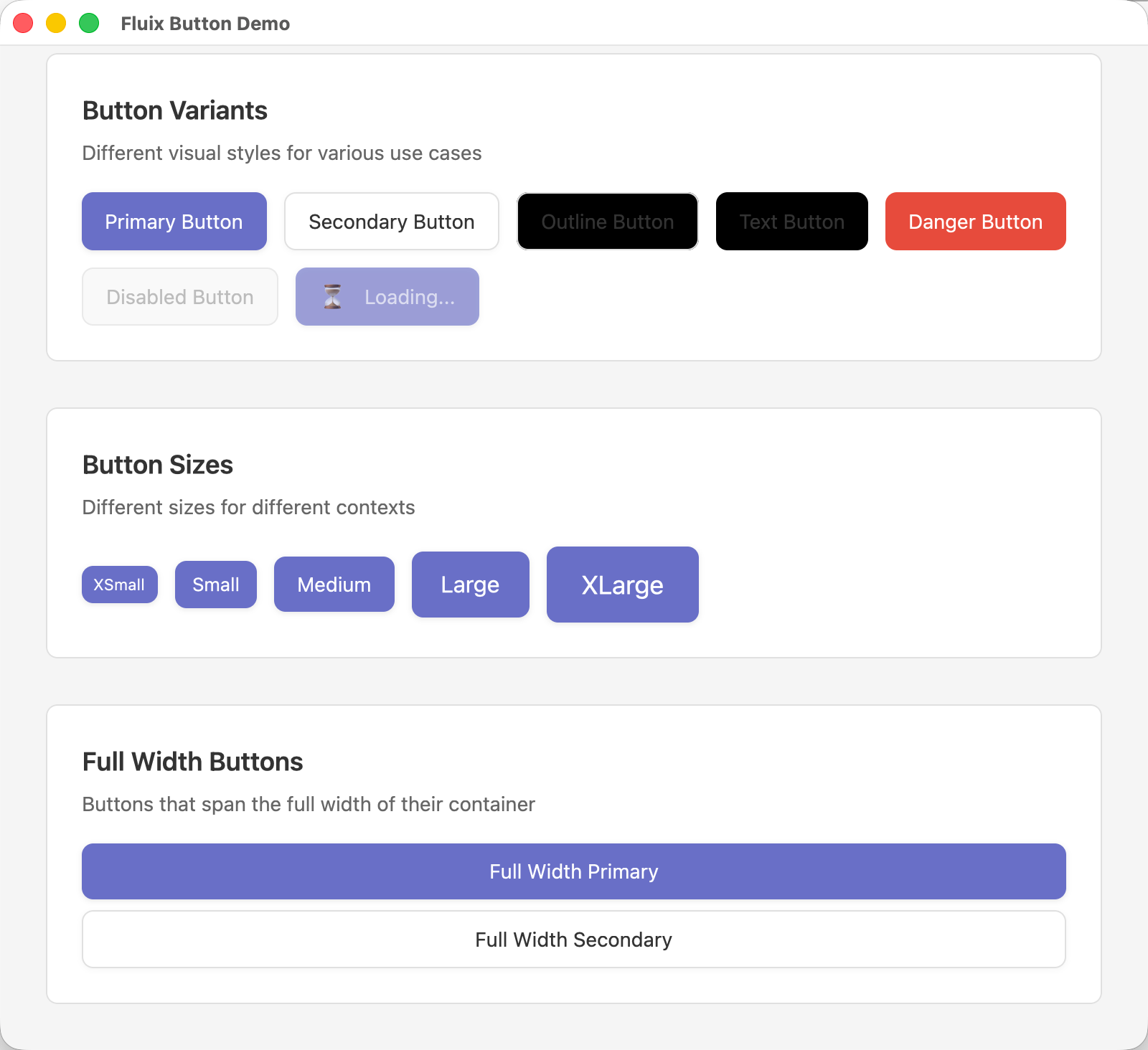
# Fluix 组件开发指南

欢迎为 Fluix 组件库贡献代码!本文档将指导你如何开发新的组件。

## 📋 开发流程

### 1. 选择要实现的组件

查看 [ROADMAP.md](ROADMAP.md) 选择一个待实现的组件。建议按照优先级顺序实现:
1. Phase 1: 核心基础组件
2. Phase 2: 表单组件
3. Phase 3-6: 其他组件

### 2. 创建组件文件

根据组件类型,在对应目录下创建文件:

```bash
# 基础组件
src/components/basic/button.rs

# 表单组件
src/components/form/dropdown.rs

# 布局组件
src/components/layout/modal.rs

# 高级组件
src/components/advanced/table.rs
```

### 3. 组件结构模板

每个组件应遵循以下结构:

```rust
use gpui::*;
use crate::theme::*;

// ============================================================================
// Events
// ============================================================================

/// Events emitted by the component
#[derive(Clone, Debug)]
pub enum ComponentEvent {
    /// Describe what this event means
    SomeEvent(String),
}

impl EventEmitter<ComponentEvent> for Component {}

// ============================================================================
// Component
// ============================================================================

/// Brief description of the component
///
/// # Example
///
/// ```rust,ignore
/// let component = Component::new(cx)
///     .prop("value")
///     .on_event(|event| {
///         // handle event
///     });
/// ```
pub struct Component {
    /// Field description
    field: String,
    /// Focus handle for keyboard input (if needed)
    focus_handle: FocusHandle,
}

impl Component {
    /// Create a new Component
    pub fn new(cx: &mut Context<Self>) -> Self {
        Self {
            field: String::new(),
            focus_handle: cx.focus_handle(),
        }
    }

    /// Builder method example
    pub fn prop(mut self, value: impl Into<String>) -> Self {
        self.field = value.into();
        self
    }

    // Private helper methods
    fn handle_something(&mut self, cx: &mut Context<Self>) {
        // Implementation
        cx.emit(ComponentEvent::SomeEvent(self.field.clone()));
        cx.notify();
    }
}

// ============================================================================
// Render
// ============================================================================

impl Render for Component {
    fn render(&mut self, window: &mut Window, cx: &mut Context<Self>) -> impl IntoElement {
        let field = self.field.clone();

        div()
            .child(field)
    }
}
```

## 🎨 设计原则

### 1. 使用主题系统

所有组件应使用 `theme::*` 中定义的颜色、尺寸和间距:

```rust
use crate::theme::*;

// 使用主题颜色
let theme = Theme::default();
div().bg(theme.colors.primary)

// 使用尺寸系统
Size::Medium.px()
Size::Medium.font_size()

// 使用间距
px(Spacing::MD)

// 使用圆角
px(BorderRadius::MD)
```

### 2. 事件处理

使用 `EventEmitter` trait 来发送事件:

```rust
#[derive(Clone, Debug)]
pub enum ComponentEvent {
    Click,
    Change(String),
}

impl EventEmitter<ComponentEvent> for Component {}

// 在组件内发送事件
cx.emit(ComponentEvent::Click);
cx.notify();
```

### 3. 焦点管理

如果组件需要接收键盘输入,使用 `FocusHandle`:

```rust
pub struct Component {
    focus_handle: FocusHandle,
}

impl Component {
    pub fn new(cx: &mut Context<Self>) -> Self {
        Self {
            focus_handle: cx.focus_handle(),
        }
    }
}

impl Render for Component {
    fn render(&mut self, window: &mut Window, cx: &mut Context<Self>) -> impl IntoElement {
        div()
            .track_focus(&self.focus_handle)
            .on_key_down(cx.listener(|this, event, window, cx| {
                // Handle key events
            }))
    }
}
```

### 4. 状态管理

组件状态应该是响应式的:

```rust
// 当状态改变时,调用 cx.notify() 触发重新渲染
fn update_state(&mut self, new_value: String, cx: &mut Context<Self>) {
    self.value = new_value;
    cx.notify();  // 触发重新渲染
}
```

## 📝 代码规范

### 1. 文件组织

每个组件文件应包含以下部分(按顺序):

```rust
// 1. 导入
use gpui::*;
use crate::theme::*;

// 2. Events(如果有)
pub enum ComponentEvent { }
impl EventEmitter<ComponentEvent> for Component {}

// 3. 组件结构
pub struct Component { }

// 4. 实现方法
impl Component {
    pub fn new() { }
    // public builder methods
    // private helper methods
}

// 5. Render 实现
impl Render for Component { }
```

### 2. 命名规范

- **组件名**: PascalCase (e.g., `Button`, `TextInput`)
- **事件名**: PascalCase with `Event` 后缀 (e.g., `ButtonEvent`)
- **方法名**: snake_case (e.g., `set_value`, `on_click`)
- **字段名**: snake_case (e.g., `is_disabled`, `max_length`)

### 3. 文档注释

所有公开的类型和方法都应该有文档注释:

```rust
/// A button component with multiple variants
///
/// # Example
///
/// ```rust,ignore
/// let button = Button::new("Click me")
///     .variant(ButtonVariant::Primary)
///     .on_click(|cx| {
///         println!("Clicked!");
///     });
/// ```
pub struct Button {
    /// The button label text
    label: String,
}
```

## 🧪 测试

### 1. 创建示例

每个组件都应该有一个示例文件:

```rust
// examples/button_demo.rs

use gpui::*;
use fluix::prelude::*;

fn main() {
    App::new().run(|window, cx| {
        let window_options = WindowOptions {
            window_bounds: Some(WindowBounds::Windowed(Bounds {
                origin: point(px(100.), px(100.)),
                size: size(px(800.), px(600.)),
            })),
            titlebar: Some(TitlebarOptions {
                title: Some("Button Demo".into()),
                appears_transparent: false,
                ..Default::default()
            }),
            ..Default::default()
        };

        window.open_window(window_options, |window, cx| {
            cx.new(|cx| ButtonDemo::new(cx))
        }).unwrap();
    });
}

struct ButtonDemo {
    // demo state
}

impl ButtonDemo {
    fn new(cx: &mut Context<Self>) -> Self {
        Self { }
    }
}

impl Render for ButtonDemo {
    fn render(&mut self, _: &mut Window, _: &mut Context<Self>) -> impl IntoElement {
        div()
            .flex()
            .flex_col()
            .p_8()
            .gap_4()
            // Add your component examples here
    }
}
```

### 2. 运行示例

```bash
cargo run --example button_demo
```

## 📚 参考实现

在实现新组件时,可以参考:

1. **现有组件**: `TextInput`, `TextArea`
2. **gpui-component**: https://github.com/longbridge/gpui-component
3. **GPUI 示例**: https://github.com/zed-industries/zed

## ✅ 提交检查清单

在提交代码前,请确保:

- [ ] 组件功能完整且正常工作
- [ ] 使用了主题系统(颜色、尺寸、间距)
- [ ] 代码有适当的注释和文档
- [ ] 创建了示例文件并测试通过
- [ ] 更新了对应模块的 `mod.rs`
- [ ] 更新了 `ROADMAP.md` 中的完成状态
- [ ] 代码编译无错误和警告

## 🔄 更新模块文件

实现新组件后,需要更新模块文件:

```rust
// src/components/basic/mod.rs

pub mod button;  // 新增这行

pub use button::*;  // 新增这行
```

## 🎯 下一步

1. 从 `Button` 组件开始(最基础最常用)
2. 实现 `Icon` 组件(集成 Lucide 图标)
3. 逐步完成 Phase 1 的所有基础组件

有任何问题,欢迎在 Issues 中讨论!