# egui-elegance
[](https://github.com/stephenberry/egui-elegance/actions/workflows/ci.yml)
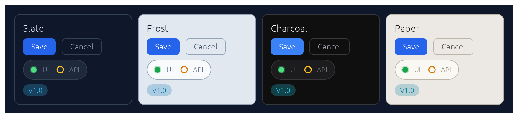
Opinionated widgets for [`egui`]: six-accent rounded buttons, text inputs with a sky focus ring and submit-flash feedback, themed selects and tabs, segmented LED toggles, status pills, and badges — all driven by a single installable `Theme`. Four palettes ship built-in — two dark (`Theme::slate`, `Theme::charcoal`) and two light (`Theme::frost`, `Theme::paper`) — paired so you can toggle without any layout shift.
The design aims to make native apps feel as polished as modern web UIs.
## Install
```sh
cargo add egui-elegance
```
or, in `Cargo.toml`:
```toml
[dependencies]
egui = "0.34"
egui-elegance = "0.3"
```
The crate is published as `egui-elegance` but the library name is `elegance`, so imports look like `use elegance::Button;`.
MSRV: Rust 1.92.
## Quick start
Install the theme once per `Context`, then drop widgets into any `Ui` the way you would an egui built-in:
```rust
use elegance::{Accent, Button, Card, Checkbox, TextInput, Theme};
struct App {
email: String,
remember: bool,
}
impl eframe::App for App {
fn ui(&mut self, ui: &mut egui::Ui, _: &mut eframe::Frame) {
Theme::slate().install(ui.ctx()); // cheap to call every frame — skips work when unchanged
egui::CentralPanel::default().show_inside(ui, |ui| {
Card::new().heading("Account").show(ui, |ui| {
ui.add(
TextInput::new(&mut self.email)
.label("Email")
.hint("you@example.com"),
);
ui.add(Checkbox::new(&mut self.remember, "Keep me signed in"));
if ui.add(Button::new("Save").accent(Accent::Green)).clicked() {
// …
}
});
});
}
}
```
## Widgets
Every widget follows one of three usage patterns:
- **Leaf widgets** — including stateful ones that take a `&mut T` in their constructor like `TextInput::new(&mut email)` or `Select::new(id, &mut unit)` — implement `egui::Widget` and render with `ui.add(…)`.
- **Container widgets** (`Card`, `CollapsingSection`) take a body closure with `.show(ui, |ui| …)` and return an `InnerResponse<R>`.
- **Overlay widgets** create their own top-level `Area`s and render at `Context` scope: `Modal::new("id", &mut open).show(ctx, |ui| …)` for a dialog, `Drawer::new("id", &mut open).show(ctx, |ui| …)` for a side-anchored slide-in panel, `Toast::new("…").show(ctx)` to enqueue a notification paired with `Toasts::new().render(ctx)` once per frame to draw the stack, and `LogBar` — owned state on your app struct — rendered once per frame with `log.show(ui)`.
Reference for each widget follows. Tiles are rendered headlessly by `cargo render-docs` — see [Regenerating widget screenshots](#regenerating-widget-screenshots).
### Button
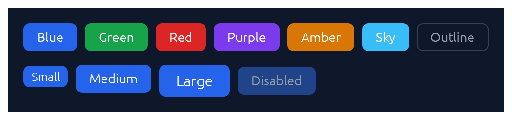
Chunky rounded button in six accent colours plus an outline variant, in three sizes.
```rust
use elegance::{Accent, Button, ButtonSize};
if ui.add(Button::new("Save").accent(Accent::Green)).clicked() {
// …
}
ui.add(Button::new("Cancel").outline().size(ButtonSize::Small));
ui.add(Button::new("Disabled").accent(Accent::Blue).enabled(false));
```
### TextInput
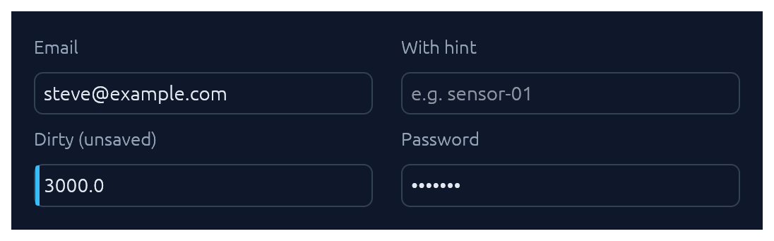
Single-line text input. See also [Submit-flash feedback](#submit-flash-feedback) for success / error tinting on submit.
```rust
use elegance::TextInput;
ui.add(
TextInput::new(&mut email)
.label("Email")
.hint("you@example.com"),
);
ui.add(TextInput::new(&mut secret).label("API key").password(true));
ui.add(TextInput::new(&mut name).label("Name").dirty(true));
```
### TextArea
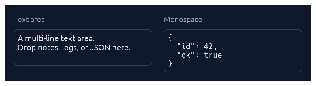
Multi-line counterpart to `TextInput` with a configurable visible row count. Optional monospace for code, JSON, or keys.
```rust
use elegance::TextArea;
ui.add(
TextArea::new(&mut notes)
.label("Notes")
.hint("Jot anything down…")
.rows(6),
);
ui.add(TextArea::new(&mut json).monospace(true).rows(8));
```
### TagInput
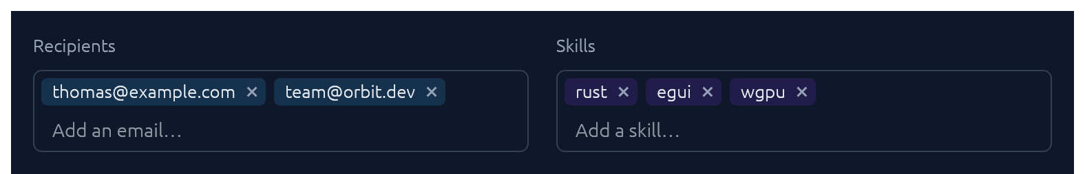
A pill-list text input bound to a `Vec<String>`. Enter or comma commits the buffer as a tag; with `commit_on_space(true)` whitespace commits too. Backspace on an empty buffer arms the last pill (red highlight) and a second Backspace removes it; clicking a pill's `×` removes it directly. Pasted text containing commas or whitespace splits into multiple tags. Optional `validator` closure rejects malformed values with an inline error.
```rust
use elegance::TagInput;
let mut recipients: Vec<String> = Vec::new();
TagInput::new("recipients", &mut recipients)
.label("Recipients")
.placeholder("Add an email…")
.commit_on_space(true)
.validator(|v| {
if v.contains('@') && v.contains('.') {
Ok(())
} else {
Err(format!("\"{v}\" isn't a valid email."))
}
})
.show(ui);
```
### Select
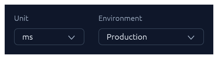
Themed combo-box generic over any `PartialEq + Clone` value type.
```rust
use elegance::Select;
#[derive(Clone, PartialEq)]
enum Unit { Us, Ms, S }
ui.add(
Select::new("unit", &mut unit)
.options([(Unit::Us, "μs"), (Unit::Ms, "ms"), (Unit::S, "s")]),
);
// Shorthand for string-valued selects:
ui.add(Select::strings("env", &mut env, ["Production", "Staging", "Development"]));
```
### Checkbox · Switch · SegmentedButton
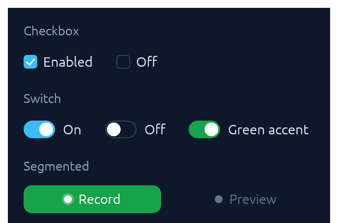
Three flavours of boolean input. Pick `Checkbox` for list-style selection, `Switch` for feature/settings flags, `SegmentedButton` for mode toggles where the on-state should read as a distinct accent pill.
```rust
use elegance::{Accent, Checkbox, SegmentedButton, Switch};
ui.add(Checkbox::new(&mut remember, "Keep me signed in"));
ui.add(Switch::new(&mut notify, "Notify on Slack").accent(Accent::Green));
ui.add(
SegmentedButton::new(&mut continuous, "Continuous")
.accent(Accent::Green)
.min_width(120.0),
);
```
`SegmentedButton` accepts the same `ButtonSize` scale as `Button`, so a mixed row (e.g. `Button::new("Collect")` next to `SegmentedButton::new(&mut continuous, "Continuous")`) stays aligned at any size. Pass matching `.size(ButtonSize::Large)` on both for a chunkier action row without touching the theme.
### TabBar

Horizontal tab strip. The active tab gets a sky underline.
```rust
use elegance::TabBar;
ui.add(TabBar::new(&mut tab, ["Overview", "Settings", "Activity", "Logs"]));
```
### SegmentedControl
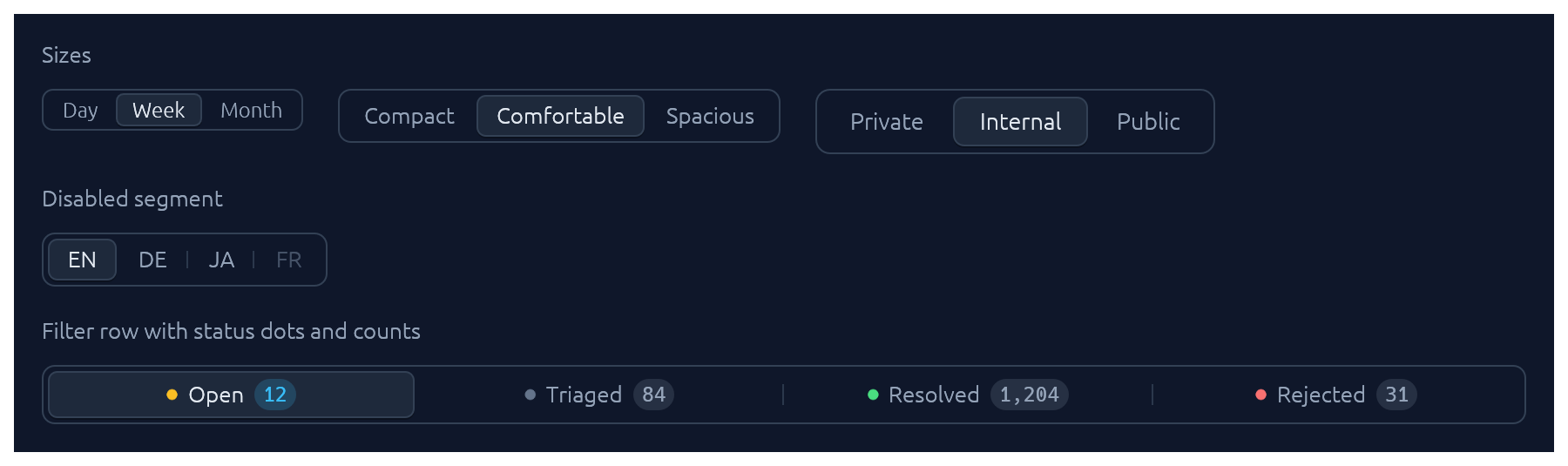
A row of mutually-exclusive segments sharing one rounded track. The selected segment lifts to the card colour with a soft drop shadow; unhovered, unactive neighbours are separated by a hairline. Use it for compact pickers where every option fits inline (timeframe, density, view mode).
```rust
use elegance::{SegmentedControl, SegmentedSize};
let mut selected = 1usize;
ui.add(SegmentedControl::new(&mut selected, ["Day", "Week", "Month"]));
ui.add(
SegmentedControl::new(&mut selected, ["Compact", "Comfortable", "Spacious"])
.size(SegmentedSize::Small),
);
```
Rich segments with a status dot, a count badge, and `.fill()` to stretch across the row:
```rust
use elegance::{Segment, SegmentDot, SegmentedControl};
ui.add(
SegmentedControl::from_segments(
&mut bucket,
[
Segment::text("Open").dot(SegmentDot::Amber).count("12"),
Segment::text("Triaged").dot(SegmentDot::Neutral).count("84"),
Segment::text("Resolved").dot(SegmentDot::Green).count("1,204"),
Segment::text("Rejected").dot(SegmentDot::Red).count("31"),
],
)
.fill(),
);
```
`Segment::icon` and `Segment::icon_text` cover icon-only and icon+label variants; `.enabled(false)` greys out a single segment without removing it from the row.
### BrowserTabs

Owned-state strip of browser-style closable tabs. The active tab fills with the card colour so it merges with the panel below; each tab can flag a sky dirty-dot for unsaved changes, and the trailing `+` emits a `NewRequested` event for the caller to handle.
```rust
use elegance::{BrowserTab, BrowserTabs, BrowserTabsEvent};
struct App { tabs: BrowserTabs, untitled: u32 }
impl App {
fn ui(&mut self, ui: &mut egui::Ui) {
self.tabs.show(ui);
for ev in self.tabs.take_events() {
if let BrowserTabsEvent::NewRequested = ev {
self.untitled += 1;
let n = self.untitled;
self.tabs.add_tab(BrowserTab::new(format!("u{n}"), format!("Untitled-{n}")));
}
}
}
}
```
### StatusPill · Indicator · Badge
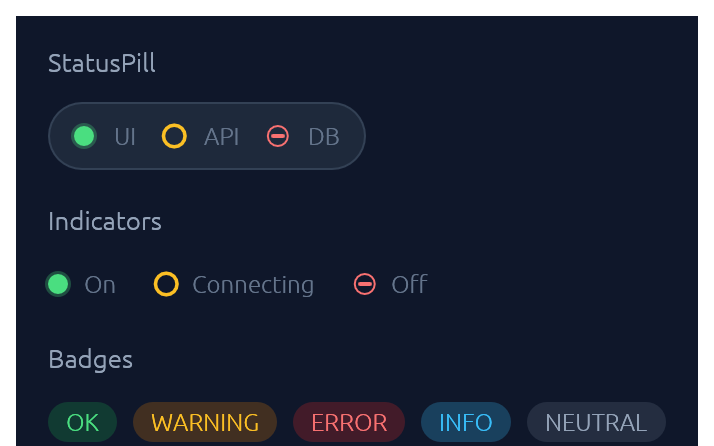
`IndicatorState` has three visual modes: `On` (solid green dot), `Off` (red bar), `Connecting` (amber ring). `Badge` carries a `BadgeTone`: `Ok`, `Warning`, `Danger`, `Info`, or `Neutral`.
```rust
use elegance::{Badge, BadgeTone, Indicator, IndicatorState, StatusPill};
ui.add(
StatusPill::new()
.item("UI", IndicatorState::On)
.item("API", IndicatorState::Connecting)
.item("DB", IndicatorState::Off),
);
ui.add(Indicator::new(IndicatorState::On));
ui.add(Badge::new("Dev build", BadgeTone::Info));
```
### Slider
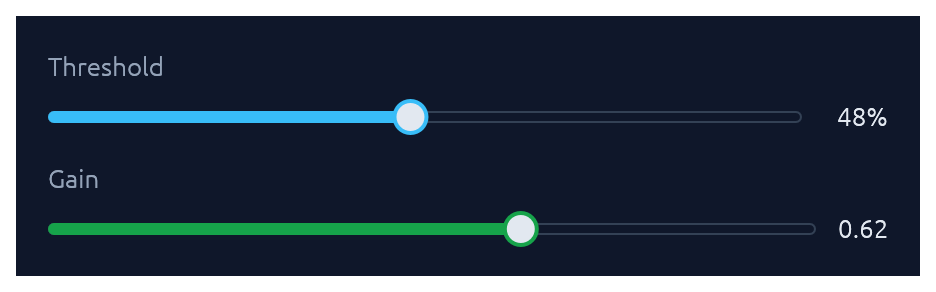
Pill-track slider generic over `egui::emath::Numeric` — works with any integer or float type. Value readout on the right; `.value_fmt(|v| …)` for custom formatting.
```rust
use elegance::{Accent, Slider};
ui.add(
Slider::new(&mut cpu, 0.0..=100.0)
.label("CPU limit")
.suffix("%")
.accent(Accent::Green),
);
ui.add(Slider::new(&mut port, 0u16..=65535u16).label("Port"));
```
### RangeSlider
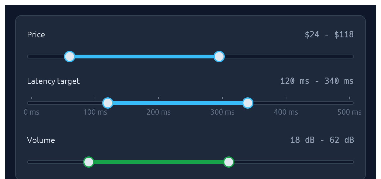
Two-handle range slider for picking a `[low, high]` interval. Same pill track and accent fill as `Slider`; the fill spans only the selected portion. Optional evenly-spaced ticks with labels, and the keyboard works on each focused thumb (arrows nudge by `step`, `Shift`+arrow for a 10x nudge, `Home`/`End` jump to the bounds).
```rust
use elegance::{Accent, RangeSlider};
ui.add(
RangeSlider::new(&mut price_lo, &mut price_hi, 0u32..=200u32)
.label("Price")
.value_fmt(|v| format!("${v:.0}")),
);
ui.add(
RangeSlider::new(&mut latency_lo, &mut latency_hi, 0u32..=500u32)
.label("Latency target")
.suffix(" ms")
.step(10.0)
.ticks(6)
.show_tick_labels(true),
);
ui.add(
RangeSlider::new(&mut volume_lo, &mut volume_hi, 0u32..=100u32)
.label("Volume")
.accent(Accent::Green)
.suffix(" dB"),
);
```
### Knob
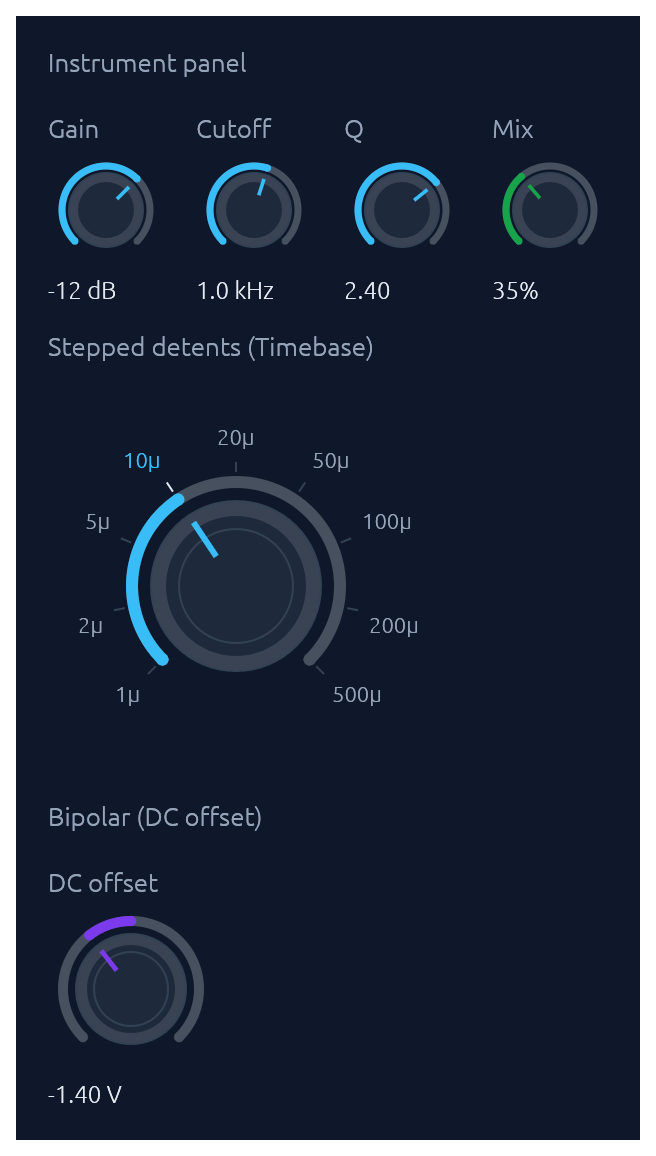
Rotary knob bound to any `egui::emath::Numeric`. A 270-degree arc with an accent fill grows clockwise from the lower left; the active position drives a tick indicator inside the body. Three sizes (`Small` / `Medium` / `Large`), an `Accent` colour, and three behavioural variants share one widget: continuous (with optional `step` snap), `bipolar` (fill from the centre of the range outward toward the current value, suited to signed offsets), and stepped with `(value, label)` `detents` that render labeled ticks and snap drag/scroll/keyboard moves to the nearest detent. Drag combines horizontal and vertical motion: right and up both increase, left and down both decrease, so a diagonal flick reads as a single gesture (Shift slows for fine control). The scroll wheel and arrow keys nudge, Page Up / Page Down step coarser, Home / End jump to the bounds, and Alt+click or double-click resets to a configured `default`. Optional `log_scale` for wide ranges (audio frequency, gain). `show_value(true)` renders the formatted value below the knob.
```rust
use elegance::{Accent, Knob, KnobSize};
// Compact instrument-panel knob with a log scale and inline value.
ui.add(
Knob::new(&mut cutoff, 20.0..=20000.0)
.label("Cutoff")
.size(KnobSize::Small)
.log_scale()
.default(1000.0_f32)
.show_value(true)
.value_fmt(|v| if v >= 1000.0 { format!("{:.1} kHz", v / 1000.0) } else { format!("{v:.0} Hz") }),
);
// Bipolar knob for a signed offset.
ui.add(
Knob::new(&mut dc_offset, -5.0..=5.0)
.label("DC offset")
.bipolar()
.accent(Accent::Purple)
.default(0.0_f32),
);
// Stepped knob with labeled detents.
ui.add(
Knob::new(&mut timebase, 0u32..=8u32)
.size(KnobSize::Large)
.step(1.0)
.detents([
(0u32, "1µ"), (1u32, "2µ"), (2u32, "5µ"),
(3u32, "10µ"), (4u32, "20µ"), (5u32, "50µ"),
(6u32, "100µ"), (7u32, "200µ"), (8u32, "500µ"),
]),
);
```
### ColorPicker
Bound to a `Color32`. Renders as a compact swatch-and-hex trigger; clicking opens a popover containing any combination of a curated palette grid, an auto-tracked recents row, a continuous saturation/value plane plus hue slider, an alpha slider, and a hex input. Builder toggles let you mix-and-match: a palette-only picker for status colors, a continuous picker for free-form brand colors, or both stacked. Recent picks are persisted in egui context memory keyed by `id_salt`. Hex parsing accepts `#RGB`, `#RRGGBB`, `#RRGGBBAA` (with or without `#`).
```rust
use elegance::ColorPicker;
ui.add(ColorPicker::new("brand", &mut brand).label("Brand"));
ui.add(
ColorPicker::new("status", &mut status)
.label("Status color")
.palette(ColorPicker::default_palette())
.continuous(false)
.alpha(false),
);
```
### FileDropZone
A click-and-drop file target: dashed border, cloud icon, and prompt. The widget renders the visual treatment and drag-over state; the caller handles the dropped files reported on `FileDropResponse.dropped_files` and opens a native picker on click (use a crate like `rfd`).
```rust
use elegance::FileDropZone;
let drop = FileDropZone::new()
.hint("up to 10 MB · PNG, JPG, CSV, PDF")
.show(ui);
if drop.response.clicked() {
// open file picker
}
for file in &drop.dropped_files {
// file.path on native, file.bytes on web
let _ = file;
}
```
### Spinner · ProgressBar
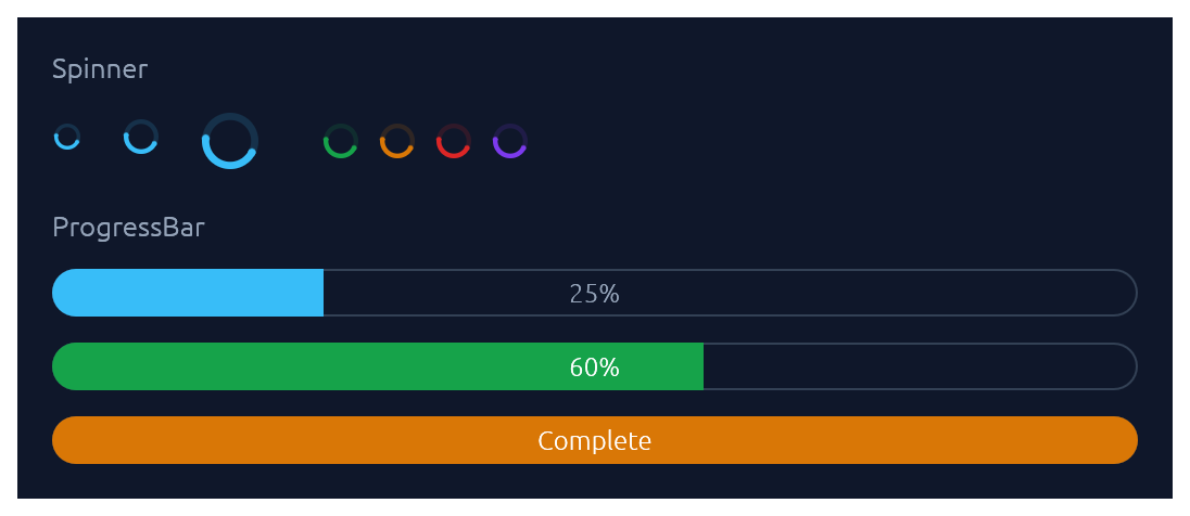
`Spinner` is the indeterminate loader — an animated sweeping arc. `ProgressBar` is determinate: a pill-shaped bar with an optional inline label.
```rust
use elegance::{Accent, ProgressBar, Spinner};
ui.add(Spinner::new().size(20.0).accent(Accent::Green));
ui.add(ProgressBar::new(0.6));
ui.add(ProgressBar::new(1.0).accent(Accent::Amber).text("Complete"));
```
### ProgressRing
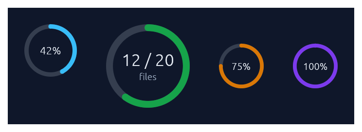
A determinate circular progress indicator — a ring-shaped cousin of `ProgressBar`. A faint track plus an accent-coloured arc that sweeps clockwise from 12 o'clock as the fraction grows. Centre text defaults to the rounded percent; override with `.text(...)` and add a small muted sub-caption with `.caption(...)`. Doubles as a circular gauge: pass `.zones(GaugeZones::new(warn, crit))` to colour the arc by which threshold band the fraction falls in (`success`/`warning`/`danger`), `.unit("...")` to render a baseline-aligned suffix next to the value, and `.caption_below("...")` to anchor a descriptive caption beneath the ring instead of inside. For indeterminate "still working" loaders, use `Spinner` instead.
```rust
use elegance::{Accent, GaugeZones, ProgressRing};
ui.add(ProgressRing::new(0.42));
ui.add(
ProgressRing::new(0.6)
.size(88.0)
.accent(Accent::Green)
.text("12 / 20")
.caption("files"),
);
// Donut-style gauge: zones colour the arc, the unit suffix is
// baseline-aligned next to the value, and the caption sits below.
ui.add(
ProgressRing::new(0.68)
.size(160.0)
.zones(GaugeZones::new(0.6, 0.85))
.text("68")
.unit("GB")
.caption_below("of 100"),
);
// Hide the centre text entirely.
ui.add(ProgressRing::new(0.3).size(32.0).text(""));
```
### RadialGauge · LinearGauge
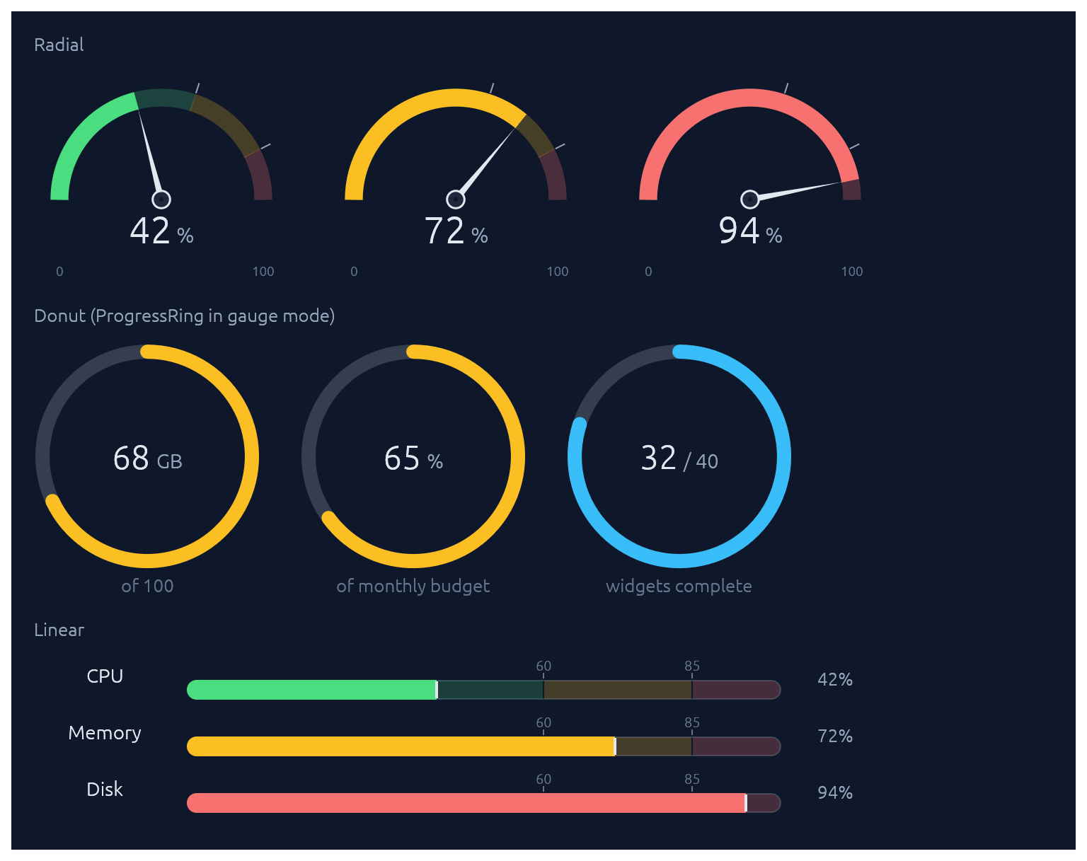
Two widgets for displaying a value (as a `0..1` fraction) against optional threshold zones. `RadialGauge` is a half-circle dashboard speedometer with a needle and a value readout in the bowl; `LinearGauge` is a horizontal meter with optional faded threshold bands behind the fill plus tick-and-label markers above. For the donut form (a circular gauge with no needle), use `ProgressRing` with `.zones(...)`. Pass `GaugeZones::new(warn, crit)` to drive the fill colour automatically (success/warning/danger based on which band the value falls into). Without zones, the fill defaults to the theme's sky accent.
```rust
use elegance::{GaugeZones, LinearGauge, RadialGauge};
let zones = GaugeZones::new(0.6, 0.85);
// Half-circle speedometer.
ui.add(RadialGauge::new(0.42).zones(zones));
// Linear meter with auto-labelled zone thresholds.
ui.add(LinearGauge::new(0.72).zones(zones).show_zone_labels());
// Custom thresholds for non-percentage scales.
ui.add(
LinearGauge::new(186.0 / 850.0)
.zones(GaugeZones::new(0.4, 0.75))
.threshold_label(0.4, "340")
.threshold_label(0.75, "638"),
);
```
### Steps
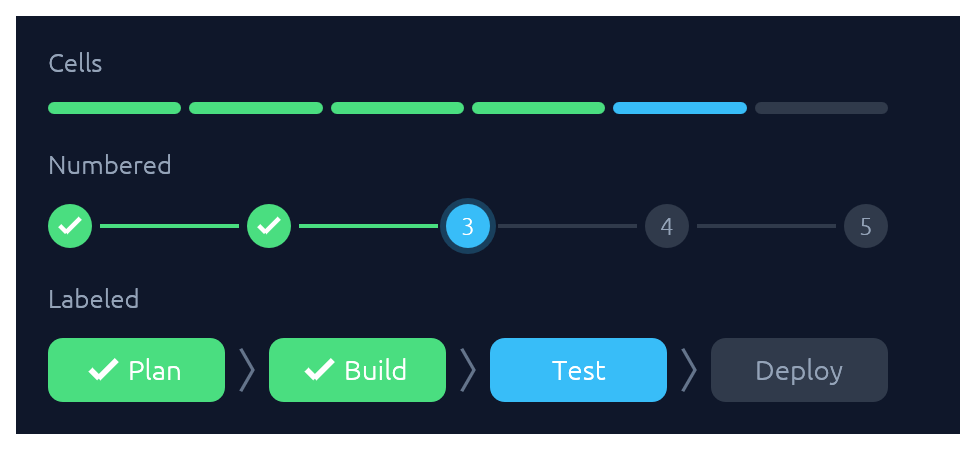
A stepped progress indicator for discrete, countable stages. Three visual styles share the same state model (`total`, `current`, `errored`): `StepsStyle::Cells` paints a segmented bar of uniform rounded cells, suited to compact "N of M" progress. `StepsStyle::Numbered` paints numbered circles connected by thin lines, with a checkmark on completed dots and a glow on the active one. `StepsStyle::Labeled` (via `Steps::labeled`) paints taller pills containing text labels — horizontal by default (a progress bar with readable stage names), or call `.vertical()` for a wizard-sidebar layout. Done cells use the theme's success green, the active one uses sky, and errors use danger red.
```rust
use elegance::{Steps, StepsStyle};
// 4 of 6 release steps complete, step 5 running.
ui.add(Steps::new(6).current(4));
// Migration failed on step 3 of 5.
ui.add(Steps::new(5).current(2).errored(true));
// Onboarding wizard, step 3 of 5.
ui.add(Steps::new(5).current(2).style(StepsStyle::Numbered));
// Labeled horizontal strip — a progress bar with stage names.
ui.add(Steps::labeled(["Plan", "Build", "Test", "Deploy"]).current(2));
// Same data, rendered as a vertical wizard sidebar.
ui.add(
Steps::labeled(["Plan", "Design", "Build", "Test", "Deploy"])
.current(2)
.vertical(),
);
```
### StatCard
A compact dashboard tile for a single numeric KPI. The headline value sits above a comparison subtitle (`"vs last 7 days"`) and an optional 44 pt filled-area sparkline of recent values, tinted by the card's accent. A small delta chip shows direction of change with semantic colouring: by default, up is good (green); call `.invert_delta(true)` for metrics where down is good (latency, error rate). Pass `.loading(true)` while data is in flight to render a shimmer placeholder.
```rust
use elegance::{Accent, StatCard};
let series = [12.0, 14.0, 13.0, 15.0, 17.0, 16.0, 18.0, 22.0_f32];
ui.add(
StatCard::new("Active deploys")
.accent(Accent::Blue)
.value("24")
.delta(0.12)
.trend("vs last 7 days")
.sparkline(&series),
);
// Down is good for latency: invert the chip's semantic colouring.
ui.add(
StatCard::new("P95 latency")
.accent(Accent::Amber)
.value("184")
.unit("ms")
.delta(0.24)
.invert_delta(true)
.trend("regressed vs last hour"),
);
// Loading skeleton while fetching.
ui.add(StatCard::new("Revenue today").accent(Accent::Green).loading(true));
```
### Card · CollapsingSection
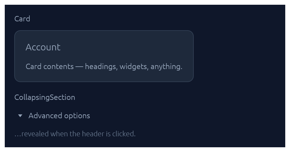
Both take a body closure and return an `InnerResponse<R>`.
```rust
use elegance::{Card, CollapsingSection};
Card::new().heading("Account").show(ui, |ui| {
ui.label("…card contents…");
});
CollapsingSection::new("advanced", "Show advanced options").show(ui, |ui| {
ui.label("…hidden until expanded…");
});
```
### Accordion
A grouped stack of collapsible items inside one bordered panel. Each row gets a chevron, a title, and optional subtitle, icon halo, and right-aligned meta slot (badges, counts, status dots). Use `.exclusive(true)` to allow only one item open at a time, or `.flush(true)` to drop the outer border for inline use inside a form.
```rust
use elegance::{Accordion, Accent, Badge, BadgeTone};
Accordion::new("settings").exclusive(true).show(ui, |acc| {
acc.item("Notifications")
.icon("\u{1F514}")
.accent(Accent::Sky)
.subtitle("Email, Slack, and in-app alerts")
.meta(|ui| { ui.add(Badge::new("3 channels", BadgeTone::Ok)); })
.default_open(true)
.show(|ui| { ui.label("…channel details…"); });
acc.item("Security")
.icon("\u{1F512}")
.accent(Accent::Green)
.subtitle("2FA, sessions, and trusted devices")
.show(|ui| { ui.label("…"); });
});
```
### Menu · MenuItem
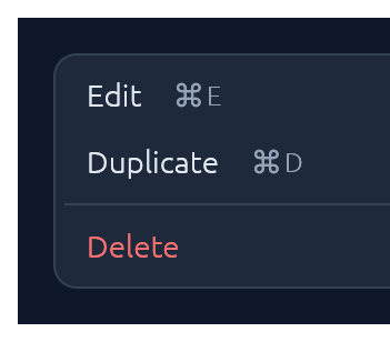
Click-to-open popup attached to any trigger `Response`. `Esc`, outside-click, or item-click all dismiss. For a desktop-style top-of-window strip with brand, multiple menus, and status, see [`MenuBar`](#menubar).
```rust
use elegance::{Button, ButtonSize, Menu, MenuItem};
let trigger = ui.add(Button::new("⋯").outline().size(ButtonSize::Small));
Menu::new("row_actions").show_below(&trigger, |ui| {
if ui.add(MenuItem::new("Edit").shortcut("⌘ E")).clicked() { /* … */ }
if ui.add(MenuItem::new("Duplicate").shortcut("⌘ D")).clicked() { /* … */ }
ui.separator();
if ui.add(MenuItem::new("Delete").danger()).clicked() { /* … */ }
});
```
`MenuItem` also supports `.icon("📄")` (a leading glyph in the gutter), `.checked(bool)` (a checkmark for togglable items), and `.radio(bool)` (a filled dot for mutually-exclusive choices). Items in the same menu align cleanly when they all opt in to the same gutter style.
For nested menus, drop a `SubMenuItem` inside any menu body — it renders as a `MenuItem` with a right-pointing chevron and opens its body as a flyout submenu when hovered:
```rust
use elegance::{MenuBar, MenuItem, SubMenuItem};
MenuBar::new("app").show(ui, |bar| {
bar.menu("File", |ui| {
ui.add(MenuItem::new("New"));
SubMenuItem::new("Open Recent").icon("🕒").show(ui, |ui| {
ui.add(MenuItem::new("theme.rs").shortcut("5m ago"));
ui.add(MenuItem::new("README.md").shortcut("2d ago"));
ui.separator();
ui.add(MenuItem::new("Clear list"));
});
ui.add(MenuItem::new("Save"));
});
});
```
### MenuBar
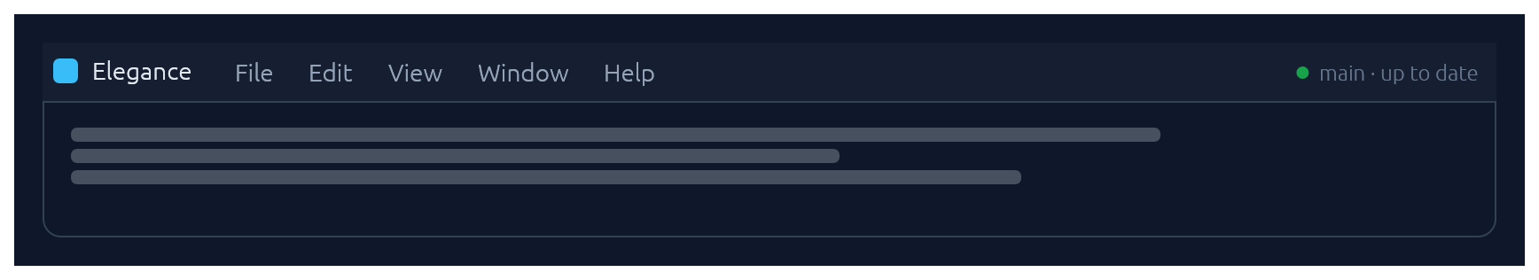
Desktop-style top-of-window menu strip: an optional brand on the left, a row of click-to-open menus (File, Edit, View, …), and an optional status slot on the right. Once any menu is open, hovering a sibling trigger switches to it — the same "menu mode" feel native menubars have. Each dropdown is a themed panel; populate it with `MenuItem`s, separators, and section headers. `MenuItem` exposes `.checked(bool)` (checkbox toggles), `.radio(bool)` (mutually-exclusive choices), `.icon(...)` (leading glyph), `.shortcut("⌘N")`, `.danger()`, and `.enabled(false)`.
```rust
use elegance::{MenuBar, MenuItem, Theme};
MenuBar::new("app_menubar")
.brand("Elegance")
.status_with_dot("main · up to date", Theme::current(ctx).palette.green)
.show(ui, |bar| {
bar.menu("File", |ui| {
if ui.add(MenuItem::new("New").icon("📄").shortcut("⌘N")).clicked() { /* … */ }
ui.add(MenuItem::new("Open…").icon("📂").shortcut("⌘O"));
ui.separator();
ui.add(MenuItem::new("Save").shortcut("⌘S"));
});
// Settings-style menus stay open while the user toggles items, so
// the state change is visible. Action menus default to closing on
// click (use `bar.menu(...)` for those).
bar.menu_keep_open("View", |ui| {
ui.add(MenuItem::new("Show sidebar").checked(show_sidebar).shortcut("⌘\\"));
ui.add(MenuItem::new("Show minimap").checked(show_minimap));
ui.separator();
ui.add(MenuItem::new("Compact").radio(density == 0));
ui.add(MenuItem::new("Comfortable").radio(density == 1));
ui.add(MenuItem::new("Spacious").radio(density == 2));
});
});
```
For a single click-to-open menu attached to an arbitrary trigger button (e.g. row actions, a toolbar overflow), reach for [`Menu`](#menu--menuitem) directly instead.
### Modal
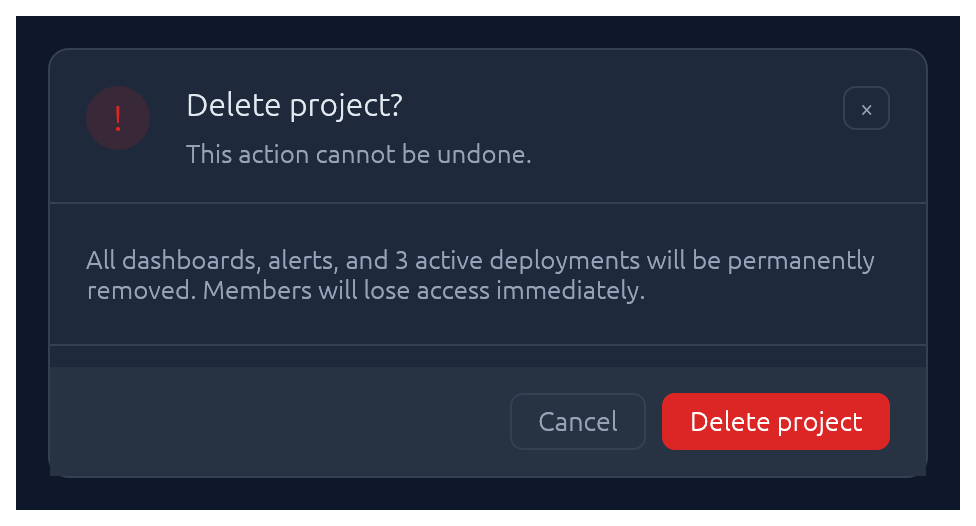
Centered dialog over a dimmed backdrop. `Esc`, backdrop-click, or the built-in × button all flip the bound `open` flag back to `false`.
```rust
use elegance::Modal;
Modal::new("stats", &mut open)
.heading("Run Summary")
.show(ctx, |ui| {
ui.label("…");
});
```
### Drawer
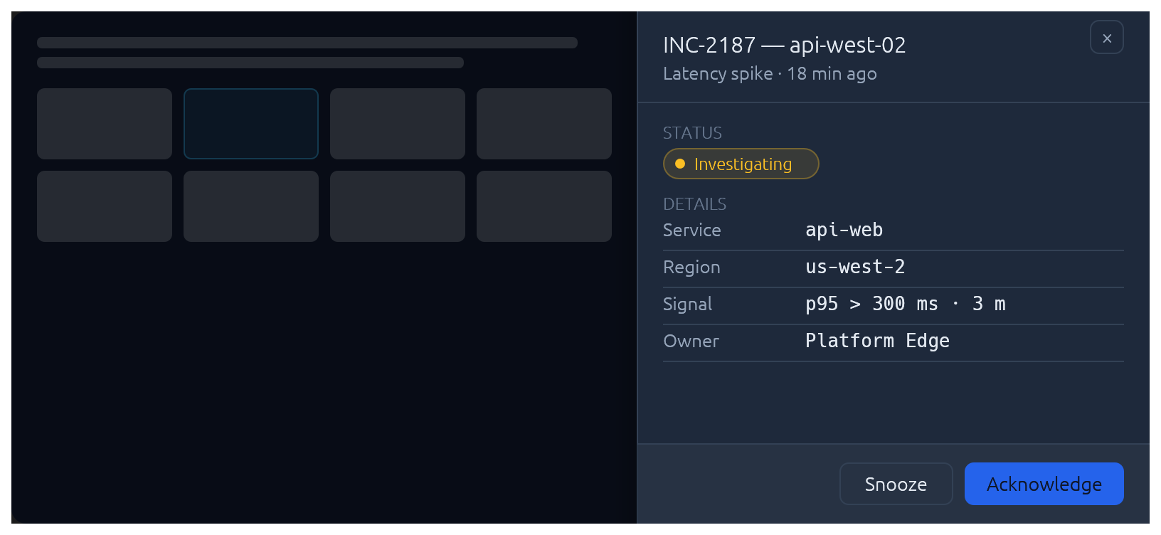
Side-anchored slide-in overlay panel: full-height, dimmed backdrop, slides over the page rather than carving space out of it. Reach for `Drawer` when the content is too tall for a `Modal` but doesn't deserve its own route — record inspectors, edit forms, filter sidebars. `Esc`, backdrop-click, and the built-in × button all flip the bound `open` flag back to `false`. The slide animation, focus capture, and focus restore on close are built in.
```rust
use elegance::{Drawer, DrawerSide};
Drawer::new("inspector", &mut open)
.side(DrawerSide::Right)
.width(420.0)
.title("INC-2187 — api-west-02")
.subtitle("Latency spike · 18 minutes ago")
.show(ctx, |ui| {
// Slice the body into a scrollable region + pinned footer:
let footer_h = 56.0;
let body_h = (ui.available_height() - footer_h).max(0.0);
ui.allocate_ui_with_layout(
egui::vec2(ui.available_width(), body_h),
egui::Layout::top_down(egui::Align::Min),
|ui| {
egui::ScrollArea::vertical().show(ui, |ui| {
ui.label("…details, status, KV rows…");
});
},
);
ui.separator();
ui.horizontal(|ui| {
// …footer buttons…
});
});
```
For a *persistent* (non-overlay) side panel that resizes the surrounding content, use `egui::SidePanel` directly with the elegance palette — `Drawer` is the modal slide-in case.
### Popover
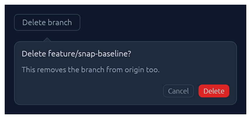
Click-anchored floating panel that points at a trigger. Lighter than `Modal`: no backdrop, no focus trap. Pick a side with `PopoverSide` (top, bottom, left, right), optionally set a `title`, and fill the body closure with whatever you like. `Esc`, outside-click, or a second trigger-click dismiss.
```rust
use elegance::{Accent, Button, ButtonSize, Popover, PopoverSide};
let trigger = ui.add(Button::new("Delete branch").outline());
Popover::new("delete_branch")
.side(PopoverSide::Bottom)
.title("Delete feature/snap-baseline?")
.show(&trigger, |ui| {
ui.label("This removes the branch from origin too.");
ui.horizontal(|ui| {
let _ = ui.add(Button::new("Cancel").outline().size(ButtonSize::Small));
let _ = ui.add(Button::new("Delete").accent(Accent::Red).size(ButtonSize::Small));
});
});
```
### Tooltip
Hover-triggered, themed callout that explains a trigger widget. One-line label by default; opt into a bold heading and a keyboard-shortcut row (label + small key chips) for richer hints. Visibility is driven by egui's tooltip system, so the standard delay, grace-window chaining between siblings, and dismiss-on-click behaviour come for free. For a click-anchored panel the user can interact with, reach for [`Popover`](#popover) instead.
```rust
use elegance::{Button, Tooltip};
let trigger = ui.add(Button::new("Save"));
Tooltip::new("Write the working tree to disk. Remote sync runs in the background.")
.heading("Save changes")
.shortcut("\u{2318} S")
.show(&trigger);
```
### Callout
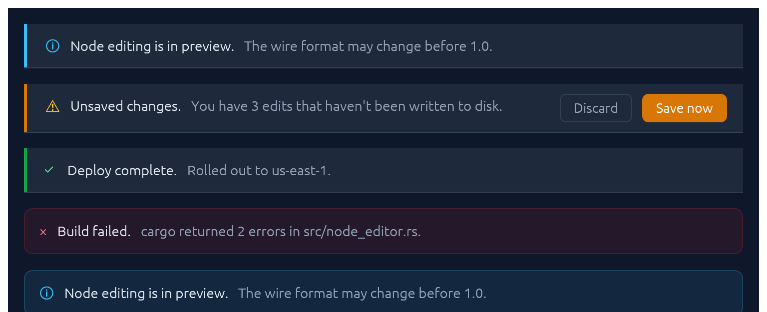
Full-width inline banner for persistent context: experimental features, unsaved changes, failed builds, maintenance windows. `CalloutTone` picks the accent (`Info`, `Success`, `Warning`, `Danger`, `Neutral`). The closure slot is a right-to-left action area — add primary button first. Opt into a trailing × with `.dismissable(&mut open)`.
```rust
use elegance::{Accent, Button, Callout, CalloutTone};
Callout::new(CalloutTone::Warning)
.title("Unsaved changes.")
.body("You have 3 edits that haven't been written to disk.")
.show(ui, |ui| {
let _ = ui.add(Button::new("Save now").accent(Accent::Amber));
let _ = ui.add(Button::new("Discard").outline());
});
```
Unlike [`Toast`](#toast--toasts) it does not auto-dismiss, and unlike [submit-flash feedback](#submit-flash-feedback) it's a whole surface rather than a pulse on another widget.
### Toast · Toasts
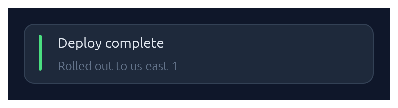
Non-blocking notifications. `Toast::show(ctx)` enqueues from any callback that has `&Context`; `Toasts::new().render(ctx)` draws the stack once per frame. Auto-dismissed with fade-out after ~4 s (override with `.duration(…)` or `.persistent()`).
```rust
use elegance::{BadgeTone, Toast, Toasts};
// From any callback with `&Context`:
Toast::new("Deploy complete")
.tone(BadgeTone::Ok)
.description("Rolled out to us-east-1")
.show(&ctx);
// In your top-level `ui`:
Toasts::new().render(ctx);
```
### LogBar
Expandable bottom log bar — a monospace console with timestamped rows colour-coded by kind: `Sys`, `Out` (→), `In` (←), `Err`. Owned state — construct once on your app struct, push entries from anywhere with `&mut self`, and render once per frame.
```rust
use elegance::LogBar;
// In App::default, construct once:
let mut log = LogBar::new();
// From a button handler, async callback, completion, etc.:
log.out("reload_config");
log.recv("{\"temp\":42.1}");
log.err("retry budget exceeded");
// Once per frame, inside your top-level `ui`:
log.show(ui);
```
### Pairing
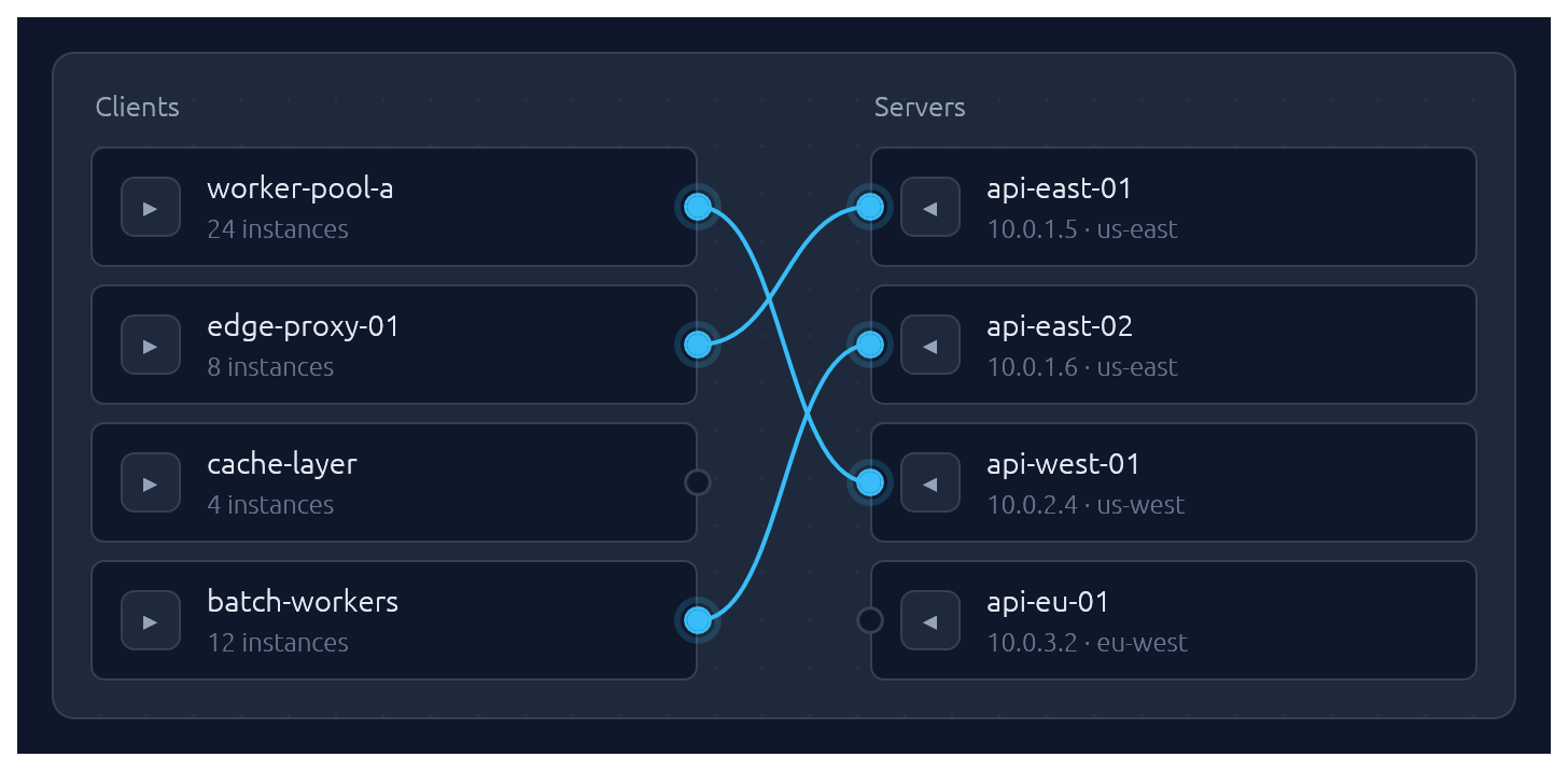
One-to-one pairing between two lists, drawn as bezier curves between port circles. Click a port to start a connection, then click an opposite-side port to complete it. Hovering an opposite-side node during selection latches the ghost line to its port. Clicking a paired node breaks its connection *and* starts a new pairing from it — one-click reconnection. Clicking a line unpairs. Optional `.align_left()` / `.align_right()` auto-arranges the chosen side so every pairing renders as a straight horizontal line.
Pairs are stored as `(left_id, right_id)` tuples in a caller-owned `Vec`; transient selection state lives in egui memory keyed by the widget's id salt. Each side supports up to 64 items — layout uses fixed-size stack buffers so there is zero heap allocation per frame.
```rust
use elegance::{PairItem, Pairing};
let clients = vec![
PairItem::new("c1", "worker-pool-a").detail("24 instances"),
PairItem::new("c2", "edge-proxy-01").detail("8 instances"),
];
let servers = vec![
PairItem::new("s1", "api-east-01").detail("10.0.1.5 · us-east"),
PairItem::new("s2", "api-west-01").detail("10.0.2.4 · us-west"),
];
let mut pairs: Vec<(String, String)> = vec![];
Pairing::new("client-server", &clients, &servers, &mut pairs)
.left_label("Clients")
.right_label("Servers")
.align_right()
.show(ui);
```
## Submit-flash feedback
`TextInput` can play a short green or red background flash to confirm the outcome of a submit:
```rust
use elegance::{ResponseFlashExt, TextInput};
let resp = ui.add(TextInput::new(&mut port).id_salt("port"));
if resp.lost_focus() && ui.input(|i| i.key_pressed(egui::Key::Enter)) {
match parse_port(&port) {
Ok(_) => resp.flash_success(),
Err(_) => resp.flash_error(),
}
}
```
The tint fades out over `FLASH_DURATION` (~0.8 s). `resp.clear_flash()` dismisses it early.
## Bundled glyphs
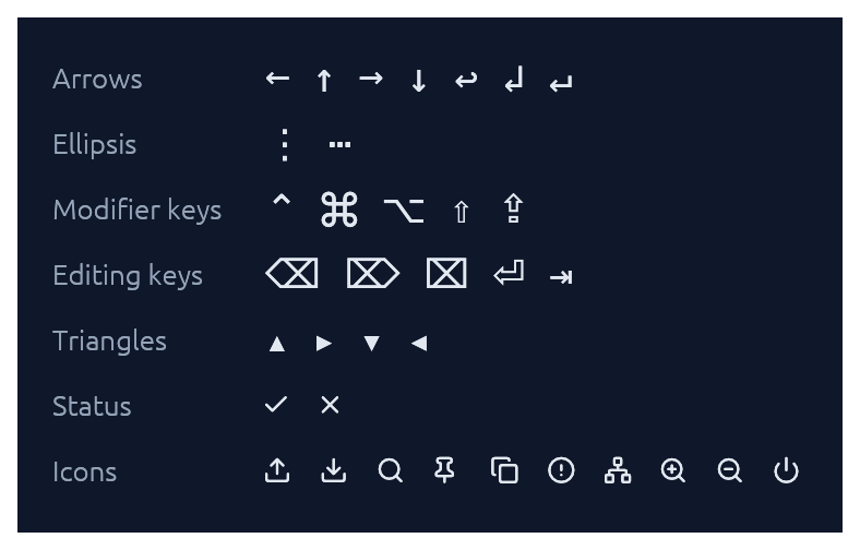
`Theme::install` registers the ~15 KB `Elegance Symbols` font as a Proportional and Monospace fallback, so inline glyphs like `→`, `⋯`, `⌘`, `⇧`, `⌫`, `⏎`, `↩`, `▾` render out of the box without egui's default font missing them.
The font combines a subset of DejaVu Sans (arrows, math ellipsis, Mac modifier keys `⌘ ⌥ ⌃ ⇧ ⇪`, editing keys `⌫ ⌦ ⌧ ⏎ ⇥`, disclosure triangles) with a small set of [Lucide](https://lucide.dev) UI icons baked in at the Private Use Area (`upload`, `download`, `search`, `pin`, `copy`, `circle-alert`, `network`, `zoom-in`, `zoom-out`, `power`) plus Lucide-styled `check` / `x` overriding the standard U+2713 / U+2717 codepoints. The icons are exposed as constants in the [`glyphs`] module:
```rust
ui.label(egui::RichText::new(elegance::glyphs::UPLOAD).size(20.0));
```
See [`assets/README.md`](assets/README.md) for the full glyph table and regeneration instructions.
If you need additional fonts (emoji, CJK, a different text face), register them **after** `Theme::install(ctx)` — calling `ctx.set_fonts(...)` before install will be overwritten the first time `install` runs:
```rust
Theme::slate().install(ctx);
let mut fonts = egui::FontDefinitions::default();
fonts.font_data.insert(
"MyEmoji".into(),
egui::FontData::from_static(include_bytes!("../assets/NotoEmoji.ttf")).into(),
);
fonts.families.get_mut(&egui::FontFamily::Proportional).unwrap()
.push("MyEmoji".into());
ctx.set_fonts(fonts);
```
## Theming
A `Theme` bundles a `Palette` of colours, a `Typography` of font sizes, and a few shape parameters (corner radius, padding). Calling `.install(ctx)` both stores the theme in `ctx` memory so elegance widgets can read it, and updates `egui::Style` so built-in widgets (labels, sliders, scroll bars) inherit the palette.
Four presets are built in, arranged as two dark/light pairs that share shape and typography so you can swap between members of a pair without a layout shift:
| Name | Mode | Flavour |
|---|---|---|
| `Theme::slate()` | dark | cool corporate blue — the default |
| `Theme::frost()` | light | slate-tinted off-white with a sky accent |
| `Theme::charcoal()` | dark | neutral dark grey with a cyan accent |
| `Theme::paper()` | light | warm off-white with a cyan accent |
The `widgets` demo switches between all four live via a header picker. Start from any preset and tweak whatever you like:
```rust
let mut theme = elegance::Theme::charcoal();
theme.palette.sky = egui::Color32::from_rgb(0xa7, 0xf3, 0xd0);
theme.card_radius = 14.0;
theme.install(ctx);
```
For the common case — a header combo-box that lets the user flip between the four presets — drop in `ThemeSwitcher`. It renders the picker and installs the selected theme each frame:
```rust
use elegance::{BuiltInTheme, ThemeSwitcher};
// In your app state:
let mut theme = BuiltInTheme::Slate;
// In your UI:
ui.add(ThemeSwitcher::new(&mut theme));
```
## Demos
An interactive showcase and a widget reference ship with the crate:
```sh
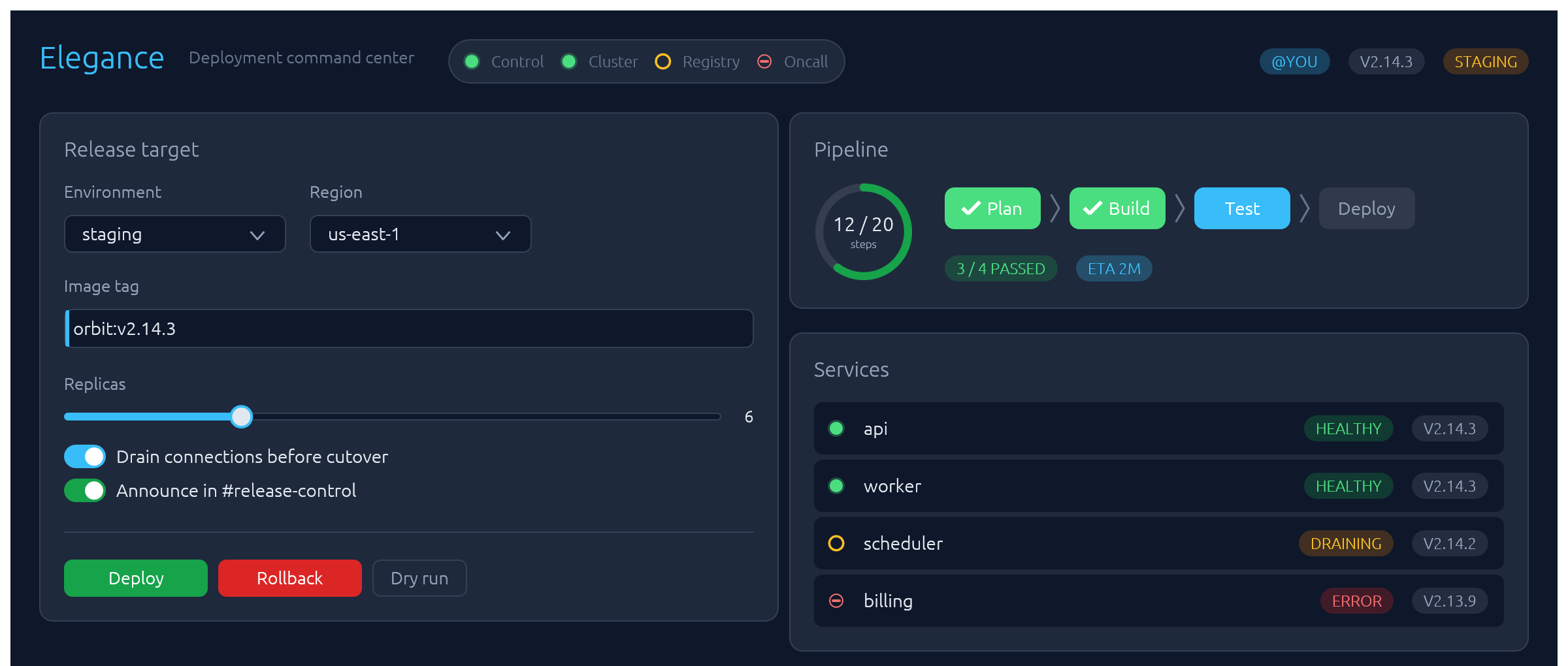
cargo orbit # a CI/CD deployment command center
cargo widgets # every widget in one place: a clean reference layout for screenshotting
```
## Contributing
See [`CONTRIBUTING.md`](CONTRIBUTING.md) for regenerating screenshots, running visual regression tests, and adding new widgets.
## License
Dual-licensed under either [MIT](LICENSE-MIT) or [Apache-2.0](LICENSE-APACHE), at your option.
[`egui`]: https://github.com/emilk/egui