
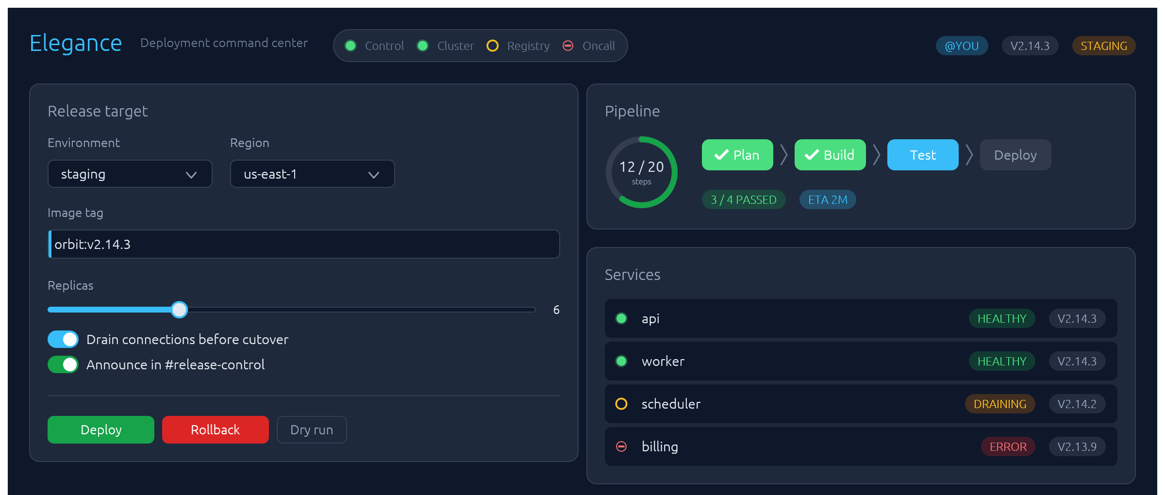
egui-elegance
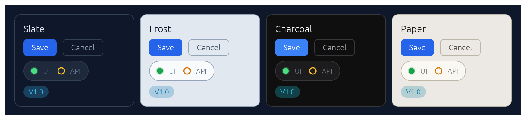
Opinionated widgets for egui: six-accent rounded buttons, text inputs with a sky focus ring and submit-flash feedback, themed selects and tabs, segmented LED toggles, status pills, and badges — all driven by a single installable Theme. Four palettes ship built-in — two dark (Theme::slate, Theme::charcoal) and two light (Theme::frost, Theme::paper) — paired so you can toggle without any layout shift.
The design aims to make native apps feel as polished as modern web UIs.
Install
or, in Cargo.toml:
[]
= "0.34"
= "0.3"
The crate is published as egui-elegance but the library name is elegance, so imports look like use elegance::Button;.
MSRV: Rust 1.92.
Quick start
Install the theme once per Context, then drop widgets into any Ui the way you would an egui built-in:
use ;
Widgets
Every widget follows one of three usage patterns:
- Leaf widgets — including stateful ones that take a
&mut Tin their constructor likeTextInput::new(&mut email)orSelect::new(id, &mut unit)— implementegui::Widgetand render withui.add(…). - Container widgets (
Card,CollapsingSection) take a body closure with.show(ui, |ui| …)and return anInnerResponse<R>. - Overlay widgets create their own top-level
Areas and render atContextscope:Modal::new("id", &mut open).show(ctx, |ui| …)for a dialog,Drawer::new("id", &mut open).show(ctx, |ui| …)for a side-anchored slide-in panel,Toast::new("…").show(ctx)to enqueue a notification paired withToasts::new().render(ctx)once per frame to draw the stack, andLogBar— owned state on your app struct — rendered once per frame withlog.show(ui).
Reference for each widget follows. Tiles are rendered headlessly by cargo render-docs — see Regenerating widget screenshots.
Button
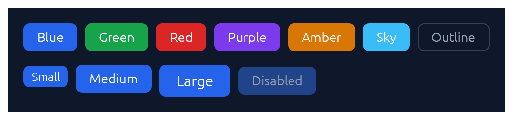
Chunky rounded button in six accent colours plus an outline variant, in three sizes.
use ;
if ui.add.clicked
ui.add;
ui.add;
TextInput
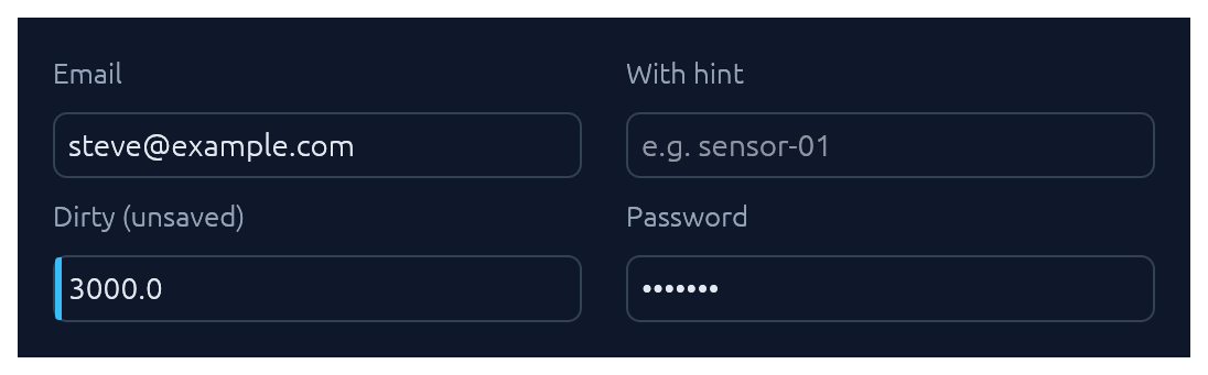
Single-line text input. See also Submit-flash feedback for success / error tinting on submit.
use TextInput;
ui.add;
ui.add;
ui.add;
TextArea
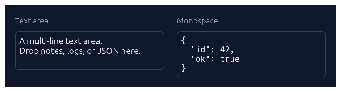
Multi-line counterpart to TextInput with a configurable visible row count. Optional monospace for code, JSON, or keys.
use TextArea;
ui.add;
ui.add;
TagInput
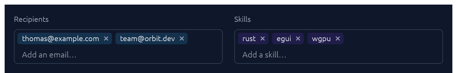
A pill-list text input bound to a Vec<String>. Enter or comma commits the buffer as a tag; with commit_on_space(true) whitespace commits too. Backspace on an empty buffer arms the last pill (red highlight) and a second Backspace removes it; clicking a pill's × removes it directly. Pasted text containing commas or whitespace splits into multiple tags. Optional validator closure rejects malformed values with an inline error.
use TagInput;
let mut recipients: = Vecnew;
new
.label
.placeholder
.commit_on_space
.validator
.show;
Select
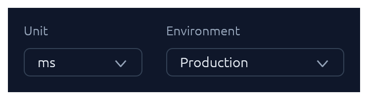
Themed combo-box generic over any PartialEq + Clone value type.
use Select;
ui.add;
// Shorthand for string-valued selects:
ui.add;
Checkbox · Switch · SegmentedButton
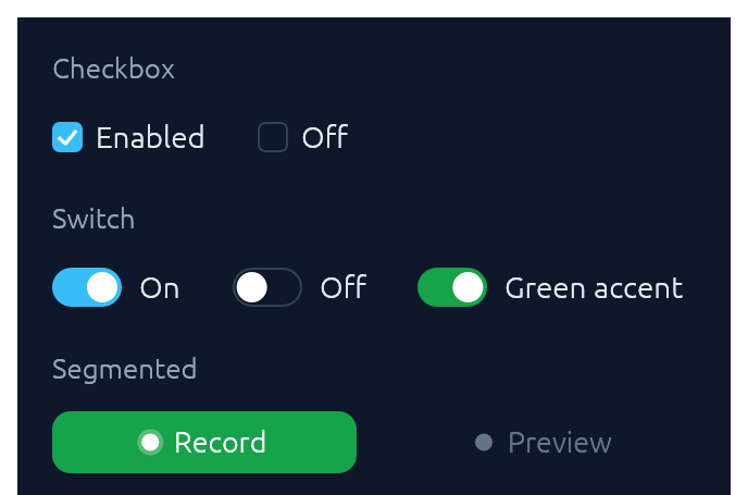
Three flavours of boolean input. Pick Checkbox for list-style selection, Switch for feature/settings flags, SegmentedButton for mode toggles where the on-state should read as a distinct accent pill.
use ;
ui.add;
ui.add;
ui.add;
SegmentedButton accepts the same ButtonSize scale as Button, so a mixed row (e.g. Button::new("Collect") next to SegmentedButton::new(&mut continuous, "Continuous")) stays aligned at any size. Pass matching .size(ButtonSize::Large) on both for a chunkier action row without touching the theme.
TabBar

Horizontal tab strip. The active tab gets a sky underline.
use TabBar;
ui.add;
SegmentedControl
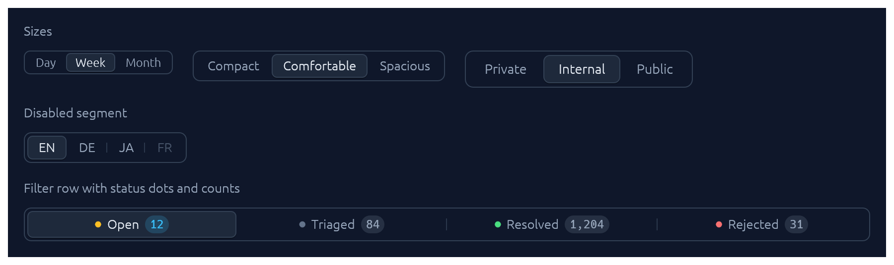
A row of mutually-exclusive segments sharing one rounded track. The selected segment lifts to the card colour with a soft drop shadow; unhovered, unactive neighbours are separated by a hairline. Use it for compact pickers where every option fits inline (timeframe, density, view mode).
use ;
let mut selected = 1usize;
ui.add;
ui.add;
Rich segments with a status dot, a count badge, and .fill() to stretch across the row:
use ;
ui.add;
Segment::icon and Segment::icon_text cover icon-only and icon+label variants; .enabled(false) greys out a single segment without removing it from the row.
BrowserTabs

Owned-state strip of browser-style closable tabs. The active tab fills with the card colour so it merges with the panel below; each tab can flag a sky dirty-dot for unsaved changes, and the trailing + emits a NewRequested event for the caller to handle.
use ;
StatusPill · Indicator · Badge
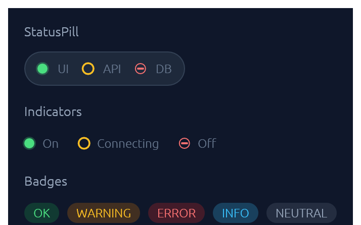
IndicatorState has three visual modes: On (solid green dot), Off (red bar), Connecting (amber ring). Badge carries a BadgeTone: Ok, Warning, Danger, Info, or Neutral.
use ;
ui.add;
ui.add;
ui.add;
Slider
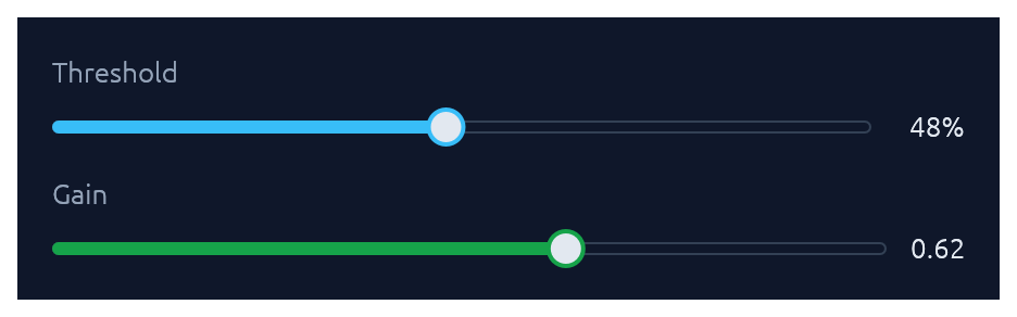
Pill-track slider generic over egui::emath::Numeric — works with any integer or float type. Value readout on the right; .value_fmt(|v| …) for custom formatting.
use ;
ui.add;
ui.add;
RangeSlider
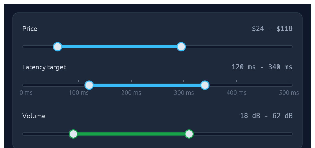
Two-handle range slider for picking a [low, high] interval. Same pill track and accent fill as Slider; the fill spans only the selected portion. Optional evenly-spaced ticks with labels, and the keyboard works on each focused thumb (arrows nudge by step, Shift+arrow for a 10x nudge, Home/End jump to the bounds).
use ;
ui.add;
ui.add;
ui.add;
Knob
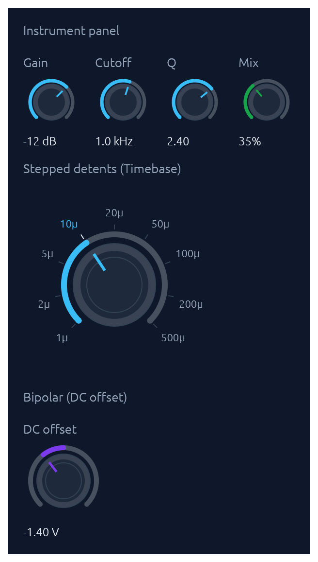
Rotary knob bound to any egui::emath::Numeric. A 270-degree arc with an accent fill grows clockwise from the lower left; the active position drives a tick indicator inside the body. Three sizes (Small / Medium / Large), an Accent colour, and three behavioural variants share one widget: continuous (with optional step snap), bipolar (fill from the centre of the range outward toward the current value, suited to signed offsets), and stepped with (value, label) detents that render labeled ticks and snap drag/scroll/keyboard moves to the nearest detent. Drag combines horizontal and vertical motion: right and up both increase, left and down both decrease, so a diagonal flick reads as a single gesture (Shift slows for fine control). The scroll wheel and arrow keys nudge, Page Up / Page Down step coarser, Home / End jump to the bounds, and Alt+click or double-click resets to a configured default. Optional log_scale for wide ranges (audio frequency, gain). show_value(true) renders the formatted value below the knob.
use ;
// Compact instrument-panel knob with a log scale and inline value.
ui.add;
// Bipolar knob for a signed offset.
ui.add;
// Stepped knob with labeled detents.
ui.add;
ColorPicker
Bound to a Color32. Renders as a compact swatch-and-hex trigger; clicking opens a popover containing any combination of a curated palette grid, an auto-tracked recents row, a continuous saturation/value plane plus hue slider, an alpha slider, and a hex input. Builder toggles let you mix-and-match: a palette-only picker for status colors, a continuous picker for free-form brand colors, or both stacked. Recent picks are persisted in egui context memory keyed by id_salt. Hex parsing accepts #RGB, #RRGGBB, #RRGGBBAA (with or without #).
use ColorPicker;
ui.add;
ui.add;
FileDropZone
A click-and-drop file target: dashed border, cloud icon, and prompt. The widget renders the visual treatment and drag-over state; the caller handles the dropped files reported on FileDropResponse.dropped_files and opens a native picker on click (use a crate like rfd).
use FileDropZone;
let drop = new
.hint
.show;
if drop.response.clicked
for file in &drop.dropped_files
Spinner · ProgressBar
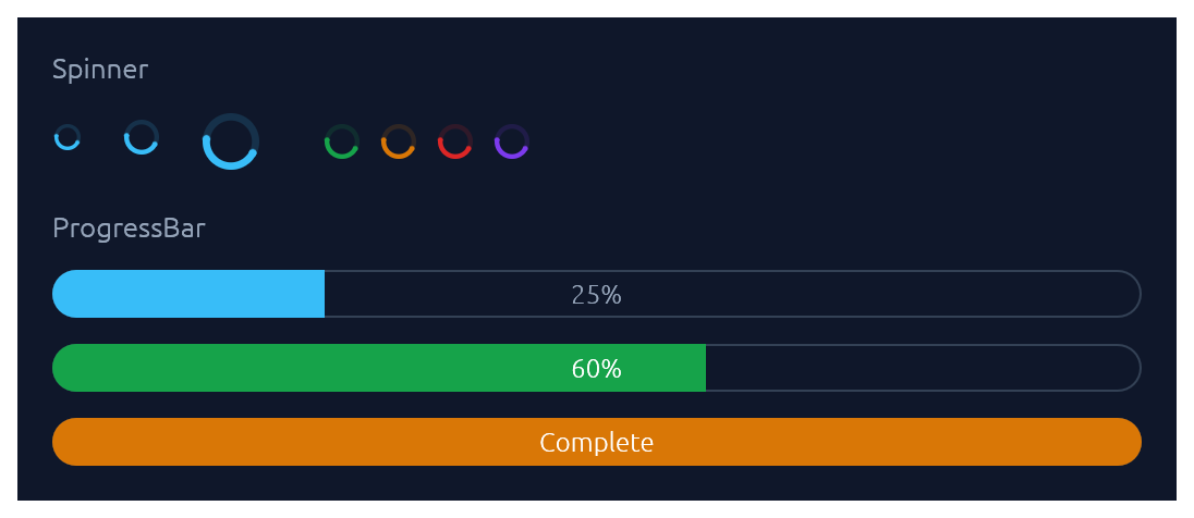
Spinner is the indeterminate loader — an animated sweeping arc. ProgressBar is determinate: a pill-shaped bar with an optional inline label.
use ;
ui.add;
ui.add;
ui.add;
ProgressRing
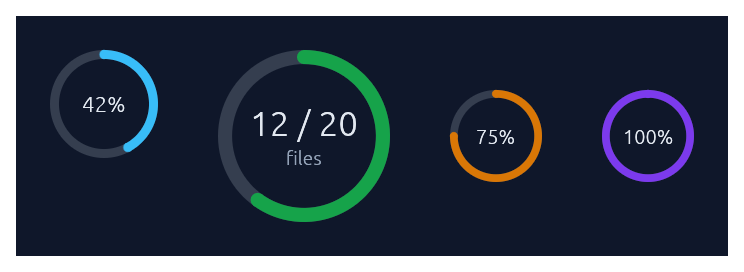
A determinate circular progress indicator — a ring-shaped cousin of ProgressBar. A faint track plus an accent-coloured arc that sweeps clockwise from 12 o'clock as the fraction grows. Centre text defaults to the rounded percent; override with .text(...) and add a small muted sub-caption with .caption(...). Doubles as a circular gauge: pass .zones(GaugeZones::new(warn, crit)) to colour the arc by which threshold band the fraction falls in (success/warning/danger), .unit("...") to render a baseline-aligned suffix next to the value, and .caption_below("...") to anchor a descriptive caption beneath the ring instead of inside. For indeterminate "still working" loaders, use Spinner instead.
use ;
ui.add;
ui.add;
// Donut-style gauge: zones colour the arc, the unit suffix is
// baseline-aligned next to the value, and the caption sits below.
ui.add;
// Hide the centre text entirely.
ui.add;
RadialGauge · LinearGauge
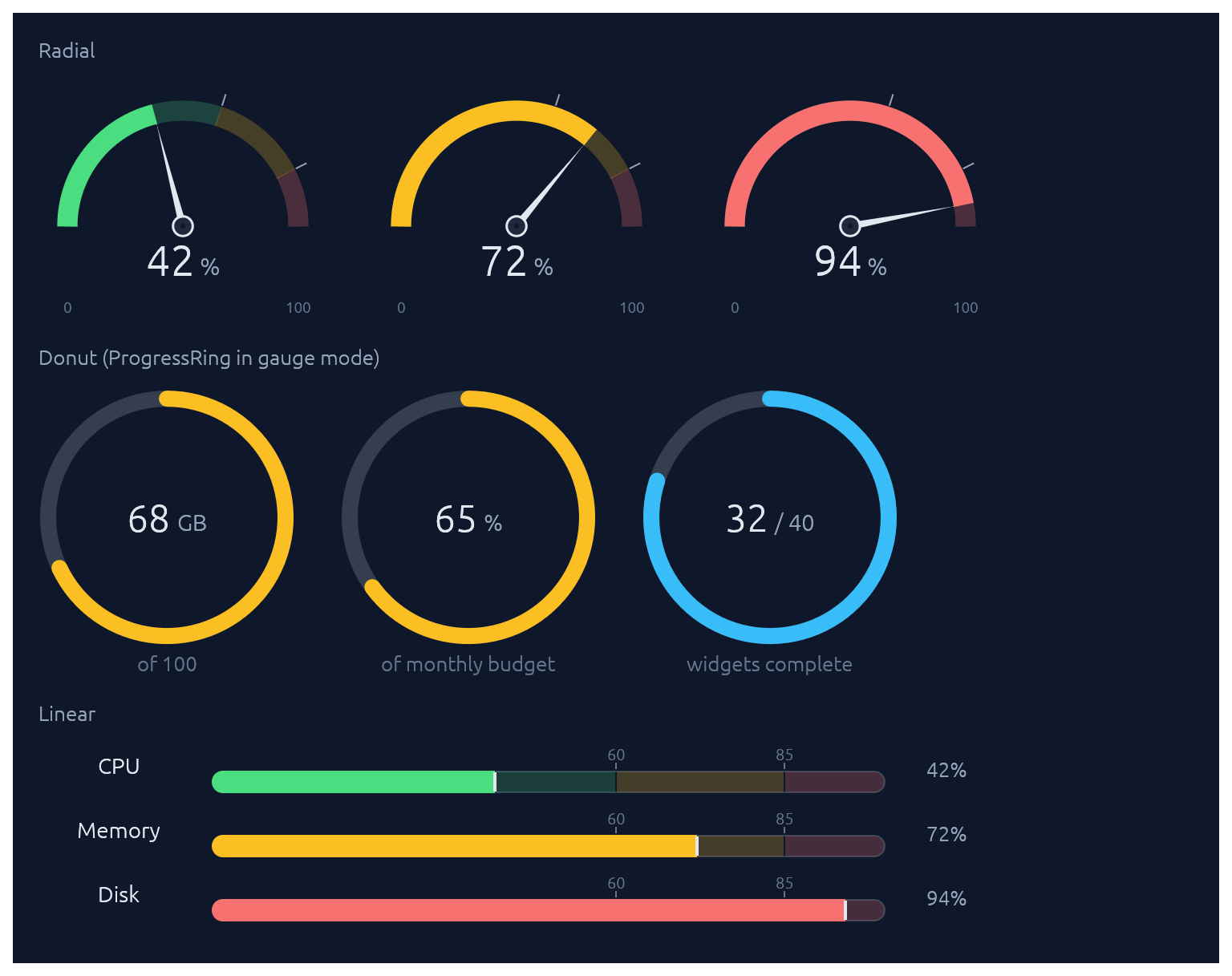
Two widgets for displaying a value (as a 0..1 fraction) against optional threshold zones. RadialGauge is a half-circle dashboard speedometer with a needle and a value readout in the bowl; LinearGauge is a horizontal meter with optional faded threshold bands behind the fill plus tick-and-label markers above. For the donut form (a circular gauge with no needle), use ProgressRing with .zones(...). Pass GaugeZones::new(warn, crit) to drive the fill colour automatically (success/warning/danger based on which band the value falls into). Without zones, the fill defaults to the theme's sky accent.
use ;
let zones = new;
// Half-circle speedometer.
ui.add;
// Linear meter with auto-labelled zone thresholds.
ui.add;
// Custom thresholds for non-percentage scales.
ui.add;
Steps
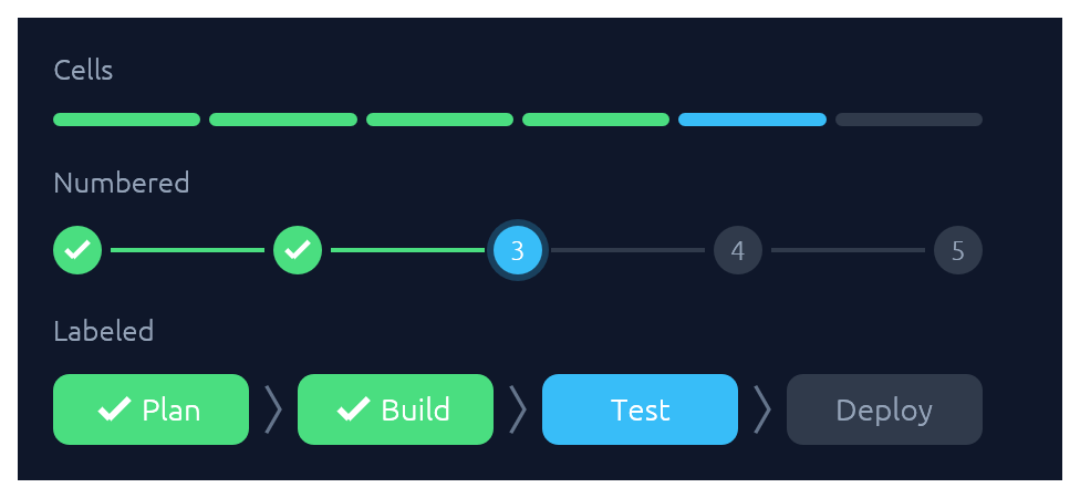
A stepped progress indicator for discrete, countable stages. Three visual styles share the same state model (total, current, errored): StepsStyle::Cells paints a segmented bar of uniform rounded cells, suited to compact "N of M" progress. StepsStyle::Numbered paints numbered circles connected by thin lines, with a checkmark on completed dots and a glow on the active one. StepsStyle::Labeled (via Steps::labeled) paints taller pills containing text labels — horizontal by default (a progress bar with readable stage names), or call .vertical() for a wizard-sidebar layout. Done cells use the theme's success green, the active one uses sky, and errors use danger red.
use ;
// 4 of 6 release steps complete, step 5 running.
ui.add;
// Migration failed on step 3 of 5.
ui.add;
// Onboarding wizard, step 3 of 5.
ui.add;
// Labeled horizontal strip — a progress bar with stage names.
ui.add;
// Same data, rendered as a vertical wizard sidebar.
ui.add;
StatCard
A compact dashboard tile for a single numeric KPI. The headline value sits above a comparison subtitle ("vs last 7 days") and an optional 44 pt filled-area sparkline of recent values, tinted by the card's accent. A small delta chip shows direction of change with semantic colouring: by default, up is good (green); call .invert_delta(true) for metrics where down is good (latency, error rate). Pass .loading(true) while data is in flight to render a shimmer placeholder.
use ;
let series = ;
ui.add;
// Down is good for latency: invert the chip's semantic colouring.
ui.add;
// Loading skeleton while fetching.
ui.add;
Card · CollapsingSection
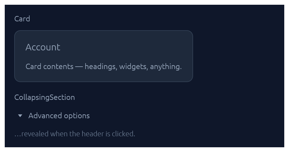
Both take a body closure and return an InnerResponse<R>.
use ;
new.heading.show;
new.show;
Accordion
A grouped stack of collapsible items inside one bordered panel. Each row gets a chevron, a title, and optional subtitle, icon halo, and right-aligned meta slot (badges, counts, status dots). Use .exclusive(true) to allow only one item open at a time, or .flush(true) to drop the outer border for inline use inside a form.
use ;
new.exclusive.show;
Menu · MenuItem
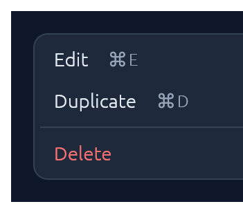
Click-to-open popup attached to any trigger Response. Esc, outside-click, or item-click all dismiss. For a desktop-style top-of-window strip with brand, multiple menus, and status, see MenuBar.
use ;
let trigger = ui.add;
new.show_below;
MenuItem also supports .icon("📄") (a leading glyph in the gutter), .checked(bool) (a checkmark for togglable items), and .radio(bool) (a filled dot for mutually-exclusive choices). Items in the same menu align cleanly when they all opt in to the same gutter style.
For nested menus, drop a SubMenuItem inside any menu body — it renders as a MenuItem with a right-pointing chevron and opens its body as a flyout submenu when hovered:
use ;
new.show;
MenuBar
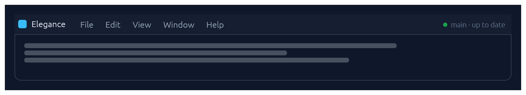
Desktop-style top-of-window menu strip: an optional brand on the left, a row of click-to-open menus (File, Edit, View, …), and an optional status slot on the right. Once any menu is open, hovering a sibling trigger switches to it — the same "menu mode" feel native menubars have. Each dropdown is a themed panel; populate it with MenuItems, separators, and section headers. MenuItem exposes .checked(bool) (checkbox toggles), .radio(bool) (mutually-exclusive choices), .icon(...) (leading glyph), .shortcut("⌘N"), .danger(), and .enabled(false).
use ;
new
.brand
.status_with_dot
.show;
For a single click-to-open menu attached to an arbitrary trigger button (e.g. row actions, a toolbar overflow), reach for Menu directly instead.
Modal
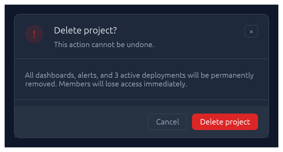
Centered dialog over a dimmed backdrop. Esc, backdrop-click, or the built-in × button all flip the bound open flag back to false.
use Modal;
new
.heading
.show;
Drawer
Side-anchored slide-in overlay panel: full-height, dimmed backdrop, slides over the page rather than carving space out of it. Reach for Drawer when the content is too tall for a Modal but doesn't deserve its own route — record inspectors, edit forms, filter sidebars. Esc, backdrop-click, and the built-in × button all flip the bound open flag back to false. The slide animation, focus capture, and focus restore on close are built in.
use ;
new
.side
.width
.title
.subtitle
.show;
For a persistent (non-overlay) side panel that resizes the surrounding content, use egui::SidePanel directly with the elegance palette — Drawer is the modal slide-in case.
Popover
Click-anchored floating panel that points at a trigger. Lighter than Modal: no backdrop, no focus trap. Pick a side with PopoverSide (top, bottom, left, right), optionally set a title, and fill the body closure with whatever you like. Esc, outside-click, or a second trigger-click dismiss.
use ;
let trigger = ui.add;
new
.side
.title
.show;
Tooltip
Hover-triggered, themed callout that explains a trigger widget. One-line label by default; opt into a bold heading and a keyboard-shortcut row (label + small key chips) for richer hints. Visibility is driven by egui's tooltip system, so the standard delay, grace-window chaining between siblings, and dismiss-on-click behaviour come for free. For a click-anchored panel the user can interact with, reach for Popover instead.
use ;
let trigger = ui.add;
new
.heading
.shortcut
.show;
Callout
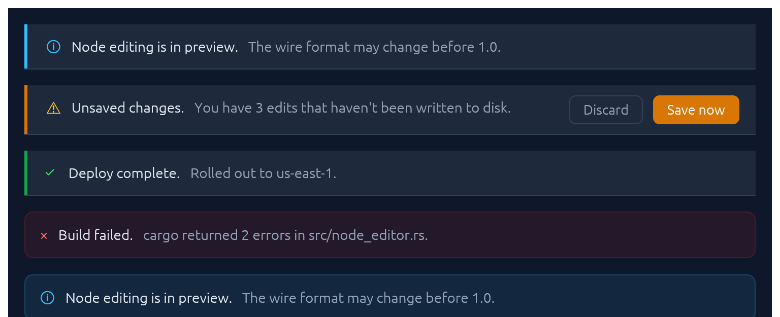
Full-width inline banner for persistent context: experimental features, unsaved changes, failed builds, maintenance windows. CalloutTone picks the accent (Info, Success, Warning, Danger, Neutral). The closure slot is a right-to-left action area — add primary button first. Opt into a trailing × with .dismissable(&mut open).
use ;
new
.title
.body
.show;
Unlike Toast it does not auto-dismiss, and unlike submit-flash feedback it's a whole surface rather than a pulse on another widget.
Toast · Toasts
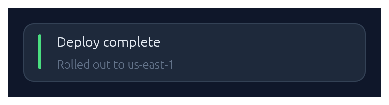
Non-blocking notifications. Toast::show(ctx) enqueues from any callback that has &Context; Toasts::new().render(ctx) draws the stack once per frame. Auto-dismissed with fade-out after ~4 s (override with .duration(…) or .persistent()).
use ;
// From any callback with `&Context`:
new
.tone
.description
.show;
// In your top-level `ui`:
new.render;
LogBar
Expandable bottom log bar — a monospace console with timestamped rows colour-coded by kind: Sys, Out (→), In (←), Err. Owned state — construct once on your app struct, push entries from anywhere with &mut self, and render once per frame.
use LogBar;
// In App::default, construct once:
let mut log = new;
// From a button handler, async callback, completion, etc.:
log.out;
log.recv;
log.err;
// Once per frame, inside your top-level `ui`:
log.show;
Pairing
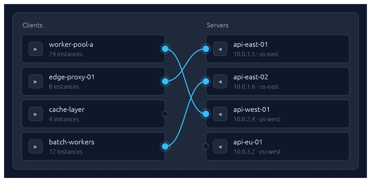
One-to-one pairing between two lists, drawn as bezier curves between port circles. Click a port to start a connection, then click an opposite-side port to complete it. Hovering an opposite-side node during selection latches the ghost line to its port. Clicking a paired node breaks its connection and starts a new pairing from it — one-click reconnection. Clicking a line unpairs. Optional .align_left() / .align_right() auto-arranges the chosen side so every pairing renders as a straight horizontal line.
Pairs are stored as (left_id, right_id) tuples in a caller-owned Vec; transient selection state lives in egui memory keyed by the widget's id salt. Each side supports up to 64 items — layout uses fixed-size stack buffers so there is zero heap allocation per frame.
use ;
let clients = vec!;
let servers = vec!;
let mut pairs: = vec!;
new
.left_label
.right_label
.align_right
.show;
Submit-flash feedback
TextInput can play a short green or red background flash to confirm the outcome of a submit:
use ;
let resp = ui.add;
if resp.lost_focus && ui.input
The tint fades out over FLASH_DURATION (~0.8 s). resp.clear_flash() dismisses it early.
Bundled glyphs
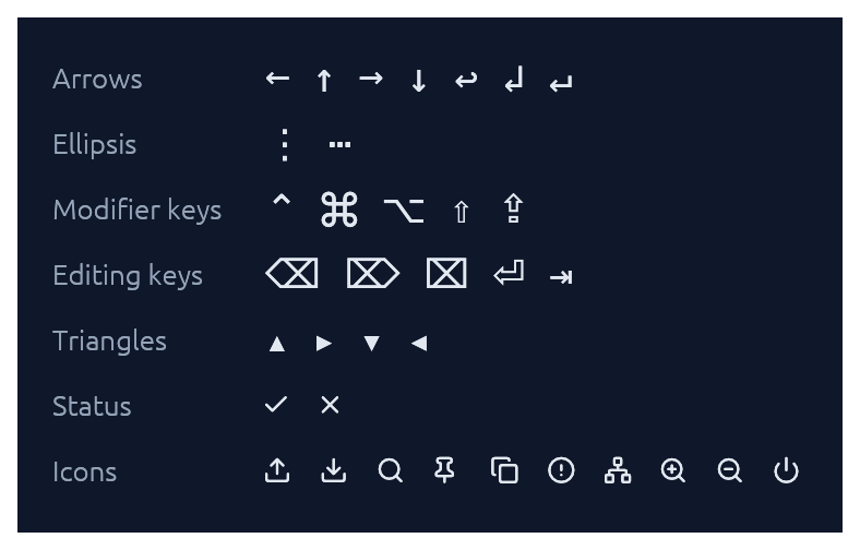
Theme::install registers the ~15 KB Elegance Symbols font as a Proportional and Monospace fallback, so inline glyphs like →, ⋯, ⌘, ⇧, ⌫, ⏎, ↩, ▾ render out of the box without egui's default font missing them.
The font combines a subset of DejaVu Sans (arrows, math ellipsis, Mac modifier keys ⌘ ⌥ ⌃ ⇧ ⇪, editing keys ⌫ ⌦ ⌧ ⏎ ⇥, disclosure triangles) with a small set of Lucide UI icons baked in at the Private Use Area (upload, download, search, pin, copy, circle-alert, network, zoom-in, zoom-out, power) plus Lucide-styled check / x overriding the standard U+2713 / U+2717 codepoints. The icons are exposed as constants in the [glyphs] module:
ui.label;
See assets/README.md for the full glyph table and regeneration instructions.
If you need additional fonts (emoji, CJK, a different text face), register them after Theme::install(ctx) — calling ctx.set_fonts(...) before install will be overwritten the first time install runs:
slate.install;
let mut fonts = default;
fonts.font_data.insert;
fonts.families.get_mut.unwrap
.push;
ctx.set_fonts;
Theming
A Theme bundles a Palette of colours, a Typography of font sizes, and a few shape parameters (corner radius, padding). Calling .install(ctx) both stores the theme in ctx memory so elegance widgets can read it, and updates egui::Style so built-in widgets (labels, sliders, scroll bars) inherit the palette.
Four presets are built in, arranged as two dark/light pairs that share shape and typography so you can swap between members of a pair without a layout shift:
| Name | Mode | Flavour |
|---|---|---|
Theme::slate() |
dark | cool corporate blue — the default |
Theme::frost() |
light | slate-tinted off-white with a sky accent |
Theme::charcoal() |
dark | neutral dark grey with a cyan accent |
Theme::paper() |
light | warm off-white with a cyan accent |
The widgets demo switches between all four live via a header picker. Start from any preset and tweak whatever you like:
let mut theme = charcoal;
theme.palette.sky = from_rgb;
theme.card_radius = 14.0;
theme.install;
For the common case — a header combo-box that lets the user flip between the four presets — drop in ThemeSwitcher. It renders the picker and installs the selected theme each frame:
use ;
// In your app state:
let mut theme = Slate;
// In your UI:
ui.add;
Demos
An interactive showcase and a widget reference ship with the crate:
Contributing
See CONTRIBUTING.md for regenerating screenshots, running visual regression tests, and adding new widgets.
License
Dual-licensed under either MIT or Apache-2.0, at your option.