
egui-elegance
Opinionated widgets for egui: six-accent rounded buttons, text inputs with a sky focus ring and submit-flash feedback, themed selects and tabs, segmented LED toggles, status pills, and badges — all driven by a single installable Theme. Four palettes ship built-in — two dark (Theme::slate, Theme::charcoal) and two light (Theme::frost, Theme::paper) — paired so you can toggle without any layout shift.
The design aims to make native apps feel as polished as modern web UIs.
Install
or, in Cargo.toml:
[]
= "0.34"
= "0.1"
The crate is published as egui-elegance but the library name is elegance, so imports look like use elegance::Button;.
MSRV: Rust 1.92.
Quick start
Install the theme once per Context, then drop widgets into any Ui the way you would an egui built-in:
use ;
Widgets
Every widget follows one of three usage patterns:
- Leaf widgets — including stateful ones that take a
&mut Tin their constructor likeTextInput::new(&mut email)orSelect::new(id, &mut unit)— implementegui::Widgetand render withui.add(…). - Container widgets (
Card,CollapsingSection) take a body closure with.show(ui, |ui| …)and return anInnerResponse<R>. - Overlay widgets create their own top-level
Areas and render atContextscope:Modal::new("id", &mut open).show(ctx, |ui| …)for a dialog,Toast::new("…").show(ctx)to enqueue a notification paired withToasts::new().render(ctx)once per frame to draw the stack, andLogBar— owned state on your app struct — rendered once per frame withlog.show(ui).
Reference for each widget follows. Tiles are rendered headlessly by cargo render-docs — see Regenerating widget screenshots.
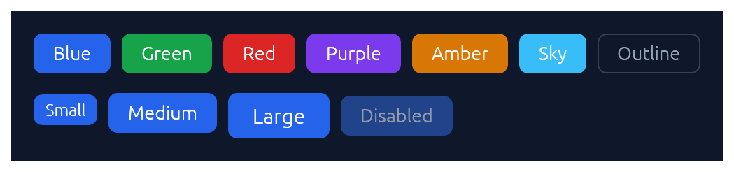
Button
Chunky rounded button in six accent colours plus an outline variant, in three sizes.
use ;
if ui.add.clicked
ui.add;
ui.add;
TextInput
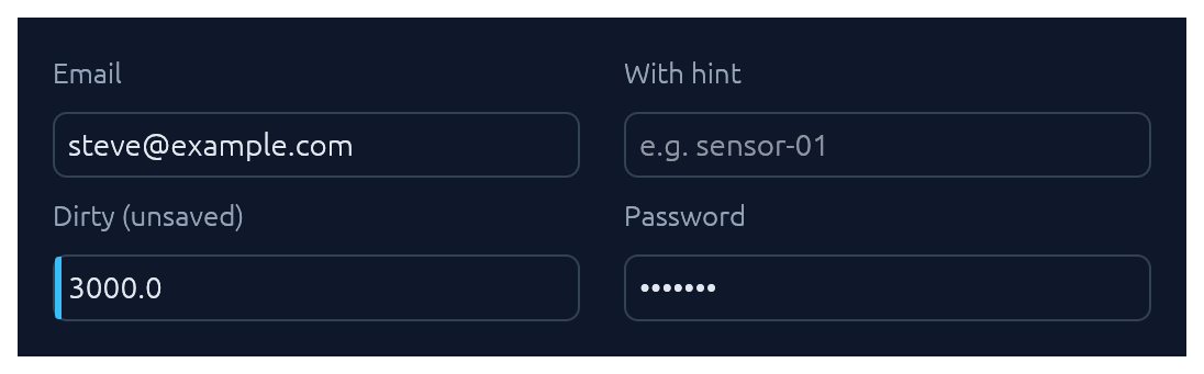
Single-line text input. See also Submit-flash feedback for success / error tinting on submit.
use TextInput;
ui.add;
ui.add;
ui.add;
TextArea
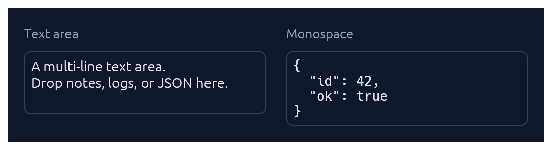
Multi-line counterpart to TextInput with a configurable visible row count. Optional monospace for code, JSON, or keys.
use TextArea;
ui.add;
ui.add;
Select
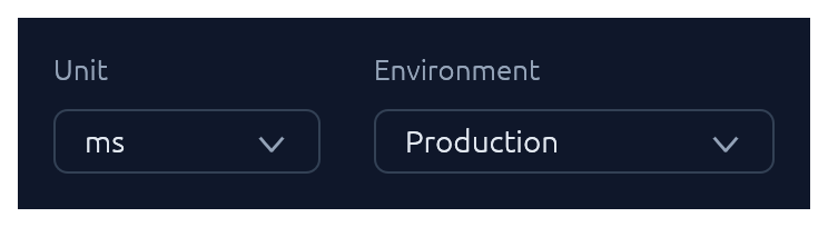
Themed combo-box generic over any PartialEq + Clone value type.
use Select;
ui.add;
// Shorthand for string-valued selects:
ui.add;
Checkbox · Switch · SegmentedButton
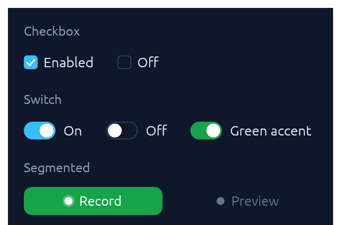
Three flavours of boolean input. Pick Checkbox for list-style selection, Switch for feature/settings flags, SegmentedButton for mode toggles where the on-state should read as a distinct accent pill.
use ;
ui.add;
ui.add;
ui.add;
TabBar

Horizontal tab strip. The active tab gets a sky underline.
use TabBar;
ui.add;
StatusPill · Indicator · Badge
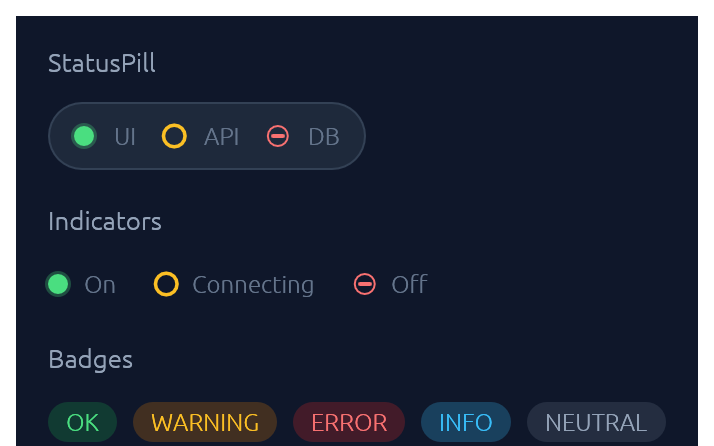
IndicatorState has three visual modes: On (solid green dot), Off (red bar), Connecting (amber ring). Badge carries a BadgeTone: Ok, Warning, Danger, Info, or Neutral.
use ;
ui.add;
ui.add;
ui.add;
Slider
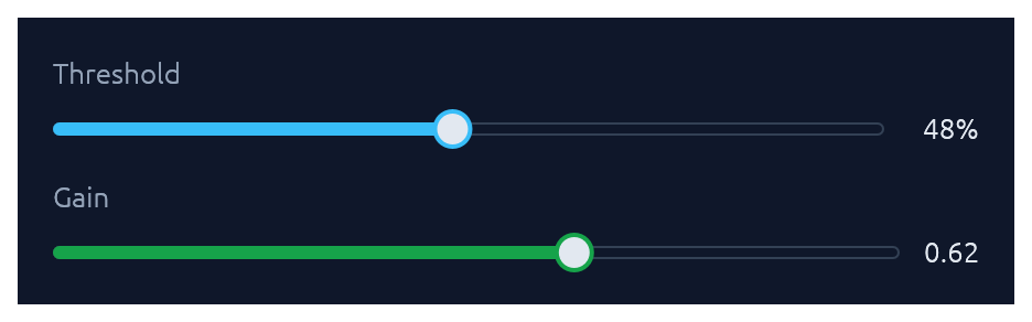
Pill-track slider generic over egui::emath::Numeric — works with any integer or float type. Value readout on the right; .value_fmt(|v| …) for custom formatting.
use ;
ui.add;
ui.add;
Spinner · ProgressBar
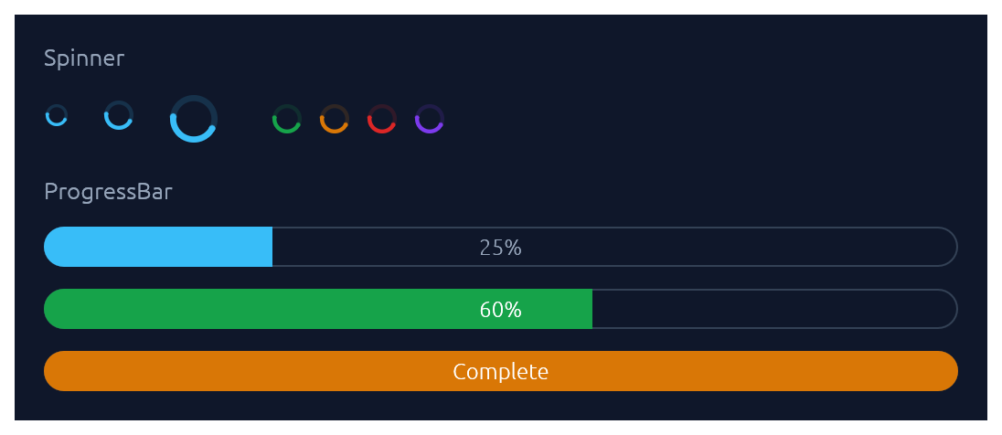
Spinner is the indeterminate loader — an animated sweeping arc. ProgressBar is determinate: a pill-shaped bar with an optional inline label.
use ;
ui.add;
ui.add;
ui.add;
Card · CollapsingSection
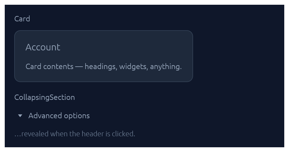
Both take a body closure and return an InnerResponse<R>.
use ;
new.heading.show;
new.show;
Menu · MenuItem
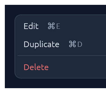
Click-to-open popup attached to any trigger Response. Esc, outside-click, or item-click all dismiss.
use ;
let trigger = ui.add;
new.show_below;
Modal
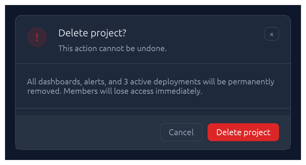
Centered dialog over a dimmed backdrop. Esc, backdrop-click, or the built-in × button all flip the bound open flag back to false.
use Modal;
new
.heading
.show;
Callout
Full-width inline banner for persistent context: experimental features, unsaved changes, failed builds, maintenance windows. CalloutTone picks the accent (Info, Success, Warning, Danger, Neutral). The closure slot is a right-to-left action area — add primary button first. Opt into a trailing × with .dismissable(&mut open).
use ;
new
.title
.body
.show;
Unlike Toast it does not auto-dismiss, and unlike submit-flash feedback it's a whole surface rather than a pulse on another widget.
Toast · Toasts
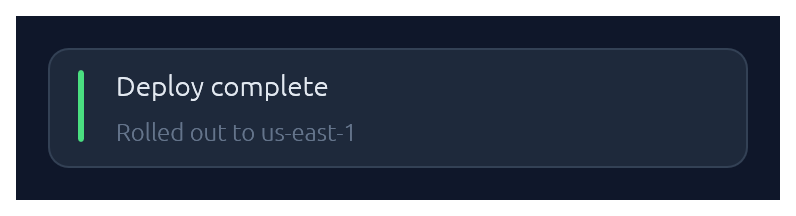
Non-blocking notifications. Toast::show(ctx) enqueues from any callback that has &Context; Toasts::new().render(ctx) draws the stack once per frame. Auto-dismissed with fade-out after ~4 s (override with .duration(…) or .persistent()).
use ;
// From any callback with `&Context`:
new
.tone
.description
.show;
// In your top-level `ui`:
new.render;
LogBar
Expandable bottom log bar — a monospace console with timestamped rows colour-coded by kind: Sys, Out (→), In (←), Err. Owned state — construct once on your app struct, push entries from anywhere with &mut self, and render once per frame.
use LogBar;
// In App::default, construct once:
let mut log = new;
// From a button handler, async callback, completion, etc.:
log.out;
log.recv;
log.err;
// Once per frame, inside your top-level `ui`:
log.show;
Pairing
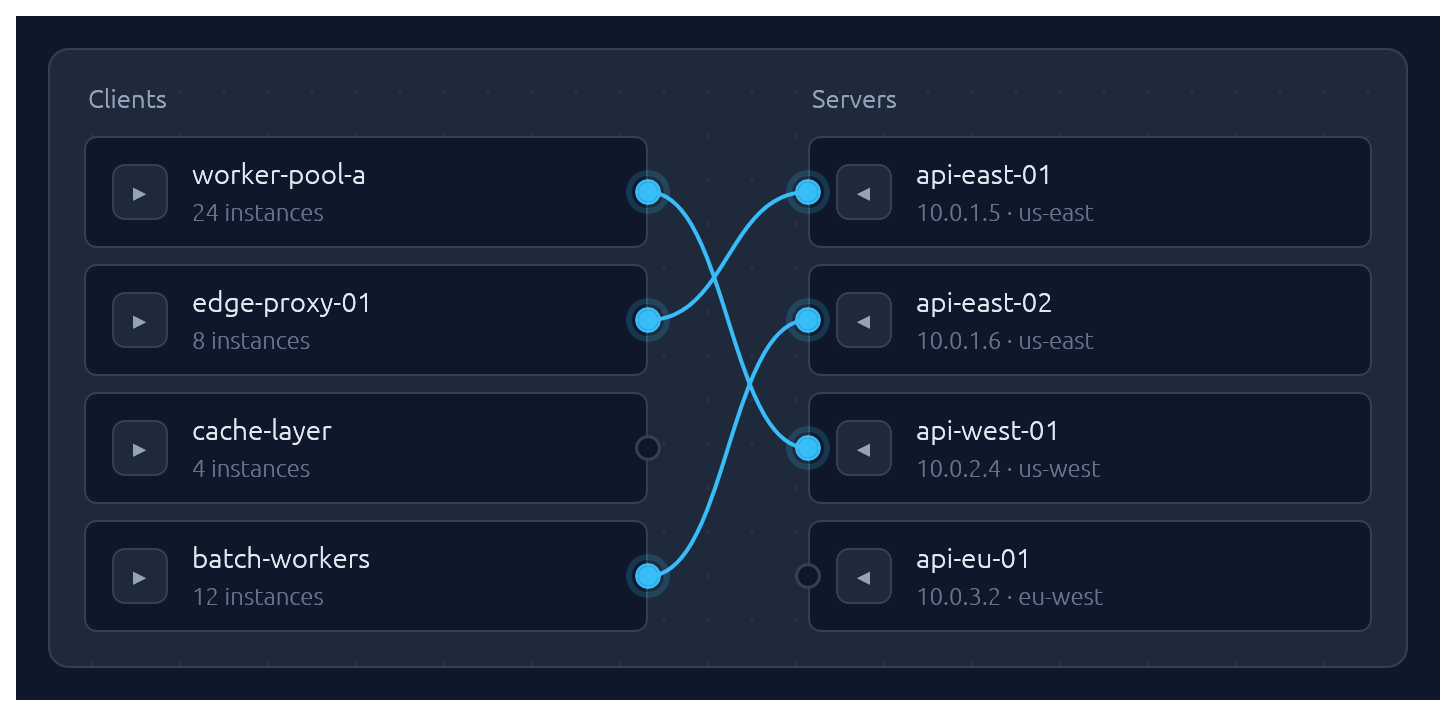
One-to-one pairing between two lists, drawn as bezier curves between port circles. Click a port to start a connection, then click an opposite-side port to complete it. Hovering an opposite-side node during selection latches the ghost line to its port. Clicking a paired node breaks its connection and starts a new pairing from it — one-click reconnection. Clicking a line unpairs. Optional .align_left() / .align_right() auto-arranges the chosen side so every pairing renders as a straight horizontal line.
Pairs are stored as (left_id, right_id) tuples in a caller-owned Vec; transient selection state lives in egui memory keyed by the widget's id salt. Each side supports up to 64 items — layout uses fixed-size stack buffers so there is zero heap allocation per frame.
use ;
let clients = vec!;
let servers = vec!;
let mut pairs: = vec!;
new
.left_label
.right_label
.align_right
.show;
Submit-flash feedback
TextInput can play a short green or red background flash to confirm the outcome of a submit:
use ;
let resp = ui.add;
if resp.lost_focus && ui.input
The tint fades out over FLASH_DURATION (~0.8 s). resp.clear_flash() dismisses it early.
Bundled glyphs
Theme::install registers a ~13 KB subset of DejaVu Sans (renamed Elegance Symbols) as a Proportional and Monospace fallback, so inline glyphs like →, ⋯, ⌘, ⌫, ↩, ▾ render out of the box without egui's default font missing them.
Covered blocks: arrows, math ellipsis, modifier keys (⌘ ⌥ ⌃), delete keys (⌫ ⌦), disclosure triangles, check / cross. See assets/README.md for the full list and regeneration instructions.
If you need additional fonts (emoji, CJK, a different text face), register them after Theme::install(ctx) — calling ctx.set_fonts(...) before install will be overwritten the first time install runs:
slate.install;
let mut fonts = default;
fonts.font_data.insert;
fonts.families.get_mut.unwrap
.push;
ctx.set_fonts;
Theming
A Theme bundles a Palette of colours, a Typography of font sizes, and a few shape parameters (corner radius, padding). Calling .install(ctx) both stores the theme in ctx memory so elegance widgets can read it, and updates egui::Style so built-in widgets (labels, sliders, scroll bars) inherit the palette.
Four presets are built in, arranged as two dark/light pairs that share shape and typography so you can swap between members of a pair without a layout shift:
| Name | Mode | Flavour |
|---|---|---|
Theme::slate() |
dark | cool corporate blue — the default |
Theme::frost() |
light | slate-tinted off-white with a sky accent |
Theme::charcoal() |
dark | neutral dark grey with a cyan accent |
Theme::paper() |
light | warm off-white with a cyan accent |
The widgets demo switches between all four live via a header picker. Start from any preset and tweak whatever you like:
let mut theme = charcoal;
theme.palette.sky = from_rgb;
theme.card_radius = 14.0;
theme.install;
For the common case — a header combo-box that lets the user flip between the four presets — drop in ThemeSwitcher. It renders the picker and installs the selected theme each frame:
use ;
// In your app state:
let mut theme = Slate;
// In your UI:
ui.add;
Demos
An interactive showcase and a widget reference ship with the crate:
Contributing
See CONTRIBUTING.md for regenerating screenshots, running visual regression tests, and adding new widgets.
License
Dual-licensed under either MIT or Apache-2.0, at your option.