
Bevy Round UI
This Bevy plugin contains a shader for rendering rounded rect UI elements, with an adjustable offset that can be used to add borders or make the node appear 3D.
Examples
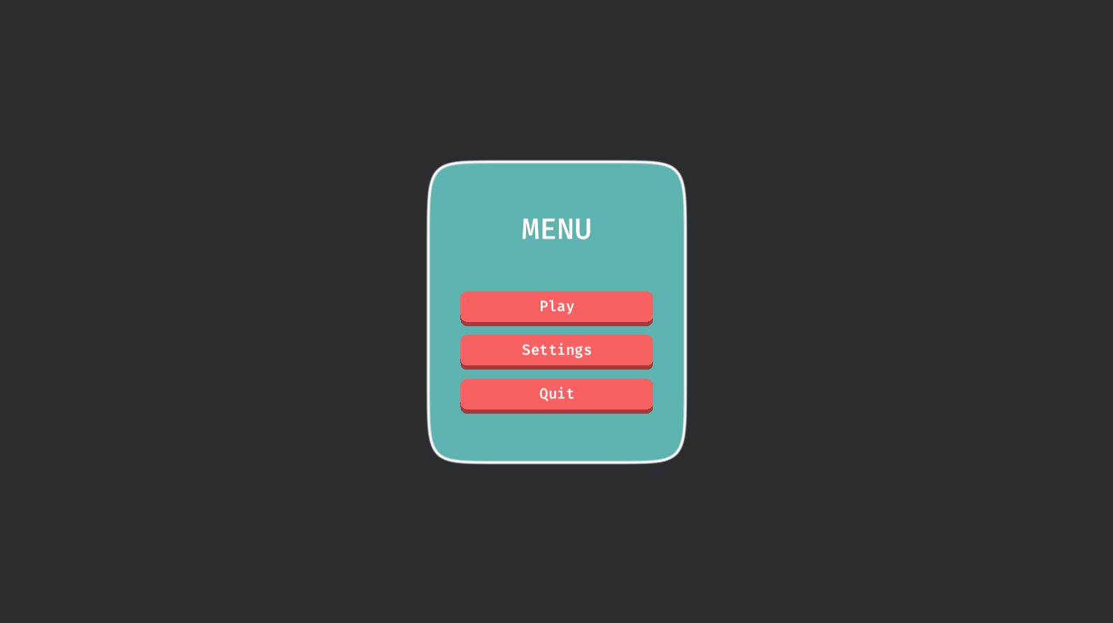
The simple example shows how to use it in its simplest form. The buttons example shows how to use it with interactive buttons and a panel. The autosize example demonstrates what it looks like when nodes resize. The circle example shows how to make a circle shape. The shapes example shows a number of possible shapes.
Basic Usage
- Add the
RoundUiPluginto the app. - Create a
RoundUiMaterialmaterial. - Spawn a regular
MaterialNodeBundleusing the material.
use *;
use *;
Shapes
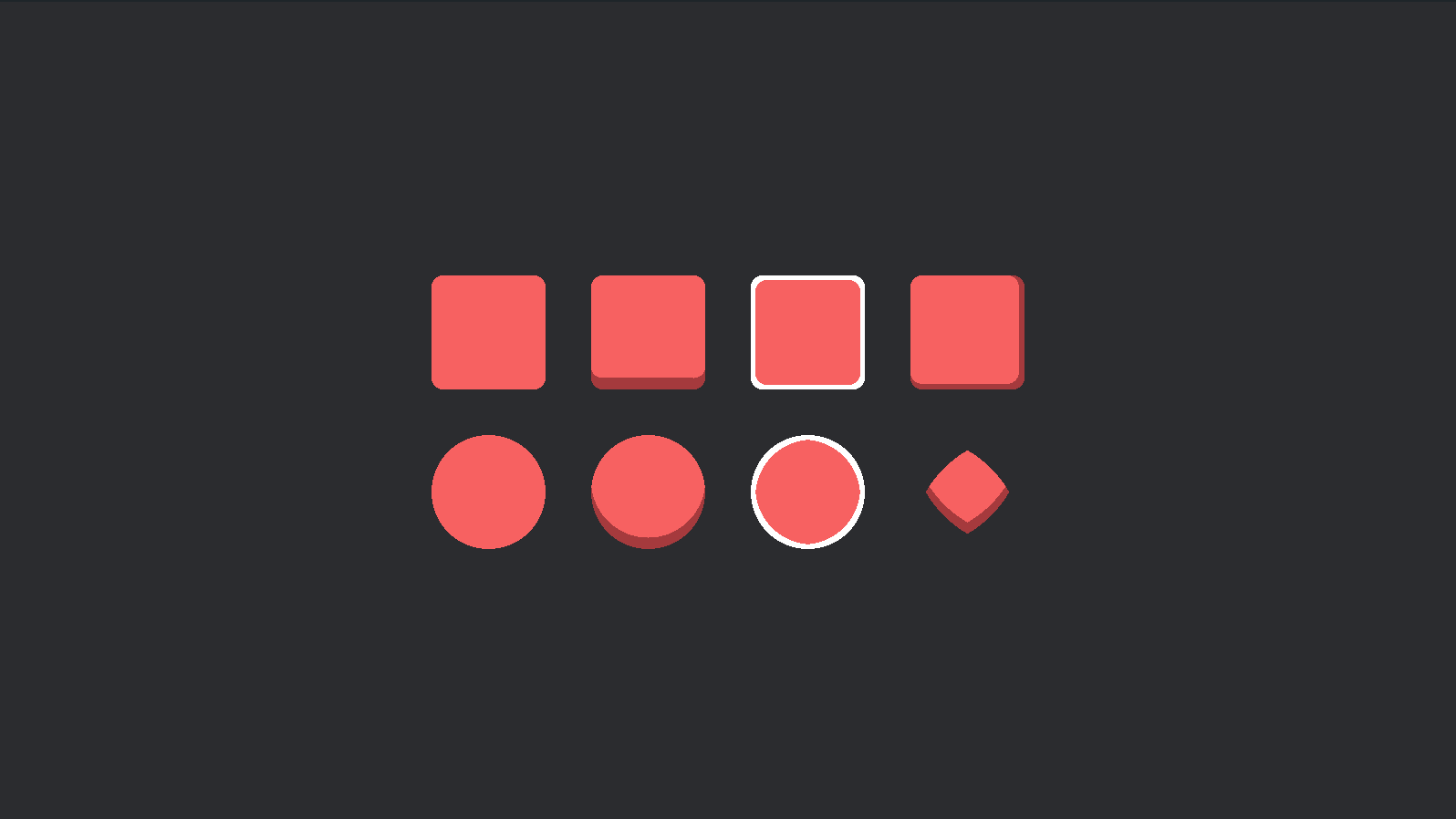
The shapes example demonstrates a number
of possible shapes that can be achieved by changing the RoundUiMaterial::border_radius property.
NOTE: Bordered circles are not perfect.
Compatible Bevy versions
bevy_round_ui |
bevy |
|---|---|
1.x |
0.13 |
0.2 |
0.13 |
0.1 |
0.12 |
License
Dual-licensed under either of
- Apache License, Version 2.0, (LICENSE-APACHE or https://www.apache.org/licenses/LICENSE-2.0)
- MIT license (LICENSE-MIT or https://opensource.org/licenses/MIT)
at your option.
Contribution
Unless you explicitly state otherwise, any contribution intentionally submitted for inclusion in the work by you, as defined in the Apache-2.0 license, shall be dual licensed as above, without any additional terms or conditions.