
Bevy Round UI
This Bevy plugin contains a shader for rendering rounded rect UI elements, with an adjustable offset that can be used to add borders or make the node appear 3D.
Examples
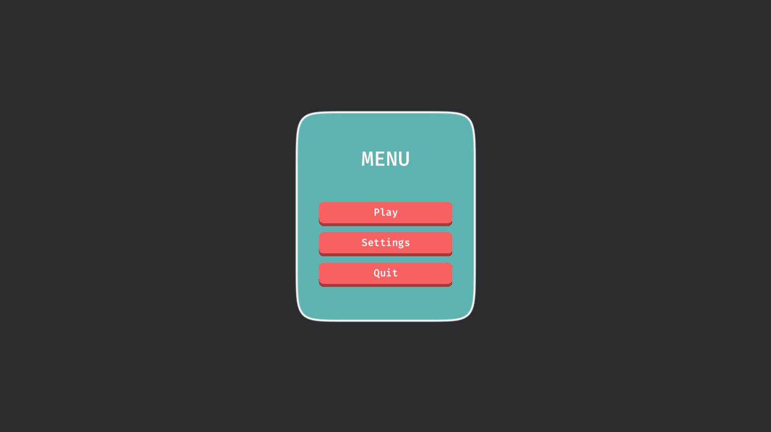
The simple example shows how to use it
in its simplest form. The buttons
example shows how to use it with interactive buttons and a panel. The
autosize example shows how to use it
with flexibly-sized elements and the autosize feature. The
circle example shows how to make a
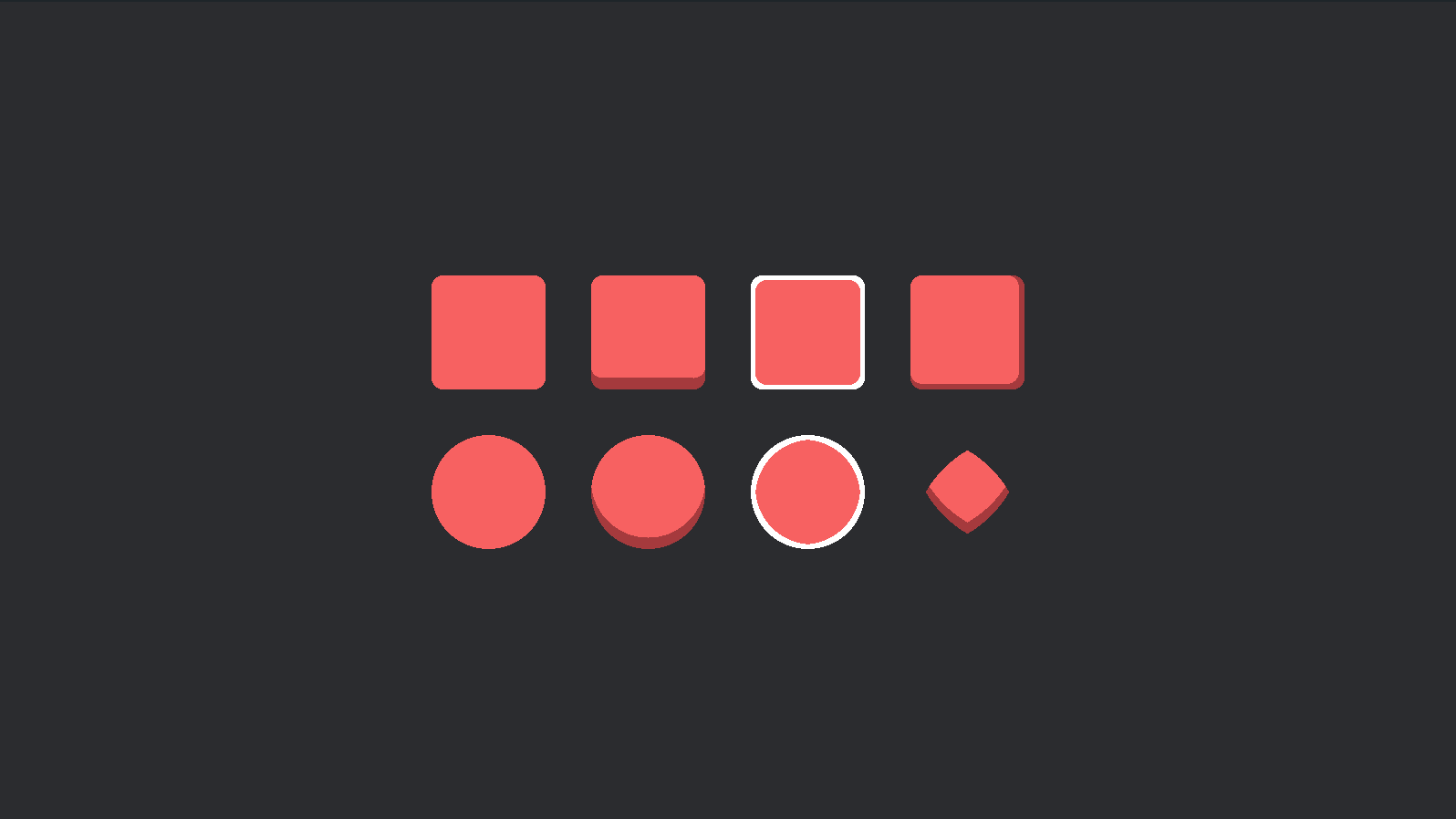
circle shape. The shapes example shows a
number of possible shapes.
Basic Usage
- Add the
RoundUiPluginto the app. - Create a
RoundUiMaterialmaterial. - Spawn a regular
MaterialNodeBundleusing the material.
IMPORTANT: The
RoundUiMaterialmust have the same size as the node. For flexible layouts, see the Auto Size section below.
use *;
use *;
Auto Size
The autosize Cargo feature (enabled by default) adds support for auto-sizing material nodes in various ways.

The following components are available to enable auto-sizing in various ways:
RoundUiAutosizeMaterial
Updates the material to match the size of the node. Use this in flexible layouts where nodes don't have a fixed size.
IMPORTANT: This requires a unique material asset for each node. This means you can't re-use a
Handle<RoundUiMaterial>among multiple nodes.
RoundUiAutosizeNodePadding
Update the node padding to match the border-radius and offset of the material. This is typically used when you have
text or other content inside a material node and don't want it pressed against the edges, or, like in the buttons
example, when the material might change, and you want the padding to automatically adjust.
RoundUiAutosizeNode
Update the size of the node to match the size of the material. Typically used then you are
re-using a Handle<RoundUiMaterial> and need all nodes to have the same size.
Usage in Examples:
buttons- This example usesRoundUiAutosizeNodeandRoundUiAutosizeNodePaddingto make sure that all button nodes have the size and padding of their current material. All buttons use the sameHandle<RoundUiMaterial>so this is important to prevent them from appearing "stretched". Notice how the padding changes automatically when clicking a button.autosize- This example usesRoundUiAutosizeMaterialandRoundUiAutosizeNodePaddingto automatically update the material size when the node size changes.
Shapes
The shapes example demonstrates a number of possible shapes.
NOTE: Bordered circles are not perfect.
Compatible Bevy versions
bevy_round_ui |
bevy |
|---|---|
0.1 |
0.12 |
License
Dual-licensed under either of
- Apache License, Version 2.0, (LICENSE-APACHE or https://www.apache.org/licenses/LICENSE-2.0)
- MIT license (LICENSE-MIT or https://opensource.org/licenses/MIT)
at your option.
Contribution
Unless you explicitly state otherwise, any contribution intentionally submitted for inclusion in the work by you, as defined in the Apache-2.0 license, shall be dual licensed as above, without any additional terms or conditions.