# Bevy Round UI
This [Bevy](https://bevyengine.org/) plugin contains a shader for rendering rounded rect UI elements, with an
adjustable offset that can be used to add borders or make the node appear 3D.
## Examples
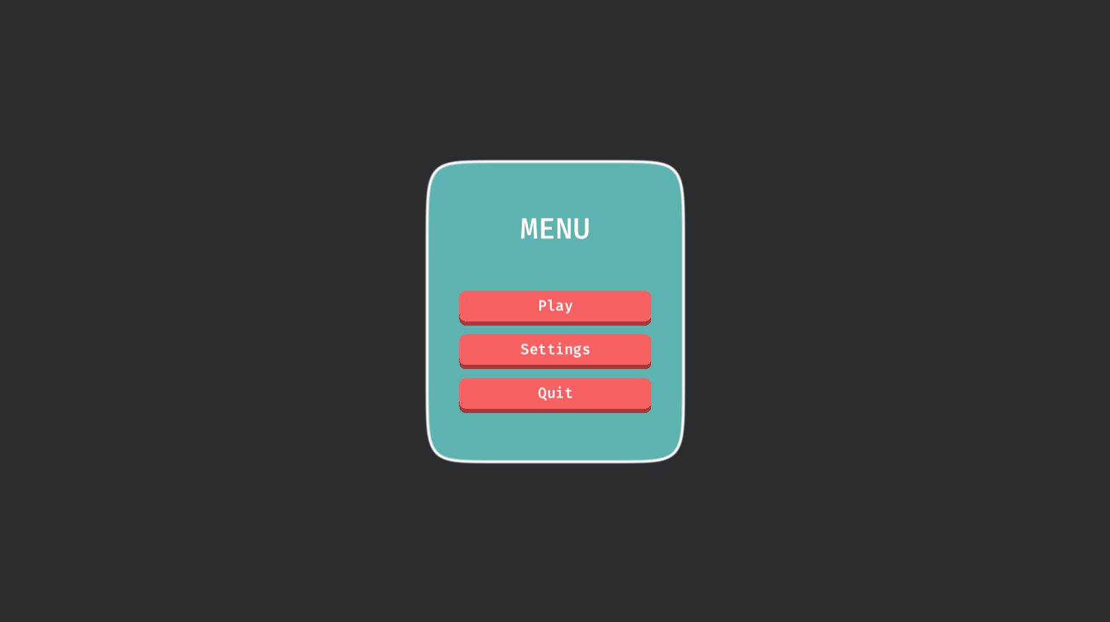
The [simple](https://github.com/robertdodd/bevy_round_ui/blob/master/examples/simple.rs) example shows how to use it
in its simplest form. The [buttons](https://github.com/robertdodd/bevy_round_ui/blob/master/examples/buttons.rs)
example shows how to use it with interactive buttons and a panel. The
[autosize](https://github.com/robertdodd/bevy_round_ui/blob/master/examples/autosize.rs) example shows how to use it
with flexibly-sized elements and the `autosize` feature. The
[circle](https://github.com/robertdodd/bevy_round_ui/blob/master/examples/circle.rs) example shows how to make a
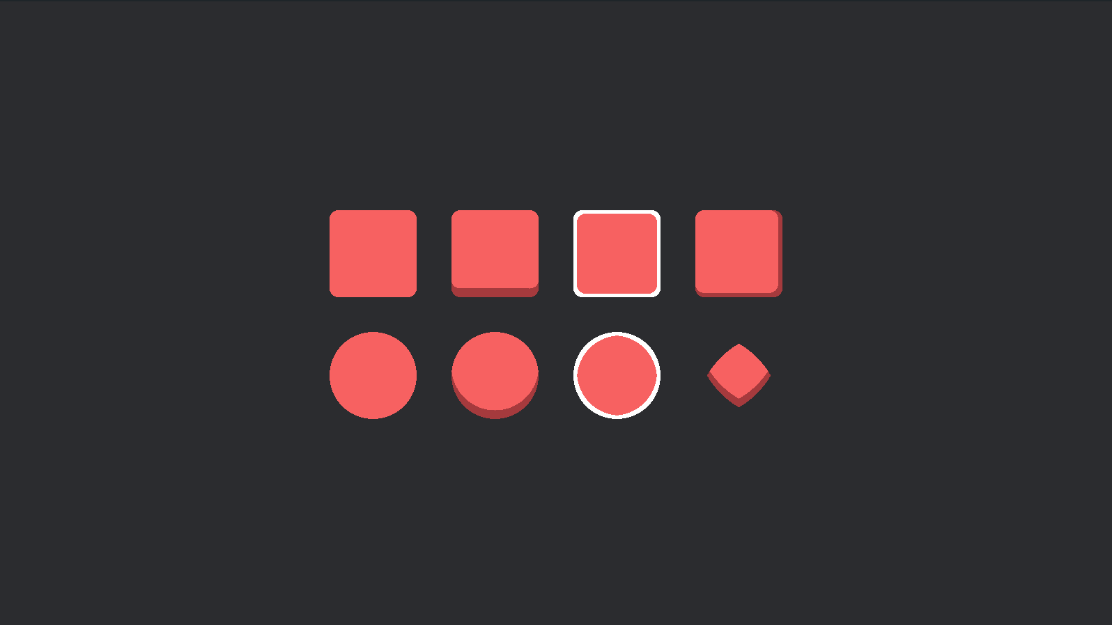
circle shape. The [shapes](https://github.com/robertdodd/bevy_round_ui/blob/master/examples/shapes.rs) example shows a
number of possible shapes.
## Basic Usage
1. Add the `RoundUiPlugin` to the app.
2. Create a `RoundUiMaterial` material.
3. Spawn a regular `MaterialNodeBundle` using the material.
> **IMPORTANT:** The `RoundUiMaterial` must have the same size as the node. For flexible layouts, see the
> [Auto Size](#auto-size) section below.
```rust
use bevy::prelude::*;
use bevy_round_ui::prelude::*;
fn main() {
App::new()
.add_plugins((DefaultPlugins, RoundUiPlugin))
.add_systems(Startup, setup)
.run();
}
fn setup(mut commands: Commands, mut materials: ResMut<Assets<RoundUiMaterial>>) {
commands.spawn(Camera2dBundle::default());
let panel_width = 200.0;
let panel_height = 200.0;
commands.spawn(MaterialNodeBundle {
material: materials.add(RoundUiMaterial {
background_color: Color::hex("#F76161").unwrap().into(),
border_color: Color::hex("#A53A3D").unwrap().into(),
border_radius: RoundUiBorder::all(20.0).into(),
offset: RoundUiOffset::bottom(10.0).into(),
size: Vec2::new(panel_width, panel_height),
}),
style: Style {
width: Val::Px(panel_width),
height: Val::Px(panel_height),
..default()
},
..default()
});
}
```
## Auto Size
The `autosize` Cargo feature (enabled by default) adds support for auto-sizing material nodes in various ways.

The following components are available to enable auto-sizing in various ways:
`RoundUiAutosizeMaterial`
Updates the material to match the size of the node. Use this in flexible layouts where nodes don't have a fixed size.
> **IMPORTANT:** This requires a unique material asset for each node. This means you can't re-use a
> `Handle<RoundUiMaterial>` among multiple nodes.
`RoundUiAutosizeNodePadding`
Update the node padding to match the border-radius and offset of the material. This is typically used when you have
text or other content inside a material node and don't want it pressed against the edges, or, like in the `buttons`
example, when the material might change, and you want the padding to automatically adjust.
`RoundUiAutosizeNode`
Update the size of the node to match the size of the material. Typically used then you are
re-using a `Handle<RoundUiMaterial>` and need all nodes to have the same size.
**Usage in Examples:**
- `buttons` - This example uses `RoundUiAutosizeNode` and `RoundUiAutosizeNodePadding` to make sure that all button
nodes have the size and padding of their current material. All buttons use the same `Handle<RoundUiMaterial>` so
this is important to prevent them from appearing "stretched". Notice how the padding changes automatically when
clicking a button.
- `autosize` - This example uses `RoundUiAutosizeMaterial` and `RoundUiAutosizeNodePadding` to automatically update
the material size when the node size changes.
## Shapes
The [shapes](https://github.com/robertdodd/bevy_round_ui/blob/master/examples/shapes.rs) example demonstrates a number
of possible shapes.
> NOTE: Bordered circles are not perfect.
## Compatible Bevy versions
| `0.1` | `0.12` |
## License
Dual-licensed under either of
- Apache License, Version 2.0,
([LICENSE-APACHE](https://github.com/robertdodd/bevy_round_ui/blob/master/LICENSE-APACHE) or
https://www.apache.org/licenses/LICENSE-2.0)
- MIT license ([LICENSE-MIT](https://github.com/robertdodd/bevy_round_ui/blob/master/LICENSE-MIT) or
https://opensource.org/licenses/MIT)
at your option.
## Contribution
Unless you explicitly state otherwise, any contribution intentionally submitted for inclusion in the work by you, as
defined in the Apache-2.0 license, shall be dual licensed as above, without any additional terms or conditions.