# bevy_material_ui
[](https://github.com/edgarhsanchez/bevy_material_ui/actions/workflows/ci.yml)
[](https://crates.io/crates/bevy_material_ui)
[](https://docs.rs/bevy_material_ui)
[](https://deps.rs/repo/github/edgarhsanchez/bevy_material_ui)
[](LICENSE)
[](https://youtu.be/l7PdTGuuqLU)
A Material Design 3 UI library for Bevy.
## Installation
```toml
[dependencies]
bevy_material_ui = "0.1"
```
## Documentation
- Documentation index: [docs/README.md](docs/README.md)
- Developer guide: [docs/DEVELOPER_GUIDE.md](docs/DEVELOPER_GUIDE.md)
- Component docs: [docs/components/](docs/components/)
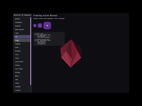
- Run the interactive showcase: `cargo run --example showcase`
## Features
- **Material Design 3 Components**: Buttons, FABs, Cards, Checkboxes, Switches, Radio Buttons, Sliders, Text Fields, Dialogs, Lists, Menus, Tabs, Progress Indicators, and more
- **Date/Time Picker**: Material-style date and time picker component (see the showcase for an end-to-end example)
- **Material Symbols Icons**: Full support for [Material Symbols](https://fonts.google.com/icons) icon font with 3,000+ scalable icons
- **Theming**: Dynamic color system with light/dark mode support
- **Animations**: Motion system following MD3 guidelines
- **Accessibility**: Proper touch targets and focus handling
## Material Symbols Icons
This library includes the Material Symbols Outlined variable font from Google. The font is automatically loaded when you add the `MaterialUiPlugin`.
### Using Icons
```rust
use bevy::prelude::*;
use bevy_material_ui::prelude::*;
fn spawn_icon(mut commands: Commands, icon_font: Res<MaterialIconFont>) {
// Spawn a home icon
commands.spawn((
Text::new(MaterialIcon::home().as_str()),
TextFont {
font: icon_font.0.clone(),
font_size: 24.0,
..default()
},
TextColor(Color::WHITE),
));
}
```
### Available Icons
Common icons are available as methods on `MaterialIcon`:
- Navigation: `home()`, `menu()`, `arrow_back()`, `close()`, `check()`
- Actions: `add()`, `delete()`, `edit()`, `save()`, `search()`, `settings()`
- Toggle: `checkbox_checked()`, `radio_checked()`, `star()`, `favorite()`
- Media: `play_arrow()`, `pause()`, `volume_up()`, `skip_next()`
- And many more...
Or use any icon codepoint directly:
```rust
use bevy_material_ui::icons::ICON_SETTINGS;
let icon = MaterialIcon::new(ICON_SETTINGS);
```
For the complete list of icons, see [Material Symbols](https://fonts.google.com/icons).
## License
This library is licensed under MIT.
The Material Symbols font is licensed under the Apache License 2.0 by Google.
See `assets/fonts/LICENSE` for details.
## Releases (semantic versioning)
Publishing to crates.io is automated via GitHub Actions and uses tags of the form `vMAJOR.MINOR.PATCH`.
1. Update `version` in `Cargo.toml`.
2. Commit and push to `main`.
3. Create and push a tag like `v0.1.1`.
The workflow in [.github/workflows/publish.yml](.github/workflows/publish.yml) verifies the tag matches `Cargo.toml` and then runs `cargo publish`.