
bevy_material_ui


A Material Design 3 UI library for Bevy.
Installation
[]
= "0.1"
Documentation
- Documentation index: docs/README.md
- Developer guide: docs/DEVELOPER_GUIDE.md
- Component docs: docs/components/
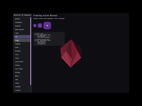
- Run the interactive showcase:
cargo run --example showcase
Features
- Material Design 3 Components: Buttons, FABs, Cards, Checkboxes, Switches, Radio Buttons, Sliders, Text Fields, Dialogs, Lists, Menus, Tabs, Progress Indicators, and more
- Date/Time Picker: Material-style date and time picker component (see the showcase for an end-to-end example)
- Material Symbols Icons: Full support for Material Symbols icon font with 3,000+ scalable icons
- Theming: Dynamic color system with light/dark mode support
- Animations: Motion system following MD3 guidelines
- Accessibility: Proper touch targets and focus handling
Material Symbols Icons
This library includes the Material Symbols Outlined variable font from Google. The font is automatically loaded when you add the MaterialUiPlugin.
Using Icons
use *;
use *;
Available Icons
Common icons are available as methods on MaterialIcon:
- Navigation:
home(),menu(),arrow_back(),close(),check() - Actions:
add(),delete(),edit(),save(),search(),settings() - Toggle:
checkbox_checked(),radio_checked(),star(),favorite() - Media:
play_arrow(),pause(),volume_up(),skip_next() - And many more...
Or use any icon codepoint directly:
use ICON_SETTINGS;
let icon = new;
For the complete list of icons, see Material Symbols.
License
This library is licensed under MIT.
The Material Symbols font is licensed under the Apache License 2.0 by Google.
See assets/fonts/LICENSE for details.
Releases (semantic versioning)
Publishing to crates.io is automated via GitHub Actions and uses tags of the form vMAJOR.MINOR.PATCH.
- Update
versioninCargo.toml. - Commit and push to
main. - Create and push a tag like
v0.1.1.
The workflow in .github/workflows/publish.yml verifies the tag matches Cargo.toml and then runs cargo publish.