pub struct Checkbox<'a, Message, Theme = Theme, Renderer = Renderer>{ /* private fields */ }Expand description
A box that can be checked.
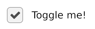
§Example
use iced::widget::checkbox;

struct State {
   is_checked: bool,
}

enum Message {
    CheckboxToggled(bool),
}

fn view(state: &State) -> Element<'_, Message> {
    checkbox(state.is_checked)
        .label("Toggle me!")
        .on_toggle(Message::CheckboxToggled)
        .into()
}

fn update(state: &mut State, message: Message) {
    match message {
        Message::CheckboxToggled(is_checked) => {
            state.is_checked = is_checked;
        }
    }
}
Implementations§
Source§impl<'a, Message, Theme, Renderer> Checkbox<'a, Message, Theme, Renderer>
impl<'a, Message, Theme, Renderer> Checkbox<'a, Message, Theme, Renderer>
Sourcepub fn label(self, label: impl IntoFragment<'a>) -> Self
pub fn label(self, label: impl IntoFragment<'a>) -> Self
Sets the label of the Checkbox.
Sourcepub fn on_toggle_maybe<F>(self, f: Option<F>) -> Self
pub fn on_toggle_maybe<F>(self, f: Option<F>) -> Self
Sets the function that will be called when the Checkbox is toggled,
if Some.
If None, the checkbox will be disabled.
Sourcepub fn spacing(self, spacing: impl Into<Pixels>) -> Self
pub fn spacing(self, spacing: impl Into<Pixels>) -> Self
Sets the spacing between the Checkbox and the text.
Sourcepub fn text_size(self, text_size: impl Into<Pixels>) -> Self
pub fn text_size(self, text_size: impl Into<Pixels>) -> Self
Sets the text size of the Checkbox.
Sourcepub fn line_height(self, line_height: impl Into<LineHeight>) -> Self
pub fn line_height(self, line_height: impl Into<LineHeight>) -> Self
Sets the text text::LineHeight of the Checkbox.
Sourcepub fn shaping(self, shaping: Shaping) -> Self
pub fn shaping(self, shaping: Shaping) -> Self
Sets the text::Shaping strategy of the Checkbox.
Sourcepub fn wrapping(self, wrapping: Wrapping) -> Self
pub fn wrapping(self, wrapping: Wrapping) -> Self
Sets the text::Wrapping strategy of the Checkbox.
Sourcepub fn font(self, font: impl Into<Renderer::Font>) -> Self
pub fn font(self, font: impl Into<Renderer::Font>) -> Self
Sets the Renderer::Font of the text of the Checkbox.
Trait Implementations§
Source§impl<'a, Message, Theme, Renderer> From<Checkbox<'a, Message, Theme, Renderer>> for Element<'a, Message, Theme, Renderer>
impl<'a, Message, Theme, Renderer> From<Checkbox<'a, Message, Theme, Renderer>> for Element<'a, Message, Theme, Renderer>
Source§impl<Message, Theme, Renderer> Widget<Message, Theme, Renderer> for Checkbox<'_, Message, Theme, Renderer>
impl<Message, Theme, Renderer> Widget<Message, Theme, Renderer> for Checkbox<'_, Message, Theme, Renderer>
Source§fn update(
&mut self,
tree: &mut Tree,
event: &Event,
layout: Layout<'_>,
cursor: Cursor,
_renderer: &Renderer,
shell: &mut Shell<'_, Message>,
_viewport: &Rectangle,
)
fn update( &mut self, tree: &mut Tree, event: &Event, layout: Layout<'_>, cursor: Cursor, _renderer: &Renderer, shell: &mut Shell<'_, Message>, _viewport: &Rectangle, )
Source§fn mouse_interaction(
&self,
_tree: &Tree,
layout: Layout<'_>,
cursor: Cursor,
_viewport: &Rectangle,
_renderer: &Renderer,
) -> Interaction
fn mouse_interaction( &self, _tree: &Tree, layout: Layout<'_>, cursor: Cursor, _viewport: &Rectangle, _renderer: &Renderer, ) -> Interaction
Source§fn draw(
&self,
tree: &Tree,
renderer: &mut Renderer,
theme: &Theme,
defaults: &Style,
layout: Layout<'_>,
_cursor: Cursor,
viewport: &Rectangle,
)
fn draw( &self, tree: &Tree, renderer: &mut Renderer, theme: &Theme, defaults: &Style, layout: Layout<'_>, _cursor: Cursor, viewport: &Rectangle, )
Draws the
Widget using the associated Renderer.Auto Trait Implementations§
impl<'a, Message, Theme, Renderer> Freeze for Checkbox<'a, Message, Theme, Renderer>
impl<'a, Message, Theme = Theme, Renderer = Renderer> !RefUnwindSafe for Checkbox<'a, Message, Theme, Renderer>
impl<'a, Message, Theme = Theme, Renderer = Renderer> !Send for Checkbox<'a, Message, Theme, Renderer>
impl<'a, Message, Theme = Theme, Renderer = Renderer> !Sync for Checkbox<'a, Message, Theme, Renderer>
impl<'a, Message, Theme, Renderer> Unpin for Checkbox<'a, Message, Theme, Renderer>
impl<'a, Message, Theme, Renderer> UnsafeUnpin for Checkbox<'a, Message, Theme, Renderer>
impl<'a, Message, Theme = Theme, Renderer = Renderer> !UnwindSafe for Checkbox<'a, Message, Theme, Renderer>
Blanket Implementations§
Source§impl<T> BorrowMut<T> for Twhere
T: ?Sized,
impl<T> BorrowMut<T> for Twhere
T: ?Sized,
Source§fn borrow_mut(&mut self) -> &mut T
fn borrow_mut(&mut self) -> &mut T
Mutably borrows from an owned value. Read more