pub struct Ui;Expand description
This class is a collection of user interface and interaction methods! StereoKit uses an Immediate Mode GUI system, which can be very easy to work with and modify during runtime.
You must call the UI method every frame you wish it to be available, and if you no longer want it to be present, you simply stop calling it! The id of the element is used to track its state from frame to frame, so for elements with state, you’ll want to avoid changing the id during runtime! Ids are also scoped per-window, so different windows can re-use the same id, but a window cannot use the same id twice. https://stereokit.net/Pages/StereoKit/UI.html
§Examples
use stereokit_rust::{ui::{Ui,UiBtnLayout}, maths::{Vec2, Vec3, Pose}, sprite::Sprite};
let mut window_pose = Pose::new(
[0.01, 0.09, 0.88], Some([0.0, 185.0, 0.0].into()));
let (mut choice, mut doubt, mut scaling) = ("C", false, 0.5);
let (on, off) = (Sprite::radio_on(), Sprite::radio_off());
let exit_sprite = Sprite::from_file("textures/exit.jpeg", None, None)
.expect("exit.jpeg should be ok");
filename_scr = "screenshots/ui.jpeg";
test_screenshot!( // !!!! Get a proper main loop !!!!
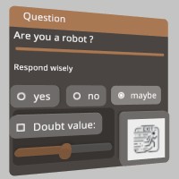
Ui::window_begin("Question", &mut window_pose, None, None, None);
Ui::text("Are you a robot ?", None, None, None, Some(0.13), None, None);
Ui::hseparator();
Ui::label("Respond wisely", Some([0.08, 0.03].into()), false);
if Ui::radio_img("yes", choice == "A", &off, &on, UiBtnLayout::Left, None) {
choice = "A"; scaling = 0.0;
}
Ui::same_line();
if Ui::radio_img("no", choice == "B", &off, &on, UiBtnLayout::Left, None){
choice = "B"; scaling = 1.0;
}
Ui::same_line();
if Ui::radio_img("maybe", choice == "C", &off, &on, UiBtnLayout::Left, None) {
choice = "C"; scaling = 0.5;
}
Ui::panel_begin(None);
Ui::toggle("Doubt value:", &mut doubt, None);
Ui::push_enabled(doubt, None);
Ui::hslider("scaling", &mut scaling, 0.0, 1.0,Some(0.05), Some(0.14), None, None);
Ui::pop_enabled();
Ui::panel_end();
Ui::same_line();
if Ui::button_img("Exit", &exit_sprite, Some(UiBtnLayout::CenterNoText),
Some(Vec2::new(0.08, 0.08)), None) {
sk.quit(None);
}
Ui::window_end();
);
Implementations§
Source§impl Ui
impl Ui
Sourcepub fn color_scheme(color: impl Into<Color128>)
pub fn color_scheme(color: impl Into<Color128>)
StereoKit will generate a color palette from this gamma space color, and use it to skin the UI! To explicitly adjust individual theme colors, see Ui::set_theme_color. https://stereokit.net/Pages/StereoKit/UI/ColorScheme.html
see also ui_set_color Ui::set_theme_color
§Examples
use stereokit_rust::{ui::Ui, maths::{Vec2, Vec3, Pose}, util::named_colors};
let mut window_pose = Pose::new(
[0.01, 0.035, 0.92], Some([0.0, 185.0, 0.0].into()));
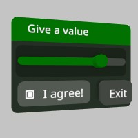
Ui::color_scheme(named_colors::GREEN);
let mut agree = true;
let mut scaling = 0.75;
filename_scr = "screenshots/ui_color_scheme.jpeg";
test_screenshot!( // !!!! Get a proper main loop !!!!
Ui::window_begin("Give a value", &mut window_pose, None, None, None);
Ui::panel_begin(None);
Ui::hslider("scaling", &mut scaling, 0.0, 1.0, Some(0.05), Some(0.14), None, None);
Ui::panel_end();
Ui::toggle("I agree!",&mut agree, None);
Ui::same_line();
if Ui::button("Exit", None) {
sk.quit(None);
}
Ui::window_end();
);
Sourcepub fn enable_far_interact(enable: bool)
pub fn enable_far_interact(enable: bool)
Enables or disables the far ray grab interaction for Handle elements like the Windows. It can be enabled and disabled for individual UI elements, and if this remains disabled at the start of the next frame, then the hand ray indicators will not be visible. This is enabled by default. https://stereokit.net/Pages/StereoKit/UI/EnableFarInteract.html
see also ui_enable_far_interact Ui::get_enable_far_interact
§Examples
use stereokit_rust::ui::Ui;

assert_eq!(Ui::get_enable_far_interact(), true);

Ui::enable_far_interact(false);
assert_eq!(Ui::get_enable_far_interact(), false);Sourcepub fn settings(settings: UiSettings)
pub fn settings(settings: UiSettings)
UI sizing and layout settings. https://stereokit.net/Pages/StereoKit/UI/Settings.html
see also ui_settings Ui::get_settings
§Examples
use stereokit_rust::ui::{Ui, UiSettings};

let settings = Ui::get_settings();
assert_eq!(settings.margin, 0.010000001);
assert_eq!(settings.padding, 0.010000001);
assert_eq!(settings.gutter, 0.010000001);
assert_eq!(settings.depth, 0.010000001);
assert_eq!(settings.rounding, 0.0075000003);
assert_eq!(settings.backplate_depth, 0.4);
assert_eq!(settings.backplate_border, 0.0005);
assert_eq!(settings.separator_scale, 0.4);

let new_settings = UiSettings {
    margin: 0.005,
    padding: 0.005,
    gutter: 0.005,
    depth: 0.015,
    rounding: 0.004,
    backplate_depth: 0.6,
    backplate_border: 0.002,
    separator_scale: 0.6,
};
Ui::settings(new_settings);
let settings = Ui::get_settings();
assert_eq!(settings.margin, 0.005);
assert_eq!(settings.padding, 0.005);
assert_eq!(settings.gutter, 0.005);
assert_eq!(settings.depth, 0.015);
assert_eq!(settings.rounding, 0.004);
assert_eq!(settings.backplate_depth, 0.6);
assert_eq!(settings.backplate_border, 0.002);
assert_eq!(settings.separator_scale, 0.6);Sourcepub fn show_volumes(show: bool)
pub fn show_volumes(show: bool)
Shows or hides the collision volumes of the UI! This is for debug purposes, and can help identify visible and invisible collision issues. https://stereokit.net/Pages/StereoKit/UI/ui_show_volumes.html
see also ui_show_volumes
§Examples
use stereokit_rust::ui::Ui;

Ui::show_volumes(true);
Sourcepub fn system_move_type(move_type: UiMove)
pub fn system_move_type(move_type: UiMove)
This is the UiMove that is provided to UI windows that StereoKit itself manages, such as the fallback filepicker and soft keyboard. https://stereokit.net/Pages/StereoKit/UI/SystemMoveType.html
see also ui_system_set_move_type Ui::get_system_move_type
§Examples
use stereokit_rust::ui::{Ui, UiMove};

assert_eq!(Ui::get_system_move_type(), UiMove::FaceUser);

Ui::system_move_type(UiMove::Exact);
assert_eq!(Ui::get_system_move_type(), UiMove::Exact);A pressable button! A button will expand to fit the text provided to it, vertically and horizontally. Text is re-used as the id. Will return true only on the first frame it is pressed! https://stereokit.net/Pages/StereoKit/UI/Button.html
text- Text to display on the button and id for tracking element state. MUST be unique within current hierarchy.size- The layout size for this element in Hierarchy space. If an axis is left as zero, it will be auto-calculated. For X this is the remaining width of the current layout, and for Y this is Ui::get_line_height.
Returns true if the button was pressed this frame.
see also ui_button ui_button_sz Ui::button_at Ui::button_behavior
§Examples
use stereokit_rust::{ui::Ui, maths::{Vec2, Vec3, Pose}};
let mut window_pose = Pose::new(
[0.01, 0.035, 0.92], Some([0.0, 185.0, 0.0].into()));
let mut button = 0;
filename_scr = "screenshots/ui_button.jpeg";
test_screenshot!( // !!!! Get a proper main loop !!!!
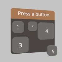
Ui::window_begin("Press a button", &mut window_pose, None, None, None);
if Ui::button("1", None) {button = 1}
Ui::same_line();
if Ui::button("2", Some([0.025, 0.025].into())) {button = 2}
if Ui::button("3", Some([0.04, 0.04].into())) {button = 3}
if Ui::button_at("4", [-0.01, -0.01, 0.005],[0.05, 0.05]) {button = 4}
if Ui::button_at("5", [-0.04, -0.08, 0.005],[0.03, 0.03]) {button = 5}
Ui::window_end();
);
A variant of Ui::button that doesn’t use the layout system, and instead goes exactly where you put it. https://stereokit.net/Pages/StereoKit/UI/ButtonAt.html
text- Text to display on the button and id for tracking element state. MUST be unique within currenttop_left_corner- This is the top left corner of the UI element relative to the current Hierarchy. hierarchy.size- The layout size for this element in Hierarchy space.
Returns true if the button was pressed this frame.
see also ui_button_at Ui::button_behavior
see example in Ui::button
This is the core functionality of StereoKit’s buttons, without any of the rendering parts! If you’re trying to create your own pressable UI elements, or do more extreme customization of the look and feel of UI elements, then this function will provide a lot of complex pressing functionality for you! https://stereokit.net/Pages/StereoKit/UI/ButtonBehavior.html
window_relative_pos- The layout position of the pressable area.size- The size of the pressable area.id- The id for this pressable element to track its state with.out_finger_offset- This is the current distance of the finger, within the pressable volume, from the bottom of the button.out_button_state- This is the current frame’s “active” state for the button.out_focus_state- This is the current frame’s “focus” state for the button.out_hand- Id of the hand that interacted with the button. This will be -1 if no interaction has occurred.
see also ui_button_behavior Ui::button_behavior_depth
§Examples
use stereokit_rust::{ui::Ui, maths::{Vec2, Vec3, Pose}, system::BtnState};

let mut window_pose = Pose::new(
    [0.01, 0.035, 0.92], Some([0.0, 185.0, 0.0].into()));

let mut out_button_state = BtnState::empty();
let mut out_focus_state = BtnState::empty();
let mut out_finger_offset = 0.0;
filename_scr = "screenshots/ui_button_behavior.jpeg";
test_steps!( // !!!! Get a proper main loop !!!!
    Ui::window_begin("I'm a button", &mut window_pose, None, None, None);
    Ui::button_behavior([0.0, 0.0, 0.005],[0.05, 0.05], "Button1",
                        &mut out_finger_offset, &mut out_button_state,
                        &mut out_focus_state, None);
    if out_button_state.is_just_inactive() {
       println!("Button1 pressed");
    }
    Ui::window_end();
);This is the core functionality of StereoKit’s buttons, without any of the rendering parts! If you’re trying to create your own pressable UI elements, or do more extreme customization of the look and feel of UI elements, then this function will provide a lot of complex pressing functionality for you! This overload allows for customizing the depth of the button, which otherwise would use UiSettings.depth for its values. https://stereokit.net/Pages/StereoKit/UI/ButtonBehavior.html
- hand - Id of the hand that interacted with the button. This will be -1 if no interaction has occurred.
see also ui_button_behavior_depth
window_relative_pos- The layout position of the pressable area.size- The size of the pressable area.id- The id for this pressable element to track its state with.button_depth- This is the z axis depth of the pressable area.button_activation_depth- This is the current distance of the finger, within the pressable volume, from the bottom of the button.out_finger_offset- This is the current distance of the finger, within the pressable volume, from the bottom of the button.out_button_state- This is the current frame’s “active” state for the button.out_focus_state- This is the current frame’s “focus” state for the button.
see also ui_button_behavior_depth Ui::button_behavior
§Examples
use stereokit_rust::{ui::Ui, maths::{Vec2, Vec3, Pose}, system::BtnState};

let mut window_pose = Pose::new(
    [0.01, 0.035, 0.92], Some([0.0, 185.0, 0.0].into()));

let mut out_button_state = BtnState::empty();
let mut out_focus_state = BtnState::empty();
let mut out_finger_offset = 0.0;
test_steps!( // !!!! Get a proper main loop !!!!
    Ui::window_begin("I'm a button", &mut window_pose, None, None, None);
    Ui::button_behavior_depth([0.0, 0.0, 0.005],[0.05, 0.05], "Button1", 0.01, 0.005,
                        &mut out_finger_offset, &mut out_button_state,
                        &mut out_focus_state, None);
    if out_button_state.is_just_inactive() {
       println!("Button1 pressed");
    }
    Ui::window_end();
);Sourcepub fn slider_behavior(
window_relative_pos: impl Into<Vec3>,
size: impl Into<Vec2>,
id: IdHashT,
value: &mut Vec2,
min: impl Into<Vec2>,
max: impl Into<Vec2>,
button_size_visual: impl Into<Vec2>,
button_size_interact: impl Into<Vec2>,
confirm_method: Option<UiConfirm>,
data: &mut UiSliderData,
)
pub fn slider_behavior( window_relative_pos: impl Into<Vec3>, size: impl Into<Vec2>, id: IdHashT, value: &mut Vec2, min: impl Into<Vec2>, max: impl Into<Vec2>, button_size_visual: impl Into<Vec2>, button_size_interact: impl Into<Vec2>, confirm_method: Option<UiConfirm>, data: &mut UiSliderData, )
This is the core functionality of StereoKit’s slider elements, without any of the rendering parts! If you’re trying to create your own sliding UI elements, or do more extreme customization of the look and feel of slider UI elements, then this function will provide a lot of complex pressing functionality for you https://stereokit.net/Pages/StereoKit/UI/SliderBehavior.html
window_relative_pos- The layout position of the pressable area.size- The size of the pressable area.id- The id for this pressable element to track its state with.value- The value that the slider will store slider state in.min- The minimum value the slider can set, left side of the slider.max- The maximum value the slider can set, right side of the slider.button_size_visual- This is the visual size of the element representing the touchable area of the slider. This is used to calculate the center of the button’s placement without going outside the provided bounds.button_size_interact- The size of the interactive touch element of the slider. Set this to zero to use the entire area as a touchable surface.confirm_method- How should the slider be activated? Default Push will be a push-button the user must press first, and pinch will be a tab that the user must pinch and drag around.data- This is data about the slider interaction, you can use this for visualizing the slider behavior, or reacting to its events.
see also ui_slider_behavior
§Examples
use stereokit_rust::{ui::{Ui, UiSliderData, UiVisual}, maths::{Vec2, Vec3, Pose},
system::BtnState};
let mut window_pose = Pose::new(
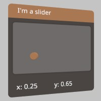
[0.01, 0.07, 0.90], Some([0.0, 185.0, 0.0].into()));
let depth = Ui::get_settings().depth;
let size = Vec2::new(0.18, 0.11);
let btn_height = Ui::get_line_height() * 0.5;
let btn_size = Vec3::new(btn_height, btn_height, depth);
let mut slider_pt = Vec2::new(0.25, 0.65);
let id_slider = "touch panel";
let id_slider_hash = Ui::stack_hash(&id_slider);
filename_scr = "screenshots/ui_slider_behavior.jpeg";
test_screenshot!( // !!!! Get a proper main loop !!!!
let prev = slider_pt;
let mut slider = UiSliderData::default();
Ui::window_begin("I'm a slider", &mut window_pose, None, None, None);
let bounds = Ui::layout_reserve(size, false, depth);
let tlb = bounds.tlb();
Ui::slider_behavior(tlb , bounds.dimensions.xy(), id_slider_hash, &mut slider_pt,
Vec2::ZERO, Vec2::ONE, Vec2::ZERO, btn_size.xy(), None, &mut slider);
let focus = Ui::get_anim_focus(id_slider_hash, slider.focus_state, slider.active_state);
Ui::draw_element(UiVisual::SliderLine, None,tlb,
Vec3::new(bounds.dimensions.x, bounds.dimensions.y, depth * 0.1),
if slider.focus_state.is_active() { 0.5 } else { 0.0 });
Ui::draw_element(UiVisual::SliderPush, None,
slider.button_center.xy0() + btn_size.xy0() / 2.0, btn_size, focus);
if slider.active_state.is_just_inactive() {
println!("Slider1 moved");
}
Ui::label(format!("x: {:.2} y: {:.2}", slider_pt.x, slider_pt.y), None, true);
Ui::window_end();
);
A pressable button accompanied by an image! The button will expand to fit the text provided to it, horizontally. Text is re-used as the id. Will return true only on the first frame it is pressed! https://stereokit.net/Pages/StereoKit/UI/ButtonImg.html
text- Text to display on the button and id for tracking element state. MUST be unique within current hierarchy.image- This is the image that will be drawn along with the text. See imageLayout for where the image gets drawn!image_layout- This enum specifies how the text and image should be laid out on the button. For example, UiBtnLayout::Left will have the image on the left, and text on the right. If None will have default value of UiBtnLayout::Leftsize- The layout size for this element in Hierarchy space. If an axis is left as zero, it will be auto-calculated. For X this is the remaining width of the current layout, and for Y this is Ui::get_line_height.color- The Sprite’s color will be multiplied by this tint. None will have default value of white.
Returns true only on the first frame it is pressed!
see also ui_button_img ui_button_img_sz Ui::button_img_at
§Examples
use stereokit_rust::{ui::{Ui,UiBtnLayout}, maths::{Vec2, Vec3, Pose},
                     sprite::Sprite, util::named_colors};

let mut window_pose = Pose::new(
    [-0.01, 0.095, 0.88], Some([0.0, 185.0, 0.0].into()));

let mut choice = "C";
let log_sprite = Sprite::from_file("icons/log_viewer.png", None, None)
                              .expect("log_viewer.jpeg should be ok");
let scr_sprite = Sprite::from_file("icons/screenshot.png", None, None)
                              .expect("screenshot.jpeg should be ok");
let app_sprite = Sprite::grid();

let fly_sprite = Sprite::from_file("icons/fly_over.png", None, None)
                              .expect("fly_over.jpeg should be ok");
let close_sprite = Sprite::close();

filename_scr = "screenshots/ui_button_img.jpeg";
test_screenshot!( // !!!! Get a proper main loop !!!!
    Ui::window_begin("Choose a pretty image", &mut window_pose, None, None, None);
    if Ui::button_img("Log", &log_sprite, Some(UiBtnLayout::Center),
                      Some([0.07, 0.07].into()), Some(named_colors::GOLD.into())) {
        choice = "A";
    }
    if Ui::button_img("screenshot", &scr_sprite, Some(UiBtnLayout::CenterNoText),
                      Some([0.07, 0.07].into()), None){
        choice = "B";
    }
    if Ui::button_img("Applications", &app_sprite, Some(UiBtnLayout::Right),
                      Some([0.17, 0.04].into()), None) {
        choice = "C";
    }
    if Ui::button_img_at("fly", &fly_sprite, Some(UiBtnLayout::CenterNoText),
                         [-0.01, -0.04, 0.0], [0.12, 0.12], Some(named_colors::CYAN.into())) {
        choice = "D";
    }
    if Ui::button_img_at("close", &close_sprite, Some(UiBtnLayout::CenterNoText),
                        [-0.08, 0.03, 0.0], [0.05, 0.05], None) {
        sk.quit(None);
    }
    Ui::window_end();
);
A variant of UI::button_img that doesn’t use the layout system, and instead goes exactly where you put it. https://stereokit.net/Pages/StereoKit/UI/ButtonImgAt.html
text- Text to display on the button and id for tracking element state. MUST be unique within current hierarchy.image- This is the image that will be drawn along with the text. See imageLayout for where the image gets drawn!image_layout- This enum specifies how the text and image should be laid out on the button. For example, UiBtnLayout::Left will have the image on the left, and text on the right. If None will have default value of UiBtnLayout::Lefttop_left_corner- This is the top left corner of the UI element relative to the current Hierarchy.size- The layout size for this element in Hierarchy space.color- The Sprite’s color will be multiplied by this tint. None will have default value of white.
Returns true only on the first frame it is pressed!
see also ui_button_img_at
see example in Ui::button_img
A pressable round button! This button has a square layout,Add commentMore actions and only shows an image, no text. Will return true only on the first frame it is pressed! https://stereokit.net/Pages/StereoKit/UI/ButtonRound.html
id- An id for tracking element state. MUST be unique within current hierarchy. hierarchy.image- An image to display as the face of the button.diameter- The diameter of the button’s visual. ThisAdd commentMore actions defaults to the line height.
Returns true only on the first frame it is pressed!
see also ui_button_round Ui::button_round_at
§Examples
use stereokit_rust::{ui::Ui, maths::{Vec2, Vec3, Pose}, sprite::Sprite};

let mut window_pose = Pose::new(
    [0.01, 0.035, 0.92], Some([0.0, 185.0, 0.0].into()));

let mut button = 0;
let close_sprite = Sprite::close();
let shift_sprite = Sprite::shift();
let list_sprite = Sprite::list();
let backspace_sprite = Sprite::backspace();

filename_scr = "screenshots/ui_button_round.jpeg";
test_screenshot!( // !!!! Get a proper main loop !!!!
    Ui::window_begin("Press a round button", &mut window_pose, None, None, None);
    if Ui::button_round("1", &close_sprite, 0.07) {button = 1}
    Ui::same_line();
    if Ui::button_round("2", &shift_sprite, 0.05) {button = 2}
    if Ui::button_round_at("3", &list_sprite, [-0.04, 0.04, 0.005], 0.03) {button = 3}
    if Ui::button_round_at("4", &backspace_sprite, [-0.04, -0.08, 0.005], 0.04) {button = 4}
    Ui::window_end();
);
A variant of Ui::button_round that doesn’t use the layout system, and instead goes exactly where you put it. https://stereokit.net/Pages/StereoKit/UI/ButtonRoundAt.html
id- An id for tracking element state. MUST be unique within current hierarchy. hierarchy.image- An image to display as the face of the button.top_left_corner- This is the top left corner of the UI element relative to the current Hierarchy.diameter- The diameter of the button’s visual.
Returns true only on the first frame it is pressed!
see also ui_button_round_at
see example in Ui::button_round
Sourcepub fn handle(
id: impl AsRef<str>,
pose: &mut Pose,
handle: Bounds,
draw_handle: bool,
move_type: Option<UiMove>,
allower_gesture: Option<UiGesture>,
) -> bool
pub fn handle( id: impl AsRef<str>, pose: &mut Pose, handle: Bounds, draw_handle: bool, move_type: Option<UiMove>, allower_gesture: Option<UiGesture>, ) -> bool
This begins and ends a handle so you can just use its grabbable/moveable functionality! Behaves much like a window, except with a more flexible handle, and no header. You can draw the handle, but it will have no text on it. Returns true for every frame the user is grabbing the handle. https://stereokit.net/Pages/StereoKit/UI/Handle.html
id- An id for tracking element state. MUST be unique within current hierarchy.pose- The pose state for the handle! The user will be able to grab this handle and move it around. The pose is relative to the current hierarchy stack.handle- Size and location of the handle, relative to the pose.draw_handle- Should this function draw the handle for you, or will you draw that yourself?move_type- Describes how the handle will move when dragged around. If None, has default value of UiMove::Exactallower_gesture- Which hand gestures are used for interacting with this Handle? If None, has default value of UiGesture::Pinch
Returns true for every frame the user is grabbing the handle.
see also ui_handle_begin ui_handle_end Ui::handle_begin
§Examples
use stereokit_rust::{ui::{Ui, UiMove, UiGesture}, maths::{Vec2, Vec3, Pose, Bounds},
                     material::Material, mesh::Mesh, util::named_colors};

// lets create two handles of the same size:
let mut handle_pose1 = Pose::new(
    [-0.02, -0.035, 0.92], Some([0.0, 145.0, 0.0].into()));
let mut handle_pose2 = Pose::new(
    [0.02, 0.035, 0.92], Some([0.0, 145.0, 0.0].into()));
let handle_bounds = Bounds::new([0.0, 0.0, 0.0], [0.045, 0.045, 0.045]);

let mut material_bound = Material::ui_box();
material_bound.color_tint(named_colors::GOLD)
              .border_size(0.0025);
let cube_bounds  = Mesh::cube();

filename_scr = "screenshots/ui_handle.jpeg";
test_screenshot!( // !!!! Get a proper main loop !!!!
    // Handles are drawn
    Ui::handle("Handle1", &mut handle_pose1, handle_bounds, true,
               Some(UiMove::FaceUser), Some(UiGesture::Pinch));

    // Handles aren't drawn so we draw a cube_bound to show where they are.
    Ui::handle("Handle2", &mut handle_pose2, handle_bounds, false,
               Some(UiMove::PosOnly), Some(UiGesture::PinchGrip));
    cube_bounds.draw(token, &material_bound,
                     handle_pose2.to_matrix(Some(handle_bounds.dimensions)), None, None);
);
Sourcepub fn handle_begin(
id: impl AsRef<str>,
pose: &mut Pose,
handle: Bounds,
draw_handle: bool,
move_type: Option<UiMove>,
allower_gesture: Option<UiGesture>,
) -> bool
pub fn handle_begin( id: impl AsRef<str>, pose: &mut Pose, handle: Bounds, draw_handle: bool, move_type: Option<UiMove>, allower_gesture: Option<UiGesture>, ) -> bool
This begins a new UI group with its own layout! Much like a window, except with a more flexible handle, and no header. You can draw the handle, but it will have no text on it. The pose value is always relative to the current hierarchy stack. This call will also push the pose transform onto the hierarchy stack, so any objects drawn up to the corresponding Ui::handle_end() will get transformed by the handle pose. Returns true for every frame the user is grabbing the handle. https://stereokit.net/Pages/StereoKit/UI/HandleBegin.html
id- An id for tracking element state. MUST be unique within current hierarchy.pose- The pose state for the handle! The user will be able to grab this handle and move it around. The pose is relative to the current hierarchy stack.handle- Size and location of the handle, relative to the pose.draw_handle- Should this function draw the handle for you, or will you draw that yourself?move_type- Describes how the handle will move when dragged around. If None, has default value of UiMove::Exactallower_gesture- Which hand gestures are used for interacting with this Handle? If None, has default value of UiGesture::Pinch
Returns true for every frame the user is grabbing the handle.
see also ui_handle_begin Ui::handle
§Examples
use stereokit_rust::{ui::{Ui, UiMove, UiGesture},
                     maths::{Vec2, Vec3, Pose, Bounds, Matrix},
                     material::Material, mesh::Mesh, util::named_colors, sprite::Sprite};

// lets create two handles of the same size:
let mut handle_pose1 = Pose::new(
    [-0.02, -0.035, 0.92], Some([0.0, 145.0, 0.0].into()));
let mut handle_pose2 = Pose::new(
    [0.02, 0.035, 0.92], Some([0.0, 145.0, 0.0].into()));
let handle_bounds = Bounds::new([0.0, 0.0, 0.0], [0.045, 0.045, 0.045]);

let mut material_bound = Material::ui_box();
material_bound.color_tint(named_colors::GOLD)
              .border_size(0.0025);
let cube_bounds  = Mesh::cube();

let sphere = Mesh::generate_sphere(0.045, None);
let material_sphere = Material::pbr();

filename_scr = "screenshots/ui_handle_begin.jpeg";
test_screenshot!( // !!!! Get a proper main loop !!!!
    // Handles aren't drawn so we draw som cube_bounds to show where they are.
    Ui::handle_begin("Handle1", &mut handle_pose1, handle_bounds, false,
               Some(UiMove::FaceUser), Some(UiGesture::Pinch));
    sphere.draw(token, &material_sphere, Matrix::IDENTITY, None, None);
    cube_bounds.draw(token, &material_bound, Matrix::s(handle_bounds.dimensions), None, None);
    Ui::handle_end();

    Ui::handle_begin("Handle2", &mut handle_pose2, handle_bounds, false,
               Some(UiMove::PosOnly), Some(UiGesture::PinchGrip));
    sphere.draw(token, &material_sphere, Matrix::IDENTITY, None, None);
    cube_bounds.draw(token, &material_bound, Matrix::s(handle_bounds.dimensions), None, None);
    Ui::handle_end();
);
Sourcepub fn handle_end()
pub fn handle_end()
Finishes a handle! Must be called after Ui::handle_begin and all elements have been drawn. Pops the pose
transform pushed by Ui::handle_begin() from the hierarchy stack.
https://stereokit.net/Pages/StereoKit/UI/HandleEnd.html
see also ui_handle_end
see example in Ui::handle_begin
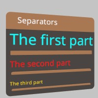
Sourcepub fn hseparator()
pub fn hseparator()
This draws a line horizontally across the current layout. Makes a good separator between sections of UI! https://stereokit.net/Pages/StereoKit/UI/HSeparator.html
see also ui_hseparator
§Examples
use stereokit_rust::{ui::Ui, maths::{Vec2,  Pose}, system::TextStyle,
                     util::named_colors, font::Font};

let mut window_pose = Pose::new(
    [0.01, 0.035, 0.92], Some([0.0, 185.0, 0.0].into()));

let font = Font::default();
let mut style_big    = TextStyle::from_font(&font, 0.002, named_colors::CYAN);
style_big.layout_height(0.018);
let mut style_medium = TextStyle::from_font(&font, 0.002, named_colors::RED);
style_medium.layout_height(0.010);
let mut style_small  = TextStyle::from_font(&font, 0.002, named_colors::GOLD);
style_small.layout_height(0.006);

filename_scr = "screenshots/ui_hseparator.jpeg";
test_screenshot!( // !!!! Get a proper main loop !!!!
    Ui::window_begin("Separators", &mut window_pose, Some([0.17, 0.0].into()), None, None);
    Ui::push_text_style(style_big);
    Ui::text("The first part", None, None, None, None, None, None);
    Ui::hseparator();
    Ui::pop_text_style();
    Ui::push_text_style(style_medium);
    Ui::text("The second part", None, None, None, None, None, None);
    Ui::hseparator();
    Ui::pop_text_style();
    Ui::push_text_style(style_small);
    Ui::text("The third part", None, None, None, None, None, None);
    Ui::hseparator();
    Ui::pop_text_style();
    Ui::window_end();
);
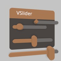
Sourcepub fn hslider(
id: impl AsRef<str>,
out_value: &mut f32,
min: f32,
max: f32,
step: Option<f32>,
width: Option<f32>,
confirm_method: Option<UiConfirm>,
notify_on: Option<UiNotify>,
) -> Option<f32>
pub fn hslider( id: impl AsRef<str>, out_value: &mut f32, min: f32, max: f32, step: Option<f32>, width: Option<f32>, confirm_method: Option<UiConfirm>, notify_on: Option<UiNotify>, ) -> Option<f32>
A vertical slider element! You can stick your finger in it, and slide the value up and down. https://stereokit.net/Pages/StereoKit/UI/HSlider.html
id- An id for tracking element state. MUST be unique within current hierarchy.out_value- The value that the slider will store slider state in.min- The minimum value the slider can set, left side of the slider.max- The maximum value the slider can set, right side of the slider.step- Locks the value to increments of step. Starts at min, and increments by step. None is default 0 and means “don’t lock to increments”.width- Physical width of the slider on the window. None is default 0 will fill the remaining amount of window space.confirm_method- How should the slider be activated? None is default Push will be a push-button the user must press first, and pinch will be a tab that the user must pinch and drag around.notify_on- Allows you to modify the behavior of the return value. None is default UiNotify::Change.
Returns new value of the slider if it has changed during this step.
see also ui_hslider Ui::hslider_f64 Ui::hslider_at Ui::hslider_at_f64
§Examples
use stereokit_rust::{ui::{Ui, UiConfirm, UiNotify}, maths::{Vec2, Vec3, Pose}};

let mut window_pose = Pose::new(
    [0.01, 0.035, 0.92], Some([0.0, 185.0, 0.0].into()));

let mut scaling1 = 0.15;
let mut scaling2 = 0.50f64;
let mut scaling3 = 0.0;
let mut scaling4 = 0.85;

filename_scr = "screenshots/ui_hslider.jpeg";
test_screenshot!( // !!!! Get a proper main loop !!!!
    Ui::window_begin("VSlider", &mut window_pose, None, None, None);
    Ui::hslider(    "scaling1", &mut scaling1, 0.0, 1.0, Some(0.05), Some(0.10),
                    None, None);
    Ui::hslider_f64("scaling2", &mut scaling2, 0.0, 1.0, None, Some(0.12),
                    Some(UiConfirm::Pinch), None);
    Ui::hslider_at( "scaling3", &mut scaling3, 0.0, 1.0, None,
                    [0.0, 0.0, 0.0], [0.08, 0.02],
                    None, Some(UiNotify::Finalize));
    if let Some(new_value) = Ui::hslider_at_f64(
                    "scaling4", &mut scaling4, 0.0, 1.0, None,
                    [0.07, -0.085, 0.0], [0.15, 0.036],
                    Some(UiConfirm::VariablePinch), None) {
        if new_value == 1.0 {
            Log::info("scaling4 is at max");
        }
    }
    Ui::window_end();
);
Sourcepub fn hslider_f64(
id: impl AsRef<str>,
out_value: &mut f64,
min: f64,
max: f64,
step: Option<f64>,
width: Option<f32>,
confirm_method: Option<UiConfirm>,
notify_on: Option<UiNotify>,
) -> Option<f64>
pub fn hslider_f64( id: impl AsRef<str>, out_value: &mut f64, min: f64, max: f64, step: Option<f64>, width: Option<f32>, confirm_method: Option<UiConfirm>, notify_on: Option<UiNotify>, ) -> Option<f64>
A vertical slider element! You can stick your finger in it, and slide the value up and down. https://stereokit.net/Pages/StereoKit/UI/HSlider.html
id- An id for tracking element state. MUST be unique within current hierarchy.out_value- The value that the slider will store slider state in.min- The minimum value the slider can set, left side of the slider.max- The maximum value the slider can set, right side of the slider.step- Locks the value to increments of step. Starts at min, and increments by step. None is default 0 and means “don’t lock to increments”.width- Physical width of the slider on the window. None is default 0 will fill the remaining amount of window space.confirm_method- How should the slider be activated? None is default Push will be a push-button the user must press first, and pinch will be a tab that the user must pinch and drag around.notify_on- Allows you to modify the behavior of the return value. None is default UiNotify::Change.
Returns new value of the slider if it has changed during this step.
see also ui_hslider_f64 Ui::hslider Ui::hslider_at Ui::hslider_at_f64
see example in Ui::hslider
Sourcepub fn hslider_at(
id: impl AsRef<str>,
out_value: &mut f32,
min: f32,
max: f32,
step: Option<f32>,
top_left_corner: impl Into<Vec3>,
size: impl Into<Vec2>,
confirm_method: Option<UiConfirm>,
notify_on: Option<UiNotify>,
) -> Option<f32>
pub fn hslider_at( id: impl AsRef<str>, out_value: &mut f32, min: f32, max: f32, step: Option<f32>, top_left_corner: impl Into<Vec3>, size: impl Into<Vec2>, confirm_method: Option<UiConfirm>, notify_on: Option<UiNotify>, ) -> Option<f32>
A vertical slider element! You can stick your finger in it, and slide the value up and down. https://stereokit.net/Pages/StereoKit/UI/HSliderAt.html
id- An id for tracking element state. MUST be unique within current hierarchy.out_value- The value that the slider will store slider state in.min- The minimum value the slider can set, left side of the slider.max- The maximum value the slider can set, right side of the slider.step- Locks the value to increments of step. Starts at min, and increments by step. None is default 0 and means “don’t lock to increments”.top_left_corner- This is the top left corner of the UI element relative to the current Hierarchy.size- The layout size for this element in Hierarchy space.confirm_method- How should the slider be activated? None is default Push will be a push-button the user must press first, and pinch will be a tab that the user must pinch and drag around.notify_on- Allows you to modify the behavior of the return value. None is default UiNotify::Change.
Returns new value of the slider if it has changed during this step.
see also ui_hslider_at Ui::hslider_f64 Ui::hslider Ui::hslider_at_f64
see example in Ui::hslider
Sourcepub fn hslider_at_f64(
id: impl AsRef<str>,
out_value: &mut f64,
min: f64,
max: f64,
step: Option<f64>,
top_left_corner: impl Into<Vec3>,
size: impl Into<Vec2>,
confirm_method: Option<UiConfirm>,
notify_on: Option<UiNotify>,
) -> Option<f64>
pub fn hslider_at_f64( id: impl AsRef<str>, out_value: &mut f64, min: f64, max: f64, step: Option<f64>, top_left_corner: impl Into<Vec3>, size: impl Into<Vec2>, confirm_method: Option<UiConfirm>, notify_on: Option<UiNotify>, ) -> Option<f64>
A vertical slider element! You can stick your finger in it, and slide the value up and down. https://stereokit.net/Pages/StereoKit/UI/HSliderAt.html
id- An id for tracking element state. MUST be unique within current hierarchy.out_value- The value that the slider will store slider state in.min- The minimum value the slider can set, left side of the slider.max- The maximum value the slider can set, right side of the slider.step- Locks the value to increments of step. Starts at min, and increments by step. None is default 0 and means “don’t lock to increments”.top_left_corner- This is the top left corner of the UI element relative to the current Hierarchy.size- The layout size for this element in Hierarchy space.confirm_method- How should the slider be activated? None is default Push will be a push-button the user must press first, and pinch will be a tab that the user must pinch and drag around.notify_on- Allows you to modify the behavior of the return value. None is default UiNotify::Change.
Returns new value of the slider if it has changed during this step.
see also ui_hslider_at_f64 Ui::hslider_f64 Ui::hslider Ui::hslider_at
see example in Ui::hslider
Sourcepub fn image(image: impl AsRef<Sprite>, size: impl Into<Vec2>)
pub fn image(image: impl AsRef<Sprite>, size: impl Into<Vec2>)
Adds an image to the UI! https://stereokit.net/Pages/StereoKit/UI/Image.html
sprite- A valid sprite.size- Size in Hierarchy local meters. If one of the components is 0, it’ll be automatically determined from the other component and the image’s aspect ratio.
see also ui_image
§Examples
use stereokit_rust::{ui::Ui, maths::{Vec2, Vec3, Pose}, sprite::Sprite};

let mut window_pose = Pose::new(
    [0.01, 0.055, 0.92], Some([0.0, 185.0, 0.0].into()));

let log_sprite = Sprite::from_file("icons/log_viewer.png", None, None)
                              .expect("log_viewer.jpeg should be ok");
let scr_sprite = Sprite::from_file("icons/screenshot.png", None, None)
                              .expect("screenshot.jpeg should be ok");
let app_sprite = Sprite::grid();

filename_scr = "screenshots/ui_image.jpeg";
test_screenshot!( // !!!! Get a proper main loop !!!!
    Ui::window_begin("Images", &mut window_pose, None, None, None);
    Ui::image(&log_sprite, [0.03, 0.03]);
    Ui::same_line();
    Ui::image(&app_sprite, [0.06, 0.06]);
    Ui::image(&scr_sprite, [0.05, 0.05]);
    Ui::same_line();
    Ui::image(&log_sprite, [0.05, 0.05]);
    Ui::window_end();
);
Sourcepub fn input(
id: impl AsRef<str>,
out_value: &mut String,
size: Option<Vec2>,
type_text: Option<TextContext>,
) -> Option<String>
pub fn input( id: impl AsRef<str>, out_value: &mut String, size: Option<Vec2>, type_text: Option<TextContext>, ) -> Option<String>
This is an input field where users can input text to the app! Selecting it will spawn a virtual keyboard, or act as the keyboard focus. Hitting escape or enter, or focusing another UI element will remove focus from this Input. https://stereokit.net/Pages/StereoKit/UI/Input.html
id- An id for tracking element state. MUST be unique within current hierarchy.out_value- The string that will store the Input’s content in.size- The layout size for this element in Hierarchy space. Zero axes will auto-size. None is full auto-size.type_text- What category of text this Input represents. This may affect what kind of soft keyboard will be displayed, if one is shown to the user. None has default value of TextContext::Text.
Returns the current text in the input field if it has changed, otherwise None.
see also ui_input Ui::input_at
§Examples
use stereokit_rust::{ui::Ui, maths::{Vec2, Vec3, Pose},
system::TextContext};
let mut window_pose = Pose::new(
[0.01, 0.05, 0.92], Some([0.0, 185.0, 0.0].into()));
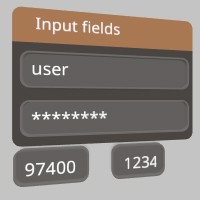
let mut username = String::from("user");
let mut password = String::from("password");
let mut zip_code = String::from("97400");
let mut pin_code = String::from("123456");
filename_scr = "screenshots/ui_input.jpeg";
test_screenshot!( // !!!! Get a proper main loop !!!!
Ui::window_begin("Input fields", &mut window_pose, None, None, None);
Ui::input("username1", &mut username, Some([0.15, 0.03].into()), None);
Ui::input("password1", &mut password, None, Some(TextContext::Password));
Ui::input_at("zip code1", &mut zip_code, [0.08, -0.09, 0.0], [0.06, 0.03],
Some(TextContext::Number));
if let Some(new_value) =
Ui::input_at("pin_code1", &mut pin_code, [0.0, -0.09, 0.0], [0.05, 0.03],
Some(TextContext::Number)) {
if new_value.is_empty() {
Log::warn("pin_code should not be empty");
}
}
Ui::window_end();
);
Sourcepub fn input_at(
id: impl AsRef<str>,
out_value: &mut String,
top_left_corner: impl Into<Vec3>,
size: impl Into<Vec2>,
type_text: Option<TextContext>,
) -> Option<String>
pub fn input_at( id: impl AsRef<str>, out_value: &mut String, top_left_corner: impl Into<Vec3>, size: impl Into<Vec2>, type_text: Option<TextContext>, ) -> Option<String>
This is an input field where users can input text to the app! Selecting it will spawn a virtual keyboard, or act as the keyboard focus. Hitting escape or enter, or focusing another UI element will remove focus from this Input. https://stereokit.net/Pages/StereoKit/UI/InputAt.html
id- An id for tracking element state. MUST be unique within current hierarchy.out_value- The string that will store the Input’s content in.top_left_corner- This is the top left corner of the UI element relative to the current Hierarchy.size- The layout size for this element in Hierarchy space.type_text- What category of text this Input represents. This may affect what kind of soft keyboard will be displayed, if one is shown to the user. None has default value of TextContext::Text.
Returns the current text in the input field if it has changed during this step, otherwise None.
see also ui_input_at
see example in Ui::input
Sourcepub fn is_interacting(hand: Handed) -> bool
👎Deprecated since 0.4.0: TODO: These functions use hands instead of interactors, they need replaced!
pub fn is_interacting(hand: Handed) -> bool
Tells if the user is currently interacting with a UI element! This will be true if the hand has an active or focused UI element. TODO: v0.4 These functions use hands instead of interactors, they need replaced! https://stereokit.net/Pages/StereoKit/UI/IsInteracting.html
hand- The hand to check for interaction.
Returns true if the hand has an active or focused UI element. False otherwise.
see also ui_is_interacting
§Examples
use stereokit_rust::{ui::Ui, system::Handed};

test_steps!( // !!!! Get a proper main loop !!!!
    // These are unit tests. no arms, no chocolate.
    assert_eq!(Ui::is_interacting(Handed::Right), false);
    assert_eq!(Ui::is_interacting(Handed::Left), false);
    assert_eq!(Ui::is_interacting(Handed::Max), false);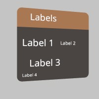
);Sourcepub fn label(text: impl AsRef<str>, size: Option<Vec2>, use_padding: bool)
pub fn label(text: impl AsRef<str>, size: Option<Vec2>, use_padding: bool)
Adds some text to the layout! Text uses the UI’s current font settings, which can be changed with Ui::push/pop_text_style. Can contain newlines! https://stereokit.net/Pages/StereoKit/UI/Label.html
text- Label text to display. Can contain newlines! Doesn’t use text as id, so it can be non-unique.size- The layout size for this element in Hierarchy space. If an axis is left as zero, it will be auto-calculated. For X this is the remaining width of the current layout, and for Y this isUi::get_line_height. If None, both axis will be auto-calculated.use_padding- Should padding be included for positioning this text? Sometimes you just want un-padded text!
see also ui_label ui_label_sz
§Examples
use stereokit_rust::{ui::Ui, maths::{Vec2, Vec3, Pose}};

let mut window_pose = Pose::new(
    [0.01, 0.035, 0.93], Some([0.0, 185.0, 0.0].into()));

filename_scr = "screenshots/ui_label.jpeg";
test_screenshot!( // !!!! Get a proper main loop !!!!
    Ui::window_begin("Labels", &mut window_pose, None, None, None);
    Ui::label("Label 1", None, false);
    Ui::same_line();
    Ui::label("Label 2", Some([0.025, 0.0].into()), false);
    Ui::label("Label 3", Some([0.1,   0.01].into()), true);
    Ui::label("Label 4", Some([0.0,   0.0045].into()), false);
    Ui::window_end();
);
Sourcepub fn last_element_hand_active(hand: Handed) -> BtnState
👎Deprecated since 0.4.0: TODO: These functions use hands instead of interactors, they need replaced!
pub fn last_element_hand_active(hand: Handed) -> BtnState
Tells if the hand was involved in the active state of the most recently called UI element using an id. Active state is frequently a single frame in the case of Buttons, but could be many in the case of Sliders or Handles. TODO: v0.4 These functions use hands instead of interactors, they need replaced! https://stereokit.net/Pages/StereoKit/UI/LastElementHandActive.html
hand- Which hand we’re checking.
Returns a BtnState that indicated the hand was “just active” this frame, is currently “active” or if it “just
became inactive” this frame.
see also ui_last_element_hand_active Ui::get_last_element_active
§Examples
use stereokit_rust::{ui::Ui, maths::{Vec2, Vec3, Pose}, system::{Handed, BtnState}};

let mut window_pose = Pose::new(
    [0.01, 0.035, 0.92], Some([0.0, 185.0, 0.0].into()));

test_steps!( // !!!! Get a proper main loop !!!!
    Ui::window_begin("Last Element Hand Active", &mut window_pose, None, None, None);
    Ui::button("Button1", None);
    let state_hand = Ui::last_element_hand_active(Handed::Right);
    let state_element = Ui::get_last_element_active();

    assert_eq!( state_hand.is_just_active(), false);
    assert_eq!( state_element.is_just_active(), false);
    Ui::window_end();
);Sourcepub fn last_element_hand_focused(hand: Handed) -> BtnState
👎Deprecated since 0.4.0: TODO: These functions use hands instead of interactors, they need replaced!
pub fn last_element_hand_focused(hand: Handed) -> BtnState
Tells if the hand was involved in the focus state of the most recently called UI element using an id. Focus occurs when the hand is in or near an element, in such a way that indicates the user may be about to interact with it. TODO: v0.4 These functions use hands instead of interactors, they need replaced! https://stereokit.net/Pages/StereoKit/UI/LastElementHandFocused.html
hand- Which hand we’re checking.
Returns a BtnState that indicated the hand was “just focused” this frame, is currently “focused” or if it “just
became focused” this frame.
see also ui_last_element_hand_focused Ui::get_last_element_focused
§Examples
use stereokit_rust::{ui::Ui, maths::{Vec2, Vec3, Pose}, system::{Handed, BtnState}};

let mut window_pose = Pose::new(
    [0.01, 0.035, 0.92], Some([0.0, 185.0, 0.0].into()));

test_steps!( // !!!! Get a proper main loop !!!!
    Ui::window_begin("Last Element Hand Focuse", &mut window_pose, None, None, None);
    Ui::button("Button1", None);
    let state_hand = Ui::last_element_hand_focused(Handed::Right);
    let state_element = Ui::get_last_element_focused();
    assert_eq!( state_hand.is_just_active(), false);
    assert_eq!( state_element.is_just_active(), false);
    Ui::window_end();
);Sourcepub fn layout_area(
start: impl Into<Vec3>,
dimensions: impl Into<Vec2>,
add_margin: bool,
)
pub fn layout_area( start: impl Into<Vec3>, dimensions: impl Into<Vec2>, add_margin: bool, )
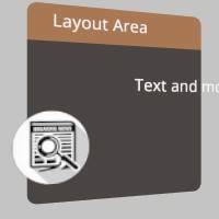
Manually define what area is used for the UI layout. This is in the current Hierarchy’s coordinate space on the X/Y plane. https://stereokit.net/Pages/StereoKit/UI/LayoutArea.html
start- The top left of the layout area, relative to the current Hierarchy in local meters.dimensions- The size of the layout area from the top left, in local meters.add_margin- If true, the layout area will have a margin added to it.
see also ui_layout_area
§Examples
use stereokit_rust::{ui::Ui, maths::{Vec2, Vec3, Pose}, sprite::Sprite};

let mut window_pose = Pose::new(
    [0.01, 0.055, 0.92], Some([0.0, 185.0, 0.0].into()));

let sprite = Sprite::from_file("icons/log_viewer.png", None, None)
                      .expect("open_gltf.jpeg should be ok");

filename_scr = "screenshots/ui_layout_area.jpeg";
test_screenshot!( // !!!! Get a proper main loop !!!!
    Ui::window_begin("Layout Area", &mut window_pose, Some([0.15, 0.13].into()), None, None);
    Ui::layout_area([0.1, -0.04, 0.0], [0.01, 0.01], true);
    Ui::image(&sprite, [0.07, 0.07]);
    Ui::layout_area([0.00, -0.01, 0.0], [0.01, 0.01], true);
    Ui::label("Text and more", None, false);
    Ui::window_end();
);
Sourcepub fn layout_push(
start: impl Into<Vec3>,
dimensions: impl Into<Vec2>,
add_margin: bool,
)
pub fn layout_push( start: impl Into<Vec3>, dimensions: impl Into<Vec2>, add_margin: bool, )
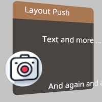
This pushes a layout rect onto the layout stack. All UI elements using the layout system will now exist inside this layout area! Note that some UI elements such as Windows will already be managing a layout of their own on the stack. https://stereokit.net/Pages/StereoKit/UI/LayoutPush.html
start- The top left position of the layout. Note that Windows have their origin at the top center, the left side of a window is X+, and content advances to the X- direction.dimensions- The total size of the layout area. A value of zero means the layout will expand in that axis, but may prevent certain types of layout “Cuts”.add_margin- Adds a spacing margin to the interior of the layout. Most of the time you won’t need this, but may be useful when working without a Window.
see also ui_layout_push
§Examples
use stereokit_rust::{ui::{Ui, UiCut}, maths::{Vec2, Vec3, Pose}, sprite::Sprite};

let mut window_pose = Pose::new(
    [0.01, 0.055, 0.92], Some([0.0, 185.0, 0.0].into()));

let sprite = Sprite::from_file("icons/screenshot.png", None, None)
                      .expect("open_gltf.jpeg should be ok");

filename_scr = "screenshots/ui_layout_push.jpeg";
test_screenshot!( // !!!! Get a proper main loop !!!!
    Ui::window_begin("Layout Push", &mut window_pose, Some([0.15, 0.13].into()), None, None);
    Ui::layout_push([0.1, -0.04, 0.0], [0.01, 0.01], true);
    Ui::image(&sprite, [0.07, 0.07]);
    Ui::layout_pop();
    Ui::layout_push_cut( UiCut::Right, 0.1, true);
    Ui::label("Text and more ...", None, false);
    Ui::layout_push_cut( UiCut::Bottom, 0.02, true);
    Ui::label("And again and again ...", None, false);
    Ui::layout_pop();
    Ui::layout_pop();
    Ui::window_end();
);
Sourcepub fn layout_push_cut(cut_to: UiCut, size_meters: f32, add_margin: bool)
pub fn layout_push_cut(cut_to: UiCut, size_meters: f32, add_margin: bool)
This cuts off a portion of the current layout area, and pushes that new area onto the layout stack. Left and Top cuts will always work, but Right and Bottom cuts can only exist inside of a parent layout with an explicit size, auto-resizing prevents these cuts. All UI elements using the layout system will now exist inside this layout area! Note that some UI elements such as Windows will already be managing a layout of their own on the stack. https://stereokit.net/Pages/StereoKit/UI/LayoutPushCut.html
cut_to- Which side of the current layout should the cut happen to? Note that Right and Bottom will require explicit sizes in the parent layout, not auto-sizes.size_meters- The size of the layout cut, in meters.add_margin- Adds a spacing margin to the interior of the layout. Most of the time you won’t need this, but may be useful when working without a Window.
see also ui_layout_push_cut
see example in Ui::layout_push
Sourcepub fn layout_pop()
pub fn layout_pop()
This removes a layout from the layout stack that was previously added using Ui::layout_push, or Ui::layout_push_cut. https://stereokit.net/Pages/StereoKit/UI/LayoutPop.html
see also ui_layout_pop
see example in Ui::layout_push
Sourcepub fn layout_reserve(
size: impl Into<Vec2>,
add_padding: bool,
depth: f32,
) -> Bounds
pub fn layout_reserve( size: impl Into<Vec2>, add_padding: bool, depth: f32, ) -> Bounds
Reserves a box of space for an item in the current UI layout! If either size axis is zero, it will be auto-sized to fill the current surface horizontally, and fill a single line_height vertically. Returns the Hierarchy local bounds of the space that was reserved, with a Z axis dimension of 0. https://stereokit.net/Pages/StereoKit/UI/LayoutReserve.html
size- Size of the layout box in Hierarchy local meters.add_padding- If true, this will add the current padding value to the total final dimensions of the space that is reserved.depth- This allows you to quickly insert a depth into the Bounds you’re receiving. This will offset on the Z axis in addition to increasing the dimensions, so that the bounds still remain sitting on the surface of the UI. This depth value will not be reflected in the bounds provided by LayouLast.
Returns the Hierarchy local bounds of the space that was reserved, with a Z axis dimension of 0.
see also ui_layout_reserve
§Examples
use stereokit_rust::{ui::Ui, maths::{Vec2, Vec3, Pose, Bounds}};

let mut window_pose = Pose::new(
    [0.01, 0.055, 0.92], Some([0.0, 185.0, 0.0].into()));

test_steps!( // !!!! Get a proper main loop !!!!
    Ui::window_begin("Layout Reserve", &mut window_pose, Some([0.2, 0.2].into()), None, None);

    let bounds = Ui::layout_reserve([0.05, 0.05], true, 0.005);

    let bounds_no_pad = Ui::layout_reserve([0.05, 0.05], false, 0.005);

    assert_eq!(bounds, Bounds::new([0.055, -0.045, -0.0025], [0.07, 0.07, 0.005]));
    assert_eq!(bounds_no_pad, Bounds::new([0.065, -0.115, -0.0025], [0.05, 0.05, 0.005]));
    Ui::window_end();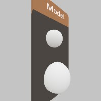
);Sourcepub fn model(
model: impl AsRef<Model>,
ui_size: Option<Vec2>,
model_scale: Option<f32>,
)
pub fn model( model: impl AsRef<Model>, ui_size: Option<Vec2>, model_scale: Option<f32>, )
This adds a non-interactive Model to the UI panel layout, and allows you to specify its size. https://stereokit.net/Pages/StereoKit/UI/Model.html
model- The model to useui_size- The size this element should take from the layout.model_scale- 0 will auto-scale the model to fit the layout space, but you can specify a different scale in case you’d like a different size. None will auto-scale the model.
see also ui_model
§Examples
use stereokit_rust::{ui::Ui, maths::{Vec2, Vec3, Pose}, model::Model,
                     mesh::Mesh, material::Material};

let mut window_pose = Pose::new(
    [0.01, 0.055, 0.92], Some([0.0, 215.0, 0.0].into()));

let model = Model::from_mesh(Mesh::sphere(), Material::pbr());

filename_scr = "screenshots/ui_model.jpeg";
test_screenshot!( // !!!! Get a proper main loop !!!!
    Ui::window_begin("Model", &mut window_pose, None, None, None);
    Ui::model(&model, Some([0.03, 0.03].into()), None);
    Ui::model(&model, Some([0.04, 0.04].into()), Some(0.05));
    Ui::window_end();
);
Sourcepub fn next_line()
pub fn next_line()
This will advance the layout to the next line. If there’s nothing on the current line, it’ll advance to the start of the next on. But this won’t have any affect on an empty line, try Ui::hspace for that. https://stereokit.net/Pages/StereoKit/UI/NextLine.html
see also ui_nextline
§Examples
use stereokit_rust::{ui::Ui, maths::{Vec2, Vec3, Pose}};

let mut window_pose = Pose::new(
    [0.01, 0.035, 0.93], Some([0.0, 185.0, 0.0].into()));

test_steps!( // !!!! Get a proper main loop !!!!
    Ui::window_begin("Next line", &mut window_pose, None, None, None);
    Ui::label("Line 1", None, false);
    Ui::next_line();
    Ui::next_line();
    Ui::next_line();
    Ui::label("Line 5", None, false);
    Ui::window_end();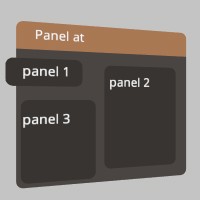
);Sourcepub fn panel_at(
start: impl Into<Vec3>,
size: impl Into<Vec2>,
padding: Option<UiPad>,
)
pub fn panel_at( start: impl Into<Vec3>, size: impl Into<Vec2>, padding: Option<UiPad>, )
If you wish to manually draw a Panel, this function will let you draw one wherever you want! https://stereokit.net/Pages/StereoKit/UI/PanelAt.html
start- The top left corner of the Panel element.size- The size of the Panel element, in hierarchy local meters.padding- Only UiPad::Outsize has any effect here. UiPad::Inside will behave the same as UiPad::None.
see also ui_panel_at Ui::panel_begin
§Examples
use stereokit_rust::{ui::{Ui, UiPad, UiCut}, maths::{Vec2, Vec3, Pose, Bounds}};

let mut window_pose = Pose::new(
    [0.01, 0.055, 0.90], Some([0.0, 185.0, 0.0].into()));

filename_scr = "screenshots/ui_panel_at.jpeg";
test_screenshot!( // !!!! Get a proper main loop !!!!
    Ui::window_begin("Panel at", &mut window_pose, Some([0.2, 0.15].into()), None, None);
    Ui::panel_at([0.11, -0.01, 0.0], [0.08, 0.03], Some(UiPad::None));
    Ui::label("panel 1", None, false);

    Ui::layout_push_cut( UiCut::Right, 0.1, true);
    Ui::panel_at(Ui::get_layout_at(), Ui::get_layout_remaining(), None);
    Ui::label("panel 2", None, false);
    Ui::layout_pop();

    Ui::layout_push_cut( UiCut::Bottom, 0.08, false);
    Ui::panel_at(Ui::get_layout_at(), Ui::get_layout_remaining(), None);
    Ui::label("panel 3", None, false);
    Ui::layout_pop();

    Ui::window_end();
);
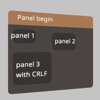
Sourcepub fn panel_begin(padding: Option<UiPad>)
pub fn panel_begin(padding: Option<UiPad>)
This will begin a Panel element that will encompass all elements drawn between panel_begin and panel_end. This is an entirely visual element, and is great for visually grouping elements together. Every Begin must have a matching End. https://stereokit.net/Pages/StereoKit/UI/PanelBegin.html
padding- Describes how padding is applied to the visual element of the Panel. If None the default value is UiPad::Outside
see also ui_panel_begin Ui::panel_at
§Examples
use stereokit_rust::{ui::{Ui, UiPad, UiCut}, maths::{Vec2, Vec3, Pose}};

let mut window_pose = Pose::new(
    [0.01, 0.055, 0.90], Some([0.0, 185.0, 0.0].into()));

filename_scr = "screenshots/ui_panel_begin.jpeg";
test_screenshot!( // !!!! Get a proper main loop !!!!
    Ui::window_begin("Panel begin", &mut window_pose, Some([0.2, 0.15].into()), None, None);
    Ui::panel_begin(Some(UiPad::None));
    Ui::label("panel 1", None, false);
    Ui::panel_end();

    Ui::layout_push_cut( UiCut::Right, 0.1, true);
    Ui::panel_begin(None);
    Ui::label("panel 2", None, false);
    Ui::panel_end();
    Ui::layout_pop();

    Ui::layout_push_cut( UiCut::Bottom, 0.08, false);
    Ui::panel_begin(Some(UiPad::Inside));
    Ui::label("panel 3\nwith CRLF", None, false);
    Ui::panel_end();
    Ui::layout_pop();

    Ui::window_end();
);
Sourcepub fn panel_end()
pub fn panel_end()
This will finalize and draw a Panel element. https://stereokit.net/Pages/StereoKit/UI/PanelEnd.html
see also ui_panel_end
see example in Ui::panel_begin
Sourcepub fn play_sound_on_off(
element_visual: UiVisual,
element_id: IdHashT,
at_local: impl Into<Vec3>,
)
pub fn play_sound_on_off( element_visual: UiVisual, element_id: IdHashT, at_local: impl Into<Vec3>, )
This will play the ‘on’ sound associated with the given UIVisual at the local position. It will also play the ‘off’ sound when the given element becomes inactive, at the world location of the initial local position! https://stereokit.net/Pages/StereoKit/UI/PlaySoundOnOff.html
element_visual- The UIVisual to pull sound information from.element_id- The id of the element that will be tracked for playing the ‘off’ sound.at_local- The hierarchy local location where the sound will play.
see also ui_play_sound_on_off Ui::play_sound_on Ui::play_sound_off
§Examples
use stereokit_rust::{ui::{Ui, UiVisual}, maths::{Vec3, Pose}};

let mut window_pose = Pose::new(
    [0.01, 0.035, 0.93], Some([0.0, 185.0, 0.0].into()));

let element_visual = UiVisual::WindowBody;
let id= "Play sound on/off";
let id_hash = Ui::stack_hash(&id);

test_steps!( // !!!! Get a proper main loop !!!!
    Ui::window_begin(id, &mut window_pose, None, None, None);
    Ui::play_sound_on_off(element_visual, id_hash, window_pose.position);
    Ui::label("This will play the 'on' sound\nfor the given (id / UiVisual)\nat the local position.", None, false);
    Ui::window_end();
);Sourcepub fn play_sound_on(element_visual: UiVisual, at_local: impl Into<Vec3>)
pub fn play_sound_on(element_visual: UiVisual, at_local: impl Into<Vec3>)
This will play the ‘on’ sound associated with the given UIVisual at the world position. https://stereokit.net/Pages/StereoKit/UI/PlaySoundOn.html
element_visual- The UIVisual to pull sound information from.at_local- The hierarchy local location where the sound will play.
see also ui_play_sound_on Ui::play_sound_on_off Ui::play_sound_off
§Examples
use stereokit_rust::{ui::{Ui, UiVisual}, maths::{Vec3, Pose}};

let mut window_pose = Pose::new(
    [0.01, 0.035, 0.93], Some([0.0, 185.0, 0.0].into()));

let element_visual = UiVisual::WindowBody;

test_steps!( // !!!! Get a proper main loop !!!!
    Ui::window_begin("Play sound on", &mut window_pose, None, None, None);
    Ui::play_sound_on(element_visual, window_pose.position);
    Ui::label("This will play the 'on' sound\nassociated with the given UIVisual\nat the local position.", None, false);
    Ui::window_end();
);Sourcepub fn play_sound_off(element_visual: UiVisual, at_local: impl Into<Vec3>)
pub fn play_sound_off(element_visual: UiVisual, at_local: impl Into<Vec3>)
This will play the ‘off’ sound associated with the given UIVisual at the world position. https://stereokit.net/Pages/StereoKit/UI/PlaySoundOff.html
element_visual- The UIVisual to pull sound information from.at_local- The hierarchy local location where the sound will play.
see also ui_play_sound_off Ui::play_sound_on Ui::play_sound_on_off
§Examples
use stereokit_rust::{ui::{Ui, UiVisual}, maths::{Vec3, Pose}};

let mut window_pose = Pose::new(
    [0.01, 0.035, 0.93], Some([0.0, 185.0, 0.0].into()));
let element_visual = UiVisual::SliderPinch;
let mut value = 0.5;

test_steps!( // !!!! Get a proper main loop !!!!
    Ui::window_begin("Play sound off", &mut window_pose, None, None, None);
    Ui::hslider("Slider1", &mut value, 0.0, 1.0,  None, None, None, None);
    Ui::play_sound_off(element_visual, window_pose.position);
    Ui::label("This will play the 'off' sound\nassociated with the given UIVisual\nat the local position.", None, false);
    Ui::window_end();
);Sourcepub fn pop_enabled()
pub fn pop_enabled()
Removes an ‘enabled’ state from the stack, and whatever was below will then be used as the primary enabled state. https://stereokit.net/Pages/StereoKit/UI/PopEnabled.html
see also ui_pop_enabled
see example in Ui::push_enabled
Sourcepub fn pop_id()
pub fn pop_id()
Removes the last root id from the stack, and moves up to the one before it! https://stereokit.net/Pages/StereoKit/UI/PopId.html
see also ui_pop_id
see example in Ui::push_id
Sourcepub fn pop_preserve_keyboard()
pub fn pop_preserve_keyboard()
This pops the keyboard presentation state to what it was previously. https://stereokit.net/Pages/StereoKit/UI/PopPreserveKeyboard.html
see also ui_pop_preserve_keyboard
see example in Ui::push_preserve_keyboard
Sourcepub fn pop_grab_aura()
pub fn pop_grab_aura()
This removes an enabled status for grab auras from the stack, returning it to the state before the previous push_grab_aura call. Grab auras are an extra space and visual element that goes around Window elements to make them easier to grab. https://stereokit.net/Pages/StereoKit/UI/PopGrabAurahtml
see also ui_pop_grab_aura
see example in Ui::push_grab_aura
Sourcepub fn grab_aura_enabled() -> bool
pub fn grab_aura_enabled() -> bool
This retreives the top of the grab aura enablement stack, in case you need to know if the current window will have an aura. https://stereokit.net/Pages/StereoKit/UI/GrabAuraEnabled
see also ui_grab_aura_enabled
see example in Ui::push_grab_aura
Sourcepub fn pop_surface()
pub fn pop_surface()
This will return to the previous UI layout on the stack. This must be called after a PushSurface call. https://stereokit.net/Pages/StereoKit/UI/PopSurface.html
see also ui_pop_surface
see example in Ui::push_surface
Sourcepub fn pop_text_style()
pub fn pop_text_style()
Removes a TextStyle from the stack, and whatever was below will then be used as the GUI’s primary font. https://stereokit.net/Pages/StereoKit/UI/PopTextStyle.html
see also ui_pop_text_style
see example in Ui::push_text_style
Sourcepub fn pop_tint()
pub fn pop_tint()
Removes a Tint from the stack, and whatever was below will then be used as the primary tint. https://stereokit.net/Pages/StereoKit/UI/PopTint.html
see also ui_pop_tint
see example in Ui::push_tint
Sourcepub fn popup_pose(shift: impl Into<Vec3>) -> Pose
pub fn popup_pose(shift: impl Into<Vec3>) -> Pose
This creates a Pose that is friendly towards UI popup windows, or windows that are created due to some type of user interaction. The fallback file picker and soft keyboard both use this function to position themselves! https://stereokit.net/Pages/StereoKit/UI/PopupPose.html
shift- A positional shift from the default location, this is useful to account for the height of the window, and center or offset this pose. A value of [0.0, -0.1, 0.0] may be a good starting point.
Returns a pose between the UI or hand that is currently active, and the user’s head. Good for popup windows.
see also ui_popup_pose
Sourcepub fn progress_bar(percent: f32, width: f32)
👎Deprecated since 0.0.1: Use HProgressBar instead
pub fn progress_bar(percent: f32, width: f32)
This is a simple horizontal progress indicator bar. This is used by the hslider to draw the slider bar beneath the interactive element. Does not include any text or label. https://stereokit.net/Pages/StereoKit/UI/ProgressBar.html
see also ui_hprogress_bar
Sourcepub fn hprogress_bar(percent: f32, width: f32, flip_fill_direction: bool)
pub fn hprogress_bar(percent: f32, width: f32, flip_fill_direction: bool)
This is a simple horizontal progress indicator bar. This is used by the hslider to draw the slider bar beneath the interactive element. Does not include any text or label. https://stereokit.net/Pages/StereoKit/UI/HProgressBar.html
percent- A value between 0 and 1 indicating progress from 0% to 100%.width- Physical width of the slider on the window. 0 will fill the remaining amount of window space.flip_fill_direction- By default, this fills from left to right. This allows you to flip the fill direction to right to left.
see also ui_hprogress_bar
see example in Ui::progress_bar_at
Sourcepub fn vprogress_bar(percent: f32, height: f32, flip_fill_direction: bool)
pub fn vprogress_bar(percent: f32, height: f32, flip_fill_direction: bool)
This is a simple vertical progress indicator bar. This is used by the vslider to draw the slider bar beneath the interactive element. Does not include any text or label. https://stereokit.net/Pages/StereoKit/UI/VProgressBar.html
percent- A value between 0 and 1 indicating progress from 0% to 100%.width- Physical width of the slider on the window. 0 will fill the remaining amount of window space.flip_fill_direction- By default, this fills from top to bottom. This allows you to flip the fill direction to bottom to top.
see also ui_vprogress_bar
see example in Ui::progress_bar_at
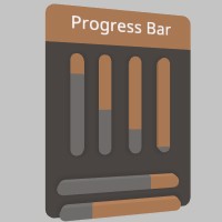
Sourcepub fn progress_bar_at(
percent: f32,
top_left_corner: impl Into<Vec3>,
size: impl Into<Vec2>,
bar_direction: UiDir,
flip_fill_direction: bool,
)
pub fn progress_bar_at( percent: f32, top_left_corner: impl Into<Vec3>, size: impl Into<Vec2>, bar_direction: UiDir, flip_fill_direction: bool, )
This is a simple horizontal progress indicator bar. This is used by the hslider to draw the slider bar beneath the interactive element. Does not include any text or label. https://stereokit.net/Pages/StereoKit/UI/ProgressBarAt.html
percent- A value between 0 and 1 indicating progress from 0% to 100%.top_left_corner- This is the top left corner of the UI element relative to the current Hierarchy.size- The layout size for this element in Hierarchy space.
see also ui_progress_bar_at Ui::vprogress_bar Ui::hprogress_bar
§Examples
use stereokit_rust::{ui::{Ui, UiDir}, maths::{Vec2, Vec3, Pose}, font::Font, system::TextStyle,
                     util::named_colors};

let mut window_pose = Pose::new(
    [0.01, 0.055, 0.92], Some([0.0, 185.0, 0.0].into()));

filename_scr = "screenshots/ui_progress_bar_at.jpeg";
test_screenshot!( // !!!! Get a proper main loop !!!!
    Ui::window_begin("Progress Bar", &mut window_pose, None, None, None);

    Ui::vprogress_bar(0.20, 0.08, false);
    Ui::progress_bar_at(0.55, [ 0.02,  -0.01, 0.0], [0.01, 0.08], UiDir::Vertical, false);
    Ui::progress_bar_at(0.75, [-0.005, -0.01, 0.0], [0.01, 0.08], UiDir::Vertical, false);
    Ui::progress_bar_at(0.95, [-0.03,  -0.01, 0.0], [0.01, 0.08], UiDir::Vertical, false);

    Ui::hprogress_bar(0.25, 0.1, true);
    Ui::progress_bar_at(0.75, [0.05, -0.13, 0.0], [0.1, 0.01], UiDir::Horizontal, true);

    Ui::window_end();
);
Sourcepub fn push_enabled(enabled: bool, parent_behavior: Option<HierarchyParent>)
pub fn push_enabled(enabled: bool, parent_behavior: Option<HierarchyParent>)
All UI between push_enabled and its matching pop_enabled will set the UI to an enabled or disabled state, allowing or preventing interaction with specific elements. The default state is true. https://stereokit.net/Pages/StereoKit/UI/PushEnabled.html
enabled- Should the following elements be enabled and interactable?parent_behavior- Do we want to ignore or inherit the state of the current stack? if None, has default value HierarchyParent::Inherit
see also ui_push_enabled
§Examples
use stereokit_rust::{ui::Ui, maths::{Vec2, Vec3, Pose}, system::HierarchyParent};

let mut window_pose = Pose::new(
    [0.01, 0.075, 0.9], Some([0.0, 185.0, 0.0].into()));
let mut enabled_value = false;
let mut toggle_value = false;

test_steps!( // !!!! Get a proper main loop !!!!
    Ui::window_begin("Push Enabled", &mut window_pose, None, None, None);
    assert_eq!(Ui::get_enabled(), true);
    Ui::toggle("Enabled", &mut enabled_value, None);
    Ui::push_enabled(enabled_value, None);

    Ui::push_enabled(true, None);
    assert_eq!(Ui::get_enabled(), false);
    Ui::hprogress_bar(0.20, 0.08, false);
    Ui::pop_enabled();

    let bt2 = Ui::button("Button", None);

    Ui::push_enabled(true, Some(HierarchyParent::Ignore));
    assert_eq!(Ui::get_enabled(), true);
    Ui::toggle("I'm a robot!",&mut toggle_value, None);
    Ui::pop_enabled();

    Ui::pop_enabled();
    Ui::window_end();
);Sourcepub fn push_id(root_id: impl AsRef<str>) -> IdHashT
pub fn push_id(root_id: impl AsRef<str>) -> IdHashT
Adds a root id to the stack for the following UI elements! This id is combined when hashing any following ids, to prevent id collisions in separate groups. https://stereokit.net/Pages/StereoKit/UI/PushId.html
root_id- The root id to use until the following PopId call. MUST be unique within current hierarchy.
see also ui_push_id
§Examples
use stereokit_rust::{ui::Ui, maths::{Vec2, Vec3, Pose}};

let mut window_pose = Pose::new(
    [0.01, 0.055, 0.92], Some([0.0, 185.0, 0.0].into()));
let mut toggle_value1 = false;
let mut toggle_value1b = true;

test_steps!( // !!!! Get a proper main loop !!!!
    Ui::window_begin("Push Id", &mut window_pose, None, None, None);
    Ui::push_id("group1");
    Ui::toggle("Choice 1",&mut toggle_value1, None);
    Ui::pop_id();
    Ui::push_id("group2");
    Ui::toggle("Choice 1",&mut toggle_value1b, None);
    Ui::pop_id();
    Ui::window_end();
);Sourcepub fn push_id_int(root_id: i32) -> IdHashT
pub fn push_id_int(root_id: i32) -> IdHashT
Adds a root id to the stack for the following UI elements! This id is combined when hashing any following ids, to prevent id collisions in separate groups. https://stereokit.net/Pages/StereoKit/UI/PushId.html
root_id- The root id to use until the following PopId call. MUST be unique within current hierarchy.
see also ui_push_idi
§Examples
use stereokit_rust::{ui::Ui, maths::{Vec2, Vec3, Pose}};

let mut window_pose = Pose::new(
    [0.01, 0.055, 0.92], Some([0.0, 185.0, 0.0].into()));
let mut toggle_value1 = false;
let mut toggle_value1b = true;

test_steps!( // !!!! Get a proper main loop !!!!
    Ui::window_begin("Push Id", &mut window_pose, None, None, None);
    Ui::push_id_int(1);
    Ui::toggle("Choice 1",&mut toggle_value1, None);
    Ui::pop_id();
    Ui::push_id_int(2);
    Ui::toggle("Choice 1",&mut toggle_value1b, None);
    Ui::pop_id();
    Ui::window_end();
);Sourcepub fn push_preserve_keyboard(preserve_keyboard: bool)
pub fn push_preserve_keyboard(preserve_keyboard: bool)
When a soft keyboard is visible, interacting with UI elements will cause the keyboard to close. This function allows you to change this behavior for certain UI elements, allowing the user to interact and still preserve the keyboard’s presence. Remember to Pop when you’re finished! https://stereokit.net/Pages/StereoKit/UI/PushPreserveKeyboard.html
preserve_keyboard- If true, interacting with elements will NOT hide the keyboard. If false, interaction will hide the keyboard.
see also ui_push_preserve_keyboard
§Examples
use stereokit_rust::{ui::Ui, maths::{Vec2, Vec3, Pose}};

let mut window_pose = Pose::new(
    [0.01, 0.075, 0.9], Some([0.0, 185.0, 0.0].into()));
let mut title = String::from("title");
let mut author = String::from("author");
let mut volume = 0.5;
let mut mute = false;

test_steps!( // !!!! Get a proper main loop !!!!
    Ui::window_begin("Sound track", &mut window_pose, None, None, None);
    Ui::push_preserve_keyboard(true);
    Ui::input("Title", &mut title, Some([0.15, 0.03].into()), None);
    Ui::input("Author", &mut author, Some([0.15, 0.03].into()), None);
    Ui::hslider("volume", &mut volume, 0.0, 1.0, Some(0.05), None, None, None);
    Ui::toggle("mute", &mut mute, None);
    Ui::pop_preserve_keyboard();
    Ui::window_end();
);Sourcepub fn push_grab_aura(enabled: bool)
pub fn push_grab_aura(enabled: bool)
This pushes an enabled status for grab auras onto the stack. Grab auras are an extra space and visual element that goes around Window elements to make them easier to grab. MUST be matched by a pop_grab_aura call. https://stereokit.net/Pages/StereoKit/UI/PushGrabAura.html
enabled- Is the grab aura enabled or not?
see also ui_push_grab_aura
§Examples
use stereokit_rust::{ui::Ui, maths::{Vec2, Vec3, Pose}};

let mut window_pose = Pose::new(
    [0.01, 0.075, 0.9], Some([0.0, 185.0, 0.0].into()));
let mut title = String::from("");

assert_eq!(Ui::grab_aura_enabled(), true);

test_steps!( // !!!! Get a proper main loop !!!!
    Ui::push_grab_aura(false);
    assert_eq!(Ui::grab_aura_enabled(), false);
    Ui::window_begin("Write a title", &mut window_pose, None, None, None);
    Ui::label("Title:", None, false);
    Ui::input("Title", &mut title, Some([0.15, 0.03].into()), None);
    Ui::window_end();
    Ui::pop_grab_aura();
    assert_eq!(Ui::grab_aura_enabled(), true);
);Sourcepub fn push_surface(
pose: impl Into<Pose>,
layout_start: impl Into<Vec3>,
layout_dimension: impl Into<Vec2>,
)
pub fn push_surface( pose: impl Into<Pose>, layout_start: impl Into<Vec3>, layout_dimension: impl Into<Vec2>, )
This will push a surface into SK’s UI layout system. The surface becomes part of the transform hierarchy, and SK creates a layout surface for UI content to be placed on and interacted with. Must be accompanied by a pop_surface call. https://stereokit.net/Pages/StereoKit/UI/PushSurface.html
pose- The Pose of the UI surface, where the surface forward direction is the same as the Pose’s.layout_start- This is an offset from the center of the coordinate space created by the surfacePose. Vec3.Zero would mean that content starts at the center of the surfacePose.layout_dimension- The size of the surface area to use during layout. Like other UI layout sizes, an axis set to zero means it will auto-expand in that direction.
see also ui_push_surface
§Examples
use stereokit_rust::{ui::{Ui, UiPad}, maths::{Vec2, Vec3, Pose}, util::named_colors,
                     font::Font, system::TextStyle};
let mut title = String::from("");
let style = TextStyle::from_font(Font::default(), 0.05, named_colors::BLUE);

let mut surface_pose = Pose::new(
    [-0.09, 0.075, 0.92], Some([0.0, 185.0, 0.0].into()));

filename_scr = "screenshots/ui_push_surface.jpeg";
test_screenshot!( // !!!! Get a proper main loop !!!!
    Ui::push_surface(surface_pose, [0.0, 0.0, 0.0], [0.1, 0.1]);
    Ui::push_text_style(style);
    Ui::label("Surface", Some([0.25, 0.03].into()), false);
    Ui::pop_text_style();
    Ui::panel_begin(Some(UiPad::Inside));
    Ui::label("Give a title:", None, false);
    Ui::input("Title", &mut title, Some([0.15, 0.03].into()), None);
    Ui::panel_end();
    Ui::pop_surface();
);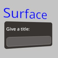
Sourcepub fn push_text_style(style: TextStyle)
pub fn push_text_style(style: TextStyle)
This pushes a Text Style onto the style stack! All text elements rendered by the GUI system will now use this styling. https://stereokit.net/Pages/StereoKit/UI/PushTextStyle.html
see also ui_push_text_style
§Examples
use stereokit_rust::{ui::Ui, maths::{Vec2, Vec3, Pose}, font::Font, system::TextStyle,
                     util::named_colors};

let mut window_pose = Pose::new(
    [0.01, 0.035, 0.92], Some([0.0, 185.0, 0.0].into()));

let font = Font::default();
let style_big    = TextStyle::from_font(&font, 0.015, named_colors::CYAN);
let style_medium = TextStyle::from_font(&font, 0.012, named_colors::FUCHSIA);
let style_small  = TextStyle::from_font(&font, 0.009, named_colors::GOLD);
let style_mini   = TextStyle::from_font(&font, 0.006, named_colors::WHITE);

filename_scr = "screenshots/ui_push_text_style.jpeg";
test_screenshot!( // !!!! Get a proper main loop !!!!
    Ui::window_begin("Push TextStyle", &mut window_pose, Some([0.16, 0.0].into()), None, None);

    Ui::push_text_style(style_big);
    Ui::text("The first part", None, None, None, None, None, None);
    assert_eq!(Ui::get_text_style(), style_big);
    Ui::pop_text_style();

    Ui::push_text_style(style_medium);
    Ui::text("The second part", None, None, None, None, None, None);
    Ui::pop_text_style();

    Ui::push_text_style(style_small);
    Ui::text("The third part", None, None, None, None, None, None);
    Ui::push_text_style(style_mini);
    Ui::text("The Inside part", None, None, None, None, None, None);
    assert_eq!(Ui::get_text_style(), style_mini);
    Ui::pop_text_style();
    Ui::text("----////", None, None, None, None, None, None);
    Ui::pop_text_style();

    Ui::window_end();
);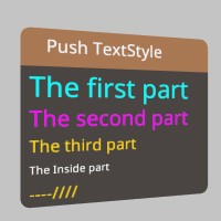
Sourcepub fn push_tint(color_gamma: impl Into<Color128>)
pub fn push_tint(color_gamma: impl Into<Color128>)
All UI between push_tint and its matching pop_tint will be tinted with this color. This is implemented by multiplying this color with the current color of the UI element. The default is a White (1,1,1,1) identity tint. https://stereokit.net/Pages/StereoKit/UI/PushTint.html
color_gamma- A normal (gamma corrected) color value. This is internally converted to linear, so tint multiplication happens on linear color values.
see also ui_push_tint Ui::color_scheme
§Examples
use stereokit_rust::{ui::Ui, maths::{Vec2, Vec3, Pose}, util::Color128};
let mut title = String::from("Push Tint");
let mut volume = 0.5;
let mut mute = true;

let mut window_pose = Pose::new(
    [0.01, 0.05, 0.92], Some([0.0, 185.0, 0.0].into()));

let blue  = Color128::rgb(0.0, 0.0, 1.0);
let red   = Color128::rgb(1.0, 0.0, 0.0);
let green = Color128::rgb(0.0, 1.0, 0.0);

filename_scr = "screenshots/ui_push_tint.jpeg";
test_screenshot!( // !!!! Get a proper main loop !!!!
    Ui::window_begin("Push Tint", &mut window_pose, None, None, None);
    Ui::push_tint(blue.to_gamma());
    Ui::input("Title", &mut title, Some([0.15, 0.03].into()), None);
    Ui::pop_tint();
    Ui::push_tint(red.to_gamma());
    Ui::hslider("volume", &mut volume, 0.0, 1.0, Some(0.05), None, None, None);
    Ui::pop_tint();
    Ui::push_tint(green.to_gamma());
    Ui::toggle("mute", &mut mute, None);
    Ui::pop_tint();
    Ui::window_end();
);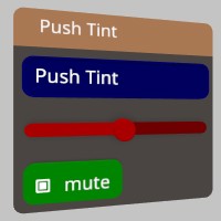
Sourcepub fn quadrant_size_mesh(mesh: impl AsRef<Mesh>, overflow_percent: f32)
pub fn quadrant_size_mesh(mesh: impl AsRef<Mesh>, overflow_percent: f32)
This will reposition the Mesh’s vertices to work well with quadrant resizing shaders. The mesh should generally be centered around the origin, and face down the -Z axis. This will also overwrite any UV coordinates in the verts.
You can read more about the technique here : https://playdeck.net/blog/quadrant-sizing-efficient-ui-rendering https://stereokit.net/Pages/StereoKit/UI/QuadrantSizeMesh.html
mesh- The vertices of this Mesh will be retrieved, modified, and overwritten.overflow_percent- When scaled, should the geometry stick out past the “box” represented by the scale, or edge up against it? A value of 0 will mean the geometry will fit entirely inside the “box”, and a value of 1 means the geometry will start at the boundary of the box and continue outside it.
see also ui_quadrant_size_mesh
§Examples
use stereokit_rust::{ui::{Ui, UiCorner, UiVisual, UiLathePt}, maths::{Vec2, Vec3, Pose, Matrix},
                     mesh::Mesh, material::Material, util::named_colors};

let mut window_pose = Pose::new(
    [0.01, 0.025, 0.948], Some([0.0, 185.0, 0.0].into()));

let material = Material::pbr();
let transform1 = Matrix::t_r_s([-0.1, 0.0, 0.74], [0.0, 130.0, 0.0], [3.0, 1.0, 0.05]);

let mut mesh = Mesh::generate_cube([1.0, 1.0, 1.0], None);
Ui::quadrant_size_mesh(&mut mesh, 0.20);

let bounds = mesh.get_bounds();
assert_eq!(bounds.center, Vec3 { x: 0.0, y: 0.0, z: 0.0 });
//TODO:
assert_eq!(bounds.dimensions, Vec3 { x: 0.0, y: 0.0, z: 1.0 });

Ui::set_element_visual(UiVisual::Separator, mesh, None, None);

test_steps!( // !!!! Get a proper main loop !!!!
    Ui::window_begin("Push Tint", &mut window_pose, None, None, None);
    Ui::hseparator();
    if Ui::button("Exit", None) {sk.quit(None);}
    Ui::hseparator();
    Ui::window_end();
);Sourcepub fn quadrant_size_verts(verts: &[Vertex], overflow_percent: f32)
pub fn quadrant_size_verts(verts: &[Vertex], overflow_percent: f32)
This will reposition the vertices to work well with quadrant resizing shaders. The mesh should generally be centered around the origin, and face down the -Z axis. This will also overwrite any UV coordinates in the verts.
You can read more about the technique here : https://playdeck.net/blog/quadrant-sizing-efficient-ui-rendering https://stereokit.net/Pages/StereoKit/UI/QuadrantSizeVerts.html
verts- A list of vertices to be modified to fit the sizing shader.overflow_percent- When scaled, should the geometry stick out past the “box” represented by the scale, or edge up against it? A value of 0 will mean the geometry will fit entirely inside the “box”, and a value of 1 means the geometry will start at the boundary of the box and continue outside it.
see also ui_quadrant_size_verts
§Examples
use stereokit_rust::{ui::{Ui, UiCorner, UiVisual, UiLathePt},
                     maths::{Vec2, Vec3, Pose, Matrix},
                     mesh::Mesh, material::Material, util::named_colors};

let mut window_pose = Pose::new(
    [0.01, 0.025, 0.948], Some([0.0, 185.0, 0.0].into()));

let material = Material::pbr();
let transform1 = Matrix::t_r_s([-0.1, 0.0, 0.74], [0.0, 130.0, 0.0], [3.0, 1.0, 0.05]);

let mut mesh = Mesh::generate_cube([1.0, 1.0, 1.0], None);
let mut verts = mesh.get_verts();
Ui::quadrant_size_verts(&verts, 0.0);
let mut remesh = mesh.clone_ref();
remesh.set_verts(&verts, true);

let bounds = mesh.get_bounds();
assert_eq!(bounds.center, Vec3 { x: 0.0, y: 0.0, z: 0.0 });
//TODO:
assert_eq!(bounds.dimensions, Vec3 { x: 0.0, y: 0.0, z: 1.0 });

Ui::set_element_visual(UiVisual::Separator, mesh, None, None);

test_steps!( // !!!! Get a proper main loop !!!!
    Ui::window_begin("Push Tint", &mut window_pose, None, None, None);
    Ui::hseparator();
    if Ui::button("Exit", None) {sk.quit(None);}
    Ui::hseparator();
    Ui::window_end();
);Sourcepub fn gen_quadrant_mesh(
rounded_corners: UiCorner,
corner_radius: f32,
corner_resolution: u32,
delete_flat_sides: bool,
quadrantify: bool,
lathe_pts: &[UiLathePt],
) -> Result<Mesh, StereoKitError>
pub fn gen_quadrant_mesh( rounded_corners: UiCorner, corner_radius: f32, corner_resolution: u32, delete_flat_sides: bool, quadrantify: bool, lathe_pts: &[UiLathePt], ) -> Result<Mesh, StereoKitError>
This generates a quadrantified mesh meant for UI buttons by sweeping a lathe over the rounded corners of a rectangle! Note that this mesh is quadrantified, so it requires special shaders to draw properly! https://stereokit.net/Pages/StereoKit/UI/GenQuadrantMesh.html
rounded_corners- A bit-flag indicating which corners should be rounded, and which should be sharp!corner_radius- The radius of each rounded corner.corner_resolution- How many slices/verts go into each corner? More is smoother, but more expensive to render.delete_flat_sides- If two adjacent corners are sharp, should we skip connecting them with triangles? If this edge will always be covered, then deleting these faces may save you some performance.quadrantify- Does this generate a mesh compatible with StereoKit’s quadrant shader system, or is this just a traditional mesh? In most cases, this should be true, but UI elements such as the rounded button may be exceptions.lathe_pts“ - The lathe points to sweep around the edge.
Returns the final Mesh, ready for use in SK’s theming system.
see also ui_gen_quadrant_mesh
§Examples
use stereokit_rust::{ui::{Ui, UiCorner, UiVisual, UiLathePt}, maths::{Vec2, Vec3, Pose, Matrix},
                     mesh::Mesh, material::Material, util::named_colors};

let mut window_pose = Pose::new(
    [0.01, 0.028, 0.92], Some([0.0, 185.0, 0.0].into()));

let material = Material::pbr();
let mut mesh_button = Ui::gen_quadrant_mesh(
    UiCorner::All, 0.002, 8, false, true, &UiLathePt::button())
                       .expect("mesh should be created");
let mut mesh_input = Ui::gen_quadrant_mesh(
    UiCorner::All, 0.018, 8, false, true, &UiLathePt::input())
                       .expect("mesh should be created");

let bounds = mesh_button.get_bounds();
assert_eq!(bounds.center, Vec3 { x: 0.0, y: 0.0, z: -0.005 });
assert_eq!(bounds.dimensions, Vec3 { x: 0.004, y: 0.004, z: 0.99 });

Ui::set_element_visual(UiVisual::Button, mesh_button, None, None);
Ui::set_element_visual(UiVisual::Input, mesh_input, None, None);

let mut text = String::from("Text");

filename_scr = "screenshots/ui_gen_quadrant_mesh.jpeg";
test_screenshot!( // !!!! Get a proper main loop !!!!
    Ui::window_begin("gen_quadrant_mesh", &mut window_pose, None, None, None);
    Ui::input("input", &mut text, None, None );
    if Ui::button("Exit", None) {sk.quit(None);}
    Ui::window_end();
);
Sourcepub fn radio(text: impl AsRef<str>, active: bool, size: Option<Vec2>) -> bool
👎Deprecated since 0.0.1: Performence issues, use radio_img instead
pub fn radio(text: impl AsRef<str>, active: bool, size: Option<Vec2>) -> bool
A Radio is similar to a button, except you can specify if it looks pressed or not regardless of interaction. This can be useful for radio-like behavior! Check an enum for a value, and use that as the ‘active’ state, Then switch to that enum value if Radio returns true. https://stereokit.net/Pages/StereoKit/UI/Radio.html
text- Text to display on the Radio and id for tracking element state. MUST be unique within current hierarchy.active- Does this button look like it’s pressed?size- The layout size for this element in Hierarchy space. If an axis is left as zero, it will be auto-calculated. For X this is the remaining width of the current layout, and for Y this isUi::get_line_height.
Returns true only on the first frame it is pressed.
see also ui_toggle_img ui_toggle_img_sz
Sourcepub fn radio_img(
text: impl AsRef<str>,
active: bool,
image_off: impl AsRef<Sprite>,
image_on: impl AsRef<Sprite>,
image_layout: UiBtnLayout,
size: Option<Vec2>,
) -> bool
pub fn radio_img( text: impl AsRef<str>, active: bool, image_off: impl AsRef<Sprite>, image_on: impl AsRef<Sprite>, image_layout: UiBtnLayout, size: Option<Vec2>, ) -> bool
A Radio is similar to a button, except you can specify if it looks pressed or not regardless of interaction. This can be useful for radio-like behavior! Check an enum for a value, and use that as the ‘active’ state, Then switch to that enum value if Radio returns true. This version allows you to override the images used by the Radio. https://stereokit.net/Pages/StereoKit/UI/Radio.html
text- Text to display on the Radio and id for tracking element state. MUST be unique within current hierarchy.active- Does this button look like it’s pressed?image_off- Image to use when the radio value is false.image_on- Image to use when the radio value is true.image_layout- This enum specifies how the text and image should be laid out on the radio. For example, UiBtnLayout::Left will have the image on the left, and text on the right.size- The layout size for this element in Hierarchy space. If an axis is left as zero, it will be auto-calculated. For X this is the remaining width of the current layout, and for Y this isUi::get_line_height.
Returns true only on the first frame it is pressed.
see also ui_toggle_img ui_toggle_img_sz Ui::radio_at
§Examples
use stereokit_rust::{ui::{Ui, UiBtnLayout}, maths::{Vec2, Vec3, Pose}, sprite::Sprite};

let mut window_pose = Pose::new(
    [0.01, 0.035, 0.91], Some([0.0, 185.0, 0.0].into()));

let (on, off) = (Sprite::radio_on(), Sprite::radio_off());

let mut choice = "A";

filename_scr = "screenshots/ui_radio.jpeg";
test_screenshot!( // !!!! Get a proper main loop !!!!
    Ui::window_begin("Radio", &mut window_pose, None, None, None);
    if Ui::radio_img("A", choice == "A", &off, &on, UiBtnLayout::Right,
                     Some([0.06, 0.05].into())) {
        choice = "A";
    }
    Ui::same_line();
    if Ui::radio_img("B", choice == "B", &off, &on, UiBtnLayout::Center,
                     Some([0.03, 0.05].into())){
        choice = "B";
    }
    Ui::same_line();
    if Ui::radio_img("C", choice == "C", &off, &on, UiBtnLayout::Left, None) {
        choice = "C";
    }
    if Ui::radio_at("D", choice == "D", &off, &on, UiBtnLayout::Right,
                    [0.06, -0.07, 0.0], [0.06, 0.03]) {
        choice = "D";
    }
    if Ui::radio_at("E", choice == "E", &off, &on, UiBtnLayout::Left,
                    [-0.01, -0.07, 0.0], [0.06, 0.03]) {
        choice = "E";
    }
    Ui::window_end();
);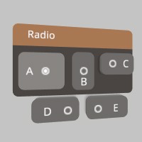
Sourcepub fn radio_at(
text: impl AsRef<str>,
active: bool,
image_off: impl AsRef<Sprite>,
image_on: impl AsRef<Sprite>,
image_layout: UiBtnLayout,
top_left_corner: impl Into<Vec3>,
size: impl Into<Vec2>,
) -> bool
pub fn radio_at( text: impl AsRef<str>, active: bool, image_off: impl AsRef<Sprite>, image_on: impl AsRef<Sprite>, image_layout: UiBtnLayout, top_left_corner: impl Into<Vec3>, size: impl Into<Vec2>, ) -> bool
A Radio is similar to a button, except you can specify if it looks pressed or not regardless of interaction. This can be useful for radio-like behavior! Check an enum for a value, and use that as the ‘active’ state, Then switch to that enum value if Radio returns true. This version allows you to override the images used by the Radio. https://stereokit.net/Pages/StereoKit/UI/RadioAt.html
text- Text to display on the Radio and id for tracking element state. MUST be unique within current hierarchy.active- Does this button look like it’s pressed?image_off- Image to use when the radio value is false.image_on- Image to use when the radio value is true.image_layout- This enum specifies how the text and image should be laid out on the radio. For example, UiBtnLayout::Left will have the image on the left, and text on the right.top_left_corner- This is the top left corner of the UI element relative to the current Hierarchy.- size - The layout size for this element in Hierarchy space.
Returns true only on the first frame it is pressed.
see also ui_toggle_img_at
see example in Ui::radio_img
Sourcepub fn same_line()
pub fn same_line()
Moves the current layout position back to the end of the line that just finished, so it can continue on the same line as the last element! https://stereokit.net/Pages/StereoKit/UI/SameLine.html
see also ui_sameline
Sourcepub fn set_element_visual(
visual: UiVisual,
mesh: impl AsRef<Mesh>,
material: Option<Material>,
min_size: Option<Vec2>,
)
pub fn set_element_visual( visual: UiVisual, mesh: impl AsRef<Mesh>, material: Option<Material>, min_size: Option<Vec2>, )
Override the visual assets attached to a particular UI element. Note that StereoKit’s default UI assets use a type of quadrant sizing that is implemented in the Material and the Mesh. You don’t need to use quadrant sizing for your own visuals, but if you wish to know more, you can read more about the technique here : https://playdeck.net/blog/quadrant-sizing-efficient-ui-rendering You may also find Ui::quadrant_size_verts and Ui::quadrant_size_mesh to be helpful. https://stereokit.net/Pages/StereoKit/UI/SetElementVisual.html
visual- Which UI visual element to override. Use UiVisual::ExtraSlotXX if you need extra UIVisual slots for your own custom UI elements.mesh- The Mesh to use for the UI element’s visual component. The Mesh will be scaled to match the dimensions of the UI element.material- The Material to use when rendering the UI element. None is for the default Material specifically designed to work with quadrant sizing formatted meshes.min_size- For some meshes, such as quadrant sized meshes, there’s a minimum size where the mesh turns inside out. This lets UI elements to accommodate for this minimum size, and behave somewhat more appropriately. None is Vec2::ZERO.
see also ui_set_element_visual
see example in Ui::gen_quadrant_mesh
§Examples
use stereokit_rust::{ui::{Ui, UiColor, UiVisual, UiLathePt, UiCorner}, maths::{Vec2, Vec3, Pose},
                     mesh::Mesh, material::Material, util::named_colors};

let mut window_pose = Pose::new(
    [0.01, 0.025, 0.92], Some([0.0, 185.0, 0.0].into()));

let material = Material::pbr();
let mut mesh = Ui::gen_quadrant_mesh(
    UiCorner::All, 0.005, 8, false, true, &UiLathePt::plane())
                       .expect("mesh should be created");

Ui::set_element_visual(UiVisual::Separator, mesh, None, None);

test_steps!( // !!!! Get a proper main loop !!!!
    Ui::window_begin("set element visual", &mut window_pose, None, None, None);
    Ui::hseparator();
    if Ui::button("Exit", None) {sk.quit(None);}
    Ui::hseparator();
    Ui::window_end();
);Sourcepub fn set_element_color(visual: UiVisual, color_category: UiColor)
pub fn set_element_color(visual: UiVisual, color_category: UiColor)
This allows you to override the color category that a UI element is assigned to. https://stereokit.net/Pages/StereoKit/UI/SetElementColor.html
visual- The UI element type to set the color category of.color_category- The category of color to assign to this UI element. Use Ui::set_theme_color in combination with this to assign a specific color. Use UiColor::ExtraSlotXX if you need extra UIColor slots for your own custom UI elements.
see also ui_set_element_color
§Examples
use stereokit_rust::{ui::{Ui, UiColor, UiVisual}, maths::{Vec2, Vec3, Pose},
                     util::{named_colors, Color128}};

let mut window_pose = Pose::new(
    [0.01, 0.025, 0.93], Some([0.0, 185.0, 0.0].into()));

assert_eq!(Ui::get_element_color(UiVisual::Separator, 1.0),
           Color128 { r: 1.0620984, g: 0.49995762, b: 0.2311526, a: 1.0 });

Ui::set_element_color(UiVisual::Separator, UiColor::Complement);
assert_eq!(Ui::get_element_color(UiVisual::Separator, 1.0),
           Color128 { r: 0.10546647, g: 0.092475444, b: 0.08364652, a: 1.0 });

assert_eq!(Ui::get_element_color(UiVisual::Button, 0.0),
           Color128 { r: 0.2058468, g: 0.1961254, b: 0.18924558, a: 0.0 });
Ui::set_element_color(UiVisual::Button, UiColor::Background);
assert_eq!(Ui::get_element_color(UiVisual::Button, 0.0),
           Color128 { r: 0.091664724, g: 0.08037374, b: 0.072700225, a: 0.0 });

test_steps!( // !!!! Get a proper main loop !!!!
    Ui::window_begin("set_element_color", &mut window_pose, None, None, None);
    Ui::hseparator();
    if Ui::button("Exit", None) {sk.quit(None);}
    Ui::hseparator();
    Ui::window_end();
);Sourcepub fn set_element_sound(
visual: UiVisual,
activate: Option<Sound>,
deactivate: Option<Sound>,
)
pub fn set_element_sound( visual: UiVisual, activate: Option<Sound>, deactivate: Option<Sound>, )
This sets the sound that a particulat UI element will make when you interact with it. One sound when the interaction starts, and one when it ends. https://stereokit.net/Pages/StereoKit/UI/SetElementSound.html
visual- The UI element to apply the sounds to. Use UiVisual::ExtraSlotXX if you need extra UIVisual slotsactivate- The sound made when the interaction begins. None will fall back to the default sound.deactivate- The sound made when the interaction ends. None will fall back to the default sound.
see also ui_set_element_sound
§Examples
use stereokit_rust::{ui::{Ui, UiVisual}, maths::{Vec2, Vec3, Pose}, sound::Sound};

let mut window_pose = Pose::new(
    [0.01, 0.075, 0.9], Some([0.0, 185.0, 0.0].into()));

let sound_activate = Sound::click();
let sound_deactivate = Sound::unclick();

Ui::set_element_sound(UiVisual::Button, Some(sound_activate), Some(sound_deactivate));

test_steps!( // !!!! Get a proper main loop !!!!
    Ui::window_begin("Set Element Sound", &mut window_pose, None, None, None);
    if Ui::button("Button1", None) {todo!();}
    if Ui::button("Button2", None) {todo!();}
    Ui::window_end();
);Sourcepub fn draw_element(
element_visual: UiVisual,
element_color: Option<UiVisual>,
start: impl Into<Vec3>,
size: impl Into<Vec3>,
focus: f32,
)
pub fn draw_element( element_visual: UiVisual, element_color: Option<UiVisual>, start: impl Into<Vec3>, size: impl Into<Vec3>, focus: f32, )
This will draw a visual element from StereoKit’s theming system, while paying attention to certain factors such as enabled/disabled, tinting and more. https://stereokit.net/Pages/StereoKit/UI/DrawElement.html
element_visual- The element type to draw. Use UiVisual::ExtraSlotXX to use extra UiVisual slots for your own custom UI elements. If these slots are empty, SK will fall back to UiVisual::Defaultelement_color- If you wish to use the coloring from a different element, you can use this to override the theme color used when drawing. Use UiVisual::ExtraSlotXX to use extra UiVisual slots for your own custom UI elements. If these slots are empty, SK will fall back to UiVisual::Default.start- This is the top left corner of the UI element relative to the current Hierarchy.size- The layout size for this element in Hierarchy space.focus- The amount of visual focus this element currently has, where 0 is unfocused, and 1 is active. You can acquire a good focus value fromUi::get_anim_focus.
see also ui_draw_element ui_draw_element_color
§Examples
use stereokit_rust::{ui::{Ui, UiVisual}, maths::{Vec2, Vec3, Pose}};

let mut window_pose = Pose::new(
    [0.01, 0.075, 0.9], Some([0.0, 185.0, 0.0].into()));

filename_scr = "screenshots/ui_draw_element.jpeg";
test_screenshot!( // !!!! Get a proper main loop !!!!
    Ui::window_begin("Draw Element", &mut window_pose, Some([0.22, 0.18].into()), None, None);
    Ui::draw_element(UiVisual::Button, None, [0.1, -0.01, 0.0], [0.1, 0.025, 0.005], 1.0);
    Ui::draw_element(UiVisual::Input, None, [0.0, -0.01, 0.0], [0.1, 0.025, 0.005], 1.0);
    Ui::draw_element(UiVisual::Handle, None, [0.1, -0.05, 0.0], [0.1, 0.025, 0.005], 1.0);
    Ui::draw_element(UiVisual::Toggle, None, [0.0, -0.05, 0.0], [0.1, 0.025, 0.005], 1.0);
    Ui::draw_element(UiVisual::Separator, None, [0.1, -0.08, 0.0], [0.2, 0.005, 0.005], 1.0);
    Ui::draw_element(UiVisual::Aura, None, [0.1, -0.1, 0.0], [0.08, 0.08, 0.005], 0.5);
    Ui::draw_element(UiVisual::Default, None, [0.0, -0.1, 0.0], [0.1, 0.025, 0.005], 0.0);
    Ui::draw_element(UiVisual::Carat, None, [0.0, -0.14, 0.0], [0.025, 0.025, 0.005], 1.0);
    Ui::window_end();
);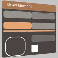
Sourcepub fn get_element_color(element_visual: UiVisual, focus: f32) -> Color128
pub fn get_element_color(element_visual: UiVisual, focus: f32) -> Color128
This will get a final linear draw color for a particular UI element type with a particular focus value. This obeys the current hierarchy of tinting and enabled states. https://stereokit.net/Pages/StereoKit/UI/GetElementColor.html
element_visual- Get the color from this element type. Use UiVisual::ExtraSlotXX to use extra UiVisual slots for your own custom UI elements. If these slots are empty, SK will fall back to UiVisual::Default.focus- The amount of visual focus this element currently has, where 0 is unfocused, and 1 is active. You can acquire a good focus value fromUi::get_anim_focus
Returns a linear color good for tinting UI meshes.
see also ui_get_element_color
see example in Ui::set_element_color
Sourcepub fn get_anim_focus(
id: IdHashT,
focus_state: BtnState,
activation_state: BtnState,
) -> f32
pub fn get_anim_focus( id: IdHashT, focus_state: BtnState, activation_state: BtnState, ) -> f32
This resolves a UI element with an ID and its current states into a nicely animated focus value. https://stereokit.net/Pages/StereoKit/UI/GetAnimFocus.html
id- The hierarchical id of the UI element we’re checking the focus of, this can be created withUi::stack_hash.focus_state- The current focus state of the UI element.activationState- The current activation status of the/ UI element.
Returns a focus value in the realm of 0-1, where 0 is unfocused, and 1 is active.
see also ui_get_anim_focus
§Examples
use stereokit_rust::{ui::Ui, system::BtnState, maths::{Vec2, Vec3, Pose}};

let mut window_pose = Pose::new(
    [0.01, 0.075, 0.9], Some([0.0, 185.0, 0.0].into()));

test_steps!( // !!!! Get a proper main loop !!!!
    Ui::window_begin("Get Anim Focus", &mut window_pose, None, None, None);
    if Ui::button("button1", None) {todo!()}
    let id = Ui::stack_hash("button1");
    let focus = Ui::get_anim_focus(id, BtnState::Inactive, BtnState::Inactive);
    assert_eq!(focus, 0.0);
    let focus = Ui::get_anim_focus(id, BtnState::Active, BtnState::Inactive);
    assert_eq!(focus, 0.5);
    let focus = Ui::get_anim_focus(id, BtnState::Active, BtnState::Active);
    assert_eq!(focus, 1.0);
    Ui::window_end();
);Sourcepub fn set_theme_color(
color_category: UiColor,
color_state: Option<UiColorState>,
color_gamma: impl Into<Color128>,
)
pub fn set_theme_color( color_category: UiColor, color_state: Option<UiColorState>, color_gamma: impl Into<Color128>, )
This allows you to explicitly set a theme color, for finer grained control over the UI appearance. Each theme type is still used by many different UI elements. This will automatically generate colors for different UI element states. https://stereokit.net/Pages/StereoKit/UI/SetThemeColor.html
color_category- The category of UI elements that are affected by this theme color. Use UiColor::ExtraSlotXX if you need extra UiColor slots for your own custom UI elements.color_state- The state of the UI element this color should apply to. If None has the value UiColorState::Normalcolor_gama: the gamma corrected color that should be applied to this theme color category in its normal resting state. Active and disabled colors will be generated based on this color.
see also ui_set_theme_color ui_set_theme_color_state Ui::color_scheme
§Examples
use stereokit_rust::{ui::{Ui, UiColor, UiColorState}, maths::{Vec2, Vec3, Pose},
                     util::{named_colors, Color128}};

let mut window_pose = Pose::new(
    [0.01, 0.04, 0.93], Some([0.0, 185.0, 0.0].into()));

assert_eq!(Ui::get_theme_color(UiColor::Primary, None),
           Color128 { r: 0.75, g: 0.5325, b: 0.375, a: 1.0 });

let red: Color128 = named_colors::RED.into();
Ui::set_theme_color(UiColor::Common, Some(UiColorState::Disabled), red.to_gamma());
assert_eq!(Ui::get_theme_color(UiColor::Common,  Some(UiColorState::Disabled)),
            red.to_gamma());

let green: Color128 = named_colors::GREEN.into();
Ui::set_theme_color(UiColor::Primary, None, green.to_gamma());
assert_eq!(Ui::get_theme_color(UiColor::Primary, None),
           green.to_gamma());

let blue: Color128 = named_colors::BLUE.into();
Ui::set_theme_color(UiColor::Background, None, blue.to_gamma());
assert_eq!(Ui::get_theme_color(UiColor::Background, None),
           blue.to_gamma());

filename_scr = "screenshots/ui_set_theme_color.jpeg";
test_screenshot!( // !!!! Get a proper main loop !!!!
    Ui::window_begin("set_theme_color", &mut window_pose, None, None, None);
    Ui::push_enabled(false, None);
    if Ui::button("Button", None) { todo!() };
    Ui::pop_enabled();
    Ui::hseparator();
    if Ui::button("Exit", None) {sk.quit(None);}
    Ui::window_end();
);
Sourcepub fn get_theme_color(
color_category: UiColor,
color_state: Option<UiColorState>,
) -> Color128
pub fn get_theme_color( color_category: UiColor, color_state: Option<UiColorState>, ) -> Color128
This allows you to inspect the current color of the theme color category in a specific state! If you set the color with Ui::color_scheme, or without specifying a state, this may be a generated color, and not necessarily the color that was provided there. https://stereokit.net/Pages/StereoKit/UI/GetThemeColor.html
color_category- The category of UI elements that are affected by this theme color. Use UiColor::ExtraSlotXX if you need extra UiColor slots for your own custom UI elements. If the theme slot is empty, the color will be pulled from UiColor::Nonecolor_state: The state of the UI element this color applies to. If None has the value UiColorState::Normal
Returns the gamma space color for the theme color category in the indicated state.
see also ui_get_theme_color ui_get_theme_color_state
Sourcepub fn vspace(space: f32)
pub fn vspace(space: f32)
adds some vertical space to the current line! All UI following elements on this line will be offset. https://stereokit.net/Pages/StereoKit/UI/VSpace.html
space- Space in meters to shift the layout by.
see also ui_vspace
§Examples
use stereokit_rust::{ui::Ui, maths::{Vec2, Vec3, Pose}};

let mut window_pose = Pose::new(
    [0.01, 0.075, 0.88], Some([0.0, 185.0, 0.0].into()));

test_steps!( // !!!! Get a proper main loop !!!!
    Ui::window_begin("VSpace", &mut window_pose, None, None, None);
    Ui::label("Line 1", None, false);
    Ui::vspace(0.02);
    Ui::label("Line 2", None, false);
    Ui::vspace(0.04);
    if Ui::button("Exit", None) {sk.quit(None);}
    Ui::window_end();
);Sourcepub fn hspace(space: f32)
pub fn hspace(space: f32)
adds some horizontal space to the current line! https://stereokit.net/Pages/StereoKit/UI/HSpace.html
space- Space in meters to shift the layout by.
see also ui_hspace
§Examples
use stereokit_rust::{ui::Ui, maths::{Vec2, Vec3, Pose}};

let mut window_pose = Pose::new(
    [0.01, 0.075, 0.88], Some([0.0, 185.0, 0.0].into()));

test_steps!( // !!!! Get a proper main loop !!!!
    Ui::window_begin("HSpace", &mut window_pose, None, None, None);
    Ui::label("Bla bla ...", None, false);
    Ui::same_line();
    Ui::hspace(0.08);
    if Ui::button("Exit", None) {sk.quit(None);}
    Ui::window_end();
);Sourcepub fn stack_hash(id: impl AsRef<str>) -> IdHashT
pub fn stack_hash(id: impl AsRef<str>) -> IdHashT
This will hash the given text based id into a hash for use with certain StereoKit UI functions. This includes the hash of the current id stack. https://stereokit.net/Pages/StereoKit/UI/StackHash.html
id- Text to hash along with the current id stack.
Returns an integer based hash id for use with SK UI.
see also ui_stack_hash
§Examples
use stereokit_rust::ui::Ui;

let hash1 = Ui::stack_hash("button1");
let hash2 = Ui::stack_hash("input2");

assert_eq!(hash1, 17108023170974569920);
assert_eq!(hash2, 5305247587935581291);Sourcepub fn text(
text: impl AsRef<str>,
scroll: Option<&mut Vec2>,
scroll_direction: Option<UiScroll>,
height: Option<f32>,
width: Option<f32>,
text_align: Option<Align>,
fit: Option<TextFit>,
) -> bool
pub fn text( text: impl AsRef<str>, scroll: Option<&mut Vec2>, scroll_direction: Option<UiScroll>, height: Option<f32>, width: Option<f32>, text_align: Option<Align>, fit: Option<TextFit>, ) -> bool
A scrolling text element! This is for reading large chunks of text that may be too long to fit in the available space when scroll is Some(size). It requires a height, as well as a place to store the current scroll value. Text uses the UI’s current font settings, which can be changed with UI.Push/PopTextStyle. https://stereokit.net/Pages/StereoKit/UI/Text.html
text- The text you wish to display, there’s no additional parsing done to this text, so put it in as you want to see it!scroll- This is the current scroll value of the text, in meters, not percent.scrollDirection- What scroll bars are allowed to show on this text? Vertical, horizontal, both? None is UiScroll::None.height- The vertical height of this Text element. None is 0.0.width- if None it will automatically take the remainder of the current layout.text_align- Where should the text position itself within its bounds? None is Align::TopLeft is how most european language are aligned.fit- Describe how the text should behave when one of its size dimensions conflicts with the provided ‘size’ parameter. None will use TextFit::Wrap by default and this scrolling overload will always addTextFit.Clipinternally.
Returns true if any of the scroll bars have changed this frame.
see also ui_text
§Examples
use stereokit_rust::{ui::{Ui, UiScroll}, system::{Align, TextFit}, maths::{Vec2, Vec3, Pose}};

let mut window_pose = Pose::new(
    [0.01, 0.075, 0.9], Some([0.0, 185.0, 0.0].into()));

let mut scroll_value = Vec2::new(0.05, 0.0);
let mut scroll_value_at = Vec2::new(0.00, 0.165);
let text = r#"Lorem ipsum dolor sit amet, consectetur
adipiscing elit, sed do eiusmod tempor incididunt ut
labore et dolore magna aliqua. Ut enim ad minim veniam,
quis nostrud exercitation ullamco laboris nisi ut ... "#;

filename_scr = "screenshots/ui_text.jpeg";
test_screenshot!( // !!!! Get a proper main loop !!!!
    Ui::window_begin("Text", &mut window_pose, Some([0.22, 0.14].into()), None, None);
    Ui::text(text, Some(&mut scroll_value), Some(UiScroll::Both), Some(0.07), Some(0.21),
             Some(Align::TopCenter), Some(TextFit::Clip));
    Ui::text(text, None, None, Some(0.04), Some(1.8),
             None, Some(TextFit::Exact));
    Ui::text_at(text, Some(&mut scroll_value_at), Some(UiScroll::Both), Align::TopRight,
                TextFit::Wrap, [0.10, -0.14, 0.0], [0.21, 0.04]);
    Ui::window_end();
);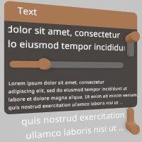
Sourcepub fn text_at(
text: impl AsRef<str>,
scroll: Option<&mut Vec2>,
scroll_direction: Option<UiScroll>,
text_align: Align,
fit: TextFit,
top_left_corner: impl Into<Vec3>,
size: impl Into<Vec2>,
) -> bool
pub fn text_at( text: impl AsRef<str>, scroll: Option<&mut Vec2>, scroll_direction: Option<UiScroll>, text_align: Align, fit: TextFit, top_left_corner: impl Into<Vec3>, size: impl Into<Vec2>, ) -> bool
Displays a large chunk of text on the current layout. This can include new lines and spaces, and will properly wrap once it fills the entire layout! Text uses the UI’s current font settings, which can be changed with Ui::push/pop_text_style. https://stereokit.net/Pages/StereoKit/UI/TextAt.html
text- The text you wish to display, there’s no additional parsing done to this text, so put it in as you want to see it!scroll- This is the current scroll value of the text, in meters, not percent.scrollDirection- What scroll bars are allowed to show on this text? Vertical, horizontal, both?text_align- Where should the text position itself within its bounds?fit- Describe how the text should behave when one of its size dimensions conflicts with the provided ‘size’ parameter.size- The layout size for this element in Hierarchy space.
Returns true if any of the scroll bars have changed this frame.
see also ui_text_at
see example in Ui::text
Sourcepub fn toggle(
text: impl AsRef<str>,
out_value: &mut bool,
size: Option<Vec2>,
) -> Option<bool>
pub fn toggle( text: impl AsRef<str>, out_value: &mut bool, size: Option<Vec2>, ) -> Option<bool>
A toggleable button! A button will expand to fit the text provided to it, vertically and horizontally. Text is re-used as the id. Will return the toggle value any time the toggle value changes or None if no change occurs https://stereokit.net/Pages/StereoKit/UI/Toggle.html
text- Text to display on the Toggle and id for tracking element state. MUST be unique within current hierarchy.out_value- The current state of the toggle button! True means it’s toggled on, and false means it’s toggled off.size- The layout size for this element in Hierarchy space. If an axis is left as zero, it will be auto-calculated. For X this is the remaining width of the current layout, and for Y this is Ui::get_line_height. None is for auto-calculated.
Will return the new value (same as out_value) any time the toggle value changes.
see also ui_toggle ui_toggle_sz Ui::toggle_img Ui::toggle_at
§Examples
use stereokit_rust::{ui::{Ui, UiBtnLayout}, maths::{Vec2, Vec3, Pose}, sprite::Sprite};

let mut window_pose = Pose::new(
    [0.01, 0.065, 0.91], Some([0.0, 185.0, 0.0].into()));

let (on, off) = (Sprite::arrow_up(), Sprite::arrow_down());

let mut choiceA = false; let mut choiceB = true;
let mut choiceC = false; let mut choiceD = true;
let mut choiceE = false; let mut choiceF = true;

filename_scr = "screenshots/ui_toggle.jpeg";
test_screenshot!( // !!!! Get a proper main loop !!!!
    Ui::window_begin("Toggle button", &mut window_pose, None, None, None);
    Ui::toggle_img("A", &mut choiceA, &off, &on, Some(UiBtnLayout::Right),
                   Some([0.06, 0.05].into()));
    Ui::same_line();
    if let Some(bool) = Ui::toggle_img("B", &mut choiceB, &off, &on,
                                       Some(UiBtnLayout::Center),
                                       Some([0.06, 0.05].into())) {todo!()}

    Ui::toggle("C", &mut choiceC, None);
    Ui::same_line();
    Ui::toggle("D", &mut choiceD, Some([0.06, 0.04].into()));

    Ui::toggle_at("E", &mut choiceE, Some(&off), None, Some(UiBtnLayout::Right),
                    [0.06, -0.12, 0.0], [0.06, 0.03]);
    if let Some(bool) = Ui::toggle_at("F", &mut choiceF, None, None, None,
                                      [-0.01, -0.12, 0.0], [0.06, 0.03]) {todo!()}
    Ui::window_end();
);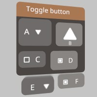
Sourcepub fn toggle_img(
id: impl AsRef<str>,
out_value: &mut bool,
toggle_off: impl AsRef<Sprite>,
toggle_on: impl AsRef<Sprite>,
image_layout: Option<UiBtnLayout>,
size: Option<Vec2>,
) -> Option<bool>
pub fn toggle_img( id: impl AsRef<str>, out_value: &mut bool, toggle_off: impl AsRef<Sprite>, toggle_on: impl AsRef<Sprite>, image_layout: Option<UiBtnLayout>, size: Option<Vec2>, ) -> Option<bool>
A toggleable button! A button will expand to fit the text provided to it, vertically and horizontally. Text is re-used as the id. Will return the toggle value any time the toggle value changes or None if no change occurs https://stereokit.net/Pages/StereoKit/UI/Toggle.html
text- Text to display on the Toggle and id for tracking element state. MUST be unique within current hierarchy.out_value- The current state of the toggle button! True means it’s toggled on, and false means it’s toggled off.toggle_off- Image to use when the toggle value is false.toggle_on- Image to use when the toggle value is true.image_layout- This enum specifies how the text and image should be laid out on the button. DefaultUiBtnLayout::Leftwill have the image on the left, and text on the right.size- The layout size for this element in Hierarchy space. If an axis is left as zero, it will be auto-calculated. For X this is the remaining width of the current layout, and for Y this is Ui::line_height. None is for auto-calculated.
Will return the new value (same as out_value) any time the toggle value changes.
see also ui_toggle_img ui_toggle_img_sz Ui::toggle Ui::toggle_at
see example in Ui::toggle
Sourcepub fn toggle_at(
id: impl AsRef<str>,
out_value: &mut bool,
toggle_off: Option<&Sprite>,
toggle_on: Option<&Sprite>,
image_layout: Option<UiBtnLayout>,
top_left_corner: impl Into<Vec3>,
size: impl Into<Vec2>,
) -> Option<bool>
pub fn toggle_at( id: impl AsRef<str>, out_value: &mut bool, toggle_off: Option<&Sprite>, toggle_on: Option<&Sprite>, image_layout: Option<UiBtnLayout>, top_left_corner: impl Into<Vec3>, size: impl Into<Vec2>, ) -> Option<bool>
A variant of Ui::toggle that doesn’t use the layout system, and instead goes exactly where you put it. https://stereokit.net/Pages/StereoKit/UI/ToggleAt.html
text- Text to display on the Toggle and id for tracking element state. MUST be unique within current hierarchy.out_value- The current state of the toggle button! True means it’s toggled on, and false means it’s toggled off.toggle_off- Image to use when the toggle value is false or when no toggle-on image is specified.toggle_on- Image to use when the toggle value is true and toggle-off has been specified. None will usetoggle_offimage if it has been specified.imageLayout- This enum specifies how the text and image should be laid out on the button. None isUiBtnLayout::Leftwill have the image on the left, and text on the right.top_left_corner- This is the top left corner of the UI element relative to the current Hierarchy.size- The layout size for this element in Hierarchy space.
Will return the new value (same as out_value) any time the toggle value changes.
see also ui_toggle_img_at ui_toggle_at Ui::toggle_img Ui::toggle
see example in Ui::toggle
Sourcepub fn volume_at(
id: impl AsRef<str>,
bounds: impl Into<Bounds>,
interact_type: UiConfirm,
out_hand: Option<*mut Handed>,
out_focus_state: Option<*mut BtnState>,
) -> BtnState
pub fn volume_at( id: impl AsRef<str>, bounds: impl Into<Bounds>, interact_type: UiConfirm, out_hand: Option<*mut Handed>, out_focus_state: Option<*mut BtnState>, ) -> BtnState
A volume for helping to build one handed interactions. This checks for the presence of a hand inside the bounds, and if found, return that hand along with activation and focus information defined by the interactType. https://stereokit.net/Pages/StereoKit/UI/VolumeAt.html
id- An id for tracking element state. MUST be unique within current hierarchy.bounds- Size and position of the volume, relative to the current Hierarchy.interact_type-UiConfirm::Pinchwill activate when the hand performs a ‘pinch’ gesture.UiConfirm::Pushwill activate when the hand enters the volume, and behave the same as element’s focusState.out_hand- This will be the last unpreoccupied hand found inside the volume, and is the hand controlling the interaction.out_focusState- The focus state tells if the element has a hand inside of the volume that qualifies for focus.
see also ui_volume_at
§Examples
use stereokit_rust::{ui::{Ui, UiConfirm}, maths::{Vec2, Vec3, Pose, Bounds},
                     system::{Hand, Handed, BtnState}};

let mut window_pose = Pose::new(
    [0.01, 0.075, 0.9], Some([0.0, 185.0, 0.0].into()));

let bounds = Bounds::new([0.0, -0.05, 0.0], [0.05, 0.05, 0.05]);

let mut hand_volume = Handed::Max;
let mut focus_state = BtnState::Inactive;

test_steps!( // !!!! Get a proper main loop !!!!
    Ui::window_begin("Volume At", &mut window_pose, None, None, None);
    let is_active = Ui::volume_at("volume", bounds, UiConfirm::Push,
                                  Some(&mut hand_volume), Some(&mut focus_state));
    assert_eq!(is_active, BtnState::Inactive);

    let is_active = Ui::volume_at("volume", bounds, UiConfirm::Pinch,
                                  None, None);
    assert_eq!(is_active, BtnState::Inactive);
    Ui::window_end();
);Sourcepub fn vslider(
id: impl AsRef<str>,
value: &mut f32,
min: f32,
max: f32,
step: Option<f32>,
height: Option<f32>,
confirm_method: Option<UiConfirm>,
notify_on: Option<UiNotify>,
) -> Option<f32>
pub fn vslider( id: impl AsRef<str>, value: &mut f32, min: f32, max: f32, step: Option<f32>, height: Option<f32>, confirm_method: Option<UiConfirm>, notify_on: Option<UiNotify>, ) -> Option<f32>
A vertical slider element! You can stick your finger in it, and slide the value up and down. https://stereokit.net/Pages/StereoKit/UI/VSlider.html
id- An id for tracking element state. MUST be unique within current hierarchy.out_value- The value that the slider will store slider state in.min- The minimum value the slider can set, left side of the slider.max- The maximum value the slider can set, right side of the slider.step- Locks the value to increments of step. Starts at min, and increments by step. None is default 0 and means “don’t lock to increments”.height- Physical height of the slider on the window. None is default 0 will fill the remaining amount of window space.confirm_method- How should the slider be activated? None is default Push will be a push-button the user must press first, and pinch will be a tab that the user must pinch and drag around.notify_on- Allows you to modify the behavior of the return value. None is default UiNotify::Change.
Returns new value of the slider if it has changed during this step.
see also ui_vslider Ui::vslider_f64 Ui::vslider_at Ui::vslider_at_f64
§Examples
use stereokit_rust::{ui::{Ui, UiConfirm, UiNotify}, maths::{Vec2, Vec3, Pose}};

let mut window_pose = Pose::new(
    [0.01, 0.055, 0.91], Some([0.0, 185.0, 0.0].into()));

let mut scaling1 = 0.15;
let mut scaling2 = 0.50f64;
let mut scaling3 = 0.0;
let mut scaling4 = 0.85;

filename_scr = "screenshots/ui_vslider.jpeg";
test_screenshot!( // !!!! Get a proper main loop !!!!
    Ui::window_begin("HSlider", &mut window_pose, Some([0.18, 0.14].into()), None, None);
    Ui::vslider(    "scaling1", &mut scaling1, 0.0, 1.0, Some(0.05), Some(0.10),
                    None, None);
    Ui::same_line();
    Ui::vslider_f64("scaling2", &mut scaling2, 0.0, 1.0, None, Some(0.12),
                    Some(UiConfirm::Pinch), None);

    Ui::vslider_at( "scaling3", &mut scaling3, 0.0, 1.0, None,
                    [-0.01, -0.01, 0.0], [0.02, 0.08],
                    None, Some(UiNotify::Finalize));
    if let Some(new_value) = Ui::vslider_at_f64(
                    "scaling4", &mut scaling4, 0.0, 1.0, None,
                    [-0.05, -0.01, 0.0], [0.036, 0.15],
                    Some(UiConfirm::VariablePinch), None) {
        if new_value == 1.0 {
            Log::info("scaling4 is at max");
        }
    }
    Ui::window_end();
);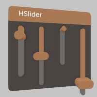
Sourcepub fn vslider_f64(
id: impl AsRef<str>,
value: &mut f64,
min: f64,
max: f64,
step: Option<f64>,
height: Option<f32>,
confirm_method: Option<UiConfirm>,
notify_on: Option<UiNotify>,
) -> Option<f64>
pub fn vslider_f64( id: impl AsRef<str>, value: &mut f64, min: f64, max: f64, step: Option<f64>, height: Option<f32>, confirm_method: Option<UiConfirm>, notify_on: Option<UiNotify>, ) -> Option<f64>
A vertical slider element! You can stick your finger in it, and slide the value up and down. https://stereokit.net/Pages/StereoKit/UI/VSlider.html
id- An id for tracking element state. MUST be unique within current hierarchy.out_value- The value that the slider will store slider state in.min- The minimum value the slider can set, left side of the slider.max- The maximum value the slider can set, right side of the slider.step- Locks the value to increments of step. Starts at min, and increments by step. None is default 0 and means “don’t lock to increments”.height- Physical height of the slider on the window. None is default 0 will fill the remaining amount of window space.confirm_method- How should the slider be activated? None is default Push will be a push-button the user must press first, and pinch will be a tab that the user must pinch and drag around.notify_on- Allows you to modify the behavior of the return value. None is default UiNotify::Change.
Returns new value of the slider if it has changed during this step.
see also ui_vslider_f64 Ui::vslider Ui::vslider_at Ui::vslider_at_f64
see example in Ui::vslider
Sourcepub fn vslider_at(
id: impl AsRef<str>,
value: &mut f32,
min: f32,
max: f32,
step: Option<f32>,
top_left_corner: impl Into<Vec3>,
size: impl Into<Vec2>,
confirm_method: Option<UiConfirm>,
notify_on: Option<UiNotify>,
) -> Option<f32>
pub fn vslider_at( id: impl AsRef<str>, value: &mut f32, min: f32, max: f32, step: Option<f32>, top_left_corner: impl Into<Vec3>, size: impl Into<Vec2>, confirm_method: Option<UiConfirm>, notify_on: Option<UiNotify>, ) -> Option<f32>
A vertical slider element! You can stick your finger in it, and slide the value up and down. https://stereokit.net/Pages/StereoKit/UI/VSliderAt.html
id- An id for tracking element state. MUST be unique within current hierarchy.out_value- The value that the slider will store slider state in.min- The minimum value the slider can set, left side of the slider.max- The maximum value the slider can set, right side of the slider.step- Locks the value to increments of step. Starts at min, and increments by step. None is default 0 and means “don’t lock to increments”.top_left_corner- This is the top left corner of the UI element relative to the current Hierarchy.size- The layout size for this element in Hierarchy space.confirm_method- How should the slider be activated? None is default Push will be a push-button the user must press first, and pinch will be a tab that the user must pinch and drag around.notify_on- Allows you to modify the behavior of the return value. None is default UiNotify::Change.
Returns new value of the slider if it has changed during this step.
see also ui_vslider_at Ui::vslider Ui::vslider_f64 Ui::vslider_at_f64
see example in Ui::vslider
Sourcepub fn vslider_at_f64(
id: impl AsRef<str>,
value: &mut f64,
min: f64,
max: f64,
step: Option<f64>,
top_left_corner: impl Into<Vec3>,
size: impl Into<Vec2>,
confirm_method: Option<UiConfirm>,
notify_on: Option<UiNotify>,
) -> Option<f64>
pub fn vslider_at_f64( id: impl AsRef<str>, value: &mut f64, min: f64, max: f64, step: Option<f64>, top_left_corner: impl Into<Vec3>, size: impl Into<Vec2>, confirm_method: Option<UiConfirm>, notify_on: Option<UiNotify>, ) -> Option<f64>
A vertical slider element! You can stick your finger in it, and slide the value up and down. https://stereokit.net/Pages/StereoKit/UI/VSliderAt.html
id- An id for tracking element state. MUST be unique within current hierarchy.out_value- The value that the slider will store slider state in.min- The minimum value the slider can set, left side of the slider.max- The maximum value the slider can set, right side of the slider.step- Locks the value to increments of step. Starts at min, and increments by step. None is default 0 and means “don’t lock to increments”.top_left_corner- This is the top left corner of the UI element relative to the current Hierarchy.size- The layout size for this element in Hierarchy space.confirm_method- How should the slider be activated? None is default Push will be a push-button the user must press first, and pinch will be a tab that the user must pinch and drag around.notify_on- Allows you to modify the behavior of the return value. None is default UiNotify::Change.
Returns new value of the slider if it has changed during this step.
see also ui_vslider_at_f64 Ui::vslider Ui::vslider_at Ui::vslider_f64
see example in Ui::vslider
Sourcepub fn window_begin(
text: impl AsRef<str>,
pose: &mut Pose,
size: Option<Vec2>,
window_type: Option<UiWin>,
move_type: Option<UiMove>,
)
pub fn window_begin( text: impl AsRef<str>, pose: &mut Pose, size: Option<Vec2>, window_type: Option<UiWin>, move_type: Option<UiMove>, )
Begins a new window! This will push a pose onto the transform stack, and all UI elements will be relative to that new pose. The pose is actually the top-center of the window. Must be finished with a call to Ui::window_end(). If size is None the size will be auto-calculated based on the content provided during the previous frame. https://stereokit.net/Pages/StereoKit/UI/WindowBegin.html
text- Text to display on the window title and id for tracking element state. MUST be unique within current hierarchy.pose- The pose state for the window! If showHeader is true, the user will be able to grab this header and move it around.size- Physical size of the window! If None, then the size on that axis will be auto- calculated based on the content provided during the previous frame.windowType- Describes how the window should be drawn, use a header, a body, neither, or both? None is UiWin::NormalmoveType- Describes how the window will move when dragged around. None is UiMove::FaceUser
see also ui_window_begin
§Examples
use stereokit_rust::{ui::{Ui, UiMove, UiWin}, maths::{Vec2, Vec3, Pose}};

let mut window_pose1 = Pose::new(
    [-0.07, 0.115, 0.89], Some([0.0, 185.0, 0.0].into()));
let mut window_pose2 = Pose::new(
    [-0.05, 0.02, 0.89], Some([0.0, 180.0, 0.0].into()));
let mut window_pose3 = Pose::new(
    [0.09, -0.075, 0.89], Some([0.0, 175.0, 0.0].into()));

filename_scr = "screenshots/ui_window.jpeg";
test_screenshot!( // !!!! Get a proper main loop !!!!
    Ui::window_begin("Window", &mut window_pose1, None, Some(UiWin::Body), None);
    Ui::label("Hello", None, true);
    Ui::window_end();

    Ui::window_begin("Window", &mut window_pose2, Some([0.19, 0.05].into()), None, None);
    Ui::label("World", None, true);
    Ui::window_end();

    Ui::window_begin("Window", &mut window_pose3, None, None, Some(UiMove::Exact));
    Ui::label("!!", None, true);
    Ui::window_end();
);
Sourcepub fn window_end()
pub fn window_end()
Finishes a window! Must be called after Ui::window_begin() and all elements have been drawn. https://stereokit.net/Pages/StereoKit/UI/WindowEnd.html
see also ui_window_end
see example in Ui::window_begin
Sourcepub fn get_enable_far_interact() -> bool
pub fn get_enable_far_interact() -> bool
get the flag about the far ray grab interaction for Handle elements like the Windows. It can be enabled and disabled for individual UI elements, and if this remains disabled at the start of the next frame, then the hand ray indicators will not be visible. This is enabled by default. https://stereokit.net/Pages/StereoKit/UI/EnableFarInteract.html
see also ui_far_interact_enabled
see example in Ui::enable_far_interact
Sourcepub fn get_last_element_active() -> BtnState
pub fn get_last_element_active() -> BtnState
Tells the Active state of the most recently called UI element that used an id. https://stereokit.net/Pages/StereoKit/UI/LastElementActive.html
see also ui_last_element_active
see example in Ui::last_element_hand_active
Sourcepub fn get_last_element_focused() -> BtnState
pub fn get_last_element_focused() -> BtnState
Tells the Focused state of the most recently called UI element that used an id. https://stereokit.net/Pages/StereoKit/UI/LastElementFocused.html
see also ui_last_element_focused
see example in Ui::last_element_hand_focused
Sourcepub fn get_layout_at() -> Vec3
pub fn get_layout_at() -> Vec3
The hierarchy local position of the current UI layout position. The top left point of the next UI element will be start here! https://stereokit.net/Pages/StereoKit/UI/LayoutAt.html
see also ui_layout_at
see example in Ui::panel_at
Sourcepub fn get_layout_last() -> Bounds
pub fn get_layout_last() -> Bounds
These are the layout bounds of the most recently reserved layout space. The Z axis dimensions are always 0. Only UI elements that affect the surface’s layout will report their bounds here. You can reserve your own layout space via Ui::layout_reserve, and that call will also report here. https://stereokit.net/Pages/StereoKit/UI/LayoutLast.html
see also ui_layout_last
§Examples TODO: Very very slow under Windows
use stereokit_rust::{ui::{Ui, UiPad, UiCut}, maths::{Vec2, Vec3, Pose, Bounds}};

let mut window_pose = Pose::new(
    [0.01, 0.055, 0.90], Some([0.0, 185.0, 0.0].into()));

test_steps!( // !!!! Get a proper main loop !!!!
    Ui::window_begin("Panel at", &mut window_pose, Some([0.2, 0.15].into()), None, None);
    Ui::panel_at([0.11, -0.01, 0.0], [0.08, 0.03], Some(UiPad::None));
    Ui::label("panel 1", None, false);

    Ui::layout_push_cut( UiCut::Right, 0.1, true);
    Ui::panel_at(Ui::get_layout_at(), Ui::get_layout_remaining(), None);
    Ui::label("panel 2", None, false);
    Ui::layout_pop();
    assert_eq!(Ui::get_layout_last(),
        Bounds { center: Vec3 { x: -0.02382, y: -0.035, z: 0.0 },
                 dimensions: Vec3 { x: 0.06765, y: 0.05, z: 0.0 } });

    Ui::layout_push_cut( UiCut::Bottom, 0.08, false);
    Ui::panel_at(Ui::get_layout_at(), Ui::get_layout_remaining(), None);
    Ui::label("panel 3", None, false);
    Ui::layout_pop();
    assert_eq!(Ui::get_layout_last(),
        Bounds { center: Vec3 { x: 0.0661, y: -0.075, z: 0.0 },
                 dimensions: Vec3 { x: 0.0476, y: 0.03, z: 0.0 } });

    Ui::window_end();
);Sourcepub fn get_layout_remaining() -> Vec2
pub fn get_layout_remaining() -> Vec2
How much space is available on the current layout! This is based on the current layout position, so X will give you the amount remaining on the current line, and Y will give you distance to the bottom of the layout, including the current line. These values will be 0 if you’re using 0 for the layout size on that axis. https://stereokit.net/Pages/StereoKit/UI/LayoutRemaining.html
see also ui_layout_remaining
see example in Ui::panel_at
Sourcepub fn get_line_height() -> f32
pub fn get_line_height() -> f32
This is the height of a single line of text with padding in the UI’s layout system! https://stereokit.net/Pages/StereoKit/UI/LineHeight.html
see also ui_line_height
§Examples
use stereokit_rust::{ui::Ui, maths::{Vec2, Vec3, Pose}};

let line_height = Ui::get_line_height();
assert_eq!(line_height, 0.030000001);Sourcepub fn get_settings() -> UiSettings
pub fn get_settings() -> UiSettings
UI sizing and layout settings. https://stereokit.net/Pages/StereoKit/UI/Settings.html
see also ui_get_settings
see example in Ui::settings
Sourcepub fn get_system_move_type() -> UiMove
pub fn get_system_move_type() -> UiMove
This is the UiMove that is provided to UI windows that StereoKit itself manages, such as the fallback filepicker and soft keyboard. https://stereokit.net/Pages/StereoKit/UI/SystemMoveType.html
see also ui_system_get_move_type
see example in Ui::system_move_type
Sourcepub fn get_text_style() -> TextStyle
pub fn get_text_style() -> TextStyle
This returns the TextStyle that’s on top of the UI’s stack, according to Ui::(push/pop)_text_style. https://stereokit.net/Pages/StereoKit/UI/TextStyle.html
see also ui_get_text_style
see example in Ui::push_text_style
Sourcepub fn get_enabled() -> bool
pub fn get_enabled() -> bool
This returns the current state of the UI’s enabled status stack, set by Ui::(push/pop)_enabled.
https://stereokit.net/Pages/StereoKit/UI/Enabled.html
see also ui_is_enabled
see example in Ui::push_enabled
Auto Trait Implementations§
impl Freeze for Ui
impl RefUnwindSafe for Ui
impl Send for Ui
impl Sync for Ui
impl Unpin for Ui
impl UnwindSafe for Ui
Blanket Implementations§
Source§impl<T> BorrowMut<T> for Twhere
T: ?Sized,
impl<T> BorrowMut<T> for Twhere
T: ?Sized,
Source§fn borrow_mut(&mut self) -> &mut T
fn borrow_mut(&mut self) -> &mut T
Source§impl<T> Downcast for Twhere
T: Any,
impl<T> Downcast for Twhere
T: Any,
Source§fn into_any(self: Box<T>) -> Box<dyn Any>
fn into_any(self: Box<T>) -> Box<dyn Any>
Box<dyn Trait> (where Trait: Downcast) to Box<dyn Any>. Box<dyn Any> can
then be further downcast into Box<ConcreteType> where ConcreteType implements Trait.Source§fn into_any_rc(self: Rc<T>) -> Rc<dyn Any>
fn into_any_rc(self: Rc<T>) -> Rc<dyn Any>
Rc<Trait> (where Trait: Downcast) to Rc<Any>. Rc<Any> can then be
further downcast into Rc<ConcreteType> where ConcreteType implements Trait.Source§fn as_any(&self) -> &(dyn Any + 'static)
fn as_any(&self) -> &(dyn Any + 'static)
&Trait (where Trait: Downcast) to &Any. This is needed since Rust cannot
generate &Any’s vtable from &Trait’s.Source§fn as_any_mut(&mut self) -> &mut (dyn Any + 'static)
fn as_any_mut(&mut self) -> &mut (dyn Any + 'static)
&mut Trait (where Trait: Downcast) to &Any. This is needed since Rust cannot
generate &mut Any’s vtable from &mut Trait’s.