Expand description
§Guillotine
§Guillotine





A no-std, allocation-free graphical user interface framework for embedded devices prioritizing efficiency and ergonomics. The UI declaration API is heavily inspired by GPUI. Built with (and inherits compatibility from)
embedded-graphics.
§Demo
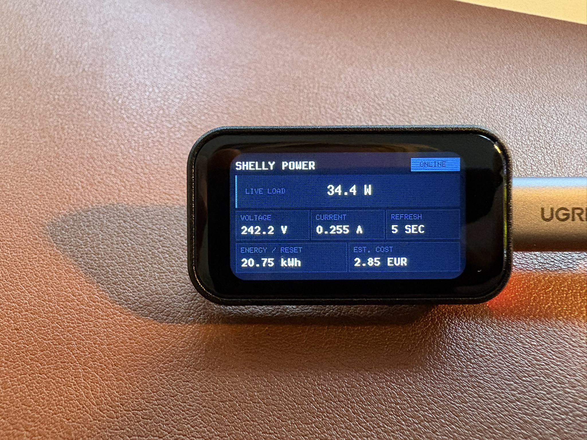
A demo Guillotine UI on a Waveshare ESP32-C6 1.47“ LCD board from the shellyctl project:
§Quickstart
This example uses the optional flexbox feature.
use embedded_graphics::{
    mock_display::MockDisplay,
    mono_font::ascii::{FONT_6X10, FONT_9X18_BOLD},
    pixelcolor::Rgb565,
    prelude::Size,
};
use guillotine::{style::JustifyContent, *};

const CANVAS: Rgb565 = Rgb565::new(2, 4, 6);
const PANEL: Rgb565 = Rgb565::new(4, 9, 12);
const ACCENT: Rgb565 = Rgb565::new(7, 47, 25);

struct BasicView {
    greeting: &'static str,
}

impl Render for BasicView {
    // Render lets you declaratively build your UI tree.
    fn render(&self, cx: &Context<'_>) -> impl ElementBuilder {
        cx.column()
            .size(Size::new(320, 172))
            .padding(12)
            .gap(8)
            .background(CANVAS)
            .justify_content(JustifyContent::Center)
            .child(
                cx.row()
                    .child(cx.text("GUILLOTINE").flex_grow(1).font(Font::mono(&FONT_9X18_BOLD)))
                    .child(
                        cx.text("READY")
                            .padding((4, 9))
                            .background(ACCENT)
                            .font(Font::mono(&FONT_6X10)),
                    ),
            )
            .child(
                cx.row()
                    .gap(8)
                    .child(
                        cx.text(self.greeting)
                            .font(Font::mono(&FONT_6X10))
                            .flex(3)
                            .padding(10)
                            .background(PANEL),
                    )
                    .child(
                        cx.text("7 nodes, 54 bytes")
                            .font(Font::mono(&FONT_6X10))
                            .flex(2)
                            .padding(6)
                            .background(ACCENT),
                    ),
            )
    }
}

fn main() {
    // Displays implement embedded-graphics' `DrawTarget`.
    let display = MockDisplay::<Rgb565>::new();

    let view = BasicView { greeting: "Build tiny interfaces." };

    // Initialize stack-based storage for the frame. Capacity: 32 nodes
    // and 128 bytes of UTF-8 text.
    let storage = FrameStorage::<Rgb565, 32, 128>::default();

    // Create a new UI with a direct display target. Used here for brevity;
    // if you have memory available, use `BufferedTarget`.
    let mut ui = Ui::new(DirectTarget::new(display), storage).with_background(CANVAS);

    // Render the view.
    ui.render(&view).unwrap();
}§Frame Buffers
The framebuffer feature (on by default) provides a BufferedTarget type that
works with caller-provided frame buffers. It is highly recommended to use this
over DirectTarget, since it can dramatically increase frame rates and reduce
flicker to near unnoticeable if you can cover the whole display.
use embedded_graphics::{mock_display::MockDisplay, pixelcolor::Rgb565};
use static_cell::ConstStaticCell;
use guillotine::{buffered::BufferedTarget, *};

// The frame buffer should ideally cover the whole display (width * height).
const FRAMEBUFFER_PIXELS: usize = 320 * 172;

// Allocate the buffer in static memory with your chosen color.
static FRAMEBUFFER: ConstStaticCell<[Rgb565; FRAMEBUFFER_PIXELS]> =
    ConstStaticCell::new([Rgb565::new(0, 0, 0); FRAMEBUFFER_PIXELS]);

fn main() {
    let mut display = MockDisplay::<Rgb565>::new();

    // Initialize stack-based storage for the frame. Capacity: 32 elements
    // and 128 bytes of UTF-8 text.
    let storage = FrameStorage::<Rgb565, 32, 128>::default();

    // Initialize the buffered display target.
    let target = BufferedTarget::new(&mut display, FRAMEBUFFER.take());

    let mut ui = Ui::new(target, storage);

    // ... render something
}
Large buffers should generally use static storage (with static_cell).
Small buffers can live on the stack if the stack size permits it.
Note that the memory used by an Rgb565 buffer is pixels x 2 bytes.
§Picking Sizes
Ideally, your frame buffer covers the whole display. However, you can provide a
buffer of any size, and render() will execute a greedy top-down traversal to
find the first subtree that fits.
Passing buffers that are smaller than the area of any element on the screen will
fall back to direct drawing.
[!NOTE] If your frame buffer doesn’t fit the root element, it is painted directly before its children are considered. An opaque root background may therefore appear as a visible clear before buffered children are presented, so you may still notice a flicker.
§Memory Management
Guillotine does not require an allocator, and uses heapless to store fixed-capacity node and text arrays inline.
This library exposes FrameStorage as the frontend for frame memory. Its signature is:
pub struct FrameStorage<
    C,
    const N: usize = 64,
    const T: usize = 1024,
    CE = NoCustomElement,
>
Since heapless stores data inline, capacity has to be specified upfront through const generics.
FrameStorage contains two buffers:
nodes, with capacityN, stores the frame’s element tree. The default is 64 nodes.text, with capacityT, stores the UTF-8 bytes for all text elements in the frame. The default is 1024 bytes.
CE is the application-defined custom element type. It defaults to NoCustomElement for UIs that
only use Guillotine’s built-in elements.
It’s recommended to tune N and T to fit the specifics
of your UI. FrameStorage exposes some methods to help you do that:
usage()returns the used length of both buffers.capacity()returns the capacity of both buffers.
[!NOTE] These buffers are only populated after calls to
render(), and will contain the element tree and text bytes for the currently rendered frame.
§Layout
By default, Guillotine supports a limited subset of the flexbox layout engine. Rows are start-aligned containers along the horizontal axis with support for gaps, and columns are their vertical counterpart.
§Flexbox
More complete flexbox support is gated behind a flexbox feature and is turned off by default,
because these flexbox properties require the layout tree to be traversed
twice, demanding extra compute and slightly higher rendering latency.
With flexbox on, you’ll get access to CSS-like flexbox functionality, including justify-content and
align-items (for containers), and flex-grow and flex for items.
[!TIP] Some properties, like
AlignItems::Stretch, currently have a complexity ofO(N x D), whereNis the number of nodes andDis the tree depth. For small trees, this shouldn’t be a problem, but keep it in mind if you have more complex layouts.
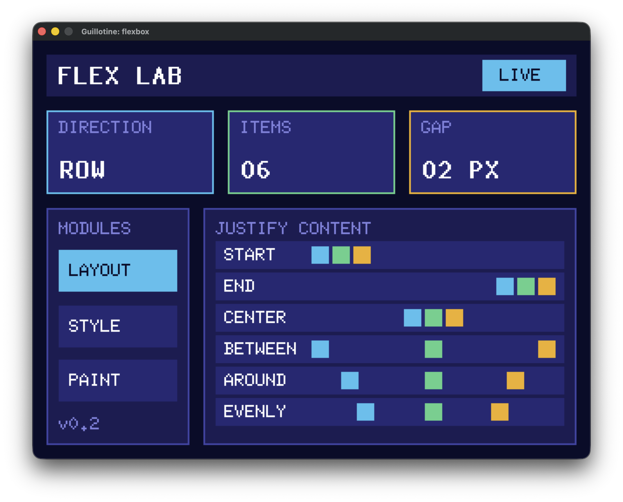
Refer to flexbox.rs for a flexbox layout example:
§Styling
§Insets and the box model
Margin, padding, and border widths accept CSS-like physical-edge shorthands:
cx.column()
    .margin(10)                 // all edges
    .padding((4, 8))            // vertical, horizontal
    .border((1, 2, 3))          // top, horizontal, bottom
    .margin((4, 8, 12, 16));    // top, right, bottom, left
Use Insets::new(top, right, bottom, left) when a named value is clearer. Insets are non-negative
pixel lengths. Guillotine doesn’t currently support percentages, auto, logical edges, negative
margins, margin collapsing, per-edge border colors, or border styles. Adjacent margins in rows and
columns add together.
size, width, and height configure border-box dimensions: padding and border are placed inside
them, and margin is added outside. Width and height are independent; an omitted dimension is sized
automatically from the element’s contents. Configured dimensions grow to contain padding and border
when parent constraints allow.
§Custom Elements
Guillotine supports custom elements that implement their own embedded-graphics-based drawing.
For example, a custom BatteryGauge can implement the CustomElement trait:
pub trait CustomElement<C: PixelColor> {
    /// Returns the element's natural content size before common style and parent constraints.
    fn intrinsic_size(&self) -> Size;

    /// Draws the element inside its absolute content bounds.
    fn draw<D>(&self, bounds: &Rectangle, theme: &Theme<C>, target: &mut D) -> Result<(), D::Error>
    where
        D: DrawTarget<Color = C>;
}
Then add it to a view with cx.custom():
impl Render<Color, BatteryGauge> for AppView {
    fn render(&self, cx: &Context<'_, Color, BatteryGauge>) -> impl ElementBuilder {
        cx.custom(BatteryGauge::new(100))
            .padding(4)
            .border(1)
            .border_color(Color::new(0, 0, 0))
    }
}
The bounds passed to draw are the absolute content rectangle after margin, border, and padding
have been resolved. Guillotine clips the draw target to that rectangle and passes the active theme.
If an application has multiple custom element types, define an enum with one variant per type and
delegate CustomElement from the enum. See custom_element.rs for a
complete example.
[!IMPORTANT] Custom elements are stored inline. A large
CEtype can therefore increase the size of every node in the UI tree. Keep custom element values compact.
§Examples
See the examples README.
§Core Concepts
Each call to Ui::render declaratively rebuilds an element tree in FrameStorage, lays it out, and
draws it. Application state remains in the view; the frame tree is temporary and is cleared before
the next render.
Layout follows a constraints-based model: parent constraints flow down the tree, child sizes flow back up, and final positions flow down. Rows arrange children horizontally, columns arrange them vertically, and custom elements act as leaf content with an intrinsic size.
§Why?
I was trying to build a clean-looking dashboard on a small LCD screen powered by an ESP32-C6, that’s supposed to monitor and display the power consumption of my home lab (project here). I wanted to do this in Rust, with the esp-rs ecosystem. The ecosystem is quite mature, but I couldn’t really find a UI framework that was:
- Performant
- Very low memory footprint (no Slint / LVGL)
- Beautiful
Additionally, I wanted to learn what it would take to build something like this.
§Roadmap
§v0.0.1
- Try to mimic GPUI declaration style: https://github.com/zed-industries/zed/blob/main/crates/gpui/examples/hello_world.rs
-
Low-level
ElementBuilder/ParentElementtraits for composing elements and widgets -
Support generic
PixelColor - Full immediate mode redrawing
-
Make repo ready for publishing:
- README documentation (a la Dioxus)
- Rustdoc documentation
-
Examples
- Sizing (insets)
- Fonts
- Cool
- ESP32
- Fix exports
- Dual Apache / MIT license
- Fix sdl2 vendoring for embedded-graphics-simulator
-
TextStylefonts -
Support for non-interactive elements:
- Row
- (formatted) Text
- Column
§v0.1.0
- No alloc
§v0.2.1
-
framebufferfeature with frame buffer support
§v0.3.0
- Refactored layout engine
-
Support flexbox layout (
flexboxfeature)
§v0.4.0
- Support custom elements
§v0.4.1
-
Support for absolute positioning
(relative by default). Introduces a new explicit
positionproperty toStyle.
§v0.4.2
-
New elements
- Dialogs / Modals (floating containers)
- Charts
-
Spinner (going to be interesting as this is essentially a self-rendering element). Will
probably require a global
frame_rateto be set on theUi. However, this would be a full retained mode approach with an async polling loop. Another approach is to first implement incremental redrawing, and rely on the caller to callrender()at their chosen rate. However, eachrender()would do a bunch of compute, so probably not super efficient?
§Backlog
-
Mirrored debugger / inspector:
- When plugged into an MCU, this feature launches an interactive inspector on your host machine (think the Chrome inspector). Displays real-time total and per-element memory consumption, frame rendering times, boxes, frame buffer utilization, etc. Builds on the embedded-graphics simulator.
-
Add memory usage for examples
- cargo binutils for examples in CI (cargo size). This will detect regressions.
-
Documentation
-
Guide for finding the ideal
FrameStoragecapacity.
-
Guide for finding the ideal
-
Benchmarks for:
- Frame rendering
- Frame drawing
- Stats for frame buffers (to determine optimal sizing)
-
Incremental drawing behind an
incrementalfeature -
Explicit behaviour:
- Hidden
- Visible
- Scroll
-
Support for interaction behind an
interactionfeature -
Support interactive elements:
- Button
- Slider
§Prior Work & Inspiration
Re-exports§
pub use style::Insets;pub use style::Style;pub use style::StyledElement;
Modules§
Structs§
- Context
- Per-frame context used to create element builders backed by fixed-capacity storage.
- Custom
Builder - A builder that adds application-defined leaf content to a frame.
- Direct
Target - A display target that only supports direct drawing without buffering. For a buffered display,
use
BufferedTarget(behind theframebufferfeature). - DivStyle
- Style for a div element.
- Frame
Capacity - Tracks the capacity of a
FrameStoragebuffer. - Frame
Storage - Fixed-capacity storage for the nodes and text needed to render one frame.
- Frame
Usage - Tracks the usage of a
FrameStoragebuffer. - Storage
View - A capacity-erased mutable view into a
FrameStoragebuffer. - Text
Style - Text style.
- Theme
- Colors used by the UI when an element doesn’t specify a color explicitly.
- Ui
- The
Uistruct is the main entrypoint for the Guillotine UI framework. It manages the display and renders the tree produced byRenderwithSelf::render.
Enums§
- Build
Error - An error encountered while building a frame in fixed-capacity storage.
- Font
- Font for text rendering.
- NoCustom
Element - An uninhabited marker used when a UI doesn’t support custom elements.
- Render
Error - An error encountered while building or drawing a frame.
Traits§
- Custom
Element - Application-defined leaf content that participates in layout and drawing.
- Display
Target - A display target that optionally supports buffered drawing.
- Element
Builder - A value that can add an element node to the current frame.
- Fluent
Builder - A helper trait for building complex objects with imperative conditionals in a fluent style.
- Parent
Element - A builder for an element that can contain any number of child elements.
- Render
- Converts a view into an element tree for the current frame.
- Styled
Flex Container - A trait for elements that can be styled as a flex container.
- Text
Styled Element - A trait for elements that can be styled with text properties.