pub struct Button { /* private fields */ }Expand description
Creates a normal button
Implementations§
Source§impl Button
impl Button
Sourcepub fn new<'a, T: Into<Option<&'a str>>>(
x: i32,
y: i32,
width: i32,
height: i32,
title: T,
) -> Button
pub fn new<'a, T: Into<Option<&'a str>>>( x: i32, y: i32, width: i32, height: i32, title: T, ) -> Button
Creates a new widget, takes an x, y coordinates, as well as a width and height, plus a title
§Arguments
x- The x coordinate in the screeny- The y coordinate in the screenwidth- The width of the widgetheigth- The height of the widgettitle- The title or label of the widget
To use dynamic strings use with_label(self, &str) or set_label(&mut self, &str).
labels support special symbols preceded by an @ sign
and for the associated formatting.
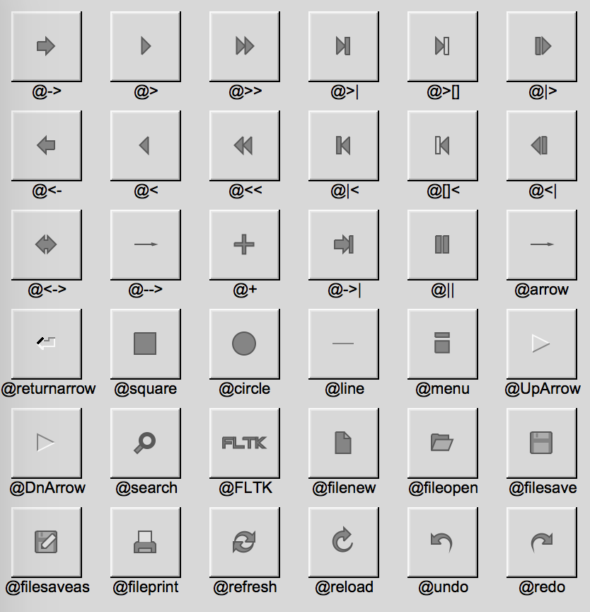
Examples found in repository?
examples/hello_button.rs (line 7)
3fn main() {
4    let app = app::App::default();
5    let mut wind = Window::default().with_size(400, 300);
6    let mut frame = Frame::default().with_size(200, 100).center_of(&wind);
7    let mut but = Button::new(160, 210, 80, 40, "Click me!");
8    wind.end();
9    wind.show();
10
11    but.set_callback(move |_| frame.set_label("Hello world"));
12
13    app.run().unwrap();
14}
More examples
examples/widget_table.rs (line 18)
5fn main() {
6    let a = app::App::default();
7    let mut win = window::Window::default().with_size(500, 400);
8    let mut table = table::Table::default()
9        .with_size(400, 130)
10        .center_of_parent();
11    table.set_frame(enums::FrameType::NoBox);
12    table.set_scrollbar_size(-1);
13    table.set_rows(5);
14    table.set_cols(5);
15    for i in 0..5 {
16        for j in 0..5 {
17            if let Some((x, y, w, h)) = table.find_cell(table::TableContext::Cell, i, j) {
18                button::Button::new(x, y, w, h, None).with_label(&(i + j).to_string());
19            }
20        }
21    }
22    table.end();
23    win.end();
24    win.show();
25    a.run().unwrap();
26}
examples/closable_tabs2.rs (line 23)
20    fn create_tab_button(label: &str) -> group::Group {
21        let mut grp = group::Group::new(0, 0, 150, 40, None);
22        grp.set_align(Align::Left | Align::Inside);
23        let mut but_handle = button::Button::new(grp.x() + 5, grp.y() + 5, 110, 30, "");
24        but_handle.set_align(Align::Left | Align::Inside);
25        but_handle.set_label(label);
26        let mut but_close = button::Button::new(grp.x() + 120, grp.y() + 10, 20, 20, "@1+");
27        but_handle.set_frame(FrameType::FlatBox);
28        but_handle.clear_visible_focus();
29        but_close.set_frame(FrameType::FlatBox);
30        grp.end();
31        grp.set_frame(FrameType::UpFrame);
32        grp
33    }
34
35    // Public
36    pub struct ClosableTab<'a> {
37        current: Option<i32>, // The tab which is visible on the foreground
38        snd: &'a app::Sender<Message>,
39        contents: group::Group,
40        tab_labels: group::Pack,
41    }
42
43    impl<'a> ClosableTab<'a> {
44        pub fn new(x: i32, y: i32, w: i32, h: i32, snd: &'a app::Sender<Message>) -> Self {
45            let current = None;
46            let parent_grp = group::Group::new(x, y, w, h, None);
47            let mut tab_labels = group::Pack::new(x + 5, y, w - 10, 40, None);
48            tab_labels.set_spacing(3);
49            tab_labels.set_type(group::PackType::Horizontal);
50            tab_labels.end();
51            let mut contents = group::Group::new(x, y + 40, w, h - 40, None);
52            contents.set_frame(FrameType::NoBox);
53            contents.end();
54            parent_grp.end();
55            Self {
56                current,
57                snd,
58                contents,
59                tab_labels,
60            }
61        }
62
63        pub fn add(&mut self, child: &mut group::Group, label: &str) {
64            child.resize(
65                self.contents.x(),
66                self.contents.y(),
67                self.contents.w(),
68                self.contents.h(),
69            );
70            self.contents.add(child);
71            let but = create_tab_button(label);
72            self.tab_labels.add(&but);
73            but.child(1).unwrap().set_callback({
74                let curr_child = child.clone();
75                let contents = self.contents.clone();
76                let sndb = *self.snd;
77                move |_| {
78                    let idx = contents.find(&curr_child);
79                    sndb.send(Message::Delete(idx));
80                    app::redraw();
81                }
82            });
83            but.child(0).unwrap().set_callback({
84                let curr_child = child.clone();
85                let contents = self.contents.clone();
86                let sndb = *self.snd;
87                move |_| {
88                    let idx = contents.find(&curr_child);
89                    sndb.send(Message::Foreground(idx));
90                    app::redraw();
91                }
92            });
93        }
94
95        pub fn remove(&mut self, idx: i32) {
96            self.contents.remove_by_index(idx);
97            self.tab_labels.remove_by_index(idx);
98            if self.current == Some(idx) {
99                if idx > 1 {
100                    self.set_foreground(idx - 1);
101                } else if self.contents.children() > 0 {
102                    self.set_foreground(0);
103                }
104            }
105        }
106
107        /** No return variable, fails silently */
108        pub fn set_foreground(&mut self, fg_idx: i32) {
109            for idx in 0..self.contents.children() {
110                if idx != fg_idx {
111                    self.contents.child(idx).unwrap().hide();
112                    self.tab_labels
113                        .child(idx)
114                        .unwrap()
115                        .set_label_color(fltk::enums::Color::Inactive);
116                    self.tab_labels
117                        .child(idx)
118                        .unwrap()
119                        .set_color(fltk::enums::Color::Inactive);
120                    self.tab_labels
121                        .child(idx)
122                        .unwrap()
123                        .set_frame(FrameType::DownFrame);
124                } else {
125                    self.contents.child(idx).unwrap().show();
126                    self.tab_labels
127                        .child(idx)
128                        .unwrap()
129                        .set_label_color(Color::Selection);
130                    self.tab_labels
131                        .child(idx)
132                        .unwrap()
133                        .set_color(fltk::enums::Color::Selection);
134                    self.tab_labels
135                        .child(idx)
136                        .unwrap()
137                        .set_frame(FrameType::NoBox);
138                }
139                self.tab_labels.child(idx).unwrap().set_damage(true);
140                self.tab_labels.child(idx).unwrap().redraw();
141                self.current = Some(fg_idx);
142            }
143        }
144
145        /** Report which tab index is visible on foreground */
146        pub fn get_foreground(&self) -> Option<i32> {
147            self.current
148        }
149    }
150}
151
152fn main() {
153    use fltk::{prelude::*, *};
154    // Create groups to be used as content for tabs
155    pub fn create_tab(from: i32, to: i32) -> group::Group {
156        let grp = group::Group::new(0, 0, 800, 600, None);
157        for idx in from..to {
158            button::Button::new(
159                idx * 10 + (idx - from) * 42,
160                idx * 10 + (idx - from) * 42,
161                80,
162                40,
163                None,
164            )
165            .with_label(&format!("button {idx}"));
166        }
167        grp.end();
168        grp
169    }
examples/composite_widgets.rs (line 14)
9    pub fn new(w: i32, h: i32) -> MyButton {
10        let mut grp = group::Group::new(0, 0, w, h, None);
11        grp.set_frame(enums::FrameType::RFlatBox);
12        grp.set_color(enums::Color::from_u32(0x01579b));
13        grp.set_align(enums::Align::Center);
14        let mut btn = button::Button::new(grp.x() + 420, grp.y() + 35, 30, 25, "@1+");
15        btn.set_frame(enums::FrameType::OFlatBox);
16        btn.set_color(enums::Color::from_u32(0xf49da9));
17        btn.set_callback(move |b| b.parent().unwrap().hide());
18        grp.end();
19        grp.handle(|g, ev| match ev {
20            enums::Event::Push => {
21                g.do_callback();
22                true
23            }
24            _ => false,
25        });
26        MyButton { grp }
27    }
examples/custom_choice.rs (line 113)
108    pub fn new<S: Into<Option<&'static str>>>(x: i32, y: i32, w: i32, h: i32, label: S) -> Self {
109        let grp = group::Group::new(x, y, w, h, label).with_align(Align::Left);
110        let mut frame = frame::Frame::new(x, y, w - w / 4, h, None);
111        frame.set_frame(FrameType::DownBox);
112        frame.set_color(Color::Background2);
113        let mut btn = button::Button::new(x + w - w / 4, y, w / 4, h, "@2>");
114        btn.clear_visible_focus();
115        grp.end();
116        let choices = Rc::from(RefCell::from(vec![]));
117        btn.set_callback({
118            let c = choices.clone();
119            let mut f = frame.clone();
120            let btn_win = btn.window().unwrap();
121            move |b| {
122                let mut menu = MyPopup::new(&c.borrow());
123                let s = menu.popup(b.x() + btn_win.x() - f.w(), b.y() + btn_win.y() + b.h());
124                f.set_label(&s.0);
125            }
126        });
127        Self {
128            grp,
129            frame,
130            btn,
131            choices,
132        }
133    }
examples/calculator.rs (line 38)
37    pub fn new(title: &'static str) -> MyButton {
38        let mut b = Button::new(0, 0, 90, 0, title);
39        b.set_label_size(20);
40        b.set_compact(true);
41        match title {
42            "0" => {
43                b.resize(0, 0, 90 * 2, 0);
44                b.set_color(Color::Light3);
45                b.set_shortcut(Shortcut::None | '0');
46            }
47            "CE" => {
48                b.set_color(Color::Red);
49                b.set_shortcut(Shortcut::None | Key::Delete);
50            }
51            "x" | "/" | "+" | "-" | "=" | "C" | "@<-" => {
52                b.set_color(Color::Yellow);
53                let shortcut = if title == "x" {
54                    '*'
55                } else {
56                    title.chars().next().unwrap()
57                };
58                b.set_shortcut(Shortcut::None | shortcut);
59                if shortcut == '@' {
60                    b.set_shortcut(Shortcut::None | Key::BackSpace);
61                }
62                if shortcut == '=' {
63                    b.set_shortcut(Shortcut::None | Key::Enter);
64                }
65            }
66            _ => {
67                b.set_color(Color::Light3);
68                b.set_shortcut(Shortcut::None | title.chars().next().unwrap());
69            }
70        }
71        Self { b }
72    }
Additional examples can be found in:
Sourcepub fn default_fill() -> Self
pub fn default_fill() -> Self
Constructs a widget with the size of its parent
Source§impl Button
impl Button
Sourcepub fn set_compact(&mut self, flag: bool)
pub fn set_compact(&mut self, flag: bool)
Set whether a button is compact
Examples found in repository?
examples/calculator.rs (line 40)
37    pub fn new(title: &'static str) -> MyButton {
38        let mut b = Button::new(0, 0, 90, 0, title);
39        b.set_label_size(20);
40        b.set_compact(true);
41        match title {
42            "0" => {
43                b.resize(0, 0, 90 * 2, 0);
44                b.set_color(Color::Light3);
45                b.set_shortcut(Shortcut::None | '0');
46            }
47            "CE" => {
48                b.set_color(Color::Red);
49                b.set_shortcut(Shortcut::None | Key::Delete);
50            }
51            "x" | "/" | "+" | "-" | "=" | "C" | "@<-" => {
52                b.set_color(Color::Yellow);
53                let shortcut = if title == "x" {
54                    '*'
55                } else {
56                    title.chars().next().unwrap()
57                };
58                b.set_shortcut(Shortcut::None | shortcut);
59                if shortcut == '@' {
60                    b.set_shortcut(Shortcut::None | Key::BackSpace);
61                }
62                if shortcut == '=' {
63                    b.set_shortcut(Shortcut::None | Key::Enter);
64                }
65            }
66            _ => {
67                b.set_color(Color::Light3);
68                b.set_shortcut(Shortcut::None | title.chars().next().unwrap());
69            }
70        }
71        Self { b }
72 }Trait Implementations§
Source§impl ButtonExt for Button
impl ButtonExt for Button
Source§fn set_shortcut(&mut self, shortcut: Shortcut)
fn set_shortcut(&mut self, shortcut: Shortcut)
Sets the shortcut associated with a button
Source§fn clear(&mut self)
fn clear(&mut self)
Clears the value of the button.
Useful for round, radio, light, toggle and check buttons
Source§fn is_set(&self) -> bool
fn is_set(&self) -> bool
Returns whether a button is set or not.
Useful for round, radio, light, toggle and check buttons
Source§fn set(&mut self, flag: bool)
fn set(&mut self, flag: bool)
Sets whether a button is set or not.
Useful for round, radio, light, toggle and check buttons
Source§fn value(&self) -> bool
fn value(&self) -> bool
Returns whether a button is set or not.
Useful for round, radio, light, toggle and check buttons
Source§fn set_value(&mut self, flag: bool)
fn set_value(&mut self, flag: bool)
Sets whether a button is set or not.
Useful for round, radio, light, toggle and check buttons
Source§fn set_down_frame(&mut self, f: FrameType)
fn set_down_frame(&mut self, f: FrameType)
Set the
down_box of the widgetSource§fn down_frame(&self) -> FrameType
fn down_frame(&self) -> FrameType
Get the down frame type of the widget
Source§impl WidgetBase for Button
impl WidgetBase for Button
Source§unsafe fn from_widget_ptr(ptr: *mut Fl_Widget) -> Self
unsafe fn from_widget_ptr(ptr: *mut Fl_Widget) -> Self
transforms a widget pointer to a Widget, for internal use Read more
Source§unsafe fn from_widget<W: WidgetExt>(w: W) -> Self
unsafe fn from_widget<W: WidgetExt>(w: W) -> Self
Get a widget from base widget Read more
Source§fn handle<F: FnMut(&mut Self, Event) -> bool + 'static>(&mut self, cb: F)
fn handle<F: FnMut(&mut Self, Event) -> bool + 'static>(&mut self, cb: F)
Set a custom handler, where events are managed manually, akin to
Fl_Widget::handle(int).
Handled or ignored events should return true, unhandled events should return false.
takes the widget as a closure argument.
The ability to handle an event might depend on handling other events, as explained hereSource§fn draw<F: FnMut(&mut Self) + 'static>(&mut self, cb: F)
fn draw<F: FnMut(&mut Self) + 'static>(&mut self, cb: F)
Set a custom draw method.
takes the widget as a closure argument.
macOS requires that
WidgetBase::draw actually calls drawing functionsSource§fn resize_callback<F: FnMut(&mut Self, i32, i32, i32, i32) + 'static>(
&mut self,
cb: F,
)
fn resize_callback<F: FnMut(&mut Self, i32, i32, i32, i32) + 'static>( &mut self, cb: F, )
Perform a callback on resize.
Avoid resizing the parent or the same widget to avoid infinite recursion
Source§unsafe fn assume_derived(&mut self)
unsafe fn assume_derived(&mut self)
Makes the widget derived Read more
Source§impl WidgetExt for Button
impl WidgetExt for Button
Source§fn set_label(&mut self, title: &str)
fn set_label(&mut self, title: &str)
Sets the widget’s label.
labels support special symbols preceded by an
@ sign.
and for the associated formatting.Source§fn unset_label(&mut self)
fn unset_label(&mut self)
Unset a widget’s label
Source§fn measure_label(&self) -> (i32, i32)
fn measure_label(&self) -> (i32, i32)
Measures the label’s width and height
Source§fn as_widget_ptr(&self) -> *mut Fl_Widget
fn as_widget_ptr(&self) -> *mut Fl_Widget
transforms a widget to a base
Fl_Widget, for internal useSource§fn deactivate(&mut self)
fn deactivate(&mut self)
Deactivates the widget
Source§fn redraw_label(&mut self)
fn redraw_label(&mut self)
Redraws the label of the widget
Source§fn resize(&mut self, x: i32, y: i32, width: i32, height: i32)
fn resize(&mut self, x: i32, y: i32, width: i32, height: i32)
Resizes and/or moves the widget, takes x, y, width and height
Source§fn widget_resize(&mut self, x: i32, y: i32, width: i32, height: i32)
fn widget_resize(&mut self, x: i32, y: i32, width: i32, height: i32)
Does a simple resize ignoring class-specific resize functionality
Source§fn set_tooltip(&mut self, txt: &str)
fn set_tooltip(&mut self, txt: &str)
Sets the tooltip text
Source§fn label_color(&self) -> Color
fn label_color(&self) -> Color
Returns the widget label’s color
Source§fn set_label_color(&mut self, color: Color)
fn set_label_color(&mut self, color: Color)
Sets the widget label’s color
Source§fn label_font(&self) -> Font
fn label_font(&self) -> Font
Returns the widget label’s font
Source§fn set_label_font(&mut self, font: Font)
fn set_label_font(&mut self, font: Font)
Sets the widget label’s font
Source§fn label_size(&self) -> i32
fn label_size(&self) -> i32
Returns the widget label’s size
Source§fn set_label_size(&mut self, sz: i32)
fn set_label_size(&mut self, sz: i32)
Sets the widget label’s size
Source§fn label_type(&self) -> LabelType
fn label_type(&self) -> LabelType
Returns the widget label’s type
Source§fn set_label_type(&mut self, typ: LabelType)
fn set_label_type(&mut self, typ: LabelType)
Sets the widget label’s type
Source§fn set_changed(&mut self)
fn set_changed(&mut self)
Mark the widget as changed
Source§fn clear_changed(&mut self)
fn clear_changed(&mut self)
Clears the changed status of the widget
Source§fn set_when(&mut self, trigger: When)
fn set_when(&mut self, trigger: When)
Sets the default callback trigger for a widget, equivalent to
when()Source§fn selection_color(&self) -> Color
fn selection_color(&self) -> Color
Gets the selection color of the widget
Source§fn set_selection_color(&mut self, color: Color)
fn set_selection_color(&mut self, color: Color)
Sets the selection color of the widget
Source§fn do_callback(&mut self)
fn do_callback(&mut self)
Runs the already registered callback
Source§fn top_window(&self) -> Option<Box<dyn WindowExt>>
fn top_window(&self) -> Option<Box<dyn WindowExt>>
Returns the topmost window holding the widget
Source§fn takes_events(&self) -> bool
fn takes_events(&self) -> bool
Checks whether a widget is capable of taking events
Source§fn set_visible_focus(&mut self)
fn set_visible_focus(&mut self)
Set the widget to have visible focus
Source§fn clear_visible_focus(&mut self)
fn clear_visible_focus(&mut self)
Clear visible focus
Source§fn visible_focus(&mut self, v: bool)
fn visible_focus(&mut self, v: bool)
Set the visible focus using a flag
Source§fn has_visible_focus(&self) -> bool
fn has_visible_focus(&self) -> bool
Return whether the widget has visible focus
Source§fn was_deleted(&self) -> bool
fn was_deleted(&self) -> bool
Check if a widget was deleted
Source§fn set_damage(&mut self, flag: bool)
fn set_damage(&mut self, flag: bool)
Signal the widget as damaged and it should be redrawn in the next event loop cycle
Source§fn damage_type(&self) -> Damage
fn damage_type(&self) -> Damage
Return the damage mask
Source§fn set_damage_type(&mut self, mask: Damage)
fn set_damage_type(&mut self, mask: Damage)
Signal the type of damage a widget received
Source§fn set_damage_area(&mut self, mask: Damage, x: i32, y: i32, w: i32, h: i32)
fn set_damage_area(&mut self, mask: Damage, x: i32, y: i32, w: i32, h: i32)
Signal damage for an area inside the widget
Source§fn clear_damage(&mut self)
fn clear_damage(&mut self)
Clear the damaged flag
Source§fn as_window(&self) -> Option<Box<dyn WindowExt>>
fn as_window(&self) -> Option<Box<dyn WindowExt>>
Return the widget as a window if it’s a window
Source§fn as_group(&self) -> Option<Group>
fn as_group(&self) -> Option<Group>
Return the widget as a group widget if it’s a group widget
Source§fn inside<W: WidgetExt>(&self, wid: &W) -> bool
fn inside<W: WidgetExt>(&self, wid: &W) -> bool
Checks whether the self widget is inside another widget
Source§fn get_type<T: WidgetType>(&self) -> T
fn get_type<T: WidgetType>(&self) -> T
Returns the widget type when applicable
Source§fn set_type<T: WidgetType>(&mut self, typ: T)
fn set_type<T: WidgetType>(&mut self, typ: T)
Sets the widget type
Source§fn set_image_scaled<I: ImageExt>(&mut self, image: Option<I>)
fn set_image_scaled<I: ImageExt>(&mut self, image: Option<I>)
Sets the image of the widget scaled to the widget’s size
Source§fn set_deimage<I: ImageExt>(&mut self, image: Option<I>)
fn set_deimage<I: ImageExt>(&mut self, image: Option<I>)
Sets the deactivated image of the widget
Source§fn set_deimage_scaled<I: ImageExt>(&mut self, image: Option<I>)
fn set_deimage_scaled<I: ImageExt>(&mut self, image: Option<I>)
Sets the deactivated image of the widget scaled to the widget’s size
Source§fn deimage(&self) -> Option<Box<dyn ImageExt>>
fn deimage(&self) -> Option<Box<dyn ImageExt>>
Gets the deactivated image associated with the widget
Source§fn set_callback<F: FnMut(&mut Self) + 'static>(&mut self, cb: F)
fn set_callback<F: FnMut(&mut Self) + 'static>(&mut self, cb: F)
Sets the callback when the widget is triggered (clicks for example)
takes the widget as a closure argument
Source§fn emit<T: 'static + Clone + Send + Sync>(&mut self, sender: Sender<T>, msg: T)
fn emit<T: 'static + Clone + Send + Sync>(&mut self, sender: Sender<T>, msg: T)
Emits a message on callback using a sender
Source§unsafe fn as_widget<W: WidgetBase>(&self) -> W
unsafe fn as_widget<W: WidgetBase>(&self) -> W
Upcast a
WidgetExt to some widget type Read moreSource§fn visible_r(&self) -> bool
fn visible_r(&self) -> bool
Returns whether a widget or any of its parents are visible (recursively)
Source§fn is_same<W: WidgetExt>(&self, other: &W) -> bool
fn is_same<W: WidgetExt>(&self, other: &W) -> bool
Return whether two widgets object point to the same widget
Source§fn active_r(&self) -> bool
fn active_r(&self) -> bool
Returns whether a widget or any of its parents are active (recursively)
Source§fn handle_event(&mut self, event: Event) -> bool
fn handle_event(&mut self, event: Event) -> bool
Handle a specific event
Source§fn is_derived(&self) -> bool
fn is_derived(&self) -> bool
Check whether a widget is derived
Source§fn as_base_widget(&self) -> Widgetwhere
Self: Sized,
fn as_base_widget(&self) -> Widgetwhere
Self: Sized,
Upcast a
WidgetExt to a WidgetSource§impl WidgetProps for Button
impl WidgetProps for Button
Source§fn with_label(self, title: &str) -> Self
fn with_label(self, title: &str) -> Self
Initialize with a label
Source§fn with_align(self, align: Align) -> Self
fn with_align(self, align: Align) -> Self
Initialize with alignment
Source§fn with_type<T: WidgetType>(self, typ: T) -> Self
fn with_type<T: WidgetType>(self, typ: T) -> Self
Initialize with type
Source§fn below_of<W: WidgetExt>(self, wid: &W, padding: i32) -> Self
fn below_of<W: WidgetExt>(self, wid: &W, padding: i32) -> Self
Initialize at bottom of another widget
Source§fn above_of<W: WidgetExt>(self, wid: &W, padding: i32) -> Self
fn above_of<W: WidgetExt>(self, wid: &W, padding: i32) -> Self
Initialize above of another widget
Source§fn right_of<W: WidgetExt>(self, wid: &W, padding: i32) -> Self
fn right_of<W: WidgetExt>(self, wid: &W, padding: i32) -> Self
Initialize right of another widget
Source§fn left_of<W: WidgetExt>(self, wid: &W, padding: i32) -> Self
fn left_of<W: WidgetExt>(self, wid: &W, padding: i32) -> Self
Initialize left of another widget
Source§fn center_x<W: WidgetExt>(self, w: &W) -> Self
fn center_x<W: WidgetExt>(self, w: &W) -> Self
Initialize center of another widget on the x axis
Source§fn center_y<W: WidgetExt>(self, w: &W) -> Self
fn center_y<W: WidgetExt>(self, w: &W) -> Self
Initialize center of another widget on the y axis
Source§fn center_of_parent(self) -> Self
fn center_of_parent(self) -> Self
Initialize center of parent
Source§fn size_of_parent(self) -> Self
fn size_of_parent(self) -> Self
Initialize to the size of the parent
impl Eq for Button
impl Send for Button
Available on non-crate feature
single-threaded only.impl Sync for Button
Available on non-crate feature
single-threaded only.Auto Trait Implementations§
impl Freeze for Button
impl RefUnwindSafe for Button
impl Unpin for Button
impl UnwindSafe for Button
Blanket Implementations§
Source§impl<T> BorrowMut<T> for Twhere
T: ?Sized,
impl<T> BorrowMut<T> for Twhere
T: ?Sized,
Source§fn borrow_mut(&mut self) -> &mut T
fn borrow_mut(&mut self) -> &mut T
Mutably borrows from an owned value. Read more