import matplotlib.pyplot as plt
from mpl_toolkits.mplot3d import Axes3D
import numpy as np
import csv
print("=== XDL DataFrame Comprehensive Visualization ===\n")
plt.style.use('seaborn-v0_8-darkgrid')
fig = plt.figure(figsize=(18, 12))
fig.suptitle('XDL DataFrame - ML, Charting, and 3D Visualization Demo', fontsize=16, fontweight='bold', y=0.995)
print("1. Loading time series data...")
ts_data = []
with open('time_series_output.csv', 'r') as f:
reader = csv.DictReader(f)
for row in reader:
ts_data.append({
'day': int(row['day']),
'temp': float(row['temperature']),
'humidity': float(row['humidity']),
'pressure': float(row['pressure'])
})
days = [d['day'] for d in ts_data]
temps = [d['temp'] for d in ts_data]
humidity = [d['humidity'] for d in ts_data]
pressure = [d['pressure'] for d in ts_data]
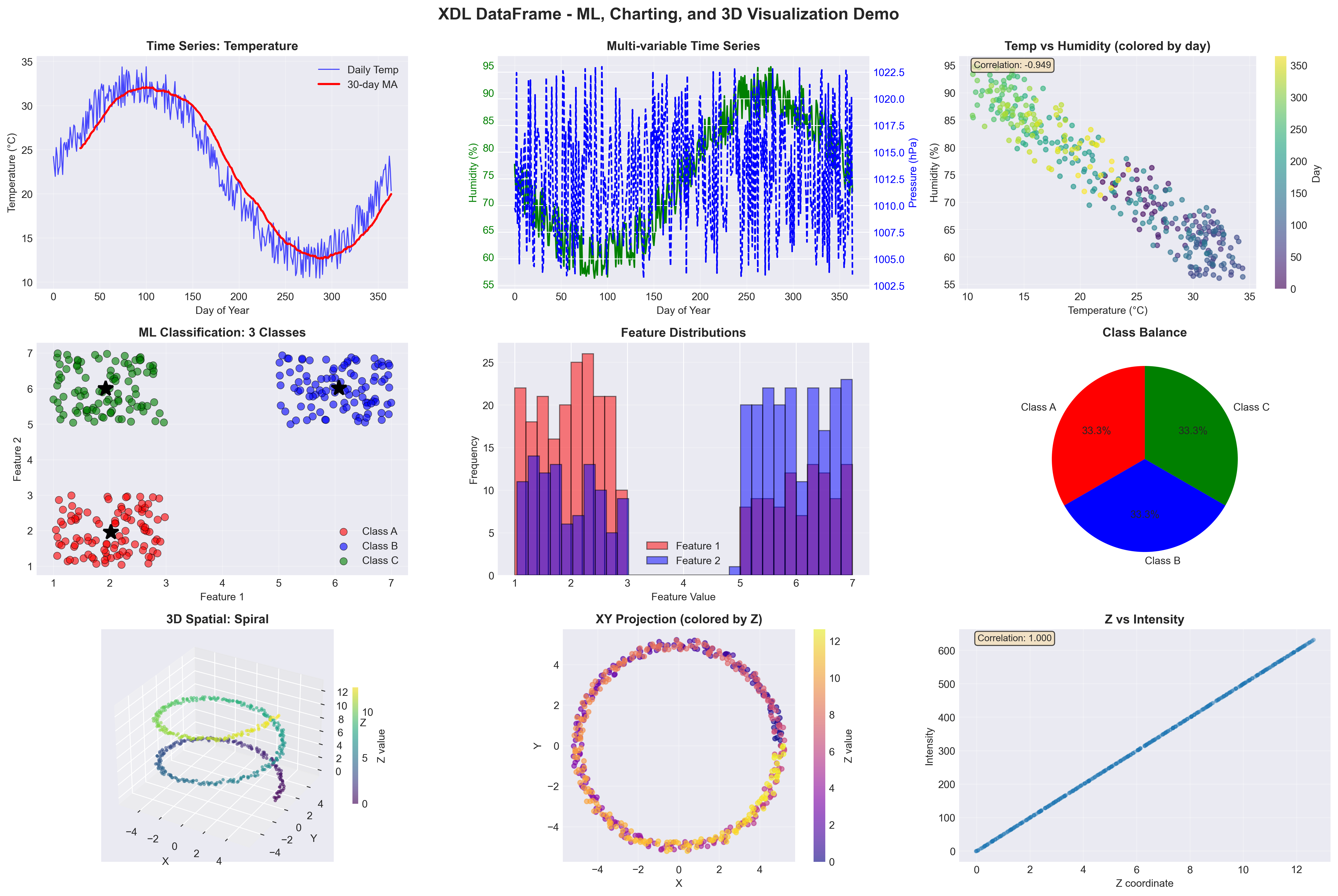
ax1 = plt.subplot(3, 3, 1)
ax1.plot(days, temps, 'b-', linewidth=1, alpha=0.7, label='Daily Temp')
window = 30
ma = np.convolve(temps, np.ones(window)/window, mode='valid')
ax1.plot(days[window-1:], ma, 'r-', linewidth=2, label=f'{window}-day MA')
ax1.set_xlabel('Day of Year')
ax1.set_ylabel('Temperature (°C)')
ax1.set_title('Time Series: Temperature', fontweight='bold')
ax1.legend()
ax1.grid(True, alpha=0.3)
ax2 = plt.subplot(3, 3, 2)
ax2_twin = ax2.twinx()
ax2.plot(days, humidity, 'g-', linewidth=1.5, label='Humidity')
ax2_twin.plot(days, pressure, 'b--', linewidth=1.5, label='Pressure')
ax2.set_xlabel('Day of Year')
ax2.set_ylabel('Humidity (%)', color='g')
ax2_twin.set_ylabel('Pressure (hPa)', color='b')
ax2.set_title('Multi-variable Time Series', fontweight='bold')
ax2.tick_params(axis='y', labelcolor='g')
ax2_twin.tick_params(axis='y', labelcolor='b')
ax2.grid(True, alpha=0.3)
ax3 = plt.subplot(3, 3, 3)
scatter = ax3.scatter(temps, humidity, c=days, cmap='viridis', alpha=0.6, s=20)
ax3.set_xlabel('Temperature (°C)')
ax3.set_ylabel('Humidity (%)')
ax3.set_title('Temp vs Humidity (colored by day)', fontweight='bold')
plt.colorbar(scatter, ax=ax3, label='Day')
ax3.grid(True, alpha=0.3)
corr_th = np.corrcoef(temps, humidity)[0, 1]
ax3.text(0.05, 0.95, f'Correlation: {corr_th:.3f}',
transform=ax3.transAxes, fontsize=9,
bbox=dict(boxstyle='round', facecolor='wheat', alpha=0.7))
print("2. Loading classification data...")
class_data = []
with open('classification_data.csv', 'r') as f:
reader = csv.DictReader(f)
for row in reader:
class_data.append({
'f1': float(row['feature1']),
'f2': float(row['feature2']),
'class': int(row['class']),
'label': row['label']
})
class_0 = [d for d in class_data if d['class'] == 0]
class_1 = [d for d in class_data if d['class'] == 1]
class_2 = [d for d in class_data if d['class'] == 2]
ax4 = plt.subplot(3, 3, 4)
ax4.scatter([d['f1'] for d in class_0], [d['f2'] for d in class_0],
c='red', label='Class A', alpha=0.6, s=50, edgecolors='black', linewidths=0.5)
ax4.scatter([d['f1'] for d in class_1], [d['f2'] for d in class_1],
c='blue', label='Class B', alpha=0.6, s=50, edgecolors='black', linewidths=0.5)
ax4.scatter([d['f1'] for d in class_2], [d['f2'] for d in class_2],
c='green', label='Class C', alpha=0.6, s=50, edgecolors='black', linewidths=0.5)
ax4.set_xlabel('Feature 1')
ax4.set_ylabel('Feature 2')
ax4.set_title('ML Classification: 3 Classes', fontweight='bold')
ax4.legend()
ax4.grid(True, alpha=0.3)
centroids = []
with open('class_centroids.csv', 'r') as f:
reader = csv.DictReader(f)
for row in reader:
centroids.append({
'class': int(row['class']),
'f1': float(row['feature1']),
'f2': float(row['feature2'])
})
for c in centroids:
color = ['red', 'blue', 'green'][c['class']]
ax4.plot(c['f1'], c['f2'], 'k*', markersize=15, markeredgewidth=2)
ax5 = plt.subplot(3, 3, 5)
all_f1 = [d['f1'] for d in class_data]
all_f2 = [d['f2'] for d in class_data]
ax5.hist(all_f1, bins=30, alpha=0.5, label='Feature 1', color='red', edgecolor='black')
ax5.hist(all_f2, bins=30, alpha=0.5, label='Feature 2', color='blue', edgecolor='black')
ax5.set_xlabel('Feature Value')
ax5.set_ylabel('Frequency')
ax5.set_title('Feature Distributions', fontweight='bold')
ax5.legend()
ax5.grid(True, axis='y', alpha=0.3)
ax6 = plt.subplot(3, 3, 6)
class_counts = [len(class_0), len(class_1), len(class_2)]
colors = ['red', 'blue', 'green']
ax6.pie(class_counts, labels=['Class A', 'Class B', 'Class C'],
autopct='%1.1f%%', colors=colors, startangle=90)
ax6.set_title('Class Balance', fontweight='bold')
print("3. Loading 3D spatial data...")
spatial_data = []
with open('spatial_3d_data.csv', 'r') as f:
reader = csv.DictReader(f)
for row in reader:
spatial_data.append({
'x': float(row['x']),
'y': float(row['y']),
'z': float(row['z']),
'intensity': int(row['intensity'])
})
x_3d = [d['x'] for d in spatial_data]
y_3d = [d['y'] for d in spatial_data]
z_3d = [d['z'] for d in spatial_data]
intensity = [d['intensity'] for d in spatial_data]
ax7 = fig.add_subplot(3, 3, 7, projection='3d')
scatter3d = ax7.scatter(x_3d, y_3d, z_3d, c=z_3d, cmap='viridis',
s=10, alpha=0.6, edgecolors='none')
ax7.set_xlabel('X')
ax7.set_ylabel('Y')
ax7.set_zlabel('Z')
ax7.set_title('3D Spatial: Spiral', fontweight='bold')
plt.colorbar(scatter3d, ax=ax7, label='Z value', shrink=0.5)
ax8 = plt.subplot(3, 3, 8)
scatter_xy = ax8.scatter(x_3d, y_3d, c=z_3d, cmap='plasma', s=20, alpha=0.6)
ax8.set_xlabel('X')
ax8.set_ylabel('Y')
ax8.set_title('XY Projection (colored by Z)', fontweight='bold')
plt.colorbar(scatter_xy, ax=ax8, label='Z value')
ax8.grid(True, alpha=0.3)
ax8.set_aspect('equal')
ax9 = plt.subplot(3, 3, 9)
ax9.scatter(z_3d, intensity, alpha=0.3, s=10)
ax9.set_xlabel('Z coordinate')
ax9.set_ylabel('Intensity')
ax9.set_title('Z vs Intensity', fontweight='bold')
ax9.grid(True, alpha=0.3)
corr_zi = np.corrcoef(z_3d, intensity)[0, 1]
ax9.text(0.05, 0.95, f'Correlation: {corr_zi:.3f}',
transform=ax9.transAxes, fontsize=9,
bbox=dict(boxstyle='round', facecolor='wheat', alpha=0.7))
plt.tight_layout()
output_file = 'comprehensive_visualization.png'
plt.savefig(output_file, dpi=300, bbox_inches='tight')
print(f"\n✓ Saved: {output_file}")
plt.show()
print("\n=== Analysis Summary ===\n")
print("Time Series (365 days):")
print(f" Temperature: {np.mean(temps):.2f}°C (σ={np.std(temps):.2f})")
print(f" Humidity: {np.mean(humidity):.2f}% (σ={np.std(humidity):.2f})")
print(f" Temp-Humidity Correlation: {corr_th:.3f}")
print("\nClassification (300 samples):")
print(f" Class A: {len(class_0)} samples")
print(f" Class B: {len(class_1)} samples")
print(f" Class C: {len(class_2)} samples")
print(f" Feature separation: Well-defined clusters")
print("\n3D Spatial (500 points):")
print(f" X range: [{min(x_3d):.2f}, {max(x_3d):.2f}]")
print(f" Y range: [{min(y_3d):.2f}, {max(y_3d):.2f}]")
print(f" Z range: [{min(z_3d):.2f}, {max(z_3d):.2f}]")
print(f" Z-Intensity Correlation: {corr_zi:.3f}")
print("\n✓ Comprehensive visualization complete!")
print(f" Generated 9 plots demonstrating:")
print(" • Time series analysis with DataFrame")
print(" • ML classification visualization")
print(" • 3D spatial data rendering")