

tui-scrollbar
Smooth, fractional scrollbars for Ratatui. Part of the tui-widgets suite by Joshka.


GitHub Repository · API Docs · Examples · Changelog · Contributing · Crate source
Use this crate when you want scrollbars that communicate position and size more precisely than
full-cell glyphs. The widget renders into a Buffer for a given Rect and stays reusable
by implementing Widget for &ScrollBar.
Feature highlights
- Fractional thumbs: render 1/8th-cell steps for clearer position/size feedback.
- Arrow endcaps: optional start/end arrows with click-to-step support.
- Backend-agnostic input: handle pointer + wheel events without tying to a backend.
- Stateless rendering: render via
Widgetfor&ScrollBarwith external state. - Metrics-first: [
ScrollMetrics] exposes pure geometry for testing and hit testing.
Why not Ratatui's scrollbar?
Ratatui's built-in scrollbar favors simple full-cell glyphs and a stateful widget workflow. This crate chooses fractional glyphs for more precise thumbs, keeps rendering stateless, and exposes a small interaction API plus pure metrics so apps can control behavior explicitly.
Installation
cargo add tui-scrollbar
Important
- Zero lengths are treated as 1.
- Arrow endcaps are disabled by default; configure them with [
ScrollBarArrows]. - The default [
GlyphSet] hides the track using spaces; use [GlyphSet::box_drawing] or [GlyphSet::unicode] for a visible track. - The default glyphs use Symbols for Legacy Computing for missing upper/right eighth blocks.
Use [
GlyphSet::unicode] if you need only standard Unicode block elements.
Quick start
This example renders a vertical [ScrollBar] into a Buffer using a fixed track size and
offset. Use it as a minimal template when you just need a thumb and track on screen.
use Buffer;
use Rect;
use Widget;
use ;
let area = new;
let lengths = ScrollLengths ;
let scrollbar = vertical
.arrows
.offset;
let mut buffer = empty;
scrollbar.render;
Conceptual overview
The scrollbar works in three pieces:
- Your app owns
content_len,viewport_len, andoffset(lengths along the scroll axis). - [
ScrollMetrics] converts those values into a thumb position and size. - [
ScrollBar] renders the track + thumb using fractional glyphs.
Most apps update offset in response to input events and re-render each frame.
Units and subcell conversions
content_len, viewport_len, and offset are measured in logical units along the scroll
axis. For many apps, those units are items or lines. The ratio between viewport_len and
content_len is what matters, so any consistent unit works.
Styling
Style the track, thumb, and arrow endcaps directly on [ScrollBar]. See [ScrollBar] for a
full method map and more focused examples.
Scrollbar glyphs are terminal characters. For visible track glyphs, thumb blocks, and arrow
symbols, Style::fg colors the glyph itself and Style::bg colors the cell behind it. The
default [GlyphSet::minimal] track renders spaces, so only the track background is visible in
empty track cells. Visible track glyph sets, such as [GlyphSet::box_drawing] and
[GlyphSet::unicode], can use foreground color for the track line. Thumb glyphs are block
characters, so Style::fg is usually the useful knob for thumb color; Style::bg still colors
the rest of the cell. With partial thumb glyphs, especially on a visible line track such as
[GlyphSet::box_drawing], that background can show at the ends of the thumb. Match the thumb
background to the track background unless that contrast is intentional.
use ;
use ;
let lengths = ScrollLengths ;
let scrollbar = vertical
.arrows
.track_style
.thumb_style
.arrow_style;
Layout integration
This example shows how to reserve a column for a vertical [ScrollBar] alongside your content.
Use the same pattern for a horizontal [ScrollBar] by splitting rows instead of columns.
use Buffer;
use ;
use Widget;
use ;
let area = new;
let = area.layout;
let lengths = ScrollLengths ;
let scrollbar = vertical.offset;
let mut buffer = empty;
scrollbar.render;
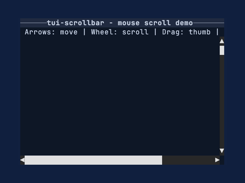
Interaction loop
This pattern assumes you have enabled mouse capture in your terminal backend and have the
scrollbar Rect (bar_area) from your layout each frame. Keep a [ScrollBarInteraction] in
your app state so drag operations persist across draws. Mouse events are handled via
[ScrollBar::handle_mouse_event], which returns a [ScrollCommand] to apply.
use Rect;
use ;
let bar_area = new;
let lengths = ScrollLengths ;
let scrollbar = vertical.offset;
let mut interaction = new;
let mut offset = 0;
if let Mouse = read?
Metrics-first workflow
This example shows how to compute thumb geometry without rendering via [ScrollMetrics]. It's
useful for testing, hit testing, or when you want to inspect thumb sizing directly.
use ;
let track_cells = 12;
let viewport_len = track_cells * SUBCELL;
let content_len = viewport_len * 6;
let lengths = ScrollLengths ;
let metrics = new;
assert!;
Glyph selection
[GlyphSet] controls the track and thumb characters. The default glyphs include
Symbols for Legacy Computing so the thumb can render upper/right partial fills that are
missing from the standard block set. Use [GlyphSet::box_drawing] for a visible line track, or
[GlyphSet::unicode] when the terminal font should avoid Symbols for Legacy Computing
glyphs.
use ;
let lengths = ScrollLengths ;
let scrollbar = vertical.glyph_set;
API map
Widgets
- [
ScrollBar]: renders vertical or horizontal scrollbars with fractional thumbs.
Supporting types
- [
ScrollBarInteraction]: drag capture state for pointer interaction. - [
ScrollMetrics]: pure math for thumb sizing and hit testing. - [
GlyphSet]: glyph selection for track and thumb rendering. - [
ScrollBarArrows]: arrow endcap configuration.
Enums and events
- [
ScrollBarOrientation], [ScrollBarArrows], [TrackClickBehavior] - [
ScrollEvent], [ScrollCommand] - [
PointerEvent], [PointerEventKind], [PointerButton] - [
ScrollWheel], [ScrollAxis]
See also
- tui-scrollbar examples
scrollbar_styledexamplescrollbar_mouseexamplescrollbarexampleWidget- Ratatui
More widgets
For the full suite of widgets, see tui-widgets.
License
Copyright (c) Josh McKinney
This project is licensed under either of:
- Apache License, Version 2.0 (LICENSE-APACHE or http://www.apache.org/licenses/LICENSE-2.0)
- MIT license (LICENSE-MIT or http://opensource.org/licenses/MIT)
at your option.
Contribution
Unless you explicitly state otherwise, any contribution intentionally submitted for inclusion in the work by you, as defined in the Apache-2.0 license, shall be dual licensed as above, without any additional terms or conditions.
See CONTRIBUTING.md.