[](https://www.npmjs.com/package/tauri-plugin-widgets-api)
[](https://crates.io/crates/tauri-plugin-widgets)
[](https://docs.rs/tauri-plugin-widgets/)
[](https://github.com/s00d/tauri-plugin-widgets/issues)
[](https://github.com/s00d/tauri-plugin-widgets/stargazers)
[](https://www.donationalerts.com/r/s00d88)
# Tauri Plugin Widgets
A Tauri v2 plugin for building **native widgets** on Android, iOS and macOS, with desktop widget windows on Windows and Linux. Includes a **universal JSON-based UI generator** — send a single config from your Tauri app and the plugin renders it natively on every platform (SwiftUI on Apple, Jetpack Glance on Android, HTML on desktop).
[![Crates.io][crates-badge]][crates-url]
[![npm][npm-badge]][npm-url]
[![MIT licensed][mit-badge]][mit-url]
[crates-badge]: https://img.shields.io/crates/v/tauri-plugin-widgets.svg
[crates-url]: https://crates.io/crates/tauri-plugin-widgets
[npm-badge]: https://img.shields.io/npm/v/tauri-plugin-widgets-api.svg
[npm-url]: https://www.npmjs.com/package/tauri-plugin-widgets-api
[mit-badge]: https://img.shields.io/badge/license-MIT-blue.svg
[mit-url]: LICENSE
## Demo
<div align="center">
<img style="border-radius: 40px; border: 1px solid black;" src="https://raw.githubusercontent.com/s00d/tauri-plugin-widgets/refs/heads/main/demo.gif" alt="Demo" width="50%" />
</div>
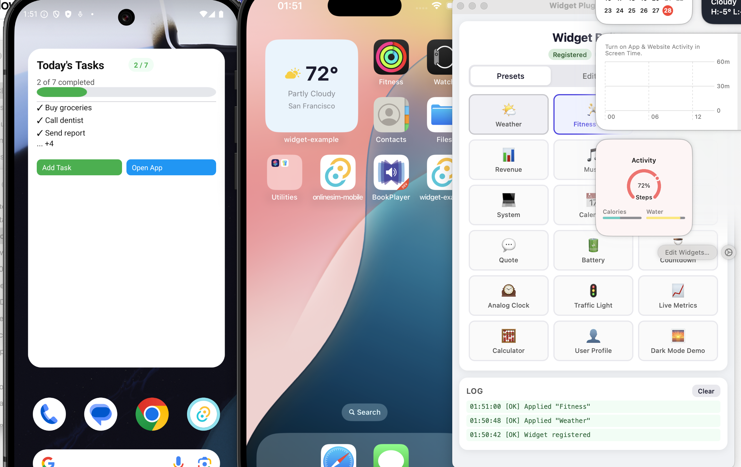
## Preview
<div align="center">
<img src="./preview.png" alt="Widgets preview on Android and iOS" width="85%" />
</div>
---
## Architecture
The plugin acts as a **library**, not a builder:
| **Rust plugin** (`src/`) | Data storage, FFI bridge, WidgetKit reload commands |
| **Swift Package** (`swift/TauriWidgets`) | Cross-platform SwiftUI views, models, data store for iOS/macOS widgets |
| **Android plugin** (`android/`) | Jetpack Glance renderer, `GlanceAppWidgetReceiver`, `BroadcastReceiver` |
| **Desktop** (`widget.html`) | HTML/CSS renderer for transparent webview widget windows |
| **Templates** (`templates/`) | Starter files for iOS and macOS widget extensions |
**Data flow:** Your Tauri app calls `setWidgetConfig(json, group)` → plugin writes JSON to the App Group shared container → calls `WidgetCenter.reloadAllTimelines()` → native widget extension reads JSON and renders SwiftUI views.
The developer owns the widget extension target — the plugin provides reusable SwiftUI components via the `TauriWidgets` Swift Package.
---
## Features
- **Universal Widget UI** — describe widgets as JSON, render natively on all platforms.
- **Three size families** — `small`, `medium`, `large` layouts in a single config.
- **21 element types** — text, image, progress, gauge, chart, list, button, toggle, divider, spacer, date, link, shape, timer, label, canvas, and layout containers (vstack, hstack, zstack, grid, container).
- **Action buttons & tappable wrappers** — buttons and `link` elements can emit `widget-action` Tauri events back to the main app, enabling two-way communication.
- **Dark mode & adaptive colors** — semantic color names (`"label"`, `"systemBackground"`, `"accent"`) and adaptive `{ light, dark }` color objects auto-switch with the system theme.
- **Semantic typography** — `textStyle` property (`"largeTitle"`, `"body"`, `"caption"`, etc.) respects platform Dynamic Type / accessibility settings.
- **Flexible layout** — `flex` property for proportional space distribution, `clipShape` for content masking (circle, capsule, rectangle).
- **Full styling** — padding, gradient backgrounds, corner radius, opacity, borders, shadows, frames.
- **Declarative canvas** — draw arbitrary shapes (circles, lines, arcs, paths) via JSON commands.
- **Swift Package** — reusable `TauriWidgets` package for iOS/macOS widget extensions.
- **File-based data sharing** — JSON file in App Group shared container (reliable, atomic, sandbox-safe).
- **Configurable reload throttling** — WidgetKit reload rate-limit with sensible defaults and `TAURI_WIDGET_MIN_RELOAD_SECS` override.
- **Desktop widget windows** — frameless, transparent Tauri webview windows for Windows/Linux.
- **Low-level data API** — `setItems`/`getItems` for arbitrary key-value storage shared with native widgets.
## Recent Android Updates
- Android rendering path migrated to **Jetpack Glance**.
- Example presets were simplified to avoid over-nested layout trees that can render inconsistently on some launchers.
- Complex `container` wrappers were reduced in favor of flatter `vstack`/`hstack` structures.
- Progress examples now include explicit labels to avoid host text fallbacks like `null`.
---
## Platform Support
| **Android** | AppWidget | Jetpack Glance from JSON | SharedPreferences + Glance state | Glance `updateAll()` |
| **iOS** | WidgetKit (17+) | SwiftUI from JSON | App Group shared container (JSON file) | WidgetCenter |
| **macOS** | WidgetKit (14+) | SwiftUI from JSON | App Group shared container (JSON file) | WidgetCenter |
| **Windows** | Desktop window | HTML/CSS from JSON | JSON file | Tauri event |
| **Linux** | Desktop window | HTML/CSS from JSON | JSON file | Tauri event |
---
## Quick Start
### 1. Install
```toml
# src-tauri/Cargo.toml
[dependencies]
tauri-plugin-widgets = "0.3"
```
```bash
npm install tauri-plugin-widgets-api
# or
pnpm add tauri-plugin-widgets-api
```
### 2. Register the Plugin
```rust
#[cfg_attr(mobile, tauri::mobile_entry_point)]
pub fn run() {
tauri::Builder::default()
.plugin(tauri_plugin_widgets::init())
.run(tauri::generate_context!())
.expect("error while running tauri application");
}
```
### 3. Add Permissions
`src-tauri/capabilities/default.json`:
```json
{
"permissions": [
"core:default",
"widgets:default"
]
}
```
### 4. Send a Widget Config
```typescript
import { setWidgetConfig } from "tauri-plugin-widgets-api";
await setWidgetConfig({
small: {
type: "vstack",
padding: 14,
background: { light: "#E8F4FD", dark: "#1a1a2e" },
spacing: 6,
cornerRadius: 16,
children: [
{
type: "hstack",
spacing: 8,
children: [
{ type: "image", systemName: "cloud.sun.fill", color: "#ffcc00", size: 28 },
{ type: "text", content: "72°", textStyle: "largeTitle", fontWeight: "bold", color: "label" },
],
},
{ type: "text", content: "Partly Cloudy", textStyle: "footnote", color: "secondaryLabel" },
{ type: "progress", value: 0.65, tint: "#4CAF50", label: "Humidity" },
],
},
}, "group.com.example.myapp");
```
### Android Glance Layout Guidelines
To reduce rendering issues on Android launchers, keep widget trees simple:
- Prefer `vstack` / `hstack` with style props (`padding`, `background`, `cornerRadius`) over deep `container` nesting.
- Avoid `container -> vstack` wrappers when a styled `vstack` can express the same UI.
- In dense rows, use simple children (`text`, `image`, `gauge`, `progress`) with `flex`.
- Keep hierarchy depth low (about 3-4 levels per branch in most presets).
- Always provide `progress.label` so host UIs never show `null`.
Recommended card pattern:
```json
{
"type": "vstack",
"spacing": 2,
"padding": 8,
"background": { "light": "#EDE9FE", "dark": "#313244" },
"cornerRadius": 8,
"children": [
{ "type": "text", "content": "Revenue", "textStyle": "caption2", "color": "secondaryLabel" },
{ "type": "text", "content": "$12,450", "fontSize": 18, "fontWeight": "bold", "color": "#a6e3a1" }
]
}
```
---
## CLI — Quick Init
The plugin includes a CLI tool to scaffold native widget extensions automatically. It reads your `tauri.conf.json` to auto-detect the bundle identifier and app group.
### macOS Widget Extension
```bash
npx tauri-plugin-widgets-api init-macos
```
This creates `src-tauri/macos-widget/` with all required files and auto-patches your `tauri.conf.json` with `beforeBundleCommand`.
**Important:** Set `"targets": ["app"]` in `bundle` section of `tauri.conf.json` to disable Tauri's built-in DMG (it won't include the widget). The embed script rebuilds the DMG itself.
```bash
# Build + embed + DMG:
pnpm tauri build && ./src-tauri/macos-widget/embed-widget.sh
# With signing identity for production:
pnpm tauri build && ./src-tauri/macos-widget/embed-widget.sh "Developer ID Application: ..."
```
**Options:**
| `--bundle-id` | Widget bundle identifier | Auto: `<tauri identifier>.widgetkit` |
| `--app-group` | App Group identifier | Auto: `group.<tauri identifier>` |
| `--dir` | Target directory | `src-tauri/macos-widget` |
| `--force` | Overwrite existing files | `false` |
```bash
# Explicit identifiers:
npx tauri-plugin-widgets-api init-macos \
--bundle-id com.example.myapp.widgetkit \
--app-group group.com.example.myapp
```
### iOS Widget Extension
```bash
npx tauri-plugin-widgets-api init-ios
```
Creates `src-tauri/ios-widget/MyWidget.swift` and prints step-by-step Xcode setup instructions.
App Group is auto-generated from `tauri.conf.json` `identifier` (or can be overridden with `--app-group`).
If a Widget Extension target already exists in `src-tauri/gen/apple/*`, the CLI also auto-syncs its generated widget Swift file.
**Options:**
| `--app-group` | App Group identifier | Auto: `group.<tauri identifier>` |
| `--dir` | Target directory | `src-tauri/ios-widget` |
| `--force` | Overwrite existing files | `false` |
> **Note:** Recommended flow: run `init-ios` once, create the Widget Extension target in Xcode, then run `init-ios` again to auto-replace the generated default widget code.
---
## Environment Variables
| `WIDGET_SIGN_IDENTITY` | macOS (`embed-widget.sh`) | ad-hoc (`-`) | Signing identity for widget/app re-signing. |
| `TAURI_WIDGET_MIN_RELOAD_SECS` | iOS/macOS runtime (plugin) | Debug: `0`, Release: `900` | Minimum seconds between plugin-triggered `reloadAllTimelines()`. Use `0` to disable plugin-side throttle. |
| `TAURI_DEV_HOST` | Example app dev (`vite.config.ts`) | — | Dev host used by Tauri/Vite during `tauri dev` (usually set automatically). |
Examples:
```bash
# iOS dev without plugin-side reload throttle
TAURI_WIDGET_MIN_RELOAD_SECS=0 pnpm tauri ios dev
# macOS build with explicit signing identity
WIDGET_SIGN_IDENTITY="Apple Development: you@example.com (TEAMID)" \
pnpm tauri build && ./src-tauri/macos-widget/embed-widget.sh
```
---
## Platform Setup
### iOS Setup
#### Step 1: Initialize the iOS project
```bash
pnpm tauri ios init
```
#### Step 2: Add a Widget Extension target
Open the generated Xcode project:
```bash
open src-tauri/gen/apple/*.xcodeproj
```
In Xcode: **File → New → Target → Widget Extension**. Name it (e.g. `WidgetExtension`), language: Swift.
In the **Choose options for your new target** dialog:
- Set `Product Name` to `WidgetExtension` (or your widget name)
- Select your Apple `Team` (e.g. Personal Team)
- Keep `Project` as your current iOS project (e.g. `myapp`)
- Set `Embed in Application` to your iOS app target (e.g. `myapp_iOS`)
- For the basic plugin setup, disable:
- `Include Live Activity`
- `Include Control`
- `Include Configuration App Intent`
#### Step 3: Add the TauriWidgets Swift Package
In Xcode:
1. **File → Add Package Dependencies...**
2. Click **Add Local...**
3. Select the package folder:
- for typical app projects: `node_modules/tauri-plugin-widgets-api/swift/`
- for this repository example: `swift/` (repository root)
4. In **Add to Target**, choose your widget target (`WidgetExtension` / `WidgetExtensionExtension`).
Important: `TauriWidgets` must be linked to the widget target itself. If it is linked only to the main iOS app target, `import TauriWidgets` fails with `no such module`.
#### Step 4: Sync the widget code via CLI (recommended)
After creating the Widget Extension target, run:
```bash
npx tauri-plugin-widgets-api init-ios
```
This updates the generated `src-tauri/gen/apple/*/*.swift` widget entry file from the plugin template using the auto-generated App Group.
It also adapts the widget struct name to match Xcode-generated `*Bundle.swift` references, preventing `cannot find 'WidgetExtension' in scope`.
Manual fallback (if you prefer to edit/copy by hand):
```swift
import SwiftUI
import WidgetKit
import TauriWidgets
struct MyWidgetEntryView: View {
var entry: TauriWidgetEntry
var body: some View {
TauriWidgetView(entry: entry)
}
}
@main
struct MyWidget: Widget {
let kind = "ExampleWidget"
var body: some WidgetConfiguration {
StaticConfiguration(
kind: kind,
// Use the same App Group that `init-ios` generated for your project.
provider: TauriWidgetProvider(appGroup: "group.<your-tauri-identifier>")
) { entry in
MyWidgetEntryView(entry: entry)
}
.configurationDisplayName("My Widget")
.description("Powered by TauriWidgets")
.supportedFamilies([.systemSmall, .systemMedium, .systemLarge])
}
}
```
Or copy from `templates/ios-widget/MyWidget.swift`.
#### Step 5: Configure App Groups
1. Select the **main app target** (your iOS app, e.g. `myapp_iOS`) → **Signing & Capabilities**.
2. Click **+ Capability** → add **App Groups**.
3. In the App Groups block click `+` and add your group (use the value printed by `init-ios`).
4. Repeat the same for the **WidgetExtension** target.
5. Verify the App Group value is **exactly the same** in both targets.
6. If **+ Capability** is disabled, set a valid **Team** in Signing for that target first.
#### Step 6: Run
```bash
pnpm tauri ios dev
```
---
### macOS Setup
macOS widgets require a "sidecar" Xcode project — a small project alongside your Tauri app that compiles the Widget Extension (`.appex`).
> **Important:** On macOS, WidgetKit picks up extension widgets from the installed app bundle.
> Addable widgets appear only after you **build** the app and move the resulting `.app` to **`/Applications`** (or install from the DMG generated by `embed-widget.sh`).
**Requirements:** `xcodegen` (`brew install xcodegen`)
#### Step 1: Initialize the widget project (automatic)
```bash
# Recommended: use the CLI (auto-detects bundle ID from tauri.conf.json)
npx tauri-plugin-widgets-api init-macos
# Or with explicit identifiers:
npx tauri-plugin-widgets-api init-macos \
--bundle-id com.example.myapp.widgetkit \
--app-group group.com.example.myapp
```
This creates `src-tauri/macos-widget/` with:
- `Sources/MyWidget.swift` — widget code using `TauriWidgetProvider`
- `TauriWidgetExtension.entitlements` — App Group configuration
- `project.yml` — xcodegen spec
- `build-widget.sh` — builds the `.appex` without signing (called automatically by `beforeBundleCommand`)
- `embed-widget.sh` — injects `.appex` into the `.app` bundle, signs widget with entitlements, re-signs the app
#### Step 2: Configure tauri.conf.json
The CLI automatically adds `beforeBundleCommand`. Verify your config and make two adjustments:
```json
{
"build": {
"beforeBundleCommand": "./src-tauri/macos-widget/build-widget.sh || true"
},
"bundle": {
"targets": ["app"]
}
}
```
- **`beforeBundleCommand`** compiles the widget extension (without code-signing — signing is deferred to the embed step)
- **`"targets": ["app"]`** — disable Tauri's built-in DMG creation. Tauri creates the DMG **before** `embed-widget.sh` runs, so it would not contain the widget. The `embed-widget.sh` script rebuilds the DMG itself after embedding the `.appex`.
> **Note:** Tauri 2.x does not natively support embedding `.appex` via `bundle.macOS.frameworks`. The `embed-widget.sh` script handles copying the `.appex` into `Contents/PlugIns/`, signing it with its own entitlements, re-signing the app bundle with hardened runtime, and rebuilding the DMG.
#### Step 3: Register App Groups
Add an entitlements file to your main app with the same App Group identifier (e.g. `group.com.example.myapp`).
#### Step 4: Build & Sign
```bash
# Local development (ad-hoc signing):
pnpm tauri build && ./src-tauri/macos-widget/embed-widget.sh
# With signing identity (via env):
WIDGET_SIGN_IDENTITY="Apple Development: you@example.com (TEAMID)" \
pnpm tauri build && ./src-tauri/macos-widget/embed-widget.sh
# Or via argument:
pnpm tauri build && ./src-tauri/macos-widget/embed-widget.sh "Apple Development: you@example.com (TEAMID)"
```
The full pipeline:
1. `tauri build` — compiles Rust, builds `.appex` via `beforeBundleCommand`, creates `.app`
2. `embed-widget.sh` — copies `.appex` → `Contents/PlugIns/`, signs with entitlements, re-signs app, rebuilds DMG, opens DMG
> **Tip:** Add a shortcut to `package.json`:
> ```json
> { "scripts": { "build:macos": "tauri build && ./src-tauri/macos-widget/embed-widget.sh" } }
> ```
> Then just run `pnpm build:macos`.
#### Code Signing
The `embed-widget.sh` script signs both the widget extension (`.appex`) and the main app bundle. Signing identity is resolved in this order:
1. `WIDGET_SIGN_IDENTITY` environment variable
2. First argument to the script
3. Fallback: `-` (ad-hoc signing)
**Finding your signing identity:**
```bash
security find-identity -v -p codesigning
```
**Ad-hoc signing (`-`)** works for local testing but has limitations:
- Widgets appear in the gallery and render correctly
- **App Groups / UserDefaults sharing won't work** — macOS requires a real Team ID for inter-process data sharing via `UserDefaults(suiteName:)` or `containerURL(forSecurityApplicationGroupIdentifier:)`
**Apple Development certificate** (free Apple Developer account) resolves this. The plugin uses a file-based fallback: the non-sandboxed main app writes `widget_data.json` directly into the widget extension's sandbox container (`~/Library/Containers/<widget-bundle-id>/Data/`). The widget reads it from `NSHomeDirectory()`. This works without provisioning profiles.
**Important:** The main app's `App.entitlements` should **not** include `com.apple.security.app-sandbox`. The Tauri app must remain non-sandboxed so it can write into the widget's container. The widget extension is always sandboxed (required by macOS for WidgetKit).
| Ad-hoc (`-`) | Yes | File-based only | Local only |
| Apple Development | Yes | File-based + UserDefaults | Local + TestFlight |
| Developer ID | Yes | File-based + UserDefaults | Direct distribution |
#### Debugging the widget separately
```bash
cd src-tauri/macos-widget
xcodegen generate
open TauriWidgetExtension.xcodeproj
```
Select the widget scheme in Xcode, set your app as the Host Application, and run with breakpoints.
---
### Android Setup
#### Step 1: Initialize
```bash
pnpm tauri android init
```
The plugin automatically registers its Android bridge and Glance widget receiver.
**No Kotlin code required** — the built-in receiver reads widget config from shared storage and renders it via Jetpack Glance.
#### Step 2: Configure the App Group (optional)
By default, the plugin uses the application package name as the `SharedPreferences` group. To use a custom group, add a `<meta-data>` tag in your app's `AndroidManifest.xml`:
```xml
<receiver
android:name="git.s00d.widgets.TauriGlanceWidgetReceiver"
tools:replace="android:label"
android:label="My Widget">
<meta-data
android:name="tauri_widget_group"
android:value="group.com.example.myapp" />
</receiver>
```
#### Step 3: Run
```bash
pnpm tauri android dev
```
#### Step 4: Add widget to home screen
Long-press the home screen → **Widgets** → find your app → drag to screen.
#### Custom Widget Provider (advanced)
If you need custom behavior, create your own `GlanceAppWidget` / `GlanceAppWidgetReceiver` and keep the same shared group contract.
---
### Desktop Setup (Windows / Linux / macOS)
Desktop widgets are transparent frameless webview windows that render the JSON config as HTML/CSS.
#### Option A: Declarative (tauri.conf.json)
```json
{
"app": {
"windows": [
{ "label": "main", "title": "My App", "width": 800, "height": 600 },
{
"label": "desktop-widget",
"url": "/widget.html",
"width": 300, "height": 150,
"decorations": false, "transparent": true,
"alwaysOnBottom": true, "skipTaskbar": true,
"visible": false, "resizable": false
}
]
}
}
```
#### Option B: Dynamic (TypeScript)
```typescript
import { createWidgetWindow, closeWidgetWindow } from "tauri-plugin-widgets-api";
await createWidgetWindow({
label: "weather",
width: 280,
height: 200,
x: 80,
y: 80,
skipTaskbar: true,
group: "group.com.example.myapp",
size: "small",
});
await closeWidgetWindow("weather");
```
---
## Widget Config Schema
The `WidgetConfig` object defines layouts per widget size family:
```typescript
interface WidgetConfig {
version?: number;
small?: WidgetElement;
medium?: WidgetElement;
large?: WidgetElement;
}
```
### Layout Containers
#### `vstack` — Vertical Stack
```json
{
"type": "vstack",
"spacing": 8,
"alignment": "leading",
"padding": 12,
"background": "#1a1a2e",
"cornerRadius": 12,
"children": [...]
}
```
| `children` | `WidgetElement[]` | Child elements |
| `spacing` | `number` | Space between children (pt) |
| `alignment` | `"leading" \| "center" \| "trailing"` | Horizontal alignment |
#### `hstack` — Horizontal Stack
```json
{
"type": "hstack",
"spacing": 10,
"alignment": "center",
"children": [...]
}
```
| `children` | `WidgetElement[]` | Child elements |
| `spacing` | `number` | Space between children (pt) |
| `alignment` | `"top" \| "center" \| "bottom"` | Vertical alignment |
#### `zstack` — Overlay Stack
```json
{
"type": "zstack",
"alignment": "center",
"children": [...]
}
```
Children are layered on top of each other. Uses `FrameLayout` on Android.
#### `grid` — Grid Layout
```json
{
"type": "grid",
"columns": 2,
"spacing": 8,
"rowSpacing": 8,
"children": [...]
}
```
| `columns` | `number` | `2` | Number of columns |
| `spacing` | `number` | — | Column spacing |
| `rowSpacing` | `number` | — | Row spacing |
#### `container` — Single-Child Wrapper (Box)
A single-child wrapper for badges/avatars/overlays. For Android Glance stability, avoid long chains of nested `container` wrappers when a styled `vstack` is enough.
```json
{
"type": "container",
"contentAlignment": "center",
"padding": 12,
"background": { "light": "#F0F0FF", "dark": "#1C1C1E" },
"cornerRadius": 16,
"clipShape": "circle",
"children": [
{ "type": "text", "content": "AK", "fontSize": 20, "fontWeight": "bold", "color": "#ffffff" }
]
}
```
| `children` | `WidgetElement[]` | Child elements (typically one) |
| `contentAlignment` | `string` | Content alignment: `"center"`, `"topLeading"`, `"bottomTrailing"`, etc. |
> **Platform mapping:** SwiftUI `ZStack`, Android Glance `Box`, HTML `div` with flexbox.
### Leaf Elements
#### `text`
```json
{
"type": "text",
"content": "Hello World",
"fontSize": 18,
"fontWeight": "bold",
"fontDesign": "rounded",
"textStyle": "headline",
"color": "label",
"alignment": "center",
"lineLimit": 2
}
```
| `content` | `string` | Text to display |
| `fontSize` | `number` | Font size in points (overridden by `textStyle` if set) |
| `fontWeight` | `FontWeight` | `ultralight` `thin` `light` `regular` `medium` `semibold` `bold` `heavy` `black` |
| `fontDesign` | `FontDesign` | `default` `monospaced` `rounded` `serif` |
| `textStyle` | `TextStyle` | Semantic text style (see below) — respects Dynamic Type / accessibility |
| `color` | `ColorValue` | Hex color, semantic name, or adaptive `{ light, dark }` object |
| `alignment` | `TextAlignment` | `leading` `center` `trailing` |
| `lineLimit` | `number` | Max number of lines |
**TextStyle values:** `largeTitle`, `title`, `title2`, `title3`, `headline`, `subheadline`, `body`, `callout`, `footnote`, `caption`, `caption2`
> When `textStyle` is set, it determines font size semantically based on platform settings (Dynamic Type on iOS, accessibility on Android). This ensures widgets remain readable for users with vision accessibility needs.
> **Android:** Bold/heavy/semibold font weights are rendered via `SpannableString` with `StyleSpan`.
#### `image`
```json
{
"type": "image",
"systemName": "cloud.sun.fill",
"size": 32,
"color": "#ffcc00"
}
```
| `systemName` | `string` | SF Symbol name (Apple) / drawable resource name (Android) |
| `data` | `string` | Base64-encoded image data (with or without `data:image/...;base64,` prefix) |
| `url` | `string` | Remote image URL |
| `size` | `number` | Display size in points |
| `color` | `string` | Tint color (hex) |
| `contentMode` | `"fit" \| "fill"` | How image fills its frame |
> **Android:** Base64 images are decoded to `Bitmap` and displayed in a real `ImageView`. System names map to drawable resources.
#### `progress`
```json
{
"type": "progress",
"value": 0.7,
"total": 1.0,
"tint": "#4CAF50",
"label": "Steps",
"barStyle": "linear"
}
```
#### `gauge`
```json
{
"type": "gauge",
"value": 0.72,
"min": 0,
"max": 1,
"label": "CPU",
"currentValueLabel": "72%",
"tint": "#7aa2f7",
"gaugeStyle": "circular"
}
```
#### `chart`
```json
{
"type": "chart",
"chartType": "bar",
"tint": "#89b4fa",
"chartData": [
{ "label": "Mon", "value": 120 },
{ "label": "Tue", "value": 180, "color": "#a6e3a1" }
]
}
```
Supported types: `bar`, `line`, `area`, `pie`.
#### `list` — Collection List
```json
{
"type": "list",
"spacing": 4,
"items": [
{ "text": "Buy groceries", "checked": true, "action": "task_buy" },
{ "text": "Call dentist", "checked": false, "action": "task_call", "payload": "id=42" }
]
}
```
| `items` | `ListItem[]` | List rows with text and optional checked/action/payload |
| `spacing` | `number` | Space between rows |
`ListItem`:
| `text` | `string` | Row label |
| `checked` | `boolean` | Optional checked marker |
| `action` | `string` | Optional action emitted as `widget-action` |
| `payload` | `string` | Optional payload for `widget-action` |
> Platform notes:
> - **Android:** rendered via Glance list/lazy composition.
> - **iOS/macOS:** rendered as SwiftUI row list.
> - **Desktop:** rendered as HTML row list.
#### `button`
```json
{
"type": "button",
"label": "Refresh",
"action": "refresh_data",
"backgroundColor": "#4CAF50",
"color": "#ffffff"
}
```
| `label` | `string` | Button text |
| `url` | `string` | Deep-link URL |
| `action` | `string` | Action identifier — emits `widget-action` event |
| `backgroundColor` | `string` | Background color (hex) |
| `color` | `string` | Text color (hex) |
Listen for actions:
```typescript
import { onWidgetAction } from "tauri-plugin-widgets-api";
await onWidgetAction((data) => {
console.log("Action:", data.action, data.payload);
});
```
#### `toggle`
```json
{ "type": "toggle", "isOn": true, "label": "Dark Mode", "tint": "#4CAF50" }
```
#### `divider`
```json
{ "type": "divider", "color": "#333333", "thickness": 1 }
```
#### `spacer`
```json
{ "type": "spacer", "minLength": 10 }
```
#### `date`
```json
{ "type": "date", "date": "2026-03-01T10:00:00Z", "dateStyle": "relative", "fontSize": 14, "color": "#ffffff" }
```
| `time` | `10:00 AM` |
| `date` | `Mar 1, 2026` |
| `relative` | `in 2 days` |
| `offset` | `+2 days` |
| `timer` | `48:00:00` |
#### `link` — Tappable Wrapper
Wraps any child content and makes it tappable:
```json
{
"type": "link",
"action": "open_profile",
"children": [
{ "type": "text", "content": "Tap me!", "fontSize": 16, "color": "#60a5fa" }
]
}
```
#### `shape`
```json
{ "type": "shape", "shapeType": "circle", "fill": "#ef4444", "size": 12 }
```
Supported shapes: `circle`, `capsule`, `rectangle`.
#### `timer`
```json
{
"type": "timer",
"targetDate": "2026-12-31T23:59:59Z",
"counting": "down",
"fontSize": 24,
"fontWeight": "bold",
"color": "#ffffff"
}
```
> **iOS/macOS:** Uses `Text(date, style: .timer)` which updates natively every second without consuming widget refresh budget.
#### `label` — Icon + Text
```json
{
"type": "label",
"text": "5 new messages",
"systemName": "envelope.fill",
"iconColor": "#60a5fa",
"fontSize": 14,
"color": "#e2e8f0"
}
```
#### `canvas` — Declarative Drawing
```json
{
"type": "canvas",
"width": 120,
"height": 120,
"elements": [
{ "draw": "circle", "cx": 60, "cy": 60, "r": 55, "fill": "#1e293b", "stroke": "#475569", "strokeWidth": 2 },
{ "draw": "line", "x1": 60, "y1": 60, "x2": 60, "y2": 20, "stroke": "#f1f5f9", "strokeWidth": 3, "lineCap": "round" },
{ "draw": "circle", "cx": 60, "cy": 60, "r": 4, "fill": "#ef4444" }
]
}
```
Draw commands: `circle`, `line`, `rect`, `arc`, `text`, `path`.
> **Android:** Canvas bitmaps are capped at 512px and compressed to stay under the 500KB Binder IPC limit, preventing `TransactionTooLargeException`.
### Common Style Properties
All elements support:
```json
{
"padding": 12,
"background": "#1a1a2e",
"cornerRadius": 8,
"opacity": 0.9,
"frame": { "width": 100, "height": 50, "maxWidth": "infinity" },
"border": { "color": "#333333", "width": 1 },
"shadow": { "color": "#000000", "radius": 4, "x": 0, "y": 2 },
"clipShape": "circle",
"flex": 1
}
```
#### `clipShape` — Content Masking
Clips the element's content to a shape. Useful for circular avatars, pill-shaped badges, etc.
| `"circle"` | Perfect circle (50% border-radius) |
| `"capsule"` | Pill shape (fully rounded ends) |
| `"rectangle"` | Rectangle with `cornerRadius` applied |
> **Platform mapping:** SwiftUI `.clipShape()`, CSS `border-radius` + `overflow: hidden`, Android Glance shape clipping.
#### `flex` — Proportional Layout
The `flex` property allows elements to occupy available space proportionally within stacks, analogous to CSS `flex`, Android `layout_weight`, or SwiftUI `layoutPriority`.
```json
{
"type": "hstack",
"children": [
{ "type": "text", "content": "Left", "flex": 1 },
{ "type": "text", "content": "Center (wider)", "flex": 2 },
{ "type": "text", "content": "Right", "flex": 1 }
]
}
```
#### Adaptive Colors (Dark Mode Support)
All color properties (`color`, `tint`, `fill`, `stroke`, `backgroundColor`, `iconColor`, `background`) support three formats:
**1. Hex string** (static):
```json
{ "color": "#FF5733" }
```
**2. Semantic color name** (auto-adapts to system theme):
```json
{ "color": "label" }
```
Available semantic colors: `label`, `secondaryLabel`, `tertiaryLabel`, `systemBackground`, `secondarySystemBackground`, `separator`, `accent`, `systemRed`, `systemGreen`, `systemBlue`, `systemOrange`, `systemYellow`, `systemPurple`, `systemPink`, `systemGray`
**3. Adaptive object** (explicit light/dark values):
```json
{ "color": { "light": "#000000", "dark": "#FFFFFF" } }
```
The `background` property additionally supports gradients:
```json
{
"background": { "light": "#FFFFFF", "dark": "#1C1C1E" }
}
```
#### Gradient Backgrounds
```json
{
"background": {
"gradientType": "linear",
"colors": ["#667eea", "#764ba2"],
"direction": "topToBottom"
}
}
```
Types: `linear`, `radial`, `angular`.
---
## Widget Updater
For periodic updates (clocks, dashboards):
```typescript
import { startWidgetUpdater } from "tauri-plugin-widgets-api";
const stop = await startWidgetUpdater(
() => ({
small: {
type: "vstack", padding: 12, background: "#1a1a2e",
children: [
{ type: "text", content: new Date().toLocaleTimeString(),
fontSize: 32, fontWeight: "bold", color: "#fff" },
],
},
}),
"group.com.example.myapp",
{
intervalMs: 60_000,
reload: true,
onAction: (action, payload) => {
console.log("Widget action:", action, payload);
},
},
);
// Later:
stop();
```
| `intervalMs` | `number` | `1000` | Update interval (ms). Use `60000+` for native widgets. |
| `immediate` | `boolean` | `true` | Run builder immediately on start |
| `reload` | `boolean` | `false` | Call `reloadAllTimelines()` after each tick. Throttled by `TAURI_WIDGET_MIN_RELOAD_SECS` on iOS/macOS. |
| `onAction` | `function` | — | Subscribe to `widget-action` events |
> **Important:** Apple enforces a daily widget reload budget (~40-70 reloads/day). The Rust backend throttle is configurable via `TAURI_WIDGET_MIN_RELOAD_SECS`.
>
> Defaults:
> - **Debug:** `0` (no plugin-side throttle)
> - **Release:** `900` (15 minutes)
>
> Examples:
> - Disable plugin-side throttle: `TAURI_WIDGET_MIN_RELOAD_SECS=0`
> - Set custom throttle: `TAURI_WIDGET_MIN_RELOAD_SECS=5`
>
> Even with `0`, WidgetKit may still coalesce/defer refreshes — this is a platform-level limit. For second-by-second UI, prefer native timer/date styles (for example, `{ type: "timer" }`) instead of frequent reload calls.
---
## Low-Level Data API
```typescript
import { setItems, getItems, reloadAllTimelines } from "tauri-plugin-widgets-api";
await setItems("temperature", "72", "group.com.example.myapp");
const temp = await getItems("temperature", "group.com.example.myapp");
await reloadAllTimelines();
```
### API Reference
| `setItems(key, value, group)` | Store a key-value pair |
| `getItems(key, group)` | Read a stored value |
| `setWidgetConfig(config, group, skipReload?)` | Send a full UI config |
| `getWidgetConfig(group)` | Read the current UI config |
| `setRegisterWidget(widgets)` | Register widget provider class names |
| `reloadAllTimelines()` | Reload all widget timelines |
| `reloadTimelines(ofKind)` | Reload a specific widget kind |
| `requestWidget()` | Pin a widget (Android only) |
| `createWidgetWindow(config)` | Create a desktop widget window |
| `closeWidgetWindow(label)` | Close a desktop widget window |
| `widgetAction(action, payload?)` | Emit a `widget-action` event |
| `onWidgetAction(callback)` | Listen for `widget-action` events |
| `startWidgetUpdater(builder, group, options?)` | Periodic config updater |
---
## Rust API
```rust
use tauri::Manager;
use tauri_plugin_widgets::WidgetExt;
fn update_widget(app: &tauri::AppHandle) {
let widget = app.widget();
widget.set_items("key", "value", "group").unwrap();
widget.reload_all_timelines().unwrap();
}
```
---
## Project Structure
```
├── android/ Android plugin (Jetpack Glance renderer)
│ └── src/main/java/
│ ├── TauriGlanceWidget.kt Glance UI renderer
│ ├── WidgetBridgePlugin.kt Tauri bridge
│ ├── TauriGlanceWidgetReceiver.kt Universal AppWidget receiver
│ └── WidgetActionReceiver.kt Button action handler
├── ios/ iOS plugin (Tauri bridge)
│ └── Sources/
│ └── WidgetPlugin.swift setItems/getItems/reload via FileManager
├── macos/
│ └── WidgetReload.swift Minimal FFI bridge (reload + shared container path)
├── swift/ TauriWidgets Swift Package
│ ├── Package.swift
│ └── Sources/TauriWidgets/
│ ├── Models.swift Widget UI models (public, Codable)
│ ├── DynamicElementView.swift SwiftUI renderer
│ ├── TauriWidgetProvider.swift TimelineProvider + TauriWidgetView
│ ├── WidgetDataStore.swift App Group file I/O
│ └── WidgetActionIntent.swift AppIntent for button actions
├── src/ Rust plugin core
│ ├── lib.rs Plugin init + commands
│ ├── desktop.rs Desktop: file storage + widget windows
│ ├── mobile.rs Mobile: native bridge + throttled reload
│ └── models.rs WidgetConfig / WidgetElement models
├── guest-js/ TypeScript API
│ └── index.ts All exports + startWidgetUpdater
├── templates/ Starter files for widget extensions
│ ├── ios-widget/MyWidget.swift
│ └── macos-widget/
│ ├── MyWidget.swift Widget Swift code template
│ ├── Entitlements.plist App Group entitlements
│ ├── project.yml xcodegen project spec
│ └── build-widget.sh Build script (xcodebuild)
├── bin/
│ └── cli.mjs CLI tool (npx tauri-plugin-widgets-api)
├── widget.html Desktop widget HTML renderer
├── build.rs Minimal: tauri_plugin::Builder + macOS FFI bridge
├── GUIDE.md Русскоязычная инструкция запуска примера
└── examples/
└── tauri-plugin-widgets-example/ Complete demo app
```
---
## Troubleshooting
### Widget shows "No configuration" (macOS)
- Call `setWidgetConfig(...)` from your app before adding the widget.
- Verify the app is signed with a real certificate (`security find-identity -v -p codesigning`), not ad-hoc.
- Check that the app is **not sandboxed** (`App.entitlements` should not contain `com.apple.security.app-sandbox`).
- Verify the widget's container has the data file:
```bash
ls ~/Library/Containers/<your-bundle-id>.widgetkit/Data/widget_data.json
```
- Check widget logs: `log show --last 1m --predicate 'subsystem == "com.tauri.widgets"' --style compact`
- Ensure `TauriWidgetExtension.entitlements` contains `com.apple.security.app-sandbox` and the correct App Group.
### Widget shows "No configuration" (iOS)
- Ensure the App Group identifier is **identical** in the main app and widget extension (Xcode → Signing & Capabilities → App Groups).
- Call `setWidgetConfig(...)` from your app before adding the widget.
### Widget doesn't update (iOS/macOS)
- Apple limits widget refreshes to ~40-70 per day.
- Check plugin throttle: `TAURI_WIDGET_MIN_RELOAD_SECS` (Debug default `0`, Release default `900`).
- For testing: in Xcode, use **Debug → Simulate Timeline → After Refresh**.
- For live counters, use `{ type: "timer" }` instead of frequent reloads.
### Android widget is empty or crashes
- Check `adb logcat | grep -i widget` for errors.
- Canvas bitmaps larger than 512px are automatically capped.
- Bitmap data is compressed to stay under the Binder IPC 500KB limit.
### Desktop widget window not appearing
- Ensure `createWidgetWindow(...)` is called, or the window is defined in `tauri.conf.json`.
- Add `"desktop-widget"` to the `windows` array in `capabilities/default.json`.
---
## License
MIT