
rok-ui



A shadcn/ui-style component system for desktop apps built with GPUI, the GPU-accelerated UI framework from the Zed team, with a React-like developer experience.
- shadcn/ui's components and tokens. The full catalog, from Button and Dialog to Data Table,
Calendar, Chart and the chat components, styled from the same design tokens (
background,primary,muted-foreground,ring, …). - React-like components. Write a function with
#[component]and get a builder API. Props become arguments or builder methods,#[children]gives you.child(..), anduse_stateworks likeuseState. - Overridable styles. Every visual component implements GPUI's
Styled, so.w_full().mt_4()overrides its defaults the wayclassNamedoes. - App plumbing, TanStack style. Reactive state from rok-ui-hooks; a query cache with
mutations, procedures and
Suspense(query); a router with typed routes, search params, guards, loaders and file-based routes (router,rok-ui-build); headless type-safe forms (form); and PostgreSQL through rok-db (db). See the guides. - One app architecture, generated. The BLoC pattern as the standard structure (
bloc): repositories, blocs and cubits, views that read state and add events. A JSON API client whose errors land on form fields (http).cargo rok-ui new --template blocandcargo rok-ui g featurewrite it for you: see the architecture guide and the CLI guide. - Flutter-style app shells and layouts.
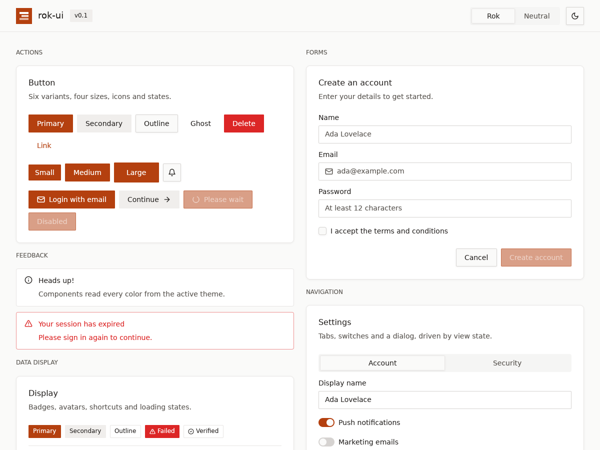
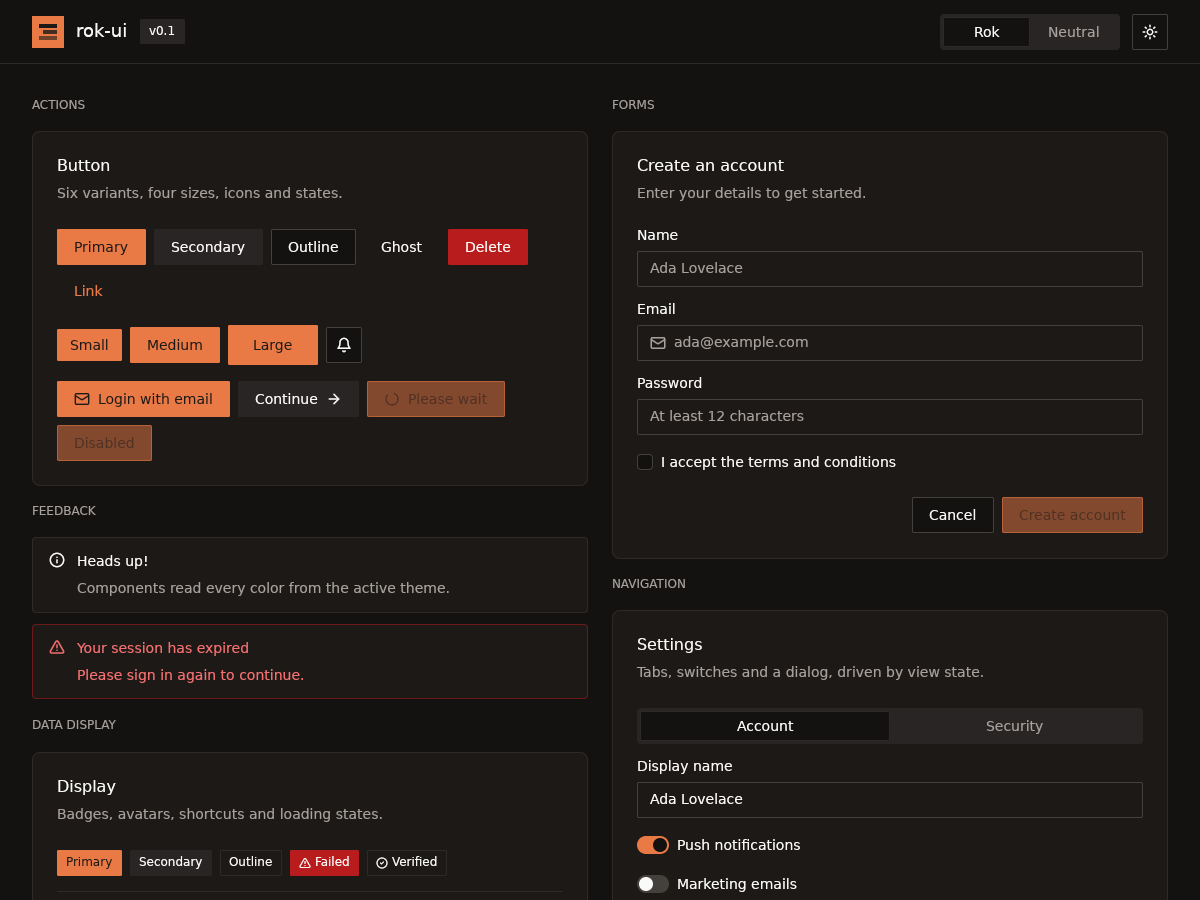
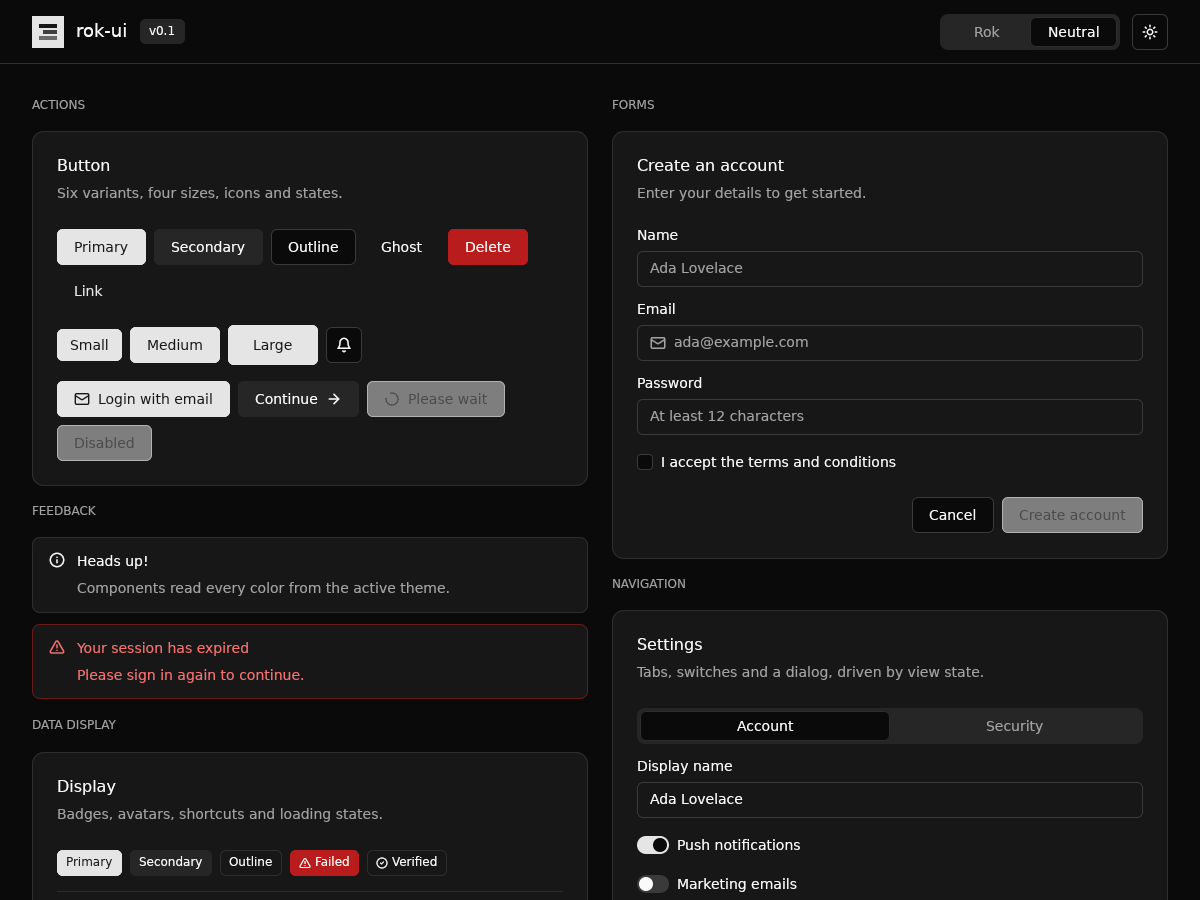
Scaffold,AppBar,NavigationBar,NavigationRail,NavigationDrawerand anAdaptiveScaffoldthat follows the window width, plusRow,Column,Expanded,Stack,GridView,LayoutBuilderand friends. - Themes. Light and dark modes, two presets (Rok and Neutral), and every text/surface pair is tested to reach at least 4.5:1 contrast.
- Keyboard support. Tab and Shift-Tab move focus, Enter and Space activate buttons, and Escape closes dialogs. Text fields support IME composition, selection and the clipboard.
| Rok, light | Rok, dark |
|---|---|
 |
 |
| Neutral, dark | Dialog |
 |
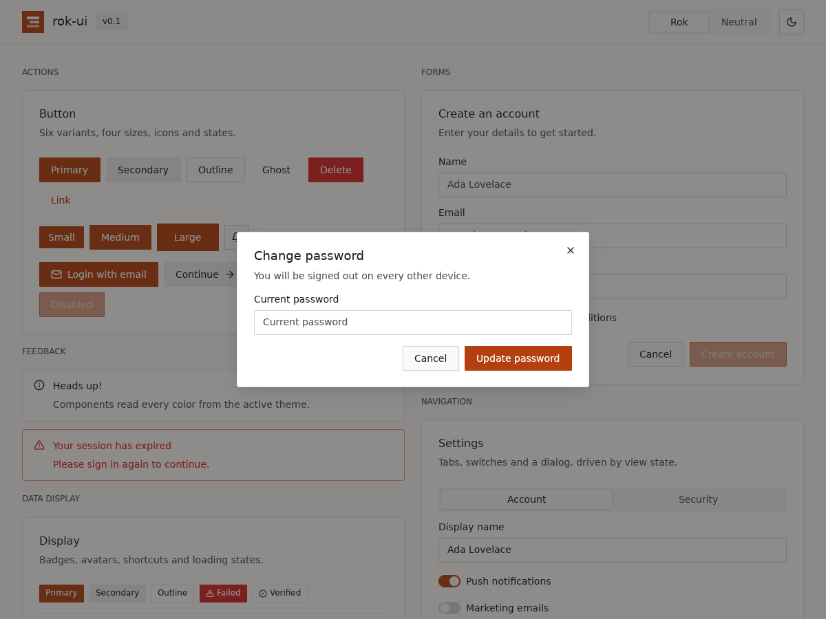 |
These are real renders of cargo run --example gallery on Linux.
Install
[]
= "0.9"
= "0.2.2" # rok-ui re-exports it as rok_ui::gpui; keep the versions in step
rok-ui 0.3 targets gpui 0.2.2 from crates.io and Rust 1.88 or newer.
Picking components
Every component is a Cargo feature. The default, full, enables all of them. To compile only
what you use, turn off the defaults and list the components you want:
= { = "0.9", = false, = ["button", "dialog", "select"] }
- Dependencies: a feature pulls in the components it is built from (
comboboxenablescommandandinput). - Naming: features use kebab-case module names (
alert-dialog,data-table). shadcn/ui names work as aliases:dropdown-menu,context-menu,navigation-menu,drawer,textarea,kbd,native-selectandtoggle-group. - Groups:
forms,overlays,layout,data,chatandshell(Scaffold, navigation and layout widgets) each enable a whole group. - App features:
state(rok-ui-hooks) andformare part offull. Opt-in:query(data layer, tokio),router,db(rok-db, sqlx and tokio, plusdb-chrono,db-uuid,db-json,db-migrate),persist(saved stores, serde),devtoolsandform-garde. - Always included:
AppRoot,Direction,BidiText, the theme, icons, hooks, styling (styles!,view!) and motion, whatever features you pick. - Fonts:
font-cairo,font-noto-sans-arabicandfont-interbundle Google Fonts (see Fonts). They are not part offull.
On Linux, GPUI needs the X11/Wayland development packages. On Debian/Ubuntu:
Starting a new app
cargo install rok-ui-cli adds cargo rok-ui:
Quick start
use *;
;
The examples:
Coming from React and shadcn/ui
| React / shadcn/ui | rok-ui |
|---|---|
function Card(props) { … } |
#[component] fn Card(…) -> impl IntoElement { … } |
<Button variant="outline" size="sm">Save</Button> |
Button::new("save").outline().small().label("Save") |
props.children |
#[children] children: Vec<AnyElement> |
className="w-full mt-4" |
.w_full().mt_4() |
onClick={() => …} |
.on_click(|event, window, cx| …) |
const [count, setCount] = useState(0) |
let count = use_state(window, cx, || 0) |
setCount(5) / setCount(c => c + 1) |
count.set(5, cx) / count.update(cx, |c| *c += 1) |
useRef for an input |
use_input_state("email", window, cx, |s| s) |
var(--primary) |
cx.theme().colors.primary |
<ThemeProvider> |
AppRoot::new() plus Theme::set_global(..) |
Writing a component
use *;
/// A counter, written the way you would in React.
// Usage
new.step.on_change;
Parameter rules for #[component]:
windowandcxare the GPUI window and app context;cx: &mut Cxgets both in one handle (cx.window, andCxderefs toApp).- Plain parameters are required props.
new(..)takes them asimpl Into<T>, so a missing one is a compile error that names it. #[default]parameters start atDefault::default(),#[default(expr)]ones atexpr(#[default(px(32.))] size: Pixels), and get a builder method with the same name. ForOption<T>, the method takesimpl Into<T>.#[prop(optional)]is the older spelling of#[default].EventHandler<E>props, optional or not, takeFn(&E, &mut Window, &mut App)closures.- One
#[children]parameter of typeVec<AnyElement>makes the component aParentElement. - One
#[style]parameter of typeStyleRefinementmakes the componentStyled. Apply it last in the body with.apply_style_overrides(&style_overrides).
Hooks
use_state builds on GPUI's own Window::use_state. State lives as long as the component
keeps rendering at the same position, and updating it re-renders the owning view. Follow
React's rules of hooks: call hooks unconditionally and in the same order every render. Inside
loops, use use_keyed_state(key, …) with a stable key per item.
Long-lived or shared state still belongs in a GPUI view (Entity<T> with cx.notify()). The
gallery's settings card shows this pattern, with cx.listener(..) as the change handler.
Styling and markup
rok-ui has a StyleX-style styling system and two ways to write element trees. Both compile to ordinary GPUI builder calls, and both mix freely with builder code.
styles!: define styles once
styles!
| StyleX | rok-ui |
|---|---|
stylex.create({...}) |
styles! { NAME = { key: {...} } }: a static with one Sx per key |
stylex.props(a, cond && b) |
.sx((&A.base, cond.then_some(&A.extra))) or .sx(sx![A.base, cond => A.extra]) |
':hover': {...} |
hover: {...} (also focus, active) |
| variants | key(Enum): { Variant: {...} }, then A.key(value); a missing variant is a compile error |
xstyle prop |
components take .sx(..), applied last so the caller wins |
defineVars / createTheme |
theme tokens (primary, muted_foreground, md) and presets |
Values follow Tailwind:
- Lengths: numbers are multiples of 4px (
gap: 6is 24px). Also0.5,50%,full,auto,px(10.), or any expression in braces ({px(width)}). - Colors: theme tokens (
primary,border), with opacity (primary/90),transparent, or{expr}. - Radius:
none,sm,md,lg,xl,full, or a length. - Text and font:
text: xs..3xlortext: theme(the theme's base size),font: medium/semibold/bold,font_family: mono. - Layout:
direction: rowmirrors in RTL;direction: row_ltralways runs left to right (charts, codes, numbers). - Borders:
border: 1,border_start: 1,border_style: dashed.
Tokens resolve against the active theme when the style is applied, so the same static style follows light/dark and preset switches. Unknown properties, tokens and keywords are compile errors pointing at the mistake, with a suggestion when there is a close match.
Every rok-ui component accepts .sx(..). The caller's styles are applied last, so they win,
including hover and focus states.
For one-off or dynamic values, use style! { width: {px(width)}, background: accent }.
Your own #[component]s accept overrides with an #[sx] sx: Sx parameter: apply it last,
div().sx((&MY.base, &sx)).
children![]: mixed children with control flow
div.children
view!: JSX-like markup
view!
The syntax:
- Components:
Name(a, b, key = value)isName::new(a, b).key(value). Method calls after the arguments pass through unchanged. - GPUI elements: lowercase
div,imgandsvgare GPUI's element functions. - Children:
{ … }holds children: elements,"text",{expr},if,if let,matchandfor. - Keys:
#[key(item.id)] for item in items { .. }gives each item a stable identity (Keyed), so hook state follows the item when the list is reordered.
Right-to-left layouts
set_text_direction; // the whole app
set_text_direction; // or explicitly
new.child // one subtree
build
In RTL, every component mirrors the way CSS dir="rtl" mirrors a page:
- Rows and text: rows flow right to left and text aligns right.
- Icons: directional icons flip (submenu chevrons, back and forward arrows, calendar and carousel navigation).
- Floating surfaces: they align to the trigger's right edge, and submenus open to the left.
- Panels: sheets and sidebars swap sides, close buttons and scrollbars move left, and toasts appear bottom-left.
- Values and keys: sliders, progress bars and resizable panels run right to left, and arrow keys follow.
- Text inputs: inputs and textareas right-align their text, including each wrapped row.
In your own code:
- Builder code: use the direction-aware helpers from
DirectionalStyled:flex_dir()for rows,ps/pe,ms/me,inset_start/inset_end,border_s_1,rounded_s/rounded_eandtext_start. UseIconName::ArrowRight.for_direction()for directional icons andflex_ltr()for content that stays left to right, such as codes and charts. styles!:display: flexrows mirror automatically. The logical properties arepadding_start,margin_end,border_start,inset_start,radius_top_start,text_align: start, and so on.- Detection:
TextDirection::from_localerecognizes Arabic, Hebrew, Persian, Urdu, Pashto, Sindhi, Kurdish (Sorani), Uyghur, Yiddish, Dhivehi and others.
Plain elements built in the same expression as a Direction are created before it lays out.
Use Direction::build, or set the app direction, so they mirror too.
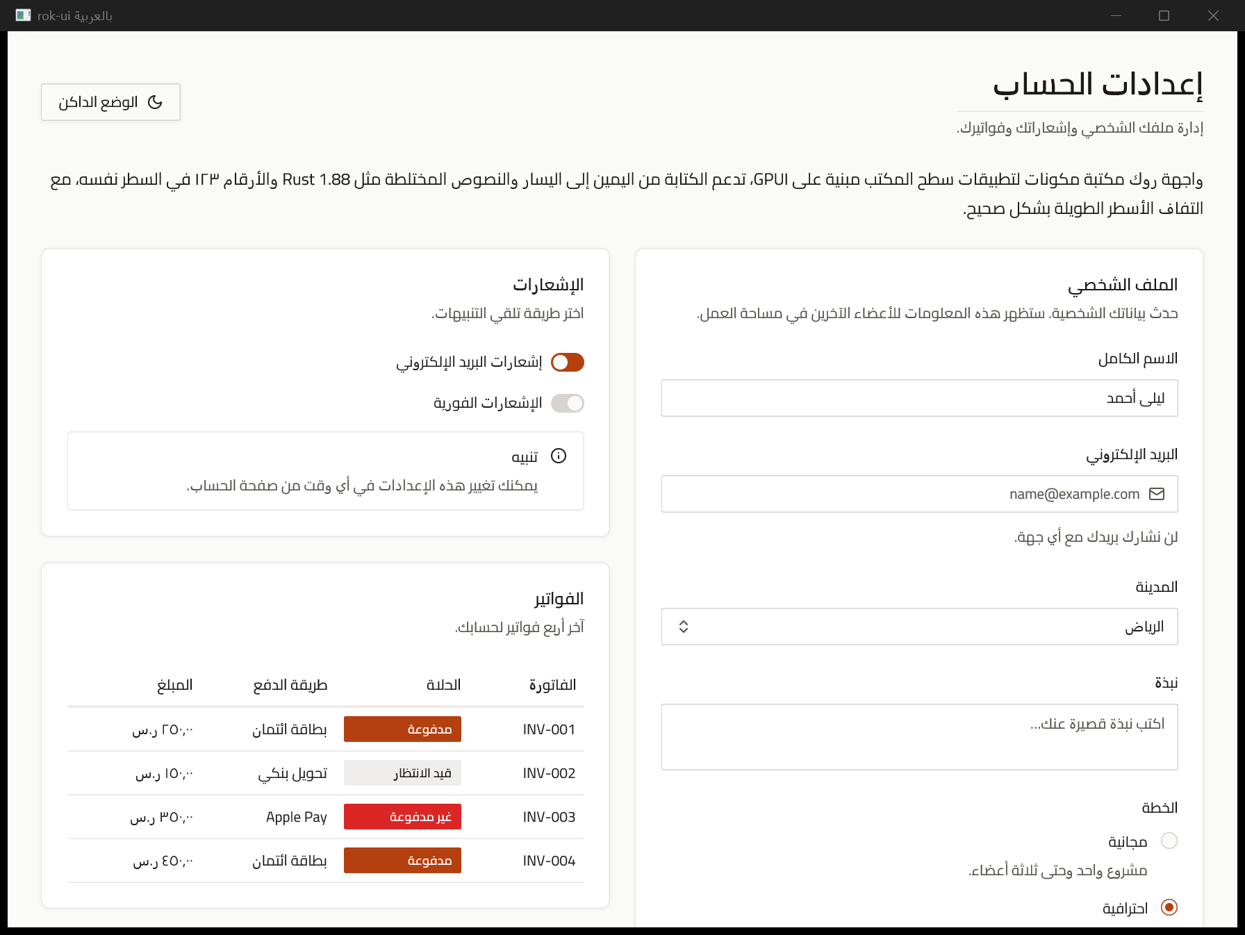
Arabic and mixed-direction text
Settings (cargo run --example arabic --features font-cairo) |
Chat (--example arabic_chat) |
|---|---|
 |
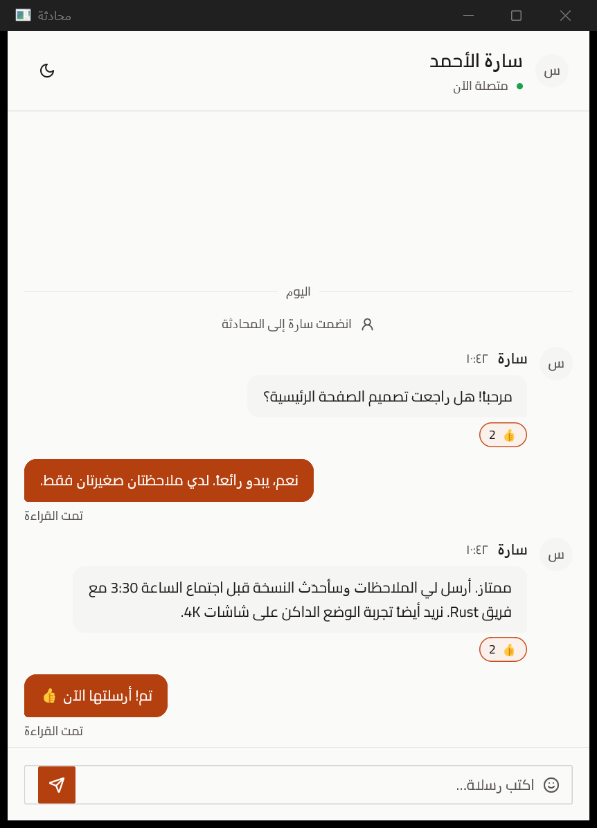 |
Arabic, Persian and Hebrew text, and text mixing them with English or numbers, displays in the right order on every platform:
- Component text (labels, titles, descriptions, options, menu items, table heads, badges) is handled automatically.
- Your own text: wrap it in
BidiText, which also wraps long paragraphs and truncates with an ellipsis under.truncate():div().child(BidiText::new("مرحبا بك في rok-ui")). Inview!andchildren!markup, string literals and string expressions ({user.name}) are wrapped for you. - Inputs: inputs and textareas keep the caret, selection, clicks and IME in the right place while you type Arabic, including across wrapped textarea rows.
macOS and Linux lay out bidirectional text natively. GPUI 0.2.2's Windows backend draws every
run left to right, so on Windows rok-ui reorders text itself: rok_ui::bidi runs the Unicode
Bidirectional Algorithm and converts joined Arabic letters to their contextual presentation
forms. Many Arabic fonts, Cairo among them, leave the isolated presentation forms out. rok-ui reads
which forms each font has (fonts registered through rok_ui::fonts, and installed fonts through
DirectWrite) and draws isolated letters so they stay in that font. Noto Sans Arabic maps every form.
Motion
Keyframe animations, transitions and enter/exit presence.
Keyframes
keyframes! is like CSS @keyframes, and .motion(..) is like CSS animation:
keyframes!
div.motion
new.motion
new.motion // replays when the id changes
- Animatable properties:
opacity,xandy(offsets from the laid-out position, since GPUI has no transforms for divs),width,height,radius,background,colorandborder_color. Values work as instyles!, theme tokens included. - Timing:
duration,delay,iterations(n)orinfinite(), andreverse()oralternate(). - Easing:
Linear,EaseIn,EaseOut,EaseInOut,CubicBezier(..),Spring { damping }andSteps(n). - Presets:
fade_in,fade_out,slide_in(side, distance),pulse,bounce,shakeandhighlight, inmotion::.
Transitions and presence
// Animate a value toward each new target (interruptible, starts from the current value).
let width = use_transition;
div.w
// Keep something mounted while it animates out.
let panel = use_presence;
div.when
- Types:
use_transitionworks forf32,Pixels,Hslacolors and pairs of these. - Built in: dialogs, alert dialogs, sheets, drawers and the command palette animate in and out. Popovers, menus, selects and hover cards fade and slide in. Toasts spring up.
- Reduced motion:
rok_ui::motion::set_reduced_motion(true)turns animation off app-wide. Motions jump to their end and transitions finish at once.
App shells and layouts
Full guide: docs/guide/app-shells.md.
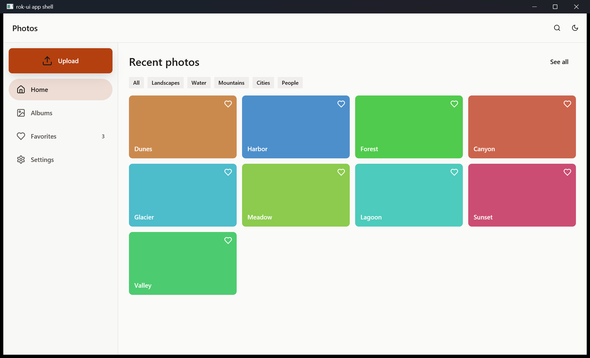
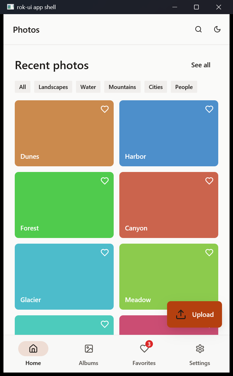
For people coming from Flutter, rok-ui has its Material app structure and layout widgets, built
on the same theme and controlled like every other component. Run
cargo run --example app_shell and resize the window.
Wide (NavigationRail, extended) |
Compact (NavigationBar) |
|---|---|
 |
 |
Scaffold
new
.app_bar
.drawer
.floating_action_button
.child
| Flutter | rok-ui |
|---|---|
Scaffold |
Scaffold: app_bar, body children, drawer, end_drawer, navigation (a permanent rail), bottom_navigation_bar, bottom_sheet, footer_button, floating_action_button and fab_location |
AppBar |
AppBar: leading, title, action, center_title, bottom (for tabs) |
FloatingActionButton, .extended |
FloatingActionButton with an optional label; Small, Regular, Large; Primary, Secondary, Surface |
NavigationBar, NavigationDestination |
NavigationBar, NavigationDestination (icon, selected icon, label, badge or dot, disabled) |
NavigationRail |
NavigationRail: extended, leading, trailing, label behavior, alignment |
NavigationDrawer |
NavigationDrawer: header, sections, dividers |
AdaptiveScaffold (flutter_adaptive_scaffold) |
AdaptiveScaffold: bottom bar under 600 px, rail from 600 px, extended rail from 1200 px |
Layout widgets
new
.cross_axis_alignment
.spacing
.child
.child
.child
| Flutter | rok-ui |
|---|---|
Row, Column |
Row, Column with MainAxisAlignment, CrossAxisAlignment, MainAxisSize and spacing |
Expanded, Flexible, Spacer |
Same names, with flex factors |
Center, Align |
Center, Aligned::new(Alignment::BottomEnd) |
Padding, EdgeInsets |
Padding::all(..), Padding::symmetric(..), Padding::new(EdgeInsets::zero().top(..).start(..)) |
SizedBox |
SizedBox::new(w, h), ::width, ::height, ::square, ::expand, ::shrink |
Stack, Positioned |
Stack with alignment and fit; .positioned(Positioned::new().top(..).end(..)) |
Wrap |
Wrap with spacing and run_spacing |
GridView.count, GridView.extent |
GridView::count(3), GridView::extent(id, max_width) |
LayoutBuilder |
LayoutBuilder::new(id, |constraints, window, cx| ..) |
| Material window size classes | WindowSizeClass::of(window), constraints.size_class() |
"Start" and "end" follow the reading direction, like Flutter's AlignmentDirectional: rows,
grids, Positioned and the shells mirror in right-to-left layouts. Sizing is CSS flexbox
rather than Flutter's constraints. The one difference you will notice: a Column inside a
Column fills the parent's height by default; give it MainAxisSize::Min or wrap it in
Expanded.
State, routing and data
Three features cover the app plumbing most desktop apps need. state is part of full; router
and db are opt-in (db brings in sqlx and a tokio runtime). Each has a full guide in
docs/guide, also shown as the module docs on docs.rs.
Reactive state (state)
Full guide: docs/guide/state.md.
rok-ui-hooks gives you fine-grained signals, memos,
effects and stores. rok_ui::state re-exports the crate (as rok_ui::state::signals) and wires
it into GPUI:
// Shared state: a store any part of the app can read and update.
let cart = create_store;
// A view re-renders when signals or stores read inside `track` change.
// A component-owned signal: changes re-render the window.
use_tracked(window, cx, || ..) does the same for components that read shared signals.
rok_ui::init runs rok-ui-hooks' tick on GPUI's executor, so use_resource, spawn,
use_debounced and use_throttled work without a loop of your own.
Routing (router)
Full guide: docs/guide/router.md.
new
.route
.route
.route
.redirect
.not_found
- Patterns:
:namecaptures one segment and*namecaptures the rest. The most specific pattern wins, whatever the declaration order. - Navigation:
rok_ui::router::{navigate, replace, back, forward}, orLink::new(id, "/notes/3"). Alt+Left and Alt+Right go back and forward. - Reading the location:
router::location(cx)(path and query),router::is_active(path, exact, cx)for highlighting navigation, androuter::on_navigatefor listeners.
cargo run --example notes --features router puts the router, a store and use_signal together in an
AdaptiveScaffold.
Database (db)
Full guide: docs/guide/database.md.
rok-db, a type-safe async ORM for PostgreSQL on sqlx, runs on a background tokio runtime, and its results come back to the UI thread:
use ;
// not needed when rok-db is a direct dependency
connect.detach; // at startup
// In a component: data, an error, or still loading. Cached until invalidated.
let users = use_query;
// Writes: run, then refresh the queries that read the table.
let insert = run;
// …after `insert` succeeds: db::invalidate("users", cx);
Run DATABASE_URL=postgres://… cargo run --example db_users --features db for a working list
with inserts and deletes.
Components
Every component in shadcn/ui's catalog has a rok-ui counterpart.
| shadcn/ui | rok-ui | Notes |
|---|---|---|
| Accordion | Accordion, AccordionItem |
Single or .multiple(true); uncontrolled (default_open) or controlled (open_items). |
| Alert | Alert |
Default and Destructive, with icon, title and description. |
| Alert Dialog | AlertDialog |
Modal that needs an answer; the backdrop does not dismiss it, Escape cancels. |
| Aspect Ratio | AspectRatio |
AspectRatio::new(16. / 9.); children fill the box. |
| Attachment | Attachment, AttachmentState |
File or image chip: metadata, upload progress, failure, retry and remove. |
| Avatar | Avatar |
Image with an initials fallback. |
| Badge | Badge |
Primary, Secondary, Destructive, Outline, optional icon. |
| Breadcrumb | Breadcrumb |
Links, current page, … (optionally opening a menu), custom separator. |
| Bubble | Bubble |
Chat bubble: variants, alignment, run grouping, reactions, "Show more" collapsing. |
| Button | Button |
Six variants, four sizes, icons, loading, disabled, tooltip. |
| Button Group | ButtonGroup, ButtonGroupText |
Joins any styled controls; horizontal or vertical. |
| Calendar | Calendar, CalendarDate, DateRange |
Single or range selection, several months, min / max / disabled dates. |
| Card | Card, CardHeader, CardTitle, CardDescription, CardContent, CardFooter |
Composed exactly like shadcn/ui. |
| Carousel | Carousel |
Animated slides, several per view, arrows, dots, keyboard, wrap-around. |
| Chart | Chart, ChartSeries, ChartKind |
Bar (grouped or stacked), line, area, pie and donut; grid, legend, y-axis, hover tooltip. |
| Checkbox | Checkbox |
Controlled, optional label. |
| Collapsible | Collapsible |
Trigger, always-visible peek content and a collapsible panel. |
| Combobox | Combobox |
Searchable select built from a popover and a command list. |
| Command | Command, CommandItem, CommandDialog |
Filtered, grouped actions with Up / Down / Enter; CommandDialog is the ⌘K palette. |
| Context Menu | ContextMenu |
Right-click menu at the pointer. |
| Data Table | DataTable, DataColumn |
Filter, sort, row selection, column visibility, pagination, row actions. |
| Date Picker | DatePicker |
Calendar in a popover; single or range, with presets. |
| Dialog | Dialog |
Closes on Escape, backdrop click or the close button. |
| Direction | Direction, TextDirection, set_text_direction |
App-wide or per-subtree RTL: every component mirrors. See "Right-to-left layouts". |
| Bidi Text | BidiText |
Text mixing Arabic, Hebrew or Persian with other scripts, in the right order on every platform. |
| Drawer | Drawer |
Bottom sheet with a grab handle. |
| Dropdown Menu | DropdownMenu, Menu, MenuItem |
Icons, shortcuts, checkbox and radio items, submenus, labels, keyboard navigation. |
| Empty | Empty |
Icon or media, title, description and actions; optional dashed border. |
| Field | Field, FieldLabel, FieldDescription, FieldError, FieldGroup, FieldSet, FieldLegend, FieldSeparator, FieldContent, FieldTitle |
Vertical or horizontal form fields. |
| Hover Card | HoverCard |
Opens after a delay, stays open while the pointer is on the trigger or card. |
| Input | Input, InputState |
Single-line field: placeholder, masked text, leading icon, invalid state. |
| Input Group | InputGroup |
Text, icon or element addons inside the border; textarea mode with toolbars. |
| Input OTP | InputOtp |
One box per character, groups with separators, paste, digits or alphanumeric. |
| Item | Item, ItemGroup |
Media, title, description and actions; default, outline or muted. |
| Kbd | Kbd (= KeyboardShortcut), KbdGroup |
Key caps. |
| Label | Label |
Form label with a disabled state. |
| Marker | Marker |
Inline status, system note, bordered event row or labeled separator. |
| Menubar | Menubar |
Desktop menu bar; hover switches menus while one is open, Left / Right too. |
| Message | Message |
Conversation turn with avatar, name, timestamp and footer; start or end aligned. |
| Message Scroller | MessageScroller, MessageScrollerState |
Virtualized chat log: follows new and streamed messages, keeps place when history loads, jump-to-latest, scroll to any message. |
| Native Select | NativeSelect |
Full-width select styled like a native control (GPUI has no platform select). |
| Navigation Menu | NavigationMenu, NavigationMenuLink |
Links plus titles that reveal content panels on hover. |
| Pagination | Pagination |
Previous / next, page numbers and ellipses. |
| Popover | Popover |
Floating panel; uncontrolled or controlled, four sides, two alignments. |
| Progress | Progress |
Percentage bar. |
| Questionnaire | Questionnaire, Question |
Steps of single-choice, multiple-choice and freeform questions, any skippable; summary at the end. |
| Radio Group | RadioGroup |
Options with optional descriptions; arrow keys change the selection. |
| Resizable | ResizablePanelGroup, ResizablePanel |
Draggable (and keyboard-adjustable) handles with min / max sizes. |
| Scroll Area | ScrollArea |
Thin themed scrollbars that can be dragged; vertical, horizontal or both. |
| Select | Select |
Groups, separators, disabled options, keyboard navigation. |
| Separator | Separator |
Horizontal or vertical. |
| Sheet | Sheet |
Dialog attached to any edge of the window. |
| Sidebar | Sidebar, SidebarGroup, SidebarItem, SidebarTrigger |
Header, footer, groups, nested items, badges; collapses to icons with tooltips. |
| Skeleton | Skeleton |
Pulsing placeholder. |
| Slider | Slider |
Single value or range; step snapping; drag, click or arrow keys. |
| Spinner | Spinner |
Rotating loader. |
| Switch | Switch |
Controlled toggle with a label. |
| Table | Table, TableHeader, TableBody, TableFooter, TableRow, TableHead, TableCell, TableCaption |
Flex-based rows; size a column by giving its cells a width. |
| Tabs | Tabs |
Controlled tab list; you render the panel. |
| Textarea | Textarea, use_textarea_state |
Multi-line field that grows with its text; Enter adds a line, Ctrl/Cmd-Enter submits. |
| Toast | toast(cx, Toast::…), Toaster |
Sonner-style: variants, loading toasts, actions, update and dismiss. AppRoot draws them. |
| Toggle | Toggle |
Pressed / unpressed, default or outline. |
| Toggle Group | ToggleGroup |
Single or multiple selection; outline groups join into one strip. |
| Tooltip | Tooltip |
Tooltip::text("…") for any .tooltip(..). |
| Typography | H1–H4, P, Lead, Large, Small, Muted, Blockquote, List, InlineCode |
shadcn/ui's text styles. |
Icon ships 66 stroke icons in the Lucide style (IconName::ALL).
Value components are controlled, like React inputs: you pass checked, value or open in and
read changes back through on_change / on_close. Floating and disclosure components (popovers,
menus, selects, accordions, hover cards, carousels) keep their open state per element id, like
Radix, unless you pass open (or index, open_items) yourself.
Theming
Tokens mirror shadcn/ui's CSS variables:
| shadcn/ui | rok-ui (cx.theme().colors.*) |
|---|---|
--background / --foreground |
background / foreground |
--card, --popover (+ -foreground) |
card, popover (+ _foreground) |
--primary, --secondary, --muted, --accent (+ -foreground) |
same names in snake_case |
--destructive (+ -foreground) |
destructive, destructive_foreground, plus destructive_text for error text on surfaces |
--border, --input, --ring |
border, input, ring |
--radius |
theme.radius, with radius_small(), radius_medium(), radius_large(), radius_extra_large() |
toggle_mode; // light ↔ dark
change_preset; // switch palette
sync_with_system_appearance; // follow the OS
// A custom brand: start from a preset and override tokens.
let mut theme = from_preset;
theme.colors.primary = rgb.into;
theme.radius = px;
set_global;
Rok (the default) uses warm stone neutrals, an ember accent (#B4400F light, #EA7A45 dark)
and 4px corners. Neutral is shadcn/ui's neutral palette with 8px corners. Two of its values
are darkened (muted text #666666, destructive #DC2626) so every pair passes 4.5:1. The
every_text_pair_reaches_four_point_five_to_one test enforces this for every preset and mode.
Fonts
rok-ui bundles three Google Fonts, each behind a Cargo feature
(font-cairo, font-noto-sans-arabic, font-inter, or fonts for all three). They are off by
default because they add their files (about 360 KB for Cairo, 760 KB for Noto Sans Arabic,
1.3 MB for Inter) to your binary:
= { = "0.9", = ["font-cairo"] }
CAIRO.register?; // Arabic + Latin, weights 400–700
set_font_family;
NOTO_SANS_ARABIC (Arabic, Persian, Urdu) is the alternative to Cairo: a more traditional
naskh style that maps every Arabic presentation form.
Theme::set_font_family survives preset and mode changes. For any other Google Font, download
its static weights with scripts/fetch-google-font.sh "IBM Plex Sans Arabic" 400,700 fonts/
from this repository, then register them with rok_ui::fonts::register_font_files(cx, paths)
or embed them with include_bytes! and FontFamily::new. Google Fonts are licensed under the
SIL Open Font License; ship the license file with the fonts (FontFamily::license() returns it
for bundled families).
Focus rings
Focus rings show after keyboard input only, like CSS :focus-visible: tabbing to a button shows
its ring, clicking it does not. Text inputs show theirs whenever they are focused. To show rings
for every kind of focus:
set_focus_ring_mode;
If your app has its own assets, layer rok-ui's icons over them:
new.with_assets
Project layout
rok-ui/
├── Cargo.toml              workspace, the rok-ui crate and its feature list
├── macros/                 rok-ui-macros: #[component], styles!, view!, #[procedure], derives
├── rok-ui-build/           rok-ui-build: the file-based route generator for build.rs
├── rok-ui-cli/             cargo rok-ui: new (templates), add (vendor components), routes
├── assets/icons/           built-in SVG icons (embedded at compile time)
├── assets/fonts/           bundled Google Fonts (Cairo, Noto Sans Arabic, Inter) and licenses
├── src/
│   ├── lib.rs              init(), re-exports
│   ├── prelude.rs          use rok_ui::prelude::*
│   ├── theme.rs, theme/    Theme, ThemeColors, presets, ActiveTheme
│   ├── sx.rs               Sx, the style values behind styles! and .sx(..)
│   ├── bidi.rs             bidirectional text reordering and Arabic shaping
│   ├── fonts.rs            bundled fonts and font registration
│   ├── state.rs            rok-ui-hooks signals wired into GPUI
│   ├── router.rs           Router, Link, navigation history
│   ├── db.rs               rok-db on a background tokio runtime, use_query
│   ├── motion.rs           Motion, keyframes, transitions, presence
│   ├── hooks.rs            use_state, use_keyed_state, State, EventHandler
│   ├── styles.rs           ApplyStyleOverrides, ComponentSize
│   ├── icon.rs             Icon, IconName, Assets
│   ├── runtime.rs          the shared tokio runtime for background work
│   └── components.rs       the component list; components/ holds one file per component
├── examples/               counter, gallery, app_shell, notes, db_users, sign_up, arabic, arabic_chat,
│                           and file_routes/ (a crate with file-based routes)
├── tests/                  component renders, sx, motion, macro compile errors
├── scripts/                check-features.sh, check-templates.sh, fetch-google-font.sh
└── docs/screenshots/
Development
RUSTFLAGS="-D warnings"
Coding agents: start with AGENTS.md and llms.txt.
Contributing
Contributions are welcome: bug reports, fixes, new components and docs. Read CONTRIBUTING.md for setup, conventions and the release process, and CHANGELOG.md for what changed in each version. Everyone taking part follows the Code of Conduct. Report security problems privately as described in SECURITY.md.
Known limitations (0.9)
- Right-to-left text on Windows is reordered by rok-ui (see
Arabic and mixed-direction text). Strings passed to GPUI's
own
.child(..)(div().child(name)) needBidiText; inview!andchildren!markup, string literals and string expressions are wrapped for you. - System font weights: they depend on the platform UI font. Some Linux fonts have no medium or semibold weight, so those render as regular. Bundled fonts avoid this.
License
rok-ui is licensed under the MIT License. The bundled fonts in assets/fonts/ are
licensed under the SIL Open Font License 1.1; each family's license is next to its files.