import pandas as pd
import matplotlib.pyplot as plt
import numpy as np
data = {
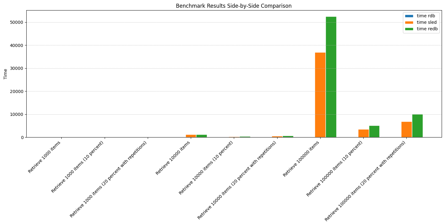
'Benchmark type': [
'Retrieve 1000 items',
'Retrieve 1000 items (10 percent)',
'Retrieve 1000 items (20 percent with repetitions)',
'Retrieve 10000 items',
'Retrieve 10000 items (10 percent)',
'Retrieve 10000 items (20 percent with repetitions)',
'Retrieve 100000 items',
'Retrieve 100000 items (10 percent)',
'Retrieve 100000 items (20 percent with repetitions)'
],
'time rdb': [50.30, 49.05, 49.16, 67.56, 55.29, 61.13, 209.59, 86.25, 124.29],
'time sled': [79.25, 17.84, 33.92, 1256.75, 311.57, 541.79, 36977, 3465.1, 6831.8],
'time redb': [97.95, 22.39, 43.17, 1225.68, 357.98, 692.16, 52558, 5090.9, 10151]
}
df = pd.DataFrame(data)
barWidth = 0.25
r1 = np.arange(len(df['time rdb']))
r2 = [x + barWidth for x in r1]
r3 = [x + barWidth for x in r2]
plt.figure(figsize=(15,8))
plt.bar(r1, df['time rdb'], width=barWidth, edgecolor='white', label='time rdb')
plt.bar(r2, df['time sled'], width=barWidth, edgecolor='white', label='time sled')
plt.bar(r3, df['time redb'], width=barWidth, edgecolor='white', label='time redb')
plt.xlabel('Benchmark type', fontweight='bold')
plt.xticks([r + barWidth for r in range(len(df['time rdb']))], df['Benchmark type'], rotation=45, ha='right')
plt.ylabel('Time')
plt.title('Benchmark Results Side-by-Side Comparison')
plt.legend()
plt.tight_layout()
plt.grid(axis='y', which='both', linestyle='--', linewidth=0.5)
plt.show()