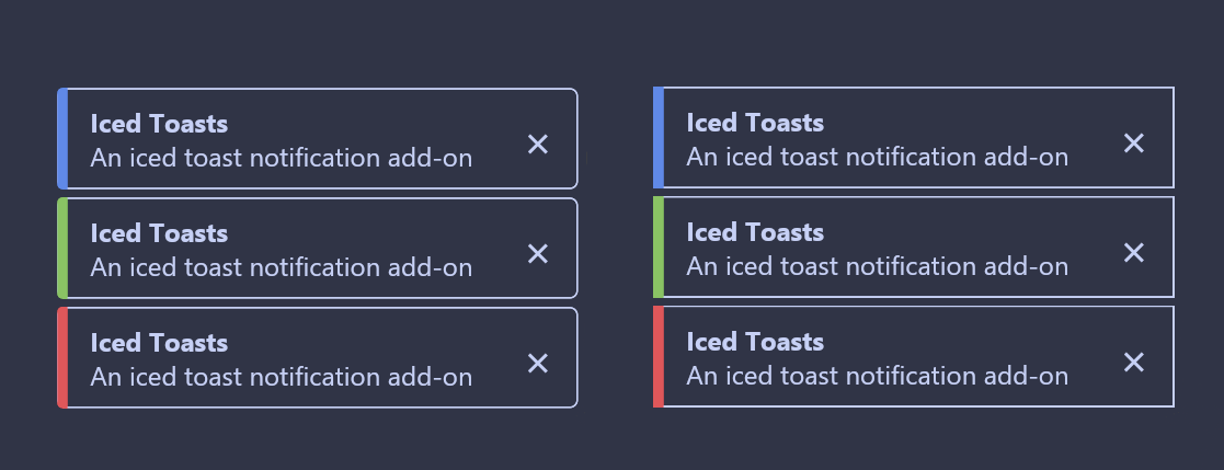
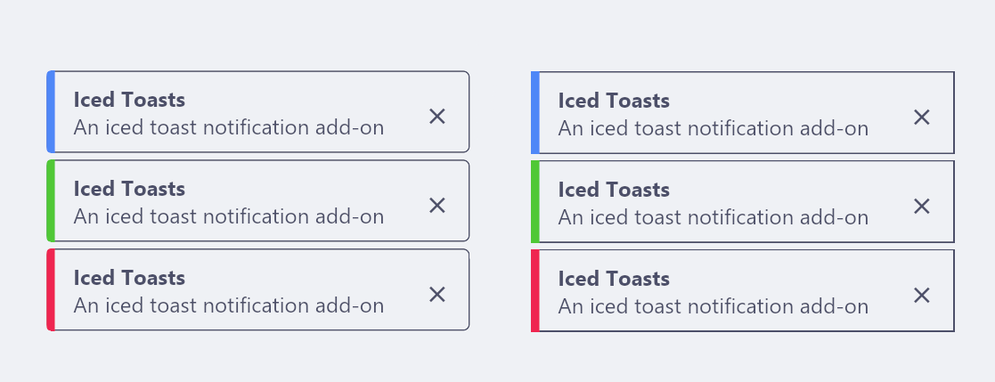
Iced Toasts
iced_toasts is an add-on crate to the iced GUI library,
which provides a simple way to add toast notifications. It is inspired by
examples/toast.
Features
In addition to the features of the example iced toast code, this create supports:
- Optional title, level and action buttons
- Styling and positioning options
- Toasts will not automatically disappear if being actively hovered over
Example
Here is a minimal example to push toasts to the screen.
use iced::{
    Element,
    widget::{button, text},
};

use iced_toasts::{ToastContainer, ToastId, ToastLevel, toast, toast_container};

pub fn main() -> iced::Result {
    iced::run("Iced Toasts Example", App::update, App::view)
}

struct App<'a, Message> {
    toasts: ToastContainer<'a, Message>,
}

#[derive(Debug, Clone, Copy)]
enum Message {
    PushToast,
    DismissToast(ToastId),
}

impl Default for App<'_, Message> {
    fn default() -> Self {
        Self {
            toasts: toast_container(Message::DismissToast),
        }
    }
}

impl App<'_, Message> {
    fn update(&mut self, message: Message) {
        match message {
            Message::PushToast => {
                self.toasts.push(
                    toast("Added a new toast!")
                        .title("Success")
                        .level(ToastLevel::Success),
                );
            }
            Message::DismissToast(id) => {
                self.toasts.dismiss(id);
            }
        }
    }

    fn view(&self) -> Element<Message> {
        let toast_button = button(text("Add new toast!")).on_press(Message::PushToast);
        self.toasts.view(toast_button)
    }
}
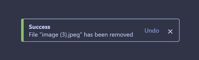
Action Buttons
iced_toasts allows you to add an optional action button to each toast, which
will broadcast a user-defined message if pressed.
enum Message {
    RemoveFile(usize),
    UndoFileRemoval(usize),
}

fn update(&mut self, message: Message) {
    match message {
        RemoveFile(file_id) => {
            self.toasts.push(
                toast(&format!("File removed ({})", file_id))
                .level(ToastLevel::Success)
                .action("Undo", Message::UndoFileRemoval(file_id))
            );
        },
        UndoFileRemoval(file_id) => {
            println!("File removal undone!")
        }
    }
Styling
Toasts appear on the bottom right with rounded corners by default, and will adjust the colours according to the current theme. We can change the alignment and size using builder methods when initialising ToastContainer.
use iced_toasts::{toast_container, alignment};

let toasts = toast_container(Message::DismissToast)
    .alignment_x(alignment::Horizontal::Left)
    .alignment_y(alignment::Vertical::Bottom)
    .size(24);
For more fine tuned styling of the appearance of individual toasts, we can
call the style method. This behaves similarly to styles in iced, as it
takes a reference to a theme and returns the Style struct.
let toasts = toast_container(Message::DismissToast)
    .style(|theme| {
        let palette = theme.extended_palette();
        iced_toasts::Style {
            text_color: Some(palette.background.base.text),
            background: None,
            border: Border::default(),
            shadow: Shadow::default(),
            level_to_color: Rc::new(|_level| None),
        }
    });
iced toasts has rounded toasts by default, but provides a premade style function for square borders as well.
let toasts = toast_container(Message::DismissToast)
    .style(iced_toasts::style::square_box);
