# declarative-gpui
[](https://crates.io/crates/declarative-gpui)
[](https://docs.rs/declarative-gpui)
[](https://github.com/DevPlus31/declarative-gpui/actions/workflows/ci.yml)
[](#license)
A declarative `ui!` macro for building [GPUI](https://www.gpui.rs/) element
trees with Tailwind-style tokens, real Rust control flow, and **zero runtime
overhead** — every token compiles directly to GPUI builder calls, and colors are
converted to their final `Hsla` values at compile time (faster than typical
hand-written GPUI).
```rust
use declarative_gpui::ui;
use gpui::prelude::*;
fn render(items: &[Item], dark: bool) -> impl IntoElement {
ui! {
col(gap_4 p_16 bg_1c1a17 rounded_lg shadow_md) {
row(items_center justify_between) {
text("Inbox" text_lg semibold text_f5f0e8)
if dark { text("dark") } else { text("light") }
}
for item in items {
row(gap_2 px_8 py_2 on_hover = |_, _, _| {}) {
text(&item.title text_sm)
}
}
}
}
}
```
## Getting started
Add the macro to your project (published as
[`declarative-gpui`](https://crates.io/crates/declarative-gpui) on crates.io;
its engine, [`declarative-gpui-core`](https://crates.io/crates/declarative-gpui-core),
is an implementation detail cargo pulls in automatically):
```sh
cargo add declarative-gpui
```
You also need GPUI itself — either the crates.io release or the Zed
repository (this macro's token tables are verified against zed rev
`bb48a42`; see [GPUI compatibility](#gpui-compatibility)):
```toml
[dependencies]
declarative-gpui = "0.3"
gpui = "0.2"
# or the rev this crate is verified against:
# gpui = { git = "https://github.com/zed-industries/zed", rev = "bb48a42983f2a4bb9ac9d31c63abe02497088f67" }
```
Then use `ui!` anywhere you build GPUI elements — it expands to plain
builder calls, so it drops into any `Render` impl (`gpui::prelude::*` must
be in scope, as with hand-written GPUI):
```rust
use declarative_gpui::ui;
use gpui::prelude::*;
use gpui::{Context, IntoElement, Window};
struct Counter {
count: usize,
}
impl Render for Counter {
fn render(&mut self, _window: &mut Window, cx: &mut Context<Self>) -> impl IntoElement {
ui! {
col(gap_8, p_16, bg_1c1a17, rounded_lg) {
text(format!("Count: {}", self.count), text_lg, semibold, text_f5f0e8)
div(
id = "increment",
on_click = cx.listener(|this, _, _, cx| {
this.count += 1;
cx.notify();
}),
cursor_pointer, px_12, py_4, rounded_md, bg_e0b184, text_1c1a17
) {
text("Increment")
}
}
}
}
}
```
The full element and style-token reference is below. Minimum supported Rust
version: **1.88**.
## Code → pixels
The 47-line [`examples/src/dsl.rs`](examples/src/dsl.rs) renders the card
below — pixel-identical to the 165-line hand-written
[`examples/src/hand_written.rs`](examples/src/hand_written.rs), **72% less
code**:
<img src="https://raw.githubusercontent.com/DevPlus31/declarative-gpui/main/examples/screenshots/card.png" width="480" alt="Team Inbox card rendered by the 47-line dsl.rs">
Both implementations run side by side in the showcase app
(`cargo run -p declarative-gpui-examples --release`); hover a pane's
`</> view code` button to see the source that renders it:
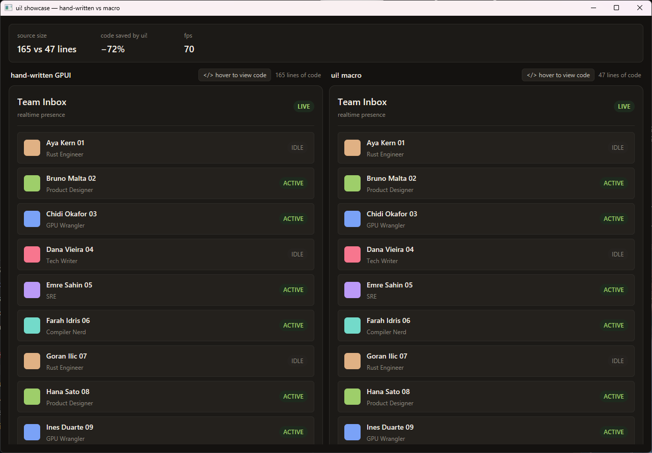
**Zero runtime overhead** — the macro expands to the same builder calls
you'd write by hand, so there is nothing extra at runtime. Details in
[examples/README.md](examples/README.md).
## Elements
| `div(...)` | `gpui::div()` |
| `row(...)` | `gpui::div().flex().flex_row()` |
| `col(...)`, `card(...)` | `gpui::div().flex().flex_col()` |
| `center(...)` | `div().flex().flex_row().items_center().justify_center()` |
| `scroll(...)` | stateful div with a stable auto ID + `.overflow_y_scroll()` |
| `list(id, count, render, ...)` | `gpui::uniform_list(...)` |
| `text(content, ...)`, `text_raw`, `label` | the content, wrapped in a styled div only when style args are present |
| any other name | called as a constructor: `badge("hi", px_4)` → `badge("hi").px(...)` |
| any path | called as a constructor: `Button::new("ok", label("Go"))` → `Button::new("ok").label("Go")` |
On custom constructors (unknown names and paths), the leading run of
arguments that aren't style tokens, `key = value` pairs, or call-style
builder methods is passed to the constructor itself; the rest chain as
builder calls. This makes third-party component libraries such as
[gpui-component](https://github.com/longbridge/gpui-component) first-class
citizens:
```rust
ui! {
col(gap_4, items_center) {
Button::new("ok", primary(), label("Let's Go!"), on_click = handler)
}
}
```
Constructor args can be literals, references, multi-segment paths,
`Type::call(...)` expressions, and method calls (`self.state.clone()`); a
call with a bare-ident callee (`label("Go")`) always chains as a builder
method, so bind it to a variable first if the constructor needs one.
Children go in braces; `if`/`else`, `if let`, `for`, and `match` (with
guards) work anywhere a child can appear and expand to real Rust control
flow — branch bodies hold any number of nodes. `{ expr }` escapes to an
arbitrary Rust expression, and `{ ..expr }` spreads any
`IntoIterator<Item: IntoElement>` into the parent's children — an `Option`
(renders nothing on `None`), a `Vec<AnyElement>`, or a mapped iterator:
```rust
col() {
{ ..self.badge.clone() } // Option<impl IntoElement>
{ ..items.iter().map(render_row) } // iterator
}
```
```rust
if let Some(modal) = self.modal.take() {
{ backdrop() }
{ modal }
}
```
Leaf elements (`text`, `text_raw`, `label`, `list`) have no children, so a
`{ ... }` directly after one is parsed as the next sibling — no wrapper
container needed.
## Element arguments
Three forms, in any mix (commas between args are optional but **recommended**
— without them adjacent expression args can merge and misparse):
- **Style tokens** — `px_8`, `bg_1c1a17`, `rounded_lg` (reference below).
- **`key = value`** — any builder method: `id = "main"`,
`w = gpui::rems(2.0)`, `font_family = "Zed Mono"`, `on_click = |e, w, cx| …`.
Mouse handlers (`on_mouse_down` etc.) default to `MouseButton::Left`.
- **Call-style** — `hover(|s| s.opacity(0.8))`, `when(cond, |el| …)` become
`.hover(…)`, `.when(…)`.
### Conditional style tokens
`when(cond, <args>)` with style tokens (or `key = value` / call-style args)
after the condition expands them inside a `.when()` closure — conditional
styling without giving up compile-time tokens, colors included:
```rust
row(px_4, when(dark, bg_1c1a17, text_f5f0e8, rounded_lg))
row(when(dark, bg = th.panel)) // key = value works too
```
`when(cond, |el| …)` with a closure still passes through to GPUI's
`FluentBuilder::when` unchanged, and a bare path that isn't a style token
(`when(cond, my_modifier)`) is treated as a callback.
### Stateful elements
Elements using a method that requires `Stateful<Div>` — `on_click`,
`on_hover`, `on_drag`, `tooltip`, `hoverable_tooltip`, `active`,
`group_active`, `track_scroll`, `anchor_scroll`, or the
`overflow(_x/_y)_scroll` tokens — automatically get a stable `.id()` (from
`file!:line!:column!`), so `div(on_click = …)` just works. An explicit
`id = …` is folded into the constructor instead. On *custom* constructors
(unknown element names and `Type::new`-style paths) nothing is injected —
there, pass the ID the component expects (usually a constructor arg) or put
`id = …` before type-changing methods yourself.
## Style token reference
Numeric conventions (deliberately different from GPUI's rem scale — rem
values remain available via `key = value`):
| `_N` | N **pixels** | `w_240` → `.w(px(240.))` |
| `_XpY` | decimal pixels | `p_2p5` → 2.5px |
| `_neg_N` | negative (where GPUI allows) | `m_neg_8` → −8px |
| `_auto`, `_full`, `_px` | GPUI's auto / 100% / 1px methods | `mx_auto`, `min_w_full`, `w_px` |
| fractions | relative size | `w_1_2` → 50%, `h_2_3`, `flex_basis_1_4` |
- **Layout** — `flex` `grid` `block` `hidden`, `flex_row`/`flex_col`
(+`_reverse`), wrap variants, `flex_1` `flex_auto` `flex_initial`
`flex_none`, `flex_grow(_0/_1)`, `flex_shrink(_0/_1)`, `justify_*`
(incl. `justify_evenly`), `items_*` (incl. `items_stretch`), `self_*`,
`content_*`, `aspect_square`.
- **Spacing** — `p`/`px`/`py`/`pt`/`pb`/`pl`/`pr`, `m*` (margins allow
`_auto`/`_neg_`), `gap`/`gap_x`/`gap_y`.
- **Sizing** — `w` `h` `size` `min_w` `min_h` `min_size` `max_w` `max_h`
`max_size` with all numeric forms.
- **Position** — `relative` `absolute`, `top`/`bottom`/`left`/`right`/`inset`
(+`_auto`/`_neg_`).
- **Colors** — `bg_`, `text_`, `border_`, `text_bg_`, `text_decoration_` +
hex (`1c1a17`, `abc`, `1c1a17cc` with alpha, `abcd`) or a named color
(`black white gray red green blue yellow cyan magenta orange purple`).
Emitted as **precomputed `Hsla` literals** — zero color math at runtime.
Precedence note: a 3/6-digit all-numeric suffix is a *color* (`text_112` =
`#112`); anything else numeric is a *size* (`text_16` = 16px).
- **Typography** — `text_xs…text_3xl`, `text_N` (px size), weights
(`thin…black`, with or without `font_` prefix), `italic`, `underline`,
`line_through`, `text_decoration_{0,1,2,4,8,solid,wavy,none}` and
`text_decoration_<color>`, `truncate`, `text_ellipsis(_start/_middle)`,
`line_clamp_N`, `whitespace_nowrap/normal`, `text_left/center/right`.
- **Borders & radius** — `border(_x/_y/_t/_b/_l/_r)` (bare = 1px, `_N` = Npx,
`_0p5` = 0.5px), `border_dashed`, `border_<color>`; full `rounded` family
(`rounded_lg`, `rounded_tl_2xl`, `rounded_8`, …).
- **Effects & misc** — `shadow(_2xs…_2xl,_none)`, `opacity_N` (0–100),
`cursor_*`, `visible`/`invisible`, `overflow_hidden(_x/_y)`,
`overflow_scroll(_x/_y)` (needs a stateful element), `scrollbar_width_N`,
`debug`, `debug_below`.
- **Grid** — `grid_cols_N`/`grid_rows_N`, `grid_cols_min_content_N`/
`_max_content_N`, `col_span_N`/`row_span_N` (+`_full`),
`col_start`/`col_end`/`row_start`/`row_end` (+`_auto`, `_neg_N`).
Unknown tokens are **compile errors** ("Unknown style token"), never silently
ignored.
## Themes: `color!` and `Hsla` palettes
Style-token colors are static by nature. For themed apps (light/dark), the
same compile-time conversion is available standalone via `color!`, which
expands to a **const-constructible `Hsla` literal**:
```rust
use declarative_gpui::{color, ui};
use gpui::Hsla;
pub struct Theme { pub panel: Hsla, pub text: Hsla, pub accent: Hsla }
pub const LIGHT: Theme = Theme {
panel: color!(f5f0e8), text: color!(1c1a17), accent: color!("#ff6b35"),
};
pub const DARK: Theme = Theme {
panel: color!(1c1a17), text: color!(f5f0e8), accent: color!(orange),
};
fn panel(th: &Theme) -> impl IntoElement {
ui! { col(bg = th.panel, text_color = th.text) { text("themed") } }
}
```
Because the palette already stores `Hsla`, a themed `bg = th.panel` is a
plain field copy — no `rgb()` hex unpacking or RGB→HSL conversion per frame.
Avoid storing themes as `u32` hex and converting at the call site
(`bg = (rgb(th.panel))`); that reintroduces the per-frame color math the
macro exists to eliminate.
## Zero runtime overhead
The generated code is what a careful GPUI author would write, or better:
- style tokens are direct method calls — no runtime string matching;
- colors are compile-time `Hsla` literals — no `rgb()` unpacking or RGB→HSL
conversion per frame (and `color!` extends this to theme palettes);
- unstyled `text(...)` emits the bare content — no wrapper div layout node;
- `list` moves its render closure — no `Arc`, no per-frame allocation;
- every element yields its concrete type — no `AnyElement` boxing.
These guarantees are pinned by tests in `core` — and you can inspect any
invocation yourself with `ui_expand!`, which returns the pretty-printed
generated code as a `&'static str` (a per-invocation `cargo expand`, no
nightly needed):
```rust
println!("{}", ui_expand! { row(px_8 bg_1c1a17) { text("hi") } });
```
## GPUI compatibility
Token tables are verified against GPUI at zed rev `bb48a42` (2026-07-02).
The `integration` crate compiles every DSL feature against that exact rev —
if GPUI renames or removes an API the macro targets, that crate stops
compiling. Bump the rev in `integration/Cargo.toml` to check newer GPUI.
## Workspace layout & development
```
. proc-macro shim (`ui!` entry point)
core/ declarative-gpui-core — parser, emitter, token tables, tests
integration/ compile-surface tests against real GPUI (excluded from default builds)
examples/ side-by-side showcase: hand-written GPUI vs ui! (see examples/README.md)
```
```sh
cargo test # unit + expansion tests (fast)
cargo test -p declarative-gpui-core dump_expansions -- --ignored --nocapture # golden expansion dump
cargo test -p declarative-gpui-integration # real-GPUI compile check (slow first build)
cargo run -p declarative-gpui-examples --release # side-by-side showcase
```
## License
Licensed under either of [Apache License, Version 2.0](LICENSE-APACHE) or
[MIT license](LICENSE-MIT) at your option.