# Bevy Nested Tooltips
[<img alt="github" src="https://img.shields.io/badge/github-lyndon-mackay/bevy_nested_tooltips?style=for-the-badge&labelColor=555555&logo=github" height="20">](https://github.com/Lyndon-Mackay/bevy_nested_tooltips/)
[<img alt="crates.io" src="https://img.shields.io/crates/v/bevy_nested_tooltips.svg?style=for-the-badge&color=fc8d62&logo=rust" height="20">](https://crates.io/crates/bevy_nested_tooltips)
[<img alt="docs.rs" src="https://img.shields.io/badge/docs.rs-bevy_nested_tooltips-66c2a5?style=for-the-badge&labelColor=555555&logo=docs.rs" height="20">](https://docs.rs/bevy_nested_tooltips)
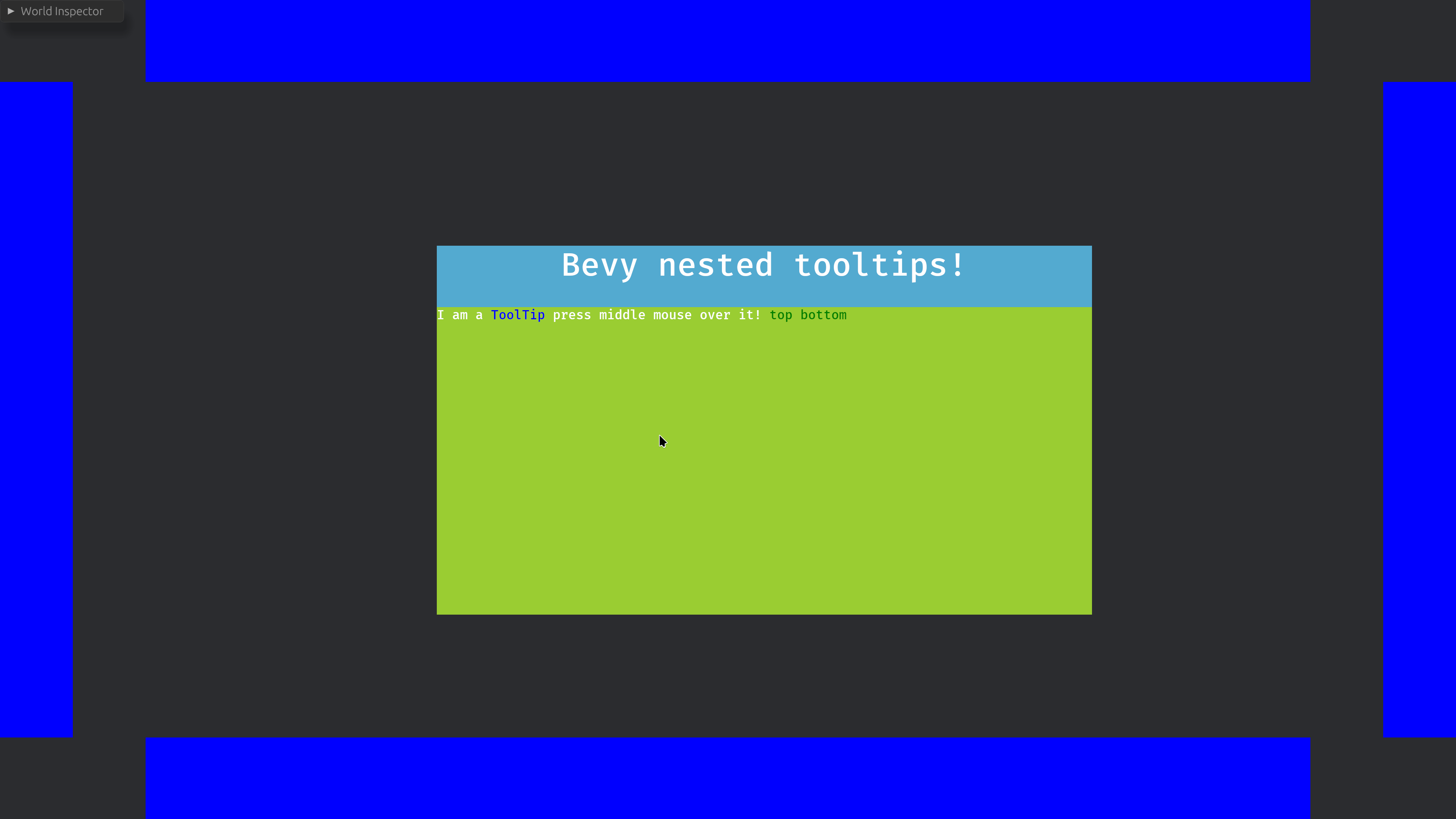
A library for creating headless(unstyled) tooltips that can be arbitrarily nested and highlight other nodes.
(Colours are chosen by end user!)
## Features
This library strives to handle the logic behind common tooltip features, while you focus on your unique data and design needs.
- Tooltips can be spawned by hovering or by user pressing the middle mouse button, your choice which and you can change at runtime.
- Nesting to arbitrary levels, the only limitation is memory.
- Despawns if the user hasn't interacted with them in a configurable time period, or they mouse away after interacting with them.
- Locking by pressing of the middle mouse button. using observers you can implement your specific design to inform your users.
- Highlight other Entites using a linked text, highlight designs are up to you.
## Usage
### Import the prelude
```rust
use bevy_nested_tooltips::prelude::*;
```
### Add the plugin
```rust
.add_plugins((
NestedTooltipPlugin,
))
```
### (Optional) Configure tooltips
```rust
commands.insert_resource(TooltipConfiguration {
activation_method: ActivationMethod::MiddleMouse,
..Default::default()
});
```
### Load your tooltips
```rust
let mut tooltip_map = TooltipMap {
map: HashMap::new(),
};
tooltip_map.insert(
"tooltip".into(),
ToolTipsData::new(
"ToolTip",
vec![
TooltipsContent::String("A way to give users infomation can be ".into()),
TooltipsContent::Term("recursive".into()),
TooltipsContent::String(" Press middle mouse button to lock me. ".into()),
],
),
);
tooltip_map.insert(
"recursive".into(),
ToolTipsData::new(
"Recursive",
vec![
TooltipsContent::String("Tooltips can be ".into()),
TooltipsContent::Term("recursive".into()),
TooltipsContent::String(
" You can highlight specific ui panels with such as the ".into(),
),
TooltipsContent::Highlight("sides".into()),
TooltipsContent::String(" Press middle mouse button to lock me. ".into()),
],
),
);
```
### Add links to relevant entities
```rust
TooltipHighlight("sides".into()),
```
Or
```rust
TooltipTermLink::new("tooltip"),
```
### Style your tooltips
Create an observer with at least these parameters.
```rust
fn style_tooltip(
new_tooltip: On<TooltipSpawned>,
tooltip_info: TooltipEntitiesParam,
mut commands: Commands,
)
```
Fetch the data.
```rust
let tooltip_info = tooltip_info
.tooltip_child_entities(new_tooltip.entity)
.unwrap();
```
Use the entities to style your node using commands or mutatable queries!
```rust
commands
.get_entity(tooltip_info.title_node)
.unwrap()
.insert(Node {
display: Display::Flex,
justify_content: JustifyContent::Center,
width: Val::Percent(100.),
..Default::default()
});
```
#### React to changes.
```rust
// When highlighted change the colour, how you highlight is up to you
// maybe fancy animations
fn add_highlight(side: On<Add, TooltipHighlighting>, mut commands: Commands) {
commands
.get_entity(side.entity)
.unwrap()
.insert(BackgroundColor(GREEN.into()));
}
// remove highlighting
fn remove_highlight(side: On<Remove, TooltipHighlighting>, mut commands: Commands) {
commands
.get_entity(side.entity)
.unwrap()
.insert(BackgroundColor(BLUE.into()));
}
```
## Limitations
This plugin assumes a single fullscreen and camera is used.
Using this library when not fullscreen will likely trigger the links at the wrong time, this limitation will be removed once textspans support observers.
## `Bevy` compatability
| 0.18 | 0.3 |
| 0.17 | 0.1-0.2 |