bevy_gooey
⚠️ Vibe Coded. Written by AI agents working from a human's direction, covered by tests rather than a line-by-line human review. Read the code before you rely on it for something you care about.
Game interfaces made easy for Bevy 0.20: a skin, ready-made game widgets and keyboard and gamepad navigation, on Bevy's own headless widgets.



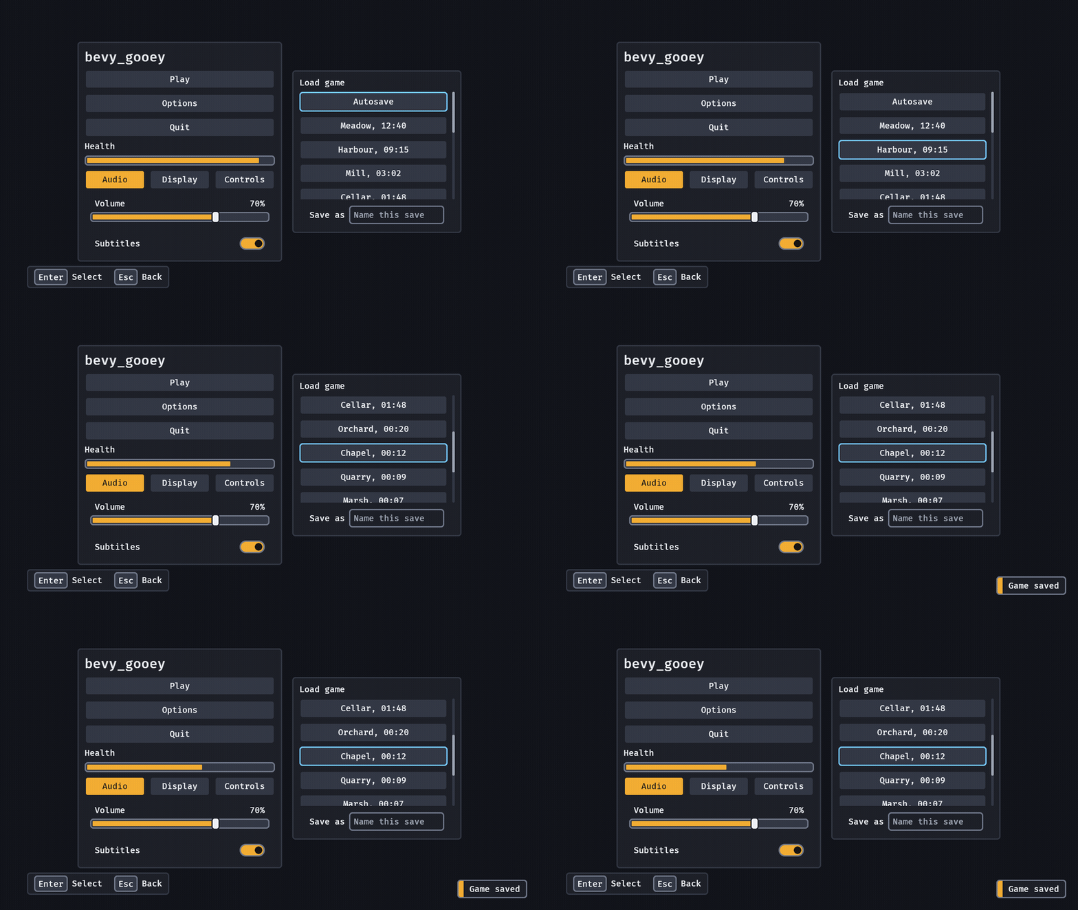
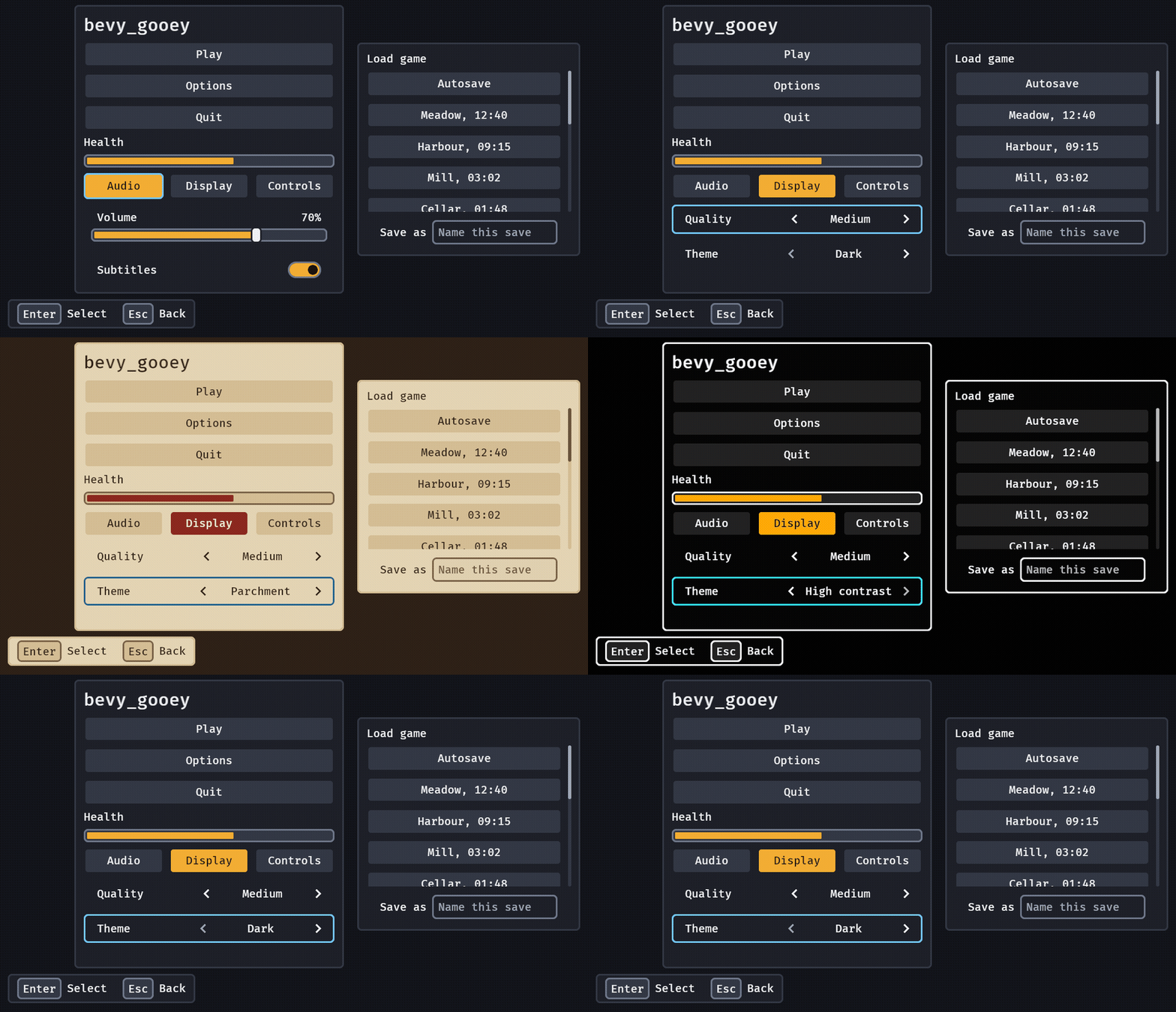
examples/gallery: two panels, a meter draining, settings in tabs (a slider and a switch on the first), a list
that scrolls to follow focus with a field to name a save under it, toasts, and the Select and Back legend in the corner.
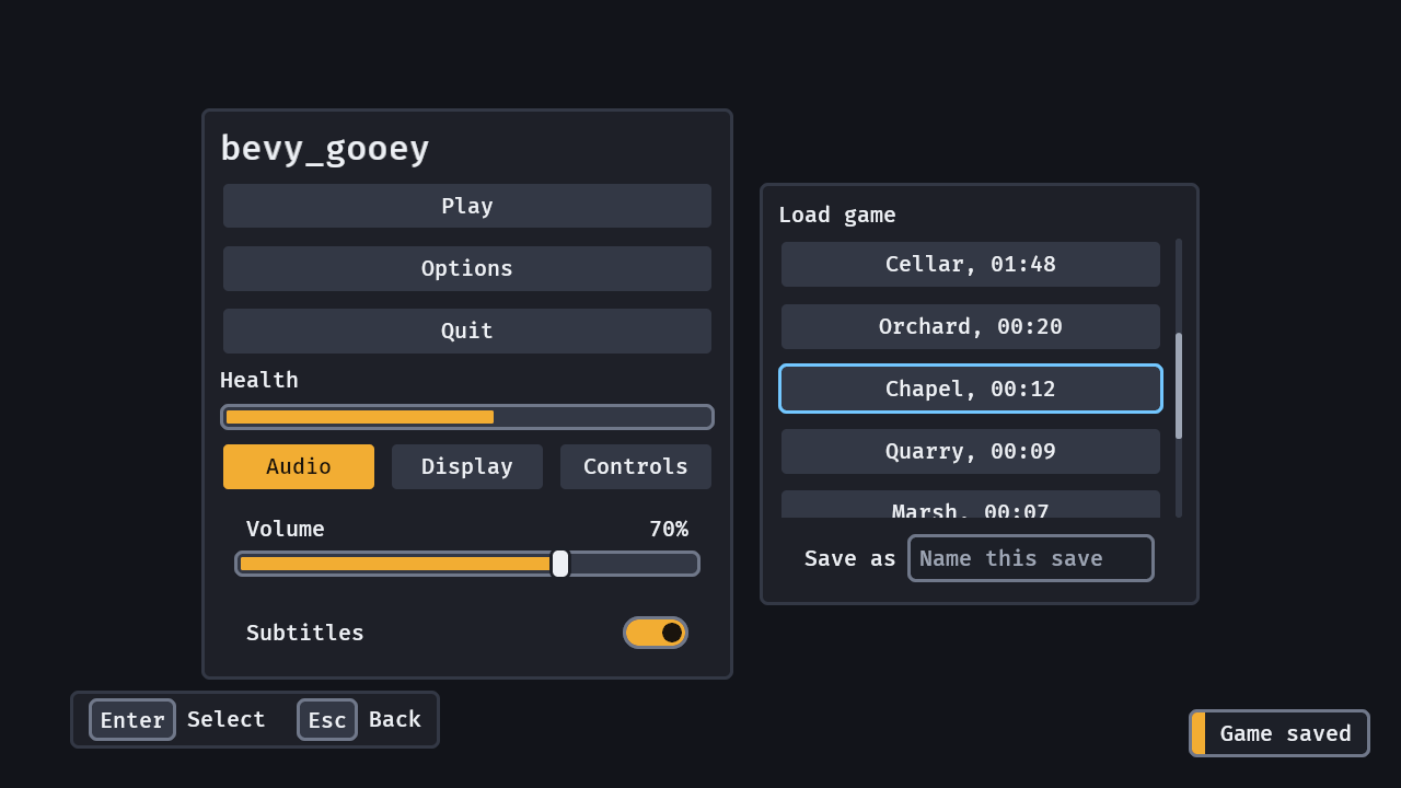
The still: the dark skin, 1280 × 720.
Status: usable · Bevy 0.20 · MSRV 1.97.1
Why: Bevy gives you layout and picking but no skin, no focus ring a pad player can follow and no
ready-made options row, so every game rebuilds the same menu — bevy_gooey makes one crate's worth of
it shared, checked against the WCAG 2.2 contrast and target-size rules, and editable as data.
Quick start
use *;
use *;
Every widget composes inside children![], and a button acts through an Activate observer. From git,
for changes not released yet:
[]
= { = "https://github.com/bevy-coven/bevy_gooey" }
Features: serde (save and load a GooeySkin and UiScaleSettings as data), reflect (inspector(..), below), testing (bevy_gooey::testing: find a widget by its label, click it and type in a headless test).
Try it
Every widget on a screen, what the pictures above show: arrows or the D-pad move focus, Enter, Space and
South activate, Shift+T doubles the text, Options swaps the skin, Quit opens a dialog, Right on a focused
tab or Ctrl+PageDown turns the settings page (Display holds the choices, Controls two rebinding rows: Enter
on Jump, then a key), the Save as field takes a name (click it or Tab to it, type, Enter saves and Down
leaves it, and the save-slot list scrolls with the wheel, a drag on its thumb or PageUp and PageDown.
cargo run --example options is the player's options on a screen of their own: Left and Right on Text size
grow everything to 200%, and Controller renames the pad's buttons.
What you can do
- Skin the whole interface from one value —
GooeySkinis plain data with four presets (dark, parchment, a high-contrast one held to 7:1 and a compactToolone), aproblems()check against the WCAG 2.2 contrast and target-size rules,density: Density::Compactfor a desktop tool's rows (half the padding, a 24 px least target), design tokens (spacing,radii,type_scaleand asurfacesladder of five fills whose every stepproblems()holds to at least ΔL* 2, drawn bysurface(n); your own named colours go intones, drawn byRole::Toneand checked pair by pair withtone_problems;hover,pressed,held,cardand friends are the states your own controls draw byRole::Pressedand the like), and aSkinScope(skin)on any node restyles just that subtree (a preview of a theme, an editor's own chrome next to a game's skin): skins and checks. - Build an options screen from a few rows and tabs — a
toggle, achoiceand asliderroot on Bevy's ownCheckbox,ButtonandSlider, so the entity you spawn carries its value, takesobserveand says each change once inValueChange,binding("Jump", Binding::Key(KeyCode::Space))rebinds a key, a mouse button, a pad button or a chord ("Ctrl+Shift+K") on the player's next press,text_input("Name", "")is a field the player types in (a caret, a selection, paste and IME on Bevy's ownTextInput, and focus it never traps;text_area("Notes", "", 5)is the same five lines high, Ctrl+Enter ends the edit),number_field("Health", 100.0, 0.5, 0.0..=250.0)is a number the player scrubs with a drag, types or steps with the keys and the D-pad (vec_fieldfor a position),color_field("Tint", color)is a swatch and a hex field (#ff8800) that open a picker,FieldProblem::error("A name is needed")on a row says what is wrong under it,icon(source)is your art sized and tinted by the skin,progress(0.4)andspinner()are honest waiting,radial(["Pistol", "Rifle", ..], 0)is a weapon wheel a stick, the pointer or the D-pad points at and South chooses (RadialItem::new("Pistol").icon(source)draws a picture on the ring),tabsputs them on pages a click, the arrows or LB and RB turn, andtext_size("Text size"),interface_size("Interface size"),pad_style("Controller")andskin_preset("Theme")are the player's own text size (up to 200%), interface size, controller and theme (dark, parchment, a high-contrast look that holds 7:1 everywhere and a tool's blue), one line each with nothing to wire: settings controls, player options, rebinding, shortcuts, text input, numbers, colours, field problems, icons, progress, radial menu, tabs. - Scroll a list, show a table or a tree, split the screen and dock panels —
list(4.5, children![..])cuts the fifth row so the player sees there is more;table(columns, rows)is ten thousand sortable rows andtree(nodes)ten thousand nodes that open and close, each in a dozen entities;split(SplitAxis::Horizontal, a, b)is two panes and a divider a drag or the keys move;DragPayload(piece)on a row andDropTarget::<Piece>::new()on a panel is drag and drop (oneDropped<Piece>a drop, a ghost, a mark that says no before the pointer is let go; Alt+M and the arrows or a pad do it with no pointer);slot_grid(5, items)is an inventory of slots (SlotItemsis the data, the grid is one tab stop the arrows walk, Enter chooses a slot, a drag, Alt+M or a pad moves an item between slots or grids as oneSlotMoved,SlotRulesmakes an equipment slot say no in red before the player lets go, and a lifted item frames every slot that takes it and dims the ones that do not);dock(DockLayout)is tab groups of your registered panels the player rearranges by dragging a tab; a tool's chrome istoolbar(..)oficon_buttons and atoggle_group(the last items go behind a More button when the bar is too narrow),status_bar(left, right)(the lowest priority hides first) andselect(..), a choice that opens a filtering list past eight options, andsection(title, open, children)folds a group of widgets under a header, its state kept bySectionId, and (featurereflect)inspector(InspectTarget::component::<T>(entity))builds the rows for a reflected component or resource, one widget per field: lists, tables, trees, split panes, docks, toolbars, status bar, select, inventory, drag and drop. - Reach every screen with keys or a pad, and back out of it — arrows and the D-pad move focus to the
nearest widget, an open dialog holds it (
confirm("Leave?", "Progress is lost.", ["Leave", "Stay"])is a whole one: the safe choice focused, Escape answers it, oneConfirmChosen;hold_button("Hold to delete", 1.2)confirms only when held, and the player'sHoldSettingsshorten the hold or make it a tap), the ring appears the moment a key is pressed, Escape or the pad's B is oneCancelevent that reaches the dialog or screen you are leaving,FocusRegions split a tool's screen into parts F6 walks between (aviewport()keeps the arrow keys for the host), andprompts()says so in the corner, in the words of the device the player used last ("Esc Back", then "B Back" the frame they pick up a pad); a screen reader is told every widget's role, name and state from the words on screen, and can press, focus, step and set them (the same events the keyboard sends), nothing to write: navigation, focus regions, prompts, the dialog, hold buttons, accessibility. - Say something, or open a menu, without building a layout —
commands.spawn(toast("Game saved"))stacks, times itself to its own length and ages on real time (.action("Undo", id)adds a button,.sticky()keeps an error until dismissed, repeats merge into "x3", andnotification_center()lists the log), andpopover(anchor, Placement::Below)opens a panel beside any widget or at the pointer, kept inside the window and closed by Escape or a press elsewhere: toasts, popovers; andmenu_bar(children![menu_title("File", children![menu_item("Open...").with_shortcut(..), separator(), ..])])is a desktop menu bar for a tool, F10 and the arrows to walk it, with checks, radio runs, submenus and disabled items that say why: menus; every dialog and menu eases into place, a health meter leaves what it lost behind its fill, andMotionSettings::off()turns it off: motion; andContextMenu(menu)on any entity, a sprite in the world or a row of a list, opens acontext_menu(..)at a right-click or below the focus on Shift+F10: context menus; andcommands.spawn(command_palette())is one searchable list of every command in aCommandList, each with its chord and why it is off, "opn prj" finds "File: Open Project", Enter sends oneRunCommand: the command palette. - Keep the interface's share of the screen at every resolution, and let the pointer through a HUD — the
skin's sizes scale with the window, every border stays a whole number of device pixels, and the empty part
of a
screenisPickable::IGNORE: screen size, over a game world; and(meter(0.8, 1.0), WorldAnchor::above(enemy, 44.0))is a health bar that rides a thing in the world (.pinned()keeps a beacon on the screen's edge toward it), gone with the thing: world anchors.Cooldown::new(8.0)on any widget dims it and sweeps it clear clockwise with the seconds left on a chip, sendsCooldownReadywhen it ends and puts the seconds in its accessible name: cooldowns.
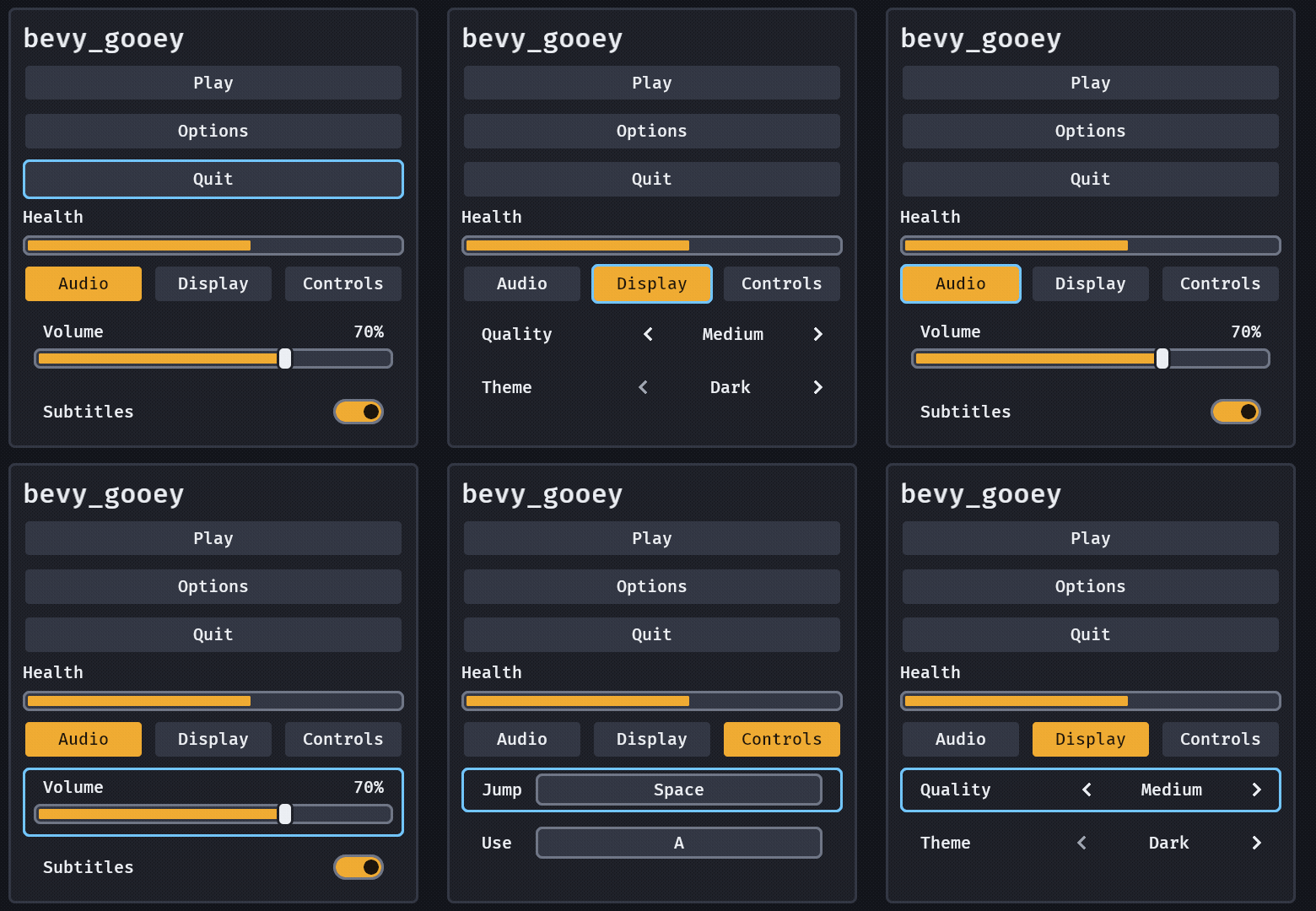
The tabs: Right on a focused tab, then Ctrl+PageDown from inside a page (a pad's RB). The panel never moves.
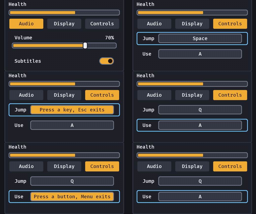
Rebinding: binding("Jump", Binding::Key(KeyCode::Space)) waits for the next press and says it once as a ValueChange<Binding>. The panel never moves, and nothing else hears the key.
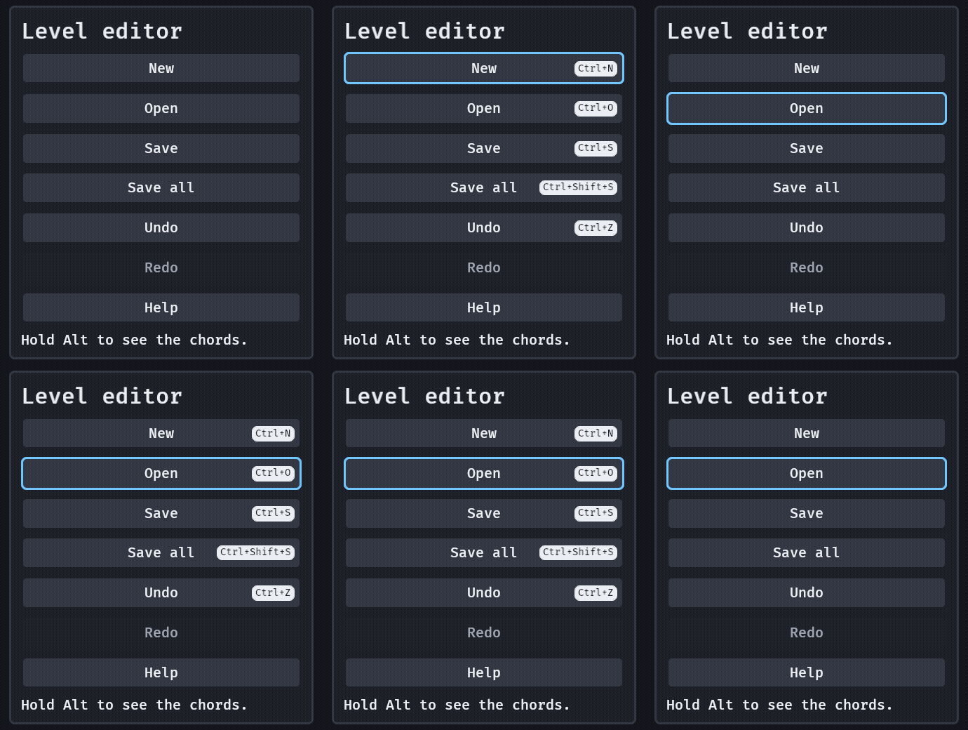
Shortcuts: (button("Save"), Shortcut::primary(KeyCode::KeyS)) and holding Alt, or any Reveal::Key, for 0.3 s (ShortcutBadges, BadgesShown) shows the chord on the button, inside its frame so the ring stays whole, and ShortcutLegend lists the chords that act on nothing; a binding row whose value is a Binding::Chord captures a chord, model::shortcut_conflicts finds two commands on one, Shortcut::just_pressed runs it, Tooltip::with_shortcut shows it.
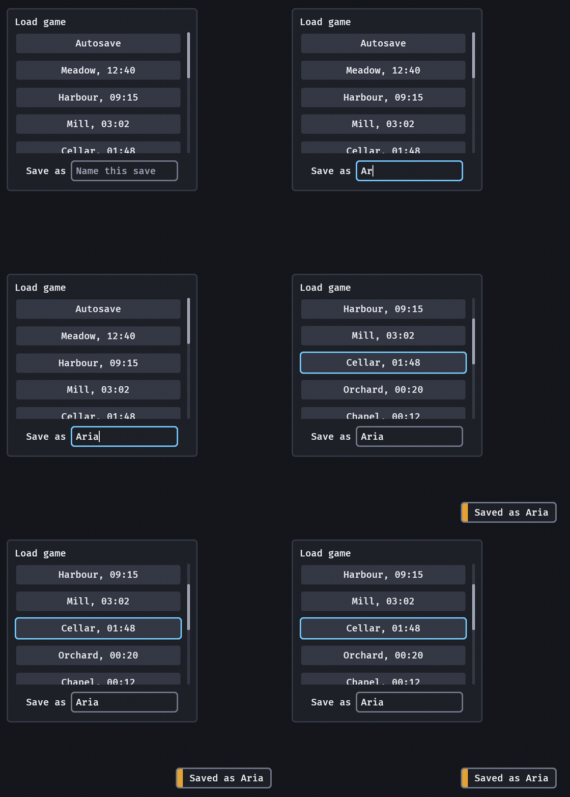
Text input: text_input("Save as", "") takes the keys the moment it has focus, says each edit once as a ValueChange<String> and the end of the edit (Enter, or focus leaving) with is_final. Up leaves it: a field never traps focus, and the row never moves while the player types.
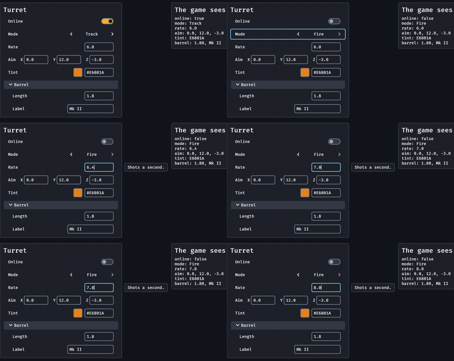
Inspector: inspector(InspectTarget::component::<Turret>(entity)) makes a toggle, choice, number_field, vec_field, color_field, text_input or section for each reflected field (a #[reflect(@RangeInclusive::<f32>::new(0.0, 20.0))] is its range, a doc comment its tooltip), writes an edit back through ReflectMut and sends one InspectorChange { path }; a value the game writes moves the row.
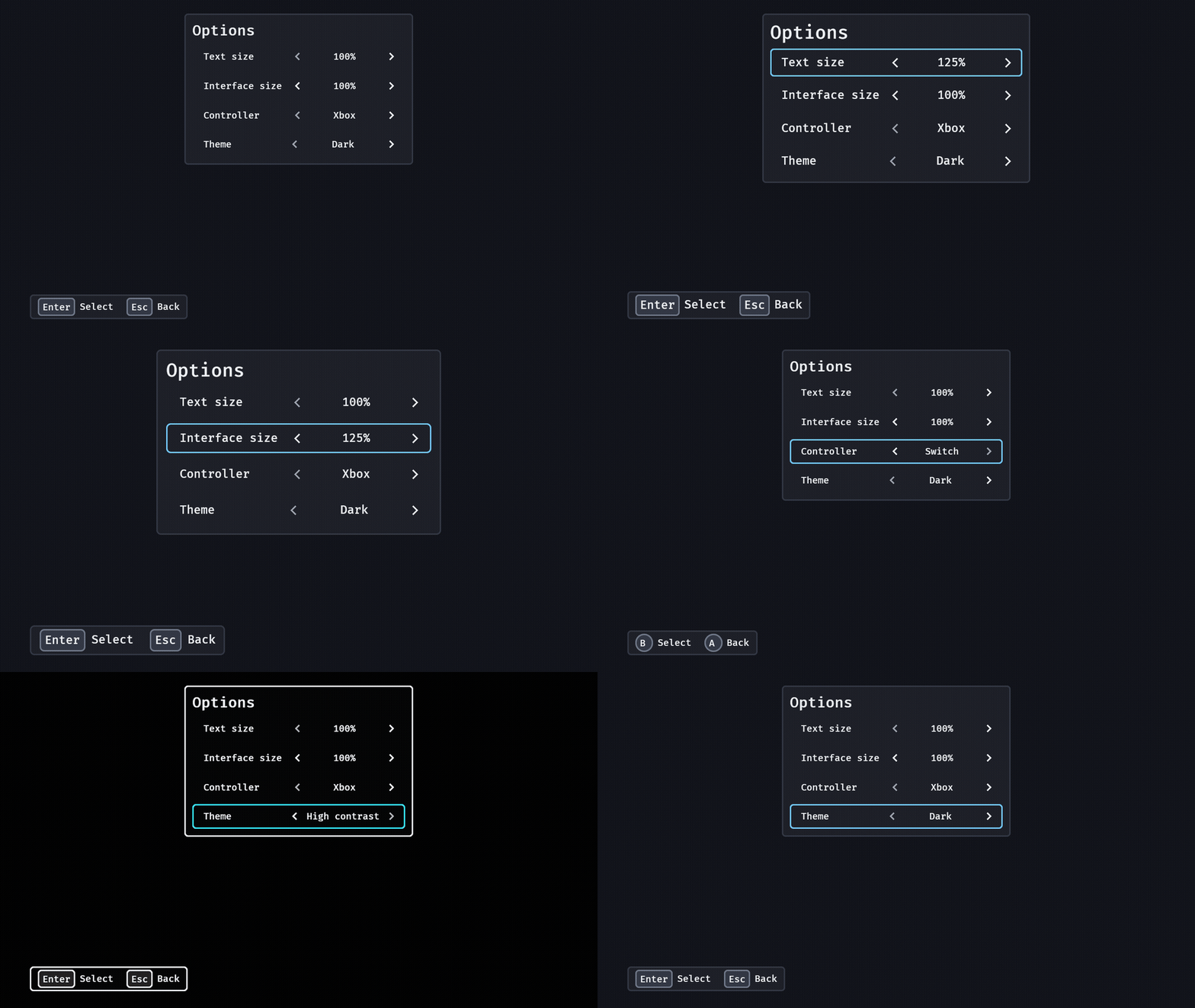
Player options: text_size, interface_size, pad_style and skin_preset each edit the crate's own settings and follow them, so a loaded save shows on them and the whole screen answers the frame the player steps one.
Theme: skin_preset("Theme") is the high-contrast mode Xbox Accessibility Guideline 102 asks of a game, in one line: every colour at 7:1 or more. A step writes the colours and no size, so the player's text size stays.
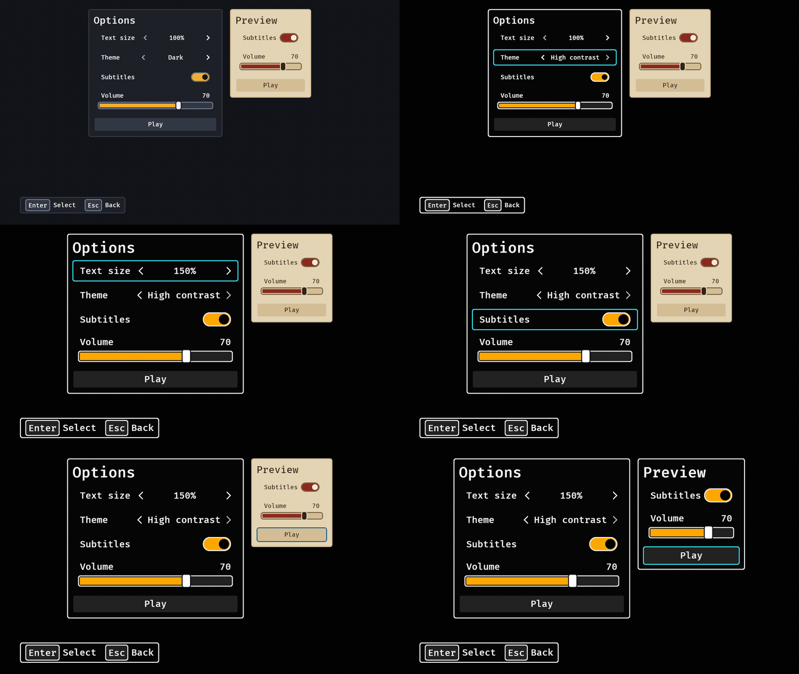
Scoped skin: SkinScope(GooeySkin::parchment()) on the Preview panel is the only thing that keeps it in its own look; removing it hands the panel back to the player's skin in the same frame.
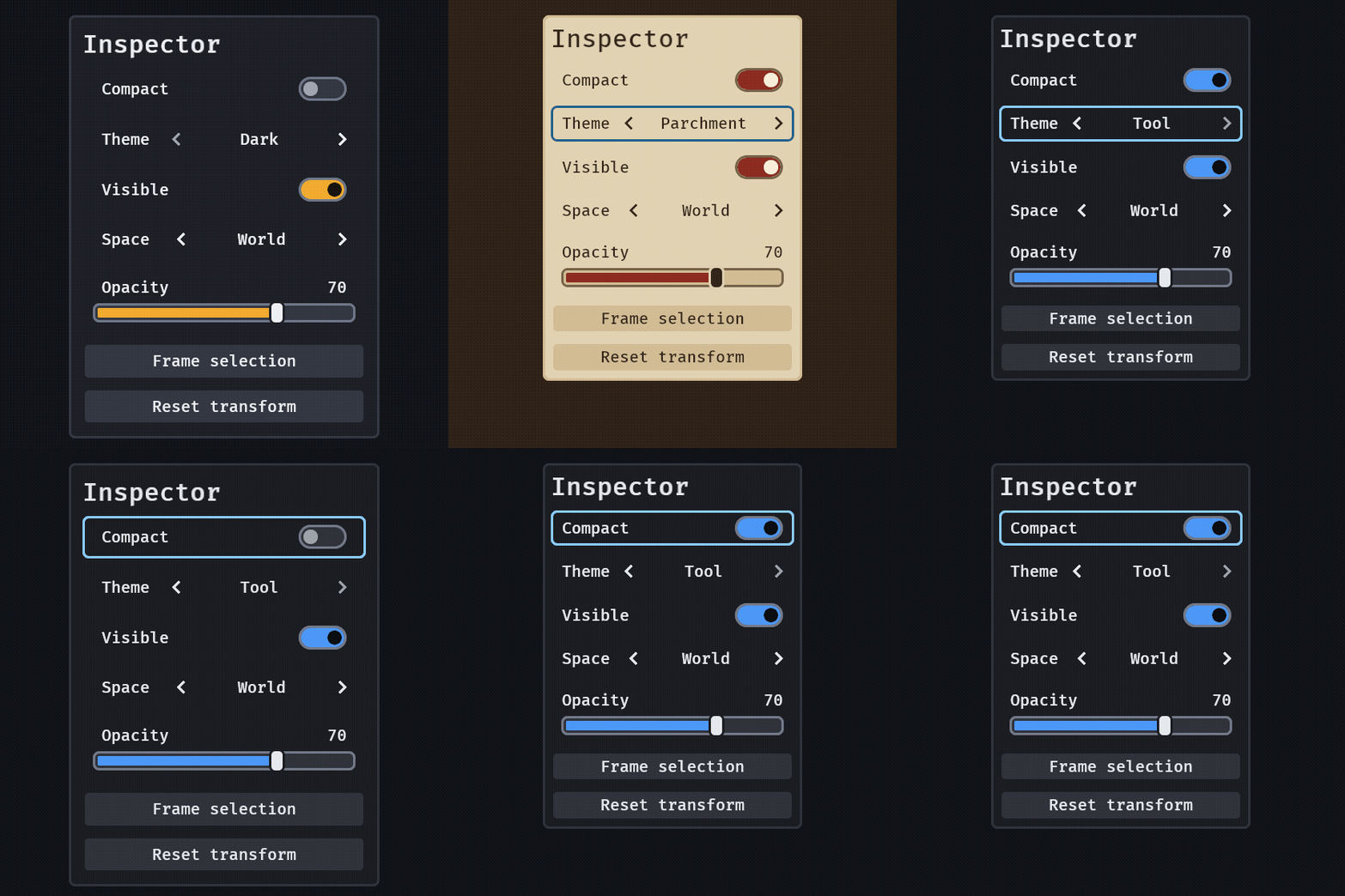
Density: skin.density = Density::Compact is one field; every row halves its padding and stands at least 24 px high (WCAG 2.2 SC 2.5.8's floor, still checked), and the colours, the ring and the keys do not change: here the panel goes from 528 px to 456 px at the same 20 px text. SkinPreset::Tool is a blue-on-grey look with 14 px text and tighter sizes: the gallery's settings panel is 294 px tall in it against 520 px in dark.
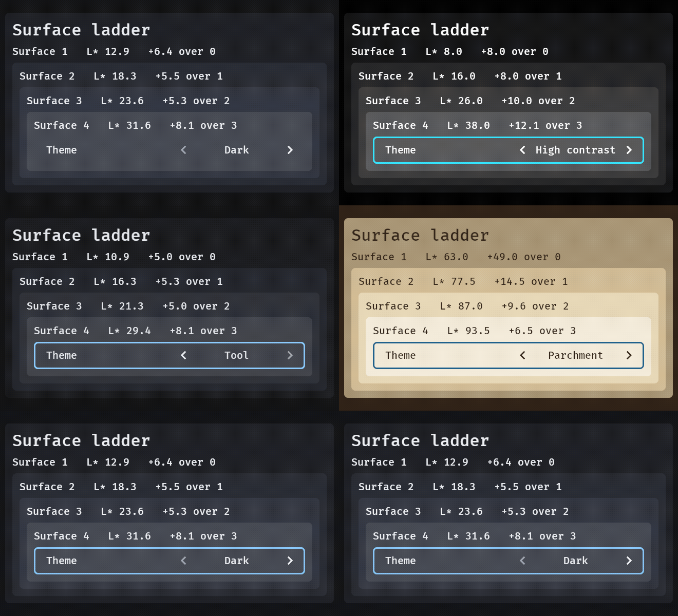
Tokens: surface(n) is step n of skin.surfaces, and problems() reports an ElevationStep when two neighbours are closer than ΔL* 2 (the eye's threshold for a flat field); the four presets sit at 5 or more. The cards' padding and corners are skin.space(3) and skin.corner(1).
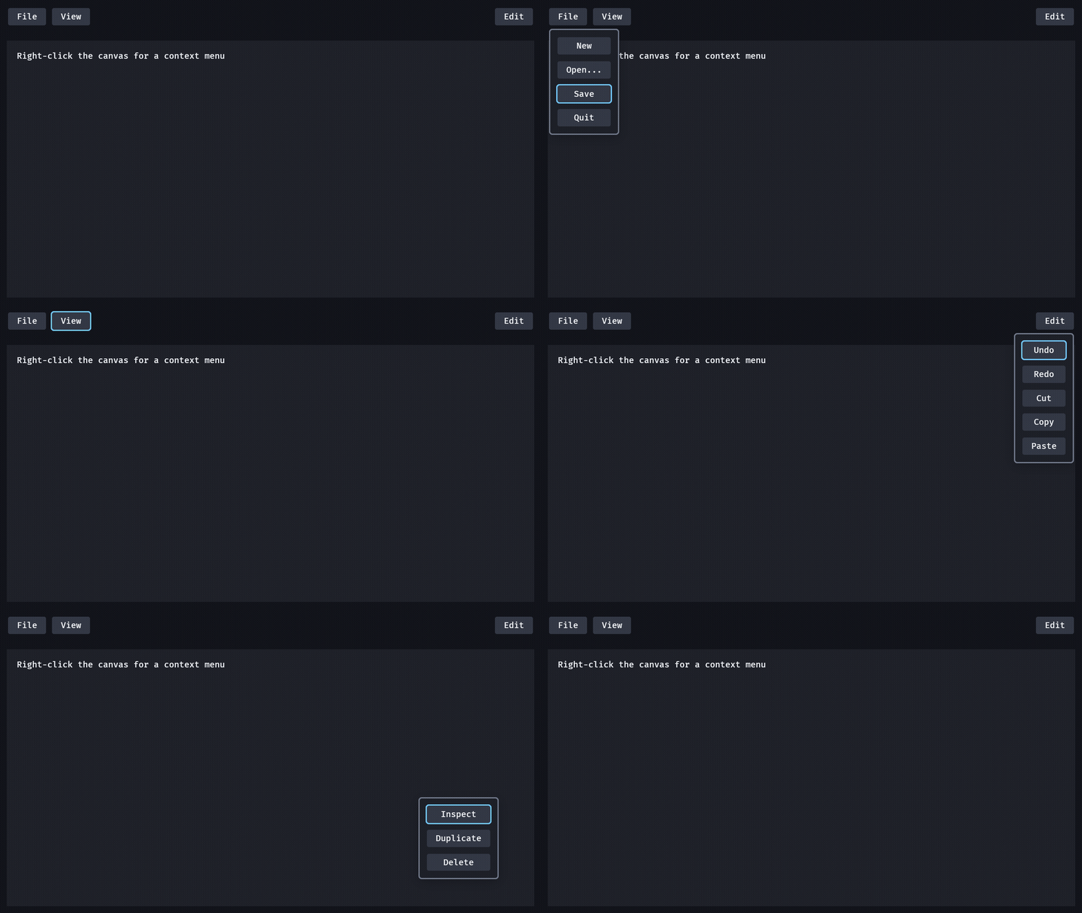
Popovers: popover_modal(file_button, Placement::Below) opens a menu under its anchor that holds focus and gives it back; at the window's edge it slides or flips and never leaves the window, and Escape or a press anywhere else closes it with one PopoverClosed.
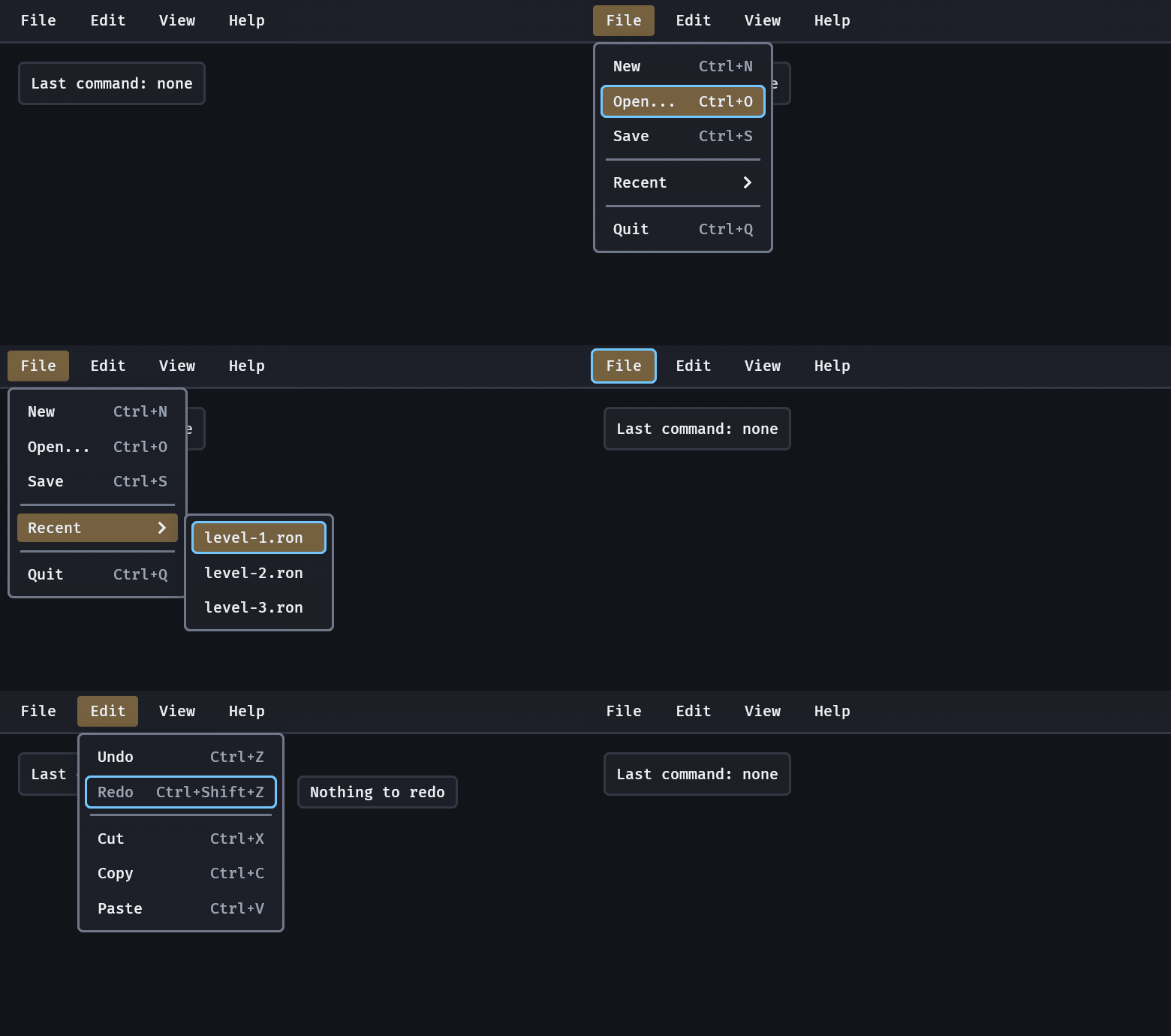
Menus: menu_bar(children![menu_title("File", children![menu_item("Open...").with_shortcut(..), ..])]), F10 and the arrows to walk it, Right into a submenu, Escape one level at a time; a disabled item says why.
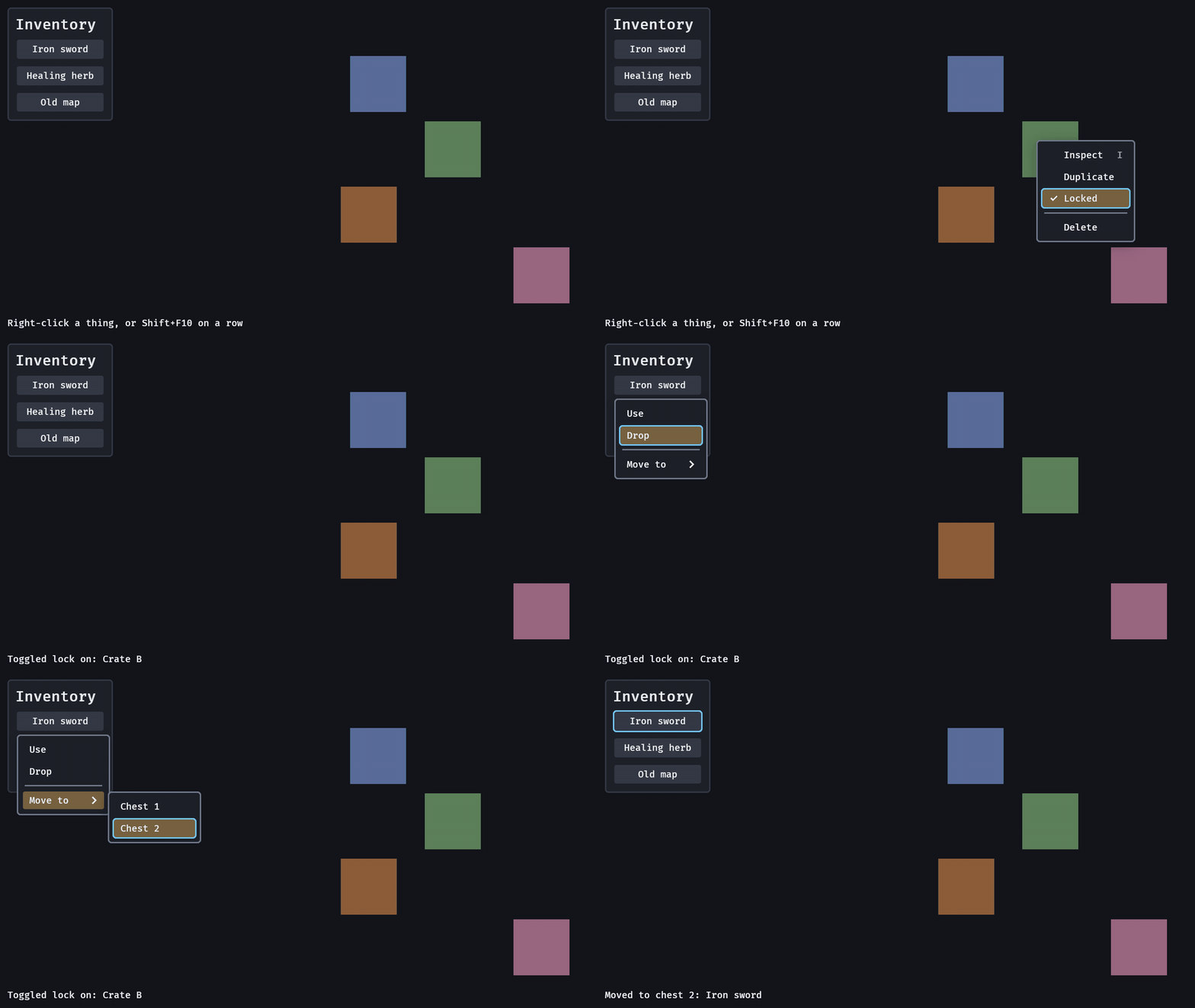
Context menus: ContextMenu(menu) on a crate, a row or any entity; a right-click opens the menu at the pointer (flipping at the window's edge), Shift+F10 or the Menu key below the focused widget, and ContextTarget says which thing a command was for.
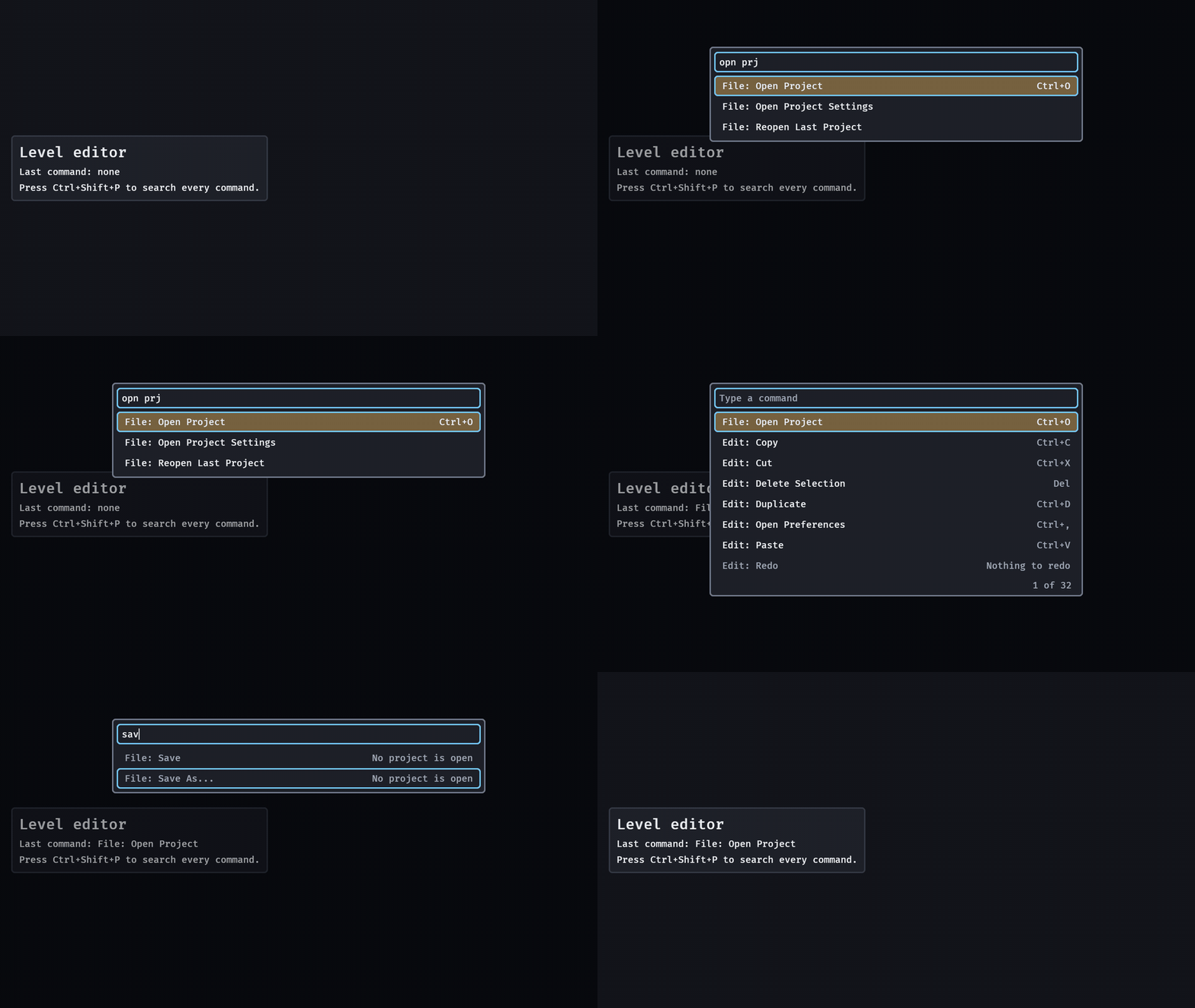
The command palette: CommandList holds the commands, command_palette() is the modal, "opn prj" is a fuzzy match, Up and Down move the lit row while focus stays in the field, and Enter or a click sends one RunCommand; a command that is off shows why and runs nothing.

Motion: a hit drops a meter()'s fill to the new value in that frame and leaves the lost length behind it in the skin's danger colour for 0.45 s before it drains, a heal eases up with no trail, a dialog's card rises 12 px in 0.18 s and a menu or popover opens 6 px out of its anchor in 0.12 s, all on real time with nothing to write; MotionSettings::off() is the player's "reduce motion" and makes every one instant, and SlideIn does the same for your own panel. Recorded with GOOEY_MOTION=2 and GOOEY_KEYS=hit,hit,heal,hit (twice slower, so the trail reads in a GIF); the dialog's rise is in the motion guide, the inventory's demo in its guide, the radial menu's in its own.
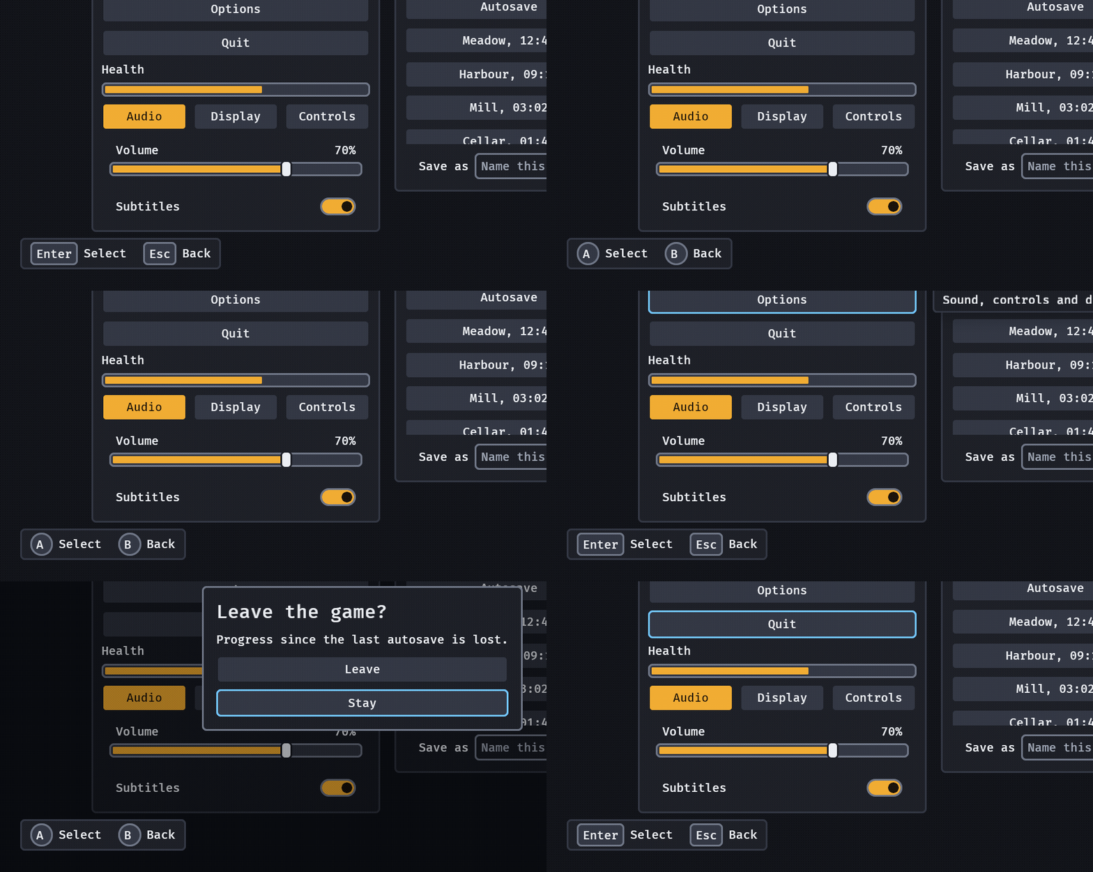
Prompts: prompts() holds prompt("Select", Prompt::SELECT) and prompt("Back", Prompt::BACK); the keycaps follow the last device the player used, and the legend moves nothing on the screen. It stands bottom-left; prompts_at(PromptsAnchor::BottomRight) (or a centre or top anchor) puts it where your own HUD leaves room.
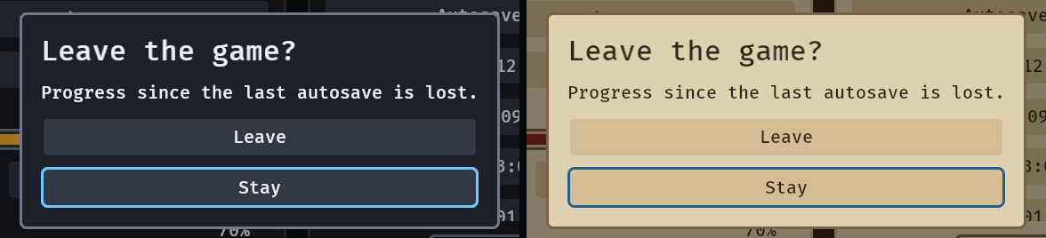
The dialog in both presets, 540 px wide here, the width of its line of body (a dialog is 420 to 720 px at the default size and grows with the text size); its edge is the skin's outline colour.
Part of the Coven
bevy_gooey is one of the Bevy Coven crates: the family table there
says which crate owns what, so two of them never both own the interface. The Cauldron, the Coven's level
editor, takes it as an optional feature and edits a project's skin as the crate's own GooeySkin —
see use it in the Cauldron.
Bevy compatibility
bevy_gooey |
Bevy |
|---|---|
| 0.1 – 0.35 | 0.20 |
Learn more
- docs.rs — the API reference (
cargo doc --open); the book page — the same guide with the pictures. docs/guide/— the detail: navigation, controls, lists, tables, split panes, docks, toasts, skins, screen size, the pointer, feedback, testing a gooey UI, every widget in one table, what a host touches and what it only sees, and the boundary with the game.examples/—gallery, every widget on one screen.docs/media/README.md— how every picture here is made.CHANGELOG.md— what each release changed, and what it broke.
Who and licence
Maintainer @Ladvien. Questions and bugs go to
the issues, and a game asking for a change here uses
the consumer label. Contributions follow the org's
CONTRIBUTING.md; the crate's own
rules for changing it are in AGENTS.md.
MIT OR Apache-2.0, at your option.