<p align="center">
<img src="https://raw.githubusercontent.com/tulustul/bevy-react/main/examples/assets/bevy-react-logo.png" alt="bevy-react logo" width="220" />
</p>
<h1 align="center">bevy-react</h1>
<p align="center">
<a href="https://github.com/tulustul/bevy-react/actions/workflows/ci.yml"><img src="https://github.com/tulustul/bevy-react/actions/workflows/ci.yml/badge.svg" alt="CI" /></a>
<a href="https://crates.io/crates/bevy-react"><img src="https://img.shields.io/crates/v/bevy-react" alt="crates.io" /></a>
<a href="https://www.npmjs.com/package/bevy-react"><img src="https://img.shields.io/npm/v/bevy-react" alt="npm" /></a>
<a href="https://docs.rs/bevy-react"><img src="https://img.shields.io/docsrs/bevy-react" alt="docs.rs" /></a>
<a href="#bevy-compatibility"><img src="https://img.shields.io/badge/bevy-0.19-232326?logo=bevy" alt="bevy 0.19" /></a>
<a href="#license"><img src="https://img.shields.io/badge/license-MIT%20OR%20Apache--2.0-blue" alt="license: MIT OR Apache-2.0" /></a>
</p>

Build [`bevy_ui`](https://docs.rs/bevy/latest/bevy/ui/index.html) interfaces with
**React**. You write components in React/TSX and they render to native Bevy UI
through a **React Native-style bridge** - **no web view, no DOM**. The JS side stays
purely declarative; Rust and Bevy do the heavy lifting. State and interactions flow
both ways between your Bevy app and React, and edits hot-reload live while keeping
component state.
You can play with a live demo here:
https://tulustul.github.io/bevy-react/
```tsx
import { mount } from "bevy-react";
import { useState } from "react";
function App() {
const [n, setN] = useState(0);
return (
<node style={{ padding: 20, gap: 12, flexDirection: "column" }}>
<text>{`Count: ${n}`}</text>
<button
onClick={() => setN((c) => c + 1)}
style={{ backgroundColor: "#7aa2f7" }}
>
<text>+</text>
</button>
</node>
);
}
mount(<App />);
```
That's a real component - `<node>` and `<button>` render to actual `bevy_ui`
nodes, `useState` works as you'd expect, and saving the file updates the running
app without losing the count.
## Why bevy-react
- **React, not a bespoke UI DSL.** Hooks, components, conditional rendering, lists -
everything you already know.
- **Native Bevy UI.** No web view, no DOM. Your UI is `bevy_ui` entities in the
same world as your game.
- **Hot reload that keeps state.** Edit a component and it re-renders live with hook
state and running animations intact.
- **Typed, two-way messaging.** React and the ECS talk over typed channels generated
straight from your Rust types.
## How it works
bevy-react uses a **bridge architecture**, much like old versions of React Native - but the native
side is Bevy and the ECS instead of iOS/Android views.
- **React runs on embedded V8.** On native targets the JS runs in a V8 isolate via
[`deno_core`](https://crates.io/crates/deno_core) - no Node, no browser - on its
own thread, off the game loop.
- **Web builds work too.** On wasm the same bundle runs in the browser's own JS
engine instead of V8; the UI is still `bevy_ui`, not DOM. The
[live demo](https://tulustul.github.io/bevy-react/) is the web build.
- **JS only describes the UI.** React renders through a custom reconciler that emits
declarative UI-mutation ops; Rust applies them to `bevy_ui` entities. All the heavy
lifting - layout, input, rendering - happens in Rust and Bevy.
- **Animations are orchestrated in Bevy, not JS.** Shared values and transitions are
driven on the Bevy side every frame; JS just declares the target. No per-frame JS,
no bridge traffic per tick.
## Project status
Currently, the project is a **quick, vibecoded proof of concept** demonstrating the idea. The API is very unstable and will change, the code quality is not satisfying.
**Do not use it in production**.
## Bevy compatibility
| 0.19 | 0.1 |
## Getting started
```sh
cargo add bevy-react
```
Scaffold the React UI:
```sh
npx bevy-react init ui
cd ui && npm run watch
```
Add the plugin to your app
```rust
use bevy_react::{ReactUiPlugin};
app.add_plugins(ReactUiPlugin::new("ui/dist/app.js")
```
Follow the [`examples/minimal`](https://github.com/tulustul/bevy-react/tree/main/examples/minimal/main.rs) example for a full working setup.
### Typescript client generation
Copy the `--export-bindings` flag implementation from [`examples/minimal`](https://github.com/tulustul/bevy-react/tree/main/examples/minimal/main.rs)
After that you can run
```sh
npm run bevy:generate
```
or
```sh
cargo run -- --export-bindings ui/src/bevy.ts
```
which will generate a `bevy.ts` file in your `ui` directory. This file will include all the needed integration with your Rust code. See [Talking to Bevy](#talking-to-bevy) for details.
Rembember to regenerate the client each time you update the communication channel in Rust.
## The demos app
[`examples/demos`](https://github.com/tulustul/bevy-react/tree/main/examples/demos) is a gallery that exercises most features available. It's the best **reference implementation** - each demo is a small, self-contained component you can read and copy when wiring up your own UI, messaging, or animations.
```sh
npm install
npm run build -w demos
cargo run --example demos
```
## Features
### Elements & styling
Host elements `<node>`, `<button>`, `<text>`, `<image>`, `<editableText>`,
`<canvas>`, `<svg>`, `<portal>`, and `<surface>` cover layout, input, drawing,
vector graphics, embedded 3D views, and UI rendered onto 3D meshes.
Style them with a flexbox/grid object (colors, spacing, borders, radius, shadows,
transforms).
```tsx
<node
style={{
flexDirection: "row",
gap: 16,
padding: 20,
backgroundColor: "#1e1e2e",
borderRadius: 8,
}}
>
<text style={{ fontSize: 18, color: "#cdd6f4" }}>Hello</text>
</node>
```
### Hover & press states
Overlay extra style while an element is hovered or pressed - no state wiring needed.
```tsx
<button
onClick={() => save()}
style={{ backgroundColor: "#7aa2f7" }}
hoverStyle={{ backgroundColor: "#89b4fa" }}
pressStyle={{ backgroundColor: "#5a7fd6" }}
>
<text>Save</text>
</button>
```
### Pointer & drag
`onPointerDown` / `onPointerMove` / `onPointerUp` give you drag gestures, with both
element-normalized (`x`, `y`) and window (`clientX`, `clientY`) coordinates.
```tsx
<node
onPointerDown={(e) => start(e.clientX, e.clientY)}
onPointerMove={(e) => drag(e.clientX, e.clientY)}
onPointerUp={() => drop()}
/>
```
### Transitions
Ease changes to a style by listing which properties should animate, with timing or
spring config.
```tsx
<button
onClick={() => setOn((v) => !v)}
style={{
backgroundColor: on ? "#a6e3a1" : "#45475a",
borderRadius: on ? 24 : 6,
transform: { translateX: on ? 36 : -36 },
transition: {
transform: { stiffness: 180, damping: 14 }, // spring
backgroundColor: { duration: 200 }, // timing (ms)
borderRadius: { duration: 200 }, // per corner
},
}}
>
<text>{on ? "ON" : "OFF"}</text>
</button>
```
### Layout animations
`transition: { layout }` eases a node to wherever layout puts it next — whatever
moved it: a reorder, a sibling growing or leaving, a parent resize, a flipped
flex knob. The real layout snaps; the box glides from its old rect to the new
one (FLIP), children ride along, and clicks land on the visual. Nothing to
measure, no transforms to write.
```tsx
<node style={{ flexDirection, justifyContent, alignItems }}>
{swatches.map((g, i) => (
<node
key={i}
style={{
width: 40,
height: 40,
backgroundGradient: g,
transition: { layout: { duration: 350, easing: "easeInOut" } },
}}
/>
))}
</node>
```

A size change eases the node's **own** box (its children stay crisp), but
whatever is laid out _around_ it snaps — a container that must re-flow its
neighbours uses the real-layout `transition: { size }` instead, with `layout`
on the children. Demos: "Flexbox", "Style transitions".

### Shared elements
Give two nodes that swap in one commit the same `sharedTag` — a thumbnail in a
grid and the hero of the detail screen that replaces it — and the incoming node
starts where the outgoing one visually was (position, size, background color,
opacity, transforms, filters, gradients) and eases to its own layout and style.
React has no reparenting, so a "move" between parents is always an unmount plus
a mount: the tag is the identity, and the commit itself is the trigger — no
hooks, no measuring, no start call.
```tsx
// grid
<image src={item.thumb} sharedTag={`hero-${item.id}`} style={{ width: 72, height: 72 }} />
// detail, mounted in the commit that unmounts the grid
<image
src={item.full}
sharedTag={`hero-${item.id}`}
style={{
width: 200,
height: 200,
transition: { sharedElement: { duration: 450, easing: "easeInOut" } },
}}
/>
```
`transition: { sharedElement }` on the incoming node is the one timing for every
seeded channel (required — a tag without it pairs but snaps). Pairs need the same
tag, element type and UI root; the first mounted match seeds every incoming node
with the tag. Size flies in measured pixels through real layout (children stay
crisp, the parent re-flows), position by translation; the outgoing node unmounts
instantly. Demo: "Shared elements".

Shared elements and layout animations compose. On the tickets board below a
clicked ticket unmounts from one column and mounts in the other in the same
commit: it carries `sharedTag` plus both transitions, so it takes off from
where it sat, easing its width and color to the new column's on the way, while
the siblings it leaves behind close the gap with their own `layout` transition.
```tsx
<button
sharedTag={`item-${id}`}
onClick={() => move(id)}
style={{
backgroundColor: color[side],
transition: {
sharedElement: { duration: 400, easing: "easeOut" },
layout: { duration: 400, easing: "easeOut" },
},
}}
/>
```
### Animations
For richer motion, use Reanimated-style shared values driven on the Bevy side (no
per-frame JS). Create a value with `useSharedValue`, assign it a driver, and bind
it **inline in `style`** with the `{ animated: … }` wrapper — on any plain
element, in any animatable position (opacity, colors, layout lengths, transform
channels, `transform3d` fields, filter params).
```tsx
import { useSharedValue, withRepeat, withTiming } from "bevy-react";
import { useEffect } from "react";
function Pulse() {
const opacity = useSharedValue(1);
useEffect(() => {
opacity.value = withRepeat(
withTiming(0, { duration: 500, easing: "easeInOut" }),
{ reverse: true }, // ping-pong; loops forever unless `count` is given
);
}, [opacity]);
return (
<node style={{ width: 80, height: 80, opacity: { animated: opacity } }} />
);
}
```
Drivers: `withTiming`, `withSpring`, `withRepeat`, `withSequence`, `withDelay`, plus
`interpolate` / `interpolateColor` to map one value through a curve
(`width: { animated: interpolate(t, [0, 1], [88, 200]) }`). Rotations bind in
degrees, bound lengths animate in px, and bindings are honored in the base
`style` only.
### Filters
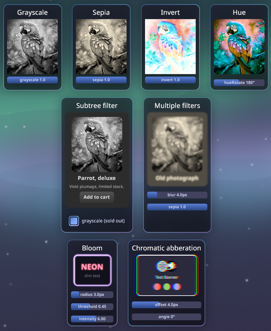
The `filter` style runs a chain of GPU post-processing passes over an element
**and its whole subtree**. The value is one `{ name, params }` object or an
ordered array (pass order). The crate ships a set of built-ins — blurs, color
ops, bloom, drop shadow, text effects, a press pinch, … — all showcased in the
"Filters" demo and typed by name in the generated `bevy.ts`.
```tsx
// One filter…
<image
src="images/parrot.png"
style={{ filter: { name: "grayscale", params: { amount: 1 } } }}
/>
// …or an ordered chain.
<node
style={{
filter: [
{ name: "blur", params: { radius: 4 } },
{ name: "sepia", params: { amount: 1 } },
],
}}
/>
```
Filter params animate like any other style: ease them with
`transition: { filter }` or drive a single param with an inline
`{ animated: sharedValue }` binding — all on the Bevy side, with no per-frame
JS and no re-capture of the subtree.
Filters compose into interaction, too. The demos' `Button` presses through the
`pinch` filter — its strength an inline `{ animated }` shared value eased in
on press and sprung back on release — under a `shadow` filter that flattens
while pressed via `transition: { filter }`. See
[`components/Button.tsx`](https://github.com/tulustul/bevy-react/blob/main/examples/demos/ui/src/components/Button.tsx)
and
[`components/Pinchable.tsx`](https://github.com/tulustul/bevy-react/blob/main/examples/demos/ui/src/components/Pinchable.tsx).

Behind the scenes, some styles automatically promote a subtree to a
**composited layer**: a non-empty `filter` or `backdropFilter`, `opacity` on a
node with children (group alpha), a `transform3d`, or an explicit
`cache: "always"` / `"never"`. The subtree is captured into an offscreen
texture and cached — a clean layer skips re-capture, and moving, fading, or
animating filter params is composite-time only. This is purely render-side:
layout, picking, and refs are untouched, and there is nothing to opt into.
### Backdrop filters
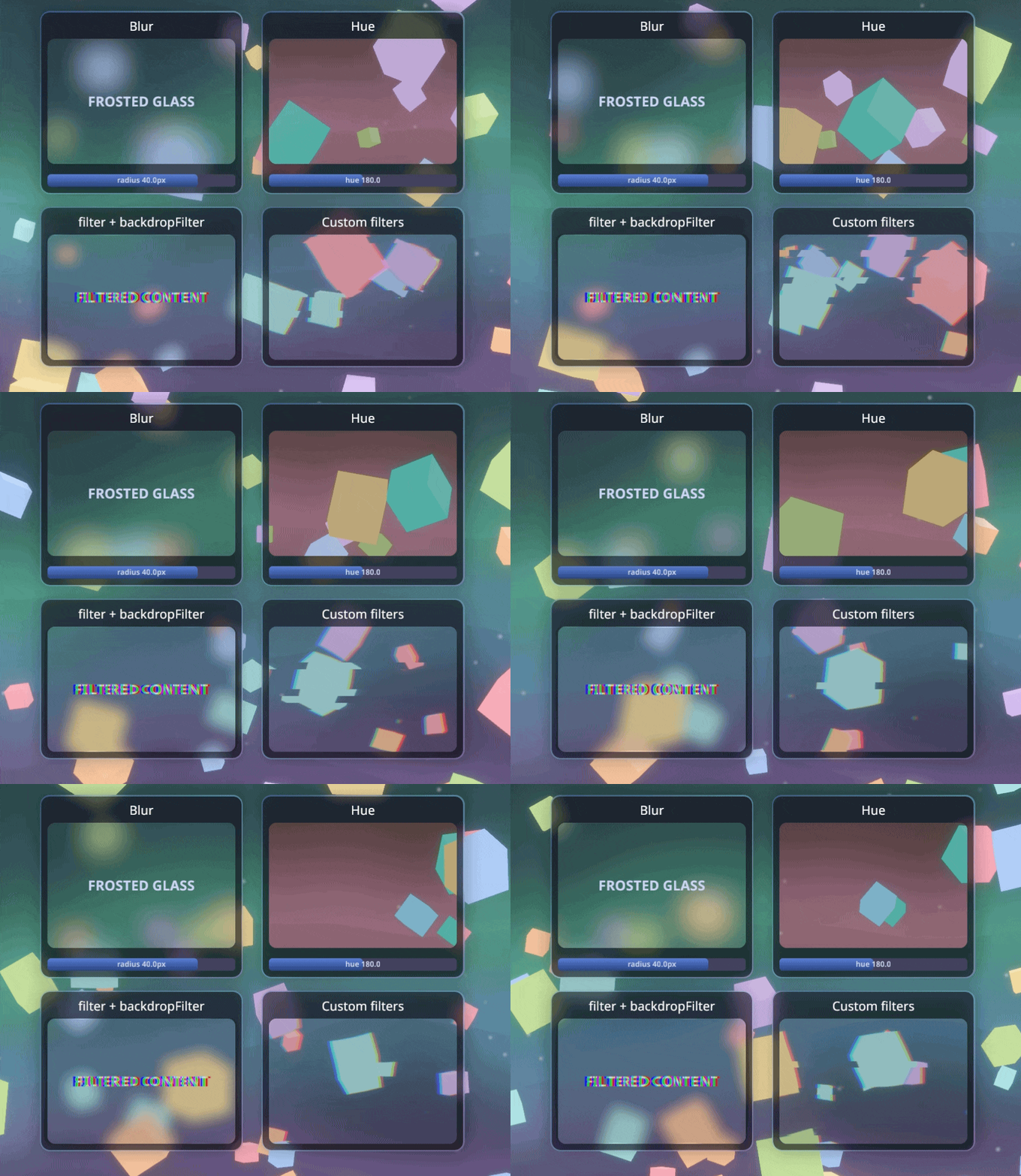
`backdropFilter` takes the same `{ name, params }` chains but filters **what
is rendered behind the node** — the 3D scene — and composites the result under
the node's own content. It respects `borderRadius`, so the classic
frosted-glass card just works.
```tsx
<node
style={{
backgroundColor: "rgba(26, 27, 38, 0.35)",
backdropFilter: { name: "blur", params: { radius: 8 } },
}}
>
<text>frosted glass</text>
</node>
```
### Custom filters
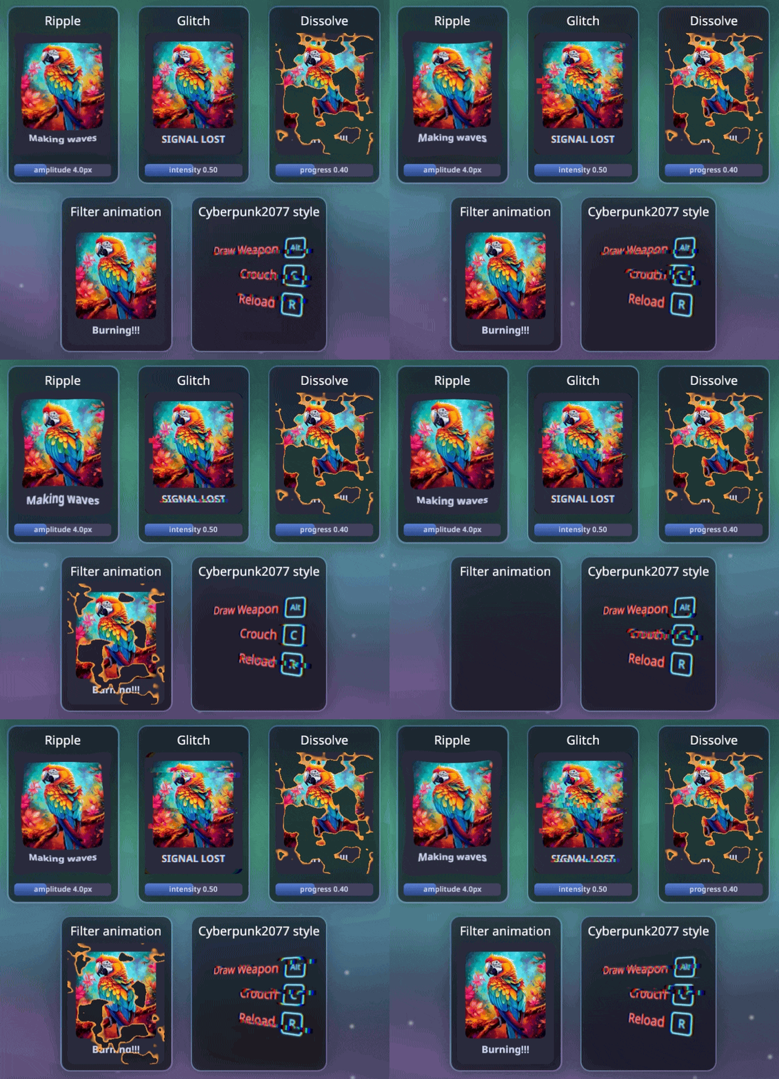
A custom filter is a Rust params struct plus a WGSL fragment shader. Register
it and it is usable from `filter` / `backdropFilter` by name, with **typed
params in TSX** via the generated `bevy.ts` (the same codegen flow as messages
and events).
```rust
use bevy_react::{ReactAppExt, react_filter};
// Fields pack into the shader's `uniforms.params` in declaration order.
#[react_filter(shader = "shaders/dissolve.wgsl")]
struct Dissolve {
progress: f32,
}
app.add_react_filter::<Dissolve>();
```
```tsx
<node
style={{
filter: { name: "dissolve", params: { progress } } },
}}
/>
```
The shader `#import`s `bevy_react::filter` for the bind-group contract (source
texture, params, time, resolution) and names its entry point `fragment`. See
[`examples/assets/shaders/`](https://github.com/tulustul/bevy-react/tree/main/examples/assets/shaders)
(`ripple`, `glitch`, `dissolve`) and
[`examples/demos/filters.rs`](https://github.com/tulustul/bevy-react/blob/main/examples/demos/filters.rs)
for complete examples, including time-driven (`time = true`) and bleed-outset
(`outset = …`) filters. Register the filter in both the running app and the
`--export-bindings` path, then regenerate `bevy.ts`.

### Morph transitions

`morphFilter: { key, name, params }` gives an element view-transition
semantics: when `key` changes, its previous rendered appearance is frozen and
a two-input filter blends it into the live content, driven by an engine-owned
progress. Nothing else to wire up — a 300ms ease applies by default, and
`transition: { morphFilter }` overrides the timing. First mount never
animates, and a mid-flight key change freezes the in-flight blend and
restarts, so interruptions stay smooth. Built-in morphs: `crossfade`,
`linearWipe`, `pixelize`.
```tsx
<node
style={{
morphFilter: { key: page, name: "pixelize" },
transition: { morphFilter: { duration: 500 } },
}}
onClick={next}
>
{content[page]}
</node>
```
### Custom morph filters
Morph filters are their own family, separate from regular `filter` chains: a
custom one is a Rust params struct plus a single-pass WGSL shader, registered
with `#[react_morph_filter]` + `add_react_morph_filter::<T>()`. It lands in
the generated `BevyMorphFilters` typing, so `params` is fully typed in TSX —
the same codegen flow as custom filters.
```rust
use bevy_react::{ReactAppExt, react_morph_filter};
// Fields pack into the shader's `uniforms.params` in declaration order.
#[react_morph_filter(shader = "shaders/morphs/windowslice.wgsl")]
struct Windowslice {
count: f32, // number of blinds
smoothness: f32, // soft lead of the sweep
}
app.add_react_morph_filter::<Windowslice>();
```
The shader is a **two-input blend**: the prelude hands it the frozen old
appearance (`morph_sample_from`), the live content (`morph_sample_to`), and
the engine-owned eased progress (`morph_progress()`). The one rule is the
**identity contract**: return exactly the "from" sample at progress 0 and
exactly the "to" sample at progress 1, so the morph starts and settles
invisibly.
```wgsl
#import bevy_react::filter::{
FullscreenVertexOutput,
morph_progress,
morph_sample_from,
morph_sample_to,
uniforms,
}
@fragment
fn fragment(in: FullscreenVertexOutput) -> @location(0) vec4<f32> {
let progress = morph_progress(); // engine-owned, eased 0 → 1
if progress <= 0.0 { return morph_sample_from(in.uv); } // identity
if progress >= 1.0 { return morph_sample_to(in.uv); } // contract
// Vertical blinds: a soft sweep sliced into `count` repeating blinds.
let count = uniforms.params[0].x;
let smoothness = max(uniforms.params[0].y, 1e-4);
let edge = smoothstep(-smoothness, 0.0, in.uv.x - progress * (1.0 + smoothness));
let s = step(edge, fract(count * in.uv.x));
return mix(morph_sample_from(in.uv), morph_sample_to(in.uv), s);
}
```
```tsx
<node
style={{
morphFilter: { key, name: "windowslice", params: { count: 14 } },
}}
/>
```
As with custom filters, register in both the running app and the
`--export-bindings` path, then regenerate `bevy.ts`. The demos app ships a
whole pack of [gl-transitions](https://gl-transitions.com/gallery) ports
(page curl, book flip, doorway, kaleidoscope, film burn, datamosh glitch, …)
under
[`examples/assets/shaders/morphs/`](https://github.com/tulustul/bevy-react/tree/main/examples/assets/shaders/morphs),
showcased in the "Morph filters" demo — any of them is a `morphFilter` name.
### Fonts
Register a font on the host, then select it by name in any `<text>` style.
```rust
// Font paths are relative to your asset root (`assets/` by default).
ReactUiPlugin::new("ui/dist/app.js").font("DancingScript", "fonts/dancing.ttf")
```
```tsx
<text style={{ fontFamily: "DancingScript", fontSize: 34 }}>Fancy</text>
```
### Canvas drawing
`<canvas>` takes a `draw` callback with an HTML-canvas-like context; the result is
rasterized into a texture. Returning fresh drawing each render makes it reactive. Uses `tiny_skia` as a rendering backend.
```tsx
<canvas
style={{ width: 460, height: 260 }}
draw={(ctx) => {
ctx.strokeStyle = "#89b4fa";
ctx.lineWidth = 2;
ctx.beginPath();
ctx.moveTo(0, 150);
ctx.bezierCurveTo(100, 0, 200, 150, 300, 20);
ctx.stroke();
}}
/>
```
### SVG — files and JSX shapes
Two web-faithful doors. An `<image>` whose `src` names an `.svg` file renders it as
a true vector: parsed once, re-rasterized at the laid-out size × DPI, pixel-crisp at
every size (layout uses the file's intrinsic size, like a bitmap). And `<svg>` is a
React-composed drawing surface: shape children (`<circle>`, `<rect>`, `<path>`,
`<g>`, …) are real elements with props, per-shape pointer events (hit-testing
follows painted geometry; event coords arrive in viewBox user units), `{ animated }`
bindings on numeric attrs, and a `transition` prop for eased changes. SVG `<text>`
in files is available behind the off-by-default `svg-text` cargo feature.
```tsx
<svg viewBox="0 0 100 100" style={{ width: 200, height: 200 }}>
<circle cx={50} cy={50} r={{ animated: pulse, seed: 20 }} fill="#89b4fa" />
<rect
x={10}
y={70}
width={30}
height={20}
rx={4}
transition={{ height: { duration: 300 } }}
onClick={() => grow()}
/>
</svg>
```
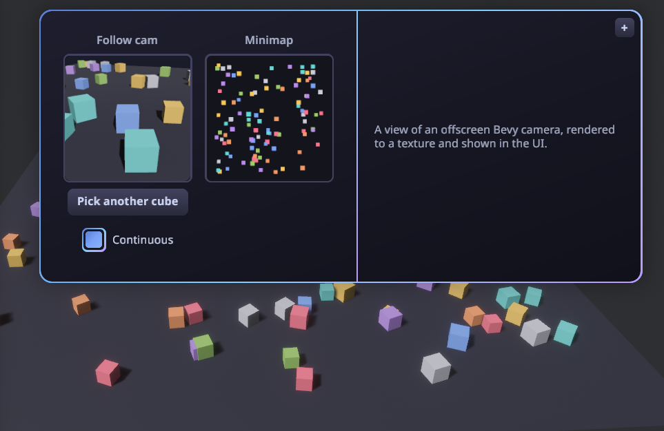
### Render-target portals
`<portal>` shows an **offscreen render target** inside the UI — the live (or
snapshot) output of a Bevy camera rendering into a texture. The app registers a
named target and aims a camera at it; React displays it by name. Good for minimaps,
picture-in-picture, or per-item 3D previews.
```rust
// Bevy: register a target, then point a camera at it.
let view = render_targets.create(&mut images, "follow", RenderTargetSpec::default());
commands.spawn((Camera3d::default(), view.camera_target(), PortalCamera("follow".into())));
```
```tsx
// React: show it by name (Auto-sized to the node, so it stays crisp).
<portal target="follow" style={{ width: 160, height: 160 }} />
```
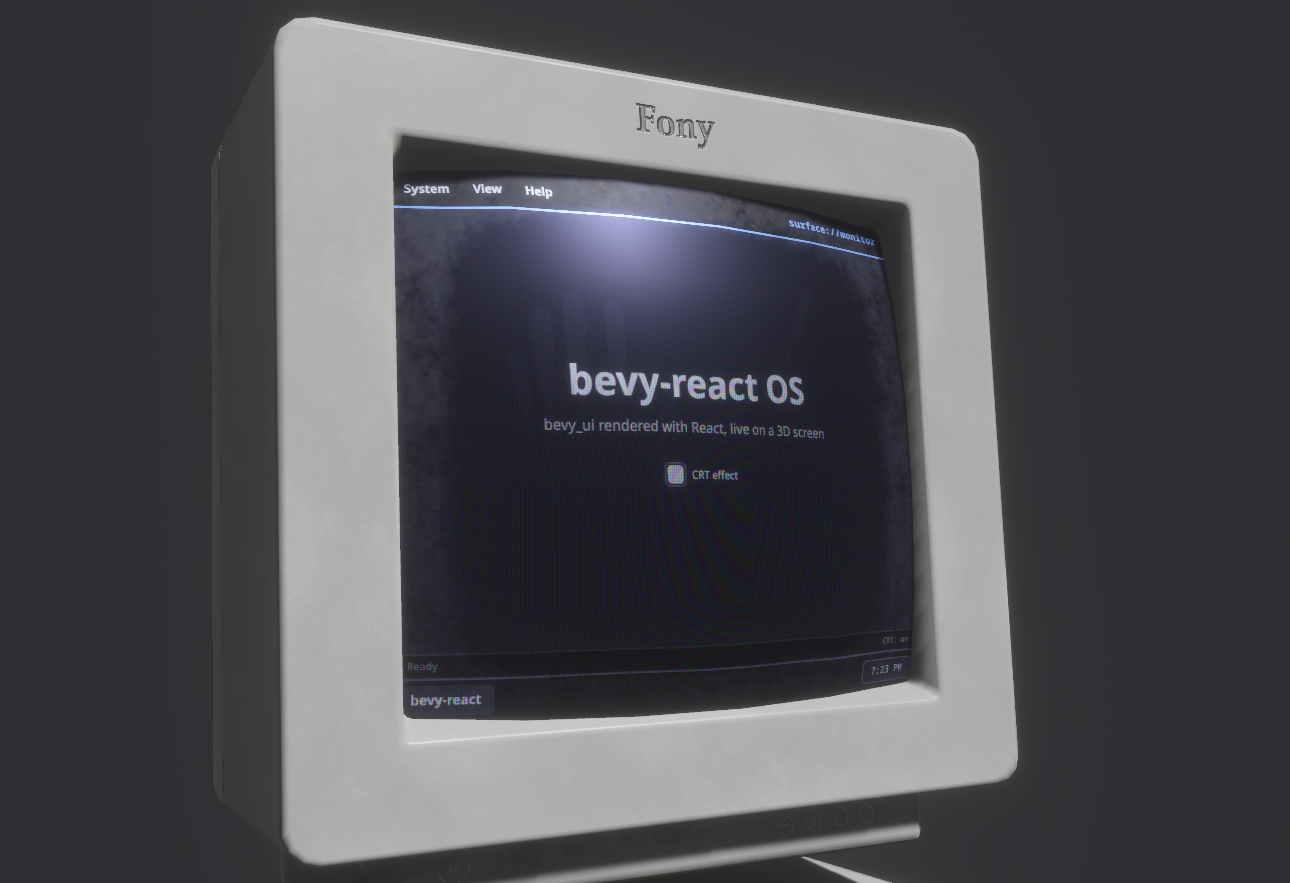
### Surfaces: UI on a 3D mesh
`<surface>` is the inverse of `<portal>`: instead of showing a 3D camera inside the
UI, it renders a React subtree into an **offscreen texture** that the Bevy app drapes
onto any 3D mesh — a diegetic monitor, panel, or hologram driven by live React. Tag
the displaying mesh with `SurfacePointer` to make the subtree clickable in 3D, so
`onClick`/`onPointer*` and hover/press styles fire from in-world pointer hits.
```rust
// Bevy: register a surface, use its texture on a mesh, make the mesh clickable.
let screen = surfaces.create(&mut images, "monitor", SurfaceSpec { size: UVec2::new(760, 700), ..default() });
material.base_color_texture = Some(screen);
commands.entity(screen_mesh).insert(SurfacePointer::new("monitor"));
```
```tsx
// React: render a subtree into the named surface's texture.
<surface target="monitor" style={{ width: "100%", height: "100%" }}>
<MonitorApp />
</surface>
```
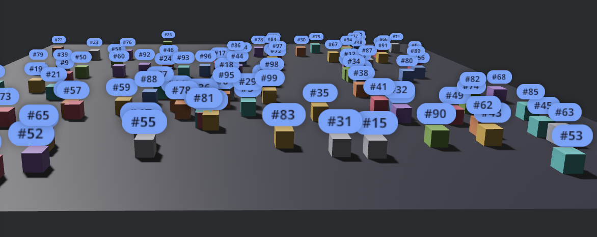
### World-anchored overlays
Pin UI to a 3D entity so it tracks the entity on screen as the camera moves.
```tsx
<anchor entity={cube} offset={[0, 1, 0]} style={{ padding: 8 }}>
<text>Label</text>
</anchor>
```
### Talking to Bevy
Three typed channels connect React and the ECS:
- **Notify** - `bevy.foo.doSomething(value)`: React -> Bevy event
- **Request** - `await bevy.foo.getSomething()`: request/response cycle
- **Subscribe** - `bevy.on(eventName, callback)`: Bevy → React events
**1. Define the channel in Rust** with a macro and register it on the `App`:
```rust
use bevy::prelude::*;
use bevy_react::{ReactAppExt, ReactEvents, react_event, react_message};
// React → Bevy: `bevy.game.reset()`.
#[react_message(name = "game.reset")]
struct Reset;
fn on_reset(_: On<Reset>, /* queries, resources… */) {
// reset the game
}
// Bevy → React: `bevy.on("game.scored", …)`.
#[react_event(name = "game.scored")]
struct Scored;
fn award_point(events: ReactEvents) {
events.send(&Scored);
}
app.add_react_handler(on_reset);
app.add_react_event::<Scored>();
```
**2. Use it from React:**
```tsx
import { bevy } from "./bevy";
import { useEffect, useState } from "react";
function Score() {
const [hits, setHits] = useState(0);
useEffect(() => bevy.on("game.scored", () => setHits((h) => h + 1)), []);
return (
<button onClick={() => bevy.game.reset()}>
<text>{`Hits: ${hits}`}</text>
</button>
);
}
```
The request channel (`#[react_request]` - React `await`s a typed reply) works the
same way; [`examples/demos`](https://github.com/tulustul/bevy-react/tree/main/examples/demos) defines all three channels across
its demos.
### Devtools
A built-in inspector for the live UI. Toggle it with
**F12** (configurable):
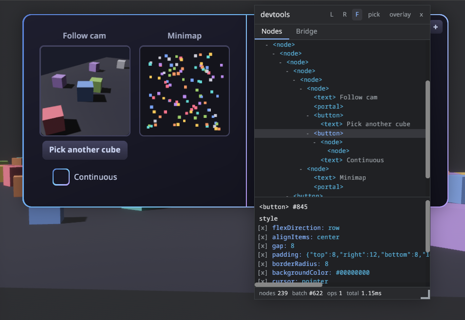
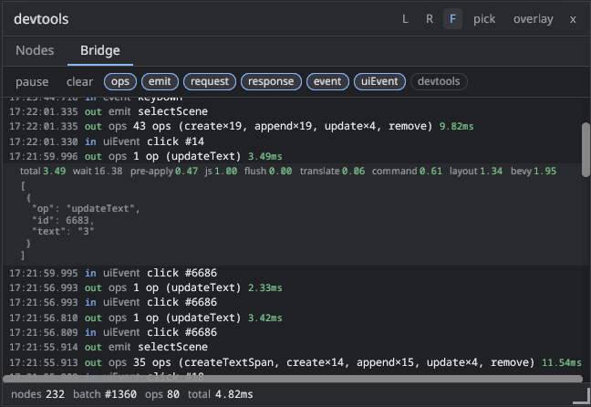
There is nothing to set up: `ReactUiPlugin` enables the devtools in dev builds
and disables them in release builds.
```sh
cargo run # dev: devtools included, F12 toggles the panel
cargo run --release # release: no devtools
```
Override anything with `.devtools(DevtoolsConfig { ... })` — every field has a
default:
```rust
app.add_plugins(ReactUiPlugin::new("ui/dist/app.js").devtools(DevtoolsConfig {
toggle_key: KeyCode::F1,
settings_path: Some(".config/devtools.json".into()),
..default()
}));
// or disable devtools entirely
app.add_plugins(ReactUiPlugin::new("ui/dist/app.js").devtools(DevtoolsConfig {
enabled: false,
..default()
}));
```
Cargo features can't depend on the build profile, so the (never-registered)
devtools code is still _compiled_ into release binaries; the panel's JS is
stripped from production bundles either way. If a shipping build must not
contain the code at all, disable the `devtools` default feature
(`bevy-react = { version = "…", default-features = false }`).
## Performance
[docs/BENCHMARKS.md](https://github.com/tulustul/bevy-react/blob/main/docs/BENCHMARKS.md).
## License
Dual-licensed under either of
[Apache License 2.0](https://github.com/tulustul/bevy-react/blob/main/LICENSE-APACHE)
or [MIT license](https://github.com/tulustul/bevy-react/blob/main/LICENSE-MIT), at
your option.