<p align="center">
<img src="https://raw.githubusercontent.com/tulustul/bevy-react/main/examples/assets/bevy-react-logo.png" alt="bevy-react logo" width="220" />
</p>
<h1 align="center">bevy-react</h1>
<p align="center">
<a href="https://github.com/tulustul/bevy-react/actions/workflows/ci.yml"><img src="https://github.com/tulustul/bevy-react/actions/workflows/ci.yml/badge.svg" alt="CI" /></a>
<a href="https://crates.io/crates/bevy-react"><img src="https://img.shields.io/crates/v/bevy-react" alt="crates.io" /></a>
<a href="https://www.npmjs.com/package/bevy-react"><img src="https://img.shields.io/npm/v/bevy-react" alt="npm" /></a>
<a href="https://docs.rs/bevy-react"><img src="https://img.shields.io/docsrs/bevy-react" alt="docs.rs" /></a>
<a href="#bevy-compatibility"><img src="https://img.shields.io/badge/bevy-0.19-232326?logo=bevy" alt="bevy 0.19" /></a>
<a href="#license"><img src="https://img.shields.io/badge/license-MIT%20OR%20Apache--2.0-blue" alt="license: MIT OR Apache-2.0" /></a>
</p>
Build [`bevy_ui`](https://docs.rs/bevy/latest/bevy/ui/index.html) interfaces with
**React**. You write components in React/TSX and they render to native Bevy UI
through a **React Native-style bridge** - **no web view, no DOM**. The JS side stays
purely declarative; Rust and Bevy do the heavy lifting. State and interactions flow
both ways between your Bevy app and React, and edits hot-reload live while keeping
component state.
You can play with a live demo here:
https://tulustul.github.io/bevy-react/
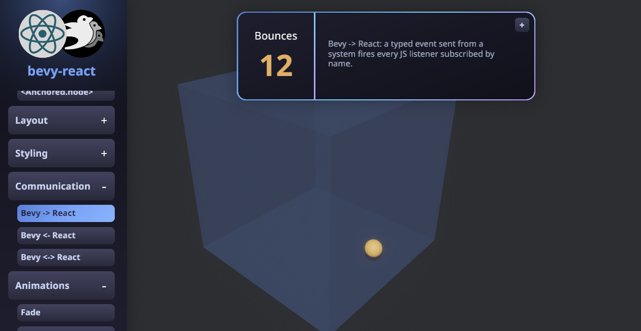
```tsx
import { mount } from "bevy-react";
import { useState } from "react";
function App() {
const [n, setN] = useState(0);
return (
<node style={{ padding: 20, gap: 12, flexDirection: "column" }}>
<text>{`Count: ${n}`}</text>
<button
onClick={() => setN((c) => c + 1)}
style={{ backgroundColor: "#7aa2f7" }}
>
<text>+</text>
</button>
</node>
);
}
mount(<App />);
```
That's a real component - `<node>` and `<button>` render to actual `bevy_ui`
nodes, `useState` works as you'd expect, and saving the file updates the running
app without losing the count.
## Why bevy-react
- **React, not a bespoke UI DSL.** Hooks, components, conditional rendering, lists -
everything you already know.
- **Native Bevy UI.** No web view, no DOM. Your UI is `bevy_ui` entities in the
same world as your game.
- **Hot reload that keeps state.** Edit a component and it re-renders live with hook
state and running animations intact.
- **Typed, two-way messaging.** React and the ECS talk over typed channels generated
straight from your Rust types.
## How it works
bevy-react uses a **bridge architecture**, much like old versions of React Native - but the native
side is Bevy and the ECS instead of iOS/Android views.
- **React runs on embedded V8.** On native targets the JS runs in a V8 isolate via
[`deno_core`](https://crates.io/crates/deno_core) - no Node, no browser - on its
own thread, off the game loop.
- **Web builds work too.** On wasm the same bundle runs in the browser's own JS
engine instead of V8; the UI is still `bevy_ui`, not DOM. The
[live demo](https://tulustul.github.io/bevy-react/) is the web build.
- **JS only describes the UI.** React renders through a custom reconciler that emits
declarative UI-mutation ops; Rust applies them to `bevy_ui` entities. All the heavy
lifting - layout, input, rendering - happens in Rust and Bevy.
- **Animations are orchestrated in Bevy, not JS.** Shared values and transitions are
driven on the Bevy side every frame; JS just declares the target. No per-frame JS,
no bridge traffic per tick.
## Project status
Currently, the project is a **quick, vibecoded proof of concept** demonstrating the idea. The API is very unstable and will change, the code quality is not satisfying.
**Do not use it in production**.
## Bevy compatibility
| 0.19 | 0.1 |
## Getting started
```sh
cargo add bevy-react
```
Scaffold the React UI:
```sh
npx bevy-react init ui
cd ui && npm run watch
```
Add the plugin to your app
```rust
use bevy_react::{ReactUiPlugin};
app.add_plugins(ReactUiPlugin::new("ui/dist/app.js")
```
Follow the [`examples/minimal`](https://github.com/tulustul/bevy-react/tree/main/examples/minimal/main.rs) example for a full working setup.
### Typescript client generation
Copy the `--export-bindings` flag implementation from [`examples/minimal`](https://github.com/tulustul/bevy-react/tree/main/examples/minimal/main.rs)
After that you can run
```sh
npm run bevy:generate
```
or
```sh
cargo run -- --export-bindings ui/src/bevy.ts
```
which will generate a `bevy.ts` file in your `ui` directory. This file will include all the needed integration with your Rust code. See [Talking to Bevy](#talking-to-bevy) for details.
Rembember to regenerate the client each time you update the communication channel in Rust.
## The demos app
[`examples/demos`](https://github.com/tulustul/bevy-react/tree/main/examples/demos) is a gallery that exercises most features available. It's the best **reference implementation** - each demo is a small, self-contained component you can read and copy when wiring up your own UI, messaging, or animations.
```sh
npm install
npm run build -w demos
cargo run --example demos
```
## Features
### Elements & styling
Host elements `<node>`, `<button>`, `<text>`, `<image>`, `<editableText>`,
`<canvas>`, `<svg>`, `<portal>`, and `<surface>` cover layout, input, drawing,
vector graphics, embedded 3D views, and UI rendered onto 3D meshes.
Style them with a flexbox/grid object (colors, spacing, borders, radius, shadows,
transforms).
```tsx
<node
style={{
flexDirection: "row",
gap: 16,
padding: 20,
backgroundColor: "#1e1e2e",
borderRadius: 8,
}}
>
<text style={{ fontSize: 18, color: "#cdd6f4" }}>Hello</text>
</node>
```
### Hover & press states
Overlay extra style while an element is hovered or pressed - no state wiring needed.
```tsx
<button
onClick={() => save()}
style={{ backgroundColor: "#7aa2f7" }}
hoverStyle={{ backgroundColor: "#89b4fa" }}
pressStyle={{ backgroundColor: "#5a7fd6" }}
>
<text>Save</text>
</button>
```
### Pointer & drag
`onPointerDown` / `onPointerMove` / `onPointerUp` give you drag gestures, with both
element-normalized (`x`, `y`) and window (`clientX`, `clientY`) coordinates.
```tsx
<node
onPointerDown={(e) => start(e.clientX, e.clientY)}
onPointerMove={(e) => drag(e.clientX, e.clientY)}
onPointerUp={() => drop()}
/>
```
### Transitions
Ease changes to a style by listing which properties should animate, with timing or
spring config.
```tsx
<button
onClick={() => setOn((v) => !v)}
style={{
backgroundColor: on ? "#a6e3a1" : "#45475a",
transform: { translateX: on ? 36 : -36 },
transition: {
transform: { stiffness: 180, damping: 14 }, // spring
backgroundColor: { duration: 200 }, // timing (ms)
},
}}
>
<text>{on ? "ON" : "OFF"}</text>
</button>
```
### Animations
For richer motion, use Reanimated-style shared values driven on the Bevy side (no
per-frame JS). Create a value with `useSharedValue`, assign it a driver, and bind
it **inline in `style`** with the `{ animated: … }` wrapper — on any plain
element, in any animatable position (opacity, colors, layout lengths, transform
channels, `transform3d` fields, filter params).
```tsx
import { useSharedValue, withRepeat, withTiming } from "bevy-react";
import { useEffect } from "react";
function Pulse() {
const opacity = useSharedValue(1);
useEffect(() => {
opacity.value = withRepeat(
withTiming(0, { duration: 500, easing: "easeInOut" }),
{ reverse: true }, // ping-pong; loops forever unless `count` is given
);
}, [opacity]);
return (
<node style={{ width: 80, height: 80, opacity: { animated: opacity } }} />
);
}
```
Drivers: `withTiming`, `withSpring`, `withRepeat`, `withSequence`, `withDelay`, plus
`interpolate` / `interpolateColor` to map one value through a curve
(`width: { animated: interpolate(t, [0, 1], [88, 200]) }`). Rotations bind in
degrees, bound lengths animate in px, and bindings are honored in the base
`style` only.
### Filters
The `filter` style runs a chain of GPU post-processing passes over an element
**and its whole subtree**. The value is one `{ name, params }` object or an
ordered array (pass order). Built-ins: `blur`, `grayscale`, `sepia`, `invert`,
`brightness`, `contrast`, `saturate`, `hueRotate`, `bloom`,
`chromaticAberration`.
```tsx
// One filter…
<image
src="images/parrot.png"
style={{ filter: { name: "grayscale", params: { amount: 1 } } }}
/>
// …or an ordered chain.
<node
style={{
filter: [
{ name: "blur", params: { radius: 4 } },
{ name: "sepia", params: { amount: 1 } },
],
}}
/>
```
Filter params animate like any other style: ease them with
`transition: { filter }` or drive a single param with an inline
`{ animated: sharedValue }` binding — all on the Bevy side, with no per-frame
JS and no re-capture of the subtree.
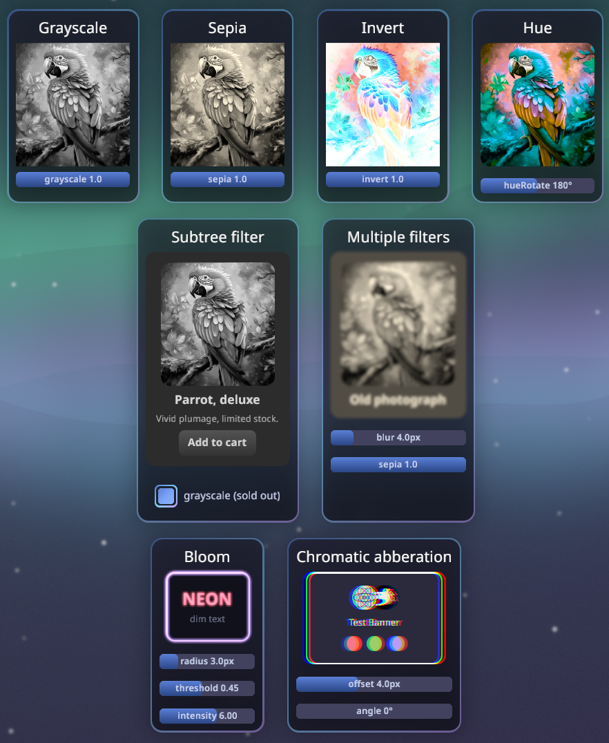
Behind the scenes, some styles automatically promote a subtree to a
**composited layer**: a non-empty `filter` or `backdropFilter`, `opacity` on a
node with children (group alpha), a `transform3d`, or an explicit
`cache: "always"` / `"never"`. The subtree is captured into an offscreen
texture and cached — a clean layer skips re-capture, and moving, fading, or
animating filter params is composite-time only. This is purely render-side:
layout, picking, and refs are untouched, and there is nothing to opt into.
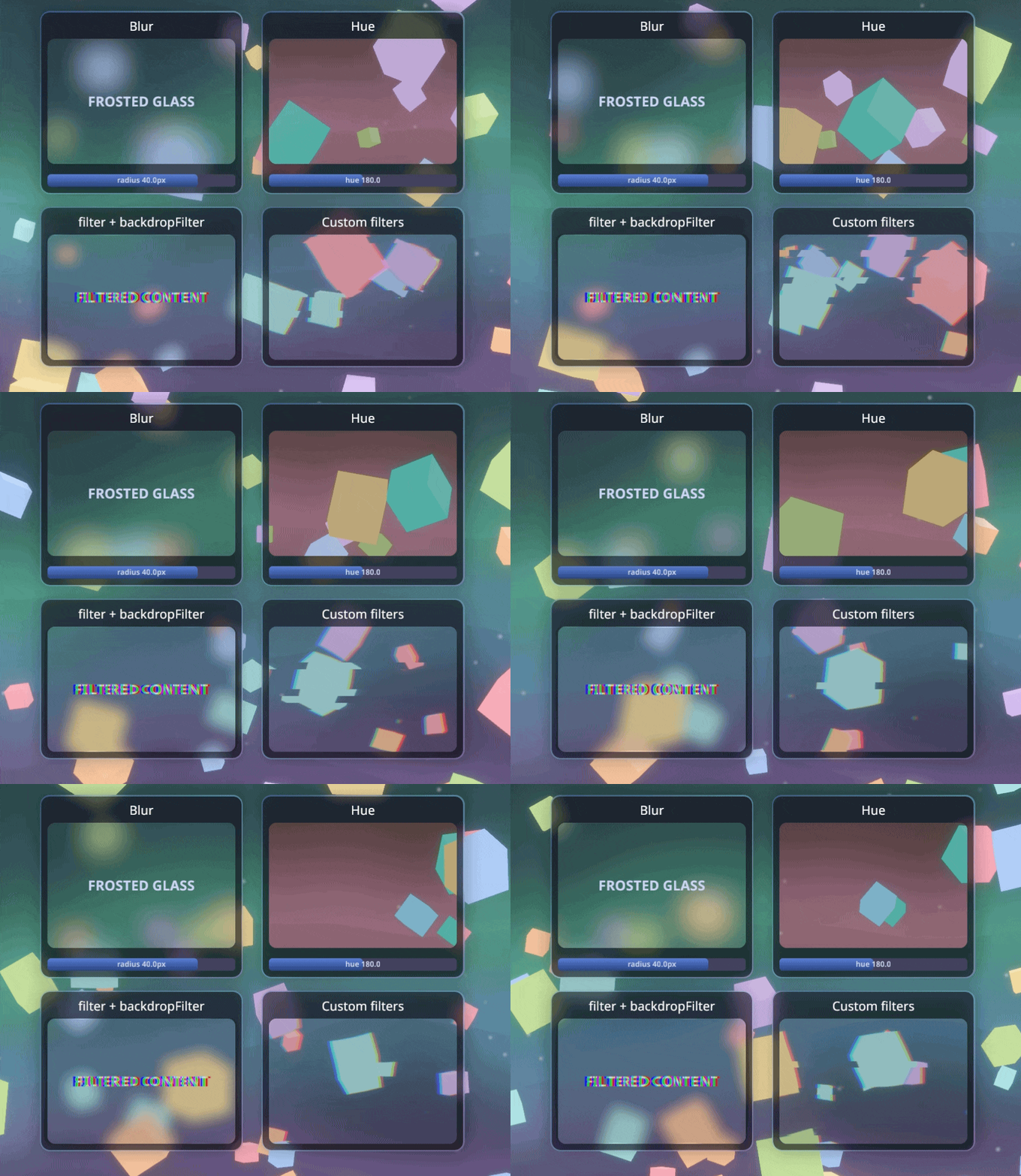
### Backdrop filters
`backdropFilter` takes the same `{ name, params }` chains but filters **what
is rendered behind the node** — the 3D scene — and composites the result under
the node's own content. It respects `borderRadius`, so the classic
frosted-glass card just works.
```tsx
<node
style={{
backgroundColor: "rgba(26, 27, 38, 0.35)",
backdropFilter: { name: "blur", params: { radius: 8 } },
}}
>
<text>frosted glass</text>
</node>
```
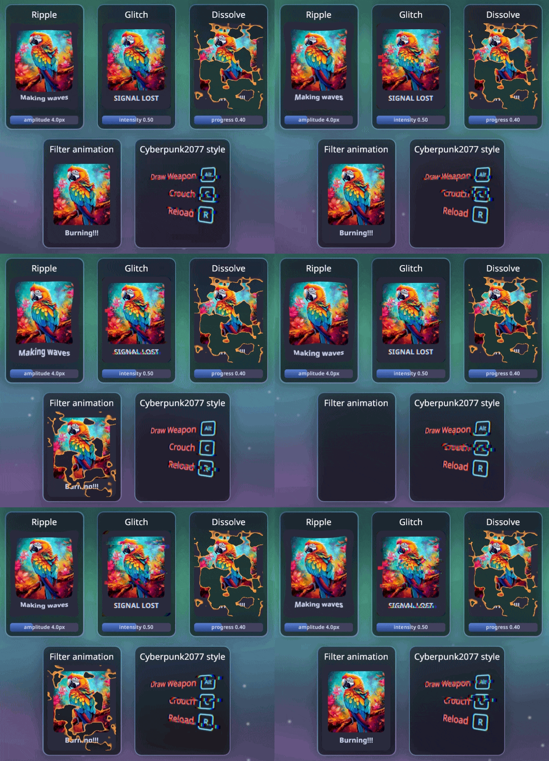
### Custom filters
A custom filter is a Rust params struct plus a WGSL fragment shader. Register
it and it is usable from `filter` / `backdropFilter` by name, with **typed
params in TSX** via the generated `bevy.ts` (the same codegen flow as messages
and events).
```rust
use bevy_react::{ReactAppExt, react_filter};
// Fields pack into the shader's `uniforms.params` in declaration order.
#[react_filter(shader = "shaders/dissolve.wgsl")]
struct Dissolve {
progress: f32,
}
app.add_react_filter::<Dissolve>();
```
```tsx
<node
style={{
filter: { name: "dissolve", params: { progress } } },
}}
/>
```
The shader `#import`s `bevy_react::filter` for the bind-group contract (source
texture, params, time, resolution) and names its entry point `fragment`. See
[`examples/assets/shaders/`](https://github.com/tulustul/bevy-react/tree/main/examples/assets/shaders)
(`ripple`, `glitch`, `dissolve`) and
[`examples/demos/filters.rs`](https://github.com/tulustul/bevy-react/blob/main/examples/demos/filters.rs)
for complete examples, including time-driven (`time = true`) and bleed-outset
(`outset = …`) filters. Register the filter in both the running app and the
`--export-bindings` path, then regenerate `bevy.ts`.
### Fonts
Register a font on the host, then select it by name in any `<text>` style.
```rust
// Font paths are relative to your asset root (`assets/` by default).
ReactUiPlugin::new("ui/dist/app.js").font("DancingScript", "fonts/dancing.ttf")
```
```tsx
<text style={{ fontFamily: "DancingScript", fontSize: 34 }}>Fancy</text>
```
### Canvas drawing
`<canvas>` takes a `draw` callback with an HTML-canvas-like context; the result is
rasterized into a texture. Returning fresh drawing each render makes it reactive. Uses `tiny_skia` as a rendering backend.
```tsx
<canvas
style={{ width: 460, height: 260 }}
draw={(ctx) => {
ctx.strokeStyle = "#89b4fa";
ctx.lineWidth = 2;
ctx.beginPath();
ctx.moveTo(0, 150);
ctx.bezierCurveTo(100, 0, 200, 150, 300, 20);
ctx.stroke();
}}
/>
```
### SVG — files and JSX shapes
Two web-faithful doors. An `<image>` whose `src` names an `.svg` file renders it as
a true vector: parsed once, re-rasterized at the laid-out size × DPI, pixel-crisp at
every size (layout uses the file's intrinsic size, like a bitmap). And `<svg>` is a
React-composed drawing surface: shape children (`<circle>`, `<rect>`, `<path>`,
`<g>`, …) are real elements with props, per-shape pointer events (hit-testing
follows painted geometry; event coords arrive in viewBox user units), `{ animated }`
bindings on numeric attrs, and a `transition` prop for eased changes. SVG `<text>`
in files is available behind the off-by-default `svg-text` cargo feature.
```tsx
<svg viewBox="0 0 100 100" style={{ width: 200, height: 200 }}>
<circle cx={50} cy={50} r={{ animated: pulse, seed: 20 }} fill="#89b4fa" />
<rect
x={10}
y={70}
width={30}
height={20}
rx={4}
transition={{ height: { duration: 300 } }}
onClick={() => grow()}
/>
</svg>
```
### Render-target portals
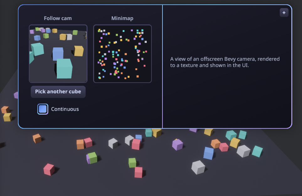
`<portal>` shows an **offscreen render target** inside the UI — the live (or
snapshot) output of a Bevy camera rendering into a texture. The app registers a
named target and aims a camera at it; React displays it by name. Good for minimaps,
picture-in-picture, or per-item 3D previews.
```rust
// Bevy: register a target, then point a camera at it.
let view = render_targets.create(&mut images, "follow", RenderTargetSpec::default());
commands.spawn((Camera3d::default(), view.camera_target(), PortalCamera("follow".into())));
```
```tsx
// React: show it by name (Auto-sized to the node, so it stays crisp).
<portal target="follow" style={{ width: 160, height: 160 }} />
```
### Surfaces: UI on a 3D mesh
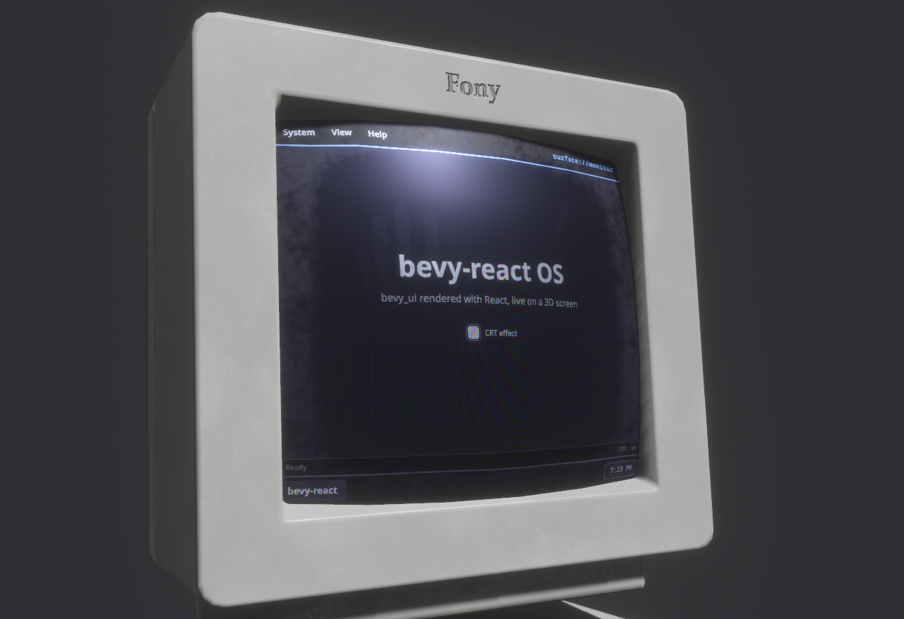
`<surface>` is the inverse of `<portal>`: instead of showing a 3D camera inside the
UI, it renders a React subtree into an **offscreen texture** that the Bevy app drapes
onto any 3D mesh — a diegetic monitor, panel, or hologram driven by live React. Tag
the displaying mesh with `SurfacePointer` to make the subtree clickable in 3D, so
`onClick`/`onPointer*` and hover/press styles fire from in-world pointer hits.
```rust
// Bevy: register a surface, use its texture on a mesh, make the mesh clickable.
let screen = surfaces.create(&mut images, "monitor", SurfaceSpec { size: UVec2::new(760, 700), ..default() });
material.base_color_texture = Some(screen);
commands.entity(screen_mesh).insert(SurfacePointer::new("monitor"));
```
```tsx
// React: render a subtree into the named surface's texture.
<surface name="monitor" style={{ width: "100%", height: "100%" }}>
<MonitorApp />
</surface>
```
### World-anchored overlays
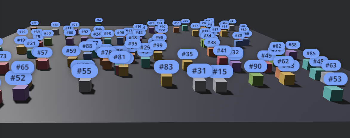
Pin UI to a 3D entity so it tracks the entity on screen as the camera moves.
```tsx
<anchor entity={cube} offset={[0, 1, 0]} style={{ padding: 8 }}>
<text>Label</text>
</anchor>
```
### Talking to Bevy
Three typed channels connect React and the ECS:
- **Notify** - `bevy.foo.doSomething(value)`: React -> Bevy event
- **Request** - `await bevy.foo.getSomething()`: request/response cycle
- **Subscribe** - `bevy.on(eventName, callback)`: Bevy → React events
**1. Define the channel in Rust** with a macro and register it on the `App`:
```rust
use bevy::prelude::*;
use bevy_react::{ReactAppExt, ReactEvents, react_event, react_message};
// React → Bevy: `bevy.game.reset()`.
#[react_message(name = "game.reset")]
struct Reset;
fn on_reset(_: On<Reset>, /* queries, resources… */) {
// reset the game
}
// Bevy → React: `bevy.on("game.scored", …)`.
#[react_event(name = "game.scored")]
struct Scored;
fn award_point(events: ReactEvents) {
events.send(&Scored);
}
app.add_react_handler(on_reset);
app.add_react_event::<Scored>();
```
**2. Use it from React:**
```tsx
import { bevy } from "./bevy";
import { useEffect, useState } from "react";
function Score() {
const [hits, setHits] = useState(0);
useEffect(() => bevy.on("game.scored", () => setHits((h) => h + 1)), []);
return (
<button onClick={() => bevy.game.reset()}>
<text>{`Hits: ${hits}`}</text>
</button>
);
}
```
The request channel (`#[react_request]` - React `await`s a typed reply) works the
same way; [`examples/demos`](https://github.com/tulustul/bevy-react/tree/main/examples/demos) defines all three channels across
its demos.
### Devtools
A built-in inspector for the live UI. Toggle it with
**F12** (configurable):
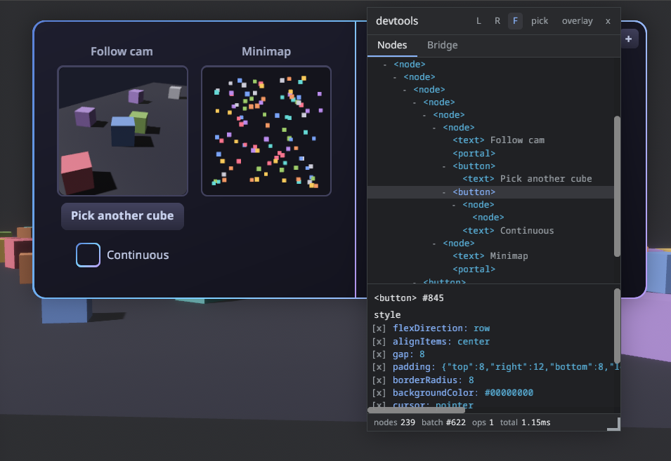
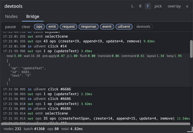
There is nothing to set up: `ReactUiPlugin` enables the devtools in dev builds
and disables them in release builds.
```sh
cargo run # dev: devtools included, F12 toggles the panel
cargo run --release # release: no devtools
```
Override anything with `.devtools(DevtoolsConfig { ... })` — every field has a
default:
```rust
app.add_plugins(ReactUiPlugin::new("ui/dist/app.js").devtools(DevtoolsConfig {
toggle_key: KeyCode::F1,
settings_path: Some(".config/devtools.json".into()),
..default()
}));
// or disable devtools entirely
app.add_plugins(ReactUiPlugin::new("ui/dist/app.js").devtools(DevtoolsConfig {
enabled: false,
..default()
}));
```
Cargo features can't depend on the build profile, so the (never-registered)
devtools code is still _compiled_ into release binaries; the panel's JS is
stripped from production bundles either way. If a shipping build must not
contain the code at all, disable the `devtools` default feature
(`bevy-react = { version = "…", default-features = false }`).
## Performance
[docs/BENCHMARKS.md](https://github.com/tulustul/bevy-react/blob/main/docs/BENCHMARKS.md).
## License
Dual-licensed under either of
[Apache License 2.0](https://github.com/tulustul/bevy-react/blob/main/LICENSE-APACHE)
or [MIT license](https://github.com/tulustul/bevy-react/blob/main/LICENSE-MIT), at
your option.