
Build bevy_ui interfaces with
React. You write components in React/TSX and they render to native Bevy UI
through a React Native-style bridge - no web view, no DOM. The JS side stays
purely declarative; Rust and Bevy do the heavy lifting. State and interactions flow
both ways between your Bevy app and React, and edits hot-reload live while keeping
component state.
You can play with a live demo here:
https://tulustul.github.io/bevy-react/
import { mount } from "bevy-react";
import { useState } from "react";

function App() {
  const [n, setN] = useState(0);
  return (
    <node style={{ padding: 20, gap: 12, flexDirection: "column" }}>
      <text>{`Count: ${n}`}</text>
      <button
        onClick={() => setN((c) => c + 1)}
        style={{ backgroundColor: "#7aa2f7" }}
      >
        <text>+</text>
      </button>
    </node>
  );
}

mount(<App />);
That's a real component - <node> and <button> render to actual bevy_ui
nodes, useState works as you'd expect, and saving the file updates the running
app without losing the count.
Why bevy-react
- React, not a bespoke UI DSL. Hooks, components, conditional rendering, lists - everything you already know.
- Native Bevy UI. No web view, no DOM. Your UI is
bevy_uientities in the same world as your game. - Hot reload that keeps state. Edit a component and it re-renders live with hook state and running animations intact.
- Typed, two-way messaging. React and the ECS talk over typed channels generated straight from your Rust types.
How it works
bevy-react uses a bridge architecture, much like old versions of React Native - but the native side is Bevy and the ECS instead of iOS/Android views.
- React runs on embedded V8. On native targets the JS runs in a V8 isolate via
deno_core- no Node, no browser - on its own thread, off the game loop. - Web builds work too. On wasm the same bundle runs in the browser's own JS
engine instead of V8; the UI is still
bevy_ui, not DOM. The live demo is the web build. - JS only describes the UI. React renders through a custom reconciler that emits
declarative UI-mutation ops; Rust applies them to
bevy_uientities. All the heavy lifting - layout, input, rendering - happens in Rust and Bevy. - Animations are orchestrated in Bevy, not JS. Shared values and transitions are driven on the Bevy side every frame; JS just declares the target. No per-frame JS, no bridge traffic per tick.
Project status
Currently, the project is a quick, vibecoded proof of concept demonstrating the idea. The API is very unstable and will change, the code quality is not satisfying. Do not use it in production.
Bevy compatibility
| bevy | bevy-react |
|---|---|
| 0.19 | 0.1 |
Getting started
Scaffold the React UI:
&&
Add the plugin to your app
use ;
app.add_pluginsFollow the examples/minimal example for a full working setup.
Typescript client generation
Copy the --export-bindings flag implementation from examples/minimal
After that you can run
or
which will generate a bevy.ts file in your ui directory. This file will include all the needed integration with your Rust code. See Talking to Bevy for details.
Rembember to regenerate the client each time you update the communication channel in Rust.
The demos app
examples/demos is a gallery that exercises most features available. It's the best reference implementation - each demo is a small, self-contained component you can read and copy when wiring up your own UI, messaging, or animations.
Features
Elements & styling
Host elements <node>, <button>, <text>, <image>, <editableText>,
<canvas>, <portal>, and <surface> cover layout, input, drawing, embedded 3D
views, and UI rendered onto 3D meshes.
Style them with a flexbox/grid object (colors, spacing, borders, radius, shadows,
transforms).
<node
  style={{
    flexDirection: "row",
    gap: 16,
    padding: 20,
    backgroundColor: "#1e1e2e",
    borderRadius: 8,
  }}
>
  <text style={{ fontSize: 18, color: "#cdd6f4" }}>Hello</text>
</node>
Hover & press states
Overlay extra style while an element is hovered or pressed - no state wiring needed.
<button
  onClick={() => save()}
  style={{ backgroundColor: "#7aa2f7" }}
  hoverStyle={{ backgroundColor: "#89b4fa" }}
  pressStyle={{ backgroundColor: "#5a7fd6" }}
>
  <text>Save</text>
</button>
Pointer & drag
onPointerDown / onPointerMove / onPointerUp give you drag gestures, with both
element-normalized (x, y) and window (clientX, clientY) coordinates.
<node
  onPointerDown={(e) => start(e.clientX, e.clientY)}
  onPointerMove={(e) => drag(e.clientX, e.clientY)}
  onPointerUp={() => drop()}
/>
Transitions
Ease changes to a style by listing which properties should animate, with timing or spring config.
<button
  onClick={() => setOn((v) => !v)}
  style={{
    backgroundColor: on ? "#a6e3a1" : "#45475a",
    transform: { translateX: on ? 36 : -36 },
    transition: {
      transform: { stiffness: 180, damping: 14 }, // spring
      backgroundColor: { duration: 200 }, // timing (ms)
    },
  }}
>
  <text>{on ? "ON" : "OFF"}</text>
</button>
Animations
For richer motion, use Reanimated-style shared values driven on the Bevy side (no
per-frame JS). Create a value with useSharedValue, assign it a driver, and bind it
through animatedStyle on an Animated.* element.
import { Animated, useSharedValue, withRepeat, withTiming } from "bevy-react";
import { useEffect } from "react";

function Pulse() {
  const opacity = useSharedValue(1);
  useEffect(() => {
    opacity.value = withRepeat(
      withTiming(0, { duration: 500, easing: "easeInOut" }),
      -1, // repeat forever
      true, // ping-pong
    );
  }, [opacity]);

  return (
    <Animated.node
      style={{ width: 80, height: 80 }}
      animatedStyle={{ opacity }}
    />
  );
}
Drivers: withTiming, withSpring, withRepeat, withSequence, withDelay, plus
interpolate / interpolateColor to map one value through a curve.
Fonts
Register a font on the host, then select it by name in any <text> style.
// Font paths are relative to your asset root (`assets/` by default).
new.font
<text style={{ fontFamily: "DancingScript", fontSize: 34 }}>Fancy</text>
Canvas drawing
<canvas> takes a draw callback with an HTML-canvas-like context; the result is
rasterized into a texture. Returning fresh drawing each render makes it reactive. Uses tiny_skia as a rendering backend.
<canvas
  style={{ width: 460, height: 260 }}
  draw={(ctx) => {
    ctx.strokeStyle = "#89b4fa";
    ctx.lineWidth = 2;
    ctx.beginPath();
    ctx.moveTo(0, 150);
    ctx.bezierCurveTo(100, 0, 200, 150, 300, 20);
    ctx.stroke();
  }}
/>
Render-target portals
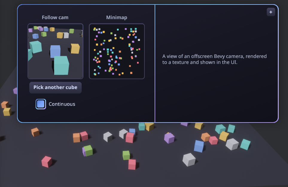
<portal> shows an offscreen render target inside the UI — the live (or
snapshot) output of a Bevy camera rendering into a texture. The app registers a
named target and aims a camera at it; React displays it by name. Good for minimaps,
picture-in-picture, or per-item 3D previews.
// Bevy: register a target, then point a camera at it.
let view = render_targets.create;
commands.spawn;
// React: show it by name (Auto-sized to the node, so it stays crisp).
<portal target="follow" style={{ width: 160, height: 160 }} />
Surfaces: UI on a 3D mesh
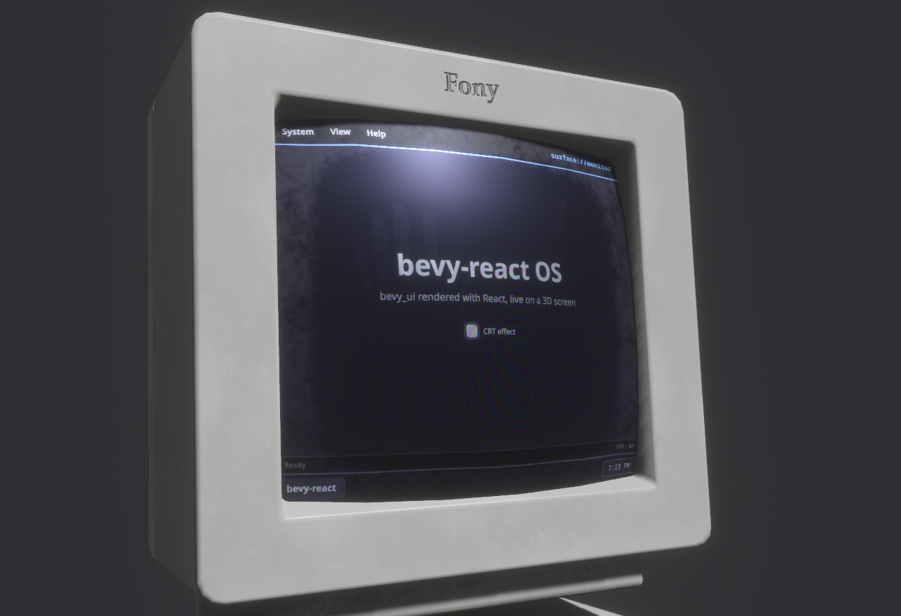
<surface> is the inverse of <portal>: instead of showing a 3D camera inside the
UI, it renders a React subtree into an offscreen texture that the Bevy app drapes
onto any 3D mesh — a diegetic monitor, panel, or hologram driven by live React. Tag
the displaying mesh with SurfacePointer to make the subtree clickable in 3D, so
onClick/onPointer* and hover/press styles fire from in-world pointer hits.
// Bevy: register a surface, use its texture on a mesh, make the mesh clickable.
let screen = surfaces.create;
material.base_color_texture = Some;
commands.entity.insert;
// React: render a subtree into the named surface's texture.
<surface name="monitor" style={{ width: "100%", height: "100%" }}>
  <MonitorApp />
</surface>
World-anchored overlays
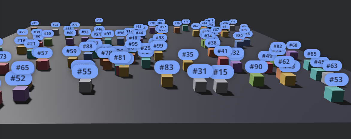
Pin UI to a 3D entity so it tracks the entity on screen as the camera moves.
import { Anchored } from "bevy-react";

<Anchored.node entity={cube} offset={[0, 1, 0]} style={{ padding: 8 }}>
  <text>Label</text>
</Anchored.node>;
Talking to Bevy
Three typed channels connect React and the ECS:
- Notify -
bevy.foo.doSomething(value): React -> Bevy event - Request -
await bevy.foo.getSomething(): request/response cycle - Subscribe -
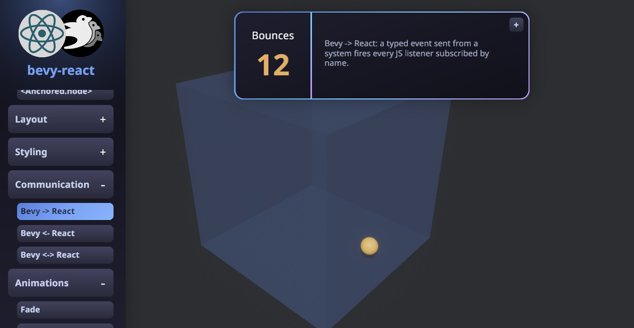
bevy.on(eventName, callback): Bevy → React events
1. Define the channel in Rust with a macro and register it on the App:
use *;
use ;
// React → Bevy: `bevy.game.reset()`.
;
// Bevy → React: `bevy.on("game.scored", …)`.
;
app.add_react_handler;
app.;
2. Use it from React:
import { bevy } from "./bevy";
import { useEffect, useState } from "react";

function Score() {
  const [hits, setHits] = useState(0);

  useEffect(() => bevy.on("game.scored", () => setHits((h) => h + 1)), []);

  return (
    <button onClick={() => bevy.game.reset()}>
      <text>{`Hits: ${hits}`}</text>
    </button>
  );
}
The request channel (#[react_request] - React awaits a typed reply) works the
same way; examples/demos defines all three channels across
its demos.
Devtools
A built-in inspector for the live UI. Toggle it with F12 (configurable):
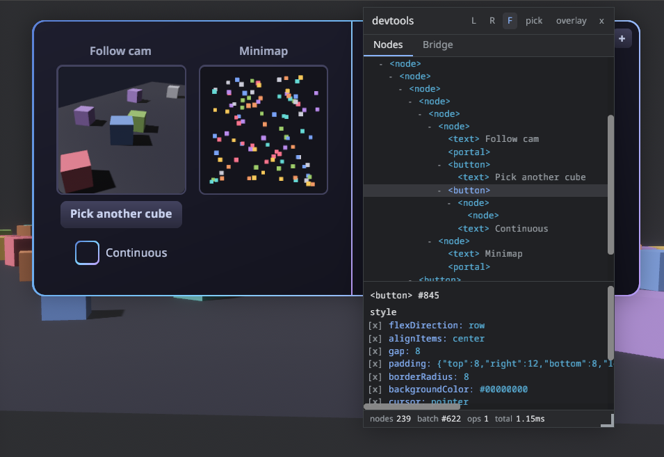
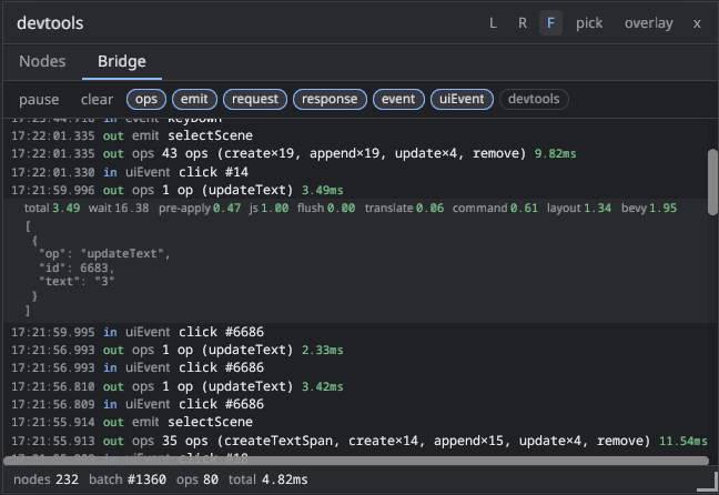
There is nothing to set up: ReactUiPlugin enables the devtools in dev builds
and disables them in release builds.
Override anything with .devtools(DevtoolsConfig { ... }) — every field has a
default:
app.add_plugins;
// or disable devtools entirely
app.add_plugins;
Cargo features can't depend on the build profile, so the (never-registered)
devtools code is still compiled into release binaries; the panel's JS is
stripped from production bundles either way. If a shipping build must not
contain the code at all, disable the devtools default feature
(bevy-react = { version = "…", default-features = false }).
Performance
License
Dual-licensed under either of Apache License 2.0 or MIT license, at your option.