Crate leptos_struct_table
source ·Expand description
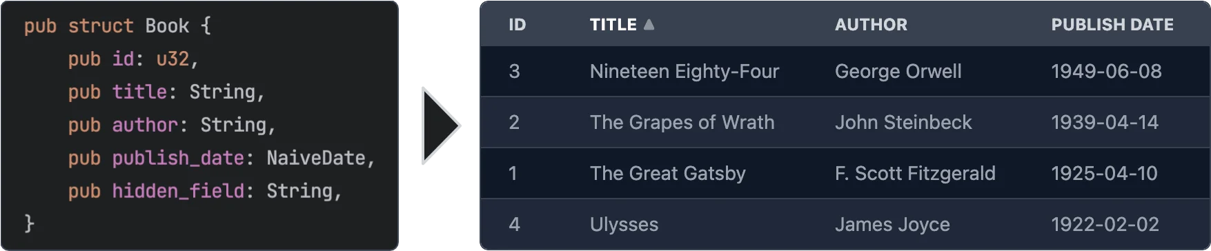
Easily create Leptos table components from structs.
§Features
- Easy to use - yet powerful.
- Async data loading - The data is loaded asynchronously. This allows to load data from a REST API or a database etc.
- Selection - Can be turned off or single/multi select
- Customization - You can customize every aspect of the table by plugging in your own components for rendering rows, cells, headers. See Custom Renderers for more information.
- Headless - No default styling is applied to the table. You can fully customize the classes that are applied to the table. See Classes customization for more information.
- Sorting - Optional. If turned on: Click on a column header to sort the table by that column. You can even sort by multiple columns.
- Virtualization - Only the visible rows are rendered. This allows for very large tables.
- Pagination - Instead of virtualization you can paginate the table.
- Caching - Only visible rows are loaded and cached.
- Editing - Optional. You can provide custom renderers for editable cells. See Editable Cells for more information.
§Usage
use leptos::*;
use leptos_struct_table::*;

#[derive(TableRow, Clone)]
#[table(impl_vec_data_provider)]
pub struct Person {
    id: u32,
    name: String,
    age: u32,
}

fn main() {
    mount_to_body(|| {
        let rows = vec![
            Person { id: 1, name: "John".to_string(), age: 32 },
            Person { id: 2, name: "Jane".to_string(), age: 28 },
            Person { id: 3, name: "Bob".to_string(), age: 45 },
        ];

        view! {
            <table>
                <TableContent rows />
            </table>
        }
    });
}§Macro options
The #[table(...)] attribute can be used to customize the generated component. The following options are available:
§Struct attributes
These attributes can be applied to the struct itself.
sortable- Specifies that the table should be sortable. This makes the header titles clickable to control sorting. See the simple example for more information.classes_provider- Specifies the name of the class provider. Used to quickly customize all of the classes that are applied to the table. For convenience sensible presets for major CSS frameworks are provided. SeeTableClassesProviderand tailwind example for more information.head_cell_renderer- Specifies the name of the header cell renderer component. Used to customize the rendering of header cells. Defaults to [DefaultTableHeaderRenderer]. See the custom_renderers_svg example for more information.impl_vec_data_provider- If given, thenTableDataProvideris automatically implemented forVec<ThisStruct>to allow for easy local data use. See the simple example for more information.row_type- Specifies the type of the rows in the table. Defaults to the struct that this is applied to. See the custom_type example for more information.
§Field attributes
These attributes can be applied to any field in the struct.
class- Specifies the classes that are applied to each cell (head and body) in the field’s column. Can be used in conjuction withclasses_providerto customize the classes.head_class- Specifies the classes that are applied to the header cell in the field’s column. Can be used in conjuction withclasses_providerto customize the classes.cell_class- Specifies the classes that are applied to the body cells in the field’s column. Can be used in conjuction withclasses_providerto customize the classes.skip- Specifies that the field should be skipped. This is useful for fields that are not displayed in the table.skip_sort- Only applies ifsortableis set on the struct. Specifies that the field should not be used for sorting. Clicking it’s header will not do anything.skip_header- Makes the title of the field not be displayed in the head row.title- Specifies the title that is displayed in the header cell. Defaults to the field name converted to title case (this_fieldbecomes"This Field").renderer- Specifies the name of the cell renderer component. Used to customize the rendering of cells. Defaults toDefaultNumberTableCellRendererfor number types andDefaultTableCellRendererfor anything else. As long as Leptos supports rendering the type it will work. If the featurechronois enabled thenDefaultNaiveDateTableCellRenderer,DefaultNaiveDateTimeTableCellRendererandDefaultNaiveTimeTableCellRendererare used forchrono::NaiveDate,chrono::NaiveDateTimeandchrono::NaiveTimerespectively.format- Quick way to customize the formatting of cells without having to create a custom renderer. See Formatting below for more information.getter- Specifies a method that returns the value of the field instead of accessing the field directly when rendering.none_value- Specifies a display value forOptiontypes when they areNone. Defaults to empty string
§Formatting
The format attribute can be used to customize the formatting of cells. It is an easier alternative to creating a custom renderer when you just want to customize some basic formatting.
precision- Specifies the number of digits to display after the decimal point. Only works for numbers.string- Specifies a format string. Currently only used forNaiveDate,NaiveDateTimeandNaiveTime. Seechrono::format::strftimefor more information. Example:
#[derive(TableRow, Clone)]
pub struct TemperatureMeasurement {
    #[table(title = "Temperature (°C)", format(precision = 2))]
    temperature: f32,
    #[table(format(string = "%m.%d.%Y"))]
    date: NaiveDate,
}§Classes Customization
Classes can be easily customized by using the classes_provider attribute on the struct.
You can specify any type that implementats the trait TableClassesProvider. Please see the documentation for that trait for more information.
You can also look at TailwindClassesPreset for an example how this can be implemented.
Example:
#[derive(TableRow, Clone)]
#[table(classes_provider = "TailwindClassesPreset")]
pub struct Book {
    id: u32,
    title: String,
}§Field Getters
Sometimes you want to display a field that is not part of the struct but a derived value either
from other fields or sth entirely different. For this you can use either the FieldGetter type
or the getter attribute.
Let’s start with FieldGetter and see an example:
#[derive(TableRow, Clone)]
#[table(classes_provider = "TailwindClassesPreset")]
pub struct Book {
    id: u32,
    title: String,
    author: String,

    // this tells the macro that you're going to provide a method called `title_and_author` that returns a `String`
    title_and_author: FieldGetter<String>
}

impl Book {
    // Returns the value that is displayed in the column
    pub fn title_and_author(&self) -> String {
        format!("{} by {}", self.title, self.author)
    }
}
To provide maximum flexibility you can use the getter attribute.
#[derive(TableRow, Clone)]
#[table(classes_provider = "TailwindClassesPreset")]
pub struct Book {
    // this tells the macro that you're going to provide a method called `get_title` that returns a `String`
    #[table(getter = "get_title")]
    title: String,
}

impl Book {
    pub fn get_title(&self) -> String {
        format!("Title: {}", self.title)
    }
}§When to use FieldGetter vs getter attribute
A field of type FieldGetter<T> is a virtual field that doesn’t really exist on the struct.
Internally FieldGetter is just a new-typed PhatomData and thus is removed during compilation.
Hence it doesn’t increase memory usage. That means you should use it for purely derived data.
The getter attribute should be used on a field that actually exists on the struct but whose
value you want to modify before it’s rendered.
§Custom Renderers
Custom renderers can be used to customize almost every aspect of the table.
They are specified by using the various ...renderer attributes on the struct or fields or props of the TableContent component.
To implement a custom renderer please have a look at the default renderers listed below.
On the struct level you can use this attribute:
thead_cell_renderer- Defaults toDefaultTableHeaderCellRendererwhich renders<th><span>Title</span></th>together with sorting functionality (if enabled).
As props of the TableContent component you can use the following:
thead_renderer- Defaults toDefaultTableHeadRendererwhich just renders the tagthead.thead_row_renderer- Defaults toDefaultTableHeadRowRendererwhich just renders the tagtr.tbody_renderer- Defaults to the tagtbody. Takes no attributes.row_renderer- Defaults toDefaultTableRowRenderer.loading_row_renderer- Defaults toDefaultLoadingRowRenderer.error_row_renderer- Defaults toDefaultErrorRowRenderer.row_placeholder_renderer- Defaults toDefaultRowPlaceholderRenderer.
On the field level you can use the renderer attribute.
It defaults to DefaultNumberTableCellRenderer for number types and DefaultTableCellRenderer for anything else.
As long as Leptos supports rendering the type it will work.
If the feature chrono is enabled then DefaultNaiveDateTableCellRenderer, DefaultNaiveDateTimeTableCellRenderer and
DefaultNaiveTimeTableCellRenderer are used for chrono::NaiveDate, chrono::NaiveDateTime and chrono::NaiveTime respectively.
Example:
#[derive(TableRow, Clone)]
pub struct Book {
    title: String,
    #[table(renderer = "ImageTableCellRenderer")]
    img: String,
}

// Easy cell renderer that just displays an image from an URL.
#[component]
fn ImageTableCellRenderer<F>(
    class: String,
    #[prop(into)] value: MaybeSignal<String>,
    on_change: F,
    index: usize,
) -> impl IntoView
where
    F: Fn(String) + 'static,
{
    view! {
        <td class=class>
            <img src=value alt="Book image" height="64"/>
        </td>
    }
}
For more detailed information please have a look at the custom_renderers_svg example for a complete customization.
§Editable Cells
You might have noticed the type parameter F in the custom cell renderer above. This can be used
to emit an event when the cell is changed. In the simplest case you can use a cell renderer that
uses an <input>.
#[derive(TableRow, Clone, Default, Debug)]
#[table(impl_vec_data_provider)]
pub struct Book {
    id: u32,
    #[table(renderer = "InputCellRenderer")]
    title: String,
}

// Easy input cell renderer that emits `on_change` when the input is changed.
#[component]
fn InputCellRenderer<F>(
    class: String,
    #[prop(into)] value: MaybeSignal<String>,
    on_change: F,
    index: usize,
) -> impl IntoView
where
    F: Fn(String) + 'static,
{
    view! {
        <td class=class>
            <input type="text" value=value on:change=move |evt| { on_change(event_target_value(&evt)); } />
        </td>
    }
}

// Then in the table component you can listen to the `on_change` event:

#[component]
pub fn App() -> impl IntoView {
    let rows = vec![Book::default(), Book::default()];

    let on_change = move |evt: ChangeEvent<Book>| {
        logging::log!("Changed row at index {}:\n{:#?}", evt.row_index, evt.changed_row);
    };

    view! {
        <table>
            <TableContent rows on_change />
        </table>
    }
}
Please have a look at the editable example for fully working example.
§Pagination / Virtualization / InfiniteScroll
This table component supports different display acceleration strategies. You can set them through the display_strategy prop of
the TableContent component.
The following options are available. Check their docs for more details.
DisplayStrategy::Virtualization(default)DisplayStrategy::InfiniteScrollDisplayStrategy::Pagination
Please have a look at the pagination example for more information on how to use pagination.
§Contribution
All contributions are welcome. Please open an issue or a pull request if you have any ideas or problems.
Modules§
- Support for uuid::Uuid type.
Macros§
Structs§
- The event provided to the
on_changeprop of the table component - Props for the
DefaultNaiveDateTableCellRenderercomponent. - Props for the
DefaultNaiveDateTimeTableCellRenderercomponent. - Props for the
DefaultNaiveTimeTableCellRenderercomponent. - Props for the
DefaultNumberTableCellRenderercomponent. - Props for the
DefaultTableCellRenderercomponent. - Props for the
DefaultTableHeaderCellRenderercomponent. - New type wrapper of a closure that takes a parameter
T. This allows the event handler props to be optional while being able to take a simple closure. - Type of struct field used to specify that the value of this field is obtained by calling a getter method on the struct.
- Allows to control what page is displayed as well as reading the page count and current page
- You can pass this to a [
TableContent] component’sreload_controllerprop to trigger a reload. - The event provided to the
on_selection_changeprop of the table component - Props for the
TableContentcomponent. - Event emitted when a table head cell is clicked.
Enums§
- Type of sorting of a column
- The display acceleration strategy. Defaults to
Virtualization. - Type of selection together with the
RwSignalto hold the selection
Traits§
- A paginated data source. This is meant to provide a more convenient way of connecting to a paginated data source instead of implementing
TableDataProviderdirectly. - A trait for providing classes for the table.
- The trait that provides data for the
<TableContent>component. Anything that is passed to therowsprop must implement this trait. - This trait has to implemented in order for [
TableContent] to be able to render rows and the head row of the table. Usually this is done by#[derive(TableRow, Clone)].
Functions§
- The default error row renderer which just displays the error message when a row fails to load, i.e. when [
TableDataProvider::get_rows] returns anErr(..). - The default loading row renderer which just displays a loading indicator.
- The default cell renderer for
chrono::NaiveDate. - The default cell renderer for
chrono::NaiveDateTime. - The default cell renderer for
chrono::NaiveTime. - The default number cell renderer. Uses the
<td>element. - The default row placeholder renderer which is just a div that is set to the appropriate height. This is used in place of rows that are not shown before and after the currently visible rows.
- Default tbody renderer. Please note that this is NOT a
#[component]. - The default cell renderer. Uses the
<td>element. - Default thead renderer. Please note that this is NOT a
#[component]. - Default thead row renderer. Please note that this is NOT a
#[component]. - The default table header renderer. Renders roughly
- The default table row renderer. Uses the
<tr>element. Please note that this is NOT a#[component]. - Render the content of a table. This is the main component of this crate.
- Return
vec[range.start..range.end]whererangeis clamped to the length ofvec.