intuitive/lib.rs
1#![cfg_attr(feature = "unstable-doc-cfg", feature(doc_cfg))]
2
3//! # Intuitive
4//! Intuitive is a component-based library for creating text-based user interfaces
5//! (TUIs) easily.
6//!
7//! It is heavily inspired by [React] and [SwiftUI], containing features that
8//! resemble functional components, hooks, and a (mostly) declarative DSL.
9//!
10//! Check out the [Getting Started] section below for a brief introduction to using Intuitive.
11//!
12//! # Design
13//! The main focus of Intuitive is to simplify the implementation of section-based TUIs,
14//! such as [lazygit](https://github.com/jesseduffield/lazygit)'s, even at the slight
15//! expense of performance. Intuitive attempts to make it easy to write reusable TUI
16//! components that
17//! - encapsulate logic around handling state and key events
18//! - have complex layouts
19//! - are easy to read
20//!
21//! For example, a complex layout with an input box:
22//! ```no_run
23//! # use intuitive::{
24//! # component,
25//! # components::{stack::Flex::*, HStack, Section, Text, VStack},
26//! # error::Result,
27//! # on_key, render,
28//! # state::use_state,
29//! # terminal::Terminal,
30//! # };
31//! #
32//! #[component(Root)]
33//! fn render() {
34//! let text = use_state(|| String::new());
35//!
36//! let on_key = on_key! { [text]
37//! KeyEvent { code: Char(c), .. } => text.mutate(|text| text.push(c)),
38//! KeyEvent { code: Backspace, .. } => text.mutate(|text| text.pop()),
39//! KeyEvent { code: Esc, .. } => event::quit(),
40//! };
41//!
42//! render! {
43//! VStack(flex: [Block(3), Grow(1)], on_key) {
44//! Section(title: "Input") {
45//! Text(text: text.get())
46//! }
47//!
48//! HStack(flex: [1, 2, 3]) {
49//! Section(title: "Column 1")
50//! Section(title: "Column 2")
51//! Section(title: "Column 3")
52//! }
53//! }
54//! }
55//! }
56//!
57//! fn main() -> Result<()> {
58//! Terminal::new(Root::new())?.run()
59//! }
60//! ```
61//! And the output would look like this:
62//!
63//! 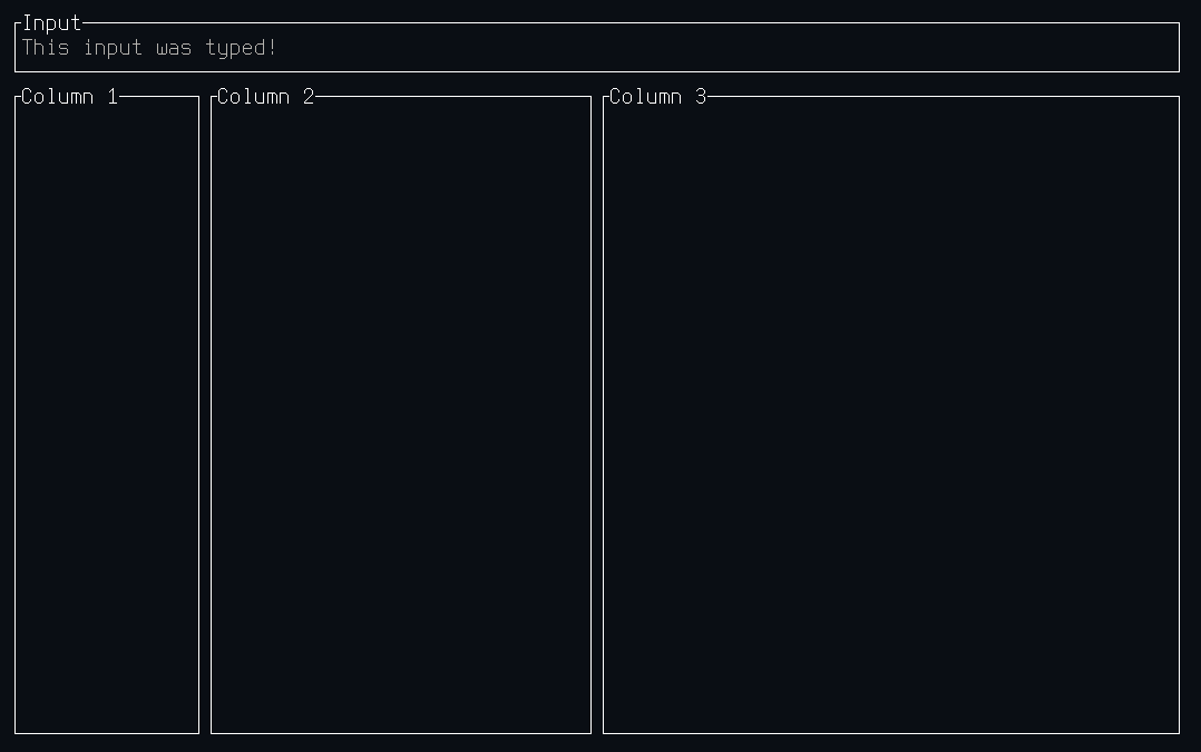
64//!
65//! # Getting Started
66//! Similarly to [React], Intuitive is built around components that are composable.
67//! There is one root component, that is passed to [`Terminal::new()`], in order to
68//! run the TUI.
69//!
70//! There are two main ways to build components:
71//! - Functional components using the [`component` attribute macro]
72//! - Custom components by implementing [`Component`] and (potentially [`Element`])
73//!
74//! Both of these are discussed in depth in the [`components`] module documentation. Other
75//! useful resources are:
76//! - The documentation for the [`render!`] and [`on_key!`] macros, as they are often used
77//! when writing components.
78//! - The [recipes] section of the [`components`] module documentation, describing ways to
79//! achieve common UI interactions.
80//! - The [examples] directory in the repository, which contains complete examples of simple
81//! applications.
82//!
83//! # Disclaimer
84//! Intuitive is closer to a proof-of-concept than to a crate that's ready for
85//! prime-time use. There may also be some bugs in the library of components,
86//! please [raise an issue] if you find any. Furthermore, since a large and
87//! complex application has yet to be built using Intuitive, it is not a
88//! guarantee that it does not have some major flaw making such development
89//! difficult.
90//!
91//! [raise an issue]: https://github.com/enricozb/intuitive/issues
92//! [`component` attribute macro]: attr.component.html
93//! [`render!`]: macro.render.html
94//! [`on_key!`]: macro.on_key.html
95//! [`Component`]: components/trait.Component.html
96//! [`components`]: components/index.html
97//! [`Element`]: element/trait.Element.html
98//! [examples]: https://github.com/enricozb/intuitive/tree/main/examples
99//! [Getting Started]: #getting-started
100//! [React]: https://reactjs.org/
101//! [recipes]: components/index.html#recipes
102//! [SwiftUI]: https://developer.apple.com/xcode/swiftui/
103//! [`Terminal::new()`]: terminal/struct.Terminal.html#method.new
104
105extern crate self as intuitive;
106
107pub mod components;
108pub mod element;
109pub mod error;
110pub mod event;
111pub mod state;
112pub mod style;
113pub mod terminal;
114pub mod text;
115
116/// Helper attribute macro for creating functional components.
117///
118/// # Usage
119/// This macro is used when creating functional components, where the name of
120/// the generated component is the item in the attribute. For example,
121/// ```rust
122/// # use intuitive::{component, components::{Centered, Section, Text}, on_key, state::use_state, render};
123/// #
124/// #[component(Root)]
125/// pub fn render(title: String) {
126/// let text = use_state(String::new);
127///
128/// let on_key = on_key! { [text]
129/// KeyEvent { code: Char(c), .. } => text.mutate(|text| text.push(c)),
130/// KeyEvent { code: Char(c), .. } => text.mutate(|text| text.pop()),
131/// KeyEvent { code: Esc, .. } => event::quit(),
132/// };
133///
134/// render! {
135/// Centered() {
136/// Section(title) {
137/// Text(text: text.get(), on_key)
138/// }
139/// }
140/// }
141/// }
142/// ```
143/// constructs a `Root` component, that can be used in a [`render!`] macro.
144///
145/// # Parameters
146/// If the `render` function contains parameters, these will become parameters to the
147/// generated component. These parameters can later be supplied when using the generated
148/// component in a [`render!`] macro. The parameters' types **must** implement [`Default`],
149/// as the generated component derives [`Default`]. If you need more control over the
150/// default values of the parameters, consider implementing the [`Component`] trait instead
151/// of using the `#[component(..)]` attribute macro.
152///
153/// # Managing State
154/// State in functional components is managed similarly to how they are in [React],
155/// using the [`use_state`] hook. Refer to the [`use_state`] documentation for details.
156///
157/// # Handling Key Events
158/// In functional components, key events are sent to the component at the root of the
159/// returned [`render!`] macro invocation. This means that in the example above, the
160/// key event will be sent to an instance of the [`Centered`] component. However,
161/// most components forward their key events to their children (especially those that
162/// have only a single child), and therefore the `on_key` handler could have been
163/// provided to any of the [`Centered`], [`Section`], or [`Text`] components above.
164///
165/// # Generics
166/// When requiring generics, for example when accepting a variable number of children,
167/// they can be added into the attribute and then used in the parameters. For example:
168/// ```rust
169/// # use intuitive::{component, components::{Centered, children::Children, Section, Text}, on_key, state::use_state, render};
170/// #
171/// #[component(Root<const N: usize>)]
172/// pub fn render(title: String, children: Children<N>) {
173/// let text = use_state(String::new);
174///
175/// let on_key = on_key! { [text]
176/// KeyEvent { code: Char(c), .. } => text.mutate(|text| text.push(c)),
177/// KeyEvent { code: Char(c), .. } => text.mutate(|text| text.pop()),
178/// KeyEvent { code: Esc, .. } => event::quit(),
179/// };
180///
181/// render! {
182/// Centered() {
183/// Section(title) {
184/// Text(text: text.get(), on_key)
185/// }
186/// }
187/// }
188/// }
189/// ```
190///
191/// # Generated Component
192/// The generated component is a structure that implements the [`Component`] trait. It
193/// also has a an associated function `new() -> component::Any` that is used to create the
194/// component when passing it to `Terminal::new()`. If the component has parameters,
195/// they will also be parameters to the associated function `new()`in the same order
196/// they were specified in the `render` function.
197///
198/// # Nuances
199/// There are a couple of nuances with this macro:
200/// - The visibility of the generated component will be the same as that of the
201/// `render` function the `#[component(..)]` attribute is applied to.
202/// - The return type to `render` (and even the function name itself) are completely
203/// ignored. In order to keep things consistent, it's recommended that the function
204/// is called `render` and the return type is left empty.
205///
206/// [`Centered`]: components/struct.Centered.html
207/// [`Component`]: components/trait.Component.html
208/// [`Default`]: https://doc.rust-lang.org/std/default/trait.Default.html
209/// [React]: https://reactjs.org/
210/// [`render!`]: macro.render.html
211/// [`Section`]: components/struct.Section.html
212/// [`Text`]: components/struct.Text.html
213/// [`use_state`]: state/fn.use_state.html
214pub use intuitive_macros::component;
215/// Helper macro for creating key handlers.
216///
217/// # Details
218/// This macro is used to simplify a common pattern constructing a [`event::KeyHandler`] where:
219/// - [`event`], [`event::KeyEvent`], [`event::KeyCode`]`::*`, and [`event::handler::Propagate`] are brought into scope
220/// - [`state::State`]s need to be cloned before being moved into the key handler
221/// - The event is immediately `match`ed
222///
223/// In addition to the above, this macro also:
224/// - implicitly introduces the `|event|` closure parameter
225/// - adds the catch-all `_ => ()` case to the `match` expression
226/// - returns [`event::handler::Propagate::Stop`]
227///
228/// # Usage
229/// An example usage looks like the following:
230/// ```rust
231/// # use intuitive::{state::use_state, on_key};
232/// #
233/// let text = use_state(String::new);
234///
235/// let on_key = on_key! { [text]
236/// KeyEvent { code: Char(c), .. } => text.mutate(|text| text.push(c)),
237/// KeyEvent { code: Char(c), .. } => text.mutate(|text| text.pop()),
238/// };
239/// ```
240/// and expands to the following:
241/// ```rust
242/// # use intuitive::{state::use_state, on_key};
243/// #
244/// let text = use_state(String::new);
245///
246/// let on_key = {
247/// let text = text.clone();
248///
249/// move |event| {
250/// use intuitive::event::{self, KeyEvent, KeyCode::*};
251///
252/// match event {
253/// KeyEvent { code: Char(c), .. } => text.mutate(|text| text.push(c)),
254/// KeyEvent { code: Char(c), .. } => text.mutate(|text| text.pop()),
255/// _ => (),
256/// };
257/// };
258/// };
259/// ```
260pub use intuitive_macros::on_key;
261/// Macro for rendering components.
262///
263/// # Usage
264/// This macro is meant to be used when returning from [`components::Component::render`],
265/// and uses a [SwiftUI](https://developer.apple.com/xcode/swiftui/)-like syntax.
266///
267/// For example:
268/// ```rust
269/// # use intuitive::{components::{Any as AnyComponent, Section, Text, VStack}, render};
270/// #
271/// let _: AnyComponent = render! {
272/// VStack() {
273/// Section(title: "Top Section") {
274/// Text(text: "Hello")
275/// }
276///
277/// Section(title: "Bottom Section") {
278/// Text(text: "World")
279/// }
280/// }
281/// };
282/// ```
283/// is rendering a `VStack` (with default parameters), and two children. The
284/// child components are `Section`s, each with their own `Text` child components.
285///
286/// # Parameters
287/// Parameters passed to components look like function arguments but are actually much
288/// closer to structure initialization. Like struct fields, they can be passed in any
289/// order, and they require the field name, unless the parameter and value are the same
290/// identifier. Unlike struct fields, you can omit parameters, as any omitted parameters
291/// are implicitly passed in with their default values.
292///
293/// ## Automatic Parameter Conversion
294/// When passing parameters to components within a `render!` macro invocation, an implicit
295/// [`TryInto::try_into`] call is made for each parameter. This means that you can omit
296/// any `.into()` calls when passing parameters to components. This is very useful when
297/// working with [`Spans`] and [`Style`], as they implement [`From`] from a variety
298/// of types.
299///
300/// # Children
301/// Children to a component come after the component surrounded by braces (`{ ... }`).
302/// Like parameters, children are optional, but are only valid for components that
303/// accept them (for example `Text` accepts no children, but `Section` does).
304///
305/// Children are passed as arrays (`[AnyComponent; N]`), so components specify exactly
306/// how many children they take in. Some components, like `VStack` and `HStack` take
307/// in a variable number of children, while some, like `Section`, only accept a single
308/// child component.
309///
310/// [`From`]: https://doc.rust-lang.org/std/convert/trait.From.html
311/// [`Spans`]: spans/struct.Spans.html
312/// [`Style`]: style/struct.Style.html
313/// [`TryInto::try_into`]: https://doc.rust-lang.org/std/convert/trait.TryInto.html#tymethod.try_into
314pub use intuitive_macros::render;