1
2
3
4
5
6
7
8
9
10
11
12
13
14
15
16
17
18
19
20
21
22
23
24
25
26
27
28
29
30
31
32
33
34
35
36
37
38
39
40
41
42
43
44
45
46
47
48
49
50
51
52
53
54
55
56
57
58
59
60
61
62
63
64
65
66
67
68
69
70
71
72
73
74
75
76
77
78
79
80
81
82
83
84
85
86
87
88
89
90
91
#![feature(doc_auto_cfg)]
//! # Intuitive
//! Intuitive is a component-based library for creating text-based user interfaces
//! (TUIs) easily.
//!
//! It is heavily inspired by [React] and [SwiftUI], containing features that
//! resemble functional components, hooks, and a (mostly) declarative DSL.
//!
//! Check out the [Getting Started] section below for a brief introduction to using Intuitive.
//!
//! # Design
//! The main focus of Intuitive is to simplify the implementation of section-based TUIs,
//! such as [lazygit](https://github.com/jesseduffield/lazygit)'s. Resizing is handled
//! automatically, and keyboard events can be handled easily.
//!
//! For example, a complex layout with an input box:
//! ```rust
//! use intuitive::{
//! component,
//! components::{Centered, Flex::*, Section, Text, VStack, HStack},
//! error::Result,
//! on_key, render,
//! state::use_state,
//! terminal::Terminal,
//! };
//!
//! #[component(Root)]
//! fn render() {
//! let text = use_state(|| String::new());
//! let on_key = on_key! { [text]
//! KeyEvent { code: Char(c), .. } => text.mutate(|text| text.push(c)),
//! KeyEvent { code: Backspace, .. } => text.mutate(|text| text.pop()),
//! KeyEvent { code: Esc, .. } => event::quit(),
//! };
//!
//! render! {
//! VStack(flex: [Block(3), Grow(1)], on_key) {
//! Section(title: "Input") {
//! Text(text: text.get())
//! }
//!
//! HStack(flex: [1, 2, 3]) {
//! Section(title: "Column 1")
//! Section(title: "Column 2")
//! Section(title: "Column 3")
//! }
//! }
//! }
//! }
//!
//! fn main() -> Result<()> {
//! Terminal::new(Root::new())?.run()
//! }
//! ```
//! And the output would look like this:
//!
//! 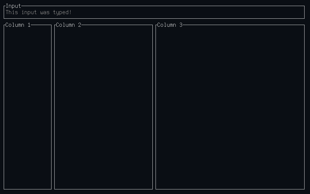
//!
//! # Getting Started
//! Similarly to [React], Intuitive is built around components that are composable.
//! There is one root component, that is passed to [`Terminal::new()`], in order to
//! run the TUI.
//!
//! There are two main ways to build components:
//! - Functional components using the [`component` attribute macro]
//! - Custom components by implementing [`Component`] and (potentially [`Element`])
//!
//! Both of these are discussed in depth in the [`components`] module documentation. Another
//! useful resource is the [recipes] section of the [`components`] module documentation,
//! describing ways to achieve common UI interactions.
//!
//!
//! [Getting Started]: #getting-started
//! [React]: https://reactjs.org/
//! [SwiftUI]: https://developer.apple.com/xcode/swiftui/
//! [`Terminal::new()`]: terminal/struct.Terminal.html#method.new
//! [`Component`]: components/trait.Component.html
//! [`component` attribute macro]: attr.component.html
//! [`Element`]: element/trait.Element.html
//! [`components`]: components/index.html
//! [recipes]: components/index.html#recipes
pub mod components;
pub mod element;
pub mod error;
pub mod event;
pub mod state;
pub mod terminal;
pub use intuitive_macros::{component, on_key, render};