
Intuitive
Intuitive is a component-based library for creating text-based user interfaces (TUIs) easily.
It is heavily inspired by React and SwiftUI, containing features that resemble functional components, hooks, and a (mostly) declarative DSL.
Check out the Getting Started section below for a brief introduction to using Intuitive.
Design
The main focus of Intuitive is to simplify the implementation of section-based TUIs, such as lazygit's. Resizing is handled automatically, and keyboard events can be handled easily.
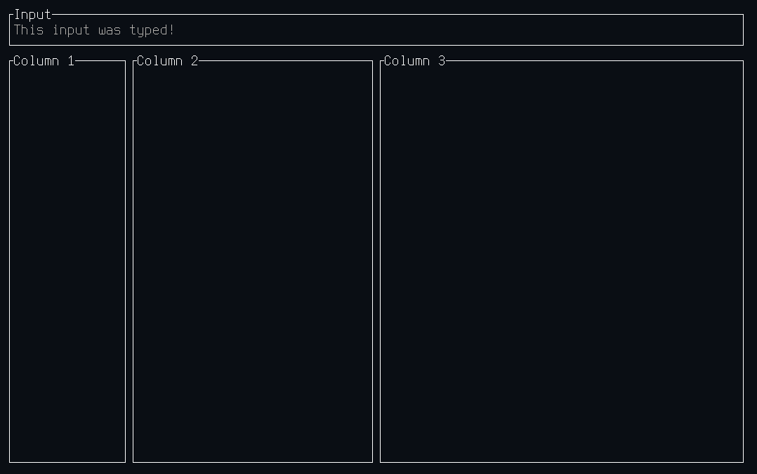
For example, a complex layout with an input box:
use ;
And the output would look like this:
Getting Started
Similarly to React, Intuitive is built around components that are composable.
There is one root component, that is passed to Terminal::new(), in order to
run the TUI.
There are two main ways to build components:
- Functional components using the
componentattribute macro - Custom components by implementing
Componentand (potentiallyElement)
Both of these are discussed in depth in the components module documentation. Another
useful resource is the recipes section of the components module documentation,
describing ways to achieve common UI interactions.