Struct fltk::tree::Tree [−][src]
pub struct Tree { /* fields omitted */ }Expand description
Defines a tree widget
Implementations
Sets the root label
Inserts a TreeItem above another tree item
Inserts a TreeItem at a position pos
Clears all children
finds a clicked item
Set the item that was last clicked.
Gets the first visible tree item
Gets the last visible tree item
Gets the next visible tree item
Gets the first selected tree item
Gets the last selected tree item
Gets the next tree item, direction_key is by default Key::Down
Gets the next selected tree item, direction_key is by default Key::Down
Gets the selected tree items
Toggle the open state
Toggle the select state of the specified
Deselect an item at path and determine whether to do the callback
Errors
Errors on failure to deselect item
Select only the specified item, deselecting all others that might be selected.
Errors
Errors on failure to select an item
pub fn extend_selection_dir(
&mut self,
from: &TreeItem,
to: &TreeItem,
direction_key: Key,
val: TreeItemSelect,
visible: bool
) -> Result<(), FltkError>
pub fn extend_selection_dir(
&mut self,
from: &TreeItem,
to: &TreeItem,
direction_key: Key,
val: TreeItemSelect,
visible: bool
) -> Result<(), FltkError>
Extend the selection between and including from and to in a certain direction
Errors
Errors on failure to extend selection in direction
pub fn extend_selection(
&mut self,
from: &TreeItem,
to: &TreeItem,
val: TreeItemSelect,
visible: bool
) -> Result<(), FltkError>
pub fn extend_selection(
&mut self,
from: &TreeItem,
to: &TreeItem,
val: TreeItemSelect,
visible: bool
) -> Result<(), FltkError>
Set the item that currently should have keyboard focus
Get the item that currently has keyboard focus
Returns whether an item is selected
Gets the items’ label font
Sets the items’ label font
Gets the items’ label size
Sets the items’ label size
Gets the items’ foreground color
Sets the items’ foreground color
Gets the items’ background color
Sets the items’ foreground color
Gets the items’ connector color
Sets the items’ foreground color
Gets the left margin
Sets the left margin
Gets the top margin
Sets the top margin
Gets the bottom margin
Sets the bottom margin
Gets the line spacing
Sets the line spacing
Gets the open child bottom margin
Sets the open child bottom margin
Gets the user icon left margin
Sets the user icon left margin
Gets the label’s left margin
Sets the label’s left margin
Gets the widget’s left margin
Sets the widget’s left margin
Gets the connector’s width
Sets the connector’s width
Sets the user icon
Sets the opne icon
Gets the close icon
Sets the opne icon
Returns true if the collapse icon is enabled, false if not.
Sets whether the collapse icon is enabled
Sets whether the root is shown
Gets the connector style
Sets the connector style
Gets the sort order
Sets the sort order
Gets the select frame
Sets the select frame
Gets the Tree select mode
Sets the Tree select mode
Gets the Tree item’s reselect mode
Sets the Tree item’s reselect mode
Gets the Tree item’s draw mode
Sets the Tree item’s draw mode
Recalculate widget dimensions and scrollbar visibility, normally done automatically
Recalculates the tree’s sizes and scrollbar visibility, normally done automatically
Recalculates the tree’s sizes and scrollbar visibility, normally done automatically
Adjust the vertical scrollbar so that item is visible
Adjust the vertical scrollbar so that item is in the middle of the display
Adjust the vertical scrollbar so that the is at the bottom of the display.
Sets the vertical position of the item
Sets the horizontal position of the item
Returns whether the widget is a scrollbar
Gets the scrollbar size
Sets the scrollbar size
Returns whether vertical scrolling is visible
Returns whether horizontal scrolling is visible
Set the callback item
Get the callback item
Set the callback reason
Get the callback reason
Trait Implementations
Creates a new widget, takes an x, y coordinates, as well as a width and height, plus a title Read more
transforms a widget pointer to a Widget, for internal use Read more
Get a widget from base widget Read more
Set a custom handler, where events are managed manually, akin to Fl_Widget::handle(int).
Handled or ignored events should return true, unhandled events should return false.
takes the widget as a closure argument Read more
Set a custom draw method.
takes the widget as a closure argument.
macOS requires that WidgetBase::draw actually calls drawing functions Read more
INTERNAL: Retrieve the draw data Read more
Initialize with a label
Initialize with alignment
Initialize with type
Initialize at bottom of another widget
Initialize above of another widget
Initialize right of another widget
Initialize center of parent
Initialize to the size of the parent
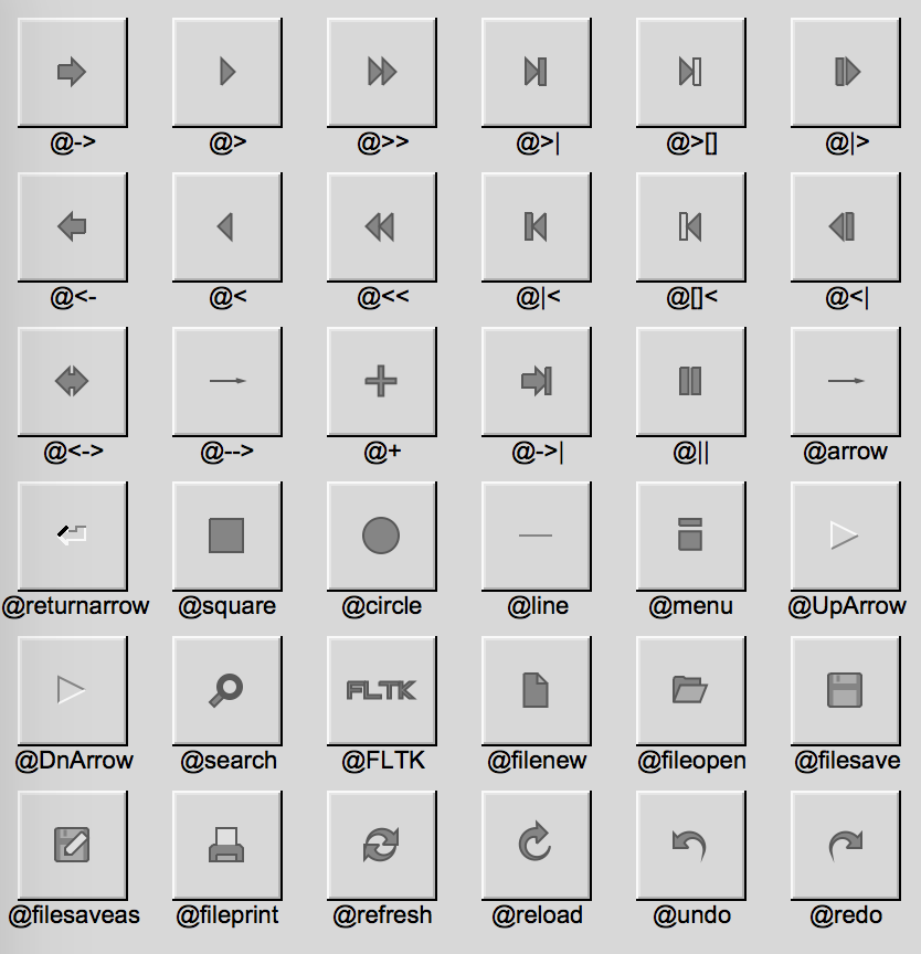
Sets the widget’s label.
labels support special symbols preceded by an @ sign.
and for the associated formatting. Read more
transforms a widget to a base Fl_Widget, for internal use Read more
Deactivates the widget
Redraws the label of the widget
Resizes and/or moves the widget, takes x, y, width and height
Does a simple resize ignoring class-specific resize functionality
Sets the tooltip text
Returns the widget label’s color
Sets the widget label’s color
Returns the widget label’s font
Sets the widget label’s font
Returns the widget label’s size
Sets the widget label’s size
Returns the widget label’s type
Sets the widget label’s type
Mark the widget as changed
Clears the changed status of the widget
Sets the default callback trigger for a widget
Return the callback trigger
Gets the selection color of the widget
Sets the selection color of the widget
Runs the already registered callback
Returns the topmost window holding the widget
Checks whether a widget is capable of taking events
INTERNAL: Retakes ownership of the user callback data Read more
Set the widget to have visible focus
Clear visible focus
Set the visible focus using a flag
Return whether the widget has visible focus
Check if a widget was deleted
Signal the widget as damaged and it should be redrawn in the next event loop cycle
Return the damage mask
Signal the type of damage a widget received
Clear the damaged flag
Return the widget as a window if it’s a window
Checks whether the self widget is inside another widget
Returns the widget type when applicable
Sets the widget type
Sets the image of the widget scaled to the widget’s size
Sets the deactived image of the widget
Sets the deactivated image of the widget scaled to the widget’s size
Gets the deactivated image associated with the widget
Sets the callback when the widget is triggered (clicks for example) takes the widget as a closure argument Read more
Emits a message on callback using a sender
Upcast a WidgetExt to a Widget Read more
Returns whether a widget or any of its parents are visible (recursively)
Return whether two widgets object point to the same widget
Returns whether a widget or any of its parents are active (recursively)
Auto Trait Implementations
Blanket Implementations
Mutably borrows from an owned value. Read more