Crate embedded_text[−][src]
Expand description
TextBox for embedded-graphics.
This crate provides a configurable TextBox to render multiline text inside a bounding
Rectangle using embedded-graphics.
TextBox supports the common text alignments:
Horizontal:LeftRightCenterJustified
Vertical:TopMiddleBottom
TextBox also supports some special characters not handled by embedded-graphics’ Text:
- non-breaking space (
\u{200b}) - zero-width space (
\u{a0}) - soft hyphen (
\u{ad}) - carriage return (
\r) - tab (
\t) with configurable tab size
TextBox also supports text coloring using ANSI escape codes.
Example
The examples are based on the embedded-graphics simulator. The simulator is built on top of
SDL2. See the simulator README for more information.
use embedded_graphics::{
mono_font::{ascii::FONT_6X10, MonoTextStyle},
pixelcolor::BinaryColor,
prelude::*,
primitives::Rectangle,
};
use embedded_graphics_simulator::{
BinaryColorTheme, OutputSettingsBuilder, SimulatorDisplay, Window,
};
use embedded_text::{
alignment::HorizontalAlignment,
style::{HeightMode, TextBoxStyleBuilder},
TextBox,
};
fn main() {
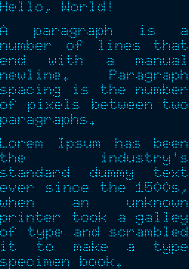
let text = "Hello, World!\n\
A paragraph is a number of lines that end with a manual newline. Paragraph spacing is the \
number of pixels between two paragraphs.\n\
Lorem Ipsum has been the industry's standard dummy text ever since the 1500s, when \
an unknown printer took a galley of type and scrambled it to make a type specimen book.";
// Specify the styling options:
// * Use the 6x10 MonoFont from embedded-graphics.
// * Draw the text fully justified.
// * Use `FitToText` height mode to stretch the text box to the exact height of the text.
// * Draw the text with `BinaryColor::On`, which will be displayed as light blue.
let character_style = MonoTextStyle::new(&FONT_6X10, BinaryColor::On);
let textbox_style = TextBoxStyleBuilder::new()
.height_mode(HeightMode::FitToText)
.alignment(HorizontalAlignment::Justified)
.paragraph_spacing(6)
.build();
// Specify the bounding box. Note the 0px height. The `FitToText` height mode will
// measure and adjust the height of the text box in `into_styled()`.
let bounds = Rectangle::new(Point::zero(), Size::new(128, 0));
// Create the text box and apply styling options.
let text_box = TextBox::with_textbox_style(text, bounds, character_style, textbox_style);
// Create a simulated display with the dimensions of the text box.
let mut display = SimulatorDisplay::new(text_box.bounding_box().size);
// Draw the text box.
text_box.draw(&mut display).unwrap();
// Set up the window and show the display's contents.
let output_settings = OutputSettingsBuilder::new()
.theme(BinaryColorTheme::OledBlue)
.scale(2)
.build();
Window::new("TextBox example with paragraph spacing", &output_settings).show_static(&display);
}Cargo features
plugin(experimental): allows implementing custom plugins.ansi(default enabled): enables ANSI sequence support using theAnsiplugin.
Modules
Text alignment options.
Plugins allow changing TextBox behaviour.
TextBox styling.
Structs
A text box object.