Expand description
Intuitive
Intuitive is a component-based library for creating text-based user interfaces (TUIs) easily.
It is heavily inspired by React and SwiftUI, containing features that resemble functional components, hooks, and a (mostly) declarative DSL.
Design
The main focus of Intuitive is to simplify the implementation of section-based TUIs, such as lazygit’s. Resizing is handled automatically, and keyboard events can be handled easily.
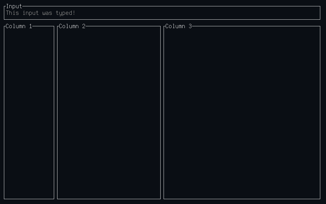
For example, a complex layout with an input box:
use intuitive::{
  component,
  components::{Centered, Flex::*, Section, Text, VStack, HStack},
  error::Result,
  on_key, render,
  state::use_state,
  terminal::Terminal,
};

#[component(Root)]
fn render() {
  let text = use_state(|| String::new());
  let on_key = on_key! { [text]
    KeyEvent { code: Char(c), .. } => text.mutate(|text| text.push(c)),
    KeyEvent { code: Backspace, .. } => text.mutate(|text| text.pop()),
    KeyEvent { code: Esc, .. } => event::quit(),
  };

  render! {
    VStack(flex: [Block(3), Grow(1)], on_key: on_key) {
      Section(title: "Input") {
        Text(text: text.get())
      }

      HStack(flex: [1, 2, 3]) {
        Section(title: "Column 1")
        Section(title: "Column 2")
        Section(title: "Column 3")
      }
    }
  }
}

fn main() -> Result<()> {
  Terminal::new(Root::new())?.run()
}
And the output would look like this:
Modules
A collection of basic components.
Types describing rendered components.
The crate’s Error type.
Primitives for handling and sending events.
Primitives for handling state.
Contains the Terminal type used to run the UI.
Macros
Attribute Macros
Helper attribute macro for creating functional components.