1
2
3
4
5
6
7
8
9
10
11
12
13
14
15
16
17
18
19
20
21
22
23
24
25
26
27
28
29
30
31
32
33
34
35
36
37
38
39
40
41
42
43
44
45
46
47
48
49
50
51
52
53
54
55
56
57
58
59
60
61
62
63
64
65
66
67
68
69
70
71
72
73
74
75
76
77
78
79
80
81
82
83
84
85
86
87
88
89
90
91
92
93
94
95
96
97
98
99
100
101
102
103
104
105
106
107
108
109
110
111
112
113
114
115
116
117
118
119
120
121
122
123
124
125
126
127
128
129
130
131
132
133
134
135
136
137
138
139
140
141
142
143
144
145
146
147
148
149
150
151
152
153
154
155
156
157
158
159
160
161
162
163
164
165
166
167
168
169
170
171
172
173
174
175
176
177
178
179
180
181
182
183
184
185
186
187
188
189
190
191
192
193
194
195
196
197
198
199
200
201
202
203
204
205
206
207
208
209
210
211
212
213
214
215
216
217
218
219
220
221
222
223
224
225
226
227
228
229
230
231
232
233
234
235
236
237
238
239
240
241
242
243
244
245
246
247
248
249
250
251
252
253
254
255
256
257
258
259
260
261
262
263
264
265
266
267
268
269
270
271
272
273
274
275
276
277
278
279
280
281
282
283
284
285
286
287
288
289
290
291
292
293
294
295
296
297
298
299
300
301
302
303
304
305
306
307
308
309
310
311
312
313
314
315
316
317
318
319
320
321
322
323
324
325
326
327
328
329
330
331
332
333
334
335
336
337
338
339
340
341
342
343
344
345
346
347
348
349
350
351
352
353
354
355
356
357
358
359
360
361
362
363
364
365
366
367
368
369
370
371
372
373
374
375
376
377
378
379
380
381
382
383
384
385
386
387
388
389
390
391
392
393
394
395
396
397
398
399
400
401
402
403
404
405
406
407
408
409
410
411
412
413
414
415
416
417
418
419
420
421
422
423
424
425
426
427
428
429
430
431
432
433
434
435
436
437
438
439
440
441
442
443
444
445
446
447
448
449
450
451
452
453
454
455
456
457
458
459
460
461
462
463
464
465
466
467
468
469
470
471
472
473
474
475
476
477
478
479
480
481
482
483
484
485
486
487
488
489
490
491
492
493
494
495
496
497
498
499
500
501
502
503
504
505
506
//! TextBox for embedded-graphics.
//!
//! This crate provides a configurable [`TextBox`] to render multiline text inside a bounding
//! `Rectangle` using [embedded-graphics].
//!
//! [`TextBox`] supports the common text alignments:
//! - [`Horizontal`]:
//! - `Left`
//! - `Right`
//! - `Center`
//! - `Justified`
//! - [`Vertical`]:
//! - `Top`
//! - `Middle`
//! - `Bottom`
//!
//! [`TextBox`] also supports some special characters not handled by embedded-graphics' `Text`:
//! - non-breaking space (`\u{200b}`)
//! - zero-width space (`\u{a0}`)
//! - soft hyphen (`\u{ad}`)
//! - carriage return (`\r`)
//! - tab (`\t`) with configurable tab size
//!
//! `TextBox` also supports text coloring using [ANSI escape codes](https://en.wikipedia.org/wiki/ANSI_escape_code).
//!
//! ### Example
//!
//! The examples are based on [the embedded-graphics simulator]. The simulator is built on top of
//! `SDL2`. See the [simulator README] for more information.
//!
//! 
//!
//! 
//!
//! ```rust,no_run
//! use embedded_graphics::{
//! mono_font::{ascii::FONT_6X10, MonoTextStyle},
//! pixelcolor::BinaryColor,
//! prelude::*,
//! primitives::Rectangle,
//! };
//! use embedded_graphics_simulator::{
//! BinaryColorTheme, OutputSettingsBuilder, SimulatorDisplay, Window,
//! };
//! use embedded_text::{
//! alignment::HorizontalAlignment,
//! style::{HeightMode, TextBoxStyleBuilder},
//! TextBox,
//! };
//!
//! fn main() {
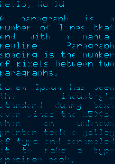
//! let text = "Hello, World!\n\
//! A paragraph is a number of lines that end with a manual newline. Paragraph spacing is the \
//! number of pixels between two paragraphs.\n\
//! Lorem Ipsum has been the industry's standard dummy text ever since the 1500s, when \
//! an unknown printer took a galley of type and scrambled it to make a type specimen book.";
//!
//! // Specify the styling options:
//! // * Use the 6x10 MonoFont from embedded-graphics.
//! // * Draw the text fully justified.
//! // * Use `FitToText` height mode to stretch the text box to the exact height of the text.
//! // * Draw the text with `BinaryColor::On`, which will be displayed as light blue.
//! let character_style = MonoTextStyle::new(&FONT_6X10, BinaryColor::On);
//! let textbox_style = TextBoxStyleBuilder::new()
//! .height_mode(HeightMode::FitToText)
//! .alignment(HorizontalAlignment::Justified)
//! .paragraph_spacing(6)
//! .build();
//!
//! // Specify the bounding box. Note the 0px height. The `FitToText` height mode will
//! // measure and adjust the height of the text box in `into_styled()`.
//! let bounds = Rectangle::new(Point::zero(), Size::new(128, 0));
//!
//! // Create the text box and apply styling options.
//! let text_box = TextBox::with_textbox_style(text, bounds, character_style, textbox_style);
//!
//! // Create a simulated display with the dimensions of the text box.
//! let mut display = SimulatorDisplay::new(text_box.bounding_box().size);
//!
//! // Draw the text box.
//! text_box.draw(&mut display).unwrap();
//!
//! // Set up the window and show the display's contents.
//! let output_settings = OutputSettingsBuilder::new()
//! .theme(BinaryColorTheme::OledBlue)
//! .scale(2)
//! .build();
//! Window::new("TextBox example with paragraph spacing", &output_settings).show_static(&display);
//! }
//! ```
//!
//! ## Cargo features
//!
//! * `plugin` (*experimental*): allows implementing custom plugins.
//! * `ansi` (default enabled): enables ANSI sequence support using the `Ansi` plugin.
//!
//! [embedded-graphics]: https://github.com/embedded-graphics/embedded-graphics/
//! [the embedded-graphics simulator]: https://github.com/embedded-graphics/embedded-graphics/tree/master/simulator
//! [simulator README]: https://github.com/embedded-graphics/embedded-graphics/tree/master/simulator#usage-without-sdl2
//! [`Horizontal`]: HorizontalAlignment
//! [`Vertical`]: VerticalAlignment
#![cfg_attr(not(test), no_std)]
#![deny(clippy::missing_inline_in_public_items)]
#![deny(clippy::cargo)]
#![deny(missing_docs)]
#![warn(clippy::all)]
#![allow(clippy::needless_doctest_main)]
pub mod alignment;
mod parser;
pub mod plugin;
mod rendering;
pub mod style;
mod utils;
use crate::{
alignment::{HorizontalAlignment, VerticalAlignment},
plugin::{NoPlugin, PluginMarker as Plugin, PluginWrapper},
style::{HeightMode, TabSize, TextBoxStyle},
};
use embedded_graphics::{
geometry::{Dimensions, Point},
primitives::Rectangle,
text::{
renderer::{CharacterStyle, TextRenderer},
LineHeight,
},
transform::Transform,
};
use object_chain::{Chain, ChainElement, Link};
#[cfg(feature = "plugin")]
pub use crate::{
parser::{ChangeTextStyle, Token},
rendering::{cursor::Cursor, TextBoxProperties},
};
/// A text box object.
/// ==================
///
/// The `TextBox` object can be used to draw text on a draw target. It is meant to be a more
/// feature-rich alternative to `Text` in embedded-graphics.
///
/// To construct a [`TextBox`] object at least a text string, a bounding box and character style are
/// required. For advanced formatting options an additional [`TextBoxStyle`] object might be used.
/// For more information about text box styling, see the documentation of the [`style`] module.
///
/// Text rendering in `embedded-graphics` is designed to be extendable by text renderers for
/// different font formats. `embedded-text` follows this philosophy by using the same text renderer
/// infrastructure. To use a text renderer in an `embedded-text` project each renderer provides a
/// character style object. See the [`embedded-graphics` documentation] for more information on text
/// renderers and character styling.
///
/// Plugins
/// -------
///
/// The feature set of `TextBox` can be extended by plugins. Plugins can be used to implement
/// optional features which are not essential to the core functionality of `embedded-text`.
///
/// Use the [`add_plugin`] method to add a plugin to the `TextBox` object. Multiple plugins can be
/// used at the same time. Plugins are applied in the reverse order they are added. Note that some
/// plugins may interfere with others if used together or not in the expected order.
///
/// If you need to extract data from plugins after the text box has been rendered,
/// you can use the [`take_plugins`] method.
///
/// See the list of built-in plugins in the [`plugin`] module.
///
/// *Note:* Implementing custom plugins is experimental and require enabling the `plugin` feature.
///
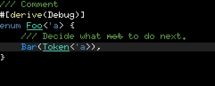
/// ### Example: advanced text styling using the ANSI plugin
///
/// ```rust,ignore
/// # use embedded_graphics::{
/// # Drawable,
/// # geometry::{Point, Size},
/// # primitives::Rectangle,
/// # mock_display::MockDisplay,
/// # mono_font::{
/// # ascii::FONT_6X10, MonoTextStyle, MonoTextStyleBuilder,
/// # },
/// # pixelcolor::BinaryColor,
/// # };
/// # let mut display: MockDisplay<BinaryColor> = MockDisplay::default();
/// # display.set_allow_out_of_bounds_drawing(true);
/// # let character_style = MonoTextStyle::new(&FONT_6X10, BinaryColor::On);
/// # let bounding_box = Rectangle::new(Point::zero(), Size::new(100, 20));
/// use embedded_text::{TextBox, plugin::ansi::Ansi};
/// TextBox::new(
/// "Some \x1b[4munderlined\x1b[24m text",
/// bounding_box,
/// character_style,
/// )
/// .add_plugin(Ansi::new())
/// .draw(&mut display)?;
/// # Ok::<(), core::convert::Infallible>(())
/// ```
///
/// Vertical offsetting
/// -------------------
///
/// You can use the [`set_vertical_offset`] method to move the text inside the text box. Vertical
/// offset is applied after all vertical measurements and alignments. This can be useful to scroll
/// text in a fixed text box. Setting a positive value moves the text down.
///
/// Residual text
/// -------------
///
/// If the text does not fit the given bounding box, the [`draw`] method returns the part which was
/// not processed. The return value can be used to flow text into multiple text boxes.
///
/// [`draw`]: embedded_graphics::Drawable::draw()
/// [`set_vertical_offset`]: TextBox::set_vertical_offset()
/// [`add_plugin`]: TextBox::add_plugin()
/// [`take_plugins`]: TextBox::take_plugins()
/// [`embedded-graphics` documentation]: https://docs.rs/embedded-graphics/0.7.1/embedded_graphics/text/index.html
#[derive(Clone, Debug, Hash)]
#[must_use]
pub struct TextBox<'a, S, M = NoPlugin<<S as TextRenderer>::Color>>
where
S: TextRenderer,
{
/// The text to be displayed in this `TextBox`
pub text: &'a str,
/// The bounding box of this `TextBox`
pub bounds: Rectangle,
/// The character style of the [`TextBox`].
pub character_style: S,
/// The style of the [`TextBox`].
pub style: TextBoxStyle,
/// Vertical offset applied to the text just before rendering.
pub vertical_offset: i32,
plugin: PluginWrapper<'a, M, S::Color>,
}
impl<'a, S> TextBox<'a, S, NoPlugin<<S as TextRenderer>::Color>>
where
S: TextRenderer + CharacterStyle,
{
/// Creates a new `TextBox` instance with a given bounding `Rectangle`.
#[inline]
pub fn new(text: &'a str, bounds: Rectangle, character_style: S) -> Self {
TextBox::with_textbox_style(text, bounds, character_style, TextBoxStyle::default())
}
/// Creates a new `TextBox` instance with a given bounding `Rectangle` and a given
/// `TextBoxStyle`.
#[inline]
pub fn with_textbox_style(
text: &'a str,
bounds: Rectangle,
character_style: S,
textbox_style: TextBoxStyle,
) -> Self {
let mut styled = TextBox {
text,
bounds,
character_style,
style: textbox_style,
vertical_offset: 0,
plugin: PluginWrapper::new(NoPlugin::new()),
};
styled.style.height_mode.apply(&mut styled);
styled
}
/// Creates a new `TextBox` instance with a given bounding `Rectangle` and a default
/// `TextBoxStyle` with the given horizontal alignment.
#[inline]
pub fn with_alignment(
text: &'a str,
bounds: Rectangle,
character_style: S,
alignment: HorizontalAlignment,
) -> Self {
TextBox::with_textbox_style(
text,
bounds,
character_style,
TextBoxStyle::with_alignment(alignment),
)
}
/// Creates a new `TextBox` instance with a given bounding `Rectangle` and a default
/// `TextBoxStyle` and the given vertical alignment.
#[inline]
pub fn with_vertical_alignment(
text: &'a str,
bounds: Rectangle,
character_style: S,
vertical_alignment: VerticalAlignment,
) -> Self {
TextBox::with_textbox_style(
text,
bounds,
character_style,
TextBoxStyle::with_vertical_alignment(vertical_alignment),
)
}
/// Creates a new `TextBox` instance with a given bounding `Rectangle` and a default
/// `TextBoxStyle` and the given [height mode].
///
/// [height mode]: HeightMode
#[inline]
pub fn with_height_mode(
text: &'a str,
bounds: Rectangle,
character_style: S,
mode: HeightMode,
) -> Self {
TextBox::with_textbox_style(
text,
bounds,
character_style,
TextBoxStyle::with_height_mode(mode),
)
}
/// Creates a new `TextBox` instance with a given bounding `Rectangle` and a default
/// `TextBoxStyle` and the given line height.
#[inline]
pub fn with_line_height(
text: &'a str,
bounds: Rectangle,
character_style: S,
line_height: LineHeight,
) -> Self {
TextBox::with_textbox_style(
text,
bounds,
character_style,
TextBoxStyle::with_line_height(line_height),
)
}
/// Creates a new `TextBox` instance with a given bounding `Rectangle` and a default
/// `TextBoxStyle` and the given paragraph spacing.
#[inline]
pub fn with_paragraph_spacing(
text: &'a str,
bounds: Rectangle,
character_style: S,
spacing: u32,
) -> Self {
TextBox::with_textbox_style(
text,
bounds,
character_style,
TextBoxStyle::with_paragraph_spacing(spacing),
)
}
/// Creates a new `TextBox` instance with a given bounding `Rectangle` and a default
/// `TextBoxStyle` and the given tab size.
#[inline]
pub fn with_tab_size(
text: &'a str,
bounds: Rectangle,
character_style: S,
tab_size: TabSize,
) -> Self {
TextBox::with_textbox_style(
text,
bounds,
character_style,
TextBoxStyle::with_tab_size(tab_size),
)
}
/// Sets the vertical text offset.
///
/// Vertical offset changes the vertical position of the displayed text within the bounding box.
/// Setting a positive value moves the text down.
#[inline]
pub fn set_vertical_offset(&mut self, offset: i32) -> &mut Self {
self.vertical_offset = offset;
self
}
/// Adds a new plugin to the `TextBox`.
#[inline]
pub fn add_plugin<M>(self, plugin: M) -> TextBox<'a, S, Chain<M>>
where
M: Plugin<'a, <S as TextRenderer>::Color>,
{
let mut styled = TextBox {
text: self.text,
bounds: self.bounds,
character_style: self.character_style,
style: self.style,
vertical_offset: self.vertical_offset,
plugin: PluginWrapper::new(Chain::new(plugin)),
};
styled.style.height_mode.apply(&mut styled);
styled
}
}
impl<'a, S, P> TextBox<'a, S, P>
where
S: TextRenderer + CharacterStyle,
P: Plugin<'a, <S as TextRenderer>::Color> + ChainElement,
{
/// Adds a new plugin to the `TextBox`.
#[inline]
pub fn add_plugin<M>(self, plugin: M) -> TextBox<'a, S, Link<M, P>>
where
M: Plugin<'a, <S as TextRenderer>::Color>,
{
let parent = self.plugin.into_inner();
let mut styled = TextBox {
text: self.text,
bounds: self.bounds,
character_style: self.character_style,
style: self.style,
vertical_offset: self.vertical_offset,
plugin: PluginWrapper::new(parent.append(plugin)),
};
styled.style.height_mode.apply(&mut styled);
styled
}
/// Deconstruct the text box and return the plugins.
#[inline]
pub fn take_plugins(self) -> P {
self.plugin.into_inner()
}
}
impl<'a, S, M> Transform for TextBox<'a, S, M>
where
S: TextRenderer + Clone,
M: Plugin<'a, S::Color>,
{
#[inline]
fn translate(&self, by: Point) -> Self {
Self {
bounds: self.bounds.translate(by),
..self.clone()
}
}
#[inline]
fn translate_mut(&mut self, by: Point) -> &mut Self {
self.bounds.translate_mut(by);
self
}
}
impl<'a, S, M> Dimensions for TextBox<'a, S, M>
where
S: TextRenderer,
M: Plugin<'a, S::Color>,
{
#[inline]
fn bounding_box(&self) -> Rectangle {
self.bounds
}
}
impl<'a, S, M> TextBox<'a, S, M>
where
S: TextRenderer,
M: Plugin<'a, S::Color>,
{
/// Sets the height of the [`TextBox`] to the height of the text.
#[inline]
fn fit_height(&mut self) -> &mut Self {
self.fit_height_limited(u32::MAX)
}
/// Sets the height of the [`TextBox`] to the height of the text, limited to `max_height`.
///
/// This method allows you to set a maximum height. The [`TextBox`] will take up at most
/// `max_height` pixel vertical space.
#[inline]
fn fit_height_limited(&mut self, max_height: u32) -> &mut Self {
// Measure text given the width of the textbox
let text_height = self
.style
.measure_text_height_impl(
self.plugin.clone(),
&self.character_style,
self.text,
self.bounding_box().size.width,
)
.min(max_height)
.min(i32::MAX as u32);
// Apply height
self.bounds.size.height = text_height;
self
}
}